
The Red Stripe Logo History, Colors, Font, And Meaning
Imagine unfurling a banner that instantly signifies a vibrant tapestry of culture, a chilled lifestyle, and the taste of the tropics—that’s the power of the Red Stripe logo.
This emblem isn’t merely a label; it melds graphic design genius with the unmistakable identity of Jamaica’s beloved lager.
Venturing into the realm of this distinctive symbol, one uncovers a chronicle of a brand’s journey, mirrored in the hues and contours of its logo. With each curve and color, the logo whispers tales of reggae-infused afternoons and laid-back evenings.
This article will unravel the threads that weave the Red Stripe logo into the iconic status it revels in today. From its conception to its current incarnation, we’ll explore how a beverage company’s insignia evolves into a cultural icon.
Brace for an insight-rich voyage into its essence, from the visual identity shaping consumer perception to the trademark complexities guarding its unique stature.
Read on, and by the final punctuation mark, you will have sailed through the intricacies that anchor a logo to become the heart of a brand’s visual identity.
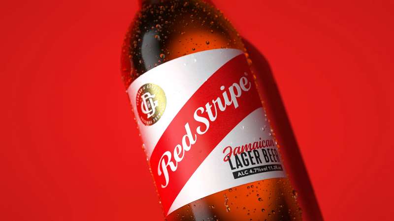
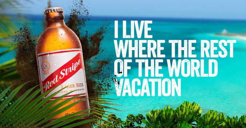
The Meaning Behind the Red Stripe Logo
![]()
You know, logos are like a piece of abstract art. There’s a whole story and emotion behind every brushstroke and color choice. Let’s break it down, shall we?
The Essence
Red Stripe, man, it’s not just a drink. It’s an emotion, a vibe, an essence of the Jamaican spirit. The logo, in its simplicity, reflects that vibe – breezy, chill, yet memorable.
Symbolism
Symbols are sneaky. They convey messages without words. The diagonal red stripe? Oh, that’s more than just a line. It represents uniqueness, a break from the norm. It’s a statement, saying “I’m different, and I’m proud.”
The History of the Red Stripe Logo
A trip down memory lane, and you realize that the Red Stripe logo has evolved, just like your favorite playlist. But the soul? It remains the same.
The Beginnings
Dating back to the 1920s, the early logo versions were, let’s say, a bit old school. But even then, it had that spark, that distinctive feel.
The Evolution
Over the decades, tweaks here and there shaped it into the iconic emblem we recognize today. The core? Unchanged. The aesthetics? Polished.
The Colors of the Red Stripe Logo

Colors are, honestly, the unsung heroes of branding. They carry weight, emotion, and tons of vibes.
The Dominant Red
Red – it’s bold, energetic, and, dare I say, a tad rebellious. Just like the beer, right? This color embodies passion, love, and adventure. Just what you need for a chill evening.
The Complementing White
White is pure, honest, and gives red its spotlight. It’s like the bass guitarist in a rock band – you might not always notice, but without it, everything’s off.
The Font Used in the Red Stripe Logo
Fonts, man, they’re the voice of the brand without actually speaking. Let’s see what the Red Stripe voice sounds like.
Simplicity is Key
The font is straightforward – no frills, no fuss. It’s like that friend who tells it like it is. Clean, legible, yet charismatic.
The Bold Statement
Ever notice how the text has a weight? Not just the physical boldness, but the gravitas. It holds its ground, ensuring you remember it long after the last sip.
The Legacy and Global Reach
When you’ve got a brand like Red Stripe, it’s bound to make waves, not just ripples.
The International Recognition
From Kingston to California, the logo’s been spotted, recognized, and loved. The universal appeal? It’s real.
The Cultural Significance
Tied closely to music, beach vibes, and good times, this logo isn’t just about beer. It’s a cultural emblem.
The Psychology of Recognition
Brands want to be remembered, but how? Let’s get a bit brainy.
The Human Memory
Our brains, weirdly cool organs, gravitate towards patterns and familiarity. The logo’s diagonal line? It stands out. Our brain notes it.
Emotions and Brands
When you have a good time with friends, and there’s a Red Stripe in hand, your brain links the joy with the logo. Next time you see it, bam! You’re reliving the memories.
FAQ On The Red Stripe Logo
What’s the history behind the Red Stripe logo?
The Red Stripe logo boasts a history as colorful as its Jamaican roots. Conceived to embody the spirit of the island, it reflects the distinctive red stripe found on the beer’s bottle since the early 20th century.
Its evolution mirrors the brand’s growing identity, from a local favorite to an international symbol of relaxed Caribbean vibes.
Is there meaning in the Red Stripe logo’s colors?
Absolutely. The logo’s red and white colors aren’t just visually striking; they carry meaning. Red emanates vitality and energy, resonating with the lively Jamaican culture, while white offers contrast, symbolizing purity.
Together, they paint a picture of the beer’s vibrant personality and its crisp, clean taste.
How has the Red Stripe logo changed over the years?
The Red Stripe logo has evolved, reflecting both changing design trends and the brand’s own journey.
While its core elements—bold red and sharp, clean lines—have remained constant, subtle tweaks over time have modernized its look, ensuring that the brand stays relevant and recognizably Red Stripe.
What does the Red Stripe logo say about the brand?
The logo speaks volumes about Red Stripe’s brand identity; it’s a testament to simplicity and the power of strong visual impact.
It conveys brand recognition and is synonymous with Jamaican heritage—inviting consumers to share in the simple pleasure of a beer synonymous with good times.
Do consumers resonate with the Red Stripe logo?
Consumers do more than just resonate; they connect. The Red Stripe logo has become a trademark symbol that customers recognize globally.
It stands for more than just beer—it’s a ticket to Jamaica’s relaxed lifestyle and the casual joy found in sharing a cold bottle with friends.
How does Red Stripe protect its logo from imitations?
Trademark laws are the shield that guards the Red Stripe logo. The company has legal protections in place to ensure their logo’s exclusive use, safeguarding their brand from counterfeiters or other breweries that might attempt to mimic their iconic design.
What role does the Red Stripe logo play in marketing?
In the theater of marketing, the logo steps onto the stage as the brand’s leading actor. Its unmistakable image anchors advertising campaigns, leaving an indelible mark on merchandising, branding, and ultimately, the consumer’s choice.
It’s the visual hook that captures attention and defines the brand’s presence.
What elements of graphic design are evident in the Red Stripe logo?
Graphic design principles shine through in the logo’s sleek lines, bold color palette, and minimalist approach.
The choice of color and typography within the design encapsulates the brand’s essence, transforming a simple logo into an enduring and instantly recognizable brand emblem.
Is the Red Stripe logo unique compared to other beer logos?
It stands tall and distinct. In an ocean of beer logos, Red Stripe’s visual calling card sets itself apart through its bold simplicity and cultural resonance. It eschews complexity for a crisp, striking design that captures the easy-going spirit of the Caribbean.
What does the future hold for the Red Stripe logo?
The path ahead looks as bright as a Caribbean sunrise. The logo’s design has shown resilience and adaptability, traits that will serve it well as branding and consumer preferences evolve.
One can expect the Red Stripe logo to hold onto its core while adapting subtly to the winds of change.
Conclusion
Stepping back, the journey through the world of the Red Stripe logo encapsulates not just a visual feast but also a cultural odyssey. It isn’t merely ink on paper—it’s a storied emblem, ripe with Jamaican zest and a symbol of communal jubilance. It stands, bold and unfettered, a beacon of the brand’s essence—a tale of tradition, innovation, and simplicity blended into a singular mark of identity.
- Trademarks and brand recognition expand beyond legalities and marketing strategies—they breathe life into this emblem.
- Graphic design ingenuity employs color schemes and visual identity to narrate the brand’s saga without uttering a single word.
In essence, the Red Stripe logo transcends its commercial purpose. It’s transformed into a tangible snippet of the carefree Caribbean spirit—a silent yet resounding invitation to savor life one bottle at a time. It’s clear, as this chapter comes to a close, that this logo will continue to evolve, forever remaining a steadfast symbol in the beer brand’s narrative.
If you enjoyed reading this article about the Red Stripe logo, you should read these as well:
- The Best 40 Beer Ads You Can See Today
- How to Design a Logo Like a Pro: Tips to Follow
- Awesome Bottle Mockups For Designers (Free and premium)
Bogdan Sandu, a seasoned designer with 15 years of diverse experience, has been designing websites since 2008.
Renowned for his expertise in logo design and visual branding, Bogdan has developed a multitude of logos for various clients.
His skills extend to creating posters, vector illustrations, business cards, and brochures. Additionally, Bogdan's UI kits were featured on marketplaces like Visual Hierarchy and UI8.
Latest posts by Bogdan Sandu (see all)
- Exploration in Type: What Font Does National Geographic Use? - 20 May 2024
- The Corona Logo History, Colors, Font, And Meaning - 19 May 2024
- Beige Color Palettes for Elegant Designs - 19 May 2024