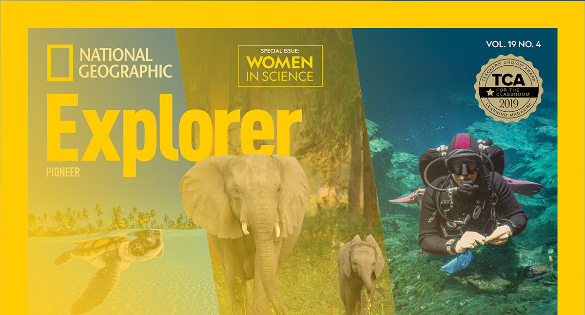
National Geographic uses Geograph, a custom geometric sans-serif typeface commissioned from New Zealand-based Klim Type Foundry. Designed by Kris Sowersby and Noe Blanco, Geograph was released in spring 2018 as the official brand typeface across National Geographic’s television, print, and digital media.
The font family spans 24 styles, split into two sub-families: Geograph (display) and Geograph Edit (editorial). The magazine also uses two additional custom typefaces, Earle and Marden, both designed by Tal Leming for the 2018 editorial redesign.
—
What Type of Font Is Geograph?

Geograph is a geometric sans-serif. That classification matters because it shapes exactly how the typeface behaves on a page or screen. Geometric construction means letterforms are built from circles, rectangles, and straight lines, which gives Geograph its clean, unambiguous look.
Klim drew on two historical reference points: the idealism of Futura and the pragmatism of Super Grotesk. The result sits between those two poles. It has round dots and smooth joins (closer to Futura), but avoids the mechanical rigidity that makes Futura feel cold at body sizes.
Geograph comes with a suite of alternate letterforms, including Futura-style alternates for characters like “a,” “e,” “g,” “j,” “s,” “t,” “u,” and an optional crossed “W.” This is what gives it that flexibility across magazine covers, TV graphics, and web articles without feeling inconsistent.
Key typographic characteristics:
- Uniform stroke weight with minimal thick-to-thin contrast
- Round dots and punctuation marks
- Smooth terminal joins (not clipped or angular)
- Variable x-height across sub-families for different reading contexts
- 24 styles with full OpenType feature support
Geograph Edit, the quieter of the two sub-families, uses blunter detailing and a more robust finish. It was built to handle body copy and captions where Geograph’s expressive display version would be too loud.
—
Who Designed Geograph?

Kris Sowersby designed Geograph, with engineering by Noe Blanco. Both work at Klim Type Foundry, based in Wellington, New Zealand. Panos Haratzopoulos handled Greek character versions.
The commission came through in 2016. National Geographic’s creative director Emmet Smith contacted Klim requesting a typeface that could serve as “the main brand typeface across television, print and digital media.” That brief later expanded to replace two existing fonts at once, Verlag (display) and Neue Haas Grotesk (editorial), with a single family flexible enough to cover both roles.
Sowersby reviewed 18 typefaces from 14 foundries before beginning work. The National Geographic creative team (Emmet Smith, Mariano Barreiro, and Bethany Powell) identified Super Grotesk and Bauer Futura as the strongest starting points. The font was completed and began rolling out publicly in spring 2018.
Geograph is not a revival or licensed adaptation of any existing typeface. It is an original design commissioned specifically for National Geographic.
—
Is Geograph Free to Use?
No. Geograph is proprietary. The Geograph fonts are currently licensed for the exclusive use of National Geographic. You cannot purchase, download, or legally use Geograph for your own projects.
Klim does offer Geograph for sale on their website (klim.co.nz) as a commercial font for third-party use, though pricing is per-license and covers desktop, web, and app use separately. This is distinct from the exclusive version held by National Geographic.
The font is not available on Google Fonts or Adobe Fonts. Any “free download” sites offering Geograph are distributing unlicensed copies, which violates Klim’s licensing terms.
If you need something similar for a personal or commercial project, see the alternatives section below.
—
What Font Did National Geographic Use Before Geograph?
Before Geograph, National Geographic’s typography was fragmented. Different properties used different typefaces with no single unifying brand font.
| Typeface | Role | Used Until | Strategic Note |
| Verlag | Display / Headlines | 2018 | Geometric, “Art Deco” influence; usually set in all-caps. |
| Neue Haas Grotesk | Secondary Headlines / Body | 2018 | The original Helvetica; cleaner and more “honest” than modern digital cuts. |
| Grosvenor | Custom Serif (Body) | 2018 | A bespoke “Fine” serif designed for luxury editorial texture. |
| Chronicle Text | Serif (Body) | ~2015 | A workhorse serif by Hoefler & Co. designed for readability. |
The 2016 rebrand, handled by studio Gretel, introduced Verlag and Neue Haas Grotesk as a stopgap solution. The National Geographic creative team felt the pairing was “an imperfect match born of tight launch timelines.” That dissatisfaction is what led to the Geograph commission.
The magazine’s nameplate (the “National Geographic” wordmark on covers) was also redrawn in 2018 by typographer Tal Leming. The original serif nameplate had appeared on covers since 1959. Leming simplified the serifs, reduced contrast, and normalized letterform proportions while preserving the original character.
—
What Are the Best Free Alternatives to Geograph?
Since Geograph is not publicly available, here are 5 free geometric sans-serifs that capture a similar feel. All share Geograph’s grounding in Futura and Super Grotesk references.
| Font | Similarity to Geograph | License | Source |
| Jost | Closest geometric proportions, single-storey “a,” clean terminals | OFL (free commercial use) | Google Fonts |
| Poppins | Circular geometry, uniform stroke, 18 weights | OFL (free commercial use) | Google Fonts |
| Montserrat | Geometric grotesk, strong display presence, extensive family | OFL (free commercial use) | Google Fonts |
| DM Sans | Clean grotesk with editorial neutrality, 3 weights | OFL (free commercial use) | Google Fonts |
| Nunito | Rounded geometric, softer version of Geograph’s warmth | OFL (free commercial use) | Google Fonts |
Jost is the most faithful option if you specifically want to approximate Geograph’s Futura-influenced forms. It even includes a single-storey “a” via OpenType stylistic sets. For editorial work, pairing Jost with a serif font like Cormorant Garamond or Libre Baskerville replicates the kind of typographic hierarchy National Geographic runs in print.
Understanding typography basics and what a font actually is helps a lot when comparing these options. The differences between them are subtle but visible at headline sizes.
—
How to Use Geograph Alternatives in Your Design Tools
In Figma or Canva
Both Jost and Poppins are available directly inside Figma through the Google Fonts integration. No installation needed. Search the font panel and they appear immediately.
For Canva, Jost is available in the free font library. Poppins is also accessible without a Pro account.
In Photoshop or Illustrator
If you use Adobe Creative Cloud, Montserrat and Poppins are available through Adobe Fonts at no extra cost. Activate them from the Creative Cloud app and they sync automatically.
For manual installation, download the font files from Google Fonts and follow the standard process for adding fonts to Adobe Illustrator or adding fonts to Photoshop.
For Web Use (CSS)
To use Jost as a Geograph alternative on a website, add this to your HTML:
“ <link href="https://fonts.googleapis.com/css2?family=Jost:wght@300;400;500;600;700&display=swap" rel="stylesheet"> `
Then in your CSS:
` body { font-family: 'Jost', sans-serif; } `
Jost is a variable font, which means a single file handles all weights. That reduces page load time compared to loading multiple static font files, which matters for performance.
—
Why Did National Geographic Choose Geograph?
The short answer: none of the existing options worked well enough across all of National Geographic’s platforms at once.
Verlag performed fine as a display typeface for large-format TV graphics. But it only worked in capitals, which severely limited its versatility for body copy, captions, and digital articles. Neue Haas Grotesk handled editorial work but didn’t carry enough personality for brand-defining moments like cover headlines or on-air titles.
Commissioning two separate typefaces would have solved both problems but created a disjointed system. The solution Emmet Smith proposed to Kris Sowersby was to design something with a “neutral base with a display version that ramps up its expressiveness.” That single brief produced two sub-families: Geograph for expression, Geograph Edit for utility.
The name is not subtle. “Geograph” maps directly to the brand’s core identity, geography as both scientific discipline and editorial subject. From a logo design and brand identity standpoint, a typeface that signals its purpose in its name is a coherent choice.
The flexibility built into Geograph through its alternate letterforms also reflects how National Geographic actually works. The magazine, TV channel, website, and social accounts all have different typographic needs. A rigid, single-style font would break in at least one context. The 24-style family with alternates handles all of them.
Good typography in editorial design is not just about aesthetics. It carries meaning. Geograph’s geometric structure signals precision and science. Its warmth (those smooth joins, the round dots) stops it from feeling clinical. That balance is appropriate for a brand that covers both rigorous research and human-scale storytelling.
If you’re thinking about how typeface decisions like this connect to broader graphic design principles, or how font psychology shapes the way readers perceive content, National Geographic’s approach is a solid case study. The font isn’t doing decorative work. It’s doing communication work.
Other major publications have taken similar approaches to brand typography. It’s worth comparing to what font Time magazine uses or what font the New York Times uses to see how editorial typography decisions differ by brand purpose.
And if you want to go deeper into how magazines approach typography elements like leading, tracking, and kerning, the best fonts for magazines guide covers how those decisions stack up across different publication types.
FAQ on What Font Does National Geographic Use
What is the official font used by National Geographic?
National Geographic uses Geograph, a custom geometric sans-serif font designed by Kris Sowersby and Noe Blanco at Klim Type Foundry.
It was commissioned in 2016 and publicly rolled out in spring 2018 across the magazine, website, and TV channel.
Is the National Geographic font available for free download?
No. Geograph is a proprietary typeface licensed exclusively to National Geographic. It is not available on Google Fonts, Adobe Fonts, or any legitimate free font platform.
Sites offering free Geograph downloads are distributing unlicensed copies.
What font does the National Geographic logo use?
The National Geographic nameplate uses custom lettering redrawn by typographer Tal Leming in 2018.
It is a refined serif wordmark, not Geograph. Leming simplified the original design that had appeared on magazine covers since 1959.
What font did National Geographic use before Geograph?
Before Geograph, National Geographic used Verlag for display headlines and Neue Haas Grotesk for editorial body text.
The magazine also used Grosvenor Book and Grosvenor Fine, two custom serif typefaces built on Tiempos, for body copy.
Who designed the National Geographic font?
Kris Sowersby designed Geograph, with font engineering by Noe Blanco, both at Klim Type Foundry in Wellington, New Zealand.
Greek character versions were handled by Panos Haratzopoulos. The project was commissioned directly by National Geographic’s creative director Emmet Smith.
What type of font is Geograph?
Geograph is a geometric sans-serif, drawing on the proportions of Futura and the practicality of Super Grotesk.
It comes in 24 styles across two sub-families: Geograph for display use and Geograph Edit for editorial and body copy. Understanding geometric fonts helps clarify why this classification fits.
What fonts are similar to the National Geographic font?
The closest free alternatives are Jost, Poppins, and Montserrat, all available on Google Fonts under open licenses.
Jost is the most structurally similar, sharing Geograph’s Futura-influenced proportions. These are solid options for anyone looking at fonts for magazine-style design.
Does National Geographic use the same font across print and digital?
Yes. Geograph was specifically designed to work across television, print, and digital media as a single unified brand typeface.
Geograph Edit handles smaller editorial contexts like captions and article body text, while the display version covers covers and large-format graphics. That range is central to strong visual hierarchy.
Can I use the National Geographic font in Canva or Photoshop?
Not legally. Geograph is not available in Canva, Photoshop, or any standard design tool library.
Use Jost or Poppins from Google Fonts as substitutes. Both install easily, and Poppins is already built into Canva’s free font library.
Why did National Geographic commission a custom font?
No existing typeface covered both display and editorial roles well enough across all of National Geographic’s platforms at once.
Verlag only worked in capitals, and Neue Haas Grotesk lacked brand personality. A single custom family with exclusive licensing solved both problems without fragmenting the brand’s typographic identity.
Conclusion
If you’ve been asking what font does National Geographic use, the answer is Geograph, a proprietary geometric sans-serif commissioned from Klim Type Foundry and built specifically to unify the brand’s magazine, digital, and television presence.
It replaced a fragmented typographic palette and gave National Geographic a single, flexible typeface system spanning 24 styles.
The font isn’t publicly available, but free alternatives like Jost and Poppins cover most use cases. Both share Geograph’s geometric sans-serif structure without the licensing restrictions.
For anyone studying logo design principles or editorial brand identity, National Geographic’s approach to custom typeface development is worth paying attention to.

Renowned for his expertise in logo design and visual branding, Bogdan has developed a multitude of logos for various clients.
His skills extend to creating posters, vector illustrations, business cards, and brochures. Additionally, Bogdan's UI kits were featured on marketplaces like Visual Hierarchy and UI8.
He also wrote in the past years on sites like Design Your Way, WebDesignerDepot, WPDean, Designmodo, Speckyboy, Slider Revolution, and more.
- The Windsurf Logo History, Colors, Font, And Meaning - 10 October 2026
- How to Remove Background From Product Photos (No Photoshop) - 10 October 2026
- How Designers can Build a Stronger Online Creative Identity - 9 October 2026

Bogdan Sandu is a seasoned designer who has been designing websites since 2008. Renowned for his expertise in logo design and visual branding, Bogdan has developed a multitude of logos for various clients. His skills extend to creating posters, vector illustrations, business cards, and brochures. Additionally, Bogdan's UI kits were featured on marketplaces like Visual Hierarchy and UI8. He also wrote in the past years on sites like Design Your Way, WebDesignerDepot, WPDean, Designmodo, Speckyboy, Slider Revolution, and more.
You Might Also Like