


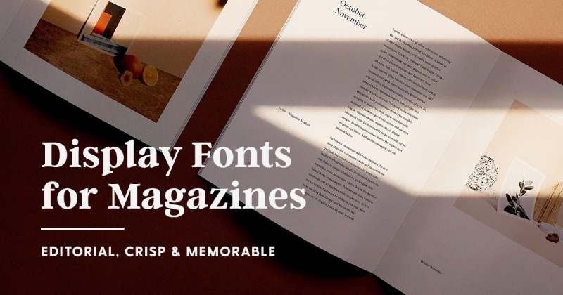
Magazine Mastery: The 41 Best Fonts for Magazines
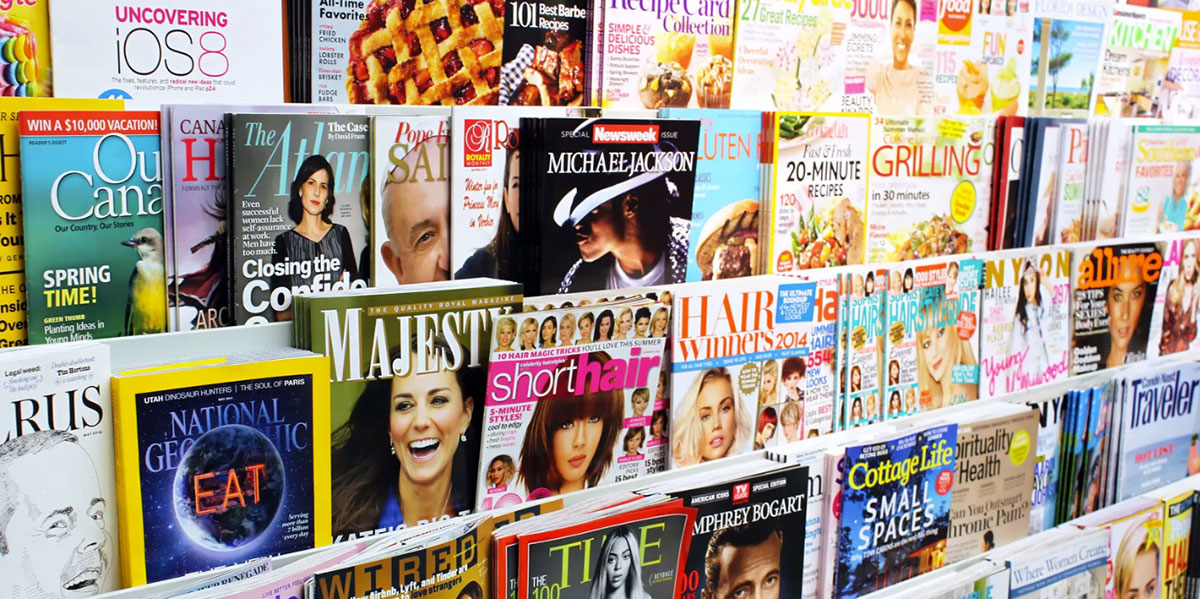
Picture this: a world where magazines leap off the racks and into the hearts of readers, not just with their compelling narratives but with an aesthetic appeal that whispers elegance and screams innovation. Typography, the unsung hero of print design, shapes this reality, and the best fonts for magazines are its knights in shining armor.
In the tapestry of editorial design, font selection is a cornerstone, profoundly impacting not just legibility but the very soul of the publication.
We’ll dive deep into the font foundries’ treasure trove, exploring the serifs that command respect and the sans-serifs that mirror modernity. Together, we’ll decode the alchemy between font licensing and visual hierarchy, turning the mundane into the majestic.
By article’s end, readers are promised a magnum opus of font wisdom.
Your takeaway?
A golden list of typefaces that harmonize with the rhythm of good design, backed by typography experts’ secrets and the whispers of Adobe InDesign’s align and balance tools.
Prepare to craft pages that sing.
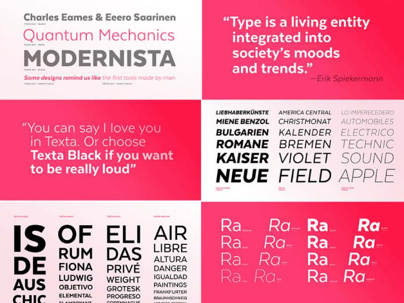
The Best Fonts For Magazines
| Font Name | Legibility | Versatility | Style | Best Used For |
|---|---|---|---|---|
| Mrs Eaves | High | Medium | Classic, Elegant | Headlines, Captions |
| Garamond | High | High | Traditional | Body Text |
| Lobster | Medium | Low | Decorative | Headlines |
| Didot | Medium | Medium | Fashionable | Headlines |
| Bodoni | Medium | Medium | Modern | Headlines |
| Futura | High | High | Geometric | Body Text, Headlines |
| Helvetica | High | High | Neutral | Body Text, Captions |
| Times New Roman | High | High | Classic | Body Text |
| Georgia | High | High | Traditional | Body Text |
| Roboto | High | High | Modern | Body Text, Headlines |
| Avenir Next | High | High | Simplistic | Body Text, Headlines |
| Montserrat | High | High | Geometric | Body Text, Headlines |
| Brandon Grotesque | High | High | Contemporary | Headlines, Captions |
| Helvetica Neue | High | High | Neutral | Body Text, Headlines |
| Source Sans Pro | High | High | Humanist | Body Text |
Foodie Magazines
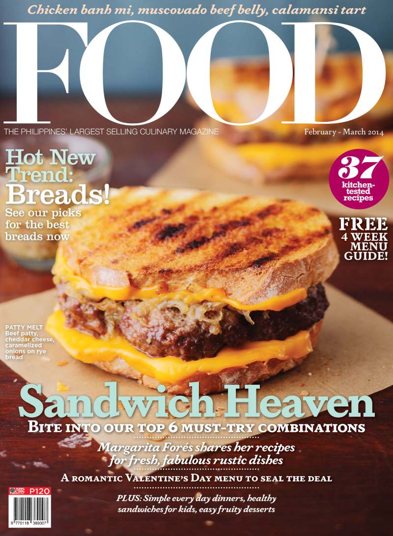
Imagine you’re flipping through a food magazine. You can almost smell the spices, right? That’s where fonts like Mrs Eaves and Berylium come in. They’re like that warm, welcoming kitchen – homely, comforting. Now, picture a classic recipe handed down through generations. That’s Garamond for you, with its elegant, timeless feel.
But hey, food is fun too! Lobster is your go-to for those playful, creative headlines. It’s like that splash of hot sauce on your favorite dish – unexpected but oh-so-delicious. These fonts aren’t just letters on a page; they’re an invitation to a gastronomic adventure.
Fashion or Lifestyle Magazines
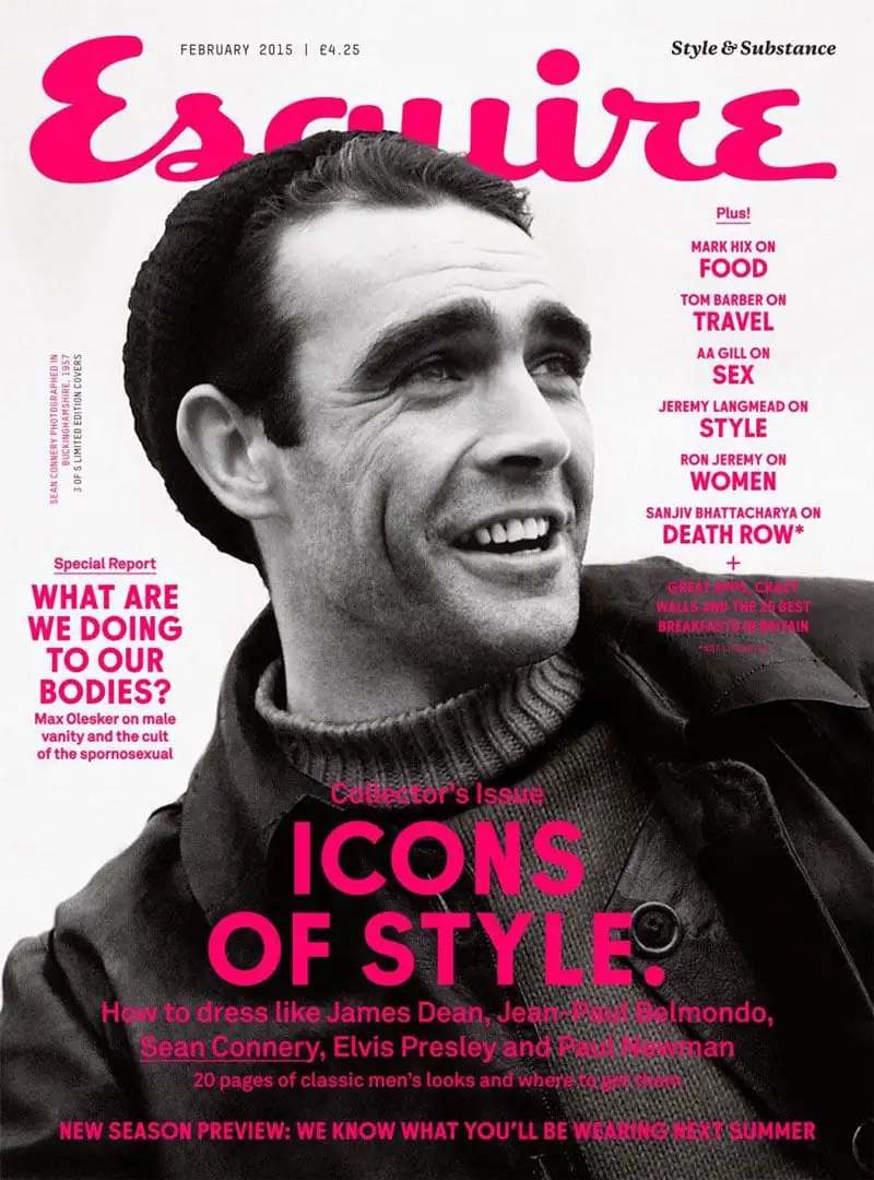
Fashion and lifestyle magazines are where you strut your style. Fonts like Didot and Theano Didot? Pure elegance and luxury. They’re like the high heels of typography – sophisticated and chic.
Then there’s De Vinne or Bodoni. Picture a minimalist, high-end boutique. These fonts are classy, with a no-fuss vibe. And when it comes to sans-serif text, Fuller Sans DT Extra Light or District Thin are your sleek, modern allies. They’re the clean lines in a contemporary home.
For something a bit quirkier, especially in men’s fashion magazines, Ano steps in. It’s like that funky accessory that completes the outfit. And of course, Futura – the go-to for that modern, clean design. It’s like the little black dress; it never goes out of style.
Commentary or Journalism Magazines
Got something serious to say? Commentary and journalism magazines are all about the facts, the truth, and sometimes, the hard-hitting realities. Fonts here aren’t just a design choice; they’re a statement.
Enter Neue Haas Grotesk and Helvetica. Think of them as your trusty news anchors – reliable, authoritative, and no-nonsense. They’ve got this serious, modern vibe that says, “Hey, pay attention, this is important.”
But let’s not forget the classic, Times New Roman. It’s like that wise professor who’s seen it all. Tradition, authority – that’s what it brings to your pages. For those article summaries, where you need to hook your reader? Proforma, Elena, and FF Scala are your go-to fonts. They’re like those snippets of conversation that make you want to know more.
Then there’s Georgia – the perfect blend of professionalism with a touch of warmth. It’s like having a serious chat with a good friend. And for something a bit more current, Roboto steps in. It’s like that trendy journalist who knows how to keep things fresh yet credible.
Music Magazines
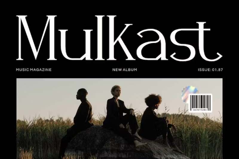
Ready to rock or maybe chill with some indie tunes? Music magazines are all about capturing the spirit of the sound. The fonts you choose are like the opening chords of your favorite song.
Royal Acidbath and Parkinson Roman? They scream rock-n-roll. Imagine the gritty vibe of a garage band, the raw energy of a live concert. That’s what these fonts bring to your magazine.
But music is diverse, right? So, for different music styles, you’ve got to mix it up. Genre-specific fonts are like those niche records you find in a vinyl store – each one telling its own story.
Bebas Neue – this one’s for bold and impactful headlines. It’s like the bass drop in a killer track. And for the electronic and modern music themes, Audiowide fits just right. It’s like the neon lights of a night club, futuristic and cool.
Technology and Science Magazines
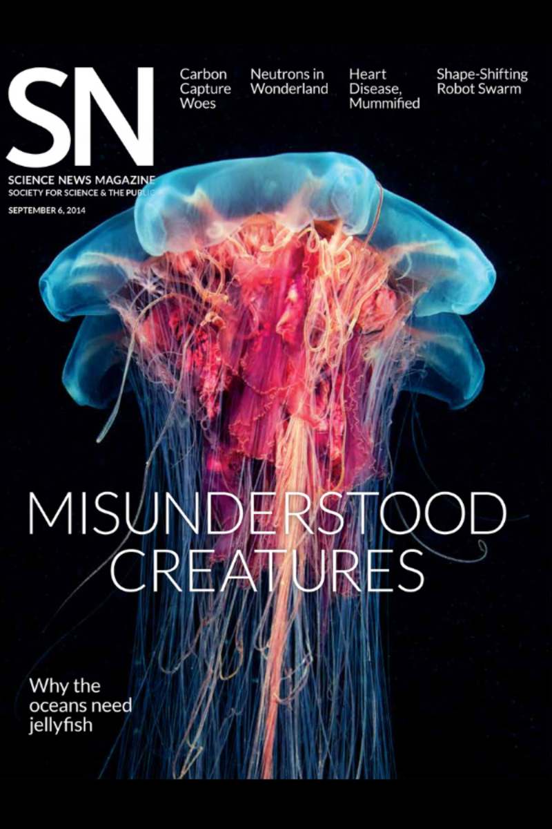
Tech and science mags are like that cool, smart friend who knows all about the latest gadgets and discoveries. The fonts here? They’ve gotta match that vibe – think smart, sleek, and futuristic.
Consolas and Inconsolata are your go-to fonts for that tech-savvy look. They’re like the clean lines of a new gadget, all crisp and modern. For a clean, futuristic appearance, Avenir Next steps up. It’s like stepping into a sci-fi movie where everything is smooth and advanced.
And then, there’s Source Sans Pro. It’s all about clarity and simplicity. Think of it like the user-friendly interface on your favorite app – easy to read and navigate. These fonts aren’t just about style; they communicate complex ideas in a way that’s accessible and engaging.
Travel and Adventure Magazines
Now, let’s talk about travel and adventure magazines. It’s all about capturing that sense of wanderlust, the thrill of exploring new places. The fonts here are your guides on this journey.
Merriweather has that warm, inviting feel. It’s like sitting by the campfire, sharing stories under the stars. For a friendly yet professional look, Brandon Grotesque is your buddy. It’s like that travel guide who knows all the best spots.
Josefin Sans brings an elegant and vintage style. Picture those old travel posters, calling you to exotic destinations. It’s about creating a window to different worlds, enticing the reader to dive in and explore.
Art and Design Magazines
In art and design magazines, the best fonts for magazines are more than text; they’re a piece of the art itself. These fonts need to be as creative and inspiring as the content they’re presenting.
Helvetica Neue for a classic, timeless aesthetic. It’s like the little black dress of fonts – always in style, always relevant. Montserrat brings in that trendy, modern vibe. Imagine a contemporary art gallery, where each piece is a conversation starter.
Font Selection Criteria
Choosing the best fonts for magazines is like being a chef in a kitchen full of ingredients. You’ve got all these options, but how do you pick the right ones to create something amazing? Let’s break down the criteria that can guide you through this creative process.
Uniqueness and Recognizability
Think of fonts as the face of your magazine. You want a look that stands out in a crowd, right? Uniqueness in font choice gives your magazine a personality, a distinct voice that says, “This is who we are.” It’s like wearing an outfit that turns heads – your magazine’s font can do that on a bookshelf.
But it’s not just about being different. Recognizability is key. You want your readers to see a title and immediately know it’s your magazine. It’s like when you hear a song on the radio and instantly recognize the band. That’s the power of a well-chosen font – it becomes synonymous with your brand.
Combining Fonts
Alright, so you’ve picked a great font. But one font doesn’t make a party, right? This is where pairing primary and secondary fonts comes into play. It’s about balance – like mixing a catchy melody with the right rhythm.
Think of your primary font as the lead singer and your secondary font as the backup vocals. Together, they create a harmony that makes your magazine’s design sing. But hey, watch out for clashing styles. It’s like mixing polka dots with stripes – could be cool, could be a disaster.
Color Usage in Typography
Color in fonts? Yes, please! But here’s the trick – use color to enhance, not overpower. It’s like adding spices to a dish. Just the right amount can transform it, but too much, and it’s all you taste.
In typography, color can highlight, draw attention, or evoke emotions. But remember, a little goes a long way. It’s about creating accents that complement, not compete with your font choices.
Balancing Serif and Sans-serif Fonts
Okay, so there are these two big families in the font world: serif and sans-serif. Serifs are like the classic, more traditional style – think of them as the old-school charm. Sans-serifs? They’re the clean, modern cousin.
Using both in your magazine is like having the best of both worlds. It’s a visual conversation between tradition and modernity. Serifs can bring elegance and formality, while sans-serifs keep things fresh and approachable. The key is finding the right balance that reflects the tone and style of your magazine.
Top Recommended Magazine Fonts
Picking the best fonts for magazines? It’s like curating the ultimate playlist – each font sets a different mood and tells a unique story. Let’s dive into some top-notch fonts that can elevate your magazine game.
Serif Fonts
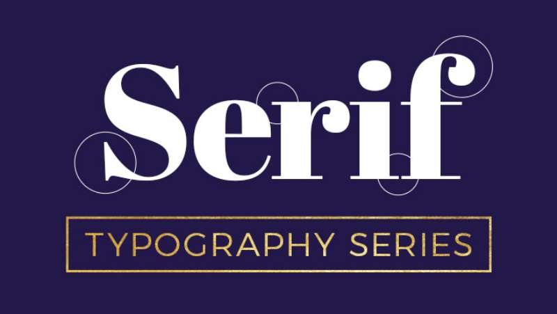
In the realm of serifs, it’s all about grace and elegance. These fonts are like the classic vinyl records – timeless and full of character.
- Metropolis. Imagine the skyline of a bustling city, sleek and sophisticated. That’s Metropolis for you – modern yet graceful. It’s perfect for those headlines that need to make a statement without shouting.
- Henri Didot. This one’s like a vintage wine – gets better with age. It’s got this large size impact that’s perfect for luxury and lifestyle mags. Think of those big, bold headers that draw you in.
- Billion Butterfly. Here’s a font that screams classic beauty. It’s like a handwritten letter from an old friend – personal, intimate, and full of charm.
Sans-serif Fonts
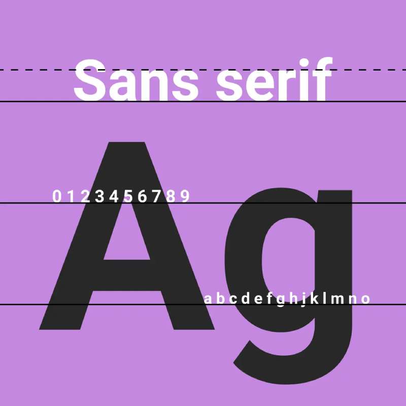
Now, let’s switch gears to sans-serif. These are your modern, clean-lined fonts – like the latest tech gadgets, all sleek and efficient.
- Chronica Pro. It’s all about balance and professionalism. Chronica Pro is like the well-tailored suit of the font world – looks good in any setting and never goes out of style.
- Isidora Sans. This font is for those who love a bit of geometry in their design. It’s modern, with a hint of playfulness – like a contemporary art piece that makes you look twice.
- Uni Sans. Think of it as the Swiss army knife of fonts – versatile, readable, and perfect for just about anything. It’s great for body text where you need clarity and a touch of modernity.
- Stag Sans. Here’s your go-to for versatility. Whether it’s in body text or headers, Stag Sans adapts like a chameleon. It’s like that one playlist you can play on any occasion and it just fits.
- Abenda. Ever wanted a touch of the ’20s in your magazine? Abenda brings that 1920s art deco style. It’s like stepping into a Gatsby party – glamorous and full of flair.
Practical Tips for Magazine Font Selection
Let’s talk real talk about picking the best fonts for magazines. It’s like putting together a killer outfit – it’s got to look good, feel right, and make a statement. Here are some practical tips to make your font game strong and spot-on.
Readability and Style Considerations
First things first, your font needs to be easy on the eyes. Long articles? You don’t want your readers squinting or getting lost in a sea of letters. It’s like finding that comfy chair – looks great and you can chill in it for hours.
- Easy readability is crucial for longer texts. Think about fonts like Georgia or Merriweather. They’re like that friend who’s easy to talk to – no strain, just comfort.
- Expressive styles for short lines and covers, though? That’s your chance to go bold. Fonts like Lobster or Billion Butterfly can make your headlines pop. It’s like that flashy accessory that turns a good outfit into a great one.
Audience and Tone
Next up, know your crowd. You wouldn’t wear a tuxedo to a beach party, right? Same goes for fonts.
- Tailoring font choice to your magazine’s target audience is key. If it’s a tech mag, something sleek like Avenir Next works. For a travel mag, something warm like Brandon Grotesque might be the ticket.
- Aligning font style with your magazine’s tone and content is like picking the right playlist for your mood. A fashion mag might call for something chic like Didot, while a sports mag might go for something more dynamic like Bebas Neue.
FAQ On The Best Fonts For Magazines
What are the best serif fonts for a magazine?
Oh, serif fonts – they bring that classic vibe, right? When it comes to magazines, think Garamond, that elegant choice that seems to tell its own story. Then there’s the timeless Baskerville; it’s got formality down to an art. If we’re talking about style and substance, don’t overlook Times New Roman.
Can I use sans-serif typefaces in magazine layouts?
Absolutely, sans-serif typefaces scream sleek and modern. For the magazine game, Helvetica’s a no-brainer with its clean lines. Futura brings that geometric cool to the table. Magazines looking to blend approachability with professionalism often rock the Arial or the minimalist vibe of Avenir.
How important is font pairing in magazines?
It’s like pairing wine with dinner—critical! A body text font should complement your headline font without overshadowing it. The trick is the contrast; mix a friendly sans-serif like Calibri for your body text with a striking serif for the headings. It’s all about balance in visual hierarchy.
Do font choices vary with different magazine genres?
Oh, they’ve got to! Fashion mags? They’re all over the stylish, elegant typefaces – think Didot, darling. Tech? You’ll find san-serifs there—clean, readable, like Roboto or Lato. Travel stories are spun best in readable, inviting fonts, a bit like Georgia.
What considerations are there for legibility in print?
Legibility is your bread and butter; if readers squint, you’ve lost ’em. Go for clarity and simplicity. Avoid fonts with too much flair for body text – keep it at least 10 points. Prioritize spacing; kerning and leading are your best pals here.
How does typography impact magazine branding?
Typography is personality in print form. Selecting a font can evoke the vibe you’re after. Luxury and class? Hello, serif fonts! Approachable and casual? Sans-serif’s got your number. Your font choice is your silent ambassador – it tells your brand’s tale before a word is even read.
What are the pitfalls of trendy fonts in magazine design?
Trends, huh? They can be like double-edged swords. Jump on a bandwagon, and tomorrow, you might seem passé. The key? Trends are good, but longevity? That’s gold. Choose fonts that feel fresh but will also stand the test of time.
Are there differences in font selection for headlines and body text?
Couldn’t be more different if they tried. Headlines grab attention – they’re the showstoppers, the conversation starters. Here, you want bolder, larger fonts that make a splash. Body text? That’s where the ease of reading comes in. Clear, consistent typefaces that don’t tire the eyes.
Does font licensing affect the choice for magazine fonts?
Big time! You can’t just snatch any font from the web. Check the licensing – it’s gotta be legit for commercial use. Font foundries and designers – they need to eat too! Make sure you go by the book; it’s not just about ethics but staying clear of legal hot water.
How should I select fonts for an online magazine versus a print publication?
Ah, the digital versus print conundrum. Screen legibility’s different – think about the backlit stage of devices. Opt for san-serifs usually, they shine on screens. For print? That’s where you can indulge in the serifs that often look better on paper. It’s about context, really – and readability.
Conclusion
So, here we stand at the crossroads of our typographic journey. The best fonts for magazines. They’re more than mere characters on a page; they’re the vessels of the voice, the vision, the very essence of a mag.
- We’ve paraded through serifs, with their footings in tradition, offering up that authoritative voice where trust is king.
- We’ve flown on the wings of sans-serifs, grasping onto the modern and the minimalist, delivering clarity in a complex world.
- From the granular, like kerning, to the majestic, like visual hierarchy, every detail is pivotal.
We’ve stitched together a tapestry of typography that does more than just sit pretty. It works. It speaks. It’s heard.
In closing, remember the responsibility resting on the curves and lines of your chosen typeface. Let it echo the message you aim to deliver, resonating with the heartbeat of your publication. Let every letter count.
If you liked this article about the best fonts for magazines, you should check out this article about the best fonts for accessibility.
There are also similar articles discussing the best fonts for children’s books, the best fonts for neon signs, the best fonts for academic papers, and the best fonts for vinyl lettering.
And let’s not forget about articles on the best fonts for invitations, the best fonts for Google Slides, the best fonts for mobile apps, and the best fonts for blogs.
Also, you can check here the version of this article about fonts for magazines in German.
Bogdan Sandu, a seasoned designer with 15 years of diverse experience, has been designing websites since 2008.
Renowned for his expertise in logo design and visual branding, Bogdan has developed a multitude of logos for various clients.
His skills extend to creating posters, vector illustrations, business cards, and brochures. Additionally, Bogdan's UI kits were featured on marketplaces like Visual Hierarchy and UI8.
Latest posts by Bogdan Sandu (see all)
- Unique Construction Website Design Examples That Work - 21 May 2024
- The Heineken Logo History, Colors, Font, And Meaning - 20 May 2024
- Graceful Grays: Timeless Gray Color Palettes for Any Project - 20 May 2024