The Harley-Davidson logo is one of the most recognized brand marks in American manufacturing history. It represents far more than a motorcycle company. It carries over 120 years of identity tied to freedom, rebellion, and working-class pride. The current version centers on the Bar and Shield emblem, a design that has remained the brand’s anchor through multiple visual updates since the early 1900s.
Within industry branding history, few marks have held cultural weight the way this one has. It sits alongside a small group of logos that people tattoo on their bodies, sew onto jackets, and treat as personal identity markers rather than corporate insignia.
The brand was founded in 1903 in Milwaukee, Wisconsin. The logo has gone through roughly a dozen meaningful iterations since then, though the shield shape has anchored nearly all of them.
—
What Is the Harley-Davidson Logo?
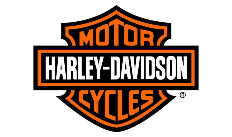
The Harley-Davidson logo is a combination mark built around a shield shape enclosing the brand name, commonly called the Bar and Shield. The current version was refined through the 20th century, with the modern iteration solidified around 1965. It uses black and orange as its core colors and bold, condensed lettering.
- Design Type: Combination mark (emblem with integrated wordmark)
- Primary Elements: Shield shape, horizontal bar bisecting the shield, “Harley-Davidson” wordmark, “Motor Company” text below
- Official Introduction Date: The Bar and Shield concept dates to approximately 1910; modernized form solidified circa 1965
- Designer/Agency: Developed internally; Willie G. Davidson, longtime VP of Styling, heavily influenced its visual direction through the latter half of the 20th century
- Trademark Status: Registered trademark, actively enforced by Harley-Davidson Inc. across all product and licensing categories
- Color Palette: Harley-Davidson Orange (#FF6600), Black (#000000), White (#FFFFFF)
- Usage Context: Motorcycles, parts, apparel (Motorclothes), merchandise, dealership signage, digital platforms, and licensed third-party products
How Has the Harley-Davidson Logo Evolved Over Time?

The logo started as simple text-based marks in the early 1900s and gradually built toward the shield-centric design the brand still uses today. Major shifts happened in the 1910s, 1950s, and 1960s, with refinements continuing through the 1990s and into the 2000s.
Original Harley-Davidson Logo (1903-1909)
- Years Active: 1903-1909
- Design Description: Simple text-only wordmark, no emblem or shield shape
- Color Scheme: Black and white
- Designer: Unknown, developed by founders
- Context: Brand was a small shed operation in Milwaukee; the mark reflected that modest scale
- Key Changes from Previous: N/A (first iteration)
- Cultural Significance: Marked the start of what would become America’s most enduring motorcycle brand
Bar and Shield Introduction (1910-1939)
- Years Active: Approx. 1910-1939
- Design Description: Introduction of the shield shape with a horizontal bar; “Harley-Davidson” text integrated into the shield
- Color Scheme: Black, white, and early use of orange accents
- Designer: Internal, unknown specific credit
- Context: Company was growing rapidly; needed a stronger visual identity for parts, tanks, and marketing materials
- Key Changes from Previous: Added the shield emblem as the primary graphic anchor
- Cultural Significance: Established the visual language the brand still operates within today
Mid-Century Refinements (1940-1964)
- Years Active: 1940-1964
- Design Description: Refined lettering inside the shield, more structured layout, eagle imagery occasionally incorporated alongside the main mark
- Color Scheme: Black and orange becoming more consistent
- Designer: Internal design team
- Context: Post-WWII boom in motorcycle culture; veterans returning home adopted HD bikes heavily
- Key Changes from Previous: Tighter typography, more deliberate use of orange
- Cultural Significance: The logo began appearing on leather jackets and club patches during this era, deepening its subcultural roots
Modern Bar and Shield (1965-Present)
- Years Active: 1965-present
- Design Description: Streamlined shield with clean, bold “Harley-Davidson” text on the bar, “Motor Company” beneath; high-contrast black and orange execution
- Color Scheme: Black (#000000), Harley Orange (#FF6600), White (#FFFFFF)
- Designer: Refined significantly under Willie G. Davidson’s creative direction
- Context: Brand needed consistency across an expanding product and merchandise line
- Key Changes from Previous: Removed decorative elements, tightened proportions, standardized color application
- Cultural Significance: This version became globally recognized and is the basis for the current trademark
What Do the Design Elements of the Harley-Davidson Logo Mean?
Every element in the logo was built to communicate toughness, American identity, and permanence.
The shield shape signals protection and strength. The horizontal bar cutting through it creates tension and movement, suggesting a bike in motion even when the mark is completely static.
What Does the Shield Shape Represent?
The shield is one of the oldest symbols of defense and authority in Western visual culture.
For Harley-Davidson, it frames the brand name like a badge, which is exactly the point. It communicates that riding this motorcycle means belonging to something protected and defined.
Historically, shield shapes in design movements from the early 20th century often carried connotations of quality guarantees and craft standards.
In the context of American motorcycle culture, the shield reads as armor, pride, and membership.
Why Did Harley-Davidson Choose These Specific Colors?
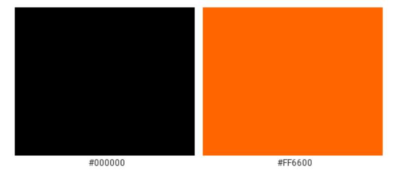
- Black (#000000)
- Symbolic meaning: Power, rebellion, authority
- Psychological impact: Commands attention, signals seriousness and strength
- Brand connection: Tied to the aesthetic of leather, chrome, and asphalt culture
- Harley-Davidson Orange (#FF6600)
- Symbolic meaning: Energy, heat, American working-class spirit
- Psychological impact: High visibility, creates urgency and excitement
- Brand connection: Differentiates HD from competitors who lean into red or blue; the orange is ownable and immediately recognizable. If you look at other brands that use orange, very few carry the same gritty weight this particular shade does.
- White (#FFFFFF)
- Symbolic meaning: Clarity, contrast, legibility
- Psychological impact: Provides visual breathing room against the heavy black and orange
- Brand connection: Used primarily for text and backgrounds in applications where black is the dominant field
The psychological weight of these colors together is no accident. Black and orange push against each other visually, and that tension mirrors exactly what the brand wants to project.
What Typography Style Is Used in the Harley-Davidson Logo?
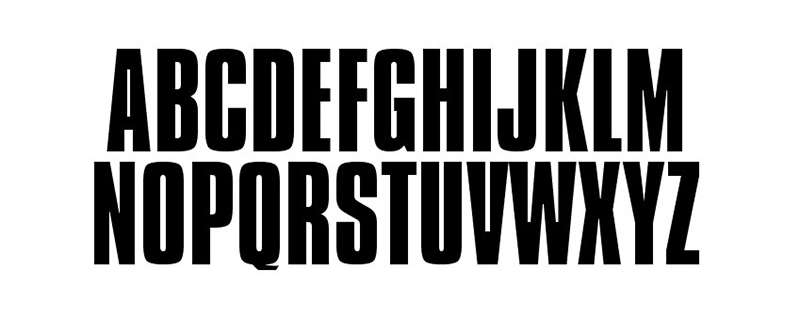
The lettering inside the shield is a custom condensed serif-influenced style, bold and upright.
It reads as industrial rather than refined. There is no elegance being pursued here. The goal is weight and legibility at small sizes, on tank badges, on patches, on signage.
The typographic approach has stayed broadly consistent since the 1960s. Minor adjustments were made for digital reproduction, but the general character has not changed much.
The condensed proportions allow the full “Harley-Davidson” name to fit inside the shield without crowding. That constraint actually shaped the entire letterform decision.
What Are the Hidden Meanings in the Harley-Davidson Logo?
There are no well-documented hidden shapes or subliminal figures built into the Bar and Shield. The design is direct by intent.
That said, the bar itself bisecting the shield has been interpreted as a road cutting through a protective frame, which is a reading that aligns neatly with the brand’s “live to ride” positioning.
Willie G. Davidson has spoken in interviews about the goal of making the logo feel like something earned rather than purchased. The emblem-as-badge quality was intentional from the start.
The unintentional reading many people arrive at is militaristic, closer to a military insignia than a commercial logo. That association has probably helped the brand more than any deliberate campaign ever could.
How Does the Harley-Davidson Logo Compare to Competitor Logos?
Among motorcycle brand marks, Harley-Davidson’s logo is the most culturally loaded. Competitors tend toward sleek, modern marks. HD leans into heritage and weight deliberately, which makes it look like a different category entirely.
The Indian Motorcycle logo is its closest cultural competitor, also leaning into Americana and history. But Indian’s mark uses a script wordmark and a headdress icon, which reads as more decorative and less industrial than the Bar and Shield.
The Ducati logo is a sharp contrast: clean, Italian, performance-focused. It signals speed and engineering rather than lifestyle and identity.
The Triumph logo uses a straightforward wordmark. Solid, British, understated. It doesn’t try to do what HD’s logo does, which is carry an entire subculture inside a single emblem.
The Kawasaki logo and the Yamaha logo both prioritize legibility and modern application over heritage signaling. They work well on sportbikes and across digital surfaces. HD’s logo is less flexible in that sense but more emotionally durable.
The KTM logo and Aprilia logo sit firmly in the performance and racing category. Completely different brand territory. No overlap with what Harley-Davidson is communicating.
What Are the Technical Specifications of the Harley-Davidson Logo?
Official Color Codes
- Primary Color: Harley-Davidson Orange
- Hex: #FF6600
- RGB: (255, 102, 0)
- CMYK: (0, 60, 100, 0)
- Pantone: Pantone 165 C
- Primary Color: Black
- Hex: #000000
- RGB: (0, 0, 0)
- CMYK: (0, 0, 0, 100)
- Pantone: Process Black C
- Accent Color: White
- Hex: #FFFFFF
- RGB: (255, 255, 255)
- CMYK: (0, 0, 0, 0)
- Pantone: N/A
Dimensions and Proportions
- Aspect ratio: The Bar and Shield maintains a roughly 4:5 width-to-height ratio in standard applications
- Minimum size requirements: Harley-Davidson guidelines recommend no smaller than 0.5 inches wide in print to preserve legibility of the wordmark inside the shield
- Clear space specifications: Minimum clear space equal to the height of the “H” in the logo on all sides
- Official usage guidelines: Full brand standards documentation is available to authorized dealers and licensees through Harley-Davidson’s dealer portal; public access is restricted. For reproduction in digital contexts, vector format files are required for all official applications to ensure clean scaling at any size. Using a bitmap version is only acceptable for screen display at fixed sizes, never for print or large-format production. Print reproduction should be done at a minimum of 300 DPI to maintain edge sharpness on the shield border and internal lettering.
What Cultural Impact Has the Harley-Davidson Logo Had?
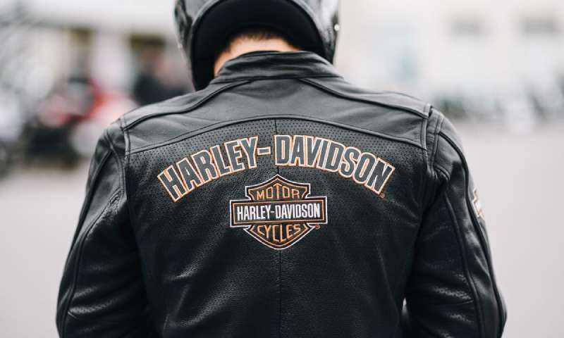
The Bar and Shield is one of a very small number of brand marks that people voluntarily put on their bodies permanently. That alone puts it in rare company.
It appeared in films, on military-adjacent merchandise, in music videos, and on custom bike builds across eight decades before “brand storytelling” was even a concept in marketing.
The logo became a proxy for American identity during periods when that identity was actively being contested. In the 1960s and 70s, wearing the logo meant something specific about where you stood culturally. It was not neutral.
It has also crossed over into fashion and luxury contexts in ways that surprised most observers. High-end designers have referenced the Bar and Shield aesthetic in collections. That kind of cultural gravity is not designed. It accumulates over generations.
The storytelling embedded in the design works because it was never purely a marketing exercise. The logo grew out of an actual community of riders, workers, and enthusiasts who made it mean something before the brand’s marketing department caught up.
How Does the Harley-Davidson Logo Fit Into the Overall Brand Identity?
The Bar and Shield is the center of an entire identity system. Every other visual element in Harley-Davidson’s branding orbits around it.
The brand guidelines built around the logo govern everything from dealership signage to apparel hang tags to digital ad formats. The mark appears on the bikes themselves as a physical badge, which collapses the line between product and brand identity in a way very few companies achieve.
The Screamin’ Eagle sub-brand, the Motorclothes line, and the Harley Owners Group (HOG) all use the Bar and Shield as their visual foundation. Supporting marks extend from it rather than competing with it.
Typography used across HD’s brand materials consistently echoes the bold, condensed character of the logo lettering. Color application stays within the black-orange-white system almost without exception.
The visual identity system is tight. It has to be, because the logo carries so much cultural weight that inconsistent application would feel like a betrayal to the rider community that has invested meaning in it for generations.
How Should the Harley-Davidson Logo Be Used?
Official Usage Guidelines
- Do’s:
- Use only official files sourced from Harley-Davidson’s authorized dealer or licensee portal
- Maintain clear space on all sides equal to the height of the shield
- Reproduce in full color (black and orange), all-black, or all-white versions only
- Use vector files for all print and large-format applications
- Follow size minimums to preserve legibility of internal text
- Don’ts:
- Do not stretch, skew, or alter the proportions of the shield
- Do not add drop shadows, gradients, or other effects not present in official files
- Do not place the logo on busy backgrounds that reduce contrast
- Do not use unofficial color variations
- Do not combine the Bar and Shield with other logos or brand marks without written authorization
Where to Access Official Logos
- Authorized dealers access brand assets through the H-D Dealer Connect portal
- Licensed manufacturers and merchandise partners access files through Harley-Davidson’s licensing program
- Press and media inquiries can request official assets through the Harley-Davidson media relations team at h-dmedia.com
- General public and fan use is governed by HD’s trademark policy, which prohibits commercial use without a license
Licensing and Trademark Protection
- The Bar and Shield is a federally registered trademark in the United States and protected in most major international markets
- Harley-Davidson actively enforces its trademark, particularly against counterfeit merchandise
- Third-party licensing is available through Harley-Davidson’s official licensing program for apparel, accessories, and collectibles
- Unauthorized reproduction for commercial purposes constitutes trademark infringement regardless of how minor the use appears
- Fan art and non-commercial personal use exists in a gray area; HD has historically been selective in enforcement against individual creators
FAQ on The Harley-Davidson Logo
What is the Harley-Davidson logo called?
It’s called the Bar and Shield. The horizontal bar cuts through a shield shape with the “Harley-Davidson Motor Company” wordmark integrated inside. That combination mark has been the brand’s core visual identity for over a century.
When was the Harley-Davidson logo first introduced?
The text-only wordmark appeared at founding in 1903.
The Bar and Shield emblem came around 1910 as the company grew and needed a stronger badge for tank decals and parts marking. That shield concept never left.
What do the colors in the Harley-Davidson logo mean?
Black signals power and rebellion. Harley-Davidson Orange (Pantone 165 C, #FF6600) communicates energy and working-class grit.
Together they create high visual contrast that reads instantly on leather, chrome, and asphalt. The color palette is deliberately aggressive.
Who designed the Harley-Davidson logo?
The original mark was developed internally by the founders. Willie G. Davidson, grandson of co-founder Arthur Davidson and longtime VP of Styling, shaped the modern version through the latter half of the 20th century.
No single outside agency is credited.
What font does the Harley-Davidson logo use?
The lettering is a custom condensed serif-influenced style, not a commercially available typeface.
It was built to fit inside the shield’s proportions while staying legible at small sizes, like a tank badge. The font has stayed broadly consistent since the 1960s.
Has the Harley-Davidson logo ever changed?
Yes, roughly a dozen times since 1903. Early versions were plain text. The shield arrived around 1910.
Refinements through the mid-century tightened the typeface and standardized orange. The 1965 version is essentially what you see today, with minor adjustments for digital use.
Is the Harley-Davidson logo trademarked?
Yes. The Bar and Shield is a federally registered trademark in the US and protected across most major international markets.
Harley-Davidson actively enforces it, especially against counterfeit merchandise. Commercial use without a license is infringement, full stop.
What makes the Harley-Davidson logo different from other motorcycle brand logos?
Most competitors use clean, modern marks built for speed and performance association. HD’s emblem functions more like a membership badge than a product logo.
Compare it to the Royal Enfield logo or the Suzuki logo and the difference in intent is obvious. Those marks sell bikes. This one sells identity.
Why do people tattoo the Harley-Davidson logo?
Because it stopped being just a brand mark decades ago. For many riders, the Bar and Shield emblem represents community, freedom, and a specific way of living.
That kind of visual emphasis on belonging is rare in commercial design. Very few logos carry that personal weight.
Where can I download the official Harley-Davidson logo?
Official files are restricted. Dealers access them through the H-D Dealer Connect portal. Press and media can request assets through h-dmedia.com.
Public downloads of the HD logo PNG or vector files from third-party sites are unofficial. For any commercial use, a Harley-Davidson license is required.
Conclusion
The Harley-Davidson logo is not just a motorcycle brand mark. It’s a piece of American visual history that has carried the same core identity through over a century of cultural shifts, design trends, and industry changes.
The Bar and Shield emblem works because it never chased what was fashionable. Black, orange, a shield, bold condensed lettering. That’s it. No gradients, no rebrands, no agency reinventions.
From the pixel-level details of digital reproduction to the physical tank badge on a Road King, the mark stays consistent. That consistency is the whole point.
Few vehicle brand marks have achieved this kind of cultural permanence. The V-twin engine brand identity and the live-to-ride emblem philosophy it represents are inseparable from the Milwaukee motor company’s legacy.

Renowned for his expertise in logo design and visual branding, Bogdan has developed a multitude of logos for various clients.
His skills extend to creating posters, vector illustrations, business cards, and brochures. Additionally, Bogdan's UI kits were featured on marketplaces like Visual Hierarchy and UI8.
He also wrote in the past years on sites like Design Your Way, WebDesignerDepot, WPDean, Designmodo, Speckyboy, Slider Revolution, and more.
- The Windsurf Logo History, Colors, Font, And Meaning - 10 October 2026
- How to Remove Background From Product Photos (No Photoshop) - 10 October 2026
- How Designers can Build a Stronger Online Creative Identity - 9 October 2026

Bogdan Sandu is a seasoned designer who has been designing websites since 2008. Renowned for his expertise in logo design and visual branding, Bogdan has developed a multitude of logos for various clients. His skills extend to creating posters, vector illustrations, business cards, and brochures. Additionally, Bogdan's UI kits were featured on marketplaces like Visual Hierarchy and UI8. He also wrote in the past years on sites like Design Your Way, WebDesignerDepot, WPDean, Designmodo, Speckyboy, Slider Revolution, and more.
You Might Also Like