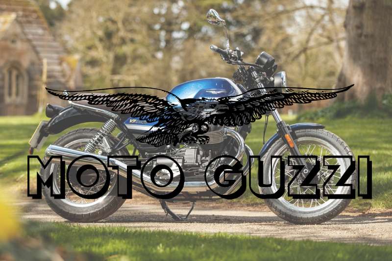
The Moto Guzzi logo is one of the most recognized emblems in motorcycle history. It combines a spread-winged eagle with the brand’s wordmark, representing both Italian engineering pride and a direct tribute to a fallen World War I aviator. Few motorcycle badges carry that kind of weight.
Within the broader history of vehicle manufacturer branding, Moto Guzzi stands out. The eagle has remained a constant anchor across more than a century of design updates, which is genuinely rare in an industry where rebranding happens every decade or so.
The current logo version pairs a detailed eagle illustration with bold, capitalized lettering. The brand itself was founded in 1921 in Mandello del Lario, Italy, and the eagle has appeared in various forms across at least six distinct logo iterations since then.
What Is the Moto Guzzi Logo?
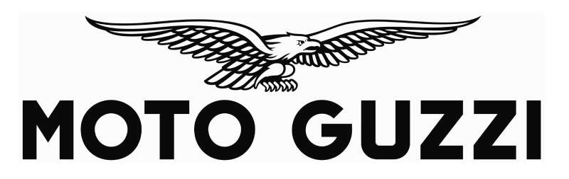
The Moto Guzzi logo is a combination mark featuring a spread-winged eagle above the brand name in bold uppercase lettering. Introduced in its modern form in 2021 for the brand’s centenary, it was refined in-house under Piaggio Group direction. The eagle symbolizes freedom, speed, and honors aviator Giovanni Ravelli.
- Design Type: Combination mark (emblem + wordmark)
- Primary Elements: Spread-winged eagle illustration, bold uppercase wordmark
- Official Introduction Date: Centenary edition introduced 2021; current standard version derived from mid-2000s refresh
- Designer/Agency: Developed internally under Piaggio Group brand management
- Trademark Status: Registered trademark under Piaggio & C. SpA
- Color Palette: Deep red (#C8102E), black (#000000), white (#FFFFFF), and metallic silver/chrome finishes on physical applications
- Usage Context: Fuel tank badges, motorcycle fairings, apparel, dealership signage, digital platforms, and official merchandise
How Has the Moto Guzzi Logo Evolved Over Time?
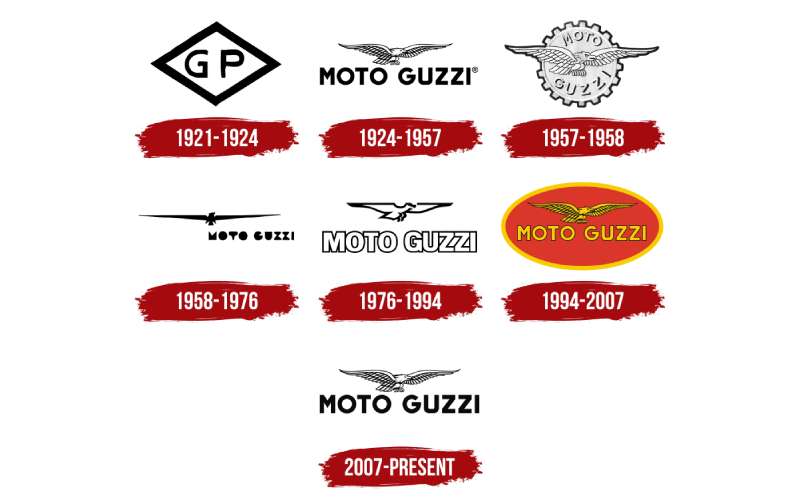
The Moto Guzzi logo has gone through roughly six major versions since 1921, moving from simple hand-drawn badges to refined vector marks while keeping the eagle as the consistent core element throughout every era.
Original Moto Guzzi Logo (1921-1930s)
- Years Active: 1921-late 1930s
- Design Description: Basic eagle outline with early script lettering, applied primarily as a tank badge
- Color Scheme: Silver and black, chrome finishes on metal badges
- Designer: Carlo Guzzi and Giorgio Parodi, founders
- Context: Founded in Mandello del Lario in 1921; the eagle was chosen from day one as a tribute to their friend Giovanni Ravelli, a WWI fighter pilot who died before the company launched
- Key Changes from Previous: First version; no predecessor
- Cultural Significance: Established the eagle as a permanent brand symbol, connecting motorcycle engineering to aviation heroism
Mid-Century Moto Guzzi Logo (1940s-1960s)
- Years Active: 1940s-1960s
- Design Description: More stylized eagle with stronger wing articulation; lettering became more uniform and mechanical in character
- Color Scheme: Red and silver introduced more prominently during this period
- Designer: Internal design
- Context: Post-war Italian industrial expansion; Moto Guzzi was one of Europe’s largest motorcycle manufacturers during this era
- Key Changes from Previous: Eagle gained more defined feather detail; typography became heavier
- Cultural Significance: The logo appeared on race bikes dominating the Isle of Man TT, tying the emblem to motorsport achievement
Classic Emblem Era (1970s-1990s)
- Years Active: 1970s-1990s
- Design Description: Rounder eagle form, often enclosed in an oval or shield shape; red background used frequently on tank badges
- Color Scheme: Red, black, silver
- Designer: Internal
- Context: Piaggio Group acquired Moto Guzzi in 2004, but this era predates that; the brand was under various ownership during financial instability
- Key Changes from Previous: Badge shape added as a containing form; eagle slightly simplified
- Cultural Significance: Became closely associated with the V7 and Le Mans models, cementing collector loyalty
Modern Moto Guzzi Logo (2000s-Present)
- Years Active: Early 2000s to present
- Design Description: Clean vector eagle with spread wings, no enclosing shape, paired with bold uppercase MOTO GUZZI wordmark in a custom sans-serif style
- Color Scheme: Red (#C8102E), black, white
- Designer: Refined under Piaggio Group brand direction
- Context: Piaggio acquisition brought consistency across brand applications and digital standards
- Key Changes from Previous: Dropped the enclosing oval/shield; eagle became cleaner and more scalable for digital use
- Cultural Significance: The centenary 2021 version introduced a special commemorative badge, reinforcing 100 years of unbroken eagle symbolism
What Do the Design Elements of the Moto Guzzi Logo Mean?
Every element in the Moto Guzzi logo connects back to a specific historical decision. The eagle is not decorative. It was chosen in 1921 with a specific person and a specific meaning in mind, and that intention has never been abandoned across any version of the mark.
What Does the Eagle in the Moto Guzzi Logo Represent?
The eagle represents Giovanni Ravelli, a World War I fighter ace and close friend of founders Carlo Guzzi and Giorgio Parodi.
Ravelli died in a plane crash in 1918, just before the company launched. The founders placed his symbol on every motorcycle as a permanent tribute.
Over time the eagle also took on broader meaning: freedom, power, and the connection between aviation and speed that shaped early 20th-century engineering culture in Italy.
Why Did Moto Guzzi Choose These Specific Colors?
- Red (#C8102E)
- Symbolic meaning: Passion, speed, Italian national identity
- Psychological impact: Urgency, energy, excitement; draws immediate visual attention
- Brand connection: Aligns with Italian motorsport tradition (Ferrari red, the broader “rosso corsa” racing culture)
- Black (#000000)
- Symbolic meaning: Power, precision, mechanical authority
- Psychological impact: Seriousness and premium positioning
- Brand connection: Used heavily in the wordmark and eagle outline for contrast and legibility
- Silver/Chrome
- Symbolic meaning: Craftsmanship, metal, Italian industrial heritage
- Psychological impact: Suggests quality and durability
- Brand connection: Appears primarily on physical tank badges and hardware applications
The psychology behind these color choices is straightforward: red commands attention, black signals authority, and chrome grounds the brand in physical craftsmanship. It’s a combination that works particularly well for a manufacturer selling machines built to last decades.
What Typography Style Is Used in the Moto Guzzi Logo?
The wordmark uses a bold, uppercase sans-serif style with tight letter spacing and strong stroke weight.
It reads as custom or heavily modified rather than a standard library font. The letterforms are geometric but not cold, with slightly softened terminals that keep it approachable.
Legibility at small sizes was clearly a consideration given the logo’s use on fuel tanks, where viewing distance and motion are factors. Earlier versions used more condensed, almost hand-lettered styles. The shift toward this cleaner geometric approach happened gradually through the 1990s and 2000s.
What Are the Hidden Meanings in the Moto Guzzi Logo?
The most significant “hidden” layer is the personal one: most people seeing the eagle read it as a generic power symbol. Few know it’s a specific memorial to a specific person.
The spread-wing pose mimics the frontal view of a biplane in flight, which is almost certainly intentional given Ravelli’s aviation background.
There’s also a geographic angle. The eagle is a symbol associated with Lombardy and northern Italian civic identity, connecting the brand to its Mandello del Lario roots in a way that feels regional without being explicitly stated.
How Does the Moto Guzzi Logo Compare to Competitor Logos?
Moto Guzzi sits in a category of motorcycle brands that use figurative emblems rather than abstract marks. The eagle puts it alongside brands that lean on heritage and symbolism, while Japanese competitors tend toward cleaner, more geometric approaches.
The Harley-Davidson logo is the most obvious comparison: both brands use shield-adjacent formats and lean heavily on legacy iconography. Both have changed slowly and deliberately over decades. The difference is that Harley-Davidson’s mark is more text-dominant, while Moto Guzzi’s eagle actually carries more visual weight than the wordmark.
The Ducati logo takes a different route entirely. It’s a clean wordmark without a central figurative icon, which makes it feel more modern and less tied to historical narrative. Moto Guzzi’s approach is older in spirit.
The Triumph logo uses a similar combination mark format, pairing a symbol with a wordmark, though its design sensibility leans more toward British modernism than Italian heritage craft.
The Royal Enfield logo is probably the closest structural parallel: both brands use bird-like or animal emblems drawn from real historical context, and both treat their logos as heritage artifacts rather than contemporary redesign projects.
Japanese brands like Kawasaki, Yamaha, and Suzuki generally use cleaner, more abstract marks with bold lettering. They prioritize scalability and global legibility over historical storytelling. Moto Guzzi makes the opposite trade: depth of meaning over visual simplicity.
What Are the Technical Specifications of the Moto Guzzi Logo?
Official Color Codes
- Primary Color: Red
- Hex: #C8102E
- RGB: (200, 16, 46)
- CMYK: (0, 92, 77, 22)
- Pantone: 186 C
- Secondary Color: Black
- Hex: #000000
- RGB: (0, 0, 0)
- CMYK: (0, 0, 0, 100)
- Pantone: Black C
- Accent Color: White
- Hex: #FFFFFF
- RGB: (255, 255, 255)
- CMYK: (0, 0, 0, 0)
- Pantone: White
Dimensions and Proportions
- Aspect ratio: Approximately 3:2 (width to height) for the standard horizontal lockup
- Minimum size requirements: No smaller than 25mm wide in print applications to preserve eagle detail; 80px minimum for digital
- Clear space specifications: Minimum clear space equal to the height of the “M” in the wordmark on all sides
- Official usage guidelines: Available through Piaggio Group’s brand licensing team; the logo must not be recolored, distorted, or used without the wordmark in most commercial contexts
- File formats available: Vector formats (AI, EPS, SVG) for print; PNG with transparent background for digital. JPEG versions exist for web use though the vector files are preferred for any sized application. For any raster output, a minimum of 300 DPI is required for print reproduction.
What Cultural Impact Has the Moto Guzzi Logo Had?
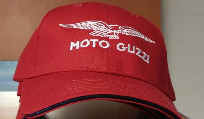
The Moto Guzzi logo has become a signifier of Italian motorcycle culture that reaches well beyond the brand’s sales numbers. It’s recognized by riders who have never owned a Guzzi and by designers who study it as an example of emblem longevity done right.
The eagle appears on tattoos, custom helmets, workshop walls, and vintage race memorabilia across Europe and North America.
In Italy specifically, the brand carries near-institutional status. Mandello del Lario holds an annual Moto Guzzi open house that draws tens of thousands of visitors. The logo functions as a regional identity marker, not just a commercial brand.
The centenary edition released in 2021 generated significant coverage across motorcycle and design media alike. It’s relatively rare for a logo anniversary to become a cultural moment, but Moto Guzzi’s 100-year mark did exactly that.
The eagle’s memorial origin story also gives the logo a narrative weight that most brand symbols don’t carry. When that story is known, the logo reads differently. That kind of depth is hard to manufacture and impossible to copy.
How Does the Moto Guzzi Logo Fit Into the Overall Brand Identity?
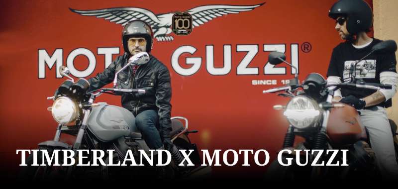
The logo is the center of a brand identity system that connects the eagle to everything from paint colors to dealer architecture. Red, black, and chrome appear consistently across motorcycles, apparel, signage, and digital platforms.
Moto Guzzi sits within the Piaggio Group alongside Aprilia and Piaggio itself, but operates as a fully separate brand identity with its own visual language.
The brand guidelines treat the eagle as non-negotiable. It doesn’t get simplified for different applications or swapped out for a modern abstract mark on digital platforms. The consistency is deliberate and functions as a statement: this brand does not chase trends.
Typography choices across Moto Guzzi’s marketing materials echo the wordmark’s bold, geometric character. Imagery skews toward long roads, alpine landscapes, and weathered leather, all reinforcing the same values the eagle communicates: endurance, freedom, craft.
The overall identity is an example of what happens when a brand style guide is actually followed over decades rather than reinvented every few years. The coherence is earned, not accidental.
How Should the Moto Guzzi Logo Be Used?
Official usage guidelines (Do’s):
- Use approved vector files sourced directly from Piaggio Group or authorized dealers
- Maintain the minimum clear space on all sides at all times
- Use the full combination mark (eagle + wordmark) as the default; the eagle alone is permitted only in specific secondary applications
- Reproduce only in approved colorways: full color, all-black, all-white (reversed)
- Respect minimum size requirements to preserve eagle detail legibility
Official usage guidelines (Don’ts):
- Do not recolor the logo outside approved brand colors
- Do not stretch, compress, rotate, or distort any element
- Do not place the logo on visually busy backgrounds without a clear space buffer
- Do not use low-resolution bitmap versions for print reproduction
- Do not combine the Moto Guzzi logo with other brand marks without explicit written permission
- Do not use the logo in ways that imply official sponsorship or endorsement without authorization
Where to access official files: Contact Piaggio Group’s brand licensing department directly, or request assets through an authorized Moto Guzzi dealership for official commercial applications.
Trademark protection: The Moto Guzzi eagle and wordmark are registered trademarks owned by Piaggio & C. SpA. Unauthorized commercial use constitutes trademark infringement under Italian and international intellectual property law. Fan and non-commercial uses fall into a gray area and are handled on a case-by-case basis by the brand’s legal team.
FAQ on the Moto Guzzi Logo
What does the Moto Guzzi eagle logo represent?
The eagle is a direct tribute to Giovanni Ravelli, a WWI fighter ace and close friend of founders Carlo Guzzi and Giorgio Parodi.
Ravelli died in a plane crash in 1918. The founders placed his symbol on every bike as a permanent memorial, connecting the Italian motorcycle brand to aviation heritage from day one.
When was the Moto Guzzi logo first introduced?
The eagle emblem has been part of the brand since its founding in 1921 in Mandello del Lario, Lombardy.
The original logo design was applied as a chrome tank badge on the very first production motorcycles. It has never been removed or fully replaced in over 100 years.
How many times has the Moto Guzzi logo changed?
The logo has evolved through roughly six distinct versions since 1921.
Each update refined the eagle’s detail level and adjusted the wordmark style, but no version has ever dropped the eagle or changed the core visual identity of the Italian motorcycle manufacturer.
What colors are used in the Moto Guzzi logo?
The official color palette is red (Pantone 186 C, hex #C8102E), black, and white.
Chrome and metallic silver also appear in physical badge applications. The red connects to Italian motorsport’s rosso corsa tradition, while black handles the wordmark and eagle outline work.
What font does the Moto Guzzi logo use?
The wordmark uses a bold, uppercase custom sans-serif style with tight letter spacing and strong stroke weight.
It reads as a modified or proprietary typeface rather than a standard library font. The geometric letterforms prioritize legibility at small sizes, which matters given the logo’s use on fuel tanks.
Who designed the Moto Guzzi logo?
The original eagle emblem was conceived by co-founders Carlo Guzzi and Giorgio Parodi in 1921.
Later refinements were handled internally under Piaggio Group brand management after the 2004 acquisition. No single external design agency is publicly credited with the modern version.
How does the Moto Guzzi logo compare to other motorcycle brand logos?
Most Italian and European heritage brands use figurative emblems, but Moto Guzzi’s memorial origin story gives the eagle unusual depth.
The Indian Motorcycle logo and KTM logo follow different visual strategies entirely. Moto Guzzi consistently prioritizes historical narrative over modern minimalism, which sets it apart from Japanese competitors.
Is the Moto Guzzi logo trademarked?
Yes. Both the eagle emblem and the wordmark are registered trademarks owned by Piaggio & C. SpA.
Unauthorized commercial use constitutes trademark infringement under Italian and international intellectual property law. Fan and non-commercial applications are handled case by case by the brand’s legal team.
What is the meaning behind the Moto Guzzi logo’s eagle pose?
The spread-wing frontal pose mirrors the view of a biplane in flight, which is almost certainly a reference to Ravelli’s aviation career.
Beyond the personal tribute, the eagle emblem also taps into broader symbolism: freedom, speed, and power. Those meanings have reinforced each other across the brand’s entire century of motorcycle manufacturing.
Where can I download the official Moto Guzzi logo?
Official logo files are not publicly distributed for download. You need to contact Piaggio Group’s brand licensing team or request assets through an authorized Moto Guzzi dealership.
For fan or editorial use, high-quality pixel-accurate versions are available through press kits on the official Moto Guzzi website.
Conclusion
The Moto Guzzi logo is one of the rare motorcycle emblems that has carried the same meaning for over a century without losing relevance.
From the original chrome tank badge to the current vector mark used across digital platforms, the eagle has held its ground through every ownership change, market shift, and design trend that came along.
What makes it stick is the story behind it. The Eagle of Mandello was never just a visual asset. It was a commitment, made in 1921 and never walked back.
For anyone studying what a logo can accomplish when it’s built on something real, this Italian motorcycle marque is worth a close look.

Renowned for his expertise in logo design and visual branding, Bogdan has developed a multitude of logos for various clients.
His skills extend to creating posters, vector illustrations, business cards, and brochures. Additionally, Bogdan's UI kits were featured on marketplaces like Visual Hierarchy and UI8.
He also wrote in the past years on sites like Design Your Way, WebDesignerDepot, WPDean, Designmodo, Speckyboy, Slider Revolution, and more.
- The Windsurf Logo History, Colors, Font, And Meaning - 10 October 2026
- How to Remove Background From Product Photos (No Photoshop) - 10 October 2026
- How Designers can Build a Stronger Online Creative Identity - 9 October 2026

Bogdan Sandu is a seasoned designer who has been designing websites since 2008. Renowned for his expertise in logo design and visual branding, Bogdan has developed a multitude of logos for various clients. His skills extend to creating posters, vector illustrations, business cards, and brochures. Additionally, Bogdan's UI kits were featured on marketplaces like Visual Hierarchy and UI8. He also wrote in the past years on sites like Design Your Way, WebDesignerDepot, WPDean, Designmodo, Speckyboy, Slider Revolution, and more.
You Might Also Like