The MV Agusta logo is one of the most recognized emblems in premium motorcycle branding. It combines a heraldic eagle with a bold wordmark, representing the Italian manufacturer’s racing heritage and engineering precision. Founded in 1945 in Varese, Italy, the brand has maintained a consistent visual identity anchored by red, silver, and black across multiple logo iterations. The current version builds directly on decades of motorsport credibility, making it instantly readable whether it appears on a tank, a race fairing, or a dealership sign.
What Is the MV Agusta Logo?
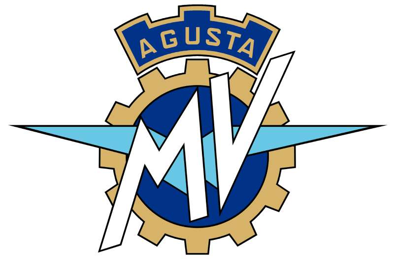
The MV Agusta logo is a combination mark featuring a stylized heraldic eagle above a bold serif wordmark. The current version, refined in the early 2010s, uses red and silver as primary colors. No single external agency is publicly credited. It functions as both a brand emblem and a quality signal in the superbike segment.
- Design Type: Combination mark (symbol + wordmark)
- Primary Elements: Heraldic eagle graphic, “MV AGUSTA” all-caps wordmark
- Official Introduction Date: Original brand logo introduced 1945; current refined version circa 2010s
- Designer/Agency: Developed in-house; no single designer publicly credited
- Trademark Status: Registered trademark under MV Agusta Motor S.p.A.
- Color Palette: Red (#C8102E), Silver (#A8A9AD), Black (#000000)
- Usage Context: Motorcycle tanks, fairings, apparel, marketing materials, digital platforms, dealership signage, merchandise
How Has the MV Agusta Logo Evolved Over Time?

The MV Agusta logo has gone through several distinct phases since 1945, moving from a complex heraldic crest to a cleaner, more controlled combination mark. Each version reflects the ownership changes and market positioning the brand experienced across eight decades.
Original MV Agusta Logo (1945-1950s)
- Years Active: 1945 to late 1950s
- Design Description: Full heraldic crest with eagle, shield elements, and ornate detailing
- Color Scheme: Red, gold, black
- Designer: Unknown; developed internally under Count Giovanni Agusta
- Context: Brand launch post-World War II, transitioning from aircraft manufacturing to motorcycles
- Key Changes from Previous: N/A (first version)
- Cultural Significance: Signaled Italian industrial ambition and aristocratic heritage through heraldic imagery
Racing Era Logo (1960s-1970s)
- Years Active: 1960s to 1970s
- Design Description: Simplified eagle, cleaner wordmark, reduced ornamental details to suit race fairing applications
- Color Scheme: Red and silver, occasionally red and white
- Designer: Unknown
- Context: Peak World Championship racing period; 37 world titles demanded a more functional mark
- Key Changes from Previous: Reduced complexity, better reproduction at small sizes on helmets and fairings
- Cultural Significance: Became synonymous with Giacomo Agostini’s dominance in grand prix racing
Cagiva Era Logo (1980s-1990s)
- Years Active: 1980s to 1999
- Design Description: More corporate presentation; eagle retained but styling adjusted to align with Cagiva Group aesthetics
- Color Scheme: Red, silver, black
- Designer: Unknown; influenced by Castiglioni family ownership
- Context: Cagiva acquired MV Agusta in 1991 and revived the brand after a decade of dormancy
- Key Changes from Previous: More structured layout, cleaner sans-serif influences in wordmark
- Cultural Significance: Represented the brand’s revival and reconnection with its racing identity
Modern Logo (2010s-Present)
- Years Active: 2010s to present
- Design Description: Refined heraldic eagle, bold all-caps serif wordmark, high contrast red and silver palette
- Color Scheme: Red (#C8102E), Silver (#A8A9AD), Black (#000000)
- Designer: Developed in-house under MV Agusta Motor S.p.A.
- Context: Brand repositioning as an ultra-premium superbike manufacturer competing with Ducati and others
- Key Changes from Previous: Tighter proportions, improved digital scalability, more confident typography weight
- Cultural Significance: Cements MV Agusta’s identity as a luxury performance brand rather than just a racing marque
What Do the Design Elements of the MV Agusta Logo Mean?
Every element in the MV Agusta logo connects directly to the brand’s history, Italian identity, and performance values. The eagle is the dominant symbol, and the wordmark reinforces name recognition without decorative distraction.
What Does the Eagle Symbol Represent?
The heraldic eagle is a direct reference to the Agusta family’s aristocratic roots.
Eagles in heraldry traditionally signal strength, precision, and authority. For MV Agusta, it also references flight, which makes sense given that the company originally manufactured aircraft components before pivoting to motorcycles.
The eagle creates an immediate focal point in the mark. It draws the eye first, before the wordmark, which is an intentional hierarchy decision that reinforces brand symbol recognition over text recognition.
Why Did MV Agusta Choose These Specific Colors?

- Red (#C8102E)
- Symbolic Meaning: Speed, passion, Italian national identity
- Psychological Impact: Urgency, excitement, energy; triggers strong emotional response
- Brand Connection: Ties directly to Italian racing red (rosso corsa), shared across Ferrari, Ducati, and Aprilia
- Silver (#A8A9AD)
- Symbolic Meaning: Precision engineering, luxury, modernity
- Psychological Impact: Trust, quality, sophistication
- Brand Connection: Reflects the metallic finish of high-performance motorcycle components
- Black (#000000)
- Symbolic Meaning: Power, exclusivity, timelessness
- Psychological Impact: Authority and premium positioning
- Brand Connection: Standard in luxury vehicle branding; grounds the brighter red and silver
The combination of red and silver puts MV Agusta in clear visual territory alongside other Italian performance brands. It’s a palette that reads as premium without trying too hard. If you look at how red functions in logo design broadly, it almost always signals performance or urgency, and MV Agusta leans into that fully.
What Typography Style Is Used in the MV Agusta Logo?
The wordmark uses a bold, all-caps serif-influenced typeface with tight tracking.
The letterforms are strong and upright, with minimal stroke contrast. This gives the wordmark a mechanical, engineered quality that matches the product.
It reads well at very small sizes, which matters when the logo needs to appear on instrument panels or small merchandise tags. The all-caps treatment removes any visual hierarchy ambiguity between “MV” and “AGUSTA,” presenting them as a unified name rather than an acronym followed by a surname.
Earlier versions used slightly lighter weight type. The shift toward heavier letterforms in recent iterations reflects a broader trend toward bolder, more confident wordmarks across the motorcycle industry.
What Are the Hidden Meanings in the MV Agusta Logo?
The initials “MV” stand for Meccanica Verghera, the manufacturing district in Varese where the brand originated.
This geographical reference is built directly into the name, though most riders don’t think about it consciously. The eagle, beyond its heraldic meaning, subtly nods to aviation, since the Agusta family originally built aircraft and helicopters before motorcycles.
There’s also an argument that the upward-facing eagle posture implies forward motion and ascent, which fits a brand that exists in the top tier of superbike performance. Whether that was a deliberate design decision or a natural byproduct of heraldic convention is unclear, but it works either way.
How Does the MV Agusta Logo Compare to Competitor Logos?
MV Agusta sits in a specific visual category alongside Italian performance motorcycle brands. Its logo shares color territory with competitors but stands apart through its heraldic complexity and aristocratic positioning.
The Ducati logo uses a similar red-dominant palette but relies on a wordmark-only approach with no symbol, making it cleaner but less storied.
The Aprilia logo goes more abstract and geometric, appealing to a sportier, younger demographic. MV Agusta’s heraldic eagle feels older, which is the point. It says “we were winning championships before you were born.”
Compare that to Japanese brands: the Yamaha logo uses crossed tuning forks in a circular mark, grounded in musical heritage. The Kawasaki logo is a pure wordmark, bold and no-nonsense. The Suzuki logo uses a stylized “S” that’s become iconic through sheer repetition.
Among British brands, the Triumph logo uses an oval badge format that feels heritage-driven but more approachable than MV Agusta’s crest.
The Harley-Davidson logo is the clearest contrast. Where Harley leans into American working-class culture with its bar-and-shield, MV Agusta leans into European aristocracy. Both are heritage plays, just aimed at completely different audiences.
MV Agusta also shares visual DNA with the Moto Guzzi logo, another Italian brand using an eagle as a central symbol. The key difference is execution: Moto Guzzi’s eagle is more naturalistic, while MV Agusta’s is formally heraldic.
Overall, among vehicle brand logos globally, MV Agusta occupies a rare position: a combination mark that genuinely communicates exclusivity without resorting to minimalism. Most luxury brands strip back. MV Agusta adds history.
What Are the Technical Specifications of the MV Agusta Logo?
Official Color Codes
- Primary Color: Red
- Hex: #C8102E
- RGB: (200, 16, 46)
- CMYK: (0, 92, 77, 22)
- Pantone: 186 C
- Secondary Color: Silver
- Hex: #A8A9AD
- RGB: (168, 169, 173)
- CMYK: (3, 2, 0, 32)
- Pantone: Cool Gray 6 C
- Accent Color: Black
- Hex: #000000
- RGB: (0, 0, 0)
- CMYK: (0, 0, 0, 100)
- Pantone: Black C
Dimensions and Proportions
- Aspect Ratio: Approximately 3:1 (width to height) for horizontal lockup
- Minimum Size Requirements: Eagle symbol should not be reproduced below 20px height in digital; 10mm in print
- Clear Space: Minimum clear space equal to the height of the “M” letterform on all sides
- Official Usage Guidelines: Do not alter color sequence, do not stretch proportions, do not use on backgrounds that reduce contrast below accessible thresholds. For print applications, CMYK values apply. For screen use, RGB hex values apply. High-resolution files should be exported as vector graphics to maintain quality at any scale. For photography and print contexts, Pantone spot colors ensure consistency across materials.
What Cultural Impact Has the MV Agusta Logo Had?

The MV Agusta logo carries genuine motorsport weight that few motorcycle brands can match.
Between the 1950s and 1970s, the eagle and wordmark appeared on machines that won 37 world championships. That’s not marketing copy. That history is baked into what the logo means to anyone who knows the brand.
The logo became culturally significant beyond racing through its association with Giacomo Agostini, the most decorated grand prix motorcycle racer in history. His face and the MV Agusta emblem appeared on magazine covers across Europe for over a decade.
When the brand was revived in the 1990s after years of dormancy, the logo itself carried enough nostalgia to generate press coverage. That’s a level of brand equity most manufacturers spend decades trying to build.
Today, the logo appears on clothing, accessories, and lifestyle products well outside the motorcycle world. It’s recognizable enough to work as a fashion statement, which puts MV Agusta in the same cultural territory as Harley-Davidson in terms of logo-as-identity, even though the two brands target entirely different buyers.
How Does the MV Agusta Logo Fit Into the Overall Brand Identity?
The logo is the anchor of MV Agusta’s broader brand system, connecting the motorcycle products, the racing heritage, the apparel line, and the dealership experience into one coherent visual identity.
The eagle symbol functions independently from the wordmark in some contexts, appearing alone on helmets or small components where space is limited. This flexibility is a sign of a well-structured brand guidelines system.
The red and silver palette runs consistently through every touchpoint: bike liveries, marketing materials, the official website, packaging, and branded apparel. That consistency is what makes the brand style guide work. When every element agrees, the brand feels deliberate.
The visual hierarchy of the full combination mark, eagle above wordmark, reinforces the brand’s positioning: symbol first (heritage, exclusivity), name second (clarity, recognition). That sequencing tells you something about how MV Agusta wants to be perceived before you even read the name.
Compared to purely functional brands, MV Agusta uses its logo as storytelling infrastructure. The design carries history so the marketing copy doesn’t have to.
How Should the MV Agusta Logo Be Used?
Official Usage Guidelines
- Do:
- Use approved color versions: full color, all-black, all-white
- Maintain minimum clear space around the logo at all times
- Use vector source files for print and large-format reproduction
- Apply appropriate DPI settings (minimum 300 DPI for print, 72-96 DPI for standard screen use) when exporting raster versions
- Use the official color palette without substitution
- Don’t:
- Stretch, skew, or distort the logo proportions
- Apply unauthorized color changes or gradients
- Place the logo on backgrounds that reduce legibility or contrast
- Recreate or redraw the eagle symbol from memory or low-resolution references
- Use the logo to imply endorsement or sponsorship without written authorization
Where to Access Official Logo Files
- Official press kits available through MV Agusta’s media relations at mvagusta.com
- Authorized dealers receive brand asset packages directly from MV Agusta Motor S.p.A.
- For partnership or licensing inquiries, contact the brand’s marketing department directly through official channels
Licensing and Trademark Protection
- The MV Agusta name, eagle symbol, and wordmark are registered trademarks of MV Agusta Motor S.p.A.
- Unauthorized commercial use of the logo, including on merchandise, printed materials, or digital content, constitutes trademark infringement
- Fan art and non-commercial personal use typically fall outside enforcement scope, but commercial reproduction requires explicit written permission
- Third-party manufacturers of aftermarket parts and accessories must obtain licensing agreements before using the logo on products or packaging
FAQ on The MV Agusta Logo
What does the MV Agusta logo represent?
The logo represents Italian racing heritage and aristocratic identity through a heraldic eagle paired with a bold wordmark.
The eagle signals strength and precision. The red and silver palette ties directly to Italian motorsport culture and the brand’s 37 world championship titles.
What does “MV” stand for in the MV Agusta logo?
“MV” stands for Meccanica Verghera, referring to the Schiranna district of Varese, Italy, where the brand was founded in 1945 by Count Giovanni Agusta.
Most riders don’t know this. The geographical origin is quietly embedded in every logo iteration.
What are the official colors of the MV Agusta logo?
The three official colors are red (Pantone 186 C, #C8102E), silver (#A8A9AD), and black (#000000).
Red is the dominant color, referencing rosso corsa, the traditional Italian racing red shared with other premium motorcycle brands.
Has the MV Agusta logo changed over the years?
Yes. The logo has gone through several phases since 1945, from a detailed heraldic crest to a cleaner, more controlled combination mark.
Each major redesign followed a shift in ownership or market positioning, including the Cagiva acquisition in the 1980s and the brand revival in the 1990s.
What type of logo is the MV Agusta logo?
It is a combination mark, meaning it uses both a symbol (the heraldic eagle) and a wordmark together as a unified brand emblem.
The eagle can also appear independently in contexts where space is limited, like helmet decals or small components.
What font is used in the MV Agusta logo?
The wordmark uses a bold, all-caps serif-influenced typeface with tight letter spacing. It is not a widely available commercial font and appears to be a custom or heavily modified version.
The heavy weight and upright letterforms give it a mechanical, engineered quality that matches the product.
Why does MV Agusta use an eagle in its logo?
The eagle comes from the Agusta family’s heraldic coat of arms. It also references the family’s aviation background, since they originally manufactured aircraft before pivoting to motorcycles in 1945.
The eagle symbol signals authority, precision, and Italian aristocratic identity all at once.
How does the MV Agusta logo compare to the Ducati logo?
Ducati uses a red wordmark-only approach with no symbol, making it simpler and more modern. MV Agusta’s logo is more complex, leaning into heritage and exclusivity through its heraldic eagle.
Both use red as the dominant color, but the design philosophy behind each is completely different.
Where can I download the official MV Agusta logo?
Official logo files are available through the MV Agusta press kit at mvagusta.com. Authorized dealers receive brand assets directly from MV Agusta Motor S.p.A.
Downloading from third-party sites risks getting low-resolution or outdated versions. Always use official sources for any commercial or professional application.
Is the MV Agusta logo trademarked?
Yes. The eagle symbol, the wordmark, and the full combination mark are all registered trademarks of MV Agusta Motor S.p.A.
Commercial use without written authorization constitutes trademark infringement. Personal, non-commercial use is generally outside enforcement scope, but any product or merchandise use requires explicit licensing.
Conclusion
The MV Agusta logo is more than a motorcycle badge. It carries eight decades of Italian racing identity, aristocratic heritage, and engineering credibility in a single combination mark.
The heraldic eagle, the rosso corsa red, the tight all-caps wordmark. Each element has a reason to exist.
Few motorcycle marques can claim this level of visual consistency across so many ownership changes and market shifts. The brand identity has stayed coherent because the core symbolism, Meccanica Verghera’s roots, the Agusta family crest, the championship legacy, was always worth protecting.
That’s what separates a logo with history from one that just looks good.

Renowned for his expertise in logo design and visual branding, Bogdan has developed a multitude of logos for various clients.
His skills extend to creating posters, vector illustrations, business cards, and brochures. Additionally, Bogdan's UI kits were featured on marketplaces like Visual Hierarchy and UI8.
He also wrote in the past years on sites like Design Your Way, WebDesignerDepot, WPDean, Designmodo, Speckyboy, Slider Revolution, and more.
- The Windsurf Logo History, Colors, Font, And Meaning - 10 October 2026
- How to Remove Background From Product Photos (No Photoshop) - 10 October 2026
- How Designers can Build a Stronger Online Creative Identity - 9 October 2026

Bogdan Sandu is a seasoned designer who has been designing websites since 2008. Renowned for his expertise in logo design and visual branding, Bogdan has developed a multitude of logos for various clients. His skills extend to creating posters, vector illustrations, business cards, and brochures. Additionally, Bogdan's UI kits were featured on marketplaces like Visual Hierarchy and UI8. He also wrote in the past years on sites like Design Your Way, WebDesignerDepot, WPDean, Designmodo, Speckyboy, Slider Revolution, and more.
You Might Also Like