

The Aprilia Logo History, Colors, Font, and Meaning
Beneath a whirl of wheels and a symphony of engines, lies the quintessence of speed and style: the Aprilia logo.
A beacon of Italian excellence, this emblem embodies more than just a brand; it represents a lineage of racing heritage and an unyielding pursuit of performance.
In diving into this mosaic of curves and colors, we unfurl the narrative of a symbol steeped in motocross lore, a stamp of motorcycle branding that transcends aesthetics.
This insignia, a harbinger of engineering marvels like the Aprilia RSV4 and the nimble Tuono, carries with it stories of MotoGP glories and whispers of Noale’s artisanal spirit.
Crafting a journey through this motorbike insignia, I invite enthusiasts and the uninitiated alike to decrypt the cipher of a crest that breathes life into a fusillade of two-wheeled prodigies.
By the close of this revelation, an understanding of the Aprilia emblem‘s power to define product identity within the luxury motorcycle panorama will be yours to wield.
Prepare to peer through the visor of Italian design and into the soul of Aprilia — where every curve meets ambition, and every color holds the heart of speed.
The Meaning Behind the Aprilia Logo
![]()
Alright, let’s dive in. Aprilia – sounds thrilling, right? There’s more to that logo than meets the eye.
A Symbol of Speed
When you look at the Aprilia logo, it’s not just a name or a brand, it’s the embodiment of pure speed and adrenaline.
The streamlined design, the forward lean… it screams velocity. It’s like you can almost feel the wind rushing past you, even if you’re just staring at it on your screen.
The Lion’s Roar
Then there’s the majestic lion in the logo. Ever noticed? Lions represent strength, dominance, and courage.
So, in a way, it feels like Aprilia is promising you a wild, dominant ride – a king of the roads sorta deal. A lion doesn’t follow; it leads. And Aprilia with its lion in the logo says just that – lead the way!
The History of the Aprilia Logo
Beginnings: Simple and Sleek
Back in the day, when Aprilia first started, their logo was a little more understated. But you could still feel the pulse of passion in it. A dash of Italian flair, a pinch of gutsy spirit.
The Evolution
As the years rolled on, Aprilia wanted to pack more punch into their brand image. And so, the logo evolved. It grew bolder, sharper, more defined. That lion? It wasn’t always there. But when it roared onto the scene, it took the logo from ‘cool’ to ‘epic’.
The Colors of the Aprilia Logo
Colors speak, ya know? And the Aprilia logo is no exception.
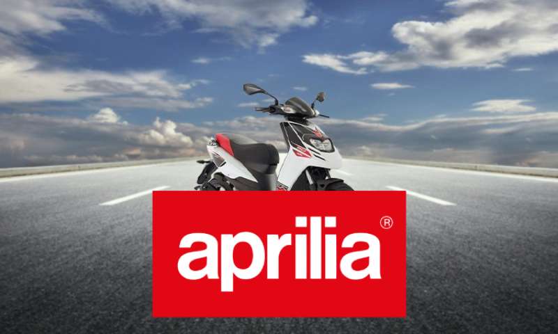
Red: The Heartbeat

The red in the logo isn’t just any red. It’s the red of passion, of heartbeats racing, of revving engines. It’s a declaration: “We’re alive, and we’re here to conquer!”
White: The Clarity
The pristine white replaces black, offering a stark contrast to the passionate red. White stands for clarity, precision, and purity. In Aprilia’s context, it symbolizes the brand’s commitment to innovation and perfection, providing a clean canvas that makes the red stand out even more, emphasizing their fiery spirit and racing heritage.
The Font Used in the Aprilia Logo
Fonts, my friend, are like the voice of a logo.
Sleek and Modern
The Aprilia font is modern and sleek. It’s not here to play; it’s here to slay! It commands attention, and yet it’s utterly simple. That’s the beauty of it. It’s like the perfect backdrop for a rock concert – there, but letting the star shine!
Italics: Forward Momentum
The slight tilt, the italics – that’s momentum right there. It’s pushing forward, urging you to move, to ride, to feel the thrill.
The Texture of the Aprilia Logo
Not Just Flat
The Aprilia logo isn’t just a flat image. If you’ve ever seen it up close, on a bike or a piece of merch, you’ll notice a subtle texture. It’s like the grain on a piece of leather, giving it depth and dimension.
A Tactile Experience
Touch it. Go on! That texture? It’s almost like a tactile promise of the experiences and adventures that await you with Aprilia.
How the Aprilia Logo Influences Brand Perception
More than Just Aesthetics
A logo is a silent ambassador. When people look at the Aprilia logo, they aren’t just seeing colors and fonts. They’re feeling things. Emotions. Desires. Yearnings.
Crafting A Persona
Aprilia, with its logo, has carved out a persona for itself. It’s not just any bike brand. It’s a maverick. It’s a rebel with a cause – and that cause is pure, unadulterated thrill.
So when you think of Aprilia, thanks to that logo, you’re not just thinking of bikes. You’re dreaming of adventures!
FAQ On The Aprilia Logo
What is the significance of the Aprilia logo?
The Aprilia logo represents more than a brand; it’s the emblem of Italian craftsmanship and racing success.
Intricately linked with performance bikes like the renowned Aprilia RSV4, it signals a commitment to engineering prowess and a storied history in the realms of MotoGP and Superbike racing.
Where did the Aprilia logo originate?
This iconic insignia was born in Noale, Italy, the cradle of the Aprilia brand. It’s a visual ode to the town’s storied legacy in speed and design, a testament to the local culture that infuses each motorcycle, from the sleek lines of the Aprilia Tuono to the gritty charm of their motocross range.
Has the Aprilia logo changed over the years?
Indeed, it has evolved. With a quest to stay contemporary while honoring their racing heritage, the logo has seen subtle refinements.
It keeps pace with the shifting aesthetics of motorcycle design and the evolving landscape of motorbike branding, just as the company’s models adapt to the forefront of technology.
What do the colors in the Aprilia logo mean?
The Aprilia emblem often showcases silver and red, a blend symbolizing speed and passion. These shades echo the adrenaline of MotoGP and the fiery essence of Italian superbikes.
It’s a chromatic nod to the brand’s relentless pursuit of high performance, akin to a racer’s beating heart.
Is the Aprilia logo trademarked?
Absolutely. This symbol is more than artwork; it’s a legal standard bearer for the company.
As such, it is staunchly defended as the Aprilia brand’s two-wheeler crest, ensuring the badge adorning each of their motorcycles, from the Tuono to the RSV4, remains exclusive and distinctive.
Why do people put the Aprilia logo on merchandise?
The Aprilia badge signifies more than mere ownership; it’s a declaration of allegiance to a lifestyle.
Apparel and accessories emblazoned with Aprilia’s symbol serve as a universal nod to others in the know, an unspoken bond among aficionados of Italian design and motorcycle culture.
What makes the Aprilia logo stand out on their motorcycles?
On the sleek canvases of their motorcycles, the logo is a splash of history and prestige.
It demands attention, its sharp contours and vivid colors stark against the engineering canvas, whispering tales of Noale’s artisanal mastery and the symphonic roar of world-class superbikes.
Are there different versions of the Aprilia logo for different bikes?
Each model might tweak the logo’s presentation to echo its unique identity. Whether it’s the street prowess of the Aprilia Tuono or the track dominance of the RSV4, the emblem adapts, much like motorcycle graphics**, to complement the distinct characteristics of each bike.
How is the Aprilia logo used in their marketing?
In marketing, it serves as the protagonist, a beacon of Italian superbike engineering.
Each campaign, each advertisement, orbits around this symbol, a star casting the glow of motorcycle excellence far and wide, ensnaring the hearts of speed enthusiasts and solidifying the measure of Aprilia’s brand recognition.
Can you customize the Aprilia logo on your bike?
Customization must respect legal and brand guidelines. While personal flairs are possible, they should not distort the official Aprilia graphics.
Authenticity is key – any modification should honor the essence of Aprilia’s design and their position within the echelons of motorcycle artistry and Italian luxury.
Conclusion
Crafting a conclusion befitting the story of the Aprilia logo, we brush off the tire rubber and slow our racing pulse. We’ve toured the curves of this storied emblem, a symbol that marks the skin of every Aprilia motorcycle with the pride of Italian heritage and a relentless pursuit of engineering excellence.
To gaze upon this badge is to see not just a motorcycle insignia but a patchwork of victories and innovations, from the dominating RSV4 on the track to the rebellious spirit of the Tuono on the road. It’s a rallying flag for a community bound by speed, a stitch in the leather jacket of motorcycle culture.
As we throttle down and let the engine idle, take this emblem with you. Let it remind you of the pursuits we chase; let it stand as a testament to the beauty and boldness that lies in the union of design and velocity. Aprilia’s logo is more than a brand; it’s a chapter in the grand saga of motorcycling lore.
If you liked this article about the Aprilia logo, you should check out this article about the Royal Enfield logo.
There are also similar articles discussing the Harley-Davidson logo, the CFMoto logo, the Moto Guzzi logo, and the Piaggio logo.
And let’s not forget about articles on the Zero Motorcycles logo, the MV Agusta logo, the Hyosung logo, and the KYMCO logo.
Bogdan Sandu, a seasoned designer with 15 years of diverse experience, has been designing websites since 2008.
Renowned for his expertise in logo design and visual branding, Bogdan has developed a multitude of logos for various clients.
His skills extend to creating posters, vector illustrations, business cards, and brochures. Additionally, Bogdan's UI kits were featured on marketplaces like Visual Hierarchy and UI8.
Latest posts by Bogdan Sandu (see all)
- Unique Construction Website Design Examples That Work - 21 May 2024
- The Heineken Logo History, Colors, Font, And Meaning - 20 May 2024
- Graceful Grays: Timeless Gray Color Palettes for Any Project - 20 May 2024