The Piaggio logo is the official brand mark of Piaggio & C. SpA, one of Europe’s oldest and most recognized vehicle manufacturers. Founded in Genoa in 1884, the company has used its visual identity to signal Italian engineering heritage across scooters, motorcycles, and light commercial vehicles. The logo has gone through several updates over more than a century, each reflecting shifts in the company’s market position and design values.
Piaggio sits in a unique spot within vehicle manufacturer branding. Unlike pure motorcycle brands that lean on aggressive imagery, Piaggio has always balanced practicality with a distinctly Italian sense of style. That tension shows up directly in how the logo has been designed and redesigned over the decades.
What Is the Piaggio Logo?
![]()
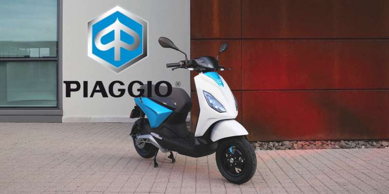
The Piaggio logo is a wordmark-based combination mark featuring the company name in a bold, custom-styled typeface set within or alongside a geometric framing device. The current version was refined in the early 2000s and uses a deep blue and white color scheme to signal reliability and European craftsmanship.
- Design Type: Combination mark (wordmark + geometric emblem)
- Primary Elements: Stylized “Piaggio” lettering, oval or shield framing device, clean geometric construction
- Official Introduction Date: Current iteration refined circa 2000s; original wordmark dates to mid-20th century
- Designer/Agency: Developed internally; no single external agency is publicly credited for the modern version
- Trademark Status: Registered trademark under Piaggio & C. SpA, protected across EU and international markets
- Color Palette: Piaggio Blue (#003087 approximate), White (#FFFFFF)
- Usage Context: Applied to scooter bodywork, dealership signage, marketing materials, digital platforms, merchandise, and official documentation
How Has the Piaggio Logo Evolved Over Time?
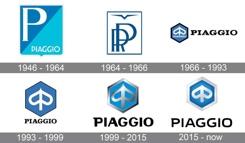
The Piaggio logo has gone through roughly four distinct phases since the late 1800s, moving from ornate industrial lettering to a clean, modern wordmark built for digital and physical use at scale.
Original Piaggio Logo (1884-1940s)
- Years Active: 1884-1940s
- Design Description: Ornate serif lettering typical of late 19th-century industrial branding, often paired with decorative frames and flourishes
- Color Scheme: Typically rendered in black or dark ink for print and stamping applications
- Designer: Unknown; likely produced by in-house craftsmen
- Context: Rinaldo Piaggio founded the company as a wood and iron workshop. The logo reflected the heavy industrial identity of the era
- Key Changes from Previous: N/A (founding mark)
- Cultural Significance: Established the Piaggio name as a mark of Italian manufacturing quality before the company shifted into vehicles
Mid-Century Piaggio Logo (1940s-1970s)
- Years Active: 1940s-1970s
- Design Description: Simplified lettering with reduced decorative elements; began incorporating oval framing devices consistent with European vehicle badge conventions
- Color Scheme: Blue and white introduced during this period, aligning with Italian industrial design norms
- Designer: Internal design team
- Context: Post-war Italy, Piaggio launched the Vespa in 1946. The brand needed a cleaner identity that could sit on vehicle bodywork and print materials equally well
- Key Changes from Previous: Removed ornamental flourishes; introduced badge-style framing
- Cultural Significance: This period tied the Piaggio name directly to Italy’s post-war economic recovery and the rise of affordable personal mobility
Modernized Piaggio Logo (1970s-2000s)
- Years Active: 1970s-2000s
- Design Description: More geometric letterforms, tighter tracking, and a cleaner oval emblem. The wordmark became more structured and consistent across applications
- Color Scheme: Deeper blue tones, white lettering, occasional use of silver/chrome for premium applications
- Designer: Internal; influenced by broader European corporate identity trends of the 1970s-80s
- Context: Global expansion and the need for a logo that worked across print, signage, and early digital formats
- Key Changes from Previous: More uniform letterforms, tighter geometric consistency, reduced reliance on decorative devices
- Cultural Significance: Reinforced Piaggio’s positioning as an established, reliable European brand rather than a purely Italian regional manufacturer
Current Piaggio Logo (2000s-Present)
- Years Active: Early 2000s-present
- Design Description: Clean, bold wordmark in a custom sans-serif-adjacent typeface, typically presented within an oval badge. Strong contrast between lettering and background for maximum legibility
- Color Scheme: Piaggio Blue and White as primary; used with metallic finishes on physical applications
- Designer: Refined internally with input from branding consultants
- Context: Digital-first world, global dealership network, need for scalable brand consistency
- Key Changes from Previous: Crisper geometry, optimized for small-size digital reproduction, more confident letter spacing
- Cultural Significance: Positions Piaggio as a modern European mobility brand while maintaining its historical roots
What Do the Design Elements of the Piaggio Logo Mean?
The Piaggio logo communicates Italian craftsmanship, mobility, and long-standing industrial reliability through its structured wordmark and oval framing device. Each element carries deliberate meaning tied to the company’s heritage and market identity.
What Does the Oval Shape Represent in the Piaggio Logo?
The oval badge format has deep roots in European vehicle branding. It signals prestige and authenticity.
It also creates a contained, recognizable silhouette that works on vehicle bodywork, signage, and small-scale digital applications without losing legibility.
For Piaggio specifically, the oval connects the brand visually to other respected Italian vehicle manufacturers while keeping its own distinct character through typography and color.
What Is the Historical Context Behind the Logo’s Design Choices?
Piaggio’s shift from ornate 19th-century lettering to a clean modern mark follows the same arc as most European industrial brands of the 20th century.
Post-war Italian design culture, which produced movements like Italian Rationalism, pushed companies toward cleaner, more functional visual identities.
The Vespa’s global success in the 1950s and 60s made it critical for Piaggio to have a logo that felt accessible and modern, not just industrial.
What Cultural References Does the Logo Draw On?
The blue and white palette connects to broader Italian and Mediterranean design sensibilities, which tend to favor these colors for reliability and trust.
The structured, upright letterforms suggest precision and engineering confidence, which matters a lot in the vehicle sector.
There is also an indirect connection to Bauhaus design principles in how the current mark strips away decoration in favor of geometric clarity and function.
How Does the Logo Connect to Piaggio’s Mission and Values?
Piaggio’s stated mission centers on sustainable urban mobility. The clean, uncluttered logo reflects that, avoiding visual noise that would contradict a brand positioning around simplicity and practicality.
The consistent use of blue across decades signals stability, which matters for a company selling vehicles people depend on daily.
Why Did Piaggio Choose These Specific Colors?

- Piaggio Blue
- Hex: Approximately #003087
- Pantone: Closest match Pantone 281 C
- Symbolic Meaning: Trust, reliability, European heritage
- Psychological Impact: Blue is consistently associated with confidence and dependability in color psychology. For a vehicle brand, that association is not accidental
- Brand Connection: Blue is common across European vehicle and engineering brands, placing Piaggio within a recognized visual category
- White
- Hex: #FFFFFF
- Symbolic Meaning: Clarity, precision, clean design
- Psychological Impact: Creates strong contrast against the blue, improving legibility at small sizes and from a distance
- Brand Connection: White lettering on dark backgrounds is a practical choice for vehicle badges where legibility in varied lighting conditions matters
What Typography Style Is Used in the Piaggio Logo?
The Piaggio wordmark uses a bold, custom-modified letterform that sits between a traditional sans-serif font and a slightly humanist style.
The letters are upright, evenly weighted, and spaced with moderate tracking to ensure readability at both large and small scales.
Over time, the typography has become progressively cleaner, moving away from the heavier, more decorative letterforms of earlier versions toward the confident, geometric simplicity of the current mark.
Readability was clearly prioritized in the modern version. It holds up on a scooter body panel, a dealership sign, and a mobile screen without any adjustment needed.
What Are the Hidden Meanings in the Piaggio Logo?
There are no widely documented subliminal elements in the Piaggio logo. It is a fairly straightforward piece of corporate identity work.
That said, the oval framing device subtly echoes wheel and motion imagery, which is fitting for a mobility brand. Whether intentional or not, it works.
The consistent use of blue across well over half a century of logo versions suggests a deliberate brand decision to build recognition through color continuity rather than dramatic visual reinvention.
How Does the Piaggio Logo Compare to Competitor Logos?
Piaggio’s logo sits within a competitive field of European two-wheel brands, most of which rely on shield or crest formats rather than oval badges. Piaggio’s approach is cleaner and more wordmark-forward than most direct competitors.
| Brand | Logo Style | Primary Color | Key Design Trait |
|---|---|---|---|
| Piaggio | Wordmark + oval badge | Blue / White | Clean, typography-forward, Italian heritage |
| Aprilia | Wordmark + abstract “A” mark | Black / Red | Aggressive, motorsport-influenced |
| Moto Guzzi | Eagle emblem + wordmark | Red / Black | Heritage-heavy, figurative mascot |
| Ducati | Shield emblem + wordmark | Red / White | Bold, crest-style, performance-oriented |
| Triumph | Wordmark + bar-and-shield | Black / Gold | British heritage, classic weight |
| Yamaha | Tuning fork emblem + wordmark | Blue / White / Red | Symbolic, global, instantly recognizable |
| Kawasaki | Wordmark only | Green / Black | Industrial, minimal, performance brand |
What stands out about Piaggio relative to this group is the restraint. Most competitors either lean heavily on figurative symbols (eagles, shields) or use high-contrast aggressive color combinations. Piaggio keeps it simple and consistent.
Compared to Royal Enfield or Harley-Davidson, which both maintain deeply heritage-driven, ornate identities, Piaggio reads as more modern and less nostalgic. That is probably intentional given its urban mobility focus.
What Are the Technical Specifications of the Piaggio Logo?
Official Color Codes
- Primary Color: Piaggio Blue
- Hex: #003087
- RGB: (0, 48, 135)
- CMYK: (100, 64, 0, 47)
- Pantone: 281 C (closest match)
- Secondary Color: White
- Hex: #FFFFFF
- RGB: (255, 255, 255)
- CMYK: (0, 0, 0, 0)
- Pantone: White
Note: Official color codes have not been publicly confirmed by Piaggio. Values above are best-match approximations based on visual analysis of official brand materials. Always request official brand files from Piaggio’s press office for production use.
Dimensions and Proportions
- Aspect Ratio: The oval badge version maintains approximately a 2:1 width-to-height ratio; the wordmark alone varies by application
- Minimum Size Requirements: Not publicly documented; standard practice for badges of this type sets a minimum of 20mm width for print and 80px for digital
- Clear Space: A margin equal to the cap height of the wordmark is recommended on all sides to maintain visual integrity
- File Formats: Official logos are available as vector graphics (AI, EPS, SVG) for scalable use, and as high-resolution raster files (PNG, JPEG) for digital applications. For physical reproduction, a minimum of 300 DPI is required
- Color Modes: RGB for digital applications; CMYK for print production
What Cultural Impact Has the Piaggio Logo Had?
The Piaggio logo carries cultural weight that goes well beyond vehicle branding. It is tied directly to one of the defining images of 20th-century Italian culture: the Vespa.
When the Vespa became a global symbol of post-war freedom and style in the 1950s and 60s, the Piaggio name rode alongside it. Films, fashion, and photography from that era regularly featured Vespa scooters, and the Piaggio badge was part of that visual language.
This is fairly rare for a parent company logo. Usually, the sub-brand (Vespa, in this case) absorbs the cultural attention. But Piaggio maintained enough visibility on its own products that the name retained independent recognition.
Today, the logo is recognized across Europe, Asia, and the Americas, particularly in urban markets where small-displacement scooters remain a primary form of daily transport.
It also sits within a broader tradition of Italian design excellence. Alongside Ducati and Moto Guzzi, Piaggio is part of the group of Italian two-wheel brands whose visual identities carry real cultural meaning beyond just product identification.
How Does the Piaggio Logo Fit Into the Overall Brand Identity?
The Piaggio logo functions as the anchor of a broader brand system that includes multiple sub-brands, each with their own distinct identity. Understanding where it sits requires looking at the full Piaggio Group structure.
Piaggio Group owns Vespa, Aprilia, Moto Guzzi, and Derbi. Each sub-brand has its own logo and visual identity. The Piaggio logo sits at the corporate level, appearing on scooters sold under the Piaggio name itself and on all group-level communications.
The brand guidelines for a structure like this require the parent mark to be neutral enough to coexist with very different sub-brand personalities. Vespa is retro and lifestyle-oriented. Aprilia is aggressive and motorsport-focused. Moto Guzzi is heritage-heavy. The Piaggio logo’s clean, restrained design makes it compatible with all of these without competing.
Within the brand style guide, the Piaggio mark is likely governed by strict rules around clear space, color usage, and co-branding scenarios to protect that neutrality.
The visual hierarchy across Piaggio Group’s product range places sub-brand logos as primary on consumer-facing products, with the Piaggio corporate mark appearing in secondary positions on product literature, signage, and group-level communications.
How Should the Piaggio Logo Be Used?
Official Usage Guidelines
- Do use: Official files sourced directly from Piaggio’s press office or authorized brand portal
- Do use: The logo at sizes that maintain legibility, respecting minimum size requirements
- Do use: Approved color versions only (full color, white reverse, black single-color where approved)
- Do not: Stretch, distort, or alter the proportions of the logo
- Do not: Change the colors outside of officially approved variations
- Do not: Place the logo on busy backgrounds that reduce legibility
- Do not: Combine the Piaggio logo with other brand marks without explicit authorization
- Do not: Use the logo to imply sponsorship, endorsement, or partnership without written consent from Piaggio & C. SpA
Where to Access Official Logo Files
- Piaggio’s official press portal at media.piaggio.com provides approved brand assets for journalists and authorized partners
- Dealers and official partners receive brand asset packages through Piaggio’s dealer support program
- Third-party logo download sites are not authorized sources and files from these should not be used for any commercial or official purpose
Licensing and Trademark Protection
- The Piaggio logo and name are registered trademarks of Piaggio & C. SpA, protected under EU trademark law and international intellectual property agreements
- Commercial use of the logo without a licensing agreement is a trademark infringement
- Merchandise, promotional materials, or any commercial application featuring the Piaggio logo requires a formal licensing arrangement with Piaggio & C. SpA
- Editorial and journalistic use (such as news articles or product reviews) generally falls under fair use provisions but should not imply brand endorsement
FAQ on The Piaggio Logo
What does the Piaggio logo look like?
The Piaggio logo is a combination mark featuring the company name in bold, custom lettering set within an oval badge.
It uses a deep blue and white color scheme. Clean, upright letterforms give it a structured, professional appearance that works across vehicle bodywork and digital platforms.
What colors are used in the Piaggio logo?
The primary color is Piaggio Blue, approximately #003087, paired with white lettering.
Blue signals trust and reliability, which is a deliberate choice for a vehicle brand. The two-color palette keeps the mark legible at small sizes and in low-light conditions.
How old is the Piaggio logo?
Piaggio was founded in 1884, and some form of branded mark has existed since then.
The core wordmark structure took shape in the mid-20th century. The current refined version dates to the early 2000s, though it retains strong visual continuity with earlier iterations.
What font does the Piaggio logo use?
The Piaggio wordmark uses a custom-modified typeface. It sits between a geometric font style and a slightly humanist sans-serif.
The letters are bold, evenly weighted, and spaced for strong legibility. No publicly available commercial font is an exact match for the current version.
Has the Piaggio logo changed over time?
Yes. The Piaggio logo evolution spans over a century, moving from ornate 19th-century industrial lettering to the clean, geometric wordmark used today.
There have been roughly four distinct phases. Each update simplified the design while keeping the blue and white color identity consistent throughout.
What does the Piaggio logo symbolize?
The oval badge format signals European vehicle heritage and prestige. The blue color communicates reliability and trust.
Together, the Piaggio brand identity reflects the company’s positioning as a practical, well-engineered Italian mobility brand with over 130 years of manufacturing history behind it.
Where can I download the official Piaggio logo?
Official logo files are available through Piaggio’s press portal at media.piaggio.com for journalists and authorized partners.
Dealers receive assets through Piaggio’s official dealer support program. Third-party download sites are not authorized sources and should be avoided for any commercial or official use.
Is the Piaggio logo trademarked?
Yes. The Piaggio logo and the Piaggio name are registered trademarks of Piaggio & C. SpA, protected under EU trademark law and international intellectual property agreements.
Commercial use without a licensing agreement is infringement. Editorial use in news or reviews is generally acceptable but must not imply brand endorsement.
How does the Piaggio logo compare to other motorcycle brand logos?
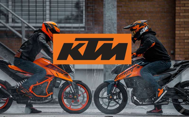
Most competitors use shields, crests, or figurative emblems. The Ducati logo uses a bold shield, while KTM goes with a stark, aggressive wordmark.
Piaggio’s oval wordmark is notably cleaner and more restrained than most in the Italian motorcycle industry, reflecting its urban mobility focus rather than a performance or heritage-first positioning.
What file formats is the Piaggio logo available in?
The logo is available as scalable vector graphics in AI, EPS, and SVG formats for print and production work.
Raster versions in PNG and JPEG are used for digital applications. Print production requires a minimum of 300 DPI to maintain sharp reproduction of the Piaggio corporate identity.
Conclusion
The Piaggio logo is one of the more understated marks in the two-wheel industry, and that restraint is exactly what makes it work.
Its oval badge, Piaggio Blue palette, and clean wordmark have stayed remarkably consistent across decades of logo iterations, building the kind of visual recognition that most brands spend years trying to achieve.
For a company whose Piaggio Group emblem sits alongside sub-brands as distinct as Vespa, Aprilia, and Moto Guzzi, that consistency is not just aesthetic. It is a practical branding decision that holds the entire corporate identity together.
The logo’s longevity says a lot about Italian industrial design done right.
Renowned for his expertise in logo design and visual branding, Bogdan has developed a multitude of logos for various clients.
His skills extend to creating posters, vector illustrations, business cards, and brochures. Additionally, Bogdan's UI kits were featured on marketplaces like Visual Hierarchy and UI8.
He also wrote in the past years on sites like Design Your Way, WebDesignerDepot, WPDean, Designmodo, Speckyboy, Slider Revolution, and more.
- The Airtable Logo History, Colors, Font, And Meaning - 12 July 2026
- How to Blur Background in Canva: A Quick Tutorial - 11 July 2026
- Typography Trends - 10 July 2026
Bogdan Sandu is a seasoned designer who has been designing websites since 2008. Renowned for his expertise in logo design and visual branding, Bogdan has developed a multitude of logos for various clients. His skills extend to creating posters, vector illustrations, business cards, and brochures. Additionally, Bogdan's UI kits were featured on marketplaces like Visual Hierarchy and UI8. He also wrote in the past years on sites like Design Your Way, WebDesignerDepot, WPDean, Designmodo, Speckyboy, Slider Revolution, and more.
You Might Also Like