The Zero Motorcycles logo is the official visual mark of Zero Motorcycles, Inc., the California-based electric motorcycle manufacturer founded in 2006. It functions as the primary brand identifier across all products, marketing, and digital platforms. The logo reflects the company’s position at the intersection of performance engineering and clean energy transportation.
Zero entered a motorcycle industry dominated by legacy combustion brands, and its visual identity had to signal something genuinely different. Unlike heritage marques with decades of logo equity behind them, Zero built its brand identity from scratch during the early EV wave, alongside companies like Rivian that faced the same challenge of communicating tech-forward values through design.
The current logo is a bold, all-caps wordmark using a custom geometric typeface. It was refined into its present form around 2012-2013 as the company scaled production. No major external design agency has been publicly credited; the identity work appears to have been handled internally.
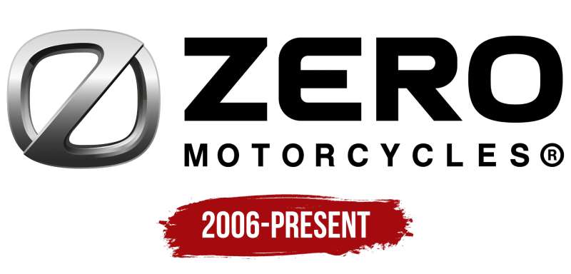
Zero Motorcycles was founded by Neal Saiki in Santa Cruz, California in 2006. The brand has gone through at least three distinct logo iterations since launch, each moving progressively toward a cleaner, more assertive visual system.
—
What Is the Zero Motorcycles Logo?
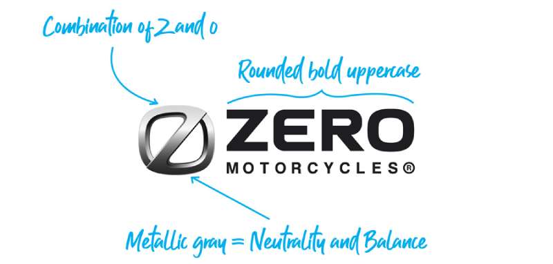
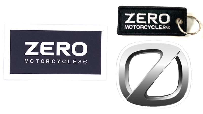
The Zero Motorcycles logo is a bold, all-caps wordmark in black and white, introduced in its current refined form around 2012-2013. It uses a custom geometric sans-serif typeface and communicates precision and forward momentum, with no illustrative elements or emblems.
- Design Type: Wordmark (text-only, no icon or emblem)
- Primary Elements: All-caps “ZERO MOTORCYCLES” lettering in a geometric sans-serif style; clean, condensed letterforms with uniform stroke weight
- Official Introduction Date: Refined current version introduced approximately 2012-2013; original brand launched 2006
- Designer/Agency: Not publicly credited; developed internally
- Trademark Status: Registered trademark owned by Zero Motorcycles, Inc.
- Color Palette: Primary black (#000000) on white (#FFFFFF); orange accent (#FF6600 approximately) used in marketing contexts
- Usage Context: Motorcycle frames, helmets, apparel, dealer signage, digital platforms, press materials, and merchandise
How Has the Zero Motorcycles Logo Evolved Over Time?
The Zero Motorcycles logo has gone through three broad phases since 2006, moving from a rough startup identity to a sharp, minimal wordmark that matches the brand’s technical maturity.
Each redesign tracked closely with product launches and company growth rather than arbitrary rebranding.
Original Zero Motorcycles Logo (2006-2010)
- Years Active: 2006-2010
- Design Description: Early wordmark with less refined letterforms; inconsistent weight distribution across characters; looser spacing
- Color Scheme: Black and white primary; early marketing used green accents to signal eco-friendly positioning
- Designer: Unknown; internal startup-era design
- Context: Introduced at company founding when Zero was a small Santa Cruz startup building converted off-road bikes
- Key Changes from Previous: N/A (original version)
- Cultural Significance: Positioned Zero as a scrappy EV challenger in a combustion-dominated market; the green accent tied it visually to the clean energy movement of the late 2000s
Transitional Zero Motorcycles Logo (2010-2012)
- Years Active: 2010-2012
- Design Description: Tightened letterforms; more uniform stroke weight; dropped the green accent in favor of straight black and white
- Color Scheme: Black (#000000) and white (#FFFFFF)
- Designer: Not publicly credited
- Context: Coincided with the launch of the first road-legal Zero S and Zero DS models, pushing the brand into mainstream motorcycle retail
- Key Changes from Previous: Removed eco-green accent; tighter kerning; more confident weight
- Cultural Significance: Signaled a shift away from “green tech hobby project” toward a serious motorcycle manufacturer identity
Current Zero Motorcycles Logo (2012-Present)
- Years Active: 2012-present
- Design Description: Fully refined all-caps wordmark; custom geometric condensed sans-serif; precise uniform stroke weight; strong horizontal tension in the letterforms
- Color Scheme: Black and white core; orange accent (#FF6600 approx.) used selectively in campaigns and on specific model liveries
- Designer: Not publicly credited
- Context: Launched alongside the brand’s push into premium electric motorcycle territory, competing directly with established performance brands
- Key Changes from Previous: More geometric precision; condensed proportions feel faster visually; fully dropped any environmental color coding
- Cultural Significance: Positions Zero as a technology and performance brand first, with the “electric” angle implied rather than shouted
What Do the Design Elements of the Zero Motorcycles Logo Mean?
The Zero Motorcycles logo communicates speed, precision, and stripped-back engineering through its geometry and weight.
There are no decorative elements. Nothing exists in this mark that doesn’t serve the goal of projecting confidence and technical credibility.
The choice of a pure wordmark is itself a statement. It says the name alone carries the weight, with no icon needed as a crutch.
What Does the Wordmark Structure Symbolize?
The all-caps format signals authority and permanence.
Condensed letterforms create a sense of forward lean, which reads as speed even in a static context.
The uniform stroke weight suggests engineering precision, the idea that nothing is over-stressed or under-built. It fits a brand selling performance machines built around clean, efficient systems.
Knowing how a logo functions as a brand tool helps explain why Zero’s text-only approach works so well. The name itself is memorable and abstract enough to carry symbolic weight without needing an icon.
Why Did Zero Motorcycles Choose These Specific Colors?
- Black (#000000)
- Symbolic meaning: Power, precision, premium positioning
- Psychological impact: Communicates seriousness and technical authority; avoids the “toy” associations some early EV brands struggled with
- Brand connection: Aligns with performance motorcycle culture broadly
- White (#FFFFFF)
- Symbolic meaning: Clarity, modernity, clean energy
- Psychological impact: Creates stark contrast that makes the mark highly legible at small sizes and at speed
- Brand connection: Used extensively in tech branding to suggest innovation
- Orange (approx. #FF6600)
- Symbolic meaning: Energy, momentum, heat despite the “zero emissions” positioning
- Psychological impact: Adds urgency and excitement without compromising the primary mark’s seriousness
- Brand connection: Appears on specific model liveries and campaign materials; not part of the core logo but tied to the visual system
Understanding color theory makes it clear why black and white was the right call here. High contrast, zero ambiguity, works on any background.
What Typography Style Is Used in the Zero Motorcycles Logo?
The Zero Motorcycles wordmark uses a custom geometric condensed sans-serif.
It shares characteristics with typefaces in the extended grotesque family, with tightly controlled letterforms and no decorative variation in stroke weight.
Readability was clearly a priority. The mark holds up at very small sizes on motorcycle frames and at large sizes on dealer signage, which is exactly what you need from a marque that lives in physical environments as much as digital ones.
The sans-serif structure reinforces the modern, tech-forward positioning. A serif font would have pulled the brand toward heritage and tradition, exactly the opposite of what Zero is trying to say.
What Are the Hidden Meanings in the Zero Motorcycles Logo?
There’s one interpretation that comes up consistently: “zero” as in zero emissions, zero compromise, zero noise.
The name works on multiple levels without the logo having to spell any of it out visually.
The condensed letterforms create a very slight forward lean when you look at the wordmark as a whole shape, which isn’t accidental in performance brand design. It implies motion.
No designer has publicly stated specific hidden intentions, but the result is a mark that reads as fast, clean, and serious simultaneously, which covers the brand’s core promises without a single icon or graphic element.
How Does the Zero Motorcycles Logo Compare to Competitor Logos?
Zero sits in an interesting position. It competes with legacy combustion brands on performance while also being compared to newer EV competitors.
Most traditional motorcycle brands lean on emblems and shields. Zero chose a pure wordmark, which immediately separates it visually.
Here’s how it stacks up against key players:
- Harley-Davidson: Uses a shield emblem with strong heritage iconography. Almost the opposite design philosophy from Zero. Where Harley leans on history, Zero projects the future.
- Ducati: Uses a wordmark with an Italian-inflected script quality. More elegant and emotional than Zero’s cold-precision approach.
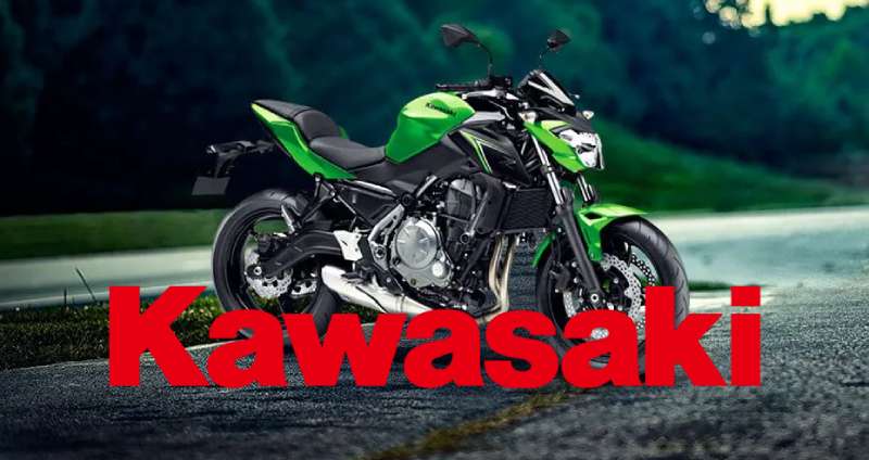
- Kawasaki: Bold, blocky lettering inside a distinct mark. Similar weight to Zero but with a more industrial feel.
- Triumph: Uses a heritage wordmark with classic proportions. Strong brand equity but anchored in the past.
- KTM: Aggressive orange and black color system. Closest to Zero in terms of performance-first visual positioning, though KTM’s mark is more angular and confrontational.
- Royal Enfield: Leans fully into heritage with a crest-based identity. Targets a completely different buyer psychology.
Among EV-adjacent tech brands, Zero’s approach is closest to companies like Rivian, which also opted for a clean, geometric wordmark to signal technology credentials without relying on legacy iconography.
Zero’s wordmark is one of the cleaner marks in the motorcycle category. It doesn’t try to win on emotion or nostalgia. That’s a deliberate trade-off.
What Are the Technical Specifications of the Zero Motorcycles Logo?
Official Color Codes
- Primary Color: Black
- Hex: #000000
- RGB: (0, 0, 0)
- CMYK: (0, 0, 0, 100)
- Pantone: Black C
- Secondary Color: White
- Hex: #FFFFFF
- RGB: (255, 255, 255)
- CMYK: (0, 0, 0, 0)
- Pantone: White
- Accent Color: Orange (marketing/livery use)
- Hex: approx. #FF6600
- RGB: approx. (255, 102, 0)
- CMYK: approx. (0, 60, 100, 0)
- Pantone: approx. 151 C
Note: Zero Motorcycles has not publicly released an official brand standards document with confirmed Pantone codes. The values above are based on observed usage and are approximate for the orange accent specifically. For print production, always request official files directly from Zero Motorcycles.
For accurate color reproduction across print and screen, understanding the difference between RGB and CMYK color modes matters. The black works identically in both. The orange accent can shift noticeably between screen and print if not properly managed.
Dimensions and Proportions
- Aspect ratio: Horizontal wordmark; approximately 6:1 width-to-height ratio for the full “ZERO MOTORCYCLES” lockup
- Minimum size requirements: Not officially published; best practice for wordmarks of this style is no smaller than 1 inch / 72px wide in digital contexts to maintain legibility
- Clear space specifications: Standard practice calls for clear space equal to the cap height of the wordmark on all sides; Zero has not published official clearance guidelines publicly
- Official usage guidelines: Available to dealers and press through Zero Motorcycles’ official media resources; not publicly downloadable for general use
- File formats available: Vector graphics (SVG, AI, EPS) for professional use; PNG for digital applications
What Cultural Impact Has the Zero Motorcycles Logo Had?
Zero Motorcycles occupies a genuinely interesting cultural position. It’s a brand that arrived during the first serious wave of EV adoption and had to build identity equity from nothing, without the benefit of decades of racing heritage or movie appearances.
The logo has become recognizable within the electric motorcycle community specifically. Among riders who follow the EV space, the Zero wordmark signals a real commitment to performance rather than just eco-positioning.
It’s also picked up presence in tech-adjacent culture. Zero bikes have appeared in film and TV productions, press coverage of EV innovation, and increasingly in mainstream motorcycle media as electric riding moves from niche to normal.
The brand sits alongside other tech-forward vehicle companies that built clean visual identities from scratch. Comparing it to something like the SpaceX logo is actually useful. Both brands chose minimal, text-forward identities that prioritize credibility over decoration, and both operate in spaces where that restraint reads as confidence.
Within the motorcycle category specifically, Zero’s visual identity has influenced how newer electric two-wheel brands approach their own branding. The move away from emblems and shields toward clean wordmarks is more common in the EV segment than in combustion brands, and Zero was early to that approach.
How Does the Zero Motorcycles Logo Fit Into the Overall Brand Identity?
The logo is the anchor of a broader visual system that covers motorcycle livery, apparel, dealer environments, and digital platforms.
It connects directly to several related brand elements: the orange accent used on specific model colorways, the all-caps typographic system used in marketing headlines, and the black-dominant aesthetic of their product photography.
Zero’s brand guidelines (available internally to partners and dealers) extend the logo’s visual logic into a full identity system. The geometric, no-frills approach of the wordmark informs everything from UI design on their app to the layout of their spec sheets.
The brand identity also connects to the product design language of the motorcycles themselves. The bikes are clean, functional, with minimal decorative elements, which mirrors exactly what the logo communicates.
This kind of alignment between product design and brand identity is what separates coherent brand systems from logos that feel stuck on as an afterthought. Zero’s visual identity and its physical products tell the same story.
A solid brand style guide is what keeps all of this consistent across touchpoints, and for a company selling through dealers globally, that consistency matters more than most people realize.
How Should the Zero Motorcycles Logo Be Used?
Official Usage Do’s
- Use the logo at sufficient size to maintain legibility of the full wordmark
- Reproduce on approved backgrounds: white, black, and neutral grey in most cases
- Use official vector files for any print, signage, or production application
- Maintain the original proportions; never stretch or distort the wordmark
- Use the correct color version for the background: black wordmark on light backgrounds, white wordmark on dark backgrounds
Official Usage Don’ts
- Do not recreate the logo from scratch using a generic font; the letterforms are customized
- Do not place the logo on busy photographic backgrounds without sufficient contrast
- Do not add drop shadows, outlines, or effects to the wordmark
- Do not use the logo in any context that implies Zero Motorcycles’ endorsement without a formal agreement
- Do not alter the color outside of the approved black/white versions
Where to Access Official Logo Files
- Dealers and media contacts can request official assets through Zero Motorcycles’ press and dealer portals
- Press-quality files including vector formats are available to journalists and media through official Zero Motorcycles press channels
- General public use of the logo requires written permission from Zero Motorcycles, Inc.
Licensing and Trademark Details
- The Zero Motorcycles name and logo are registered trademarks of Zero Motorcycles, Inc.
- Unauthorized commercial use, reproduction on merchandise, or use in advertising without written permission constitutes trademark infringement
- Fan and editorial use (journalism, reviews, commentary) falls under standard trademark fair use provisions in most jurisdictions, but commercial applications require explicit licensing
- For licensing inquiries, contact Zero Motorcycles directly through their official corporate channels
FAQ on The Zero Motorcycles Logo
What does the Zero Motorcycles logo look like?
It’s a clean, all-caps wordmark using a geometric condensed sans-serif typeface.
No icons, no emblems. Just the name set in black on white with tight, precise letterforms that communicate speed and technical confidence.
What font does the Zero Motorcycles logo use?
The Zero Motorcycles wordmark uses a custom geometric sans-serif, not an off-the-shelf typeface.
The letterforms share qualities with condensed grotesque fonts but have been modified. No standard font replicates it exactly. Avoid assuming you can recreate it from a free font library.
What colors are in the Zero Motorcycles logo?
The core logo color scheme is black (#000000) and white (#FFFFFF).
An orange accent (approx. #FF6600) appears in model liveries and some campaign materials. It’s not part of the primary mark but is tied to the broader visual identity system.
When was the Zero Motorcycles logo created?
Zero Motorcycles was founded in 2006, and an early version of the wordmark launched with the company.
The current refined version of the Zero Motorcycles visual identity was introduced around 2012-2013, coinciding with the brand’s push into mainstream motorcycle retail.
Who designed the Zero Motorcycles logo?
No external design agency has been publicly credited for the Zero Motorcycles brand identity.
The logo appears to have been developed internally. This is fairly common for early-stage tech and EV startups that build their visual systems in-house before scaling.
How has the Zero Motorcycles logo changed over time?
There have been roughly three phases: a rough startup-era mark from 2006, a transitional version around 2010, and the current refined wordmark from 2012-2013.
Each logo evolution moved toward tighter geometry, stronger weight, and a stripped-back black-and-white system.
Is the Zero Motorcycles logo trademarked?
Yes. The Zero Motorcycles name and logo are registered trademarks of Zero Motorcycles, Inc.
Commercial use without written permission is infringement. Editorial and journalistic use, such as reviews or news coverage, generally falls under fair use in most jurisdictions.
How does the Zero Motorcycles logo compare to other electric motorcycle brands?
Most legacy motorcycle brands use emblems or shields. Zero chose a pure electric motorcycle wordmark, which immediately separates it from that tradition.
Among EV-adjacent brands, the approach is closest to companies like Rivian, which also opted for clean, geometric text-based marks over illustrative icons.
Where can I download the official Zero Motorcycles logo?
Official logo files are available to dealers and press through Zero Motorcycles’ media and dealer portals.
General public downloads aren’t officially provided. For editorial use, contact Zero Motorcycles directly. Never pull low-resolution versions from third-party sites for production work.
What does the Zero Motorcycles logo represent?
The Zero Motorcycles brand identity communicates precision, performance, and clean energy without relying on visual metaphors.
The name carries the symbolic weight. “Zero” references zero emissions, zero compromise, and zero noise simultaneously, with the wordmark’s geometry reinforcing those ideas through form alone.
Conclusion
The Zero Motorcycles logo is a rare case of a wordmark that does exactly what it needs to without overreaching.
No emblem, no icon, no heritage crutch. Just a clean geometric mark that lets the electric motorcycle brand identity speak through form and restraint.
The black-and-white corporate identity holds up across motorcycle frames, digital platforms, and dealer signage equally well, which is harder to pull off than it looks.
For a company that entered the two-wheel EV space with no legacy behind it, that consistency across every touchpoint is what turns a trademark into genuine brand recognition.
Renowned for his expertise in logo design and visual branding, Bogdan has developed a multitude of logos for various clients.
His skills extend to creating posters, vector illustrations, business cards, and brochures. Additionally, Bogdan's UI kits were featured on marketplaces like Visual Hierarchy and UI8.
He also wrote in the past years on sites like Design Your Way, WebDesignerDepot, WPDean, Designmodo, Speckyboy, Slider Revolution, and more.
- The Airtable Logo History, Colors, Font, And Meaning - 12 July 2026
- How to Blur Background in Canva: A Quick Tutorial - 11 July 2026
- Typography Trends - 10 July 2026
Bogdan Sandu is a seasoned designer who has been designing websites since 2008. Renowned for his expertise in logo design and visual branding, Bogdan has developed a multitude of logos for various clients. His skills extend to creating posters, vector illustrations, business cards, and brochures. Additionally, Bogdan's UI kits were featured on marketplaces like Visual Hierarchy and UI8. He also wrote in the past years on sites like Design Your Way, WebDesignerDepot, WPDean, Designmodo, Speckyboy, Slider Revolution, and more.
You Might Also Like