The wrong font can make a well-designed infographic unreadable. The right one makes data feel effortless to scan.
Choosing the best fonts for infographics is not about personal preference. It comes down to legibility at small sizes, weight range for visual hierarchy, and how a typeface performs when paired with charts, labels, and callout numbers.
This guide covers the 10 best typefaces for infographic design, each evaluated on x-height, stroke contrast, weight availability, and real-world performance across screen and print formats.
By the end, you will know exactly which fonts to use for data visualization, editorial layouts, and social media graphics, and which combinations to avoid.
The Best Fonts For Infographics
Font choice in infographic design is not a matter of preference. It directly affects how quickly a reader processes data, whether a visual hierarchy reads clearly, and whether labels stay legible at small sizes. The fonts below were selected based on structural attributes — x-height, weight range, letter-spacing, and optical performance — not subjective appeal.
Most infographic designers work with two to three typefaces: one for headlines, one for body or labels, and occasionally one for accents. The fonts listed here cover each of those roles. Understanding what a font actually is at a structural level helps make those decisions faster and more intentional.
—
Montserrat
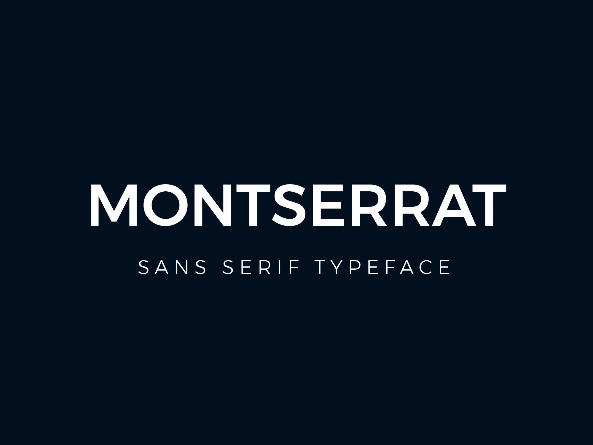
Montserrat is a geometric sans-serif typeface designed by Julieta Ulanovsky in 2011, released through Google Fonts under the SIL Open Font License. It delivers consistent stroke widths and high x-height across nine weights, making it well-suited for infographic headlines and section labels.
Montserrat works best for infographic headings and callout text because its large x-height maintains legibility at display sizes (24px and above) while its wide apertures keep letterforms distinct at medium sizes (14px–20px). It appears on over 19 million websites and was named Fiverr’s Font of the Year in 2024 based on usage in logo and infographic design. Understanding how font psychology shapes perception helps explain why Montserrat reads as both modern and authoritative.
What makes Montserrat suitable for infographics?
Montserrat has a large x-height relative to its cap height, which improves legibility for labels and subheadings within dense infographic layouts. It supports 9 weights from Thin 100 to Black 900, giving designers full control over visual hierarchy without switching typefaces. Its consistent stroke width (near-zero contrast between thick and thin strokes) renders cleanly at both screen and print resolutions.
Key attributes:
| Attribute | Value |
| Classification | Geometric sans-serif |
| Designer | Julieta Ulanovsky, 2011 |
| Weight range | Thin 100 – Black 900 (9 weights) |
| Variable font | No |
| Optical sizes | No |
| Recommended sizes | 14px–20px for labels; 24px+ for headings |
| Letter-spacing default | 0 (tight) |
| License | OFL – free for commercial use |
| Available on | Google Fonts, Adobe Fonts |
| Price | Free |
How does Montserrat perform in infographic contexts?
Montserrat renders sharply at headline sizes (24px–72px) due to its geometric construction and even stroke weight. At smaller sizes (below 12px), some letterforms like “a” and “e” can feel tight in dense infographic layouts — body text below 12px benefits from a switch to a humanist alternative.
What are the best pairings for Montserrat in infographics?
Montserrat pairs with Lora for contrast between geometric headers and calligraphic body text, and with Open Sans when a neutral, high-legibility companion is needed for data labels. The Montserrat + Open Sans combination is the more common choice in data-heavy infographics. A font pairing generator can help test these combinations quickly. More Montserrat pairing options are worth reviewing before finalizing a layout.
What are the limitations of Montserrat for infographics?
Montserrat lacks tabular (fixed-width) numerals in its standard release, which makes number columns in data tables visually misaligned. It also does not include optical size variants, so performance below 12px is not optimized for dense label text.
Montserrat – Recommended Use Cases Within Infographic Design
- Best for: Section headings, callout statistics, and title text at 24px and above
- Avoid for: Body copy below 12px, numerical data tables requiring aligned columns
- Optimal weight: SemiBold 600 for section headers; Bold 700 for primary titles
- Optimal size range: 18px–48px for most infographic heading roles
—
Roboto
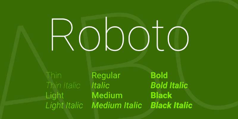
Roboto is a neo-grotesque sans-serif typeface designed by Christian Robertson in 2011, released by Google under the Apache License. It provides dual-nature letterforms — geometric skeleton with humanist curves — making it effective for both headings and body text within a single infographic layout.
Roboto suits infographic body copy and data labels because its dual-nature construction maintains natural reading rhythm while its generous x-height keeps characters distinct at 10px–14px. It is the default font on Android and across Google services including Maps, YouTube, and Google Play, giving it unmatched rendering optimization across screen environments.
What makes Roboto suitable for infographics?
Roboto has a high x-height and wide apertures in characters like “c,” “e,” and “a,” which reduce character confusion at small label sizes. It supports 6 weights from Thin 100 to Black 900 (plus condensed styles), covering every hierarchy level in an infographic without font switching. Stroke contrast is low, which helps it render consistently across low-DPI and high-DPI screens.
| Attribute | Value |
| Classification | Neo-grotesque sans-serif |
| Designer | Christian Robertson, 2011 |
| Weight range | Thin 100 – Black 900 (6 weights + condensed) |
| Variable font | Yes (Roboto Flex, released 2022) |
| Optical sizes | Yes (via Roboto Flex variable axes) |
| Recommended sizes | 10px–14px for labels; 18px+ for headings |
| Letter-spacing default | 0 |
| License | Apache License – free for commercial use |
| Available on | Google Fonts, Adobe Fonts |
| Price | Free |
How does Roboto perform in infographic contexts?
Roboto renders clearly at 10px–14px on both low-DPI and high-DPI screens, making it one of the most reliable options for small data labels and chart annotations. Roboto Flex (the variable version) adds optical size and grade axes, allowing fine-tuned weight adjustments without changing the font size — useful in dense infographic layouts where weight differentiation matters more than size changes.
What are the best pairings for Roboto in infographics?
Roboto pairs with Playfair Display for a strong contrast between utilitarian body text and editorial-style headings, and with Oswald when a condensed, high-impact headline is needed. Roboto + Oswald is a widely used combination in data journalism and dashboard design. See more Roboto pairing combinations for infographic-specific contexts.
What are the limitations of Roboto for infographics?
Roboto’s default proportional figures (rather than tabular figures) can cause number misalignment in data tables unless tabular figure OpenType features are explicitly enabled. The original 2011 design also received criticism for inconsistent letterform construction, though the 2014 redesign addressed most of those issues.
Roboto – Recommended Use Cases Within Infographic Design
- Best for: Data labels, chart annotations, body copy, and secondary text at 10px–16px
- Avoid for: Large display headlines where its neutral character lacks visual impact
- Optimal weight: Regular 400 for body labels; Medium 500 or Bold 700 for subheadings
- Optimal size range: 10px–16px for labels; 20px–36px for section headers
—
Open Sans
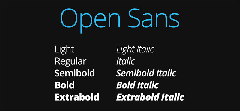
Open Sans is a humanist sans-serif typeface designed by Steve Matteson at Ascender Corp, released in 2011 through Google Fonts under the Apache License. It carries wide apertures and upright stress across 897 glyphs, optimized for legibility in user interfaces and body text.
Open Sans works best for infographic body copy and supporting text because its humanist proportions — wider than geometric alternatives — reduce reading fatigue in multi-paragraph text blocks. It is the most widely used font on Google Fonts, appearing on over 18 million websites, and was specifically optimized for print, web, and mobile interfaces.
What makes Open Sans suitable for infographics?
Open Sans has wide apertures across its lowercase letters, particularly “a,” “c,” “e,” and “g,” which distinguishes characters clearly at 10px–14px. Its upright stress (no italic lean in regular weight) keeps text stable in horizontal layout blocks. The family covers 5 weights from Light 300 to ExtraBold 800 with matching italics, supporting full hierarchy across a single infographic design.
| Attribute | Value |
| Classification | Humanist sans-serif |
| Designer | Steve Matteson, 2011 |
| Weight range | Light 300 – ExtraBold 800 (5 weights) |
| Variable font | Yes |
| Recommended sizes | 10px–16px for body text; 20px+ for headings |
| Letter-spacing default | 0 (slightly wide) |
| License | Apache License – free for commercial use |
| Available on | Google Fonts, Adobe Fonts |
| Price | Free |
How does Open Sans perform in infographic contexts?
Open Sans renders clearly at 10px on standard displays due to its wide apertures and low stroke contrast. Its 897-character glyph set includes extensive diacritic support, making it one of the most reliable options for multilingual infographics. At large display sizes (48px+), it reads as neutral and clean — effective for labels but less distinctive as a primary headline font.
What are the best pairings for Open Sans in infographics?
Open Sans pairs with Oswald for a high-contrast combination — condensed Gothic headings against wide humanist body text. It also pairs with Playfair Display when editorial warmth is needed in the headline role. The Oswald + Open Sans pairing is standard practice in data journalism layouts. For more structured approaches to combining typefaces, reviewing font combinations by role is helpful.
What are the limitations of Open Sans for infographics?
Open Sans lacks optical size variants, so it does not auto-adjust weight or spacing for very small text. Its weight range stops at ExtraBold 800, meaning it cannot produce the heaviest Black-weight headlines that condensed alternatives like Oswald provide.
Open Sans – Recommended Use Cases Within Infographic Design
- Best for: Body copy, supporting text, footnotes, and data source labels
- Avoid for: Primary display headlines where stronger visual weight is needed
- Optimal weight: Regular 400 for body; SemiBold 600 for subheadings
- Optimal size range: 10px–18px for labels and body text
—
Lato
Lato is a humanist sans-serif typeface designed by Łukasz Dziedzic in 2010, released through Google Fonts under the Open Font License. It uses semi-rounded letterforms with classical proportions, producing a typeface that reads as structured in large sizes and warm at small sizes.
Lato suits infographic body text and label roles because its semi-rounded details distinguish characters at small sizes (10px–14px) while its classical proportions maintain reading rhythm across longer text blocks. It appears on over 8 million websites and is used by brands including Merriam-Webster and GoFundMe for primary body text.
What makes Lato suitable for infographics?
Lato’s semi-rounded terminals on letters like “t,” “r,” and “l” add subtle distinctiveness that helps readers differentiate characters in dense label text. It covers 10 weights from Hairline 100 to Black 900 (the widest range of any font on this list), making it practical for complete infographic systems built on a single typeface. Its classical proportions keep line spacing consistent at both 10px and 48px.
| Attribute | Value |
| Classification | Humanist sans-serif |
| Designer | Łukasz Dziedzic, 2010 |
| Weight range | Hairline 100 – Black 900 (10 weights) |
| Variable font | No |
| Recommended sizes | 10px–16px for body; 22px+ for headings |
| Letter-spacing default | 0 |
| License | OFL – free for commercial use |
| Available on | Google Fonts, Adobe Fonts |
| Price | Free |
How does Lato perform in infographic contexts?
Lato maintains consistent character spacing at sizes from 10px to 72px without requiring manual tracking adjustments, which is useful in infographic layouts where the same typeface appears across multiple size roles. Its Hairline 100 weight works well for decorative large text (100px+), while its Black 900 weight creates high-impact callout numbers. That weight range within a single family is uncommon for a free font.
What are the best pairings for Lato in infographics?
Lato pairs with Merriweather for a warm sans-serif/serif combination in editorial infographics, and with Montserrat when a geometric headline contrast is needed. The Lato + Merriweather pairing is common in long-form editorial layouts. For a fully geometric visual system, Lato body text under Montserrat headings works reliably.
What are the limitations of Lato for infographics?
Lato is not available as a variable font, so each weight requires a separate file — a consideration for web-based infographics where file size affects load time. Its glyph set, while large, does not cover as many non-Latin scripts as Roboto or Open Sans.
Lato – Recommended Use Cases Within Infographic Design
- Best for: Body text, supporting callouts, and single-typeface infographic systems
- Avoid for: Web infographics where minimizing HTTP requests is a priority
- Optimal weight: Regular 400 for body; Bold 700 for subheadings; Black 900 for callout numbers
- Optimal size range: 10px–20px for labels; 28px–72px for display numbers
—
Raleway
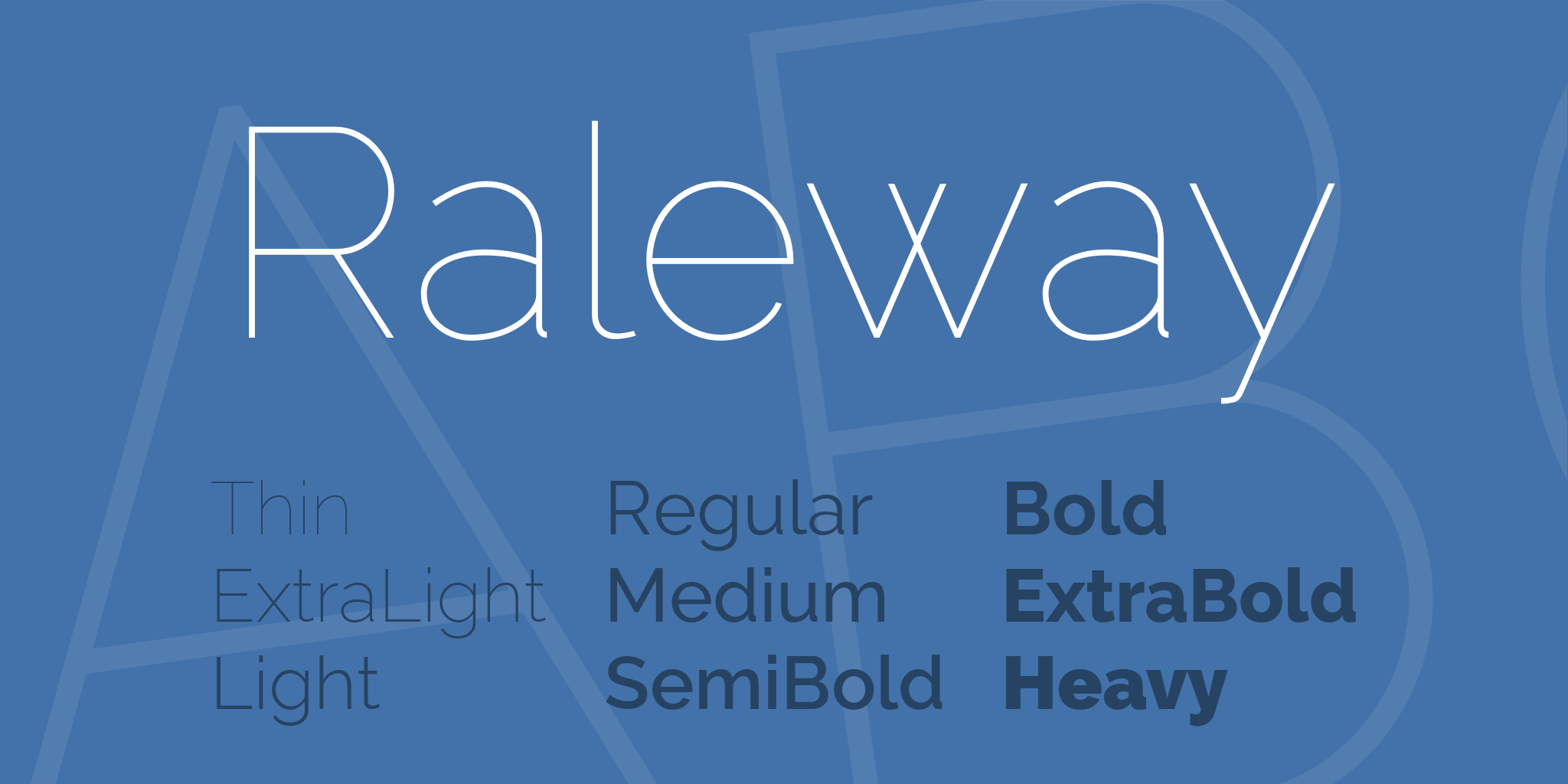
Raleway is a neo-grotesque sans-serif typeface originally designed by Matt McInerney in 2010 as a single Thin weight, then expanded to 18 styles by a team including Pablo Impallari and Rodrigo Fuenzalida in 2012, available through Google Fonts under the OFL. Its distinctive letterforms — particularly the crossed “W” — make it recognizable at display sizes.
Raleway works best for infographic section headers and accent text because its elegant proportions and unique character details create strong visual differentiation from body fonts. Its Thin weight (100) renders exceptionally at large display sizes (48px+), where it creates maximum contrast against heavier body text weights.
What makes Raleway suitable for infographics?
Raleway has wide letter proportions and generous tracking in its lighter weights, which produces strong headline presence without requiring large type sizes. Its 9 weights from Thin 100 to Heavy 900 cover all heading hierarchy levels. At Regular 400 and above, it reads clearly at 16px — though its design intention is for large display use rather than small body text.
| Attribute | Value |
| Classification | Neo-grotesque sans-serif |
| Designer | Matt McInerney, 2010; expanded 2012 |
| Weight range | Thin 100 – Heavy 900 (9 weights + italics) |
| Variable font | No |
| Recommended sizes | 18px–16px for subheadings; 32px+ for primary headings |
| Letter-spacing default | Wide (especially in lighter weights) |
| License | OFL – free for commercial use |
| Available on | Google Fonts, Adobe Fonts |
| Price | Free |
How does Raleway perform in infographic contexts?
Raleway’s Thin and ExtraLight weights (100–200) produce high-impact decorative headings at 48px+ with minimal visual weight — effective for background-layer text or secondary stat labels in complex infographic layouts. At 14px and below, its open spacing creates legibility issues in dense label text; other typefaces on this list perform better at those sizes.
What are the best pairings for Raleway in infographics?
Raleway pairs with Open Sans for a clean, neutral body text contrast, and with Lora when a more editorial, calligraphic body style is needed. Open Sans is the more practical pairing for data-heavy infographics. For the full range of alternatives similar to Raleway, it helps to compare proportions side-by-side before deciding.
What are the limitations of Raleway for infographics?
Raleway is not well-suited to body text below 14px — its wide tracking reduces information density and increases horizontal space requirements in tight layouts. It lacks tabular figures, which limits its use for numerical data alignment in tables and charts.
Raleway – Recommended Use Cases Within Infographic Design
- Best for: Primary headings, section titles, and decorative large-scale numbers (48px+)
- Avoid for: Body copy, chart annotations, and any text below 14px
- Optimal weight: Thin 100–ExtraLight 200 for decorative headers; SemiBold 600 for functional headings
- Optimal size range: 24px–96px for headline roles
—
Oswald
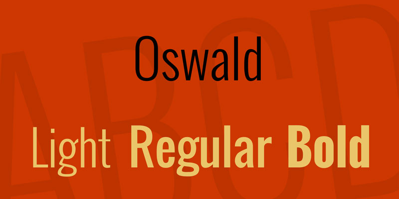
Oswald is a condensed Gothic sans-serif typeface designed by Vernon Adams in 2011, released through Google Fonts under the SIL Open Font License. It reworks the classic Alternate Gothic style with characters redrawn for digital screen rendering.
Oswald works best for infographic headings in space-constrained layouts because its condensed proportions deliver high visual impact per horizontal pixel. It is used on 7.2 million websites and is Tableau’s recommended condensed option for dashboard headings and data visualization interfaces.
What makes Oswald suitable for infographics?
Oswald’s tall x-height and narrow character width allow it to fit long heading text in tight column layouts without reducing font size. It covers 7 weights from ExtraLight 200 to Heavy 900 and includes a variable weight axis (added in 2019), enabling smooth weight transitions without file switching. Its uniform stroke weight and clean terminals maintain clarity at both small (14px) and large (72px+) sizes.
| Attribute | Value |
| Classification | Condensed Gothic sans-serif |
| Designer | Vernon Adams, 2011 |
| Weight range | ExtraLight 200 – Heavy 900 (7 weights) |
| Variable font | Yes (weight axis) |
| Recommended sizes | 16px+ for headings; avoid below 12px for body |
| Letter-spacing default | Tight |
| License | OFL – free for commercial use |
| Available on | Google Fonts, Adobe Fonts |
| Price | Free |
How does Oswald perform in infographic contexts?
Oswald renders with high contrast against wide-proportioned body fonts like Open Sans or Lato, creating clear typographic separation between heading and body roles without relying on size alone. Its condensed form means more heading characters fit per line — useful in multi-column infographic layouts. At 14px and below in body text roles, its tight letter-spacing causes crowding and reduces readability.
What are the best pairings for Oswald in infographics?
Oswald pairs with Open Sans for a contrasting combination of condensed headings and wide humanist body text — the most common pairing in data journalism. It pairs with Lato when a slightly warmer body text tone is needed. The Oswald + Open Sans combination is standard practice in dashboard and infographic design. See alternatives to Oswald if a less common condensed option is preferred.
What are the limitations of Oswald for infographics?
Oswald’s condensed proportions make it unsuitable for body copy — its tight default letter-spacing reduces readability below 14px. It does not include optical size variants, and its italic styles are obliques (mechanically slanted), not true italics with redrawn letterforms.
Oswald – Recommended Use Cases Within Infographic Design
- Best for: Section headings, stat callouts, and bold labels in column-constrained layouts
- Avoid for: Body copy, footnotes, and reversed-out text on textured backgrounds
- Optimal weight: Regular 400–Bold 700 for headings; Heavy 900 for primary stat numbers
- Optimal size range: 18px–64px for heading roles
—
Poppins
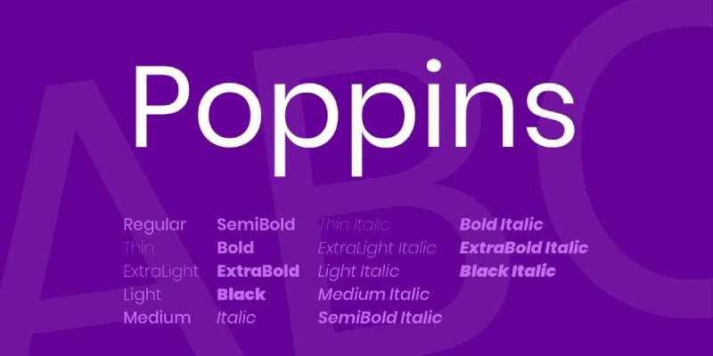
Poppins is a geometric sans-serif typeface designed by Jonny Pinhorn at the Indian Type Foundry, released through Google Fonts in 2014 under the SIL Open Font License. Each letterform is built on pure geometric forms — primarily circles — with near-monolinear stroke widths.
Poppins works across both heading and body roles in infographics because its circular construction produces consistent optical spacing at multiple size ranges. It consistently ranks among the top 10 most-used Google Fonts families, with billions of weekly views, and is optimized for both Latin and Devanagari scripts.
What makes Poppins suitable for infographics?
Poppins uses near-monolinear strokes with optical corrections at joints — this produces even typographic color (consistent perceived weight) across a text block, which matters in infographic layouts where multiple text elements appear at different sizes. It supports 9 weights from Thin 100 to Black 900, each with matching italics (18 styles total), covering every hierarchy level. Its proportional spacing is consistent across all 9 weights, so switching weights does not disrupt layout alignment.
| Attribute | Value |
| Classification | Geometric sans-serif |
| Designer | Jonny Pinhorn / Indian Type Foundry, 2014 |
| Weight range | Thin 100 – Black 900 (9 weights + matching italics) |
| Variable font | No |
| Optical sizes | No |
| Recommended sizes | 12px–18px for body; 24px+ for headings |
| Letter-spacing default | 0 (slightly wide) |
| License | OFL – free for commercial use |
| Available on | Google Fonts, Adobe Fonts |
| Price | Free |
How does Poppins perform in infographic contexts?
Poppins performs well at 12px–18px for body text in screen-based infographics, where its circular letterforms remain open and distinct. Its proportional (not tabular) figures create misalignment in numerical columns when figures vary in digit count — this is worth checking before using Poppins in table-heavy data layouts. More Poppins pairing options are available if the default geometric feel needs contrast.
What are the best pairings for Poppins in infographics?
Poppins pairs with Merriweather for a geometric-sans-over-serif combination in editorial infographics, and with Open Sans when a neutral, wide-aperture body text is needed for data-dense sections. The Poppins + Open Sans combination is increasingly common in SaaS dashboard and report design.
What are the limitations of Poppins for infographics?
Poppins uses proportional figures rather than tabular figures by default, causing number misalignment in data tables without manual OpenType adjustments. It is not available as a variable font, requiring separate file loads for each weight in web-based infographics.
Poppins – Recommended Use Cases Within Infographic Design
- Best for: Heading text, subheadings, and body copy at 12px–18px in screen infographics
- Avoid for: Numerical data tables requiring tabular figure alignment
- Optimal weight: Regular 400 for body; SemiBold 600 or Bold 700 for headings
- Optimal size range: 12px–20px for body; 24px–48px for headings
—
Source Sans Pro
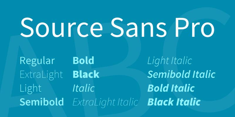
Source Sans Pro (now officially Source Sans 3) is a humanist/grotesque sans-serif typeface designed by Paul D. Hunt, released by Adobe in 2012 as Adobe’s first open-source typeface under the SIL Open Font License. It was designed specifically for user interface legibility, drawing on Franklin Gothic and News Gothic as structural references.
Source Sans Pro works best for infographic body text and data labels because its humanist proportions and wide apertures produce clean character differentiation at 10px–16px. It was adopted as the body text standard in Adobe’s own design documentation and UI systems, which reflects its performance in text-dense digital layouts.
What makes Source Sans Pro suitable for infographics?
Source Sans Pro has wide apertures on lowercase letters and a high x-height relative to cap height — two structural attributes that keep characters distinct at small display sizes. It supports 6 weights from ExtraLight 200 to Black 900, and the 2022 update (Source Sans 3) added variable font support with weight and width axes. Its low stroke contrast renders consistently across print and screen output, which matters for infographics distributed in both formats.
| Attribute | Value |
| Classification | Humanist/Grotesque sans-serif |
| Designer | Paul D. Hunt / Adobe, 2012 |
| Weight range | ExtraLight 200 – Black 900 (6 weights) |
| Variable font | Yes (Source Sans 3, 2022) |
| Recommended sizes | 10px–16px for body/labels; 22px+ for headings |
| Letter-spacing default | 0 (neutral) |
| License | OFL – free for commercial use |
| Available on | Google Fonts, Adobe Fonts |
| Price | Free |
How does Source Sans Pro perform in infographic contexts?
Source Sans Pro renders with greater clarity than geometric alternatives at 10px–12px, due to its humanist construction and wide apertures. Its neutral design means it does not compete visually with data elements — charts, icons, or color-coded categories — which is a practical advantage in information-dense infographic layouts where the type should support, not dominate, the visual content.
What are the best pairings for Source Sans Pro in infographics?
Source Sans Pro pairs with Playfair Display for editorial infographics requiring a serif headline contrast, and with Oswald when condensed, space-efficient headings are needed. The Source Sans Pro + Playfair Display combination appears frequently in news publication data graphics. More pairing ideas are available from Google Font pairing guides focused on editorial and data contexts.
What are the limitations of Source Sans Pro for infographics?
Source Sans Pro’s neutral visual character makes it less effective as a primary display font — at large sizes (48px+), it lacks the distinctive presence that geometric alternatives like Montserrat or Oswald provide. Its earlier versions (before Source Sans 3) do not include variable font support.
Source Sans Pro – Recommended Use Cases Within Infographic Design
- Best for: Body copy, data labels, chart annotations, and footnotes at 10px–18px
- Avoid for: Primary display headings where strong visual character is needed
- Optimal weight: Regular 400 for body; SemiBold for subheadings
- Optimal size range: 10px–18px for labels; 20px–32px for subheadings
—
Nunito

Nunito is a well-balanced sans-serif typeface originally created by Vernon Adams and later extended by Jacques Le Bailly, released through Google Fonts under the SIL Open Font License. It is defined by fully rounded terminals on all stroke endings — a structural choice that distinguishes it from other sans-serif options on this list.
Nunito works best for infographics targeting consumer audiences, education contexts, or health topics where approachable, non-corporate typography is needed. Its rounded terminals produce lower visual tension compared to flat-terminal alternatives, which affects how readers perceive the infographic’s tone.
What makes Nunito suitable for infographics?
Nunito’s fully rounded terminals maintain consistent visual softness across all weights without requiring style adjustments. It supports weights from ExtraLight 200 to Black 900 (8 weights), with matching italics. Its x-height is generous, keeping characters readable at 11px–14px in label contexts. Understanding the structural principles behind humanist typefaces helps explain why Nunito’s construction produces this tonal effect.
| Attribute | Value |
| Classification | Rounded sans-serif |
| Designer | Vernon Adams; extended by Jacques Le Bailly |
| Weight range | ExtraLight 200 – Black 900 (8 weights) |
| Variable font | Yes |
| Recommended sizes | 11px–16px for body; 22px+ for headings |
| Letter-spacing default | 0 (neutral) |
| License | OFL – free for commercial use |
| Available on | Google Fonts, Adobe Fonts |
| Price | Free |
How does Nunito perform in infographic contexts?
Nunito renders cleanly in screen-based infographics at 11px–16px, where its rounded terminals remain visible and contribute to character differentiation. In print infographics at small sizes (below 10px), the rounded terminals can fill in slightly depending on print quality — flat-terminal alternatives perform more reliably in high-density print output. More Nunito pairing options are worth reviewing to find the right contrast partner for a given infographic layout.
What are the best pairings for Nunito in infographics?
Nunito pairs with Playfair Display for an editorial contrast between rounded sans-serif body text and high-contrast serif headings. It pairs with Montserrat when a geometric, more structured headline style is preferred. The Nunito + Playfair Display combination works well in health, education, and lifestyle infographic contexts where the tonal contrast between approachable body text and authoritative headings is intentional.
What are the limitations of Nunito for infographics?
Nunito’s rounded terminals can reduce print sharpness below 10px at standard print resolutions. Its proportional figures (not tabular) create alignment issues in numerical data tables without manual OpenType adjustments.
Nunito – Recommended Use Cases Within Infographic Design
- Best for: Consumer-facing, health, education, and lifestyle infographics at 11px–18px
- Avoid for: High-density print labels below 10px; numerical data tables
- Optimal weight: Regular 400 for body; Bold 700 for subheadings
- Optimal size range: 11px–18px for body; 22px–40px for headings
—
Inter

Inter is a neo-grotesque sans-serif typeface designed by Rasmus Andersson, first released in 2017 under the SIL Open Font License. It was built specifically to improve on-screen readability for UI text at small sizes, addressing limitations Andersson identified in Roboto for interface use.
Inter works best for screen-based infographics — especially interactive or web-delivered formats — because its tall x-height and tight optical spacing were optimized for 10px–16px display at screen resolution. Figma, Linear, GitHub, and Mozilla use Inter as their primary interface font, which reflects its performance in data-dense screen environments.
What makes Inter suitable for infographics?
Inter has a tall x-height (taller than Roboto at equivalent point sizes) and large counters in letters like “o,” “e,” and “c,” keeping character shapes open at 10px–14px on standard displays. It supports 9 weights from Thin 100 to Black 900, all with matching italics, and is available as a variable font with weight and italic axes. Inter also includes tabular figures by default — an advantage over most fonts on this list for numerical data alignment in charts and tables.
| Attribute | Value |
| Classification | Neo-grotesque sans-serif |
| Designer | Rasmus Andersson, 2016–2017 |
| Weight range | Thin 100 – Black 900 (9 weights) |
| Variable font | Yes (weight + italic axes) |
| Optical sizes | Yes (Inter Display variant for 48px+) |
| Recommended sizes | 10px–16px for UI labels; 24px+ with Inter Display |
| Letter-spacing default | Tight |
| License | OFL – free for commercial use |
| Available on | Google Fonts, rsms.me/inter |
| Price | Free |
How does Inter perform in infographic contexts?
Inter includes both tabular and proportional figure variants, making it one of the most technically complete options for numerical infographic layouts. Its Inter Display variant (for 48px+) has adjusted spacing and slightly different letterform proportions than the text variant — using both together across a single infographic produces optimal rendering at each size level. No other font on this list offers that level of optical size differentiation for free. The Inter pairing combinations are worth reviewing for finding the right headline contrast at display sizes.
What are the best pairings for Inter in infographics?
Inter pairs with Playfair Display for strong editorial contrast between utilitarian body text and high-contrast serif headings. It also pairs with Oswald when condensed headline weight is needed over a neutral body. The Inter + Playfair Display combination appears frequently in data journalism and financial report design. Explore alternatives to Inter if a warmer, less technical character is needed.
What are the limitations of Inter for infographics?
Inter’s neutral, technical character makes it visually undistinctive at large display sizes (above 48px) — the Inter Display variant improves this, but it still lacks the graphic impact of condensed or geometric alternatives. Its tight default letter-spacing at smaller weights (Thin 100, Light 300) requires tracking adjustments for legibility below 12px.
Inter – Recommended Use Cases Within Infographic Design
- Best for: Screen-based infographics, data labels, numerical tables, and chart annotations at 10px–18px
- Avoid for: Primary display headlines where distinctive character is needed (use Inter Display or switch to a geometric alternative)
- Optimal weight: Regular 400 for body; Medium 500–SemiBold 600 for subheadings; Bold 700 for headings
- Optimal size range: 10px–18px for data labels; use Inter Display at 48px+
—
Choosing the Right Infographic Font
No single font works for every infographic layout. The right choice depends on the output format (screen vs. print), the data density, the audience, and the number of hierarchy levels required.
The table below maps each font to its primary infographic role, strongest size range, and a key structural reason for that recommendation.
| Font | Primary Role | Strongest Size Range | Key Structural Advantage |
| Montserrat | Headings, callouts | 18px–48px | Large x-height, 9-weight range |
| Roboto | Body text, labels | 10px–16px | High x-height, wide apertures, variable font |
| Open Sans | Body text, supporting text | 10px–18px | Wide apertures, 897-glyph set |
| Lato | Body text, full-system font | 10px–20px | 10-weight range, classical proportions |
| Raleway | Display headings | 24px–96px | Wide proportions, Thin 100 weight |
| Oswald | Condensed headings | 18px–64px | Condensed form, tall x-height, variable weight |
| Poppins | Headings + body | 12px–48px | Monolinear strokes, 18 styles |
| Source Sans Pro | Body text, labels | 10px–18px | Humanist apertures, neutral design |
| Nunito | Consumer body text | 11px–18px | Rounded terminals, variable font |
| Inter | Screen labels, data tables | 10px–18px | Tabular figures, optical sizes, variable font |
A practical starting point: pair Inter or Source Sans Pro for body text and labels, then use Montserrat, Oswald, or Raleway for headings depending on how much horizontal space is available. Understanding the difference between serif and sans-serif fonts helps clarify when to introduce a serif typeface — like Playfair Display or Lora — as a headline contrast to any of the sans-serif options above.
Font licensing matters too, especially for infographics used in commercial publications, client reports, or distributed digital content. All ten fonts on this list are free for commercial use under OFL or Apache licenses — but it is worth reviewing font licensing rules before distributing modified versions or embedding fonts in client deliverables.
For infographics targeting specialized formats — presentations, reports, or social posts — more specific guidance exists for fonts for PowerPoint presentations and fonts for Google Slides, where rendering environments differ from standard graphic design tools.
What Determines a Good Font for an Infographic?
Font choice in infographic design is structural, not aesthetic. The attributes that make a typeface work at 10px for a chart label are different from what makes it work at 48px for a headline.
Monotype’s 2024 Global Font Use Survey found that 76% of designers rank readability and accessibility as their top criteria when selecting a typeface. For infographics specifically, that priority maps to five measurable attributes.
| Attribute | What It Measures | Why It Matters for Infographics |
| X-height | Height of lowercase letters vs. cap height | Higher x-height = better legibility at small label sizes |
| Stroke contrast | Ratio of thick to thin strokes | Low contrast renders cleanly at screen resolution |
| Weight range | Number of available weights (Thin to Black) | More weights = more hierarchy levels without switching fonts |
| Figure type | Tabular vs. proportional numerals | Tabular figures align number columns in charts and tables |
| Aperture width | Openness of curved letters like c, e, a | Wide apertures reduce character confusion at 10px–14px |
How x-height affects label legibility in infographic layouts
X-height controls how large lowercase letters appear at a given point size. A font with a tall x-height renders its lowercase characters noticeably larger than a font with the same point size but a shorter x-height.
This matters most for data labels and chart annotations, where text often sits at 10px–14px. Inter, Roboto, and Open Sans all have high x-heights optimized for exactly this size range.
- At 10px, a high x-height keeps “a,” “e,” and “c” shapes distinct
- At 14px, it reduces the need to increase font size just for legibility
- At 24px+, x-height becomes less critical; other attributes take over
Why tabular figures matter for data alignment
Tabular figures are fixed-width numerals where every digit (0–9) occupies the same horizontal space. Proportional figures vary in width, which causes columns to misalign when digit counts differ.
A column showing “1,200” and “10,000” will visually misalign in a proportional font. The same column in a tabular font aligns perfectly without manual spacing.
Inter includes tabular figures by default. Roboto, Montserrat, and Poppins use proportional figures in their standard release, requiring OpenType feature activation to access tabular alternatives.
—
Sans-Serif vs. Serif Fonts in Infographic Design
An analysis of 1,000 websites found that 85% use sans-serif fonts as their primary typeface (Toner Buzz, 2024). In infographic design specifically, the split is even more pronounced toward sans-serif.
Understanding the difference between a serif font and a sans-serif font at a structural level explains why.
Why sans-serif dominates infographic typography
Sans-serif fonts have uniform stroke widths and no terminal decorations. Those two properties produce cleaner rendering at small sizes on low-DPI screens.
The structural reasons:
- Low stroke contrast renders consistently across screen resolutions
- Clean terminals don’t bleed or fill in at 10px on standard monitors
- Geometric and humanist sans-serifs maintain open apertures at label sizes
Research comparing sans-serif and serif fonts on screen (ResearchGate, 2024) found that minimalist layouts with sans-serif typography produced better comprehension and perceived clarity than serif alternatives. Tableau’s suite of eight “Tableau-Safe Fonts” for data visualization contains exclusively sans-serifs: Lato, Open Sans, Oswald, Poppins, Montserrat, Raleway, Noto Sans, and the Tableau family.
When a serif font adds value in an infographic layout
Serifs are not categorically wrong for infographics. They serve specific roles when the context calls for editorial warmth or print output.
Use a serif heading when:
- The infographic targets a print audience (magazines, reports, brochures)
- The content is editorial or long-form, not data-dense
- The headline sits at 32px or above, where serif detail is visible
Avoid serifs for:
- Data labels and chart annotations below 16px
- Body copy in screen-first infographic formats
- Reversed-out text on dark or textured backgrounds
Visual Capitalist, which produces data-heavy editorial infographics widely shared on the web, uses serif display headings paired with sans-serif body and label text. That split is the most common professional approach when a serif is used at all.
—
How to Build a Font System for an Infographic
Most infographic designs work with two typefaces, sometimes three. Toptal’s web typography guide puts the ceiling at three fonts per design before visual disorientation becomes a problem.
WhatFontIs data shows the average branding project uses exactly three fonts. For infographics, two is the more reliable ceiling for data-heavy layouts.
Which font role to assign first: heading or body?
Start with the body and label font. It imposes the most constraints.
Body and label text operates at the smallest sizes in the layout (10px–16px). Choosing a font that performs well at those sizes first narrows the heading candidates down to whatever provides clear contrast against it.
Body font first, then heading: Pick a legible humanist or grotesque sans-serif for labels (Inter, Roboto, Open Sans, Source Sans Pro). Then pick a heading font that contrasts by classification, weight, or proportion.
The contrast types that work:
- Classification contrast: Geometric heading (Montserrat, Oswald) + humanist body (Open Sans, Lato)
- Weight contrast: Bold or Black heading weight + Regular body weight from the same family
- Proportion contrast: Condensed heading (Oswald) + wide body (Open Sans, Source Sans Pro)
Knowing how to pair fonts effectively reduces the time spent testing combinations from hours to minutes.
How to pair a condensed heading font with a wide body font
Oswald + Open Sans is the standard condensed-plus-wide pairing in data journalism and dashboard design.
The pairing works because the proportional contrast does the visual work. Oswald’s narrow letterforms create a clear vertical rhythm in the heading; Open Sans’s wider proportions make body text and labels easy to scan horizontally.
Spacing adjustments that make this pairing work:
- Oswald heading: tracking at 0 or slightly positive (0.02em–0.05em) at 24px+
- Open Sans body: leading at 1.4x–1.6x the font size for comfortable line spacing
Understanding font spacing mechanics prevents the most common layout mistake: tight heading tracking combined with cramped body leading. A font pairing generator is worth using before committing to a layout, especially when testing condensed-plus-wide combinations at multiple size levels.
—
Font Licensing Rules for Infographic Use
47% of designers say font licensing is challenging to navigate and manage (Monotype, 2024). That number is higher for infographic designers who distribute work across formats.
Approximately 68% of U.S. digital marketing agencies purchase commercial font licenses for branding and design projects (Business Research Insights, 2024). For infographics specifically, the licensing question changes depending on how the file is delivered.
What OFL, Apache, and commercial licenses permit in infographic delivery
All 10 fonts covered in this article (Montserrat, Roboto, Open Sans, Lato, Raleway, Oswald, Poppins, Source Sans Pro, Nunito, Inter) are licensed under OFL or Apache licenses. Both permit commercial use, modification, and redistribution without fee.
OFL (SIL Open Font License): Permits commercial use, modification, and embedding. Does not permit selling the font files themselves as standalone products.
Apache License: Same commercial permissions as OFL, with slightly more permissive redistribution terms. Roboto is licensed under Apache.
The distinction that catches designers is the difference between using a font and embedding it. Understanding font licensing rules before delivering client files is worth the 15 minutes it takes.
Where licensing gets tricky for infographic designers
Free-for-use fonts become licensing issues in three specific delivery scenarios.
PDF embedding: Embedding a font in a PDF is technically a form of redistribution. OFL and Apache licenses permit this, but some commercial licenses (Adobe Fonts, Monotype’s standard licenses) restrict PDF embedding to specific tiers.
Client deliverables: Delivering an editable design file (Figma, Illustrator, InDesign) that contains font data means the client receives the font. If the font is licensed to the designer but not the client, this creates a compliance issue.
White-labeled reports: Reports produced for clients that embed fonts for print production fall under print licensing, not web or desktop licensing. These are separate license tiers in most commercial font systems.
For the 10 fonts in this article, none of those scenarios create legal exposure. All are OFL or Apache licensed.
—
How Font Choice Changes Across Infographic Types
The best font for a data visualization dashboard is not the same as the best font for a long-form editorial infographic. The output format, audience, and data density all change the evaluation.
Venngage’s 2025 infographic design trend report identified bold, legible typography as the dominant shift in infographic design, with designers moving away from decorative fonts toward typefaces optimized for clarity at multiple size levels.
Which fonts work best for data-heavy chart infographics
Data chart infographics require three specific properties: tabular figures for number alignment, high x-height for small label legibility, and enough weight range to handle heading, subheading, and annotation roles without switching typefaces.
Inter leads this category. It ships with tabular figures by default, includes a dedicated Inter Display variant for 48px+ headings, and provides a variable font with weight and italic axes. Roboto Flex (the variable version of Roboto) is the second-strongest option, offering optical size and grade axes through Roboto Flex.
Ranking for data chart use:
- Inter — tabular figures, optical sizes, variable font
- Roboto — high x-height, wide apertures, default on Google services
- Source Sans Pro — humanist apertures, clean at 10px, neutral design
Which fonts suit editorial and long-form infographic layouts
Editorial infographics tolerate more expressive typography because reading happens at larger sizes and text blocks are longer. The visual hierarchy role shifts: headlines become the primary communication tool rather than data labels.
Raleway Thin (100) or ExtraLight (200) at 48px+ creates a distinctive low-visual-weight headline that contrasts sharply against heavier body text. Playfair Display as a heading serif over Source Sans Pro or Open Sans is a common editorial combination.
Monotype’s 2024 survey notes that 83% of designers acknowledge typography’s importance in brand identity and communication. For editorial infographics, that identity signal matters as much as raw legibility.
| Infographic Type | Recommended Heading | Recommended Body/Labels |
| Data chart / Dashboard | Inter Display, Roboto Bold | Inter, Roboto, Source Sans Pro |
| Process / Step-by-step | Montserrat Bold, Oswald | Open Sans, Poppins Regular |
| Editorial / Long-form | Raleway Thin, Playfair Display | Source Sans Pro, Open Sans |
| Social media (Instagram, Pinterest) | Oswald Heavy, Montserrat Black | Lato Bold, Poppins SemiBold |
| Print report | Montserrat SemiBold | Lato, Open Sans (8pt–10pt) |
Infographic designers distributing content across social platforms should note that print-optimized fonts (particularly Lato and Open Sans) maintain legibility at 8pt–10pt in print output, while geometric alternatives like Poppins and Montserrat can produce crowding at those sizes depending on print resolution.
—
What Are the Most Common Font Mistakes in Infographic Design?
Poor typography choices can lead to a 20% decrease in reading comprehension (SuperAGI, citing Usability.gov research). For infographics, where the entire content format depends on fast visual parsing, that number hits harder than in standard editorial layouts.
Most infographic font mistakes fall into five categories.
Using the wrong font type for the wrong size role
A display font is optimized for 48px and above. Using one at 12px for body text or data labels creates illegibility because display typefaces have fine details (thin strokes, decorative terminals, exaggerated contrast) that disappear or merge at small sizes.
The same problem appears in reverse: using a body-optimized font (Inter Regular, Roboto Regular) at 72px for a primary headline produces a result that is technically legible but visually flat. Display-size text needs either heavier weight, wider tracking, or a typeface designed for that context.
The fix is simple: assign roles first, then select fonts by role. Never choose a single typeface and apply it across all size levels without checking how it performs at the extremes of your layout.
Using proportional figures in numerical data tables
This is the most common technical mistake in infographic design. Most free fonts (Poppins, Montserrat, Nunito, Lato) use proportional figures by default.
In a chart or table with varying digit counts, proportional figures produce misaligned columns. The number “1” is narrow; “8” is wide. A column containing both will appear ragged without manual spacing corrections.
- Inter: tabular figures available by default
- Roboto: tabular figures accessible via
font-feature-settings: "tnum" - Poppins, Montserrat, Lato: no tabular figure alternative in standard release
Using too many typefaces or too many weights
Three typefaces in one infographic is the practical maximum before visual hierarchy breaks down. Most professional infographic designers work with two.
Using five weights from the same typeface is the less obvious version of this mistake. Weights that are too close together (Regular 400 + Medium 500, or Bold 700 + ExtraBold 800) produce no visible hierarchy difference at typical viewing distances. The eye cannot distinguish a 100-unit weight difference reliably.
A functional infographic hierarchy uses three clearly separated weights: Regular 400 for body, SemiBold or Bold (600–700) for subheadings, and Black or Heavy (900) for primary callout numbers or titles.
Applying a script or decorative font to data labels
A script font used for body copy or chart labels fails at the most basic function of infographic typography: fast, accurate character recognition.
Script letterforms are contextual. The shape of each letter depends on its neighbors, which means isolated characters (common in chart labels and legend text) lose their legibility cues.
Decorative and script typefaces belong in headline-only roles at 36px and above, where the reader has enough size and context to parse the letterforms. Below that, legibility drops faster than in any other category of typeface.
The most widely used font statistics confirm that sans-serif dominates at the functional end of infographic design. That is not a trend. It is a structural outcome of how screen rendering, label sizes, and reading speed interact.
FAQ on The Best Fonts For Infographics
What is the best font for infographics overall?
Montserrat and Inter are the strongest all-round choices. Montserrat handles headlines well across 9 weights, while Inter provides tabular figures and optical size variants, making it the better pick for data-heavy infographic layouts.
Should I use a sans-serif or serif font in an infographic?
Sans-serif fonts dominate infographic design because their low stroke contrast renders cleanly at small label sizes on screen. Serifs work in editorial or print infographics at 32px and above, but rarely suit data labels or chart annotations.
How many fonts should an infographic use?
Two typefaces is the practical standard. One for headings, one for body text and labels. Three is the ceiling before visual hierarchy breaks down. More than three introduces noise without adding any structural benefit to the layout.
What font size should I use for infographic labels?
Data labels and chart annotations sit best at 10px–14px for screen infographics. Body text works at 12px–16px. Headlines start at 24px and scale upward depending on layout width and the number of hierarchy levels needed.
Can I use Google Fonts for commercial infographic projects?
Yes. All Google Fonts are licensed under the SIL Open Font License or Apache License, both of which permit commercial use, including client deliverables, published reports, and print output. No attribution is required for most use cases.
What font works best for data visualization and charts?
Inter is the strongest option for data visualization. It ships with tabular figures by default, which keep number columns aligned. Roboto is a reliable alternative, especially for layouts already using Google’s design system or Material Design guidelines.
What is the best font pairing for infographics?
Oswald paired with Open Sans is the most widely used combination in data journalism. Oswald provides condensed, high-impact headings while Open Sans delivers wide, readable body text. Pairing fonts by proportion contrast is more reliable than pairing by style alone.
Are variable fonts worth using in infographic design?
Variable fonts allow a single file to cover all weights and widths in a typeface. For web-based infographics, this reduces HTTP requests and file size. The HTTP Archive reported that 34% of mobile pages used variable fonts in 2024, up from 30% the previous year.
What fonts should I avoid in infographic design?
Avoid script fonts for labels or body copy. Avoid display fonts below 24px. Decorative typefaces like Lobster or Pacifico reduce legibility in data-dense layouts. Any font without at least four weights will limit your ability to build a clear visual hierarchy.
Does font choice affect how quickly people read an infographic?
Yes. Poor typography choices can reduce reading comprehension by up to 20%, according to Usability.gov research. Fonts with high x-height and wide apertures, such as Roboto and Open Sans, allow faster character recognition at the small sizes typical in chart labels and annotations.
Conclusion
This conclusion is for an article presenting the best fonts for infographics, and the core takeaway is straightforward: typeface selection is a structural decision, not a stylistic one.
Font pairing, weight range, and typographic hierarchy determine whether your infographic communicates data clearly or forces the reader to work harder than they should.
Inter and Roboto lead for data visualization. Montserrat and Oswald handle headline roles. Open Sans and Source Sans Pro cover body text and label legibility across screen and print formats.
Stick to two typefaces per layout. Prioritize x-height and aperture width for small-size text. Check your font licensing before distributing client files.
Get those fundamentals right, and the typography becomes invisible. Which is exactly what good infographic design should feel like.
Renowned for his expertise in logo design and visual branding, Bogdan has developed a multitude of logos for various clients.
His skills extend to creating posters, vector illustrations, business cards, and brochures. Additionally, Bogdan's UI kits were featured on marketplaces like Visual Hierarchy and UI8.
He also wrote in the past years on sites like Design Your Way, WebDesignerDepot, WPDean, Designmodo, Speckyboy, Slider Revolution, and more.
- The Airtable Logo History, Colors, Font, And Meaning - 12 July 2026
- How to Blur Background in Canva: A Quick Tutorial - 11 July 2026
- Typography Trends - 10 July 2026
Bogdan Sandu is a seasoned designer who has been designing websites since 2008. Renowned for his expertise in logo design and visual branding, Bogdan has developed a multitude of logos for various clients. His skills extend to creating posters, vector illustrations, business cards, and brochures. Additionally, Bogdan's UI kits were featured on marketplaces like Visual Hierarchy and UI8. He also wrote in the past years on sites like Design Your Way, WebDesignerDepot, WPDean, Designmodo, Speckyboy, Slider Revolution, and more.
You Might Also Like