Your font choice is doing more work than you think.
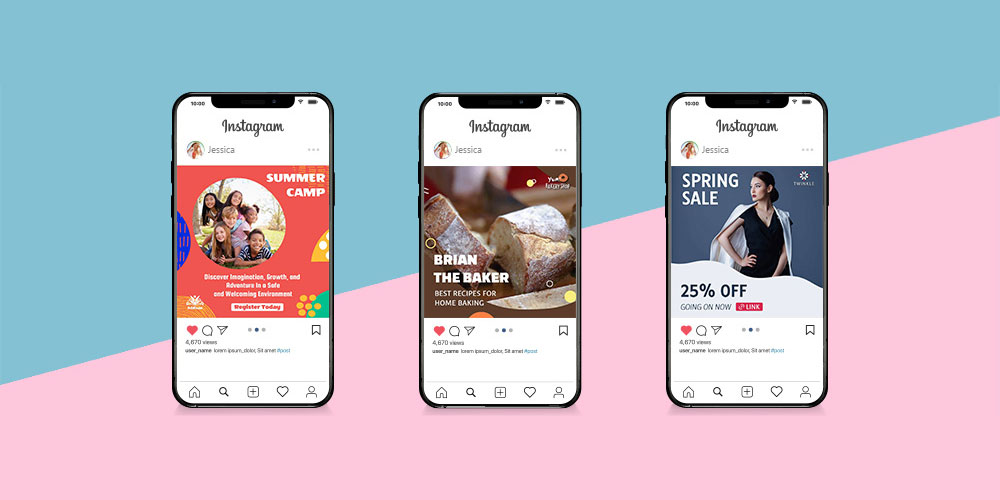
On Instagram, text gets roughly two seconds of attention before someone scrolls on. The best fonts for Instagram posts aren’t just about aesthetics — they determine whether your caption overlay is readable on a compressed mobile export, whether your carousel headline stops the scroll, and whether your brand looks consistent across every post format.
Most creators pick fonts by feel. That works until it doesn’t.
This guide covers 10 fonts that actually perform — across social media branding, quote posts, Reels covers, and educational carousels — with the structural reasons behind each recommendation.
You’ll also find guidance on font pairing, size standards, licensing, and how to build a two-font system that stays consistent across your entire Instagram feed.
The Best Fonts For Instagram Posts
Instagram is a visual platform. Your caption font, story headline, or carousel text gets roughly two seconds of attention before someone scrolls on. The right font does most of the work before the reader even processes the words.
Font choice also affects brand recognition. Consistent Instagram typography across posts, Reels, and Stories tells viewers who you are without a logo in sight.
Below are the 10 best fonts for Instagram posts, each evaluated on classification, structural performance, pairings, and limitations.
—
Montserrat

Montserrat is a geometric sans-serif font designed by Julieta Ulanovsky in 2011, released through Google Fonts under the SIL Open Font License. It delivers clean, modern letterforms across 9 weights, making it one of the most consistent options for Instagram branding.
Montserrat suits Instagram carousels and static post headlines because its large x-height maintains legibility at sizes as small as 14px on mobile screens. It is used on over 19 million websites, which reflects its reliability across screen types and resolutions.
What makes Montserrat suitable for Instagram posts?
Montserrat has a large x-height and wide apertures in characters like ‘c’, ‘e’, and ‘a’ that reduce misread characters on small mobile displays. Its 9-weight range from Thin 100 to Black 900 supports full visual hierarchy within a single post or carousel. Letter-spacing defaults to 0, which keeps text compact without crowding at body sizes.
Key attributes:
| Attribute | Value |
| Classification | Geometric sans-serif |
| Designer | Julieta Ulanovsky, 2011 |
| Weight range | Thin 100 – Black 900 (9 weights) |
| Variable font | No |
| Recommended sizes | 14px+ for captions; 24px+ for headlines |
| Letter-spacing default | 0 |
| License | OFL – free for commercial use |
| Available on | Google Fonts, Adobe Fonts |
| Price | Free |
How does Montserrat perform on Instagram?
Montserrat renders clearly at 14px–16px on modern smartphone screens, making it one of the few geometric sans-serifs that works for both caption overlays and bold headlines. Its uniform stroke width prevents letterforms from breaking down on compressed social media image exports. Bold 700 and Black 900 deliver strong contrast against photographic backgrounds without requiring a text stroke.
What are the best pairings for Montserrat on Instagram?
Montserrat pairs with Playfair Display for high contrast between geometric and editorial styles, making it a standard choice for fashion and lifestyle accounts. It pairs with Lato when a warmer, softer body text tone is needed for educational or wellness content.
What are the limitations of Montserrat for Instagram?
Montserrat’s geometric structure gives it a neutral tone that can feel generic when used without weight variation. The Thin and ExtraLight weights drop below useful legibility at sizes under 16px on compressed Instagram exports.
Montserrat – Recommended Use Cases Within Instagram Posts
- Best for: Carousel headlines, educational post titles, brand announcement graphics
- Avoid for: Small caption body text below 14px; reversed-out text on textured or busy backgrounds
- Optimal weight: SemiBold 600 for headlines; Regular 400 for supporting text
- Optimal size range: 18px–36px for headlines; 14px–16px for captions
—
Playfair Display

Playfair Display is a transitional serif font designed by Claus Eggers Sørensen in 2011, available on Google Fonts and Adobe Fonts under the SIL Open Font License. It delivers high-contrast strokes across 3 weights (updated to variable in v2.1) that work specifically for display-scale text.
Playfair Display optimizes Instagram quote posts and editorial headlines because its high stroke contrast creates strong visual impact at 28px and above. Luxury and fashion brands consistently use it for post overlays because the thick-to-thin stroke variation reads as premium even at compressed image resolutions.
What makes Playfair Display suitable for Instagram posts?
Playfair Display has a large x-height and strong serifs that anchor letterforms at display sizes, improving visual weight on image overlays. The high stroke contrast between thick and thin strokes differentiates it from sans-serif options, creating instant typographic hierarchy without needing a second font. Since v2.1 (2023), it supports variable font axes for Weight, Width, and Optical Size.
Key attributes:
| Attribute | Value |
| Classification | Transitional serif |
| Designer | Claus Eggers Sørensen, 2011 |
| Weight range | Regular, Bold, Black (v2.1 adds variable Weight axis) |
| Variable font | Yes (v2.1, 2023) – axes: Weight, Width, Optical Size |
| Optical sizes | Yes – Needlepoint, Hairline, Titling, Display, Headline, Trumpet |
| Recommended sizes | 28px+ for Instagram headlines; avoid below 18px |
| Letter-spacing default | 0 (tight at display sizes) |
| License | OFL – free for commercial use |
| Available on | Google Fonts, Adobe Fonts, Font Squirrel |
| Price | Free |
How does Playfair Display perform on Instagram?
At 28px and above, Playfair Display’s stroke contrast renders with enough definition to hold up on compressed JPEG exports. Below 18px, the thin strokes drop below reliable rendering on mid-range Android screens, making it a display-only font for social media contexts. The italic variant is particularly effective for quote post overlays where personality and editorial tone matter.
What are the best pairings for Playfair Display on Instagram?
Playfair Display pairs with Montserrat for the contrast between editorial serif and geometric sans-serif, a standard practice in fashion and lifestyle Instagram branding. It pairs with Lato when body copy accompanies the headline, as Lato’s humanist warmth softens Playfair’s formal tone.
What are the limitations of Playfair Display for Instagram?
Playfair Display’s thin strokes break down at sizes below 18px on compressed exports, making it unsuitable for caption body text. Its high stroke contrast also reduces legibility on low-contrast backgrounds or textured image overlays.
Playfair Display – Recommended Use Cases Within Instagram Posts
- Best for: Quote post headlines, editorial carousels, luxury brand title slides
- Avoid for: Caption text below 18px; Instagram Stories body text at small sizes
- Optimal weight: Regular for display headlines; Bold for emphasis in titles
- Optimal size range: 28px–72px for headline overlays
—
Lato
Lato is a humanist sans-serif typeface designed by Łukasz Dziedzic in 2010, released through tyPoland under the SIL Open Font License with support from Google. It covers 100+ Latin-based and 50+ Cyrillic-based languages across 9 weights.
Lato works best for Instagram caption overlays and educational post body text because its semi-rounded letterforms maintain legibility at sizes as small as 12px on compressed mobile exports. Save the Children adopted Lato alongside Oswald in 2022 for global communications, which shows how it holds up across diverse screen contexts.
What makes Lato suitable for Instagram posts?
Lato has semi-rounded stroke terminals and classical proportions that improve character recognition at small sizes. Its 9 weights from Hairline to Black give designers full control over visual hierarchy across post types without switching typefaces. The default letter-spacing balances readability and density for both caption text and short headline statements.
Key attributes:
| Attribute | Value |
| Classification | Humanist sans-serif |
| Designer | Łukasz Dziedzic (tyPoland), 2010 |
| Weight range | Hairline – Black (9 weights, plus italics) |
| Variable font | No |
| Recommended sizes | 12px–16px for captions; 20px+ for headlines |
| Letter-spacing default | 0 |
| License | OFL – free for commercial use |
| Available on | Google Fonts, Adobe Fonts |
| Price | Free |
How does Lato perform on Instagram?
Lato renders cleanly at 12px on mobile screens due to its open apertures and balanced stroke contrast, which is rare among free sans-serifs. Its Hairline and Thin weights suit minimal, airy Instagram aesthetics for fashion and wellness brands without disappearing on compressed exports above 14px. Bold and Black weights deliver enough visual weight for strong CTAs and post title slides.
What are the best pairings for Lato on Instagram?
Lato pairs with Playfair Display for editorial contrast, making it the standard body font in lifestyle carousel designs. It also pairs with script fonts like Dancing Script when a warm accent is needed for quote posts or personal brand content.
What are the limitations of Lato for Instagram?
Lato lacks a variable font version, so each weight requires a separate file when used in design tools like Canva. Its neutral tone makes it less distinctive for brand differentiation unless paired with a more characterful headline font.
Lato – Recommended Use Cases Within Instagram Posts
- Best for: Caption body text, educational carousel body copy, supporting text on announcement posts
- Avoid for: Solo headline use where brand personality is needed
- Optimal weight: Regular 400 for body; Bold 700 for CTAs
- Optimal size range: 12px–16px for captions; 20px–32px for subheadings
—
Bebas Neue
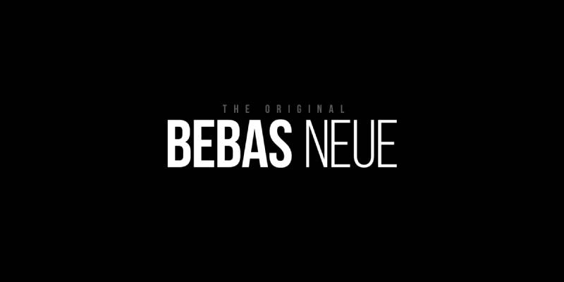
Bebas Neue is a condensed display sans-serif designed by Ryoichi Tsunekawa, first released in 2010 through Dharma Type, expanded to 5 weights by Fontfabric, and available on Google Fonts under the SIL Open Font License. It is all-caps only and delivers maximum visual impact for headline use.
Bebas Neue suits Instagram Reels cover slides and bold announcement posts because its condensed, all-uppercase letterforms achieve high visual weight at any size without requiring a heavy stroke. La La Land’s title sequence used Bebas Neue, which illustrates how it performs at large-scale display contexts.
What makes Bebas Neue suitable for Instagram posts?
Bebas Neue has a condensed structure that allows more characters per line than standard-width display fonts, useful for short headlines on square post formats. Monolinear stroke contrast keeps visual weight consistent across sizes from 18px to 120px. Its tight default letter-spacing creates a compact, impactful text block without manual kerning adjustments.
Key attributes:
| Attribute | Value |
| Classification | Condensed display sans-serif |
| Designer | Ryoichi Tsunekawa (Dharma Type), 2010 |
| Weight range | Thin – Bold (5 weights via Fontfabric) |
| Variable font | No |
| Recommended sizes | 24px+ for Instagram headlines; 48px+ for Reels covers |
| Letter-spacing default | Tight |
| License | OFL – free for commercial use |
| Available on | Google Fonts, Adobe Fonts, Fontfabric |
| Price | Free (base); Bebas Neue Pro commercial |
How does Bebas Neue perform on Instagram?
Bebas Neue delivers strong legibility at large sizes because its condensed uppercase forms have wide inner counters relative to stroke width. At 48px and above on Reels covers, it reads clearly even on small phone screens without letter-spacing adjustments. Below 18px, the tight default spacing causes individual characters to merge on compressed exports.
What are the best pairings for Bebas Neue on Instagram?
Bebas Neue pairs with Montserrat Regular for a clean contrast between bold display and neutral body text, which is the most common pairing for streetwear and fitness Instagram accounts. It pairs with Lato Light when a softer supporting text is needed for announcement or educational posts.
What are the limitations of Bebas Neue for Instagram?
Bebas Neue is all-caps only, which makes it unsuitable for any body text or mixed-case caption use. The free Google Fonts version includes only a single Regular weight; the 5-weight family requires downloading from Fontfabric separately.
Bebas Neue – Recommended Use Cases Within Instagram Posts
- Best for: Reels cover headlines, bold post title overlays, fitness and streetwear brand posts
- Avoid for: Caption body text; any context requiring lowercase characters
- Optimal weight: Regular for standard headlines; Bold for maximum impact
- Optimal size range: 36px–120px for display headlines
—
Cormorant Garamond
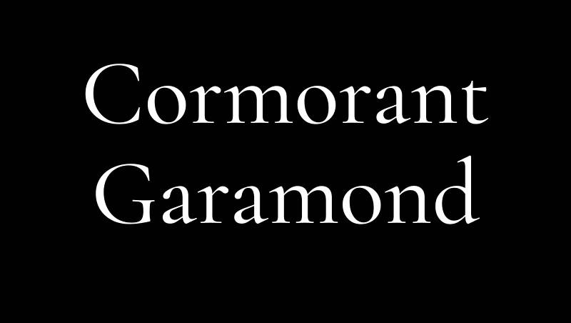
Cormorant Garamond is a display serif typeface developed by Christian Thalmann, available on Google Fonts under the SIL Open Font License. The full Cormorant family spans 45 font files across 9 visual styles, with Cormorant Garamond offering 5 weights with italics.
Cormorant Garamond suits luxury brand posts and editorial carousels because its high-contrast strokes and refined serifs communicate premium positioning at display sizes. The Government of Puerto Rico uses Montserrat alongside Cormorant Garamond for official communications, showing how it anchors formal, high-credibility design contexts.
What makes Cormorant Garamond suitable for Instagram posts?
Cormorant Garamond has high stroke contrast and sharp terminals that create strong visual distinction at 28px and above, typical of Garamond-inspired editorial typography. Its 5-weight range from Light to Bold supports visual hierarchy across title, subtitle, and pull-quote roles within a single Instagram carousel. The italic styles add expressive variation for quote-format posts without switching to a script font.
Key attributes:
| Attribute | Value |
| Classification | Display serif (Garamond-inspired) |
| Designer | Christian Thalmann |
| Weight range | Light – Bold (5 weights, with italics) |
| Variable font | No |
| Recommended sizes | 28px+ for Instagram headlines; avoid below 18px |
| Letter-spacing default | 0 (slightly open) |
| License | OFL – free for commercial use |
| Available on | Google Fonts, Adobe Fonts |
| Price | Free |
How does Cormorant Garamond perform on Instagram?
At 28px and above, Cormorant Garamond’s high-contrast strokes render with enough definition on JPEG-compressed Instagram exports to hold their editorial quality. Below 18px, the thin stroke elements drop below legibility on mid-range Android screens, particularly in Light weight. The Bold weight provides sufficient contrast for text overlaid on light photographic backgrounds at 32px+.
What are the best pairings for Cormorant Garamond on Instagram?
Cormorant Garamond pairs with Montserrat for a contrast between classical serif and geometric sans-serif, which is a standard combination for luxury and fashion Instagram accounts. It pairs with Raleway when a lighter, more airy supporting text tone is needed for editorial lifestyle content.
What are the limitations of Cormorant Garamond for Instagram?
Cormorant Garamond’s thin strokes in the Light and Regular weights break down on compressed social media exports at sizes below 18px. It is a display font, not a text font, and performs poorly for caption body copy or small supporting text.
Cormorant Garamond – Recommended Use Cases Within Instagram Posts
- Best for: Luxury brand title slides, editorial quote posts, fashion carousel headlines
- Avoid for: Caption text; body copy below 18px; fitness or casual brand aesthetics
- Optimal weight: Regular for large display headlines; Bold for post titles with background images
- Optimal size range: 28px–80px for headline overlays
—
Poppins
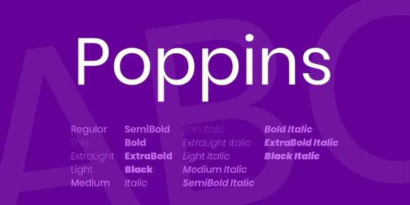
Poppins is a geometric sans-serif typeface designed by the Indian Type Foundry and Jonny Pinhorn, released on Google Fonts under the SIL Open Font License. It supports both Latin and Devanagari scripts across 18 styles (9 weights with matching italics).
Poppins works best for tech, SaaS, and startup brand Instagram posts because its monolinear geometry and consistent stroke width maintain visual clarity across all 9 weights at sizes from 12px to 96px. It is one of the most-downloaded fonts on Google Fonts and consistently appears in app UI mockups shared on Instagram by product designers.
What makes Poppins suitable for Instagram posts?
Poppins uses monolinear stroke construction and rounded terminals that render with consistent visual weight across compressed social media exports. Its 18 styles provide enough variation to build complete typographic systems within a single font family, reducing the need for secondary typefaces on Instagram carousels. The geometric letter structure performs well at both caption sizes (12px–16px) and large headline sizes (36px+).
Key attributes:
| Attribute | Value |
| Classification | Geometric sans-serif |
| Designer | Indian Type Foundry, Jonny Pinhorn |
| Weight range | Thin 100 – Black 900 (9 weights, 18 styles) |
| Variable font | No |
| Recommended sizes | 12px–16px for captions; 24px+ for headlines |
| Letter-spacing default | 0 |
| License | OFL – free for commercial use |
| Available on | Google Fonts, Adobe Fonts |
| Price | Free |
How does Poppins perform on Instagram?
Poppins’ monolinear strokes keep letterforms intact at small sizes on compressed exports, making it one of the most reliable options for 12px–14px caption text overlaid on photography. Its rounded terminals soften the geometric structure, preventing the clinical look that some geometric sans-serifs produce at small sizes. SemiBold 600 at 24px delivers enough contrast against light and dark backgrounds without requiring an additional stroke or shadow.
What are the best pairings for Poppins on Instagram?
Poppins pairs with itself across different weights (SemiBold headlines, Regular body) for a clean, single-family system that reduces visual complexity. It pairs with Cormorant Garamond when an editorial serif headline is needed above clean sans-serif body text on educational posts.
What are the limitations of Poppins for Instagram?
Poppins does not exist as a variable font, so each weight requires a separate file in design tools. Its rounded geometry reads as modern and tech-oriented, which makes it a poor fit for luxury, editorial, or heritage brand aesthetics.
Poppins – Recommended Use Cases Within Instagram Posts
- Best for: Tech and startup brand posts, infographic carousels, educational caption overlays
- Avoid for: Luxury or high-fashion brand posts; vintage or heritage brand aesthetics
- Optimal weight: SemiBold 600 for headlines; Regular 400 for body
- Optimal size range: 12px–16px for captions; 24px–48px for headlines
—
Dancing Script

Dancing Script is a casual script font designed by Pablo Impallari, first released in January 2011 and available on Google Fonts under the SIL Open Font License. It supports variable weight and is classified as a handwritten script with bouncing, size-varying letterforms.
Dancing Script suits lifestyle, food, and personal brand Instagram posts because its casual cursive letterforms signal warmth and approachability in a way that geometric sans-serifs cannot. It references 1950s script typefaces like Mistral and Murray Hill, which gives it a recognizable, friendly personality that reads as human rather than corporate.
What makes Dancing Script suitable for Instagram posts?
Dancing Script has large caps that extend below the baseline and letterforms that bounce slightly in size, creating a natural, handwritten rhythm that stands out against static geometric typefaces in a feed. Its variable font axis (weight) allows continuous adjustment from Regular to Bold within a single file. Standard ligatures and contextual alternates reduce awkward letter combinations in short display phrases typical of Instagram quotes.
Key attributes:
| Attribute | Value |
| Classification | Casual handwritten script |
| Designer | Pablo Impallari, 2011 |
| Weight range | Regular – Bold (variable weight axis) |
| Variable font | Yes |
| Recommended sizes | 28px+ for Instagram overlays; avoid below 22px |
| Letter-spacing default | 0 (tight, cursive connections) |
| License | OFL – free for commercial use |
| Available on | Google Fonts, Adobe Fonts |
| Price | Free |
How does Dancing Script perform on Instagram?
Dancing Script maintains its handwritten character at 28px and above on compressed Instagram exports, where the letter connections and size variation remain visible. Below 22px, the cursive connections between letters merge on compressed JPEG exports, reducing legibility. It works best for short phrases of 3–7 words used as accent headlines, not for full sentences or caption body text.
What are the best pairings for Dancing Script on Instagram?
Dancing Script pairs with Raleway for a contrast between expressive script and clean geometric sans-serif, a common combination for celebration, lifestyle, and event brand posts. It pairs with Montserrat Regular when a more neutral supporting text is needed to keep the script element as the visual focus.
What are the limitations of Dancing Script for Instagram?
Dancing Script is limited to short display phrases. It becomes unreadable at body text sizes below 22px and should never be used for caption copy. Its casual personality conflicts with luxury, corporate, or technical brand aesthetics.
Dancing Script – Recommended Use Cases Within Instagram Posts
- Best for: Short quote headlines, food and lifestyle brand accent text, personal brand post overlays
- Avoid for: Caption body text; sizes below 22px; corporate or luxury brand accounts
- Optimal weight: Regular for accent phrases; Bold for primary headlines
- Optimal size range: 28px–72px for display accent use
—
Oswald
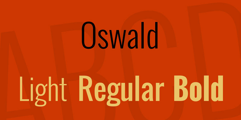
Oswald is a condensed sans-serif typeface designed by Vernon Adams and released in 2011 on Google Fonts under the SIL Open Font License. It spans 7 weights from ExtraLight 200 to Heavy 900 and draws from early 20th-century Gothic and Grotesque traditions.
Oswald suits Instagram fitness, sports, and motivational content because its tall, condensed letterforms deliver strong visual presence without requiring large font sizes. It was adopted by Save the Children in 2022 alongside Lato for global brand communications, demonstrating its legibility across mixed digital environments.
What makes Oswald suitable for Instagram posts?
Oswald has an extended x-height and tall, narrow letterforms that maintain legibility on mobile screens at sizes as small as 14px. Its 7-weight range from ExtraLight to Heavy gives designers full control over typographic hierarchy without switching fonts. The condensed structure allows longer words and headlines to fit within Instagram’s square post format without text wrapping.
Key attributes:
| Attribute | Value |
| Classification | Condensed Gothic sans-serif |
| Designer | Vernon Adams, 2011 |
| Weight range | ExtraLight 200 – Heavy 900 (7 weights) |
| Variable font | No |
| Recommended sizes | 14px+ for subheadings; 24px+ for headlines |
| Letter-spacing default | 0 (tight, condensed) |
| License | OFL – free for commercial use |
| Available on | Google Fonts, Adobe Fonts |
| Price | Free |
How does Oswald perform on Instagram?
Oswald renders reliably at 14px–16px on Android and iOS screens due to its open apertures and redrawn digital-first letter construction. Its condensed structure increases information density per line, which is useful for longer headline statements on Instagram carousel title slides. Bold 700 and Heavy 900 hold up clearly against photographic backgrounds at 24px and above without requiring outline effects.
What are the best pairings for Oswald on Instagram?
Oswald pairs with Lato for strong contrast between the condensed Gothic headline and the humanist sans-serif body, which is the most common pairing across fitness and nonprofit brand Instagram accounts. It also pairs with Raleway when a lighter, more elegant body text tone is needed for lifestyle content.
What are the limitations of Oswald for Instagram?
Oswald does not include a variable font version, requiring separate file downloads for each weight. Its strong Gothic personality conflicts with luxury, minimalist, or editorial brand aesthetics where a more neutral or refined typeface is expected.
Oswald – Recommended Use Cases Within Instagram Posts
- Best for: Fitness and sports brand headlines, motivational quote posts, event announcement graphics
- Avoid for: Luxury brand posts; editorial fashion accounts; body text below 14px
- Optimal weight: SemiBold 600 for headlines; Regular 400 for subheadings
- Optimal size range: 18px–48px for post headline overlays
—
Raleway
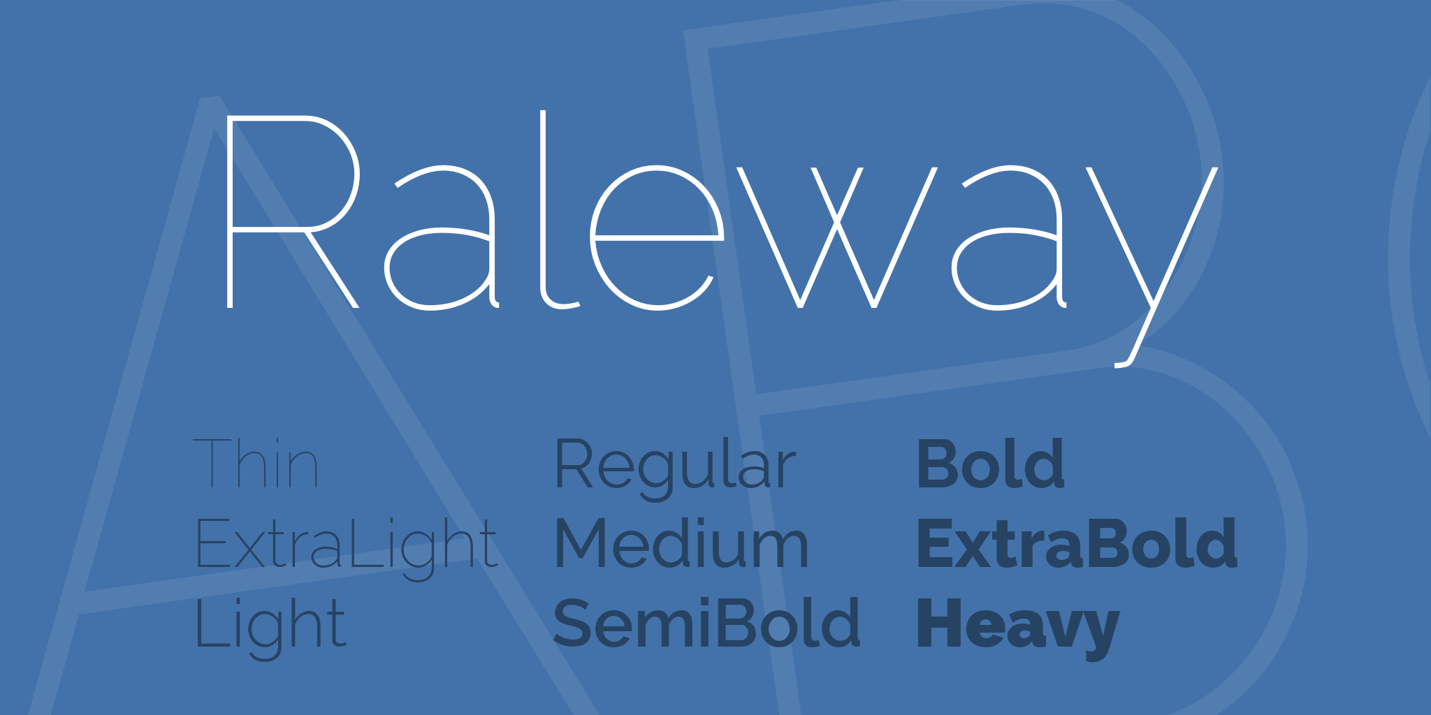
Raleway is a geometric sans-serif typeface initially designed by Matt McInerney in 2010 as a single Thin weight, then expanded to 9 weights with italics by Pablo Impallari and Rodrigo Fuenzalida in 2012. It is available on Google Fonts and through The League of Moveable Type under the SIL Open Font License.
Raleway works best for fashion, wedding, and elegant lifestyle Instagram posts because its Thin and ExtraLight weights produce an airy, sophisticated typographic tone that heavier sans-serifs cannot replicate. Its distinctive single-story ‘a’ and crossed-arm ‘W’ give it recognizable character without being decorative.
What makes Raleway suitable for Instagram posts?
Raleway’s high x-height and slightly condensed letterforms maintain legibility in its lighter weights at display sizes above 20px. Its 9-weight range from Thin 100 to Black 900 spans the full spectrum from delicate accent text to bold announcement headlines. The distinctive ‘W’ character adds visual interest to headline text without requiring ornamental letterforms.
Key attributes:
| Attribute | Value |
| Classification | Geometric sans-serif (neo-grotesque influences) |
| Designer | Matt McInerney (2010); expanded by Impallari & Fuenzalida (2012) |
| Weight range | Thin 100 – Black 900 (9 weights, 18 styles) |
| Variable font | Yes (variable version available) |
| Recommended sizes | 20px+ for Thin/Light; 14px+ for Regular–Bold |
| Letter-spacing default | 0 (slightly open) |
| License | OFL – free for commercial use |
| Available on | Google Fonts, Adobe Fonts, The League of Moveable Type |
| Price | Free |
How does Raleway perform on Instagram?
Raleway’s Thin and ExtraLight weights render with enough definition at 24px and above on compressed Instagram exports to convey their characteristic airiness. Below 16px in Thin weight, stroke width drops below reliable rendering on mid-range smartphones. The Regular and SemiBold weights perform across the full size range from 14px captions to 72px display headlines.
What are the best pairings for Raleway on Instagram?
Raleway pairs with Cormorant Garamond for editorial elegance, placing a refined serif headline above a clean sans-serif body, which is a common pairing for fashion and luxury accounts. It pairs with Dancing Script for celebration and event content, where the script serves as the accent and Raleway handles supporting text.
What are the limitations of Raleway for Instagram?
Raleway’s personality is concentrated in its lightest weights. Bold and Black Raleway lose the character that makes the Thin and Light weights distinctive, making heavier weights feel generic compared to other geometric sans-serifs. Thin weight is not suitable for caption body text at standard Instagram compression levels.
Raleway – Recommended Use Cases Within Instagram Posts
- Best for: Fashion and wedding brand headlines, elegant lifestyle post overlays, event announcement title slides
- Avoid for: Casual or athletic brand posts; caption body text in Thin or ExtraLight
- Optimal weight: Thin–Light for display headlines; SemiBold for post titles with backgrounds
- Optimal size range: 24px–80px for Thin/Light display; 14px+ for Regular–SemiBold
—
Didot
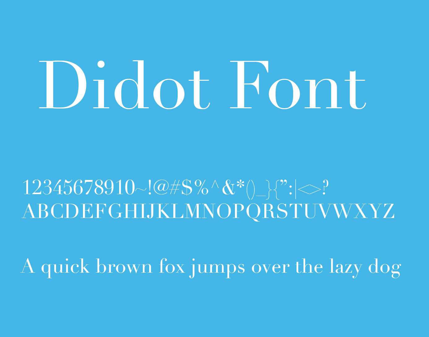
Didot is a modern (Didone) serif font originating from the Didot family created by Firmin Didot in the late 18th century, with the most-used digital version produced by Linotype. The digital Didot is a commercial typeface available through Adobe Fonts and Linotype’s foundry. It is the font Vogue magazine uses for its masthead and editorial headers.
Didot suits high-end fashion, beauty, and luxury brand Instagram posts because its extreme stroke contrast between hairline thins and heavy strokes creates immediate premium positioning at display sizes. Vogue’s consistent use of Didot in editorial contexts establishes a visual shortcut: Didot in a post signals luxury.
What makes Didot suitable for Instagram posts?
Didot has extreme stroke contrast, where thin strokes drop to hairline weight against thick upright strokes, which produces a visually arresting typographic texture at display sizes above 32px. This contrast level differentiates Didot from transitional serifs like Playfair Display, which has moderate contrast by comparison. The vertical stress axis and flat unbracketed serifs contribute to Didot’s architectural, formal appearance on image overlays.
Key attributes:
| Attribute | Value |
| Classification | Modern serif (Didone) |
| Designer | Firmin Didot (original, late 18th c.); digital by Linotype |
| Weight range | Regular, Bold, Italic (limited family) |
| Variable font | No |
| Recommended sizes | 32px+ for Instagram; extreme hairlines break below 24px |
| Letter-spacing default | Wide (designed for display use) |
| License | Commercial – requires license (Linotype or Adobe subscription) |
| Available on | Adobe Fonts (CC subscription), Linotype direct |
| Price | Subscription (Adobe CC) or commercial license from Linotype |
How does Didot perform on Instagram?
At 32px and above, Didot’s hairline strokes retain enough definition on Instagram JPEG exports to read as intentional elegance rather than rendering artifacts. Below 24px, thin stroke elements drop below reliable legibility on compressed mobile exports, particularly on screens below 300 PPI. Uppercase-only use at 48px–96px, common in fashion brand posts, is where Didot performs at its highest level.
What are the best pairings for Didot on Instagram?
Didot pairs with Futura for the classic Vogue-era combination of Didone serif headline and geometric sans-serif body, which is the standard in high-fashion editorial Instagram posts. It also pairs with Montserrat Light when a more accessible, modern body text is needed below Didot display headlines.
What are the limitations of Didot for Instagram?
Didot requires a paid license through Adobe Fonts (Creative Cloud subscription) or a direct Linotype purchase, making it inaccessible for creators without design software subscriptions. Its extreme stroke contrast causes hairline elements to disappear entirely below 24px on compressed exports, limiting it strictly to large display use.
Didot – Recommended Use Cases Within Instagram Posts
- Best for: Luxury, fashion, and beauty brand title slides; uppercase display headlines at 48px+; editorial quote posts
- Avoid for: Caption body text; any size below 24px; casual, fitness, or tech brand aesthetics
- Optimal weight: Regular for large display text; Bold for primary titles with dark backgrounds
- Optimal size range: 32px–120px for Instagram display use
—
Font Pairing Summary for Instagram Posts
Most Instagram posts benefit from two fonts: one for headlines and one for supporting text. Using pairing fonts correctly creates hierarchy without visual noise.
The table below shows the most reliable pairings from the fonts covered in this article.
| Headline Font | Body / Supporting Font | Best For |
| Playfair Display | Lato or Montserrat | Fashion, lifestyle, editorial |
| Bebas Neue | Montserrat or Lato Light | Fitness, streetwear, sports |
| Cormorant Garamond | Raleway or Montserrat | Luxury, wedding, fine dining |
| Oswald | Lato or Open Sans | Motivational, nonprofit, athletics |
| Dancing Script | Raleway or Montserrat | Personal brand, food, celebration |
| Didot | Futura or Montserrat Light | High fashion, beauty, premium brand |
| Poppins Bold | Poppins Regular | Tech, SaaS, startup, education |
If you need help finding combinations beyond these, a font pairing generator can help you test options visually before committing to a design system.
One more thing worth noting: font psychology plays a real role in how your audience perceives your brand. A serif signals tradition and authority. A geometric sans reads as modern and clean. A script feels personal and warm. Choosing a font that matches your brand’s tone is as important as choosing one that renders well at 14px.
For reference, what font Instagram itself uses across its interface is a separate question. The platform uses its own system typefaces for UI, which differ from what creators choose for their post graphics.
Finally, always check font licensing before using any typeface in commercial Instagram content. Most fonts on Google Fonts are free for commercial use under the OFL. Commercial typefaces like Didot require active licenses.
How Does a Font Choice Affect Engagement on Instagram Posts?
Typography on Instagram works before the reader processes a single word. Font weight, stroke contrast, and letter-spacing all signal brand positioning at the scroll level, in under two seconds.
Monotype and Neurons research (2022) found that typeface choice alone can boost positive consumer response by up to 13%, increase message memorability by 10%, and improve perceived trustworthiness by 9%. Those numbers don’t require color, logo, or motion.
Carousels currently lead Instagram engagement across all post formats. Socialinsider data shows carousel posts hold a median engagement rate of 6.90% as a percentage of reach, roughly 109% more than Reels. Font legibility on each slide directly affects whether someone swipes through all frames or drops off at slide one.
The practical mechanism: readable fonts on carousel slides reduce cognitive effort. Lower effort means people stay longer. Longer dwell time signals quality to the algorithm.
Instagram compresses all uploaded images to 1080px width. JPEG compression degrades thin strokes most severely. A font that looks sharp in Canva at 12px can become unreadable on a mid-range Android screen after export.
Key engagement factors tied directly to font choice:
- Stroke weight and how it survives JPEG compression on mobile exports
- Contrast ratio between text and background (WCAG AA minimum is 4.5:1)
- Letter-spacing and how it affects readability at carousel body text sizes (12px–16px)
- Font personality alignment with brand tone, which Monotype’s 2024 survey found 75% of designers view as critical to brand identity
Reels account for more than 50% of time spent on Instagram (Sprout Social, 2025), but carousels consistently drive more saves and shares. Both formats depend on font legibility to hold attention past the first frame.
—
What Font Classifications Work Best for Different Instagram Content Types?
Not all Instagram post formats need the same typography. A Reels cover headline has different legibility requirements than body text on a carousel educational slide. Matching font classification to content type is the first real decision.
| Font Classification | Best Post Format | Primary Reason |
| Geometric sans-serif | Carousels, Reels covers, educational posts | High x-height, survives compression |
| Transitional/Modern serif | Quote posts, editorial, luxury brand slides | Stroke contrast signals premium positioning |
| Condensed Gothic sans-serif | Fitness, sports, motivational posts | Condensed letterforms allow longer headlines |
| Casual handwritten script | Personal brand, food, celebration content | Communicates warmth and approachability |
Monotype’s 2024 Font Use & Forecasting Survey found 76% of designers prioritize readability and accessibility above other font attributes, with sans-serif cited as the top choice for digital content. That preference maps directly to Instagram’s mobile-first context.
Serif Fonts on Instagram: When High Contrast Works and When It Fails
Display serifs at 28px and above: Playfair Display, Cormorant Garamond, and Didot all hold their stroke contrast at large display sizes. The thick-to-thin variation reads as intentional elegance rather than compression artifact.
Below 18px, the opposite is true. Thin strokes on high-contrast serifs drop below reliable rendering on mid-range Android screens after JPEG compression. Playfair Display in Regular weight at 14px on a compressed 1080x1350px export loses its serifs.
When serifs work: Quote post headlines, editorial carousel title slides, luxury brand announcements at 28px+.
When they fail: Caption body text, reversed-out text on textured photo backgrounds, any size below 18px.
Sans-Serif Fonts on Instagram: Geometric vs. Humanist for Feed Readability
Geometric sans-serifs (Montserrat, Poppins, Bebas Neue) and humanist sans-serifs (Lato) serve different roles in Instagram typography, and the distinction matters at small sizes.
Geometric fonts use constructed, circular letterforms. They hold up at headline sizes but can feel cold for lifestyle content. Humanist fonts like Lato use semi-rounded terminals and classical proportions, making them more readable at 12px–14px for caption body overlays.
Lato’s humanist structure makes it one of the few sans-serifs that reads clearly at 12px on compressed Instagram exports. Montserrat performs best above 14px, where its large x-height starts to contribute meaningfully to legibility.
Script Fonts on Instagram: Legibility Thresholds and Appropriate Use Cases
Script fonts on Instagram have a hard legibility floor: 22px minimum. Below that threshold, cursive connections between letters merge on compressed JPEG exports.
Dancing Script at 28px or above delivers its intended handwritten character. At 16px caption size, it becomes indistinguishable smudge on most mobile screens.
Script fonts also work best in phrases of 3–7 words. Longer phrases amplify legibility problems because the eye has more connection points to interpret. Use them for accent headlines, not body copy.
—
How to Choose Between Free and Commercial Fonts for Instagram Content
Font licensing trips up more Instagram creators than any other typography decision. The difference between OFL and commercial is not about quality, it’s about legal risk and brand differentiation.
Production Type demanded $150,000 per infringement from Nike in 2023 for unauthorized font use outside license terms. That number is not hypothetical for brands running paid Instagram campaigns with non-compliant typography.
What the SIL Open Font License Actually Covers for Instagram
The OFL allows use in books, posters, logos, social media graphics, and sponsored posts without attribution or additional payment. The one restriction: you cannot sell the font file itself.
Google Fonts appears on approximately 54% of desktop sites globally (HTTP Archive, 2024). Almost all fonts in the directory use the OFL. Montserrat, Lato, Poppins, Oswald, Dancing Script, Raleway, Cormorant Garamond, and Bebas Neue are all OFL-licensed and cleared for paid Instagram content.
Common OFL misconception: “Free for personal use only” fonts from random download sites are NOT OFL fonts. Downloading a font from a third-party aggregator does not confer commercial rights. Always read the license file, not the download button label.
Commercial Fonts: When the Investment Makes Sense for Instagram
Didot (Linotype): Requires an active license via Adobe Creative Cloud subscription or direct Linotype purchase. Used by Vogue across all editorial Instagram posts. The commercial license prevents other accounts from using identical typography, which is the actual brand differentiation value.
That is the core trade-off: OFL fonts like Montserrat appear on 19 million websites. A brand using Montserrat on Instagram shares its typographic identity with thousands of other accounts in the same niche.
Commercial fonts cost more but deliver exclusive visual positioning. For brands running sponsored Instagram posts where font usage constitutes commercial advertising, this exclusivity compounds with each post published.
| License Type | Instagram Use | Sponsored Post | Example Fonts |
| SIL OFL | Yes | Yes | Montserrat, Poppins, Lato, Raleway |
| Adobe CC subscription | Yes | Yes (while subscribed) | Didot, Proxima Nova |
| Personal use only | No | No | Many aggregator downloads |
| Commercial license | Yes | Yes | Proxima Nova (direct), custom typefaces |
For more on font licensing across different use cases, including web embedding and app integration, the rules differ significantly from social media use.
—
How to Use Font Pairing on Instagram Posts Without Losing Visual Hierarchy
Two fonts. That’s the limit for Instagram post typography. Three can work if the third is used exclusively as a micro-accent. Four fonts always produces visual noise on a 6-inch mobile screen.
Monotype’s 2024 survey found 83% of designers identify font selection as one of their top three creative decisions. The discipline of limiting combinations is built into professional practice, not just aesthetics.
Serif and Sans-Serif Combinations for Instagram Carousels
Contrast as the primary pairing principle: serif headline with sans-serif body creates visual hierarchy through classification difference, not just size difference. This matters on carousel slides where two levels of text need to be scannable at a glance.
Playfair Display (headline) paired with Lato Regular (body) is the most common example of this approach in lifestyle and fashion accounts. The high stroke contrast of Playfair draws the eye first. Lato’s humanist structure handles the body copy load without competing for attention.
Cormorant Garamond paired with Raleway or Montserrat works on the same principle. Cormorant’s editorial weight anchors the title; Raleway’s geometric neutrality carries supporting text without distraction.
Single-Family Font Systems: When Using One Font Family Across All Weights Is Enough
Single-family systems work best for tech, SaaS, and educational Instagram accounts where visual consistency matters more than expressive contrast.
Poppins SemiBold 600 for headlines, Poppins Regular 400 for body text, Poppins Light 300 for captions. Three typographic levels. One font family. Zero risk of pairing conflict.
Montserrat works the same way across its 9-weight range. The font’s large x-height maintains legibility from Bold headlines down to Regular body text without the strokes collapsing at compressed sizes.
When single-family breaks down: luxury and editorial accounts where the brand requires a distinctive display typeface. Using only Poppins for a high-fashion brand reads as tech startup, not fashion house.
A font pairing generator helps test combinations before committing them to a post template, particularly useful when evaluating whether two fonts create contrast or visual conflict at Instagram’s mobile viewing sizes.
—
What Font Size and Spacing Standards Apply to Instagram Posts?
Font size decisions on Instagram are not about design preference. They are about what survives the platform’s JPEG compression pipeline on a mobile screen.
Posts with optimized dimensions receive up to 23% more engagement than improperly formatted content, according to GTR Socials’ 2026 analysis of Instagram image performance data. Typography is part of that optimization, not separate from it.
Minimum Font Sizes by Instagram Post Format
SocialRails and And Dreams Digital both specify minimum 24px for body text on Instagram post overlays, 36px and above for headlines. These numbers apply to designs exported at 1080x1080px or 1080x1350px.
Practical size standards by use case:
- Caption body text overlaid on images: 14px–16px minimum (humanist sans-serifs only)
- Carousel body text: 16px–20px for comfortable mobile reading
- Post headline overlays: 24px–48px depending on font weight
- Reels cover titles: 36px–96px, designed for 3-second legibility
- Story text safe zone: content centered within 1080x1170px, avoiding top and bottom 250px of the 1080x1920px canvas
Letter-Spacing and Line Height on Instagram Exports
Tight default letter-spacing on condensed fonts like Bebas Neue and Oswald creates merge artifacts at sizes below 20px on compressed exports. Manual tracking adjustments of +20 to +40 units at smaller sizes separate individual letterforms enough to survive JPEG encoding.
Open geometric fonts like Montserrat and Raleway use default spacing that already accounts for readability. No manual tracking adjustment required above 16px.
Line height for carousel body text: 1.4–1.6 line-height multiplier maintains readability across 1080x1080px and 1080x1350px canvas sizes. Tighter line heights cause descenders and ascenders to merge visually at mobile viewing distances.
The thumb test: export the post, open it on a phone at arm’s length, and check if the headline reads in under 2 seconds. If it doesn’t, the font size, weight, or contrast needs adjustment before publishing.
—
How Do Brand Instagram Accounts Use Fonts to Build Visual Consistency?
Consistent use of visual elements including fonts can improve brand recognition by up to 80%, according to Forbes-cited brand identity research. Consistent brand presentation across platforms can also boost revenue by up to 23%.
On Instagram specifically, font consistency determines whether a viewer recognizes a post as yours before reading the caption or spotting the handle. That recognition happens in under two seconds.
How Established Brands Apply Font Systems Across Instagram Formats
Vogue: Uses Didot consistently across editorial Instagram posts, matching the typographic identity of its print masthead. The font creates immediate platform-wide recognition without a logo visible. It’s a commercial license decision that prevents other accounts from replicating the exact typographic positioning.
Save the Children: Adopted Oswald alongside Lato in their 2022 brand refresh for global communications. Oswald carries the headline weight; Lato handles body copy. The same paired system runs across Instagram posts, Stories, and Reels cover slides without variation.
Both examples use the same structural principle: one display font, one body font, applied consistently across every content format published on the platform.
Building a Two-Font Instagram Brand System
Step one: Select one display or headline font that communicates brand personality. This is the font viewers see first on every post.
Step two: Select one body or supporting font that prioritizes readability. This handles caption overlays, slide body text, and supporting information.
Step three: Define weight and size rules for each font in each context. Headline font at Bold 700 for post titles. Body font at Regular 400 for caption text. SemiBold 600 for pull quotes or slide subheadings.
Apply the system to a template in Canva or Adobe Express before creating individual posts. Templates enforce the system mechanically, removing the decision each time a new post is designed.
Font psychology plays a direct role in how this system reads across formats: a serif headline communicates authority and tradition; a geometric sans-serif signals modernity and clarity; a script accent communicates warmth and personality. The combination chosen for the brand system determines what viewers feel before they read a single word.
For reference on how major platforms build their own typographic identities, Instagram’s own font system uses Instagram Sans, a custom typeface designed with Colophon Foundry in 2022 for global script support and platform-wide consistency. That level of investment reflects exactly how much typography contributes to platform recognition at scale.
FAQ on The Best Fonts For Instagram Posts
What is the best font for Instagram posts?
Montserrat is the most reliable choice for Instagram posts. Its large x-height, 9-weight range, and wide apertures maintain legibility on compressed mobile exports. It works across carousels, Reels covers, and caption overlays without requiring size adjustments.
What font size should I use for Instagram posts?
Use a minimum of 24px for body text overlaid on images and 36px or above for headlines. Caption text on carousel slides reads best at 16px–20px. Below 14px, most fonts lose legibility after Instagram’s JPEG compression.
Can I use Google Fonts for commercial Instagram posts?
Yes. Nearly all Google Fonts use the SIL Open Font License, which permits commercial use including sponsored posts and paid campaigns. No attribution is required. Fonts include Montserrat, Poppins, Lato, Oswald, Raleway, and Dancing Script.
What is the best font pairing for Instagram carousels?
Playfair Display paired with Lato is the most effective combination for carousels. Playfair handles the headline with editorial contrast; Lato carries body text at small sizes. For tech or educational content, Poppins SemiBold with Poppins Regular works as a single-family system.
Are script fonts readable on Instagram?
Script fonts like Dancing Script are only readable above 22px on compressed Instagram exports. Below that threshold, cursive connections between letters merge. Limit script fonts to short accent phrases of 3–7 words, never body text or captions.
What fonts do luxury brands use on Instagram?
Didot is the clearest example. Vogue uses it consistently across all editorial Instagram posts, matching its print masthead. Cormorant Garamond and Playfair Display are the most accessible alternatives under the SIL Open Font License for brands wanting a similar high-contrast serif tone.
How many fonts should I use on one Instagram post?
Two fonts maximum. One display or headline font, one body or supporting font. Three can work if the third is used only as a micro-accent. Four fonts always creates visual noise on a mobile screen, regardless of how well the individual typefaces are chosen.
Does font choice affect Instagram engagement?
Yes. Monotype and Neurons research found typeface choice alone boosts positive consumer response by up to 13% and improves message memorability by 10%. On Instagram specifically, legible fonts on carousel slides reduce cognitive effort, increasing dwell time and save rates.
What is the best font for Instagram Reels covers?
Bebas Neue and Oswald are the strongest choices for Reels covers. Both are condensed sans-serifs that deliver high visual impact at 48px and above. Bebas Neue is all-caps only; Oswald offers 7 weights and supports mixed case for more flexible headline options.
What font does Instagram itself use?
Instagram uses Instagram Sans, a custom typeface designed with Colophon Foundry in 2022. It replaced Proxima Nova across the platform’s UI and branding. Instagram Sans is proprietary and not available for public use in post graphics or brand content.
Conclusion
This conclusion is for an article presenting the best fonts for Instagram posts, and the core takeaway is simple: typography is a performance decision, not just a visual one.
Montserrat, Playfair Display, Bebas Neue, and the other typefaces covered here each serve a specific role in Instagram content design, from Reels cover headlines to carousel body text.
Stick to two fonts per post. Match font classification to your content format. Check size and contrast before every export.
Your Instagram branding typography needs to survive JPEG compression, mobile screens, and two seconds of scroll time simultaneously. Most fonts fail at least one of those conditions.
The right font pairing for your account depends on your niche, your audience, and the post formats you publish most. Pick the system that fits, then stay consistent.

Renowned for his expertise in logo design and visual branding, Bogdan has developed a multitude of logos for various clients.
His skills extend to creating posters, vector illustrations, business cards, and brochures. Additionally, Bogdan's UI kits were featured on marketplaces like Visual Hierarchy and UI8.
He also wrote in the past years on sites like Design Your Way, WebDesignerDepot, WPDean, Designmodo, Speckyboy, Slider Revolution, and more.
- Baseball Team Color Codes - 28 July 2026
- How Creators Can Use AI Image Tools to Make Better Visual Content - 28 July 2026
- Canva vs Adobe Express: Which Is Better? - 27 July 2026

Bogdan Sandu is a seasoned designer who has been designing websites since 2008. Renowned for his expertise in logo design and visual branding, Bogdan has developed a multitude of logos for various clients. His skills extend to creating posters, vector illustrations, business cards, and brochures. Additionally, Bogdan's UI kits were featured on marketplaces like Visual Hierarchy and UI8. He also wrote in the past years on sites like Design Your Way, WebDesignerDepot, WPDean, Designmodo, Speckyboy, Slider Revolution, and more.
You Might Also Like