The font on your TikTok video is doing more work than you think.
Most creators obsess over hooks, trends, and audio — then slap any random text style on their captions. That’s a mistake. The best fonts for TikTok aren’t just an aesthetic choice. They directly affect whether viewers read your captions, stay through your video, or keep scrolling.
Captioned videos outperform uncaptioned ones by up to 32% in watch time. The font carrying those captions matters.
This guide covers 10 fonts that actually work on mobile video — from TikTok’s own TikTok Sans to creator favorites like Montserrat Bold, Bebas Neue, and Poppins. For each one, you’ll find the right weight, size range, best use case, and what to pair it with.
No guesswork. Just the fonts that hold up on a 6-inch screen at scroll speed.
The Best Fonts For TikTok
Font choice on TikTok is not just a visual decision. It affects watch time, readability on small screens, and whether viewers even pause long enough to read what you wrote.
According to Blitzcut data, bold captioned videos outperform uncaptioned ones by 17–32% in watch time for educational content. The font carrying those captions matters more than most creators think.
Below are the 10 best fonts for TikTok videos, each evaluated by structure, legibility, and real-world use on the platform.
—
Montserrat Bold

Montserrat is a geometric sans-serif font designed by Julieta Ulanovsky in 2010, released through Google Fonts in 2011. It delivers high-contrast, legible text overlay at both title and caption scale.
Montserrat Bold works best for TikTok captions because its large x-height and wide apertures keep letterforms distinct at the small display sizes typical on mobile screens. A 17-second cleaning video using Montserrat Bold hit 2.3M views with no face or voiceover — the captions alone carried the content (Blitzcut, 2026).
What makes Montserrat Bold suitable for TikTok?
Montserrat has a large x-height relative to cap height, which increases legibility at sizes below 20px. The Bold weight (700) produces sufficient stroke width to remain readable over video backgrounds without an outline. It supports 9 weights, giving creators flexibility from subtitle text to full-screen titles.
Key attributes:
| Attribute | Value |
| Classification | Geometric sans-serif |
| Designer | Julieta Ulanovsky, 2010 |
| Weight range | Thin 100 – Black 900 (9 weights) |
| Variable font | No |
| Recommended sizes | 18px–28px captions; 36px+ titles |
| License | OFL (free personal and commercial) |
| Available on | Google Fonts, Adobe Fonts |
| Price | Free |
How does Montserrat Bold perform for TikTok captions?
At Bold (700) weight, Montserrat renders with high stroke contrast against both light and dark video backgrounds. The wide apertures in letters like “c”, “e”, and “a” reduce misread characters at small display sizes on mid-range Android screens.
Fiverr named Montserrat the Font of the Year in 2024, citing its frequency in logo creation — a signal of how recognizable and trusted it reads at a glance.
What are the best pairings for Montserrat Bold in TikTok videos?
Montserrat Bold pairs with Proxima Nova for body-level captions where consistent weight hierarchy is needed. It pairs with a script font like Pacifico when a warmer, more casual hook tone is needed over a bold title line.
What are the limitations of Montserrat Bold for TikTok?
Montserrat is not a variable font, so each weight requires a separate file when used in external editors. At weights below 500, it lacks enough stroke width to read clearly over busy video backgrounds without added text stroke or shadow.
Montserrat Bold – Recommended Use Cases Within TikTok Videos
- Best for: Educational captions, motivational overlays, hook text in the first 3 seconds
- Avoid for: Decorative or aesthetic-first content where personality matters more than clarity
- Optimal weight: Bold 700 for captions; Black 900 for single-word title overlays
- Optimal size range: 20px–32px for in-video captions
—
Bebas Neue
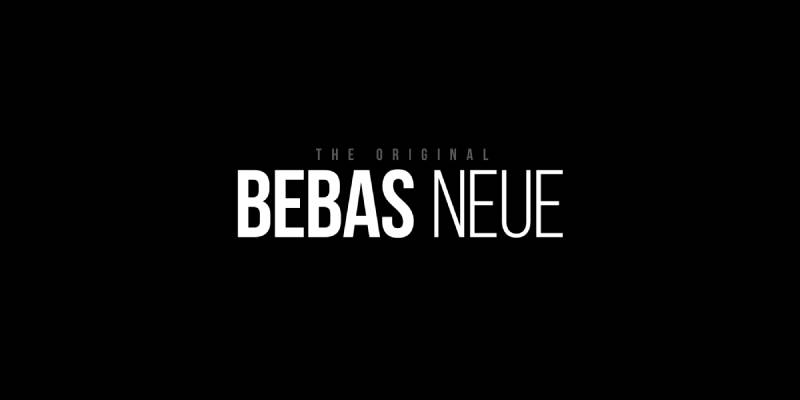
Bebas Neue is a condensed display sans-serif designed by Ryoichi Tsunekawa, first released in 2010 by Dharma Type, then expanded into a full family by Fontfabric in 2014. It delivers maximum visual impact in all-caps headline text.
Bebas Neue optimizes TikTok title overlays because its condensed proportions allow long phrases to fit within the safe zone of a vertical 9:16 frame without text wrapping. Nike and Red Bull both use it in video content — its association with high-energy brands makes it recognizable to TikTok audiences in fitness and lifestyle niches.
What makes Bebas Neue suitable for TikTok?
Bebas Neue uses tight default letter-spacing and a condensed width, fitting more characters per horizontal line than standard-width display fonts. Its single available weight (Regular) maintains consistent typographic color across all title sizes, which reduces visual noise in fast-cut video editing.
Key attributes:
| Attribute | Value |
| Classification | Condensed display sans-serif |
| Designer | Ryoichi Tsunekawa, 2010 |
| Weight range | Single weight (Regular); Pro version adds Thin–Bold |
| Variable font | No |
| Recommended sizes | 36px+ for titles; not recommended below 24px |
| License | OFL (free personal and commercial use) |
| Available on | Google Fonts, Adobe Fonts, Fontfabric |
| Price | Free (base); Pro version is paid |
How does Bebas Neue perform for TikTok title overlays?
At 48px and above, Bebas Neue maintains sharp stroke terminals with monolinear weight distribution, giving it strong legibility against both bright and dark video backgrounds. Its condensed proportions deliver a high character-per-line ratio, making it practical for 9:16 portrait video frames.
What are the best pairings for Bebas Neue in TikTok videos?
Bebas Neue pairs with Montserrat Regular or Light for secondary caption lines, as the weight contrast between an all-caps headline and a lighter body font creates clear visual hierarchy. It also works with Roboto for a more neutral, tech-oriented aesthetic.
What are the limitations of Bebas Neue for TikTok?
Bebas Neue is all-caps only in its free version, which limits use cases where mixed-case text reads more naturally. Its single weight makes weight-based hierarchy impossible without switching to a separate typeface for sub-captions.
Bebas Neue – Recommended Use Cases Within TikTok Videos
- Best for: Full-screen title cards, fitness content hooks, countdown text overlays
- Avoid for: Caption-level subtitle text below 24px; long-form body copy overlays
- Optimal weight: Regular (only available weight in free version)
- Optimal size range: 36px–72px for display use
—
TikTok Sans
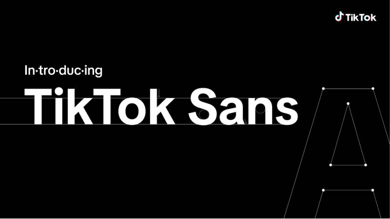
TikTok Sans is a custom sans-serif typeface created by Swiss foundry Grilli Type in 2023, expanded by Type Network and Contrast Foundry, then released as open-source under the SIL Open Font License in July 2025. It serves as TikTok’s official brand and interface font across all platforms.
TikTok Sans works best for TikTok content creation because it was specifically engineered for the platform’s screen environments, with hinting handled by Aaron Bell of Saja Typeworks to achieve sharp rendering across varied device resolutions and screen densities.
What makes TikTok Sans suitable for TikTok?
TikTok Sans was designed with larger, clearer strokes to improve character distinction at video overlay sizes. Its pixel-perfect hinting ensures consistent rendering across Android and iOS devices, including mid-range phones with lower screen densities. The font covers 16+ languages including Spanish, French, Portuguese, Russian, and Greek.
Key attributes:
| Attribute | Value |
| Classification | Sans-serif (custom platform typeface) |
| Designer | Grilli Type, expanded by Type Network (2023–2025) |
| Variable font | No |
| Recommended sizes | 14px–32px for captions; 36px+ for title overlays |
| License | OFL 1.1 (free personal and commercial; cannot resell font file) |
| Available on | Google Fonts, TikTok GitHub, tiktok.com/font |
| Price | Free |
How does TikTok Sans perform for TikTok caption text?
TikTok Sans renders clearly at sizes as low as 14px on standard mobile screens, making it one of the most legible options for subtitle-level caption work. Inside the app, it appears under the label “Classic,” “Bold,” and “Oblique” — meaning millions of viewers already associate it with native TikTok content.
That familiarity works in your favor. Content using TikTok Sans reads as platform-native, which reduces cognitive friction for the viewer.
What are the best pairings for TikTok Sans in TikTok videos?
TikTok Sans pairs with Bebas Neue for a contrast between native-feeling captions and a bold display headline. For a fully on-brand, consistent look, it works as both title and caption font across a single video without pairing at all.
What are the limitations of TikTok Sans for TikTok?
TikTok Sans is not a variable font. Modified versions cannot use the “TikTok Sans” reserved name under the OFL license without written permission. It is a newer typeface with limited third-party template support in apps like CapCut compared to Montserrat or Bebas Neue.
TikTok Sans – Recommended Use Cases Within TikTok Videos
- Best for: Auto-generated captions edited externally, e-commerce product overlays, platform-native branded content
- Avoid for: Highly styled aesthetic edits where a distinctive personality font is needed
- Optimal weight: Bold for captions; Regular for secondary text
- Optimal size range: 16px–36px
—
Proxima Nova

Proxima Nova is a geometric-humanist hybrid sans-serif designed by Mark Simonson, originally released in 2005 (building on his 1994 Proxima Sans). It provides a wide weight and width range across 80 fonts in the full family.
Proxima Nova suits TikTok caption text because its Semibold weight (used natively in TikTok’s “Classic” style before the TikTok Sans transition in May 2023) delivers high screen legibility with open apertures and near-neutral visual tone. The Verge, Wired, and BuzzFeed all use it — its visual familiarity to digital audiences makes it an easy read.
What makes Proxima Nova suitable for TikTok?
Proxima Nova has a moderate x-height with open apertures in characters like “a”, “e”, and “c”, reducing misread glyphs at 16px–20px on mobile. Its 8 weights from Thin to Black (plus condensed and extra-condensed widths) support full typographic hierarchy within a single typeface family. Since the mid-2010s it has been the most widely used commercial font on the web.
Key attributes:
| Attribute | Value |
| Classification | Geometric-humanist sans-serif |
| Designer | Mark Simonson, 2005 |
| Weight range | Thin 100 – Black 900 (8 weights, 5 widths) |
| Variable font | No |
| Recommended sizes | 16px–24px captions; 28px+ headings |
| License | Commercial (paid per use case) |
| Available on | Adobe Fonts, Mark Simonson Studio direct |
| Price | Paid (subscription via Adobe Fonts or direct license) |
How does Proxima Nova perform for TikTok text overlays?
Proxima Nova Semibold renders with consistent stroke width across display sizes from 14px to 72px, maintaining even typographic color in both portrait video frames and horizontal thumbnails. Its neutral personality makes it adaptable across content niches without signaling a specific genre.
What are the best pairings for Proxima Nova in TikTok videos?
Proxima Nova pairs with Bebas Neue for a headline-to-caption hierarchy where bold condensed titles contrast against clean, readable Proxima body text. It pairs with Playfair Display when a warmer editorial tone is needed, such as in lifestyle or beauty content.
What are the limitations of Proxima Nova for TikTok?
Proxima Nova requires a paid license for commercial use, which adds cost compared to free alternatives like Montserrat that share similar design characteristics. It is not available on Google Fonts, limiting easy access for creators working in free editing tools.
Proxima Nova – Recommended Use Cases Within TikTok Videos
- Best for: Branded content where a professional, editorial look is needed; subtitle-level captions
- Avoid for: Budget-constrained workflows where free alternatives are preferred
- Optimal weight: Semibold 600 for captions; Bold 700 for headlines
- Optimal size range: 16px–28px for caption use
—
Helvetica
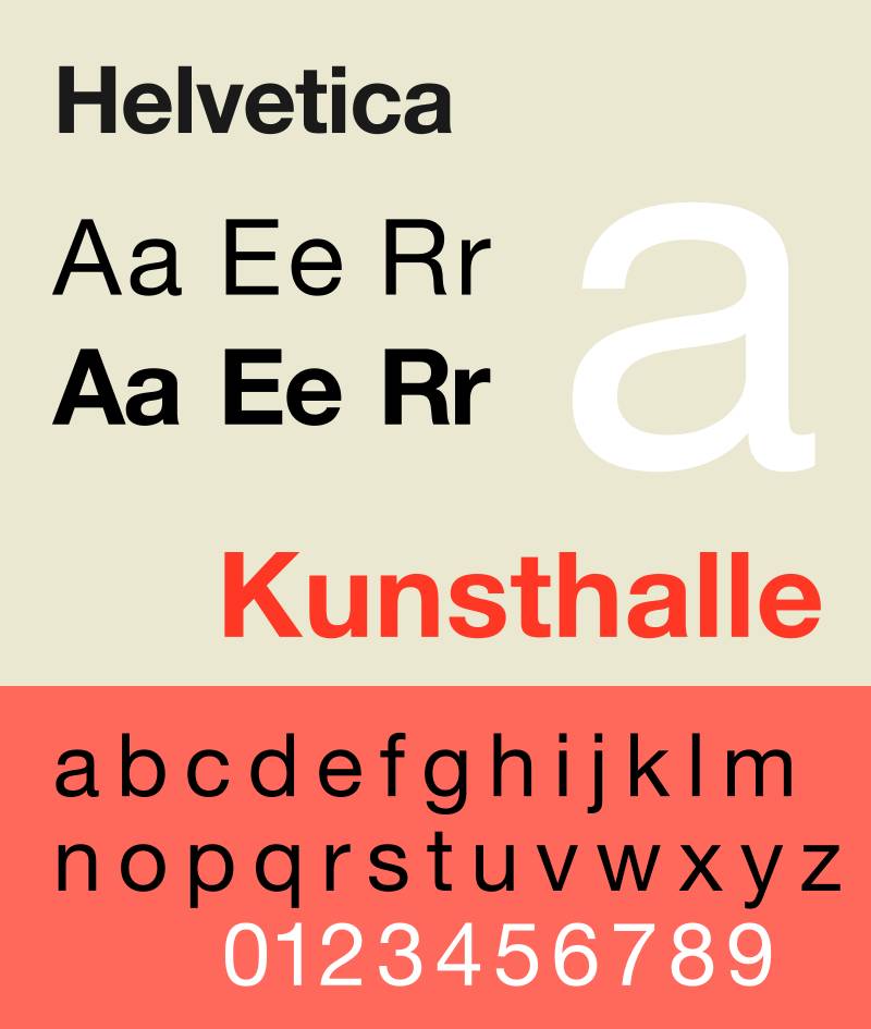
Helvetica (formally Neue Haas Grotesk) is a neo-grotesque sans-serif designed by Max Miedinger and Eduard Hoffmann in 1957, released by Haas Type Foundry. It remains one of the most widely used typefaces in professional design globally.
Helvetica works for TikTok video text because its near-zero personality allows message content to lead without visual interference. Creators like Iman Gadzhi and Gary Vaynerchuk use it for business-focused video captions, where authority and neutrality take priority over aesthetic appeal.
What makes Helvetica suitable for TikTok?
Helvetica has a high x-height and tight letter-spacing that supports dense caption text within a limited screen area. Its monolinear strokes reduce rendering artifacts on low-DPI Android screens. Helvetica Now (the 2019 Monotype update) added three optical sizes — Micro, Text, and Display — giving it better performance at both small caption sizes and large title sizes.
Key attributes:
| Attribute | Value |
| Classification | Neo-grotesque sans-serif |
| Designer | Max Miedinger & Eduard Hoffmann, 1957 |
| Weight range | Thin – Black (multiple weights across subfamilies) |
| Optical sizes | Yes (Helvetica Now: Micro, Text, Display) |
| License | Commercial (Monotype) |
| Available on | Monotype, Adobe Fonts (via subscription) |
| Price | Paid |
How does Helvetica perform for TikTok caption text?
Helvetica renders cleanly at 16px–40px with consistent stroke weight that avoids visual noise in motion video backgrounds. Its tight optical spacing means text lines fit well within TikTok’s lower-third safe zone without crowding. Creative Boom’s 2026 designer survey listed it as the most-nominated typeface by a significant margin.
What are the best pairings for Helvetica in TikTok videos?
Helvetica pairs with Garamond for a classic editorial contrast where a serif font handles secondary text and Helvetica carries the primary message. It pairs with Bebas Neue for energy-focused content where the condensed display headline contrasts against Helvetica’s neutral captions.
What are the limitations of Helvetica for TikTok?
Helvetica is a paid commercial font and not available for free. Its ubiquity means it carries little differentiation value for creators trying to build a distinctive visual identity. The free version of Arial shares similar proportions but lacks Helvetica’s refined spacing and optical balance.
Helvetica – Recommended Use Cases Within TikTok Videos
- Best for: Business, finance, and news-adjacent content where neutrality builds credibility
- Avoid for: Lifestyle, fashion, or entertainment niches where personality-driven fonts perform better
- Optimal weight: Medium or Bold for captions; Black for single-word impact titles
- Optimal size range: 18px–36px
—
Poppins
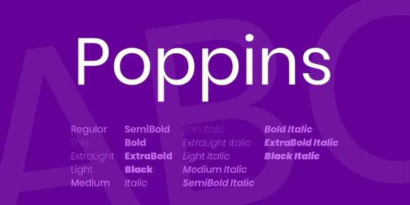
Poppins is a geometric sans-serif designed by Jonny Pinhorn and Ninad Kale at Indian Type Foundry, released through Google Fonts in 2014. It delivers a clean, rounded typographic style suited to both captions and display text.
Poppins suits TikTok overlays because its near-monolinear stroke weight and high x-height maintain legibility at caption sizes on mid-range mobile screens. It consistently ranks among the top 10 most downloaded typefaces on Google Fonts, with billions of weekly views — making it visually familiar to most TikTok users already.
What makes Poppins suitable for TikTok?
Poppins letterforms are built on near-perfect circles with optical corrections at stroke joints, maintaining even typographic color across weight settings. It supports 9 weights from Thin (100) to Black (900), each with a matching italic, covering all hierarchy levels from subtitle to full-screen title within a single family.
Key attributes:
| Attribute | Value |
| Classification | Geometric sans-serif |
| Designer | Jonny Pinhorn & Ninad Kale, Indian Type Foundry, 2014 |
| Weight range | Thin 100 – Black 900 (9 weights, 18 styles with italics) |
| Variable font | No |
| Recommended sizes | 16px–24px captions; 32px+ title overlays |
| Letter-spacing default | 0 (normal) |
| License | OFL (free personal and commercial) |
| Available on | Google Fonts, Adobe Fonts |
| Price | Free |
How does Poppins perform for TikTok video text?
Poppins Bold and SemiBold render with clear stroke width at 18px–32px, holding legibility over both bright and dark video backgrounds. Its rounded terminals soften the overall tone of captions, which works well for lifestyle, wellness, and educational content where approachability matters.
What are the best pairings for Poppins in TikTok videos?
Poppins pairs with Playfair Display for a contrast between geometric sans-serif captions and a serif title — a common approach in beauty and lifestyle TikTok content. It pairs with Montserrat when a more uniform, geometric look is needed across both title and body layers.
What are the limitations of Poppins for TikTok?
Loading the full Poppins family (all 9 weights with italics) in external editors can exceed 400KB in WOFF2 format — a bandwidth consideration for web-based editing tools like Kapwing. Its circular geometry can feel visually redundant when paired with other geometric sans-serifs like Futura or Montserrat.
Poppins – Recommended Use Cases Within TikTok Videos
- Best for: Lifestyle, wellness, education, and personal brand content; caption-level subtitle text
- Avoid for: High-energy fitness or hype content where bolder condensed fonts perform better
- Optimal weight: SemiBold 600 for captions; Bold 700 for headlines
- Optimal size range: 16px–32px
—
Anton
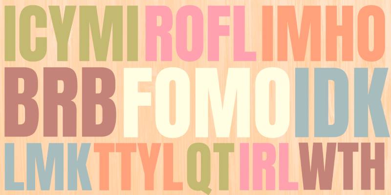
Anton is a condensed display sans-serif designed by Vernon Adams in 2011, available through Google Fonts under the SIL Open Font License. It is a reworking of traditional advertising sans-serif typefaces, digitized and reshaped for screen use.
Anton suits TikTok hook text because its heavy stroke weight and tight letter-spacing produce maximum visual impact at large display sizes within a 9:16 vertical frame. It is the closest free structural match to Impact, the classic meme caption font, and is widely used in TikTok content for bold single-phrase statements.
What makes Anton suitable for TikTok?
Anton has an extremely tall x-height and heavy, condensed strokes that hold visual weight even over busy video backgrounds at 48px and above. Its single available weight delivers consistent typographic color without weight variation decisions. The condensed proportions allow longer phrases to fit within TikTok’s vertical safe zone without wrapping.
Key attributes:
| Attribute | Value |
| Classification | Condensed display sans-serif |
| Designer | Vernon Adams, 2011 |
| Weight range | Single weight (Regular/Bold display) |
| Variable font | No |
| Recommended sizes | 36px+ for display titles; not suitable below 24px |
| Letter-spacing default | Tight |
| License | OFL (free personal and commercial) |
| Available on | Google Fonts, Adobe Fonts |
| Price | Free |
How does Anton perform for TikTok title overlays?
Anton renders with strong contrast at 48px–96px, maintaining sharp stroke terminals on both iOS and Android screens. Its heavy weight makes it suitable as a standalone title font without requiring a text stroke or shadow for legibility over standard video content.
Blitzcut data shows bold fonts score 31% better on readability tests for TikTok captions — Anton’s stroke weight puts it solidly in that category.
What are the best pairings for Anton in TikTok videos?
Anton pairs with Poppins Regular or Light for secondary caption text, as the weight contrast between heavy condensed titles and a lighter geometric body creates clear reading hierarchy. For a more editorial approach, it works alongside Open Sans at smaller caption sizes.
What are the limitations of Anton for TikTok?
Anton is available in a single weight only, making it unsuitable for caption-level text hierarchies. Its tight letter-spacing can reduce legibility at sizes below 24px, and its aggressive personality limits use cases to high-energy niches — it reads poorly on calm, aesthetic, or luxury-positioned content.
Anton – Recommended Use Cases Within TikTok Videos
- Best for: Hook text in the first 2 seconds, meme-style overlays, fitness and motivation content
- Avoid for: Caption-level subtitle text; luxury, beauty, or lifestyle content
- Optimal weight: Regular (only available weight)
- Optimal size range: 40px–96px
—
Raleway
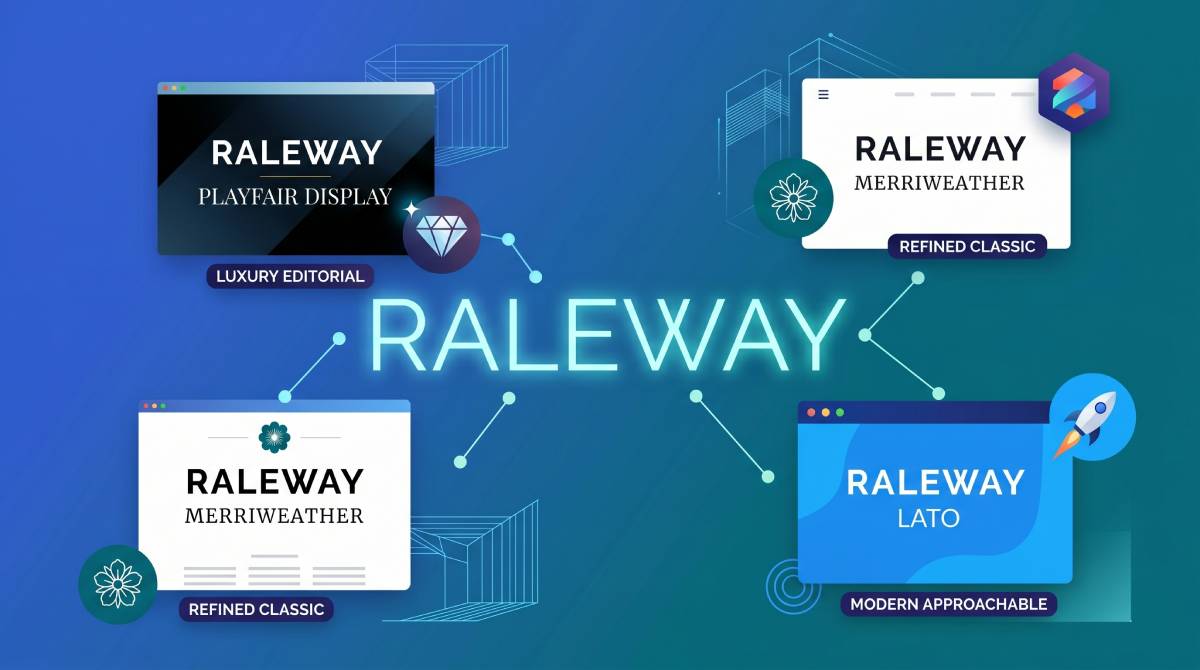
Raleway is an elegant display sans-serif with Art Deco roots, originally designed by Matt McInerney in 2010 and later expanded into a full family by Pablo Impallari and Rodrigo Fuenzalida. It is available free through Google Fonts.
Raleway suits fashion, lifestyle, and premium-positioned TikTok content because its thin-to-medium weights carry a high-contrast stroke structure that reads as polished and deliberate on screen. Fashion brands and lifestyle bloggers use it as a go-to for text overlays where aesthetic quality signals brand credibility.
What makes Raleway suitable for TikTok?
Raleway has high stroke contrast between thick and thin stroke elements, which gives it a distinctive look at display sizes above 28px. Its 9 weights from Thin (100) to Heavy (900) allow flexible hierarchy across title and caption layers. The wide default letter-spacing at lighter weights improves legibility for short phrases at large sizes.
Key attributes:
| Attribute | Value |
| Classification | Display sans-serif (Art Deco influence) |
| Designer | Matt McInerney, 2010; expanded by Impallari & Fuenzalida |
| Weight range | Thin 100 – Heavy 900 (9 weights) |
| Variable font | No |
| Recommended sizes | 24px–48px for display; 18px+ for Bold weight captions only |
| License | OFL (free personal and commercial) |
| Available on | Google Fonts |
| Price | Free |
How does Raleway perform for TikTok text overlays?
At Medium (500) and above, Raleway renders clearly over clean or subtly textured video backgrounds. Its thin stroke elements in lighter weights (Thin, ExtraLight) reduce legibility over busy or dark video content — those weights require a clean, minimal visual background to work at all.
What are the best pairings for Raleway in TikTok videos?
Raleway pairs with Helvetica for a clean aesthetic where both fonts share a modern sans-serif feel but differ in stroke contrast. For warmer editorial content, it pairs well with a humanist serif like Merriweather as a secondary caption font.
What are the limitations of Raleway for TikTok?
Raleway’s thin weights (Thin 100 – Light 300) are practically unreadable at standard caption sizes over video backgrounds without a text stroke. Its distinctive character limits it to niches where elegance is expected — it reads as mismatched in fitness, comedy, or high-energy content categories.
Raleway – Recommended Use Cases Within TikTok Videos
- Best for: Fashion haul overlays, skincare content, premium brand storytelling, minimalist edits
- Avoid for: Caption-level subtitle text below Bold weight; fast-paced or hype content
- Optimal weight: SemiBold 600 for captions; Bold 700–Heavy 900 for titles
- Optimal size range: 24px–48px
—
Futura
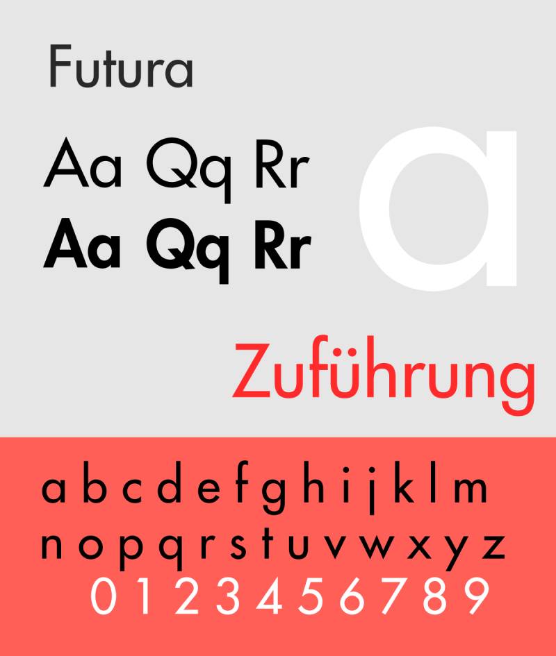
Futura is a geometric sans-serif designed by Paul Renner in 1927, released by Bauer Type Foundry. Built on Bauhaus principles of pure geometric forms (circles, triangles, straight lines), it remains one of the most recognized display typefaces in professional design.
Futura works for TikTok caption text because its monolinear strokes and consistent geometric construction maintain legibility across screen sizes. IKEA, Nike, and Volkswagen all use it — its association with quality-forward brands gives it instant credibility on video content.
What makes Futura suitable for TikTok?
Futura has a low x-height relative to its cap height, giving uppercase letters an elongated, authoritative look at display sizes. Its near-monolinear stroke weight eliminates the rendering artifacts that high-contrast fonts can develop on mid-range Android screens. Paul Renner’s 2026 inclusion in Creative Boom’s top 15 designer-favorite typefaces confirms its ongoing relevance.
Key attributes:
| Attribute | Value |
| Classification | Geometric sans-serif |
| Designer | Paul Renner, 1927 (Bauer Type Foundry) |
| Weight range | Light – ExtraBold (varies by version and license) |
| Variable font | No (standard versions) |
| Recommended sizes | 18px+ for captions; 36px+ for display titles |
| License | Commercial (various foundry licenses) |
| Available on | Adobe Fonts, MyFonts, Linotype direct |
| Price | Paid |
How does Futura perform for TikTok text?
Futura Medium and Bold render with geometric clarity at 20px–60px, making it effective for both subtitle captions and full-screen title cards. Its low x-height means it performs best at medium-to-large sizes — it loses legibility faster than high-x-height fonts like Montserrat when scaled down below 16px.
What are the best pairings for Futura in TikTok videos?
Futura pairs with Lato for a geometric-to-neutral contrast, where Futura handles display titles and Lato carries caption-level body text. It also works alongside Open Sans for web-first content where a free pairing font is needed.
What are the limitations of Futura for TikTok?
Futura is a paid commercial font with no free version on Google Fonts — creators without Adobe Fonts access need to purchase it separately. Its low x-height reduces legibility at small sizes, limiting its effectiveness for auto-generated caption text below 18px.
Futura – Recommended Use Cases Within TikTok Videos
- Best for: Brand-forward or premium content; full-screen title cards; design and architecture niches
- Avoid for: Subtitle-level captions below 18px; casual or humor content
- Optimal weight: Medium for clean captions; Bold for display titles
- Optimal size range: 20px–60px
—
Oswald
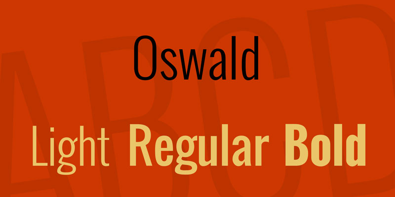
Oswald is a condensed sans-serif designed by Vernon Adams in 2011, available free on Google Fonts. It is a reworking of classic gothic/grotesque typeface styles, refined for digital screen use across multiple weights.
Oswald optimizes TikTok text overlays for business and tech content because its condensed proportions pack more words into a limited frame width while its multiple weights support full caption hierarchy from subtitle to headline. Creators in fitness, motivation, and tech regularly use it for high-density text overlays.
What makes Oswald suitable for TikTok?
Oswald has a condensed width with a moderate-to-high x-height, allowing longer caption lines to fit within TikTok’s 9:16 safe zone without text wrapping. It supports 6 weights from ExtraLight (200) to Bold (700), giving creators enough range to build visual hierarchy within a single font family. Unlike Bebas Neue, Oswald includes mixed-case letterforms.
Key attributes:
| Attribute | Value |
| Classification | Condensed grotesque sans-serif |
| Designer | Vernon Adams, 2011 |
| Weight range | ExtraLight 200 – Bold 700 (6 weights) |
| Variable font | No |
| Recommended sizes | 18px–32px captions; 36px+ display titles |
| Letter-spacing default | Slightly tight |
| License | OFL (free personal and commercial) |
| Available on | Google Fonts |
| Price | Free |
How does Oswald perform for TikTok caption and title text?
Oswald Bold renders with high visual impact at 36px+, while its Regular weight (400) holds legibility at 18px for subtitle-level text. Its condensed proportions pair well with the vertical format of TikTok video — fitting 30–40% more characters per line than standard-width fonts at equivalent sizes.
What are the best pairings for Oswald in TikTok videos?
Oswald pairs with Lato for a classic editorial contrast — Lato’s neutral, rounder forms balance Oswald’s tighter condensed structure. It also works with EB Garamond as a serif contrast pair for more refined content categories like finance or education.
What are the limitations of Oswald for TikTok?
Oswald’s maximum weight is Bold (700), which means it lacks the extreme stroke weight of Anton or Bebas Neue for single-word impact titles. At ExtraLight (200) and Light (300) weights, it loses sufficient stroke width for legibility over busy video backgrounds.
Oswald – Recommended Use Cases Within TikTok Videos
- Best for: Multi-line text overlays in business or educational content; condensed title cards
- Avoid for: Heavy single-word impact titles where Bebas Neue or Anton outperform; aesthetic or luxury content
- Optimal weight: Regular 400 for captions; Bold 700 for headlines
- Optimal size range: 18px–48px
—
Choosing Between These TikTok Fonts
Not every font here fits every content type. The right choice depends on two things: your niche, and the role the text plays in the video.
| Font | Best Niche | Primary Role | Cost |
| Montserrat Bold | Education, motivation | Captions + titles | Free (OFL) |
| Bebas Neue | Fitness, fashion, lifestyle | Display titles only | Free (OFL) |
| TikTok Sans | All niches | Platform-native captions | Free (Proprietary) |
| Proxima Nova | Business, media, editorial | Captions + subheadings | Paid |
| Helvetica | Finance, news, authority | Neutral captions | Paid |
| Poppins | Lifestyle, wellness, education | Captions + titles | Free (OFL) |
| Anton | Fitness, motivation, memes | Hook text, impact titles | Free (OFL) |
| Raleway | Fashion, beauty, premium | Aesthetic display text | Free (OFL) |
| Futura | Design, architecture, brand | Display titles | Paid |
| Oswald | Business, education, tech | Condensed captions + titles | Free (OFL) |
If you’re just starting out, Montserrat Bold or TikTok Sans cover the widest range of use cases at no cost. From there, the choice comes down to font psychology — what your text communicates before viewers even read the words.
Understanding how to correctly pair fonts across title and caption layers can also meaningfully improve how polished your TikTok content looks, especially as you move toward a consistent visual brand.
FAQ on The Best Fonts For TikTok
What is the best font for TikTok captions?
Montserrat Bold is the most widely used font for TikTok captions. Its large x-height and wide apertures keep text legible on small mobile screens. Creators like Alex Hormozi built entire content styles around it, and it’s free on Google Fonts.
What font does TikTok use by default?
TikTok’s default font is TikTok Sans, a custom typeface designed by Grilli Type in 2023. It appears in the app as “Classic,” “Bold,” and “Oblique.” TikTok released it as open-source under the SIL Open Font License in July 2025.
Are TikTok’s built-in fonts free to use?
Yes. All fonts inside TikTok’s text editor are free for use within the app. TikTok Sans is also free for external commercial use under the OFL license, downloadable directly from Google Fonts or TikTok’s GitHub repository.
What font size works best for TikTok video text?
Caption text reads clearly at 18px–28px for standard sans-serif fonts. Display titles work best at 36px and above. Fonts below Bold weight (600) typically need a text stroke to stay legible over busy video backgrounds.
Can I use custom fonts on TikTok?
TikTok’s in-app editor does not support custom font uploads. You can apply custom fonts by editing video outside the app using tools like CapCut, Canva Pro, or Kapwing, then uploading the finished video to TikTok.
What fonts do top TikTok creators use?
Most high-performing creators use Montserrat Bold, Bebas Neue, or TikTok Sans for captions. Anton is common in fitness and motivation content. Raleway appears in fashion and lifestyle niches where a more refined look is needed.
Does font choice affect TikTok watch time?
Yes. Captioned videos outperform uncaptioned ones by up to 32% in watch time for educational content, according to Blitzcut data. Bold, readable fonts drive this effect — thin or decorative fonts reduce caption legibility and break viewer focus.
What is the best font pairing for TikTok videos?
Bebas Neue for titles paired with Poppins for captions is one of the most effective combinations. The condensed display headline contrasts cleanly with Poppins’ rounded, readable body text. Montserrat Bold plus Proxima Nova is another reliable pairing.
Are all TikTok fonts free for commercial use?
Not all. Montserrat, Bebas Neue, TikTok Sans, Poppins, Anton, Raleway, and Oswald are free under the OFL license. Proxima Nova, Helvetica, and Futura require paid commercial licenses through their respective foundries.
What fonts should I avoid on TikTok?
Avoid script fonts, decorative typefaces, and any font below Regular (400) weight for caption use. Thin strokes disappear over video backgrounds. Comic Sans and bubble-style fonts signal low production quality and reduce credibility across most content niches.
Conclusion
This conclusion is for an article presenting the best fonts for TikTok videos across ten typefaces, from bold display options like Anton and Bebas Neue to clean, readable choices like Oswald and Poppins.
Font weight, x-height, and screen legibility are not minor details. They determine whether your text overlay survives a busy video background at mobile scale.
Free options cover most use cases. Montserrat, TikTok Sans, and Anton cost nothing and perform well across fitness, education, lifestyle, and brand content.
Paid fonts like Helvetica and Futura add credibility in specific niches, but only when the font licensing is handled correctly for commercial TikTok use.
Pick one font for titles, one for captions, keep the weight bold enough to read, and stay consistent across your content.

Renowned for his expertise in logo design and visual branding, Bogdan has developed a multitude of logos for various clients.
His skills extend to creating posters, vector illustrations, business cards, and brochures. Additionally, Bogdan's UI kits were featured on marketplaces like Visual Hierarchy and UI8.
He also wrote in the past years on sites like Design Your Way, WebDesignerDepot, WPDean, Designmodo, Speckyboy, Slider Revolution, and more.
- The Windsurf Logo History, Colors, Font, And Meaning - 10 October 2026
- How to Remove Background From Product Photos (No Photoshop) - 10 October 2026
- How Designers can Build a Stronger Online Creative Identity - 9 October 2026

Bogdan Sandu is a seasoned designer who has been designing websites since 2008. Renowned for his expertise in logo design and visual branding, Bogdan has developed a multitude of logos for various clients. His skills extend to creating posters, vector illustrations, business cards, and brochures. Additionally, Bogdan's UI kits were featured on marketplaces like Visual Hierarchy and UI8. He also wrote in the past years on sites like Design Your Way, WebDesignerDepot, WPDean, Designmodo, Speckyboy, Slider Revolution, and more.
You Might Also Like