


Every basketball fan recognizes the iconic Chicago Bulls logo, but NBA logos represent far more than simple team identification. These visual symbols embody decades of franchise history, city pride, and professional basketball evolution.
From the Boston Celtics leprechaun to the Golden State Warriors bridge design, each team’s logo tells a unique story about regional identity and basketball culture. Understanding these designs reveals the strategic thinking behind professional sports branding.
This comprehensive guide examines all 30 NBA team logos, exploring their design elements, historical evolution, and cultural significance. You’ll discover how color psychology, typography, and regional symbolism shape franchise identity.
Whether you’re analyzing team branding strategies or simply curious about basketball logo design, this analysis provides detailed insights into the visual language that defines professional basketball.
NBA Logos
| Team Entity | Primary Visual Attribute | Semantic Context Value | Unique Identifier Attribute |
|---|---|---|---|
| Atlanta Hawks | Stylized hawk head silhouette | Predatory bird symbolism | Red-yellow gradient coloring |
| Boston Celtics | Leprechaun mascot figure | Irish heritage symbolism | Shamrock and Celtic typography |
| Brooklyn Nets | Minimalist basketball net icon | Modern urban aesthetic | Monochromatic black-white scheme |
| Charlotte Hornets | Aggressive hornet illustration | Insect aggression symbolism | Teal-purple color combination |
| Chicago Bulls | Bull head frontal view | Strength and determination | Iconic red-black contrast |
| Cleveland Cavaliers | Sword and shield emblem | Medieval warrior symbolism | Wine-gold royal colors |
| Dallas Mavericks | Stylized horse head | Western frontier independence | Blue-silver modern gradient |
| Denver Nuggets | Mountain peak silhouette | Colorado Rocky Mountains | Navy-gold mining colors |
| Detroit Pistons | Basketball and piston graphic | Automotive industry heritage | Red-blue-white industrial |
| Golden State Warriors | Bay Bridge outline | San Francisco Bay Area | Golden-royal blue palette |
| Houston Rockets | Rocket ship trajectory | NASA space program | Red-silver aerospace theme |
| Indiana Pacers | Circular P basketball logo | Racing heritage (Indianapolis 500) | Navy-gold racing colors |
| LA Clippers | Sailing ship silhouette | Maritime Los Angeles history | Red-blue nautical scheme |
| Los Angeles Lakers | Basketball with wordmark | Minnesota lakes heritage | Purple-gold luxury colors |
| Memphis Grizzlies | Bear head profile | Wilderness strength symbolism | Navy-beale blue combination |
| Miami Heat | Flaming basketball | Tropical heat climate | Red-black-white intensity |
| Milwaukee Bucks | Buck deer head profile | Wisconsin wildlife heritage | Forest green-cream natural |
| Minnesota Timberwolves | Wolf head howling | Northern wilderness pack | Midnight blue-lime accent |
| New Orleans Pelicans | Pelican bird in flight | Louisiana state bird | Navy-gold-red Mardi Gras |
| New York Knicks | Basketball with triangle | Knickerbockers heritage | Orange-blue NYC colors |
| Oklahoma City Thunder | Shield with basketball | Storm power symbolism | Thunder blue-orange energy |
| Orlando Magic | Stylized basketball star | Entertainment fantasy theme | Blue-black-silver mystical |
| Philadelphia 76ers | Basketball with 76 stars | 1776 American Revolution | Red-white-blue patriotic |
| Phoenix Suns | Basketball with sun rays | Arizona desert sun | Orange-purple sunset gradient |
| Portland Trail Blazers | Pinwheel spiral design | Oregon Trail pioneer spirit | Red-black geometric pattern |
| Sacramento Kings | Crown above basketball | Royal authority symbolism | Purple-silver-black regality |
| San Antonio Spurs | Basketball with spur | Texas cowboy heritage | Black-silver-white classic |
| Toronto Raptors | Dinosaur claw with basketball | Jurassic Park era inspiration | Red-black-gold Canadian |
| Utah Jazz | Musical note basketball | New Orleans jazz heritage | Navy-gold mountain colors |
| Washington Wizards | Hands holding basketball | Magical transformation power | Navy-red-white DC colors |
Atlanta Hawks Logo

Brief intro: Atlanta Hawks logo features a stylized hawk head within a circle, representing strength and aerial dominance in basketball competition.
Design Elements
- Primary colors: Hawks Red #E03A3E, Volt Green #C1D32F, Hawks Charcoal #26282A
- Typography: Custom condensed sans-serif font with athletic styling
- Symbolism: Hawk head profile, basketball team identity, Atlanta city connection
- Shape/composition: Circular design with dynamic hawk silhouette
Historical Evolution
- Original design year: 1968
- Major redesigns: 1995, 2015
- Current version since: 2015
Brand Identity Attributes
- Team values represented: Speed, precision, predatory instincts
- City/regional connection: Georgia state bird symbolism
- Visual distinctiveness: Distinctive red and green color palette among NBA logos
Usage Specifications
- Primary logo format: Circular hawk head design
- Alternative versions: Secondary wordmark, simplified hawk silhouette
- Color variations: Monochrome colors versions for single-color applications
- Size constraints: Minimum 0.5 inch diameter for clarity
Recognition Metrics
- Brand recognition: Medium
- Fan merchandise popularity: Strong regional appeal with jersey sales
- Marketing prominence: Featured prominently across team branding materials
Boston Celtics Logo
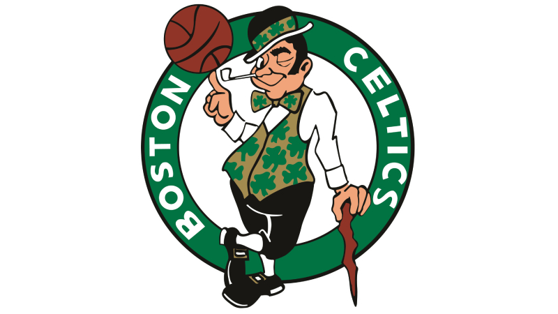
Brief intro: Boston Celtics logo showcases Lucky the Leprechaun spinning a basketball, embodying Irish heritage and basketball tradition with playful character design.
Design Elements
- Primary colors: Celtics Green #007A33, Celtics Gold #BA9653, White #FFFFFF, Black #000000
- Typography: Traditional serif font with Celtic-inspired lettering
- Symbolism: Leprechaun figure, Irish cultural heritage, four-leaf clover elements
- Shape/composition: Character-based design with basketball integration
Historical Evolution
- Original design year: 1946
- Major redesigns: 1950, 1996
- Current version since: 1996
Brand Identity Attributes
- Team values represented: Tradition, luck, Celtic pride, championship heritage
- City/regional connection: Boston’s strong Irish-American community
- Visual distinctiveness: Only character mascot logo in professional basketball
Usage Specifications
- Primary logo format: Full leprechaun with basketball
- Alternative versions: Shamrock logo, wordmark variations
- Color variations: Green and white simplified versions
- Size constraints: Minimum 0.75 inch height for character detail recognition
Recognition Metrics
- Brand recognition: High
- Fan merchandise popularity: Historic franchise with global merchandise appeal
- Marketing prominence: Central to all team marketing and arena branding
Brooklyn Nets Logo

Brief intro: Brooklyn Nets logo features a minimalist “B” within a basketball design, representing urban simplicity and professional basketball excellence.
Design Elements
- Primary colors: Black #000000, White #FFFFFF
- Typography: Clean modern typeface with geometric construction
- Symbolism: Borough identity, basketball sport, metropolitan sophistication
- Shape/composition: Geometric “B” inside circle with basketball lines
Historical Evolution
- Original design year: 2012
- Major redesigns: None since Brooklyn relocation
- Current version since: 2012
Brand Identity Attributes
- Team values represented: Urban sophistication, modernity, professional excellence
- City/regional connection: Brooklyn borough pride, New York metropolitan area
- Visual distinctiveness: Stark black-and-white contrast design philosophy
Usage Specifications
- Primary logo format: “B” basketball circle design
- Alternative versions: Standalone “B” letter, shield variations
- Color variations: Reversed white on black applications
- Size constraints: Minimum 0.4 inch diameter for letter clarity
Recognition Metrics
- Brand recognition: Medium
- Fan merchandise popularity: Strong urban market appeal
- Marketing prominence: Featured across modern arena and digital platforms
Charlotte Hornets Logo
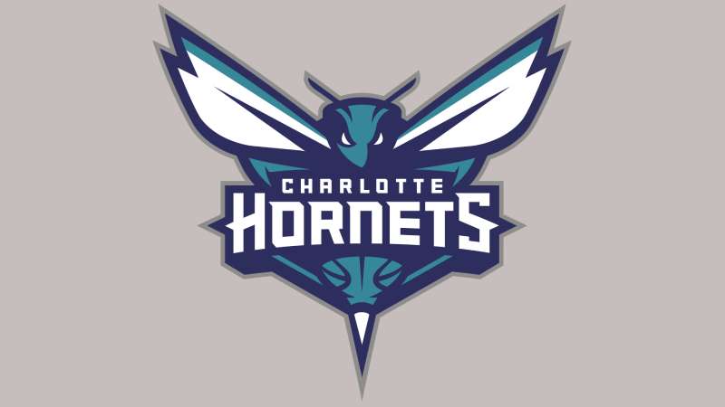
Brief intro: Charlotte Hornets logo displays a fierce hornet head with extended wings, symbolizing aggressive defensive play and regional insect identity.
Design Elements
- Primary colors: Hornets Purple #1D1160, Teal #00788C, Gray #A1A1A4
- Typography: Aggressive angular font with sharp edges
- Symbolism: Hornet insect, defensive aggression, Charlotte regional identity
- Shape/composition: Horizontal hornet profile with wing span
Historical Evolution
- Original design year: 1988 (original franchise)
- Major redesigns: 2004 (became Bobcats), 2014 (returned as Hornets)
- Current version since: 2014
Brand Identity Attributes
- Team values represented: Aggression, teamwork, defensive intensity
- City/regional connection: Charlotte’s “Hornet’s Nest” Revolutionary War history
- Visual distinctiveness: Unique purple and teal color combination
Usage Specifications
- Primary logo format: Full hornet head with wings
- Alternative versions: Simplified hornet silhouette, basketball integration
- Color variations: Single-color purple and teal options
- Size constraints: Minimum 0.6 inch width for wing detail visibility
Recognition Metrics
- Brand recognition: Medium
- Fan merchandise popularity: Strong nostalgic appeal for original franchise fans
- Marketing prominence: Central to team identity and merchandise design
Chicago Bulls Logo
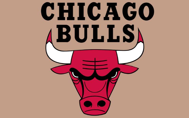
Brief intro: Chicago Bulls logo features an iconic red bull’s head with aggressive expression, representing strength and championship determination through minimalist design.
Design Elements
- Primary colors: Bulls Red #CE1141, Black #000000
- Typography: Bold condensed lettering with athletic characteristics
- Symbolism: Bull’s head, Chicago stockyards history, strength and power
- Shape/composition: Frontal bull head with prominent horns
Historical Evolution
- Original design year: 1966
- Major redesigns: Minor refinements only
- Current version since: 1966 (virtually unchanged)
Brand Identity Attributes
- Team values represented: Power, determination, championship mentality
- City/regional connection: Chicago’s meatpacking and stockyard heritage
- Visual distinctiveness: One of most recognizable sports logos globally
Usage Specifications
- Primary logo format: Red bull head on white background
- Alternative versions: Black outline version, simplified silhouette
- Color variations: Single red, black outline options
- Size constraints: Minimum 0.5 inch height for horn definition
Recognition Metrics
- Brand recognition: Very High
- Fan merchandise popularity: Global appeal, Michael Jordan legacy connection
- Marketing prominence: Primary element in all team communications
Cleveland Cavaliers Logo

Brief intro: Cleveland Cavaliers logo presents a shield design with sword elements, reflecting cavalier warrior heritage and championship resilience.
Design Elements
- Primary colors: Cavaliers Wine #860038, Cavaliers Navy #041E42, Cavaliers Gold #FDBB30
- Typography: Regal serif font with royal characteristics
- Symbolism: Shield, sword, cavalier warrior, royal heritage
- Shape/composition: Heraldic shield with internal elements
Historical Evolution
- Original design year: 1970
- Major redesigns: 1983, 1994, 2003, 2010
- Current version since: 2022
Brand Identity Attributes
- Team values represented: Honor, warrior spirit, championship determination
- City/regional connection: Ohio state pride, Cleveland industrial strength
- Visual distinctiveness: Wine and gold color scheme among NBA franchises
Usage Specifications
- Primary logo format: Full shield with sword elements
- Alternative versions: “C” monogram, simplified shield
- Color variations: Navy and gold combinations
- Size constraints: Minimum 0.7 inch height for detail recognition
Recognition Metrics
- Brand recognition: Medium-High
- Fan merchandise popularity: Strong regional loyalty, championship history appeal
- Marketing prominence: Featured prominently in arena and uniform design
Dallas Mavericks Logo
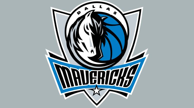
Brief intro: Dallas Mavericks logo showcases a stylized horse head merged with basketball elements, representing Texas independence and athletic speed.
Design Elements
- Primary colors: Royal Blue #00538C, Navy Blue #002B5E, Silver #B8C4CA, Black #000000
- Typography: Dynamic slanted lettering with motion characteristics
- Symbolism: Maverick horse, Texas heritage, independence and freedom
- Shape/composition: Horse head profile integrated with basketball design
Historical Evolution
- Original design year: 1980
- Major redesigns: 1993, 2001
- Current version since: 2001
Brand Identity Attributes
- Team values represented: Independence, speed, Texas pride
- City/regional connection: Dallas cowboy and ranching heritage
- Visual distinctiveness: Unique horse integration among professional sports
Usage Specifications
- Primary logo format: Horse head with basketball elements
- Alternative versions: “M” monogram, simplified horse silhouette
- Color variations: Blue and silver combinations
- Size constraints: Minimum 0.6 inch width for horse profile clarity
Recognition Metrics
- Brand recognition: Medium
- Fan merchandise popularity: Strong Texas regional appeal
- Marketing prominence: Central to team branding and arena design
Denver Nuggets Logo
Brief intro: Denver Nuggets logo features mountain peaks with pickaxe and basketball, celebrating Colorado’s mining history and Rocky Mountain geography.
Design Elements
- Primary colors: Midnight Blue #0E2240, Sunshine Yellow #FEC524, Flatirons Red #8B2131, Skyline Blue #1D428A
- Typography: Modern sans-serif font with clean lines
- Symbolism: Mountain peaks, mining pickaxe, gold rush heritage
- Shape/composition: Circular design with mountain silhouette
Historical Evolution
- Original design year: 1967
- Major redesigns: 1974, 1982, 1993, 2003, 2018
- Current version since: 2018
Brand Identity Attributes
- Team values represented: Hard work, elevation, mining determination
- City/regional connection: Colorado Rocky Mountains, Denver gold rush history
- Visual distinctiveness: Unique mining and mountain theme integration
Usage Specifications
- Primary logo format: Mountain circle with pickaxe
- Alternative versions: Simplified mountain peaks, “D” monogram
- Color variations: Blue and yellow combinations
- Size constraints: Minimum 0.5 inch diameter for mountain detail
Recognition Metrics
- Brand recognition: Medium
- Fan merchandise popularity: Strong Colorado regional identity appeal
- Marketing prominence: Featured across team communications and arena branding
Detroit Pistons Logo
Brief intro: Detroit Pistons logo incorporates automotive-inspired design elements with basketball, reflecting Detroit’s motor city industrial heritage.
Design Elements
- Primary colors: Red #C8102E, Royal #1D42BA, Gray #BEC0C2, Navy #002D62
- Typography: Industrial-style lettering with mechanical characteristics
- Symbolism: Automotive piston, Detroit motor industry, mechanical precision
- Shape/composition: Circular design with automotive elements
Historical Evolution
- Original design year: 1957
- Major redesigns: 1971, 1979, 1996, 2001, 2017
- Current version since: 2017
Brand Identity Attributes
- Team values represented: Industrial strength, precision, mechanical excellence
- City/regional connection: Detroit automotive industry, Motor City identity
- Visual distinctiveness: Automotive theming among professional basketball
Usage Specifications
- Primary logo format: Circular design with piston elements
- Alternative versions: “P” monogram, simplified automotive symbol
- Color variations: Red and blue combinations
- Size constraints: Minimum 0.5 inch diameter for mechanical detail clarity
Recognition Metrics
- Brand recognition: Medium
- Fan merchandise popularity: Strong Detroit regional loyalty
- Marketing prominence: Integrated throughout team branding and marketing
Golden State Warriors Logo
Brief intro: Golden State Warriors logo features the Bay Bridge silhouette within a circular design, celebrating California geography and basketball excellence.
Design Elements
- Primary colors: Warriors Blue #1D428A, Golden Yellow #FFC72C
- Typography: Modern athletic lettering with California styling
- Symbolism: Bay Bridge, California Golden State, regional geography
- Shape/composition: Circular bridge silhouette design
Historical Evolution
- Original design year: 1962
- Major redesigns: 1969, 1975, 1989, 1997, 2010
- Current version since: 2010
Brand Identity Attributes
- Team values represented: Innovation, California pride, championship excellence
- City/regional connection: San Francisco Bay Area geography
- Visual distinctiveness: Bridge architecture integration in sports branding
Usage Specifications
- Primary logo format: Bay Bridge circle design
- Alternative versions: “W” monogram, simplified bridge silhouette
- Color variations: Blue and gold combinations
- Size constraints: Minimum 0.5 inch diameter for bridge detail recognition
Recognition Metrics
- Brand recognition: High
- Fan merchandise popularity: Championship success drives global appeal
- Marketing prominence: Central to team identity and championship branding
Houston Rockets Logo

Brief intro: Houston Rockets logo displays a stylized rocket with circular elements, representing space exploration and Houston’s NASA connection.
Design Elements
- Primary colors: Red #CE1141, Black #000000, Silver #C4CED4
- Typography: Futuristic lettering with space-age characteristics
- Symbolism: Rocket ship, space exploration, NASA Houston mission control
- Shape/composition: Vertical rocket with circular background elements
Historical Evolution
- Original design year: 1971
- Major redesigns: 1995, 2003, 2019
- Current version since: 2019
Brand Identity Attributes
- Team values represented: Innovation, space exploration, technological advancement
- City/regional connection: Houston NASA Space Center, aerospace industry
- Visual distinctiveness: Space and rocket theming among professional sports
Usage Specifications
- Primary logo format: Rocket with circular elements
- Alternative versions: “R” monogram, simplified rocket silhouette
- Color variations: Red and black combinations
- Size constraints: Minimum 0.6 inch height for rocket detail visibility
Recognition Metrics
- Brand recognition: Medium-High
- Fan merchandise popularity: Space theme appeals to diverse demographics
- Marketing prominence: Featured prominently in team communications
Indiana Pacers Logo
Brief intro: Indiana Pacers logo features a basketball with motion lines and “P” letter integration, emphasizing speed and Indiana basketball tradition.
Design Elements
- Primary colors: Pacers Blue #002D62, Yellow #FDBB30, Silver #BEC0C2
- Typography: Athletic block lettering with racing characteristics
- Symbolism: Basketball motion, Indiana racing heritage, speed elements
- Shape/composition: Circular basketball with dynamic motion lines
Historical Evolution
- Original design year: 1967
- Major redesigns: 1976, 1990, 2005
- Current version since: 2005
Brand Identity Attributes
- Team values represented: Speed, basketball tradition, Indiana racing heritage
- City/regional connection: Indianapolis 500 racing, Hoosier basketball culture
- Visual distinctiveness: Racing and motion integration in basketball branding
Usage Specifications
- Primary logo format: Basketball with motion lines
- Alternative versions: “P” monogram, simplified basketball design
- Color variations: Blue and yellow combinations
- Size constraints: Minimum 0.5 inch diameter for motion line clarity
Recognition Metrics
- Brand recognition: Medium
- Fan merchandise popularity: Strong Indiana basketball tradition appeal
- Marketing prominence: Central to team identity and arena branding
LA Clippers Logo
Brief intro: LA Clippers logo presents a nautical-inspired compass design within a circle, reflecting maritime heritage and Los Angeles coastal identity.
Design Elements
- Primary colors: Red #C8102E, Blue #1D428A, Silver #BEC0C2, Black #000000
- Typography: Custom naval-inspired typeface with maritime characteristics
- Symbolism: Nautical compass, ship elements, Los Angeles harbor heritage
- Shape/composition: Circular compass with directional elements
Historical Evolution
- Original design year: 1970 (as Buffalo Braves)
- Major redesigns: 1978 (San Diego), 1984 (Los Angeles), 2015, 2024
- Current version since: 2024
Brand Identity Attributes
- Team values represented: Navigation, maritime heritage, Los Angeles coastal pride
- City/regional connection: LA harbor, Pacific Ocean coastal identity
- Visual distinctiveness: Nautical theming among professional basketball
Usage Specifications
- Primary logo format: Compass circle with “C” integration
- Alternative versions: Simplified “C” monogram, compass variations
- Color variations: Red, blue, and silver combinations
- Size constraints: Minimum 0.5 inch diameter for compass detail recognition
Recognition Metrics
- Brand recognition: Medium
- Fan merchandise popularity: New design gaining traction with fans
- Marketing prominence: Featured across new arena and team communications
Los Angeles Lakers Logo
Brief intro: Los Angeles Lakers logo combines purple and gold colors with basketball elements, representing royal excellence and championship tradition.
Design Elements
- Primary colors: Lakers Purple #552583, Gold #FDB927, Black #000000
- Typography: Classical serif font with regal characteristics
- Symbolism: Royal colors, championship excellence, Los Angeles entertainment
- Shape/composition: Wordmark with basketball integration
Historical Evolution
- Original design year: 1947 (Minneapolis Lakers)
- Major redesigns: 1960 (Los Angeles move), 1972, 2001
- Current version since: 2001
Brand Identity Attributes
- Team values represented: Excellence, championship tradition, Hollywood glamour
- City/regional connection: Los Angeles entertainment industry, California gold rush
- Visual distinctiveness: Purple and gold color psychology among NBA teams
Usage Specifications
- Primary logo format: “Lakers” wordmark with basketball
- Alternative versions: “LA” monogram, simplified wordmark
- Color variations: Purple and gold combinations
- Size constraints: Minimum 0.8 inch width for wordmark readability
Recognition Metrics
- Brand recognition: Very High
- Fan merchandise popularity: Global appeal, championship history drives sales
- Marketing prominence: Central to all team branding and marketing efforts
Memphis Grizzlies Logo
Brief intro: Memphis Grizzlies logo features a fierce grizzly bear head design, representing strength and aggressive play with regional wildlife connection.
Design Elements
- Primary colors: Blue #5D76A9, Navy #12173F, Yellow #F5B112, Gray #707271
- Typography: Bold athletic lettering with rugged characteristics
- Symbolism: Grizzly bear, Memphis regional wildlife, strength and aggression
- Shape/composition: Bear head profile with aggressive expression
Historical Evolution
- Original design year: 1995 (Vancouver Grizzlies)
- Major redesigns: 2001 (Memphis move), 2004, 2018
- Current version since: 2018
Brand Identity Attributes
- Team values represented: Strength, aggression, territorial defense
- City/regional connection: Memphis blues heritage, regional wildlife
- Visual distinctiveness: Bear animal mascot among professional basketball
Usage Specifications
- Primary logo format: Grizzly bear head profile
- Alternative versions: Paw print, “M” monogram with bear elements
- Color variations: Blue and navy combinations
- Size constraints: Minimum 0.6 inch height for bear feature detail
Recognition Metrics
- Brand recognition: Medium
- Fan merchandise popularity: Strong regional appeal, bear theme resonates
- Marketing prominence: Featured prominently in team identity and arena design
Miami Heat Logo
Brief intro: Miami Heat logo showcases a flaming basketball passing through a hoop, symbolizing intensity and South Florida heat.
Design Elements
- Primary colors: Red #98002E, Yellow #F9A01B, Black #000000
- Typography: Dynamic lettering with flame-inspired characteristics
- Symbolism: Flaming basketball, Miami heat, intensity and passion
- Shape/composition: Circular design with basketball and flame elements
Historical Evolution
- Original design year: 1988
- Major redesigns: Minor refinements only
- Current version since: 1988 (essentially unchanged)
Brand Identity Attributes
- Team values represented: Intensity, passion, Miami heat culture
- City/regional connection: South Florida climate, Miami energy
- Visual distinctiveness: Fire and heat theming among professional sports
Usage Specifications
- Primary logo format: Flaming basketball through hoop
- Alternative versions: Simplified flame, “H” monogram
- Color variations: Red and black combinations
- Size constraints: Minimum 0.5 inch diameter for flame detail visibility
Recognition Metrics
- Brand recognition: High
- Fan merchandise popularity: Championship success and star players drive appeal
- Marketing prominence: Central to team branding and arena atmosphere
Milwaukee Bucks Logo
Brief intro: Milwaukee Bucks logo displays a stylized buck head within a circular design, representing Wisconsin wildlife and athletic determination.
Design Elements
- Primary colors: Good Land Green #00471B, Cream City Cream #EEE1C6, Great Lakes Blue #0077C0, Black #000000
- Typography: Modern athletic lettering with Wisconsin characteristics
- Symbolism: Buck deer head, Wisconsin wildlife, regional hunting culture
- Shape/composition: Circular buck head with antler prominence
Historical Evolution
- Original design year: 1968
- Major redesigns: 1993, 2006, 2015
- Current version since: 2015
Brand Identity Attributes
- Team values represented: Determination, Wisconsin pride, natural strength
- City/regional connection: Wisconsin wildlife, Great Lakes region
- Visual distinctiveness: Deer/buck theming among professional basketball
Usage Specifications
- Primary logo format: Buck head in circle
- Alternative versions: “M” monogram, antler elements
- Color variations: Green and cream combinations
- Size constraints: Minimum 0.5 inch diameter for antler detail recognition
Recognition Metrics
- Brand recognition: Medium-High
- Fan merchandise popularity: Championship success increases global appeal
- Marketing prominence: Featured prominently across team branding
Minnesota Timberwolves Logo
Brief intro: Minnesota Timberwolves logo features a howling wolf head with basketball elements, representing Minnesota wilderness and pack mentality.
Design Elements
- Primary colors: Midnight Blue #0C2340, Lake Blue #236192, Moonlight Grey #9EA2A2, Aurora Green #78BE20
- Typography: Rugged lettering with wilderness characteristics
- Symbolism: Wolf head, Minnesota wilderness, pack hunting behavior
- Shape/composition: Wolf head profile with basketball integration
Historical Evolution
- Original design year: 1989
- Major redesigns: 1996, 2008, 2017
- Current version since: 2017
Brand Identity Attributes
- Team values represented: Pack mentality, wilderness survival, Minnesota nature
- City/regional connection: Minnesota forests, northern wilderness heritage
- Visual distinctiveness: Wolf animal theme among professional basketball
Usage Specifications
- Primary logo format: Howling wolf head with basketball
- Alternative versions: Paw print, “M” monogram with wolf elements
- Color variations: Blue and green combinations
- Size constraints: Minimum 0.6 inch height for wolf feature clarity
Recognition Metrics
- Brand recognition: Medium
- Fan merchandise popularity: Regional appeal, wilderness theme resonates
- Marketing prominence: Central to team identity and Minnesota branding
New Orleans Pelicans Logo
Brief intro: New Orleans Pelicans logo presents a pelican with spread wings holding a basketball, celebrating Louisiana state bird and regional heritage.
Design Elements
- Primary colors: Pelicans Navy #0C2340, Pelicans Red #C8102E, Pelicans Gold #85714D
- Typography: Modern athletic lettering with New Orleans flair
- Symbolism: Pelican bird, Louisiana state symbol, Mardi Gras colors
- Shape/composition: Pelican with extended wings and basketball
Historical Evolution
- Original design year: 2013
- Major redesigns: 2014, 2020
- Current version since: 2020
Brand Identity Attributes
- Team values represented: Regional pride, Louisiana heritage, soaring excellence
- City/regional connection: Louisiana state bird, New Orleans culture
- Visual distinctiveness: Pelican bird theme unique among professional sports
Usage Specifications
- Primary logo format: Pelican with basketball
- Alternative versions: “P” monogram, simplified pelican silhouette
- Color variations: Navy, red, and gold combinations
- Size constraints: Minimum 0.7 inch width for wing detail visibility
Recognition Metrics
- Brand recognition: Medium
- Fan merchandise popularity: Regional Louisiana appeal
- Marketing prominence: Featured across team communications and arena design
New York Knicks Logo
Brief intro: New York Knicks logo features classic wordmark design with basketball integration, representing New York basketball tradition and metropolitan excellence.
Design Elements
- Primary colors: Knicks Blue #006BB6, Knicks Orange #F58426, Silver #BEC0C2, Black #000000
- Typography: Traditional athletic block lettering with New York characteristics
- Symbolism: New York colors, metropolitan basketball, tradition
- Shape/composition: Wordmark with basketball elements
Historical Evolution
- Original design year: 1946
- Major redesigns: 1964, 1979, 1992
- Current version since: 1992
Brand Identity Attributes
- Team values represented: New York tradition, metropolitan excellence, basketball heritage
- City/regional connection: New York City, Madison Square Garden legacy
- Visual distinctiveness: Classic blue and orange color theory application
Usage Specifications
- Primary logo format: “Knicks” wordmark with basketball
- Alternative versions: “NY” monogram, simplified wordmark
- Color variations: Blue and orange combinations
- Size constraints: Minimum 0.8 inch width for wordmark legibility
Recognition Metrics
- Brand recognition: High
- Fan merchandise popularity: New York market size drives global appeal
- Marketing prominence: Central to Madison Square Garden branding
Oklahoma City Thunder Logo
Brief intro: Oklahoma City Thunder logo incorporates shield design with basketball and weather elements, representing Oklahoma storms and team strength.
Design Elements
- Primary colors: Thunder Blue #007AC1, Sunset #EF3B24, Blue #002D62, Yellow #FDBB30
- Typography: Bold athletic lettering with weather-inspired characteristics
- Symbolism: Thunder storms, Oklahoma weather, shield protection
- Shape/composition: Shield design with basketball and lightning elements
Historical Evolution
- Original design year: 2008
- Major redesigns: Minor refinements only
- Current version since: 2008
Brand Identity Attributes
- Team values represented: Power, Oklahoma weather, protective strength
- City/regional connection: Oklahoma thunderstorms, Great Plains weather
- Visual distinctiveness: Weather theming among professional basketball
Usage Specifications
- Primary logo format: Shield with basketball and weather elements
- Alternative versions: “OKC” monogram, simplified shield
- Color variations: Blue and orange combinations
- Size constraints: Minimum 0.6 inch height for shield detail recognition
Recognition Metrics
- Brand recognition: Medium
- Fan merchandise popularity: Strong Oklahoma regional loyalty
- Marketing prominence: Featured prominently in team communications
Orlando Magic Logo
Brief intro: Orlando Magic logo features stylized wordmark with star elements, representing Disney magic and Orlando entertainment industry.
Design Elements
- Primary colors: Magic Blue #0077C0, Silver #C4CED4, Black #000000
- Typography: Stylized lettering with magical characteristics
- Symbolism: Magic theme, Disney connection, entertainment industry
- Shape/composition: Wordmark with star and magical elements
Historical Evolution
- Original design year: 1989
- Major redesigns: 2000, 2010
- Current version since: 2010
Brand Identity Attributes
- Team values represented: Magic, entertainment, Orlando tourism industry
- City/regional connection: Disney World, Orlando entertainment hub
- Visual distinctiveness: Magic and entertainment theming
Usage Specifications
- Primary logo format: “Magic” wordmark with star elements
- Alternative versions: Star symbol, “M” monogram
- Color variations: Blue and silver combinations
- Size constraints: Minimum 0.8 inch width for wordmark clarity
Recognition Metrics
- Brand recognition: Medium
- Fan merchandise popularity: Disney connection appeals to families
- Marketing prominence: Integrated with Orlando entertainment branding
Philadelphia 76ers Logo
Brief intro: Philadelphia 76ers logo incorporates American independence symbols with basketball, celebrating Philadelphia’s role in American history.
Design Elements
- Primary colors: Blue #006BB6, Red #ED174C, Navy #002B5C, Silver #C4CED4
- Typography: Patriotic lettering with American historical characteristics
- Symbolism: American Revolution, 13 colonies, Philadelphia independence
- Shape/composition: Circular design with stars and basketball
Historical Evolution
- Original design year: 1949 (as Syracuse Nationals)
- Major redesigns: 1963 (Philadelphia move), 1978, 1997, 2015
- Current version since: 2015
Brand Identity Attributes
- Team values represented: Independence, American history, Philadelphia heritage
- City/regional connection: American Revolution birthplace, Liberty Bell
- Visual distinctiveness: American historical theming among professional sports
Usage Specifications
- Primary logo format: Circle with stars and “76ers”
- Alternative versions: Bell symbol, “76” number emphasis
- Color variations: Red, white, and blue patriotic combinations
- Size constraints: Minimum 0.6 inch diameter for star detail visibility
Recognition Metrics
- Brand recognition: Medium-High
- Fan merchandise popularity: Historical significance appeals broadly
- Marketing prominence: Featured prominently in Philadelphia market
Phoenix Suns Logo
Brief intro: Phoenix Suns logo features a basketball with radiating sun rays, representing Arizona desert heat and solar energy through dynamic logo design principles.
Design Elements
- Primary colors: Purple #1D1160, Orange #E56020, Black #000000, Yellow #F9AD1B
- Typography: Custom western-style font with athletic characteristics
- Symbolism: Sun rays, basketball, desert heat, Arizona solar identity
- Shape/composition: Circular basketball with dynamic radiating ray elements
Historical Evolution
- Original design year: 1968
- Major redesigns: 1992, 2000, 2013
- Current version since: 2013
Brand Identity Attributes
- Team values represented: Energy, heat, desert resilience, championship determination
- City/regional connection: Arizona desert climate, Phoenix rising mythology
- Visual distinctiveness: Sun and solar theming unique among professional basketball logos
Usage Specifications
- Primary logo format: Basketball with radiating sun elements
- Alternative versions: Simplified sun symbol, “PHX” monogram variations
- Color variations: Monochrome colors versions for single-color applications
- Size constraints: Minimum 0.5 inch diameter for sun ray clarity
Recognition Metrics
- Brand recognition: Medium-High
- Fan merchandise popularity: Desert theme appeals to southwestern markets
- Marketing prominence: Featured prominently in Arizona market and team communications
Portland Trail Blazers Logo
Brief intro: Portland Trail Blazers logo displays an iconic pinwheel design representing five-on-five basketball through minimalist design principles.
Design Elements
- Primary colors: Red #E03A3E, Black #000000
- Typography: Bold athletic lettering with Pacific Northwest characteristics
- Symbolism: Pinwheel represents 5v5 basketball, Oregon trail blazing heritage
- Shape/composition: Circular pinwheel with interlocking geometric elements
Historical Evolution
- Original design year: 1970
- Major redesigns: Minor refinements only
- Current version since: 1970 (essentially unchanged)
Brand Identity Attributes
- Team values represented: Pioneer spirit, trail blazing independence, Pacific Northwest identity
- City/regional connection: Oregon Trail history, Portland pioneering heritage
- Visual distinctiveness: Abstract pinwheel design unique among professional sports logos
Usage Specifications
- Primary logo format: Red and black interlocking pinwheel
- Alternative versions: Simplified pinwheel elements, standalone “P” monogram
- Color variations: Single red or black vector graphics versions
- Size constraints: Minimum 0.4 inch diameter for pinwheel pattern clarity
Recognition Metrics
- Brand recognition: High
- Fan merchandise popularity: Classic design with strong regional loyalty appeal
- Marketing prominence: Central to team identity and Portland regional branding
Sacramento Kings Logo
Brief intro: Sacramento Kings logo features a crown symbol with basketball elements, representing royal heritage and California capital city pride.
Design Elements
- Primary colors: Purple #5A2D81, Gray #63727A, Black #000000
- Typography: Regal lettering with royal serif font characteristics
- Symbolism: Crown, royal heritage, Sacramento California capital status
- Shape/composition: Crown design with integrated basketball elements
Historical Evolution
- Original design year: 1945 (as Rochester Royals)
- Major redesigns: 1972 (Kansas City move), 1985 (Sacramento move), 2016 rebrand
- Current version since: 2016
Brand Identity Attributes
- Team values represented: Royalty, leadership authority, California capital pride
- City/regional connection: Sacramento state capital identity, California government seat
- Visual distinctiveness: Crown and royal theming among professional basketball franchises
Usage Specifications
- Primary logo format: Crown with “Kings” wordmark integration
- Alternative versions: Simplified crown symbol, secondary “S” monogram
- Color variations: Purple and gray color palette combinations
- Size constraints: Minimum 0.6 inch height for crown detail recognition
Recognition Metrics
- Brand recognition: Medium
- Fan merchandise popularity: Regional California appeal with royal theme
- Marketing prominence: Featured across Sacramento market and arena branding
San Antonio Spurs Logo
Brief intro: San Antonio Spurs logo incorporates western spur elements with wordmark design, celebrating Texas cowboy heritage and championship tradition.
Design Elements
- Primary colors: Silver #C4CED4, Black #000000
- Typography: Western-style lettering with Texas typeface characteristics
- Symbolism: Cowboy spurs, Texas ranching culture, western heritage
- Shape/composition: Spur integrated seamlessly into wordmark design
Historical Evolution
- Original design year: 1967 (as Dallas Chaparrals)
- Major redesigns: 1973 (San Antonio move), 1989 update, 2002 refinement
- Current version since: 2002
Brand Identity Attributes
- Team values represented: Western heritage, Texas pride, championship excellence
- City/regional connection: San Antonio cowboy culture, Texas ranching traditions
- Visual distinctiveness: Western and cowboy theming unique among NBA franchises
Usage Specifications
- Primary logo format: “Spurs” wordmark with integrated spur element
- Alternative versions: Standalone spur symbol, “S” monogram variations
- Color variations: Silver and black contrast combinations
- Size constraints: Minimum 0.8 inch width for wordmark legibility
Recognition Metrics
- Brand recognition: High
- Fan merchandise popularity: Championship success drives global merchandise appeal
- Marketing prominence: Central to team identity and Texas regional branding
Toronto Raptors Logo
Brief intro: Toronto Raptors logo showcases a fierce dinosaur head with basketball elements, representing prehistoric power and Canadian basketball excellence.
Design Elements
- Primary colors: Red #CE1141, Black #000000, Silver #A1A1A4, Gold #B4975A
- Typography: Aggressive lettering with prehistoric design characteristics
- Symbolism: Velociraptor dinosaur, prehistoric power, basketball claw marks
- Shape/composition: Dinosaur head profile with integrated basketball elements
Historical Evolution
- Original design year: 1995
- Major redesigns: 1999 update, 2008 revision, 2015 current rebrand
- Current version since: 2015
Brand Identity Attributes
- Team values represented: Fierce competition, prehistoric power, Canadian national pride
- City/regional connection: Canadian national colors, Toronto metropolitan identity
- Visual distinctiveness: Dinosaur theming unique among all professional sports
Usage Specifications
- Primary logo format: Raptor head with basketball integration
- Alternative versions: Claw marks symbol, “T” monogram with dinosaur elements
- Color variations: Red and black graphic design principles combinations
- Size constraints: Minimum 0.6 inch height for dinosaur feature detail
Recognition Metrics
- Brand recognition: High
- Fan merchandise popularity: Unique dinosaur theme appeals to international markets
- Marketing prominence: Featured prominently across Canadian basketball market
Utah Jazz Logo
Brief intro: Utah Jazz logo combines musical note elements with basketball, maintaining New Orleans jazz origins while representing Utah mountain heritage.
Design Elements
- Primary colors: Navy #002B5C, Mountain Purple #5B2B82, Sky Blue #78C4E0
- Typography: Musical-inspired lettering with Utah mountain characteristics
- Symbolism: Musical note, jazz heritage, Utah mountain landscapes
- Shape/composition: Note integrated into wordmark with basketball elements
Historical Evolution
- Original design year: 1974 (New Orleans Jazz)
- Major redesigns: 1979 (Utah move), 1996, 2004, 2010, 2022 mountain rebrand
- Current version since: 2022 (transitioning to 2025-26)
Brand Identity Attributes
- Team values represented: Musical harmony, Utah mountain heritage, jazz tradition
- City/regional connection: New Orleans jazz origins, Utah Rocky Mountain geography
- Visual distinctiveness: Musical theming combined with mountain elements among NBA teams
Usage Specifications
- Primary logo format: “Jazz” wordmark with integrated note element
- Alternative versions: Musical note symbol, mountain-themed “U” monogram
- Color variations: Navy, purple, and sky blue analogous colors combinations
- Size constraints: Minimum 0.8 inch width for wordmark clarity
Recognition Metrics
- Brand recognition: Medium-High
- Fan merchandise popularity: Musical theme has broad demographic appeal
- Marketing prominence: Featured across Utah market with mountain basketball branding
Washington Wizards Logo
Brief intro: Washington Wizards logo features patriotic elements with basketball, representing the nation’s capital and American government symbolism.
Design Elements
- Primary colors: Navy Blue #002B5C, Red #E31837, Silver #C4CED4
- Typography: Government-inspired lettering with official typography characteristics
- Symbolism: Washington Monument, American flag colors, government authority
- Shape/composition: Monument and flag elements with basketball integration
Historical Evolution
- Original design year: 1961 (Chicago Packers)
- Major redesigns: 1963 (Washington move), 1974, 1987, 1997 (Wizards rebrand), 2011, 2015
- Current version since: 2015
Brand Identity Attributes
- Team values represented: American patriotism, government authority, national capital pride
- City/regional connection: Washington DC seat of government, American political center
- Visual distinctiveness: Patriotic and government theming among professional basketball
Usage Specifications
- Primary logo format: “Wizards” wordmark with monument elements
- Alternative versions: Monument symbol, “W” monogram with patriotic elements
- Color variations: Red, white, and blue patriotic complementary color scheme combinations
- Size constraints: Minimum 0.8 inch width for wordmark legibility
Recognition Metrics
- Brand recognition: Medium
- Fan merchandise popularity: DC market and patriotic themes appeal to broad demographics
- Marketing prominence: Featured prominently in nation’s capital market and government connections
FAQ on NBA Logos
What colors are most common in NBA team logos?
Black, blue, and red dominate NBA team branding. Eighteen teams use black, seventeen use blue, and twelve incorporate red in their color palette.
These colors create strong contrast and visual impact for merchandise and television broadcasts.
Which NBA logo has remained unchanged the longest?
The Chicago Bulls logo has stayed virtually identical since 1966. Minor refinements occurred, but the core red bull head design endures as basketball’s most recognizable symbol.
This consistency contributed to Michael Jordan-era global recognition and merchandise success.
How much did NBA teams spend on logo design?
Logo design costs vary dramatically across franchises. The Phoenix Suns famously paid only $200 for their iconic design from a Tucson print shop.
Modern rebrands like the Los Angeles Clippers cost significantly more through professional graphic design principles agencies.
What fonts do NBA teams use in their logos?
Most NBA logos feature custom typography rather than standard fonts. Teams create unique lettering that reflects their regional identity and brand personality.
Popular styles include condensed athletic fonts, western-inspired lettering, and modern sans-serif font variations.
Which NBA team has changed logos most frequently?
The Washington Wizards lead logo redesigns with major changes in 1963, 1974, 1987, 1997, 2011, and 2015. Franchise relocations and name changes drove most modifications.
The team’s visual identity reflects its complex history across multiple cities.
Do NBA logos include hidden meanings?
Many logos contain subtle symbolism beyond obvious imagery. The Portland Trail Blazers pinwheel represents five players per team in basketball competition.
The Denver Nuggets mountain design celebrates Colorado geography and gold rush mining heritage through design elements.
What makes an NBA logo successful?
Brand recognition drives logo success through simplicity, memorable imagery, and cultural connection. Effective logos work across merchandise, digital platforms, and arena displays.
Strong visual hierarchy and regional symbolism create lasting fan emotional attachment.
How do NBA teams protect their logo trademarks?
Teams register logos as federal trademarks and actively monitor unauthorized usage. Legal teams pursue infringement cases to protect valuable intellectual property rights.
Official licensing agreements generate significant revenue through merchandise partnerships and commercial applications.
Which NBA logo design trends are popular currently?
Modern NBA logos emphasize minimalist design with clean geometry and simplified elements. Teams favor vector graphics for digital scalability.
Regional identity integration and nostalgic throwback elements appeal to diverse fan demographics.
How do NBA logo redesigns affect merchandise sales?
Logo changes typically boost short-term merchandise sales through collector interest and novelty appeal. Long-term success depends on fan acceptance and design quality.
Controversial redesigns can negatively impact sales until fans adapt to new visual identity systems.
Conclusion
NBA logos represent more than simple team identification symbols. They embody franchise heritage, regional pride, and the evolution of professional basketball branding over five decades.
From the Chicago Bulls’ timeless design to the Los Angeles Clippers’ recent nautical rebrand, each logo reflects strategic brand guidelines and cultural connections. These visual identities drive merchandise sales, fan loyalty, and global recognition.
The most successful designs balance symmetry with distinctive character. Teams like the Boston Celtics and Portland Trail Blazers demonstrate how consistent branding builds lasting emotional connections with supporters.
Modern franchises increasingly embrace scale and proportion principles for digital applications. This evolution ensures logos remain effective across social media, mobile apps, and motion graphics platforms.
Understanding these design choices reveals how professional sports leverage visual identity to create powerful brand experiences that transcend basketball itself.

Renowned for his expertise in logo design and visual branding, Bogdan has developed a multitude of logos for various clients.
His skills extend to creating posters, vector illustrations, business cards, and brochures. Additionally, Bogdan's UI kits were featured on marketplaces like Visual Hierarchy and UI8.
He also wrote in the past years on sites like Design Your Way, WebDesignerDepot, WPDean, Designmodo, Speckyboy, Slider Revolution, and more.
- How to Embed Fonts in PDF for Reliable Printing - 30 September 2026
- How to Create Product Design Principles That Evolve With Your Product - 29 September 2026
- Canva vs Midjourney: AI Design Tools Compared - 28 September 2026

Bogdan Sandu is a seasoned designer who has been designing websites since 2008. Renowned for his expertise in logo design and visual branding, Bogdan has developed a multitude of logos for various clients. His skills extend to creating posters, vector illustrations, business cards, and brochures. Additionally, Bogdan's UI kits were featured on marketplaces like Visual Hierarchy and UI8. He also wrote in the past years on sites like Design Your Way, WebDesignerDepot, WPDean, Designmodo, Speckyboy, Slider Revolution, and more.
You Might Also Like


