The Charlotte Hornets Logo History, Colors, Font, and Meaning
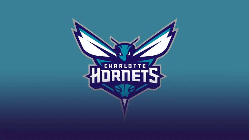
Imagine the pulse of a city, captured in swirls of teal and echoes of purple — this is the Charlotte Hornets logo. More than mere graphics, it’s a symbol woven into the seismic energy of basketball, a visual chant that resonates with fans and captures the essence of competition.
Upon first glance, this insignia seems straightforward, but hidden within its contours is a tale of heritage, identity, and transformation.
Delving into the logo’s evolution provides insights into how design mirrors the spirit of not only a team but an entire community nestled in the heart of Charlotte, North Carolina.
In this exploration, we shall unravel the threads of sports branding, the design principles that give life to symbols, and how the Hornets emblem etched its mark on the vibrant tapestry of NBA team symbols.
By the final period, expect to have navigated the subtleties of professional basketball branding, deciphered the color scheme’s saga, and appreciated how this beacon calls to its Buzz City faithful. Each stroke of the logo tells a story, and it’s time we part the curtain.
The Meaning Behind the Charlotte Hornets Logo
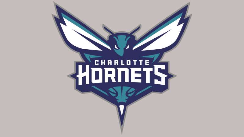
Alright, so first things first. When you look at the Charlotte Hornets logo, there’s a lot going on under the hood.
Mascot Magic
Ever noticed that fierce-looking hornet? Why a hornet, though?
Well, legend says Charlotte was once called a “hornet’s nest of rebellion” during the Revolutionary War. Hence, the choice of a hornet represents the spirit of resistance, unity, and strength.
In the Eyes
Peep into the eyes of that hornet. It’s not just staring for no reason. The intense gaze, full of determination, reflects the team’s dedication and burning passion for the game.
The Stinger
Sharp, isn’t it? That’s not just to scare away the opponents (well, partly). The stinger represents the competitive edge, the element of surprise, and of course, the killer instinct on the court.
The History of the Charlotte Hornets Logo
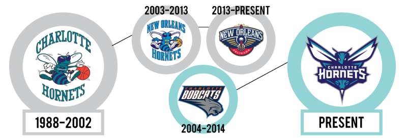
So here’s the tea.
The Birth
Back in the late ’80s, the NBA welcomed Charlotte into its fold. With the inception came the need for an identity, and thus the logo was born.
Evolution Not Revolution
Over the years, while the essence remained, the logo underwent some subtle changes. Shapes became sleeker, designs more contemporary. But the core? That remained untouched.
The Return
Post a little hiatus (and a stint as the Bobcats), the team reverted to its original moniker. And with it? A modernized version of the classic Hornets logo we all love.
The Colors of the Charlotte Hornets Logo
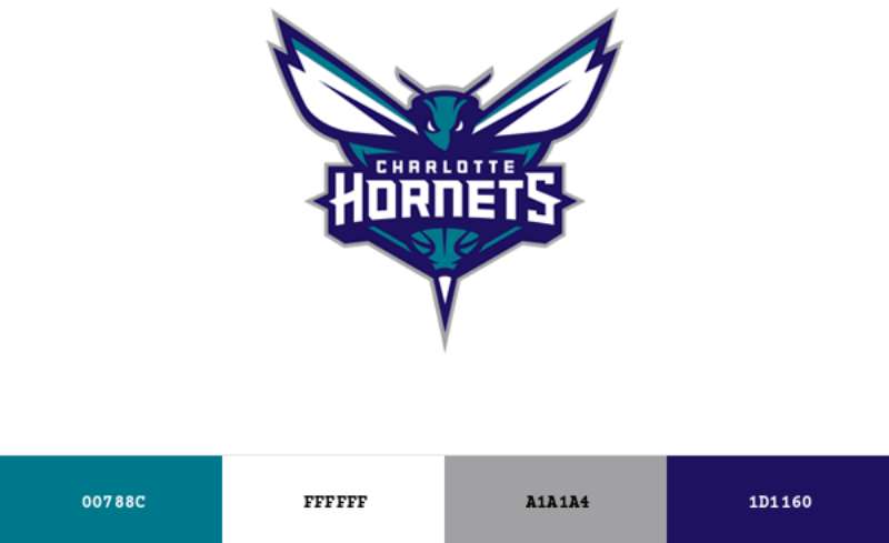
Colors ain’t just colors here. They tell a story.
Teal Tales
This isn’t just any teal. It’s THE teal. A bold choice, standing for freshness, energy, and vitality. Plus, it sets them apart in the crowd.
Purple Prowess
Purple. The color of royalty. It adds depth, richness, and a touch of class to the logo.
The Font Used in the Charlotte Hornets Logo
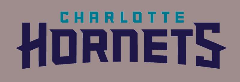
Fonts speak. No, like for real.
Sleek and Strong
You see that customized typeface? Each letter carved out meticulously. It screams modernity yet has a classical undertone. It’s both assertive and welcoming. A blend of old and new.
Impact on Merchandise
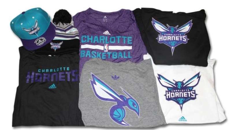
Oh, you gotta check this out!
Streetwear Influence
Hats, shirts, shoes – the logo’s everywhere. Its unique design and colors make it super trendy, bridging the gap between sports and fashion.
Collectibles
The logo’s appeal isn’t limited to wearables. From posters to basketballs, fans just can’t get enough of this emblem.
The Global Reception of the Logo
Alright, let’s get international.
The NBA’s International Appeal
With the NBA becoming a global phenomenon, the Charlotte Hornets logo has found fans worldwide. From Asia to Europe, it’s not just a logo; it’s an icon.
Influence on Other Designs
The perfect blend of history, meaning, and style. No wonder other teams and brands look to this logo for inspiration. Setting trends much?
FAQ On The Charlotte Hornets Logo
What’s the origin of the Charlotte Hornets logo?
The logo was born out of a need to visually encapsulate the energy of Charlotte’s NBA team. It embodies both the fierceness of a hornet and the city’s deep-rooted enthusiasm for basketball.
Teal and purple reign, a nostalgic nod to the team’s inception and an enduring sports branding emblem.
Why did the Charlotte Hornets choose a hornet as their mascot?
Charlotte earned the nickname ‘Hornets Nest’ during the American Revolution due to its residents’ fierce resistance. Hence, when the NBA franchise was formed, the hornet was a natural fit—synonymous with the city’s combative and spirited lineage.
What do the colors of the Hornets logo represent?
Teal signifies freshness, inclusivity, and a break from tradition—precisely what the franchise aimed for upon debuting. Purple adds a touch of royalty and distinction, cementing a unique identity within the NBA tapestry and resonating in fans’ Buzz City logo apparel.
Has the Charlotte Hornets logo changed over time?
Absolutely. Evolution is the heartbeat of any lasting brand. The logo has undergone refinement, each iteration enhancing its visual impact while preserving its core identity. Transitions reflect shifts in graphic design trends and the team’s ongoing narrative.
When was the last Charlotte Hornets logo updated?
The latest update unfurled in 2014, a sleek and modernized version apt for the digital age. This refresh tightened the emblem’s lines, enriched its colors, and exuded a more competitive spirit fitting for the basketball arena.
Can you describe the Charlotte Hornets logo design elements?
At its core lies the silhouette of a menacing hornet, primed for battle. Wings spread in dynamic action, basketball-clutched stinger poised, and the piercing gaze of a competitor—every element converges to broadcast the team’s resilience and drive for victory.
What is the significance of the basketball in the Hornets logo?
Nestled within the insect’s limbs, the basketball is not just an object but also an entity; it is the epicenter of the franchise—a constant across the NBA’s sports branding. Recognizable and familiar, it connects the logo back to the essence of the game.
Who designed the original and the updated Charlotte Hornets logos?
Designing for an NBA franchise is an all-star gig, often passed to experienced sports branding agencies.
The original design emerged in 1988 by someone with an understanding of the city’s culture and sport, while the 2014 facelift was orchestrated by a team led by senior creatives specializing in sports identities.
How does the Hornets logo compare to other NBA team logos?
Each NBA team emblem tells its unique story, balancing tradition and modernity. The Hornets logo, with its striking colors and assertive mascot, stands out for its energy and nods to local heritage. It’s both a sports team insignia and a rallying cry for the Charlotte community.
Where can I find official Charlotte Hornets logo merchandise?
Official gear, adorned with the emblem, is part of the NBA’s merchandising landscape—both online and in physical retail spaces.
Branch out to the team’s official website, NBA stores, or authenticated sports apparel outlets to find merchandise like jerseys, hats, and more, emblazoned with the resolute Hornets logo.
Conclusion
In the vibrant tapestry of professional basketball branding, the Charlotte Hornets logo stands as a beacon of creativity and regional pride. With its unmistakable teal and purple hues, it commands attention—an emblem that’s not only etched in the minds of Buzz City loyalists but also celebrated in the broader NBA arena. From the relentless stinger to the determined eyes, this insignia is more than a mere graphic; it is an entity that speaks to the heart of competition.
From buzzer to blackout, the journey across this article winds down, leaving us with a renewed appreciation for the power of design and the narratives it weaves. Be it through the evolution of the logo, its roots in Charlotte’s storied past, or the palpable energy it brings to sports merchandising, one thing is certain: the Charlotte Hornets logo transcends its graphic bounds, becoming a symbol exuding legacy, fortitude, and the sheer thrill of the game.
If you liked this article about the Charlotte Hornets logo, you should check out this article about the Portland Trail Blazers logo.
There are also similar articles discussing the San Antonio Spurs logo, the New Orleans Pelicans logo, the Philadelphia 76ers logo, and the Boston Celtics logo.
And let’s not forget about articles on the Indiana Pacers logo, the Los Angeles Clippers logo, the Oklahoma City Thunder logo, and the Phoenix Suns logo.
- The Tecate Logo History, Colors, Font, And Meaning - 5 May 2024
- REM to PX Converter - 5 May 2024
- The Asahi Logo History, Colors, Font, And Meaning - 4 May 2024


