Not every font belongs on a monogram. Most fall apart the moment a single letter has to carry the entire design.
Choosing the best fonts for monograms comes down to understanding how a letterform behaves in isolation, across embroidery, engraving, foil stamping, and vinyl cutting.
The wrong typeface loses its detail at small sizes, breaks down under a stitch, or simply looks unfinished when stripped of surrounding text. The right one holds its form, communicates elegance, and works across every output format you need.
This guide covers 10 tested options, from classic serif and calligraphic script fonts to blackletter and display typefaces, with full specs, licensing details, and pairing notes for each.
The Best Fonts For Monograms
Picking the right font for a monogram isn’t about what looks pretty on screen. It’s about how a letterform holds up when engraved on a ring, stitched onto a towel, or printed on a wedding invitation at 2 inches tall. The wrong choice falls apart. The right one stays sharp at any size.
Below are the 10 best fonts for monograms, covering script, serif, display, and blackletter styles, with full specs and pairing notes for each.
Edwardian Script

ITC Edwardian Script is a calligraphic script font designed by Edward Benguiat in 1994, published by ITC (International Typeface Corporation). It replicates the look of a flexible steel-pointed pen, producing high stroke contrast through pressure variation rather than nib angle.
Edwardian Script works best for wedding invitation monograms and formal stationery because its connective stroke logic between letters creates the illusion of continuous handwriting, even when letters are used in isolation as initials.
Luxury brands and upscale wedding designers consistently reach for it when they need a calligraphy monogram font that prints well at mid-to-large sizes. The OpenType Pro version includes swash alternates and additional ligatures.
What makes Edwardian Script suitable for monograms?
The font’s high stroke contrast, produced by a simulated pointed-nib angle, gives each capital letter a dramatic presence at display sizes. Uppercase letters include built-in flourishes and exit strokes that scale well between 48pt and 144pt. Below 36pt, the hairline strokes begin to thin out, which limits its use for small embroidered monograms.
Key attributes:
| Attribute | Value |
| Classification | Calligraphic script |
| Designer | Edward Benguiat, 1994 |
| Weight range | Regular; Bold alternate |
| Variable font | No |
| Recommended sizes | 36pt+ for print monograms; 48pt+ for engraving |
| License | Commercial (Monotype/ITC); available via Adobe Fonts subscription |
| Available on | Adobe Fonts, MyFonts, Microsoft Office (bundled) |
| Price | Subscription (Adobe Fonts) or one-time desktop license via MyFonts |
How does Edwardian Script perform for monogram use?
At 72pt and above, the stroke contrast reads clearly in both print and digital contexts. The high-contrast hairlines hold on coated paper and laser-engraved metal but can break down on absorbent fabrics below 1 inch. It’s not a strong choice for embroidery fonts below 0.75 inches.
What are the best pairings for Edwardian Script in monograms?
Edwardian Script pairs with Copperplate Gothic for title/initial combinations, where the Gothic’s uniform stroke weight provides visual contrast. It also works alongside Garamond for supporting text in multi-element monogram designs, where a warm old-style serif balances the script’s flourishes.
What are the limitations of Edwardian Script for monograms?
The font ships in Regular and Bold Alternate only, with no weight range for hierarchy. Commercial use requires a paid license, and the font is not available under an open license for modification.
Edwardian Script – Recommended Use Cases Within Monogram Design
- Best for: Three-letter wedding monograms on stationery, foil-stamped packaging, laser-engraved metal gifts
- Avoid for: Small embroidery below 1 inch, reversed-out text on dark backgrounds
- Optimal weight: Regular for standard initials; Bold Alternate for emphasis or standalone single-letter designs
- Optimal size range: 48pt–144pt for print; 72pt+ for engraving templates
Copperplate Gothic
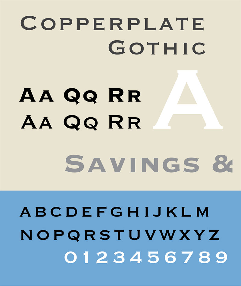
Copperplate Gothic is a wedge-serif display typeface designed by Frederic W. Goudy in 1901, first produced by American Type Founders (ATF). It delivers uniform stroke widths with subtle hairline serifs that evoke engraved lettering, making it a natural fit for monogram logo fonts and personalized initial designs requiring a structured, authoritative look.
The font is all-capitals only. That’s actually useful for monograms: every letter is already designed as a standalone display character.
What makes Copperplate Gothic suitable for monograms?
Its monolinear stroke structure, with consistent weight throughout the letterform and tiny wedge serifs at terminals, maintains legibility at sizes from 14pt to 200pt. The uniform stroke width avoids the hairline fragmentation that affects high-contrast serifs at small sizes, making it one of the more reliable choices for fonts for engraving on glass, metal, and wood.
Key attributes:
| Attribute | Value |
| Classification | Wedge-serif display (all-caps) |
| Designer | Frederic W. Goudy, 1901 |
| Weight range | Light, Medium, Bold, Heavy (9 styles in Linotype version) |
| Variable font | No |
| Recommended sizes | 14pt–200pt; performs well across all monogram sizes |
| License | Commercial (Linotype/Monotype); open-source revival via Copperplate CC (SIL OFL) |
| Available on | Adobe Fonts, MyFonts, bundled in macOS; Copperplate CC on GitHub (free) |
| Price | Subscription or one-time license; Copperplate CC is free |
How does Copperplate Gothic perform at monogram-specific contexts?
The monolinear structure holds up consistently across laser cutting, embossing, and engraving. It has appeared on business cards, bank windows, and legal stationery for over a century, which tells you something about its durability as a formal initial-letter font. At very large sizes (above 120pt), the letterforms can feel static due to low contrast, but that’s rarely a problem for monogram use.
What are the best pairings for Copperplate Gothic in monograms?
Copperplate Gothic pairs with Edwardian Script when the monogram needs a contrast between structured block lettering and flowing script. It also works with Garamond for supporting descriptive text, where Garamond’s old-style warmth softens Copperplate’s formality.
What are the limitations of Copperplate Gothic for monograms?
The all-caps-only design means there are no lowercase letterforms, which limits flexibility for mixed-case monogram layouts. The standard commercial versions require a paid license, though the open-source Copperplate CC revival covers most use cases.
Copperplate Gothic – Recommended Use Cases Within Monogram Design
- Best for: Single-letter or three-letter block monograms on business stationery, labels, engraved metal, and branded packaging
- Avoid for: Embroidery below 0.5 inches; designs requiring lowercase letterforms
- Optimal weight: Light or Regular for elegant applications; Bold for bold-impact branding
- Optimal size range: 14pt–200pt; highly versatile
Great Vibes
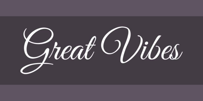
Great Vibes is a flowing calligraphic script typeface designed by Robert Leuschke of TypeSETit, released in 2012 and available on Google Fonts under SIL OFL. It provides over 2,000 glyphs with smooth connecting ligatures and swash-style uppercase forms that work well for cursive monogram styles and three-letter monogram fonts.
It’s free for commercial use. That alone puts it ahead of several premium alternatives for DIY monogram projects and small-batch personalization work.
What makes Great Vibes suitable for monograms?
The uppercase letters feature generous swash strokes and extended exit curves, which give isolated initials a complete, self-contained appearance without needing adjacent letters to justify the flourish. The font’s single weight (Regular 400) keeps the stroke consistent throughout, which helps when scaling for embroidery or vinyl lettering. In March 2024, the font received an update adding Sub-Saharan Latin and Cyrillic support, broadening its usability.
Key attributes:
| Attribute | Value |
| Classification | Calligraphic connecting script |
| Designer | Robert Leuschke (TypeSETit), 2012 |
| Weight range | Regular 400 only |
| Variable font | No |
| Recommended sizes | 36pt+ for monogram initials; 72pt+ for standalone display use |
| Letter-spacing default | Standard; moderate tracking recommended for isolated initials |
| License | SIL OFL 1.1 (free for commercial use) |
| Available on | Google Fonts, Adobe Fonts |
| Price | Free |
How does Great Vibes perform at monogram-specific contexts?
The connecting stroke logic, built for continuous text, still reads well for single-letter and three-letter monogram use because the uppercase forms have natural start and end flourishes. The script works particularly well in Cricut Design Space for cutting vinyl monograms, where the smooth curves translate cleanly to vector paths.
What are the best pairings for Great Vibes in monograms?
Great Vibes pairs with Montserrat for modern monogram layouts where a clean geometric sans-serif carries supporting text. It also works alongside Playfair Display when a higher-contrast serif is needed for a more formal, editorial-style monogram design.
What are the limitations of Great Vibes for monograms?
The font offers only one weight, which limits options for creating visual hierarchy within a multi-element monogram. At sizes below 1 inch in embroidery, the fine connecting strokes become difficult to reproduce accurately.
Great Vibes – Recommended Use Cases Within Monogram Design
- Best for: Cricut vinyl monograms, wedding invitation initials, digital monogram generators, greeting card personalization
- Avoid for: Small embroidery below 1 inch; designs requiring multiple weights for hierarchy
- Optimal weight: Regular 400
- Optimal size range: 36pt–144pt
Playfair Display

Playfair Display is a transitional serif font designed by Claus Eggers Sorensen, released in 2011 and available on Google Fonts under SIL OFL. It delivers high stroke contrast in the tradition of 18th-century European typography, with hairline horizontal strokes and bold vertical stems. It covers 6 weights from Regular to Black, with a variable font axis added in 2019.
This is the most widely used display serif on the web for a reason. It’s free, it looks expensive, and the uppercase letterforms are built specifically for large-scale display.
What makes Playfair Display suitable for monograms?
Playfair Display has an extra-large x-height and short descenders, which means capitals appear proportionally tall and commanding. The high stroke contrast between thick vertical strokes and hairline horizontals creates a premium visual impression at display sizes. The italic variants include swash alternates for letters like “k,” “v,” and “z,” which add decorative value to monogram initial designs without requiring a separate ornamental typeface.
Key attributes:
| Attribute | Value |
| Classification | Transitional serif (display) |
| Designer | Claus Eggers Sorensen, 2011 |
| Weight range | Regular 400 to Black 900 (6 weights) |
| Variable font | Yes (weight, width, optical size axes) |
| Optical sizes | Yes (Needlepoint, Hairline, Titling, Display, Headline, Trumpet) |
| Recommended sizes | 36pt+ for monogram display; hairline strokes break down below 24pt |
| License | SIL OFL (free for commercial use) |
| Available on | Google Fonts, Adobe Fonts, Font Squirrel |
| Price | Free |
How does Playfair Display perform at monogram-specific contexts?
At 72pt and above, the stroke contrast produces a luxurious, editorial character ideal for personalized gift monograms, luxury branding initials, and high-end stationery. The variable font axis allows precise weight control for different output media. At sizes below 24pt, hairline strokes become unreliable in print, especially on uncoated paper or absorbent fabric.
What are the best pairings for Playfair Display in monograms?
The Playfair Display font pairing that works best for monogram designs is alongside Source Sans Pro or Lato for supporting text elements. For a fully serif approach, pairing Playfair Display with Garamond creates a cohesive classical monogram identity across initials and descriptive text.
What are the limitations of Playfair Display for monograms?
Hairline strokes render poorly at small sizes on low-DPI screens and on absorbent materials like cotton. It is not suitable for embroidery fonts below 1.5 inches.
Playfair Display – Recommended Use Cases Within Monogram Design
- Best for: Luxury packaging initials, high-end wedding stationery, editorial monogram logos, foil-stamped designs
- Avoid for: Embroidery, small engraving below 0.75 inches, low-resolution digital thumbnails
- Optimal weight: Bold 700 or Black 900 for isolated initials; Regular 400 italic for decorative accents
- Optimal size range: 36pt–200pt
Bodoni
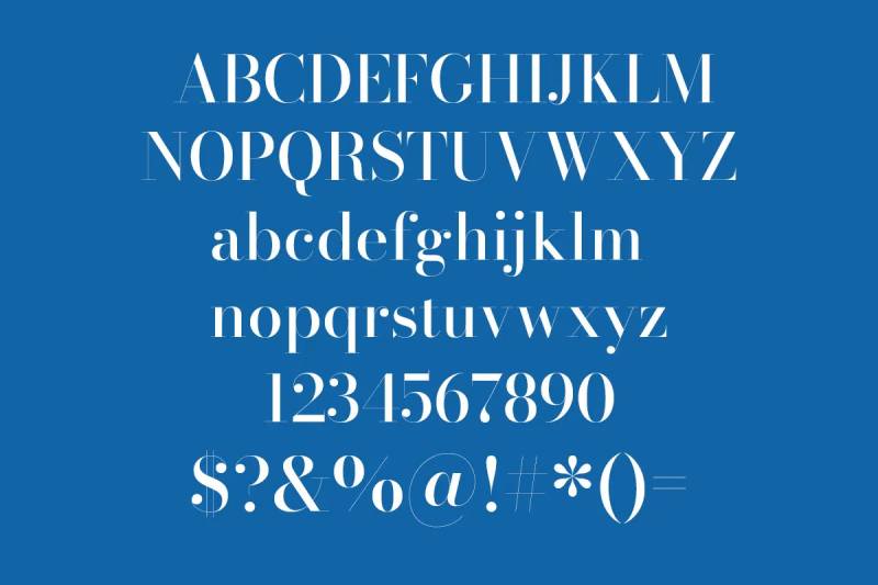
Bodoni is a Didone serif typeface originally designed by Giambattista Bodoni around 1798, with the most widely used digital revivals produced by Linotype (7 styles), Monotype (12 styles), and ITC. It defines the Didone classification with extreme thick-thin stroke contrast, flat unbracketed serifs, and a vertical stress axis.
Vogue has used Bodoni in its masthead for decades. If you need a single data point about what this font communicates, that’s it.
What makes Bodoni suitable for monograms?
The extreme stroke contrast, with bold vertical strokes and near-invisible horizontal hairlines, makes Bodoni letters visually dramatic as standalone initials at large sizes. Flat, unbracketed serifs keep the letterform geometry precise and architectural. This structural quality transfers well to laser cutting and foil stamping, where clean edge definitions are critical.
Key attributes:
| Attribute | Value |
| Classification | Didone serif (Modern) |
| Designer | Giambattista Bodoni, ~1798; digital revivals by Linotype, Monotype, ITC |
| Weight range | Varies by version; Monotype Bodoni offers 12 styles |
| Variable font | No (Bodoni Moda on Google Fonts is variable) |
| Recommended sizes | 24pt minimum; 48pt–144pt optimal for monogram display |
| License | Commercial (Linotype/Monotype); Bodoni Moda available free on Google Fonts (OFL) |
| Available on | Adobe Fonts, MyFonts, Monotype; Bodoni Moda on Google Fonts |
| Price | Paid (premium versions); Bodoni Moda is free |
How does Bodoni perform at monogram-specific contexts?
At 48pt and above, the alternating thick and thin strokes create a high-contrast shimmer that reads as luxurious and authoritative. It performs well on coated paper, gloss print, and polished metal. Below 24pt, the “dazzle” effect, where hairline strokes nearly disappear, makes individual letters hard to distinguish at a glance. Bodoni is not the right choice for monogram fonts for embroidery or small-scale engraving.
What are the best pairings for Bodoni in monograms?
Bodoni pairs with Futura for a high-fashion monogram identity, where geometric sans-serif supporting text contrasts cleanly against the serif’s drama. For a more classical approach, a Bodoni font pairing with Garamond works well when the monogram is part of a broader identity system that needs historical depth.
What are the limitations of Bodoni for monograms?
Hairline strokes become invisible below 24pt on most printing surfaces, making small-scale applications impractical. The premium commercial versions from Linotype and Monotype require paid licenses, though Bodoni Moda on Google Fonts covers most display use cases at no cost.
Bodoni – Recommended Use Cases Within Monogram Design
- Best for: Fashion brand initials, luxury packaging, magazine-style monogram headers, foil-stamped wedding stationery
- Avoid for: Embroidery, engraving at small sizes, low-resolution digital output
- Optimal weight: Bold or Black for standalone initials
- Optimal size range: 48pt–200pt
Old English Text MT

Old English Text MT is a blackletter display typeface based on 15th-century Gothic manuscript letterforms, digitized by Monotype. It is bundled with Microsoft Office and macOS, making it one of the most widely accessible gothic monogram lettering options without additional purchase.
The New York Times masthead used this style for decades. It’s also the go-to for university diploma typography and sports jersey lettering.
What makes Old English Text MT suitable for monograms?
Blackletter capitals have inherently high decorative density, with built-in flourishes, alternating thick and thin strokes, and angular terminals that give single letters a complete ornamental presence. The uppercase forms in Old English Text MT were drawn for use as standalone display characters, which aligns directly with single-letter monogram design. The dense stroke structure transfers well to embroidery, where the multiple thin lines within each letterform can be stitched with precision at 1 inch and above.
Key attributes:
| Attribute | Value |
| Classification | Blackletter (Textura) |
| Designer | Monotype Design Studio (based on 15th-century manuscript forms) |
| Weight range | Regular only |
| Variable font | No |
| Recommended sizes | 36pt+ for print; 1 inch+ for embroidery |
| License | Bundled with Microsoft Office and macOS; commercial license from Monotype for standalone use |
| Available on | Microsoft Office, macOS (built-in), Monotype |
| Price | Free with Microsoft Office or macOS; paid standalone license |
How does Old English Text MT perform at monogram-specific contexts?
The dense angular strokes render well in embroidery at 1 inch and above, where the multiple parallel lines within each letterform hold their shape. It prints cleanly at 36pt+ on coated and uncoated paper. The low-contrast lowercase is rarely used in monogram contexts. This is fundamentally an uppercase display font, which suits three-letter monogram formats well.
What are the best pairings for Old English Text MT in monograms?
Old English Text MT pairs with Copperplate Gothic for a formal heraldic monogram layout, where both fonts share an engraving-era historical reference. It also works alongside a clean sans-serif font like Helvetica Neue for modern reinterpretations of gothic initial letter styles.
What are the limitations of Old English Text MT for monograms?
The single weight offers no flexibility for hierarchy within a multi-element design. Lowercase blackletter letterforms are difficult to read at display sizes, limiting the font to uppercase-only monogram applications.
Old English Text MT – Recommended Use Cases Within Monogram Design
- Best for: Sports jersey initials, university-style monograms, gothic initial letters for diplomas and certificates, embroidery at 1 inch+
- Avoid for: Modern or minimalist design contexts; small engraving below 0.75 inches
- Optimal weight: Regular (only available weight)
- Optimal size range: 36pt–144pt for print; 1 inch+ for embroidery
Trajan Pro
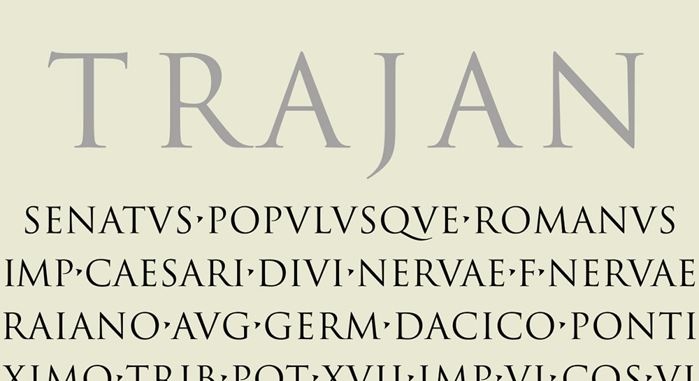
Trajan Pro is a classical display typeface designed by Carol Twombly for Adobe Originals in 1989, later extended to Trajan Pro 3 by Robert Slimbach in 2012 with six weights and added Greek and Cyrillic support. It is based directly on the first-century Roman square capitals inscribed on Trajan’s Column in Rome.
It’s an all-caps font. Every letterform was designed as a standalone capital. For monogram use, that’s not a limitation; it’s a structural advantage.
What makes Trajan Pro suitable for monograms?
The letterforms derive from Roman stone-carved inscriptions, where each character was optimized for clarity and visual balance at large scale. The balanced proportions, moderate stroke contrast, and refined serifs make Trajan Pro initials legible and authoritative at sizes from 24pt to 300pt. The Trajan Pro 3 version provides six weights from Condensed Light to Bold, giving designers range for monogram hierarchy within a single typeface.
Key attributes:
| Attribute | Value |
| Classification | Classical Roman serif (all-caps display) |
| Designer | Carol Twombly, 1989 (Adobe); extended by Robert Slimbach, 2012 |
| Weight range | 6 weights (Trajan Pro 3): Condensed Light to Bold |
| Variable font | No |
| Recommended sizes | 24pt–300pt; performs consistently across all display sizes |
| License | Adobe Fonts subscription (commercial); not available under open license |
| Available on | Adobe Fonts, MyFonts, Fontspring |
| Price | Adobe Fonts subscription or one-time license from MyFonts/Fontspring |
How does Trajan Pro perform at monogram-specific contexts?
The moderate stroke contrast, lower than Bodoni or Playfair Display, makes Trajan Pro more reliable across a wider range of output media including matte print, engraving, and embossing. The letterforms hold at small sizes better than high-contrast serifs. Its widespread use on film posters and book covers demonstrates how well it performs when a single letter or word needs to carry visual authority.
What are the best pairings for Trajan Pro in monograms?
Trajan Pro pairs with Garamond for classical monogram identity systems, where Garamond handles supporting text in a compatible old-style serif register. It also pairs with Myriad Pro for modern brand applications where a humanist sans-serif balances Trajan’s formal historical tone.
What are the limitations of Trajan Pro for monograms?
The font has no lowercase letters. Small caps fill the lowercase slots, which limits use in mixed-case monogram designs. A paid license is required; there is no free or open-source version of Trajan Pro.
Trajan Pro – Recommended Use Cases Within Monogram Design
- Best for: Formal single-letter or three-letter block monograms, architectural signage, certificates, luxury brand identity initials
- Avoid for: Designs requiring lowercase forms; scripts or cursive monogram contexts
- Optimal weight: Regular for refined elegance; Bold for high-impact display
| Optimal size range: | 24pt–300pt |
Garamond

Garamond is an old-style serif typeface originating from the 16th-century work of French engraver Claude Garamond, with the most common digital version (Monotype Garamond) developed in 1922. It features low-to-moderate stroke contrast, diagonal stress, and calligraphic-influenced letterforms with bracketed serifs and a small x-height.
Garamond is the quiet professional of this list. It doesn’t demand attention, which is exactly why it works so well in multi-element monogram designs where the initials need to coexist with decorative frames, crests, or supporting text.
What makes Garamond suitable for monograms?
The small x-height makes capitals appear proportionally large relative to the overall type body, which benefits single-letter or three-letter monogram layouts where visual hierarchy relies on cap-height dominance. Low stroke contrast means the letterforms remain legible from 12pt through 144pt without hairline fragmentation. The diagonal stress axis gives Garamond capitals a slightly dynamic quality compared to the rigid vertical axis of Bodoni or Trajan.
Key attributes:
| Attribute | Value |
| Classification | Old-style serif (Garalde) |
| Designer | Claude Garamond, 16th century; Monotype revival, 1922 |
| Weight range | Regular, Italic, Bold, Bold Italic (Monotype version); EB Garamond on Google Fonts adds more styles |
| Variable font | No (Monotype); EB Garamond is not variable |
| Recommended sizes | 12pt–144pt; highly versatile range |
| License | Bundled with Microsoft Office; EB Garamond available on Google Fonts (OFL) |
| Available on | Microsoft Office (built-in), Adobe Fonts; EB Garamond on Google Fonts |
| Price | Free with Microsoft Office; EB Garamond is free |
How does Garamond perform at monogram-specific contexts?
Garamond’s low stroke contrast makes it one of the more forgiving classic serifs for embroidery font use, where thicker strokes hold better than hairlines. For laser engraving and print, it reads cleanly across the full size range. It’s not as visually dramatic as Bodoni or Playfair Display at large sizes, but for designers who prefer a more restrained monogram aesthetic, that’s a feature.
What are the best pairings for Garamond in monograms?
A Garamond font pairing with Trajan Pro works well for classical formal monograms, where both fonts share Roman proportions. Garamond also pairs naturally with Great Vibes in mixed-style monogram layouts that combine a flowing script initial with serif supporting text.
What are the limitations of Garamond for monograms?
The low stroke contrast makes it less visually dramatic than Bodoni or Playfair Display at very large sizes. The Monotype version’s limited weight range (Regular and Bold only) restricts hierarchy options in complex monogram systems.
Garamond – Recommended Use Cases Within Monogram Design
- Best for: Multi-element monogram designs, embroidery at 1 inch+, formal correspondence initials, traditional personalized gift monograms
- Avoid for: High-drama luxury brand identities where stroke contrast is a key visual element
- Optimal weight: Regular 400 for refined use; Bold for added presence
- Optimal size range: 12pt–144pt
Zapfino
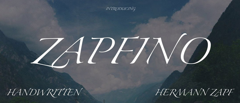
Zapfino is a calligraphic script typeface designed by Hermann Zapf, originally created in 1944 and released digitally by Linotype in 1998. The design includes over 1,400 glyphs with contextual alternates, multiple stylistic sets, and swash-heavy uppercase forms that shift automatically based on adjacent characters in AAT-aware applications.
Took Zapf over 50 years to make it work as a functioning font. The technology for what he had in mind simply didn’t exist until digital typography caught up.
What makes Zapfino suitable for monograms?
The uppercase letterforms are among the most ornate in any major typeface library, with sweeping ascenders, elaborate exit strokes, and baseline variations that give single letters a painterly, hand-rendered quality. For monogram design focused on artistic expression rather than corporate formality, Zapfino’s glyph library provides more stylistic variation per letter than almost any other typeface. The font’s swash characters are particularly effective for standalone initial letter designs.
Key attributes:
| Attribute | Value |
| Classification | Calligraphic script (ornate) |
| Designer | Hermann Zapf, 1944/1998 (Linotype) |
| Weight range | Regular; Zapfino Extra includes additional sets |
| Variable font | No |
| Recommended sizes | 48pt+ for monogram display; highly ornate letterforms require large sizes to read |
| License | Commercial (Linotype/Monotype); bundled with macOS |
| Available on | macOS (built-in), Adobe Fonts, Linotype |
| Price | Free with macOS; paid license for other platforms |
How does Zapfino perform at monogram-specific contexts?
The contextual alternate system means the same letter can look noticeably different depending on application support. In macOS Pages and some Adobe apps, the automatic glyph substitution produces a more naturalistic result. In Microsoft Word, the contextual features do not activate, so the font outputs its default glyph set only. For monogram design, this matters: software like Illustrator or Procreate will give you better access to alternate letterforms than standard word processors.
What are the best pairings for Zapfino in monograms?
Zapfino pairs with Trajan Pro when the monogram design uses a large ornate script initial alongside a structured serif subtitle or date. It also works alongside Copperplate Gothic for contrast between the script’s fluid strokes and the engraved lettering aesthetic of the Gothic.
What are the limitations of Zapfino for monograms?
Contextual alternate features only activate in specific AAT-aware applications, making the font behave inconsistently across software. It is not suitable for embroidery or small engraving due to the complexity of the stroke paths.
Zapfino – Recommended Use Cases Within Monogram Design
- Best for: Artistic standalone initial designs, high-end print monogram art, digital monogram generators in AAT-aware software
- Avoid for: Embroidery, laser engraving, applications where AAT features are unsupported
- Optimal weight: Regular (only available weight)
- Optimal size range: 48pt–200pt
Lavanderia

Lavanderia is a vintage script typeface designed by James Edmondson (OH no Type Co.) in 2012, available on Google Fonts under SIL OFL. It draws from mid-century laundry and signage lettering traditions, featuring three stylistic variants (Sturdy, Regular, Delicate) that range from bold and condensed to light and open. It works well as a vintage monogram typeface and for handwritten monogram fonts with retro character.
It’s free, it has three distinct personalities within one family, and the letterforms were built for sign-painting contexts, which means they scale well.
What makes Lavanderia suitable for monograms?
The three-variant structure gives designers explicit weight and stroke options within a single coherent typeface family, which is useful for monogram design without needing to introduce a second font. The Sturdy variant, with its thicker strokes and condensed proportions, performs well for embroidery and screen printing. The Delicate variant suits foil stamping and fine stationery. All three share compatible uppercase letterforms, allowing consistent monogram identity across different output formats.
Key attributes:
| Attribute | Value |
| Classification | Vintage script (display) |
| Designer | James Edmondson (OH no Type Co.), 2012 |
| Weight range | Sturdy, Regular, Delicate (3 stylistic variants) |
| Variable font | No |
| Recommended sizes | 36pt+ for print; Sturdy variant at 1 inch+ for embroidery |
| License | SIL OFL (free for commercial use) |
| Available on | Google Fonts |
| Price | Free |
How does Lavanderia perform at monogram-specific contexts?
The Sturdy variant holds up in embroidery at 1 inch and above because its thicker stroke widths remain distinct when stitched. The Regular and Delicate variants perform well in print and digital contexts where finer detail is reproducible. For Cricut and Silhouette Cameo cutting, all three variants convert cleanly to vector paths due to their signage-influenced stroke geometry.
What are the best pairings for Lavanderia in monograms?
Lavanderia pairs with a clean geometric sans-serif like Futura or Montserrat for modern vintage monogram designs, where the script initial contrasts with precise geometric supporting text. It also works alongside Garamond when a warmer, more traditional serif tone is needed for print-focused monogram stationery.
What are the limitations of Lavanderia for monograms?
The vintage character of the letterforms limits its use in ultra-formal or contemporary luxury contexts where a cleaner script or high-contrast serif would be more appropriate. The three-variant system, while useful, does not include a bold or black weight for maximum display impact.
Lavanderia – Recommended Use Cases Within Monogram Design
- Best for: Vintage-style monograms, embroidery using the Sturdy variant, Cricut vinyl initial designs, rustic or artisan branding initials
- Avoid for: Ultra-formal luxury contexts; high-contrast editorial monogram designs
- Optimal weight: Sturdy for embroidery and bold impact; Delicate for fine stationery and foil work
- Optimal size range: 36pt–144pt; Sturdy at 1 inch+ for embroidery
Quick Comparison: All 10 Fonts at a Glance
| Font | Classification | Best For | Free? | Embroidery-safe? |
| Edwardian Script | Calligraphic script | Wedding stationery, foil stamping | No | Partially (36pt+) |
| Copperplate Gothic | Wedge-serif display | Engraving, business stationery | Free revival | Yes |
| Great Vibes | Connecting script | Cricut projects, invitations | Yes (OFL) | Partially (1 inch+) |
| Playfair Display | Transitional serif | Luxury packaging, editorial initials | Yes (OFL) | No |
| Bodoni | Didone serif | Fashion branding, foil stamping | Bodoni Moda free | No |
| Old English Text MT | Blackletter | Sports jerseys, diplomas, embroidery | With Office/macOS | Yes (1 inch+) |
| Trajan Pro | Classical Roman serif | Formal certifications, luxury brands | No | Yes |
| Garamond | Old-style serif | Multi-element designs, embroidery | EB Garamond free | Yes |
| Zapfino | Ornate calligraphic script | Artistic standalone initials | With macOS | No |
| Lavanderia | Vintage script | Rustic branding, Cricut, embroidery | Yes (OFL) | Yes (Sturdy) |
What Makes a Font Work for a Monogram?
A monogram letter stands alone. There are no neighboring characters to clarify the shape, no context to anchor the form. The font either holds on its own or it doesn’t.
That’s the first and most important structural test: can the uppercase letterform carry the full visual weight of a design by itself?
Most text fonts fail this. They’re designed for continuous reading, where letters lean on each other for rhythm and coherence. Display fonts, calligraphic script fonts, and engraving-era serifs were built with isolated capitals in mind, which is why they dominate every serious list of monogram font options.
Beyond isolation, four structural attributes determine whether a font works for monogram use.
- Stroke contrast: the difference between thick and thin strokes within a single letterform. High contrast (Bodoni, Playfair Display) looks dramatic at large sizes but breaks down in embroidery and small engraving. Low-to-moderate contrast (Garamond, Copperplate Gothic) holds across more output formats.
- Capital design intent: fonts like Trajan Pro and Copperplate Gothic were designed specifically as uppercase display letterforms. Their capitals are proportioned and spaced to work as standalone characters, not as the first letter of a word.
- Swash and ornamental structure: script fonts with built-in entry and exit strokes (Edwardian Script, Zapfino, Great Vibes) give single initials a visual completeness without needing adjacent letters to justify the flourish.
- Size range compatibility: serif fonts require at least 0.35 inches in height for legibility in embroidery (Impress Designs). Script fonts need even more, typically 1 inch minimum for stitched monograms. Monolinear fonts like Copperplate Gothic hold cleanly from 14pt through 200pt.
The non-photo personalized gifts segment, which includes monogrammed accessories and engraved items, accounted for approximately 56% of global personalized gifts demand in 2024, according to Market Reports World. That’s a market where font choice directly affects product quality and repeat purchase rates.
One practical frame: think in terms of output format before you think in terms of aesthetics. A font that looks perfect on screen may produce an illegible mess when stitched at 0.5 inches. The psychology behind a font matters, but only after you’ve confirmed it survives the physical production process.
How Do Monogram Font Classifications Differ?
Classification tells you how a font was designed and what structural properties come with it. For monogram work, four classifications cover nearly every practical use case.
| Classification | Stroke behavior | Best monogram format | Output compatibility |
| Calligraphic script | High contrast, pressure-varied | Single initial, wedding stationery | Print, foil, vinyl (not small embroidery) |
| Transitional / Didone serif | Very high contrast, vertical axis | Luxury brand initials, editorial | Print, laser engraving, foil stamping |
| Old-style serif | Low-moderate contrast, diagonal axis | Multi-element designs, embroidery | Print, embroidery, engraving, Cricut |
| Wedge-serif / Blackletter | Uniform or dense, terminal accents | Three-letter block monograms | All formats including fabric and engraving |
Script fonts for monograms
Calligraphic connecting scripts like Edwardian Script and Great Vibes produce uppercase letters with built-in flourishes, entry strokes, and exit curves that give a single initial a painterly, self-contained appearance.
The uppercase forms in these fonts are specifically drawn as decorative set pieces. This is why they dominate personalized wedding stationery and custom gift markets.
One limitation: the fine connecting strokes that make these fonts look handcrafted also make them brittle at small sizes. Embroidery professionals recommend a minimum height of 1 inch for script fonts to retain legibility in thread (MaggieFrames).
Serif fonts for monogram use
Serif classification splits into two distinct behaviors for monogram work.
Transitional and Didone serifs (Playfair Display, Bodoni) have extreme stroke contrast. Vertical strokes are bold; horizontal strokes and serifs are near-hairline. This produces maximum visual drama at 48pt and above, but the hairlines disappear in embroidery and fail on low-gloss paper at small sizes.
Old-style serifs (Garamond) have moderate, diagonal-axis contrast with bracketed serifs. They hold across a far wider range of output sizes, from 12pt print through 1-inch embroidery. Less dramatic. More versatile.
Vogue has used Bodoni (a Didone serif) in its masthead since the 1950s. That choice communicates everything about what high-contrast serifs signal in luxury visual identity contexts.
Display and blackletter classifications
Wedge-serif display fonts like Copperplate Gothic and Trajan Pro sit in a category designed specifically for isolated large-scale letterforms. No lowercase dependency, uniform stroke weight, precise terminal geometry. Copperplate Gothic has appeared on business cards and bank windows for over a century precisely because its structural stability transfers across media.
Blackletter (Old English Text MT) carries the densest decorative structure of any classification. A single blackletter capital functions as a complete ornamental object. It’s the preferred classification for sports jersey lettering and diploma typography, where the letter needs to communicate authority on its own.
Google Fonts commands 57% of web font usage as of 2024 (CheckThat.ai), which means the OFL-licensed fonts in its library, including Great Vibes and Playfair Display, are the most accessible starting point for digital monogram design work without additional licensing overhead.
How Does Monogram Output Format Affect Font Choice?
The global personalized gifts market was valued at $28.27 billion in 2024 and is projected to reach $59.24 billion by 2032 (Verified Market Research). Laser engraving, embroidery, foil stamping, and vinyl cutting represent the four dominant physical output methods, and each one has measurable font requirements.
Which fonts work for embroidery monograms?
Industry standards specify a minimum letter height of 0.25 inches for sans-serif and block fonts, and 0.35 inches for serif fonts in machine embroidery (Impress Designs). Script fonts typically require 1 inch minimum to hold connecting stroke detail in thread.
Fonts that perform reliably at embroidery-safe sizes:
- Copperplate Gothic (uniform stroke, all sizes)
- Old English Text MT (dense blackletter, 1 inch+)
- Lavanderia Sturdy (thicker stroke variant, 1 inch+)
- Garamond (low contrast, 0.35 inch minimum)
Fonts to avoid for embroidery: Bodoni, Playfair Display, Zapfino, and any font with hairline strokes under 0.05 inches. A 10mm-tall script font requires 3x more stitches than a block equivalent, which also affects production time and cost (Sino Finetex).
Etsy, one of the largest marketplaces for embroidered monogram goods, processed significant volume in the monogrammed accessories segment in 2023 and 2024, where seller listings consistently indicate that block and monolinear fonts generate the fewest production complaints at small sizes.
Which fonts work for engraved or cut monograms?
Laser engraving and vinyl cutting reward fonts with clean vector paths and predictable stroke geometry. High stroke contrast is less problematic here than in embroidery because the cutting process follows path outlines rather than replicating stroke widths in thread.
Practical font-to-output pairings:
- Foil stamping / fine print: Bodoni, Playfair Display, Edwardian Script at 48pt+
- Laser engraving on metal / wood: Copperplate Gothic, Trajan Pro, Garamond
- Vinyl cutting (Cricut, Silhouette): Great Vibes, Lavanderia, any OFL Google Font with clean SVG conversion
- Digital monogram generators: Great Vibes, Playfair Display, Bodoni Moda (all free via Google Fonts)
Cricut introduced its dedicated Monogram Maker feature in Design Space v7.9 (2023), specifically to simplify font-based initial design for its user base. The tool works with system-installed fonts, which means OFL-licensed Google Fonts import cleanly without additional steps.
What Is the Difference Between a Single-Letter and a Three-Letter Monogram Font?
Single-letter and three-letter monograms place different demands on letterform design. A font that works beautifully as a standalone initial can look structurally inconsistent when three characters are placed side by side at different scales.
Single-letter monogram font requirements
The entire visual weight of the design rests on one uppercase glyph. This favors fonts with high decorative density or strong architectural structure.
Best single-letter font classifications:
- Ornate calligraphic scripts: Zapfino, Edwardian Script (swash-rich capitals, complete visual objects)
- Didone serifs: Bodoni at 72pt+ (extreme contrast creates instant visual impact)
- Blackletter: Old English Text MT (decorative density means one letter fills the design)
Script fonts with casual or connecting-only uppercase forms, like Dancing Script, tend to look incomplete as standalone initials. The uppercase letter appears to need a word following it. Avoid these for single-letter monogram design.
Three-letter monogram layout and font behavior
The traditional three-letter monogram format places initials as: first name, last name (center, larger), middle name. The center letter is visually dominant. This format requires fonts where the uppercase letterforms have consistent proportions and optical balance across all three characters.
| Font type | Three-letter behavior | Center-letter scaling |
| All-caps display (Copperplate, Trajan) | Uniform visual weight across all three | Scale center 150–200% cleanly |
| Script (Great Vibes, Edwardian Script) | Exit/entry strokes create visual flow between letters | Size difference creates natural hierarchy |
| Transitional serif (Playfair Display) | High stroke contrast can conflict at mixed scales | Use same weight throughout for consistency |
| Old-style serif (Garamond) | Low contrast holds cohesion at all three sizes | Scales cleanly across 12pt to 144pt range |
One common mistake: using a high-contrast serif like Bodoni for a three-letter layout where the center letter is scaled to 200%. The hairlines on the smaller flanking letters nearly disappear while the center letter’s thick strokes dominate. Garamond handles this scenario significantly better due to its low-contrast consistency across sizes.
In Cricut Design Space, three-letter monograms using script fonts require individual text blocks per initial, sized separately, then manually aligned. Block and all-caps fonts with uniform stroke widths align more consistently through the software’s automatic spacing tools.
How to Choose Between Free and Licensed Fonts for Monogram Projects
About 80% of professional designers pay for font licenses (Linearity, 2023). For monogram-specific work, the decision between free OFL fonts and paid commercial licenses comes down to three variables: the output platform, whether the product is sold commercially, and which application you’re working in.
Free OFL fonts cover most monogram use cases without restrictions:
- Great Vibes, Playfair Display, Lavanderia, EB Garamond: all on Google Fonts under SIL OFL
- OFL permits use in logos, commercial products, and items for sale
- Bodoni Moda is the free alternative to the paid Linotype/Monotype Bodoni versions
- Copperplate CC (GitHub) provides an open-source revival of Copperplate Gothic under SIL OFL
Platform-bundled fonts with restricted licensing require attention:
Old English Text MT and Edwardian Script are bundled with Microsoft Office and macOS. They’re free to use for personal projects within those applications. For standalone commercial use or redistribution as part of a product design file, a separate desktop license from Monotype is required. Most Etsy sellers and Cricut crafters using these fonts on items for sale are technically operating outside the bundled license terms.
Commercial license requirements apply to:
- Trajan Pro: requires an Adobe Fonts subscription or a one-time license from MyFonts/Fontspring
- Linotype Bodoni / Monotype Bodoni: paid per-style licensing, typically $35–$90 per style
- ITC Edwardian Script: commercial desktop license from MyFonts; not covered by Microsoft Office bundling for standalone product design
Production Type sued Nike in 2023 for $150,000 per infringement for using a typeface outside its license terms across multiple platforms. That case established a clear precedent for the financial exposure that comes from assuming platform bundling covers commercial product use.
For monogram sellers on Etsy or Redbubble, the safest approach is to build an entire design system from OFL-licensed fonts. Google Fonts hosts 1,929 font families as of April 2026, including strong monogram-compatible options across every classification. The full breakdown of font licensing types covers desktop, web, app, and product use cases in detail.
What Are the Best Font Pairings for Monogram Design Systems?
Single-font monograms are common. Multi-element monogram design systems, where an initial pairs with a name, date, decorative frame, or subtitle, require a pairing logic that maintains hierarchy without visual conflict.
The core rule for pairing fonts in monogram contexts: the initial and the supporting text should occupy different visual registers. Two high-contrast fonts compete. Two scripts blur together. The most effective pairings use contrast in stroke weight, classification, or letter-spacing default.
Script initial pairings
Great Vibes + Montserrat is the most widely used pairing for digital monogram generators and Cricut vinyl projects. Great Vibes handles the initial; Montserrat’s geometric uniformity carries names and dates without competing for attention.
Lavanderia + Futura follows the same logic with a vintage register. The mid-century signage aesthetic of Lavanderia pairs naturally with Futura’s geometric precision. Effective for artisan branding and rustic gift contexts.
Avoid pairing two script fonts. Great Vibes with Edwardian Script creates competing flourish systems with no clear visual hierarchy between the initial and the supporting text.
Serif initial pairings
Marketers report a 30% increase in consumer engagement when brands use consistent, recognizable fonts across touchpoints (Linearity, 2023). In monogram design systems, this translates directly: a coherent serif-to-serif or serif-to-sans pairing reinforces brand identity across product lines.
High-contrast serif pairings that work:
- Playfair Display Bold + Source Sans Pro Regular: editorial monogram layouts
- Bodoni + Cormorant Garamond: luxury packaging, fashion brand identity initials
Classical serif pairings:
- Trajan Pro + Garamond: formal certifications, heraldic monogram identity systems
- Copperplate Gothic + Gill Sans: business stationery, corporate gift monograms
What to avoid in monogram font pairings
Three patterns consistently produce poor results.
- Two high-contrast fonts at similar sizes: Bodoni initial + Playfair Display subtitle creates visual noise rather than hierarchy
- Mismatched historical periods: pairing a blackletter initial with a geometric sans-serif supporting text (Old English Text MT + Futura) produces an incoherent tonal register
- Same weight across both fonts: using Garamond Regular for the initial and Garamond Regular for the name eliminates the size hierarchy that makes a monogram system readable
A font pairing generator can help test combinations before committing to a full design system, particularly useful when evaluating how different weights of the same typeface behave at varied sizes in a three-element monogram layout.
FAQ on The Best Fonts For Monograms
What is the best font style for a monogram?
Calligraphic script fonts and wedge-serif display fonts perform best. Script styles like Edwardian Script work for formal stationery. Copperplate Gothic suits engraving and business contexts. The right choice depends on your output format and the tone you need the initial to communicate.
Can I use Google Fonts for monograms commercially?
Yes. All fonts on Google Fonts are released under the SIL Open Font License, which permits commercial use, including on products sold through Etsy, Redbubble, or direct storefronts. Great Vibes, Playfair Display, and EB Garamond are all fully free for commercial monogram work.
What font is used for traditional three-letter monograms?
Copperplate Gothic and Edwardian Script are the most common choices for classic three-letter monogram layouts. Both have proportioned uppercase letterforms that scale cleanly when the center initial is sized larger than the flanking letters, following the standard first-last-middle format.
What monogram fonts work best for embroidery?
Fonts with uniform stroke widths and low contrast work best for embroidery. Copperplate Gothic, Garamond, and Lavanderia Sturdy hold at 0.35 inches and above. Script fonts require a minimum of 1 inch in height to retain legibility once stitched into fabric.
Is Edwardian Script good for monograms?
Yes, for large-format applications. Edwardian Script produces highly ornate uppercase letterforms with built-in flourishes, making single initials visually complete. It performs well at 48pt and above in print and foil stamping. Avoid it for embroidery below 1 inch or small laser engraving.
What font does Cricut use for monograms?
Cricut Design Space supports any system-installed font, including OFL-licensed typefaces downloaded from Google Fonts. Its built-in Monogram Maker tool, launched in 2023, works with both Cricut Access fonts and user-installed fonts. Great Vibes and Lavanderia convert cleanly to SVG cut paths.
What is the difference between a script font and a display font for monograms?
A script font simulates handwriting with connecting strokes and swash uppercase forms. A display font is designed purely for large-scale isolated use. Both work for monograms, but display fonts like Trajan Pro hold more consistently across engraving and embossing at varied sizes.
Are serif fonts good for monograms?
Yes, depending on the serif classification. Old-style serifs like Garamond work across embroidery, print, and engraving due to low stroke contrast. Didone serifs like Bodoni and Playfair Display work best at 48pt and above in print or foil contexts, where hairline strokes remain visible.
What free monogram fonts are available for download?
Several strong options are free under the SIL Open Font License: Great Vibes, Lavanderia, Playfair Display, EB Garamond, and Bodoni Moda are all available on Google Fonts. Copperplate CC is an open-source revival of Copperplate Gothic available directly on GitHub.
What font should I avoid for monograms?
Avoid fonts designed purely for body text, such as Arial, Calibri, or Times New Roman at standard weights. These letterforms are optimized for continuous reading, not isolated display. They lack the decorative capital structure, stroke contrast, or ornamental detail that makes a monogram initial visually complete.
Conclusion
This conclusion is for an article presenting the best fonts for monograms, and the core takeaway is straightforward: font classification, stroke contrast, and output format determine the right choice, not personal preference alone.
Copperplate Gothic and Trajan Pro hold across engraving and embossing. Great Vibes and Lavanderia serve Cricut vinyl cutting and digital personalization. Bodoni and Playfair Display deliver high-contrast elegance for foil stamping and luxury stationery.
For embroidery monograms, stick to fonts with uniform strokes at minimum 0.35 inches. For three-letter monogram layouts, prioritize letterforms with consistent optical weight across all three initials.
Licensing matters too. OFL-licensed typefaces from Google Fonts cover commercial monogram work without restriction, making them the safest foundation for any personalized initial design sold through Etsy or similar platforms.

Renowned for his expertise in logo design and visual branding, Bogdan has developed a multitude of logos for various clients.
His skills extend to creating posters, vector illustrations, business cards, and brochures. Additionally, Bogdan's UI kits were featured on marketplaces like Visual Hierarchy and UI8.
He also wrote in the past years on sites like Design Your Way, WebDesignerDepot, WPDean, Designmodo, Speckyboy, Slider Revolution, and more.
- The Windsurf Logo History, Colors, Font, And Meaning - 10 October 2026
- How to Remove Background From Product Photos (No Photoshop) - 10 October 2026
- How Designers can Build a Stronger Online Creative Identity - 9 October 2026

Bogdan Sandu is a seasoned designer who has been designing websites since 2008. Renowned for his expertise in logo design and visual branding, Bogdan has developed a multitude of logos for various clients. His skills extend to creating posters, vector illustrations, business cards, and brochures. Additionally, Bogdan's UI kits were featured on marketplaces like Visual Hierarchy and UI8. He also wrote in the past years on sites like Design Your Way, WebDesignerDepot, WPDean, Designmodo, Speckyboy, Slider Revolution, and more.
You Might Also Like