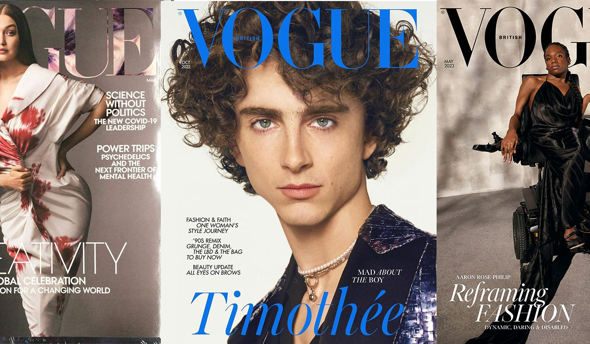
Vogue uses a modified version of Didot, a high-contrast Didone serif typeface, for its iconic masthead. The specific version licensed by Condé Nast is Linotype Didot, originally drawn by Adrian Frutiger in 1991. For cover lines and interior text, Vogue also uses Vogue AG, a custom geometric sans-serif font commissioned from Terminal Design in 2004.
The masthead itself is not a straight-from-the-shelf Didot. Vogue’s art team has adjusted the spacing, stroke modulation, and specific letterforms – most notably the elongated “V” – making it a bespoke logotype built on a Didot foundation.
What Type of Font Is Didot?

Didot is a serif font classified under the Didone category, sometimes called Modern serif. The defining feature is extreme contrast between thick vertical strokes and nearly invisible hairline thin strokes.
It has a vertical stress axis and sharp, unbracketed serifs. The x-height is relatively modest, which adds to the elongated, refined look. If you look at the letterforms under the right light, the hairlines almost disappear. That fragility is intentional.
This kind of typographic contrast is exactly what high-end fashion publications have leaned on for decades. It reads as expensive, precise, and a little cold – which matches the Vogue brand perfectly.
Vogue AG: The Other Half of the Picture
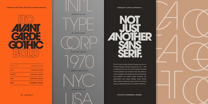
Vogue AG is a nine-weight geometric sans-serif that Terminal Design created by mixing visual DNA from Futura and Avant Garde Gothic. The Extra Light weight came first in 2004, with the remaining weights added in 2007 and updated in 2011.
It handles the heavy lifting on cover lines and inside pages where the Didot masthead would be too formal or too delicate at smaller sizes. The two typefaces work together: Didot brings history and authority, Vogue AG brings clarity and a cleaner, more contemporary feel.
Typographic Role Breakdown
| Typeface | Where It Appears | Classification | Notes |
| Linotype Didot | Masthead / Logo | Didone Serif | Extreme contrast; the “vertical” look of fashion. |
| Vogue AG | Cover Lines / Headers | Geometric Sans | Custom “Avant Garde” with modified terminals. |
| Editorial Serifs | Body Text | Modern Serif | Often utilizes Miller or Chronicle for readability. |
Who Designed the Didot Typeface?
The Didot typeface family traces back to Firmin Didot, a French type designer and printer who developed the original cuts between 1784 and 1811. He and his brother Pierre Didot were among the most prominent figures in French printing history.
The version Vogue actually uses is Linotype Didot, a revival drawn by Adrian Frutiger in 1991 for the Linotype foundry. Frutiger studied the original Didot types closely, including a 1818 book printed by the Didot family, and produced a refined digital version with seven styles.
The Vogue masthead is not Linotype Didot used straight from the font file. Art direction at Condé Nast has customized the letterforms over time, making the masthead a trademarked logotype – not a font you can download and replicate exactly.
Who Made Vogue AG?
James Montalbano at Terminal Design, a New York-based type foundry, created Vogue AG. The project was reportedly commissioned by Russell Labosky, then Art Director at Vogue magazine, in 2004.
Terminal Design is also known for work on the Clearview signage system. Montalbano teaches type design at Parsons School of Design, and his work on Vogue AG has been featured in design publications including Print and Creative Review.
Is Didot Free to Use?
It depends on which version you’re talking about. Linotype Didot (the version closest to what Vogue uses) is a commercial font. It’s available through Monotype/MyFonts with separate desktop, webfont, and app licenses. Pricing starts at roughly $35 per style for desktop use.
A version of Didot is bundled with Apple’s macOS, so Mac users technically have access to it already – though with a limited character set compared to the full Linotype family.
GFS Didot is available free through Google Fonts and carries an Open Font License, making it free for both personal and commercial use. It’s a solid alternative for web projects that need the Didone aesthetic without the licensing cost.
Vogue AG is a proprietary custom font. It was commissioned exclusively for Vogue magazine and is not publicly available for purchase or download anywhere.
What Font Did Vogue Use Before?
Vogue’s typographic history is longer and messier than most people expect. The magazine was founded in 1892 and spent decades using hand-lettered logos, varying wildly in style across issues.
Through the 1920s and 1930s, the masthead was often hand-drawn and changed from issue to issue, sometimes as a script, sometimes more geometric. A 1947 cover shows an early appearance of Didot in a taller, more condensed form. But even then, the magazine kept switching between serif and sans-serif approaches well into the mid-1950s.
The consistent Didot masthead that everyone recognizes today became the standard around the mid-20th century and solidified further with Anna Wintour’s tenure beginning in 1988. The 1991 Linotype Didot revival by Adrian Frutiger gave the magazine a refined digital version to work from, and the overall typography system got a further update when Vogue AG was added in 2004.
What Are the Best Free Alternatives to Didot?

You can’t use the actual Vogue masthead font. But you can get close. Here are 5 options that capture the high-contrast Didone look without the steep licensing cost.
| Font | Why It’s Similar | License | Source |
| GFS Didot | Direct Didot revival, high contrast strokes | Free (OFL) | Google Fonts |
| Bodoni Moda | Same Didone classification, strong stroke contrast | Free (OFL) | Google Fonts |
| Playfair Display | High contrast serif, works well at large display sizes | Free (OFL) | Google Fonts |
| Cormorant Garamond | Elegant thin-thick contrast, refined editorial feel | Free (OFL) | Google Fonts |
| Linotype Didot | The actual closest match to Vogue’s version | Paid | MyFonts / Adobe Fonts |
For web projects, Bodoni Moda or Playfair Display are probably the most practical starting points. They’re well-maintained, load reliably, and have enough character weights to build a proper typographic hierarchy.
If you’re working on something where the fine details matter – a logo or a print piece – Linotype Didot is worth the investment. The hairlines are just cleaner and more controllable at large sizes.
How to Use Didot Alternatives in Your Design Tools
In Figma or Canva
Google Fonts options like GFS Didot and Playfair Display are directly accessible inside Figma through the font picker. No installation needed. In Canva, you can upload fonts to Canva directly if you have a Pro account and want to use a purchased Linotype Didot file.
In Adobe Illustrator or Photoshop
Linotype Didot is available through Adobe Fonts if you have a Creative Cloud subscription. That’s honestly the most cost-effective way to access it. To add fonts to Adobe Illustrator from Adobe Fonts, just activate them from the Creative Cloud app and they’ll appear in your font menu automatically.
For Photoshop, the process is the same. You can also learn how to add fonts to Photoshop manually if you’ve downloaded a font file separately.
Web CSS Embed (Google Fonts)
To use Playfair Display on a website, add this to your HTML:
“ <link href="https://fonts.googleapis.com/css2?family=Playfair+Display:wght@400;700&display=swap" rel="stylesheet"> `
Then in your CSS:
` h1, h2 { font-family: 'Playfair Display', serif; } `
For a closer match to Vogue’s body text system, pair it with a clean sans-serif at a lighter weight. Something like Inter or DM Sans works well as the secondary face.
Why Did Vogue Choose Didot?
There’s an actual connection between the word “Vogue” and the font choice. The word comes from French – it means style or fashion. Didot is a French typeface, developed in Paris, and became the standard for high-end French printing in the 18th and 19th centuries. Using it for a magazine literally named after French style wasn’t accidental.
The font psychology angle matters too. High-contrast Didone typefaces read as aristocratic. The extreme difference between thick and thin strokes creates visual tension that feels expensive. That tension is a huge part of what makes the masthead so recognizable – it’s distinctive even when partially hidden behind a cover model’s shoulder, which happens constantly.
The Vogue masthead often gets partially obscured by photography. A different typeface might not survive that. Didot’s extreme contrast means even a few visible letters are immediately identifiable. That’s not a coincidence. It’s smart logo thinking baked into the typography elements themselves.
The addition of Vogue AG in 2004 addressed a real problem: Didot is fragile at small sizes. The hairlines break down at 9 or 10 points. Using a geometric sans-serif for cover lines and captions meant the overall design could stay consistent without forcing Didot into sizes where it falls apart. That’s a very practical, craft-level reason behind what looks like a purely aesthetic decision.
If you’re looking at how other fashion and luxury brands use fonts, or curious how Vogue’s approach compares to something like Dior’s font choices or Balenciaga’s typography, the pattern is consistent: high-contrast serifs for the wordmark, geometric sans-serifs for secondary text. The best magazine fonts almost always follow this structure because it creates clear visual hierarchy while keeping the brand feel intact.
Vogue also isn’t alone in leaning on Didot. Time magazine’s font choices and National Geographic’s typography both reflect a similar philosophy: authority and legibility come from typefaces with real history behind them, not whatever’s trending this year.
FAQ on What Font Does Vogue Use
What is the main font used in the Vogue logo?
Vogue’s masthead uses a customized version of Linotype Didot, a high-contrast Didone serif typeface. The letterforms have been modified specifically for Condé Nast, making it a bespoke logotype rather than an off-the-shelf font anyone can download.
Is the Vogue font the same as Didot?
Close, but not identical. The masthead is based on Didot but with adjusted spacing, modified stroke details, and custom letterforms. The “V” is notably elongated. It’s Didot as a starting point, not Didot as the final product.
What font does Vogue use for cover lines?
Cover lines use Vogue AG, a custom geometric sans-serif commissioned from Terminal Design in 2004. It mixes traits from Futura and Avant Garde Gothic and comes in nine weights. It’s not publicly available for download.
Who designed the Didot typeface Vogue uses?
The original Didot cuts came from Firmin Didot between 1784 and 1811. The Linotype revival Vogue works from was drawn by Adrian Frutiger in 1991. Vogue AG, the sans-serif companion, was created by Terminal Design’s James Montalbano.
Can I download the Vogue font for free?
Not exactly. Linotype Didot is a paid commercial font available through MyFonts and Adobe Fonts. GFS Didot on Google Fonts is free for personal and commercial use and comes close in feel. Vogue AG is proprietary and unavailable to the public.
What type of font is Didot?
Didot is a Didone serif, sometimes called a Modern serif. It has extreme contrast between thick vertical strokes and hairline-thin horizontals, vertical stress, and sharp unbracketed serifs. That high contrast is what gives it the luxury editorial look.
Why does Vogue use Didot for its masthead?
“Vogue” is a French word meaning style. Didot is a French typeface with roots in 18th-century Parisian printing. The cultural connection is intentional. The typeface’s extreme stroke contrast also stays recognizable even when partially hidden by cover photography.
What are the best free alternatives to the Vogue font?
The closest free options are GFS Didot and Bodoni Moda, both on Google Fonts. Playfair Display is a slightly looser but very usable alternative for web and editorial work. All three share the high-contrast Didone classification that defines Vogue’s serif aesthetic.
Does Vogue use the same font across all international editions?
The Didot-based masthead is consistent across major editions including Vogue US, Vogue UK, Vogue Italia, and Vogue Paris. Vogue AG became part of the global visual identity around 2020. Interior editorial typography can vary by edition and art director.
Has Vogue always used Didot?
No. Early issues from the 1890s through the 1940s used hand-lettered logos that changed regularly. Didot appeared as early as 1947 but wasn’t fully standardized until the mid-20th century. The consistent masthead most people recognize today solidified during Anna Wintour’s editorship from 1988 onward.
Conclusion
So, what font does Vogue use? The masthead runs on a customized Linotype Didot, backed by the proprietary Vogue AG for cover lines and interior text.
The Didone serif classification, with its extreme stroke contrast and vertical stress, is what gives the magazine’s visual identity its authority across print and digital formats.
For designers looking to capture a similar luxury editorial feel, free alternatives built for magazines like GFS Didot or Bodoni Moda are the most practical starting points, especially when font licensing costs are a concern.
Condé Nast’s typographic choices for Vogue aren’t arbitrary. Every decision, from the bespoke logotype down to the nine-weight sans-serif system, reflects deliberate brand identity thinking that has held up for decades.

Renowned for his expertise in logo design and visual branding, Bogdan has developed a multitude of logos for various clients.
His skills extend to creating posters, vector illustrations, business cards, and brochures. Additionally, Bogdan's UI kits were featured on marketplaces like Visual Hierarchy and UI8.
He also wrote in the past years on sites like Design Your Way, WebDesignerDepot, WPDean, Designmodo, Speckyboy, Slider Revolution, and more.
- NBA Team Color Codes - 26 July 2026
- The Figma Logo History, Colors, Font, And Meaning - 25 July 2026
- Canva for Teams Review: Is It Worth the Business Plan? - 24 July 2026

Bogdan Sandu is a seasoned designer who has been designing websites since 2008. Renowned for his expertise in logo design and visual branding, Bogdan has developed a multitude of logos for various clients. His skills extend to creating posters, vector illustrations, business cards, and brochures. Additionally, Bogdan's UI kits were featured on marketplaces like Visual Hierarchy and UI8. He also wrote in the past years on sites like Design Your Way, WebDesignerDepot, WPDean, Designmodo, Speckyboy, Slider Revolution, and more.
You Might Also Like