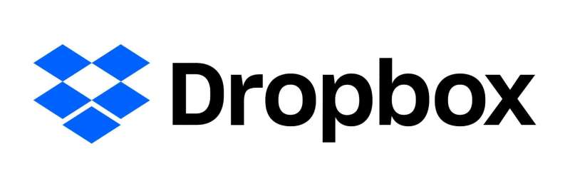
Dropbox uses Sharp Grotesk as its primary brand typeface, a neo-grotesque sans-serif font designed by Lucas Sharp at Sharp Type foundry.
Dropbox adopted Sharp Grotesk in October 2017 as part of a full visual identity overhaul, replacing its previous wordmark set in Franklin Gothic Condensed Demi Bold. The custom wordmark built for the rebrand sits between Sharp Grotesk Medium 20 and Semibold 20 in weight, a variant created specifically for Dropbox and not available in the retail version of the font.
For its product interface, Dropbox Paper uses Atlas Grotesk (by Commercial Type) in Medium and Regular weights for body copy.
—
What Type of Font Is Sharp Grotesk?

Sharp Grotesk is a neo-grotesque sans-serif typeface with strong influence from 19th-century American wood type poster lettering and the design principles of Swiss type designer Adrian Frutiger.
The font’s defining visual traits: ink traps at letter joints, a wide range of widths (05 to 25), and 7 weights from Thin to ExtraBold. That combination gives it an unusually wide tonal range for a single family.
It doesn’t look like a typical corporate sans-serif. There’s something a bit raw and American about it, which is exactly what made it work for Dropbox. The family spans 294 styles in total, including the additional italic masters Sharp Type developed exclusively for Dropbox’s rebrand.
Understanding typography basics helps here: the difference between a narrow condensed width and a wide extended width in Sharp Grotesk creates a completely different tone, almost like switching from a shout to a whisper while staying in the same voice. Dropbox used this intentionally, dialing up width and weight in marketing materials and dialing back in product UI where focus matters more than personality.
In terms of typographic hierarchy, Sharp Grotesk’s range of widths does a lot of the structural work that most brands need multiple typefaces to handle.
—
Who Designed Sharp Grotesk?
Lucas Sharp created Sharp Grotesk beginning as hand-drawn poster lettering in 2011. It was released commercially through his New York-based type foundry, Sharp Type, with version 1.0 launching in October 2016.
The font was not created for Dropbox. Dropbox licensed the existing retail family and then worked with Sharp Type to expand it. Specifically, they commissioned the remaining italic masters for widths 21 through 25, bringing the total from 259 to 294 styles.
Sharp Type also drew a custom logotype for Dropbox under the direction of Dropbox Brand Studio. That wordmark is based on a bespoke weight sitting between Sharp Grotesk Medium 20 and Semibold 20, with extensive optical adjustments to kerning, letter spacing, and bowl shapes. It is not part of the commercial Sharp Grotesk release.
The broader rebrand project involved design agency Collins, studios Instrument and Animade, and illustrators Brandon Land, Fanny Luor, and Justin Tran.
—
Is Sharp Grotesk Free to Use?
No. Sharp Grotesk is a commercial font. It requires a paid license from Sharp Type for any commercial use.
Trial versions (limited character sets in OTF format) are available free for download directly from Sharp Type’s website. These are personal-use-only and not cleared for commercial work or embedding.
Licensing is structured by use type:
- Desktop license – based on number of users (computers with the font installed)
- Webfont license – annual model, based on pageviews
- App license – for iOS, Android, or Windows Phone embedding
- Digital Ad license – based on impressions
- Electronic Doc license – for eBooks and eMagazines, based on number of publications
Pricing is available directly through Sharp Type (sharptype.co) or through MyFonts. For enterprise or broadcast use, Sharp Type handles those on a case-by-case basis via licensing@sharptype.co.
Sites offering Sharp Grotesk as a “free download” are distributing trial files with limited glyphs. They are not providing a commercial license. If you need it for client work, branding, or a web project, go directly to the foundry. Font licensing matters more than most designers realize until they get a compliance notice.
—
What Font Did Dropbox Use Before?
Before the 2017 rebrand, the Dropbox wordmark was set in Franklin Gothic Condensed Demi Bold, a typeface originally designed by Morris Fuller Benton in 1902 and published by American Type Founders.
| Period / Product | Typography | Status | Strategic Note |
| Pre-2017 Wordmark | Franklin Gothic | Commercial | Solid, reliable, but felt like “IT Infrastructure.” |
| Brand Primary (2017+) | Sharp Grotesk | Commercial | Offers 259 weights; allows the brand to “shout” or “whisper.” |
| Official Wordmark | Custom Sharp | Proprietary | A custom weight tuned for balance; not for public use. |
| Dropbox Paper | Atlas Grotesk | Commercial | Chosen for “Writing Utility” and long-form readability. |
The switch was driven by a strategic repositioning, not just aesthetic preference. Dropbox was shifting its identity from “cloud storage tool” to “creative workspace.” Franklin Gothic, widely used in corporate and editorial contexts (The New York Times, Time Magazine), read as functional and authoritative. Sharp Grotesk, with its range of widths and expressive personality, gave the brand a way to communicate differently across different contexts.
Collins, the design agency leading the rebrand, explicitly selected Sharp Grotesk for its “versatility” and the ability to “speak in a variety of tones.” That framing was core to the brief: a brand system flexible enough to be loud in marketing and quiet in product.
—
What Are the Best Free Alternatives to Sharp Grotesk?
Sharp Grotesk’s width range and ink traps make it hard to replicate exactly. But if you need something in the same general territory without the licensing cost, these are worth looking at:
| Font | Closest characteristic | License | Source |
| Inter | Neutral grotesque, strong at small sizes | Free (OFL) | Google Fonts |
| Space Grotesk | Distinctive counters, medium personality | Free (OFL) | Google Fonts |
| DM Sans | Clean, geometric, readable at body sizes | Free (OFL) | Google Fonts |
| Work Sans | Optically sized grotesque, wide weight range | Free (OFL) | Google Fonts |
| Aktiv Grotesk | Closest neo-grotesque feel | Paid | Dalton Maag |
None of these replicate Sharp Grotesk’s width axis or its American wood-type character. If you’re building a brand system that needs real tonal range across widths, you either license the real thing or accept a compromise.
Inter is probably the most practical pick for web projects. Inter font pairing options are also well-documented, which matters if you’re building a full type system on a budget. Space Grotesk font pairing is worth exploring too if you want something with a bit more visual character than Inter. And if DM Sans feels right for your project, there’s solid guidance on DM Sans font pairing to help you build around it.
—
How to Use Sharp Grotesk (or an Alternative) in Your Design Tools
In Figma
If you’ve licensed Sharp Grotesk, install it on your system and it will appear in Figma’s font picker automatically. Figma reads locally installed fonts via the Figma Desktop App or the Figma Font Helper browser plugin.
For free alternatives like Inter or Space Grotesk: Figma has Google Fonts built in. Just type the name in the font field. No installation needed.
In CSS
For Inter via Google Fonts:
“ <link href="https://fonts.googleapis.com/css2?family=Inter:wght@400;500;600;700&display=swap" rel="stylesheet"> `
Then in your CSS:
` body { font-family: 'Inter', -apple-system, BlinkMacSystemFont, 'Segoe UI', sans-serif; } `
Dropbox itself, at different breakpoints, switches Sharp Grotesk to a narrower or wider width rather than scaling the font size down. That’s worth replicating in spirit if not in exact implementation: responsive tracking and weight adjustments across breakpoints go a long way.
In Canva
Canva Pro allows you to upload fonts to Canva if you hold a valid commercial license for Sharp Grotesk. Free alternatives like Inter are available directly in Canva’s font list without uploading anything.
—
Why Did Dropbox Choose Sharp Grotesk?

The short answer: they needed a type system that could do more than one thing without feeling incoherent.
Dropbox’s creative director Aaron Robbs and VP of design Nicholas Jitkoff described the 2017 rebrand as a shift from treating users as “knowledge workers” to treating them as “creative workers.” That required a visual language capable of expressing range, not just consistency.
Sharp Grotesk’s 259 retail styles (later expanded to 294 for Dropbox) meant the brand could use a single typeface family across everything: from narrow condensed weights for dense UI text to wide extended weights for bold campaign headlines. The Dropbox design team described this as being able to “dial up” expressiveness for marketing and “dial it down” where users need to focus.
There’s also a practical brand recognition argument. Most SaaS companies in 2017 were using neutral, geometric sans-serifs. Helvetica Neue, Proxima Nova, and similar. Sharp Grotesk’s ink traps and American grotesque personality made Dropbox’s visual identity immediately distinct in that context. That distinctiveness is a real business asset, not just a design preference. Good visual hierarchy and emphasis in brand typography directly affect how memorable a brand becomes.
Collins co-founder Brian Collins noted publicly that the brief was to move Dropbox “out of being just a utility” into a larger conversation about creativity and collaboration. The typography was central to that shift, not secondary to it.
It’s a good example of font psychology in practice: the choice wasn’t about what “looks professional.” It was about what communicates the right identity to the right audience across the most contexts possible.
If you’re curious about how other tech platforms handle their type choices, it’s worth comparing to the Notion font, the Slack font, or the Airbnb font – each reflects a different set of brand priorities through its typography decisions.
FAQ on What Font Does Dropbox Use
What is the official Dropbox font?
Dropbox uses Sharp Grotesk as its primary brand typeface, licensed from Sharp Type foundry. The custom wordmark uses a bespoke weight between Sharp Grotesk Medium 20 and Semibold 20, drawn specifically for Dropbox and not available in the retail font family.
What font does the Dropbox logo use?
The Dropbox logo wordmark uses a custom weight based on Sharp Grotesk, with extensive optical adjustments to letter spacing, bowl shapes, and joins. It is not a publicly available style. Before 2017, the wordmark was set in Franklin Gothic Condensed Demi Bold.
Is Sharp Grotesk free to download?
Trial files exist with a limited character set, free for personal use only. Commercial use requires a paid license from Sharp Type. Sites offering full free downloads are distributing unlicensed files. Pricing depends on license type: desktop, webfont, app, or digital ad.
Who designed the Dropbox typeface?
Lucas Sharp designed Sharp Grotesk, starting as hand-drawn poster lettering in 2011. It was released commercially through his New York foundry, Sharp Type, in 2016. Sharp Type also drew Dropbox’s custom logotype under direction from Dropbox Brand Studio.
What font does Dropbox Paper use?
Dropbox Paper uses Atlas Grotesk, published by Commercial Type. The product UI specifically uses Atlas Grotesk Medium and Atlas Grotesk Regular for body copy. It is a separate typeface from Sharp Grotesk and was chosen for its clean leading and readability at 16px.
What type of font is Sharp Grotesk?
Sharp Grotesk is a neo-grotesque sans-serif. It draws from 19th-century American wood type and the work of Adrian Frutiger. Key features include ink traps, 7 weights, and 21 widths, giving it a tonal range that most grotesque fonts simply don’t have.
What font did Dropbox use before Sharp Grotesk?
Before the 2017 rebrand, Dropbox’s wordmark was set in Franklin Gothic Condensed Demi Bold, originally designed by Morris Fuller Benton in 1902. The switch to Sharp Grotesk came with a full brand overhaul led by design agency Collins, repositioning Dropbox as a creative workspace platform.
Are there free alternatives to Sharp Grotesk?
Yes. Inter, Space Grotesk, DM Sans, and Work Sans are all free under the Open Font License and share the clean grotesque structure. None replicate Sharp Grotesk’s width axis exactly. For something closer in personality, check fonts similar to Inter as a starting point.
How do I use the Dropbox font style in Figma?
Install Sharp Grotesk on your system via a valid license, and Figma picks it up automatically through the desktop app. For a free alternative, Inter or Space Grotesk are available directly in Figma’s Google Fonts library. No upload needed. Just type the name in the font field.
Why did Dropbox choose Sharp Grotesk?
Collins selected Sharp Grotesk for its range of 259 styles, allowing Dropbox to “speak in a variety of tones” across marketing and product without switching typefaces. It also differentiated Dropbox from competitors using standard geometric sans-serifs like Helvetica Neue or Proxima Nova at the time.
Conclusion
If you’ve ever wondered what font does Dropbox use, the answer is Sharp Grotesk, a commercial neo-grotesque typeface licensed from Sharp Type and expanded specifically for Dropbox’s 2017 brand system.
The Dropbox font stack covers everything from the custom wordmark to UI copy in Dropbox Paper, where Atlas Grotesk handles body text. That’s two distinct typefaces serving two distinct purposes inside one brand.
Sharp Grotesk’s 294-style family gave Dropbox’s design system the tonal range it needed. For those who need similar variable font versatility without the licensing cost, Inter, DM Sans, and Work Sans remain solid free alternatives with good x-height and screen legibility.

Renowned for his expertise in logo design and visual branding, Bogdan has developed a multitude of logos for various clients.
His skills extend to creating posters, vector illustrations, business cards, and brochures. Additionally, Bogdan's UI kits were featured on marketplaces like Visual Hierarchy and UI8.
He also wrote in the past years on sites like Design Your Way, WebDesignerDepot, WPDean, Designmodo, Speckyboy, Slider Revolution, and more.
- NBA Team Color Codes - 26 July 2026
- The Figma Logo History, Colors, Font, And Meaning - 25 July 2026
- Canva for Teams Review: Is It Worth the Business Plan? - 24 July 2026

Bogdan Sandu is a seasoned designer who has been designing websites since 2008. Renowned for his expertise in logo design and visual branding, Bogdan has developed a multitude of logos for various clients. His skills extend to creating posters, vector illustrations, business cards, and brochures. Additionally, Bogdan's UI kits were featured on marketplaces like Visual Hierarchy and UI8. He also wrote in the past years on sites like Design Your Way, WebDesignerDepot, WPDean, Designmodo, Speckyboy, Slider Revolution, and more.
You Might Also Like