What font does Slack use in its interface and website?
Imagine your favorite tool donning a new outfit, one that speaks of modernity yet feels as comfortable as your well-worn jeans. In the realm of digital workspaces, the Slack font stands as a silent yet formidable force, enhancing legibility, reinforcing brand identity, and shaping our daily interactions.
As fonts construct the ambience of on-screen dialogue, a meticulous selection becomes a linchpin for clarity and aesthetics — a topic I find endlessly fascinating.
Standing at the intersection of typography and user experience design, I delve into how Slack’s typographic choices fundamentally influence the user’s journey.
This article unfolds the intricacy behind Slack’s typographic facade, unveiling insights on how visual communication underpins functional design.
You’re about to navigate through the corridors of Slack’s visual guidelines, unraveling the fabric of its branding typography.
We’ll explore typography’s role in user interface readability, dissect Slack’s adherence to accessibility standards, and interpret the ethos conveyed by its chosen typeface. Prepare to see Slack’s text in an intriguing new light.
Fonts used by Slack
What font does Slack use? Helix Bold is used for the Slack logo, Noto Sans is the pliant app/UI, and M PLUS 1p is the Google slide logo.
The Slack website’s headlines are in Larsseit and Circular, and Helvetica, both text and paragraph text. Tazugane is the Japanese brand font.
What font does Slack use for its logo?
In addition to looking decently on colored backgrounds, the new logo tackles this with an icon that can be easier to adapt to multiple platforms. The symbol used is similar to the initial character in four colors, but it is more floral.
The Slack logo has an octothorpe and a Hellix Bold logo style. Hellix is the family mono-linear without serif geometric source. During an internship at the UMPRUM Prague Type and Type Design Studio. The circular shapes in Hellix are “punched” into the vertical ends, and the finishes are diagonal. In Hellix, circular shapes are gracefully linked to the vertical strokes, and the lots are sloping. Hellix has horizontal or vertical terminals in the final alteration, and the circular shapes are bound into the stem.
Slack App/UI font: Noto Sans
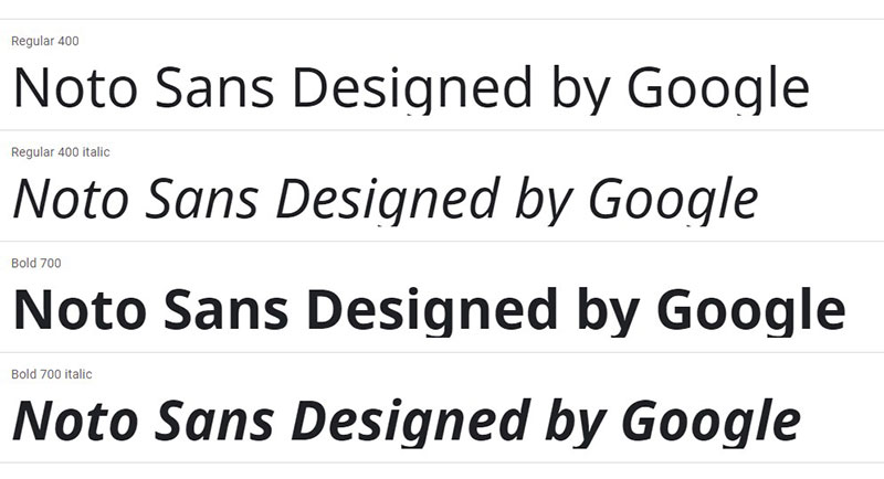
Noto Sans is a free open-source, Google Fonts humanistic typeface. It was designed to support as many languages and scripts as possible. It is still in the process, and it plans to keep all Unicode 6.2 characters at long last. Noto Sans’ nature is very similar to Open Sans, but not as many weights and types.
Fonts similar to Noto Sans
Open Sans
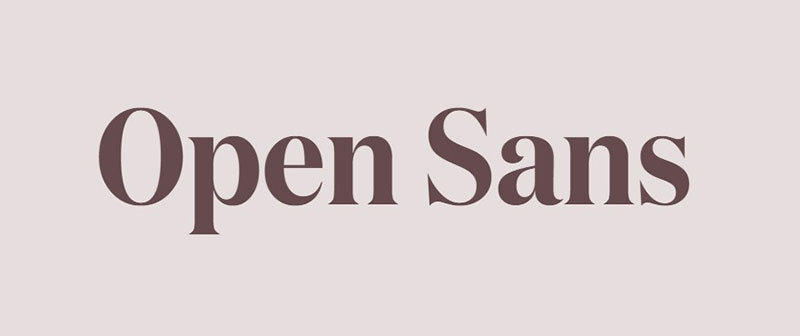
Open Sans is a humanist without serif typeface, open-source designed in 2011 by Steve Matteson. Open Sans is amazingly adaptable and helpful for a broad range of applications thanks to its five weights fitted with italics. It’s an omnipresent font on the internet that everyone from Google to WordPress uses.
Bernini Sans
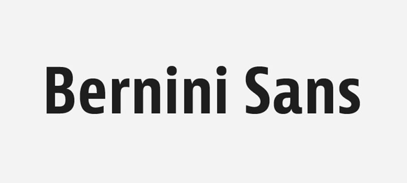 Bernini Sans is a humanist without merriment model designed and published in 2012 by Tim Ahrens. The typeface is unique in that every Bernini Sans style has two fonts: Bernino Sans and Bernina Sans, his sister, which is more playful with a two-story G and round dot.
Slack App/UI font: M PLUS 1p
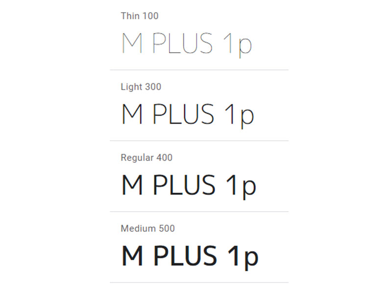
A superfamily set consists of 4 families of proportional Latin, 3 with fixed-half width Latin, and 2 with full-blown Japanese Kana variants. The project is a superfamily project.
Rounded M+ produces M+ font variants with rounded terminals. M+1p, are fonts of Latin proportional and Japanese full-width, and of Thin to Black 7 weights. The Kana have straight lines and curves drawn by hand. The Latin has been crafted to be refined and comfortable.
Slack website headlines font: Larsseit
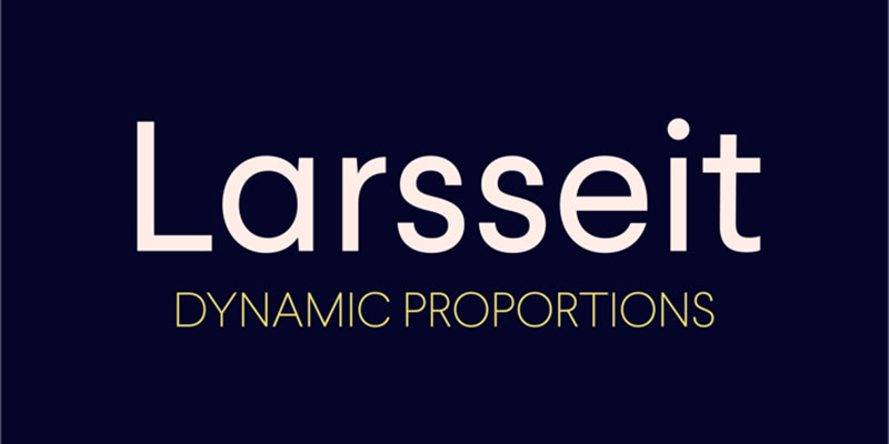
Larsseit is a contemporary font that was published by Swiss Foundry Type Dynamic in 2013. It feels like a very neutral and anonymous sans, but some of its letterforms, such as lowercase g, have a few striking peculiarities. Larsseit has been one of my favorite homeless people of recent years.
Fonts similar to Larsseit
FF Bau
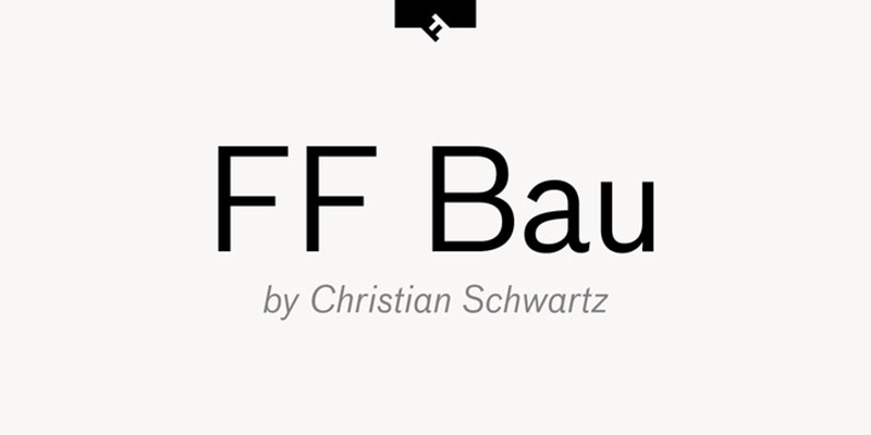
FF Bau is the grotesque sans serif typeface developed and published by FontFont in 2002, designed by Christian Schwartz. The style was influenced by the grotesques of the German Schelter & Giesecke foundry of the late 19th century. FF Bau is available with matching italics in eight weights.
Founders Grotesk
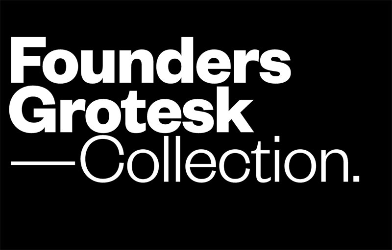
Founders Grotesk is a grotesque Klim Type Foundry designed by Kris Sowersby based in New Zealand. Classical grotesques influenced the style at the beginning of the 20th century. Founders Grotesk’s c has a small opening, one of its characteristics.
Maple
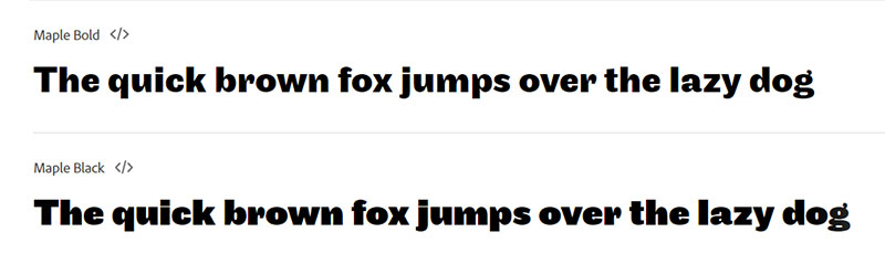
Maple was developed by Eric Olson and published in 2005 via the Process Type Foundry. Maple’s architecture is full of peculiarities, but it refines an even odder grotesque, Method Grotesque. Method Grotesque retired in 2003 and succeeded Maple. Maple with matching italics is available in four weights.
Slack website body font: Circular
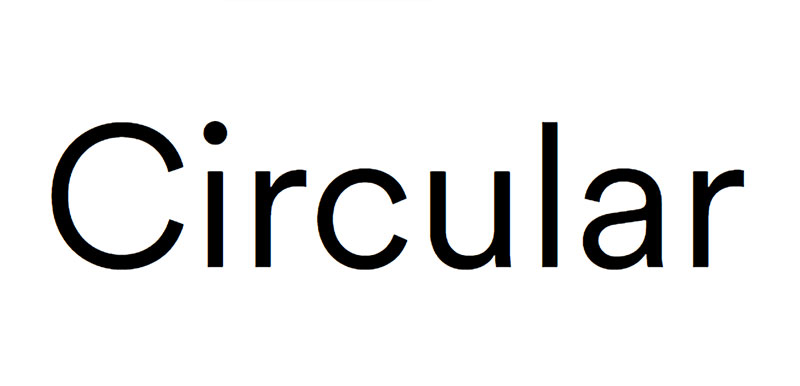
Circular is a non-serifed geometric model developed and released via Lineto in 2013 by Swiss artist Laurenz Brunner. The second official release of Brunner is circular, the other the well-received Akkurat. Style is mostly based on geometric shapes, but the Circular has quirks that warm it up a lot. Simple to define circulation compared to other without-serifs. Circular. Four weights of circular – book, medium, bold and black – are available, each equivalent in italics.
Fonts similar to Circular
Sailec
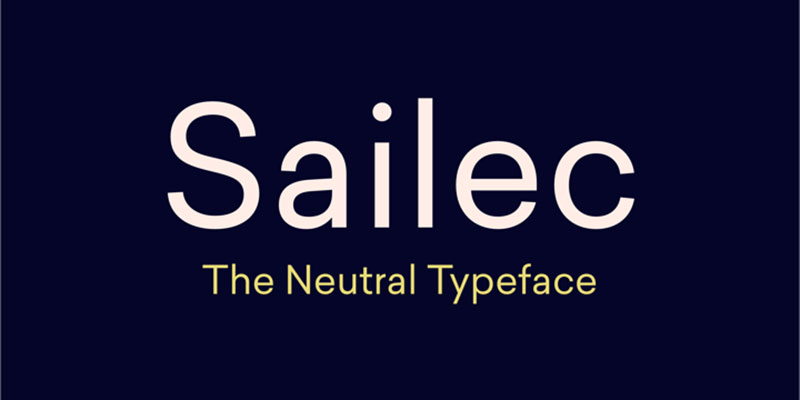
The Swiss foundry Type Dynamic wrote and published Sailec in 2014. Form Dynamic defines it as a globally typographically ‘neutral’ typeface. It doesn’t look like Helvetica or other neo-grotesques—shapes are much more geometric. Sailec is available in seven sizes, each with matching italics: slim, light, standard, mid-sized, bold, and black.
TT Commons
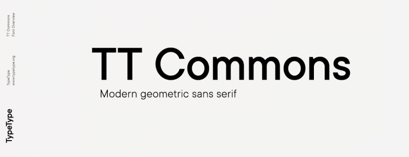
TT Commons was released by Russian Foundry TypeType in 2018 as a typeface without serif. Geometrical dimensions, tight openings, and low-stroke contrast feature the design. The family is available with matching italics in nine weights.
Stratos
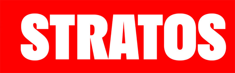
Stratos is a geometric grotesque that derives its peculiar meaning from odd proportional ideas. It does for the new effect and allows the consumer to do more exciting things with typographical notions.
Slack website body font: Helvetica
Helvetica
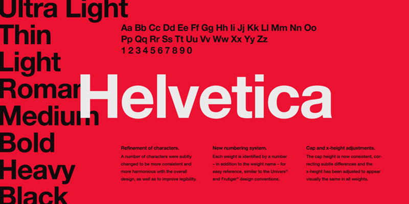
Helvetica is a neoliberal design inspired by the renowned Akkidenz-Grotesk design of the 19th century and other Swiss and German methods. It is a functional design. It was utilized by Switzerland’s artists in the 1950s and 1960s and was one of the most common styles of the 20th century, an international typographical form.
Fonts similar to Helvetica
Akzidenz Grotesk
For real enthusiasts, this is one. He was even published in 1898, more than half a century before Helvetica, and is one of the styles that helped set off the entire Neo-Grotesque movement of the beginning of the 20th century. He’s Helvetica’s grandfather and influenced several other ‘Swiss’ models.
Neue Haas Grotesk

The Helvetica digital version, which everybody today knows and uses, is different from the pre-digital edition of the 1957 typeface. Published initially as Neue Haas Grotesk, many of the features which have made it a favorite of modernism have been lost in converting one technology to the next over the years.
FAQ On The Slack Font
What font does Slack use?
Slack’s UI boasted the Lato font family for a spell. It’s a sans-serif typeface known for its warmth and clarity, crucial for the myriad messages and content shared across the platform daily.
Can I customize Slack’s font?
Surprisingly, no. Slack upholds its visual consistency by not offering font customization. This decision ensures users across diverse devices and operating systems experience uniform readability and usability.
Is the Slack font different on various platforms?
Subtlety reigns here. Although the cornerstone of Slack’s typeface remains consistent, rendering may slightly differ due to distinct font rendering technologies inherent to various devices and operating systems.
Why was Lato chosen for Slack?
Lato brings an air of sophistication and approachability, aligning seamlessly with Slack’s brand ethos. This typeface balances contemporary aesthetics with functional legibility—a harmonious blend for digital workspaces.
How important is font selection in user experience?
In the realm of UX/UI design principles, typeface is pivotal. It shapes readability, user comfort, and overall perception of the app, influencing how long and effectively users engage with the platform.
How does Slack’s font contribute to its brand identity?
As in all branding typography, Slack’s font is a silent ambassador. It extends the brand’s voice, character, and distinctiveness, bolstering its visual identity in the competitive landscape of communication platforms.
What are Slack’s visual guidelines regarding typography?
Slack’s visual guidelines dictate consistency, accessibility, and brand alignment in its typography, ensuring that every character on the screen reinforces its visual narrative and user interface aesthetics.
How does Slack’s typography adhere to accessibility standards?
The selection harmonizes with accessibility standards by enhancing font legibility and ensuring text is decipherable for users, including those with disabilities—reflecting Slack’s commitment to inclusivity in digital workplace solutions.
Has Slack’s font changed since its inception?
Evolution is natural. Slack’s font has undergone iterative changes, subtle yet strategic adjustments aligning the platform’s evolving aesthetic with usability standards, showcasing typography as an active ingredient in design evolution.
Are there any best practices for font selection in apps similar to Slack?
Indubitably. For apps in the same vein, UX/UI design principles champion legibility, scalability, and compatibility across devices.
Select a typeface reflecting your brand’s spirit while ensuring users can read and interpret text with ease, regardless of their context.
Conclusion
Through this whirlwind journey winding around the Slack font, one fact stands unchallenged: Typography in digital workspaces, such as Slack, is not merely a backdrop—it’s a pivotal actor on the stage of user experience. Consistency, clarity, and brand representation, these pillars are what the Slack font upholds, wrapping myriad conversations in a visual embrace.
The path navigated has dissected how Lato—with its unassuming elegance—doesn’t just sit on the user interface; it actively shapes your interaction narrative. This visage of the platform, subtly altering across devices and screens, maintains the integrity of Slack’s visual and functional communication.
- User Interface Fonts: They are the unsung heroes of readability and user comfort.
- Messaging App Typeface: It’s the silent voice of a brand.
- Digital Workplace Aesthetics: They are the tapestry onto which user experience is embroidered.
In closing, remember this—fonts breathe life into the virtual canvases we convene upon, making every pixel count in the story of our digital odyssey.
If you liked this article about the Slack font, you should check out this article about the YouTube font.
There are also similar articles discussing the CNN font, the Twitch font, the Reddit font, and the Netflix font.
And let’s not forget about articles on the Minecraft font, the Medium font, the Disney font, and the Instagram font.
Bogdan Sandu, a seasoned designer with 15 years of diverse experience, has been designing websites since 2008.
Renowned for his expertise in logo design and visual branding, Bogdan has developed a multitude of logos for various clients.
His skills extend to creating posters, vector illustrations, business cards, and brochures. Additionally, Bogdan's UI kits were featured on marketplaces like Visual Hierarchy and UI8.
Latest posts by Bogdan Sandu (see all)
- Out of This World: Space Color Palettes for Cosmic Designs - 28 April 2024
- The Bungie Logo History, Colors, Font, And Meaning - 27 April 2024
- After Dark: Night Color Palettes for Mysterious Designs - 27 April 2024