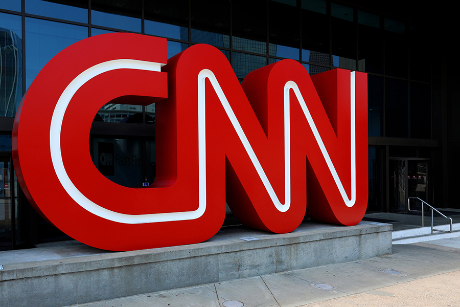
CNN uses CNN Sans, a custom humanist sans-serif font commissioned from Monotype and introduced across all platforms in April 2016.
CNN Sans replaced a Gotham-style typeface that the network had been using for its on-air graphics, lower thirds, and digital presence.
The family ships in over 30 weights and styles, ranging from light italic to display heavy, making it flexible enough to cover every touchpoint from news tickers to promotional materials.
—
What Type of Font Is CNN Sans?
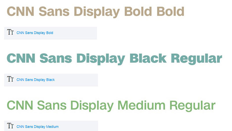
CNN Sans is a humanist neo-grotesque sans-serif, sitting somewhere between the clean neutrality of Helvetica and the warmer geometry of typefaces like Gill Sans.
CNN itself acknowledged the resemblance to Helvetica publicly when the font launched. That is not accidental. Neo-grotesque sans-serifs have been the default choice for broadcast media for decades because they hold up under rapid reading conditions and render clearly at small sizes on screen.
The family includes condensed variants specifically built for on-screen graphics, where fitting long headlines into tight lower-third containers is a constant technical challenge. Understanding concepts like x-height, tracking, and leading helps explain why CNN Sans was designed with the specific proportions it has: a generous x-height improves on-screen legibility, while tighter tracking keeps headlines compact without losing clarity.
CNN Sans also comes with a matching Arabic variant for international editions and bilingual layouts, which was added after the initial 2016 rollout.
—
Who Designed CNN Sans?
Monotype Design Studio designed CNN Sans under commission from CNN, with development beginning around 2015 and the public launch happening in April 2016.
Monotype is one of the oldest and most recognized type foundries in the world, responsible for typefaces like Times New Roman, Neue Haas Unica, and many other fonts used in publishing and broadcast.
CNN’s creative team worked alongside Monotype to define the default letter-spacing and word-spacing parameters, making sure the font behaved consistently across TV, web, and mobile without additional adjustments per platform.
The font was not designed to have a strong “personality.” CNN’s creative direction at the time was explicit about wanting something neutral and durable, not something that would feel dated in a few years. That pragmatic brief shaped how Monotype approached the design.
—
Is CNN Sans Free to Use?
No. CNN Sans is proprietary. Monotype holds the copyright, and CNN owns an exclusive license.
The font is not available on Google Fonts, Adobe Fonts, or any public font repository. Files that circulate on third-party download sites are unauthorized copies and carry legal risk if used in commercial projects.
This matters especially for designers who need to replicate the CNN visual style. The font licensing model here is similar to how brands like Netflix or Apple handle their custom typefaces: the font exists only within the brand’s ecosystem.
—
What Font Did CNN Use Before CNN Sans?
Before 2016, CNN relied on a Gotham-style typeface for its on-air graphics and brand materials.
Gotham, designed by Hoefler & Co., became widely used in media and political branding during the late 2000s and early 2010s. It was the primary typeface for Barack Obama’s 2008 presidential campaign, which gave it massive cultural visibility around that period.
The problem for CNN was practical: Gotham was a licensed font that CNN did not own outright, and the available weights were limited. When headlines ran long, graphics operators would manually condense the letterforms in the broadcast system, which is exactly the kind of visual inconsistency a brand overhaul is designed to fix.
Commissioning CNN Sans gave the network full ownership of the typeface and 30+ weights to work with, which removed the need to artificially compress or stretch type.
—
Best Free Alternatives to CNN Sans
Since CNN Sans is not publicly available, designers who want a similar look need to work with free alternatives. These 5 options cover the key characteristics: humanist construction, high legibility, and multiple weights.
| Font | Similarity | License | Source |
| Inter | Humanist neutral, strong at small sizes | Free (OFL) | Google Fonts |
| Source Sans Pro | Clean grotesque, wide weight range | Free (OFL) | Google Fonts |
| Work Sans | Grotesque structure, headline-friendly | Free (OFL) | Google Fonts |
| DM Sans | Low-contrast, neutral, readable at all sizes | Free (OFL) | Google Fonts |
| Space Grotesk | Geometric with humanist details | Free (OFL) | Google Fonts |
Inter is probably the closest match for UI and web use. It was specifically designed for screen interfaces, which aligns with what CNN Sans was built to do.
If you’re working on broadcast-style graphics, Work Sans in its condensed or semi-bold weights gets reasonably close to how CNN Sans looks in lower-third applications.
—
How to Use CNN Sans Alternatives in Your Projects
In Figma and Web Projects
Inter is available directly through Google Fonts and loads fast enough for web use without significant performance trade-offs. Add it to a project via the standard Google Fonts embed:
“ <link href="https://fonts.googleapis.com/css2?family=Inter:wght@400;600;700&display=swap" rel="stylesheet"> `
If you want to know more about how to get these into specific tools, there are detailed guides on how to add fonts to Figma, Adobe Illustrator, and InDesign that walk through the process step by step.
In Canva
Canva includes Inter natively, so no installation is needed. Work Sans and DM Sans are also available in the Canva font library.
For custom fonts on the paid plan, you can upload fonts to Canva directly from your desktop, which is useful if you’ve licensed a commercial alternative from a foundry.
CSS Font Stack for Broadcast-Inspired Web Design
` font-family: 'Inter', 'Source Sans Pro', Arial, sans-serif; `
This stack prioritizes Inter, falls back to Source Sans Pro if Inter isn’t loaded, and then to Arial as the web-safe font fallback. It is a reasonable approximation of CNN’s typographic feel for editorial or news-style web layouts.
—
Why Did CNN Choose This Font?
Two reasons drove the decision: cost and control.
Licensing Gotham across a global network with dozens of regional editions, multiple platforms, and constant broadcast use was expensive. Owning the typeface outright through a one-time commission to Monotype removed that recurring cost, and CNN’s creative team stated at the time that the savings over 15 to 20 years would be substantial.
The second reason was consistency. CNN operates across broadcast TV, web, mobile apps, international editions, and promotional materials. Before CNN Sans, different divisions used slightly different versions of the licensed typeface, or adjusted it in ways that made the brand feel inconsistent across channels.
Having a single family with 30+ weights, condensed variants, and a matching Arabic script meant that every part of the network could use the same typeface without any awkward compromises. The typographic hierarchy could be maintained reliably from a TV lower-third to a mobile push notification.
There was also a longevity brief. CNN’s creative leadership explicitly said they did not want something “cool today and out of date next year.” The humanist neo-grotesque direction was chosen because it is a stable, proven category with decades of broadcast use behind it. That is a very different brief from a fashion brand reaching for something trendy, and it shows in the result.
It is worth noting that CNN Sans was one of the first major custom typefaces adopted by a cable news network. That was actually a significant moment in broadcast design: it signaled that custom typography was no longer just for tech companies and luxury brands. Other news organizations took note.
—
CNN’s Full Typography System
CNN Sans is the primary typeface, but it is not the only one in use across CNN’s properties.
| Section / Use | Typeface | Classification |
| Main site, broadcast, UI | CNN Sans | Humanist neo-grotesque |
| CNN Business / Tech sections | CNN Business (Barlow-influenced) | Grotesque sans-serif |
| CNN Travel section | CNN Travel (Battersea Slab-influenced) | Slab serif |
| CNN Style section | CNN Style | Didone stencil serif |
| International / Arabic editions | CNN Sans Arabic | Matching Arabic companion |
Each section has its own visual identity, but they are all built to sit within the broader CNN brand system. The use of section-specific typefaces is a common pattern among large media companies: compare it to how The New York Times manages distinct type treatments across its news, cooking, and wirecutter verticals.
For anyone interested in how other major media brands handle their typography, it is worth looking at how Vogue, Time magazine, and National Geographic each use custom or licensed typefaces to build distinct brand voices through typography alone.
FAQ on What Font Does CNN Use
What is the main font CNN uses?
CNN uses CNN Sans, a custom humanist sans-serif typeface commissioned from Monotype and launched in April 2016.
It replaced a Gotham-style font and is now used across broadcast, web, and mobile platforms.
Who made CNN Sans?
Monotype Design Studio created CNN Sans under direct commission from CNN.
Development started around 2015. CNN’s creative team collaborated with Monotype to set default spacing and weight parameters across all use cases.
Is CNN Sans available for free download?
No. CNN Sans is proprietary and not publicly available on Google Fonts or Adobe Fonts.
Unauthorized copies circulate on third-party sites, but using them in commercial projects carries real legal risk given the font licensing terms.
What font did CNN use before CNN Sans?
CNN used a Gotham-style typeface before 2016.
Gotham is a geometric sans-serif designed by Hoefler & Co. CNN moved away from it partly to avoid licensing costs and gain access to more condensed weights.
How many weights does CNN Sans have?
CNN Sans comes in over 30 weights and styles, from light italic to display heavy.
That range covers everything from news ticker text to full-screen broadcast headlines without needing to artificially compress letterforms.
What font does CNN use on its website?
CNN Sans is the primary web font, though different site sections use different typefaces.
CNN Business and Tech use a grotesque sans-serif influenced by Barlow. CNN Travel uses a slab serif influenced by Battersea Slab.
What are the best free alternatives to CNN Sans?
Inter is the closest free match, followed by Source Sans Pro and Roboto.
All three are humanist sans-serifs available on Google Fonts with wide weight ranges suitable for editorial and broadcast-style design.
Is CNN Sans similar to Helvetica?
Yes. CNN itself acknowledged the resemblance publicly when the font launched.
Both are neo-grotesque sans-serifs with neutral letterforms and high legibility. CNN Sans sits closer to the humanist end, giving it slightly warmer character than pure Helvetica.
What font does the CNN logo use?
The CNN logo uses a custom letterform designed by Anthony Guy Bost of Communication Trends in 1980, created in under 48 hours before the network launched.
It is not CNN Sans. The logo mark is a standalone custom design, not drawn from any wider type family.
How does CNN Sans compare to fonts used by other news networks?
CNN Sans was one of the first fully custom typefaces adopted by a cable news network, which made it notable in broadcast typography.
Networks like BBC and Fox News rely on licensed commercial typefaces rather than purpose-built custom families.
Conclusion
If you’ve ever wondered what font does CNN use, the answer is CNN Sans, a proprietary humanist neo-grotesque typeface built by Monotype specifically for the network’s broadcast, digital, and print needs.
The decision to commission a custom typeface rather than license an existing one was driven by long-term cost savings and the need for a consistent CNN visual identity across every platform.
For designers who want a similar look, free alternatives like Inter and Source Sans Pro cover most use cases without the licensing restrictions tied to CNN’s brand typography system.

Renowned for his expertise in logo design and visual branding, Bogdan has developed a multitude of logos for various clients.
His skills extend to creating posters, vector illustrations, business cards, and brochures. Additionally, Bogdan's UI kits were featured on marketplaces like Visual Hierarchy and UI8.
He also wrote in the past years on sites like Design Your Way, WebDesignerDepot, WPDean, Designmodo, Speckyboy, Slider Revolution, and more.
- Baseball Team Color Codes - 28 July 2026
- How Creators Can Use AI Image Tools to Make Better Visual Content - 28 July 2026
- Canva vs Adobe Express: Which Is Better? - 27 July 2026

Bogdan Sandu is a seasoned designer who has been designing websites since 2008. Renowned for his expertise in logo design and visual branding, Bogdan has developed a multitude of logos for various clients. His skills extend to creating posters, vector illustrations, business cards, and brochures. Additionally, Bogdan's UI kits were featured on marketplaces like Visual Hierarchy and UI8. He also wrote in the past years on sites like Design Your Way, WebDesignerDepot, WPDean, Designmodo, Speckyboy, Slider Revolution, and more.
You Might Also Like