Roboto sits on millions of Android screens and thousands of websites, but it’s not always the right choice.
Maybe you need better font licensing terms. Maybe your brand demands something less ubiquitous. Or maybe you’re just tired of seeing the same typeface everywhere.
The good news? Plenty of fonts similar to Roboto deliver the same clean, modern aesthetic without the baggage.
This guide walks you through 20 alternatives that match Roboto’s readability and versatility. You’ll learn which free options rival Google’s flagship sans-serif font, which commercial typefaces bring extra polish, and how to pick the right one for your project.
Each font below includes weight ranges, licensing details, and practical pairing recommendations. No fluff, just what you need to make an informed decision.
Fonts Similar To Roboto
| Font Name | Primary Use Case | Character Style | Key Distinction |
|---|---|---|---|
| Open Sans | Web UI and body text | Humanist sans-serif with open apertures | More neutral than Roboto, optimized for legibility |
| Lato | Corporate and professional designs | Semi-rounded with warm character | Warmer and friendlier feel than Roboto |
| Montserrat | Headlines and modern branding | Geometric with urban aesthetic | More geometric and display-oriented |
| Inter | Digital interfaces and UI | Designed for screen readability | Optimized for small sizes and dense layouts |
| Arial | System default and universal compatibility | Neo-grotesque, Helvetica alternative | Wider availability, less refined terminals |
| Segoe UI | Windows system interface | Humanist with Microsoft design language | Windows-native, softer curves than Roboto |
| Helvetica Neue | Apple ecosystem and premium branding | Classic neo-grotesque refinement | More neutral and professional than Roboto |
| Graphik | Contemporary branding and editorial | Neo-grotesque with functional design | More condensed options, editorial focus |
| Heebo | Multilingual projects with Hebrew support | Geometric with rounded terminals | Latin and Hebrew compatibility |
| Neue Haas Grotesk | Premium editorial and luxury brands | Original Helvetica design refinement | Historical accuracy, premium licensing |
| Aktiv Grotesk | Modern branding and advertising | Contemporary grotesque with character | More personality than typical grotesques |
| Calibri | Microsoft Office and business documents | Humanist with soft curves | Office default, warmer than Roboto |
| Franklin Gothic | Headlines and display typography | American gothic with strong presence | Bolder and more condensed for impact |
| Yantramanav | Devanagari and Latin bilingual projects | Square proportions with Indic support | Designed for Indian language compatibility |
| TT Norms | Contemporary UI and web design | Modern geometric with clean lines | More extensive weight range than Roboto |
| TT Firs Neue | Tech startups and modern interfaces | Contemporary grotesque with versatility | Extended family with multiple widths |
| Futuru | Futuristic branding and tech | Geometric with technical aesthetic | More angular and tech-forward than Roboto |
| Osande Pro | Professional branding and marketing | Neo-grotesque with refined details | Professional typographic features |
| Kinetica | Sports and motion-focused brands | Dynamic geometric with energy | More dynamic terminals for movement feel |
| Quadran | Minimalist and architectural design | Square geometric with precise angles | More architectural and structured than Roboto |
Open Sans

A humanist sans-serif font commissioned by Google in 2011.
Steve Matteson designed it with wider characters than Droid Sans, making it friendlier for extended reading on screens.
Design Characteristics
- Weight range: 300 (Light) to 800 (ExtraBold)
- True italic variants across all weights
- Large x-height for screen legibility
- Wide apertures on characters like ‘c’ and ‘e’
- Humanist structure with visible stroke contrast
Similarity to Roboto
Open Sans shares Roboto’s optimized screen readability but adds warmth through its humanist proportions. Both fonts feature generous x-heights and clean letterforms.
The key difference? Open Sans has slightly wider characters and more open counters, making it feel less mechanical.
Primary Use Cases
Works brilliantly for body text on websites and mobile applications. Government sites and educational platforms favor it for accessibility.
The condensed variants handle tight spaces in navigation menus.
License & Availability
Released under Apache License 2.0. Free for personal and commercial projects.
Download from Google Fonts, Font Squirrel, or Adobe Fonts. Variable font version added in 2021 with Hebrew support.
Technical Details
Font family variants:
- 10 upright styles (5 weights × 2 widths)
- 10 italic styles
- 897 glyphs covering Latin, Greek, Cyrillic
- Supports 100+ languages
File formats: TTF, WOFF, WOFF2, EOT
Pairing Recommendations
Pair with Merriweather for editorial layouts. Combine with Playfair Display for elegant contrast.
Works well alongside Lora for mixed typography systems.
Lato

Łukasz Dziedzic created this Polish-inspired humanist sans-serif in 2010.
The name means “summer” in Polish, reflecting its warm, friendly character.
Design Characteristics
- 18 total styles (9 weights with italics)
- Hairline (100) through Black (900)
- Classical proportions in uppercase letters
- Semi-rounded letterform details
- Sleek contemporary appearance
Similarity to Roboto
Both Lato and Roboto balance geometric precision with approachability. Lato shows more warmth in its curves while maintaining the clean, modern aesthetic that makes Roboto popular.
The typography elements differ subtly but noticeably at display sizes.
Primary Use Cases
Corporate identity systems love Lato’s versatility. E-commerce platforms use it for product descriptions and UI text.
Polish Government and Bank Pekao adopted it as their official typeface. Works for both screen interfaces and print materials.
License & Availability
SIL Open Font License 1.1. Completely free for commercial use.
Available on Google Fonts (version 1.0) and latofonts.com (version 2.0). Version 2.0 covers 3000+ glyphs per style.
Technical Details
Font family variants:
- 9 weights from Hairline to Black
- Full italic complement
- 3000+ glyphs in version 2.0
- Latin, Cyrillic, Greek, IPA phonetic support
- 100+ Latin-based languages, 50+ Cyrillic languages
File formats: TTF, WOFF, WOFF2
Pairing Recommendations
Merriweather creates strong editorial pairings. Abril Fatface adds dramatic contrast for headlines.
Raleway complements Lato’s geometric elements.
Montserrat

Inspired by old posters from Buenos Aires’ Montserrat neighborhood.
Julieta Ulanovsky designed it to preserve urban typography traditions facing extinction.
Design Characteristics
- 18 styles total (9 weights plus italics)
- Geometric construction with urban character
- Medium x-height balancing display and text use
- Rounded terminals on select characters
- Clean, modern geometric forms
Similarity to Roboto
Montserrat shares Roboto’s geometric foundation but brings more personality through its vintage-inspired proportions.
Both work well in UI contexts. Montserrat adds distinctive character while maintaining similar readability.
Primary Use Cases
Tech startups and creative agencies prefer Montserrat for branding. Marketing materials benefit from its balance of professionalism and approachability.
Website headers and navigation menus showcase its geometric strength. App interfaces use lighter weights for body text.
License & Availability
SIL Open Font License. Free for all uses.
Download from Google Fonts or GitHub repository. Includes Alternates and Subrayada (underlined) variants.
Technical Details
Font family variants:
- Thin (100) to Black (900)
- Complete italic range
- Montserrat Alternates (rounded letters)
- Montserrat Subrayada (display variant)
- Extensive Latin character coverage
File formats: TTF, WOFF, WOFF2
Pairing Recommendations
Roboto and Montserrat create balanced combinations. Playfair Display adds serif contrast.
Lora works for editorial applications.
Inter

Rasmus Andersson designed Inter specifically to address Roboto’s limitations.
Released in 2017, it quickly became one of the web’s most popular interface fonts.
Design Characteristics
- Variable font with weight axis (100-900)
- Optical sizing axis (14-32)
- Tall x-height for small text legibility
- Open apertures
- True italics (not oblique)
Similarity to Roboto
Inter was literally designed as a better Roboto.
Initially metrically compatible with Roboto, allowing direct substitution. By 2018, Inter adopted unique vertical metrics while keeping the same interface-optimized approach.
Primary Use Cases
UI design dominates Inter’s usage. Figma, Notion, and Mozilla use it in their interfaces.
NASA, GitLab, and elementary OS adopted it as their system font. Dashboards and data-heavy applications benefit from tabular figures.
License & Availability
SIL Open Font License 1.1. Free for all purposes.
Download from rsms.me/inter or Google Fonts. Note: Google Fonts version lacks some OpenType features.
Technical Details
Font family variants:
- Variable font with weight (100-900) and optical size axes
- 18 static styles (9 weights with italics)
- 2000+ glyphs per style
- Supports 147 languages
- Extensive OpenType features (tabular figures, stylistic alternates, ligatures)
File formats: Variable TTF, static TTF, WOFF2
Pairing Recommendations
Source Serif Pro provides complementary contrast. Work Sans shares similar construction principles.
IBM Plex Serif balances Inter’s technical precision.
Arial
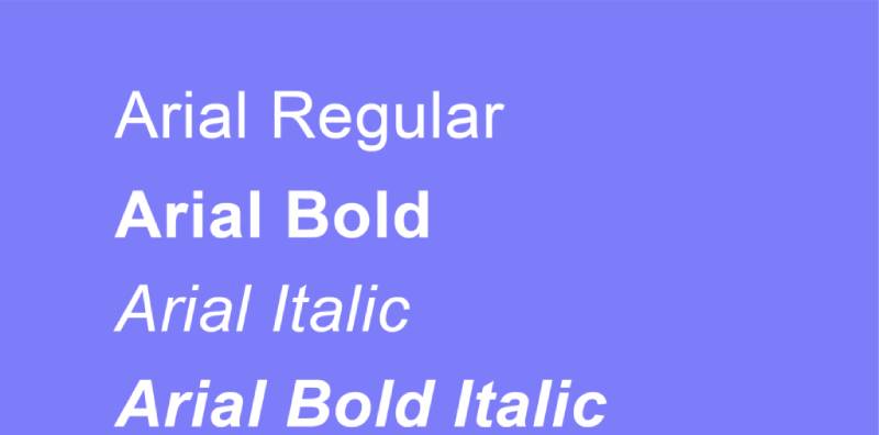
Microsoft commissioned this Monotype Imaging typeface in 1982.
Created as a metrically compatible alternative to Helvetica.
Design Characteristics
- Neo-grotesque classification
- Angled terminal cuts on letters like ‘c’ and ‘e’
- Two-story ‘a’ and ‘g’
- Slightly narrower than Helvetica
- Large x-height
Similarity to Roboto
Both Arial and Roboto serve as neutral, functional system fonts. They share similar proportions and stroke weights.
Arial feels more mechanical; Roboto adds subtle warmth through slightly rounded forms.
Primary Use Cases
Pre-installed on Windows systems makes it universally available. Business documents and presentations rely on its ubiquity.
Email campaigns use Arial for guaranteed cross-platform rendering. Print materials when web fonts aren’t needed.
License & Availability
Proprietary font owned by Monotype. Pre-installed on Windows and Microsoft Office.
Mac systems include it but San Francisco is now default. Not freely downloadable for commercial distribution.
Technical Details
Font family variants:
- Regular, Italic, Bold, Bold Italic
- Arial Narrow variants
- Arial Black for heavy display
- Arial Rounded for softer applications
- Extended character set for international languages
File formats: TTF (system font)
Pairing Recommendations
Georgia creates classic web-safe combinations. Times New Roman for traditional document aesthetics.
Verdana shares similar screen optimization.
Segoe UI
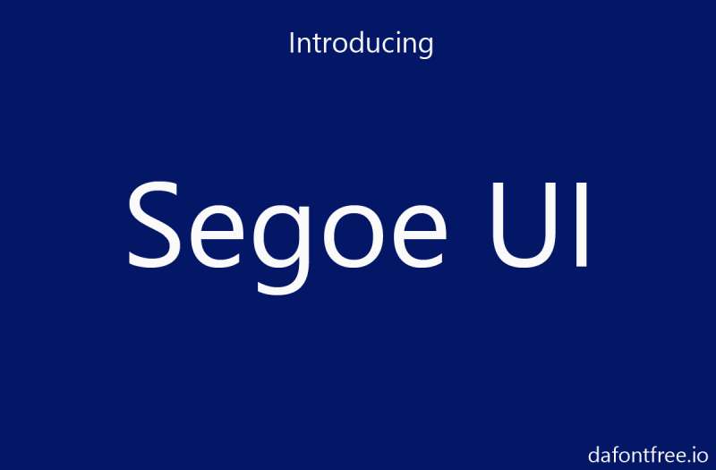
Microsoft’s interface font since Windows Vista.
Steve Matteson designed it for optimal screen legibility.
Design Characteristics
- Humanist sans-serif structure
- Friendly, approachable curves
- Large x-height for readability
- Relatively wide character widths
- Open counters
Similarity to Roboto
Segoe UI and Roboto both prioritize interface legibility.
Segoe UI leans more humanist with warmer curves. Roboto maintains stricter geometric principles.
Both work brilliantly in UI contexts at small sizes.
Primary Use Cases
Default Windows system font across all applications. Microsoft product interfaces (Office, Teams, Windows).
Web designers use it in system font stacks. Desktop applications targeting Windows users.
License & Availability
Proprietary to Microsoft. Pre-installed on Windows Vista and later versions.
Cannot be legally distributed or embedded in websites. Use via CSS system font stack: font-family: 'Segoe UI'
Technical Details
Font family variants:
- Regular, Italic, Bold, Bold Italic
- Semilight, Semibold weights
- Historic forms and emoji support
- Latin, Cyrillic, Greek coverage
File formats: TTF (system font)
Pairing Recommendations
Cambria provides complementary serif option. Consolas works for code examples.
Calibri creates cohesive Microsoft ecosystem designs.
Helvetica Neue
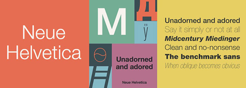
Apple’s refined version of the classic Helvetica.
Released in 1983 as an updated, rationalized type system.
Design Characteristics
- Neo-grotesque classification
- Uniform stroke widths
- High x-height
- Tight default spacing
- Horizontal/vertical stroke terminals
Similarity to Roboto
Roboto took significant inspiration from Helvetica Neue’s proportions.
Both share similar x-heights and neutral personalities. Roboto adds subtle improvements for digital rendering.
Primary Use Cases
Apple’s system font (iOS 7-8, OS X Yosemite). High-end branding and corporate identities.
Print magazines and editorial design. Signage and wayfinding systems.
License & Availability
Commercial font sold by Linotype/Monotype. Included with macOS (not freely distributable).
Web licensing requires purchase from font vendors. Apple has since replaced it with San Francisco.
Technical Details
Font family variants:
- 51 weights across multiple widths
- Ultra Light through Black
- Condensed, Extended variants
- True italics for all weights
- Comprehensive Latin support
File formats: OTF, TTF (licensed)
Pairing Recommendations
Times New Roman creates classic combinations. Garamond adds elegant contrast.
Futura complements geometric needs.
Graphik

Christian Schwartz designed this “deliberately vanilla” workhorse for Commercial Type.
Released in 2009, it became one of their most popular families.
Design Characteristics
- 9 weights (Thin to Super)
- 8 widths (Compact to XXXX Condensed)
- Low contrast strokes
- Open counters
- Round dots and terminals
Similarity to Roboto
Graphik offers more width variations than Roboto.
Both maintain neutral, functional personalities. Graphik provides editorial flexibility Roboto lacks through its extensive width range.
Primary Use Cases
Magazine layouts (Esquire, Bon Appétit, Wallpaper*). Editorial design requiring flexible condensed options.
Branding systems needing width variations. Signage and wayfinding applications.
License & Availability
Commercial font from Commercial Type. Requires purchase for desktop and web use.
Available through commercialtype.com. Various licensing tiers for different uses.
Technical Details
Font family variants:
- 9 weights: Thin, Extralight, Light, Regular, Medium, Semibold, Bold, Black, Super
- 8 widths from Compact to XXXX Condensed
- Full italic complement
- Cyrillic extension by Ilya Ruderman
- Extensive OpenType features
File formats: OTF, WOFF, WOFF2 (licensed)
Pairing Recommendations
Lyon creates sophisticated editorial combinations. Maison Neue shares similar construction.
Produkt (slab companion) works for cohesive systems.
Heebo
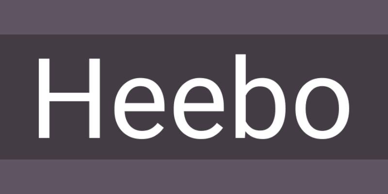
Created by Oded Ezer for Hebrew and Latin texts.
Free font focusing on contemporary Israeli design aesthetics.
Design Characteristics
- 9 weights from Thin to Black
- Harmonized Hebrew and Latin scripts
- Low contrast sans-serif
- Contemporary geometric influence
- Open apertures
Similarity to Roboto
Heebo matches Roboto’s weight range and geometric clarity.
Both work well in UI contexts. Heebo adds bidirectional text support that Roboto lacks.
Primary Use Cases
Bilingual Hebrew-English websites and applications. Israeli tech companies and startups.
Interfaces requiring right-to-left language support. Modern branding with Middle Eastern connections.
License & Availability
SIL Open Font License. Free for all uses.
Available on Google Fonts. Supports Latin and Hebrew scripts.
Technical Details
Font family variants:
- 9 weights (100-900)
- No italic variants
- Harmonized Hebrew and Latin
- Extended Latin character set
File formats: TTF, WOFF, WOFF2
Pairing Recommendations
Frank Ruhl Libre provides Hebrew serif option. Varela Round adds friendly contrast.
Alef works for additional Hebrew typography needs.
Neue Haas Grotesk
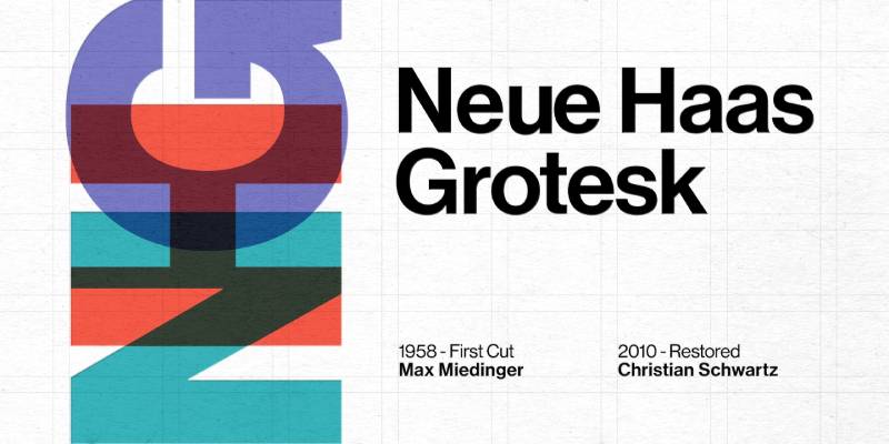
Christian Schwartz’s 2010 restoration of the original Helvetica design.
Returns to Max Miedinger’s 1957 Neue Haas Grotesk forms.
Design Characteristics
- 8 display weights (Thin through Black)
- 3 text-specific weights
- Tight spacing matching original metal type
- High x-height
- Distinct from digital Helvetica
Similarity to Roboto
Roboto draws heavily from Helvetica’s DNA.
Neue Haas Grotesk represents the purest form of that lineage. Both maintain neutral personalities but Neue Haas Grotesk brings historical authenticity.
Primary Use Cases
Editorial design requiring Helvetica character without baggage. Branding seeking classic modernist aesthetics.
Bloomberg Businessweek’s redesign featured it prominently. Print and digital applications where history matters.
License & Availability
Commercial font from Commercial Type. Requires licensing for all uses.
Available on Adobe Fonts with Creative Cloud. Purchase from Commercial Type or Linotype.
Technical Details
Font family variants:
- Display: 8 weights (Thin-Black) with italics
- Text: 3 optimized weights with italics
- Stylistic alternates (flat-legged R)
- Pro character set
- Central and Eastern European language support
File formats: OTF, WOFF (licensed)
Pairing Recommendations
Baskerville creates timeless combinations. Chronicle brings editorial sophistication.
Guardian Egyptian works for news applications.
Aktiv Grotesk
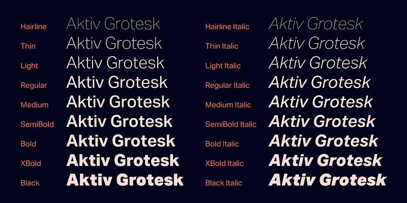
Bruno Maag and Dalton Maag designed this contemporary grotesk.
Released in multiple widths for flexible typographic systems.
Design Characteristics
- Neo-grotesk classification
- Multiple width variants
- 8 weights per width
- Clean, functional forms
- Slightly condensed default proportions
Similarity to Roboto
Aktiv Grotesk and Roboto both modernize the grotesk tradition.
Aktiv offers more width flexibility. Both maintain similar neutrality and legibility standards.
Primary Use Cases
Corporate branding requiring width variations. Digital products needing flexible type systems.
Documentation and technical materials. Interface design with multiple hierarchy needs.
License & Availability
Commercial font from Dalton Maag. Requires purchase from font vendors.
Available through Adobe Fonts with subscription. Various licensing options for different uses.
Technical Details
Font family variants:
- Multiple widths (Condensed, Normal, Extended)
- 8 weights per width
- Complete italic range
- Extensive language support
- Professional OpenType features
File formats: OTF, WOFF (licensed)
Pairing Recommendations
Freight Text provides complementary serif. Proxima Nova shares similar construction.
National creates balanced combinations.
Calibri
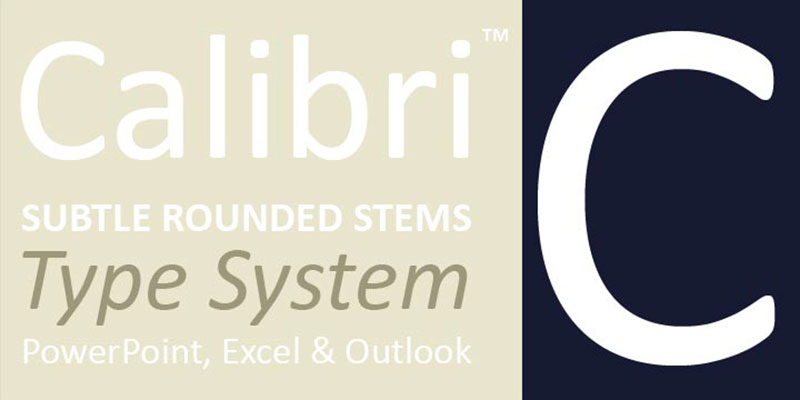
Lucas de Groot designed this ClearType font for Microsoft.
Default Office font from 2007 to 2023.
Design Characteristics
- Humanist sans-serif with warm curves
- Slightly rounded stroke terminals
- Large x-height
- Optimized for ClearType rendering
- Friendly, approachable character
Similarity to Roboto
Both Calibri and Roboto prioritize screen legibility.
Calibri uses warmer, more rounded forms. Roboto maintains slightly more geometric precision.
Primary Use Cases
Business documents and presentations. Microsoft Office default for 16 years.
Email correspondence requiring professional appearance. Corporate communications across industries.
License & Availability
Proprietary to Microsoft. Included with Windows and Office.
Cannot be legally redistributed. Use via system font stacks on Windows systems.
Technical Details
Font family variants:
- Regular, Italic, Bold, Bold Italic
- Light variants in some Office versions
- Extended Latin support
- Professional character set
File formats: TTF (system font)
Pairing Recommendations
Cambria (designed as companion serif). Consolas for code and technical content.
Segoe UI for interface consistency.
Franklin Gothic
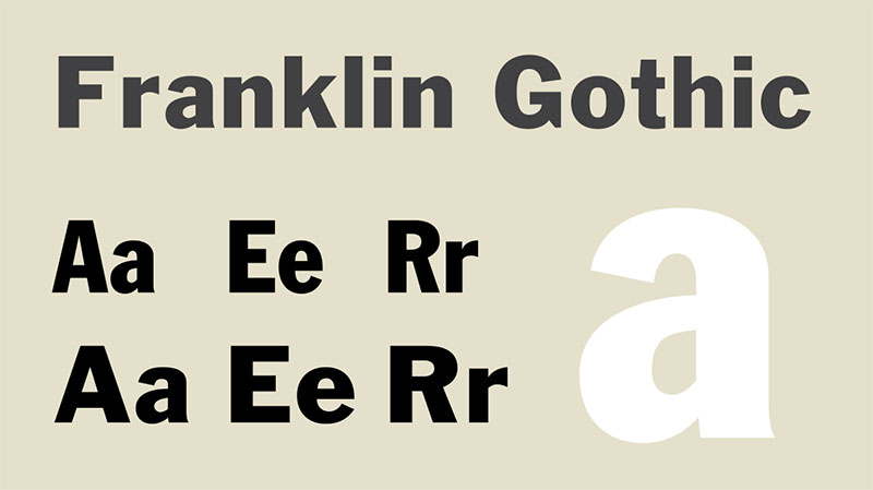
Morris Fuller Benton designed the original in 1902.
American gothic with distinctive character.
Design Characteristics
- Tall x-height
- Heavy stroke weight in display versions
- Slightly condensed proportions
- Sharp, angular terminals
- American gothic personality
Similarity to Roboto
Franklin Gothic predates Roboto by over a century but shares similar proportions.
Both work well at small sizes. Franklin Gothic brings vintage American character; Roboto offers modern neutrality.
Primary Use Cases
Newspaper headlines and editorial design. Vintage-inspired branding.
Posters and display typography. Publications wanting American design heritage.
License & Availability
Multiple versions exist from different foundries. URW++ offers digital versions.
Adobe Fonts includes ITC Franklin Gothic. Licensing varies by vendor.
Technical Details
Font family variants:
- Multiple weights from Book to Heavy
- Condensed and Compressed variants
- Some versions include italics
- Professional character sets vary by foundry
File formats: OTF, TTF (varies by vendor)
Pairing Recommendations
Baskerville creates classic editorial combinations. News Gothic maintains consistent American character.
Bodoni adds dramatic contrast.
Yantramanav
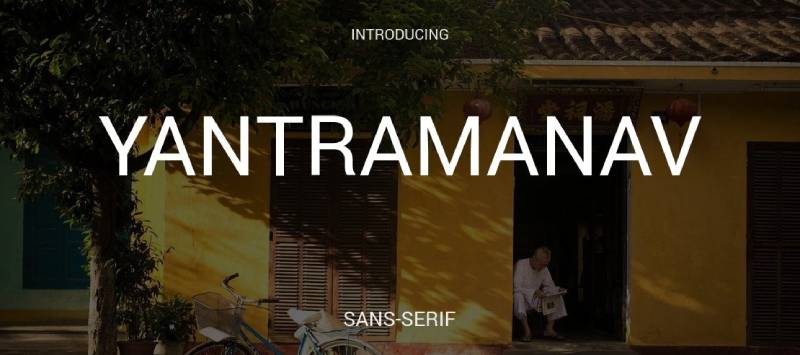
Created specifically for Devanagari and Latin scripts.
Free font designed for Indian language support.
Design Characteristics
- Geometric sans-serif structure
- Harmonized Devanagari and Latin
- 5 weights (Thin to Black)
- Contemporary appearance
- Open counters
Similarity to Roboto
Yantramanav follows similar geometric principles to Roboto.
Both prioritize clean, modern aesthetics. Yantramanav adds critical Devanagari script support.
Primary Use Cases
Indian websites and applications. Bilingual Hindi-English interfaces.
Publications requiring Devanagari typography. Modern branding in South Asian markets.
License & Availability
SIL Open Font License. Free for all uses.
Available on Google Fonts. Supports Latin and Devanagari scripts.
Technical Details
Font family variants:
- 5 weights (100, 300, 400, 500, 900)
- Harmonized Latin and Devanagari
- Limited language coverage beyond these scripts
File formats: TTF, WOFF, WOFF2
Pairing Recommendations
Lato works for Latin text combinations. Teko provides geometric compatibility.
Eczar adds serif contrast for editorial use.
TT Norms Pro
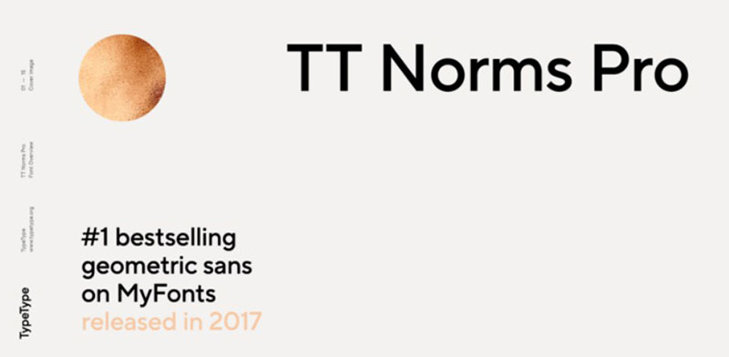
TypeType foundry’s modern geometric sans-serif.
Designed for contemporary branding and interfaces.
Design Characteristics
- Geometric construction
- 10 weights (Thin to Black)
- Slightly humanist details
- Clean, professional appearance
- Technical precision
Similarity to Roboto
TT Norms Pro shares Roboto’s geometric foundation.
Both work well in tech contexts. TT Norms Pro offers more weight options and stylistic flexibility.
Primary Use Cases
Tech startup branding. Modern corporate identities.
Digital product interfaces. Marketing materials requiring contemporary aesthetics.
License & Availability
Commercial font from TypeType. Requires purchase for use.
Available through type.today and MyFonts. Various licensing tiers available.
Technical Details
Font family variants:
- 10 weights with italics (20 styles total)
- Extended character set
- Multiple OpenType features
- Broad language support
File formats: OTF, WOFF, WOFF2 (licensed)
Pairing Recommendations
TT Norms Pro Serif (designed companion). Merriweather for mixed typography.
Source Sans Pro shares similar construction.
TT Firs Neue
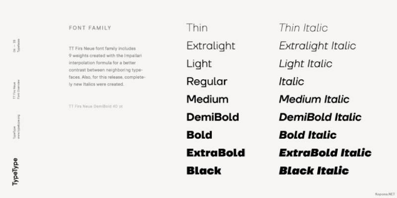
TypeType’s updated version of their TT Firs family.
Modern grotesque with extensive language support.
Design Characteristics
- Neo-grotesque classification
- Multiple width variants
- Extended weight range
- Clean, functional forms
- Professional character set
Similarity to Roboto
TT Firs Neue follows similar neo-grotesque principles.
Both prioritize functionality over personality. TT Firs Neue adds width variations and extended language coverage.
Primary Use Cases
Multilingual projects requiring consistent appearance. Corporate identity systems needing flexibility.
Digital interfaces with complex hierarchies. Print and digital materials across markets.
License & Availability
Commercial font from TypeType. Requires licensing from type.today.
Not available on free platforms. Various use-case specific licenses.
Technical Details
Font family variants:
- Multiple widths and weights
- Complete italic complement
- Extensive Cyrillic and Latin support
- Professional OpenType features
File formats: OTF, WOFF (licensed)
Pairing Recommendations
TT Norms Pro for geometric contrast. PT Serif maintains Russian typography compatibility.
Roboto Slab provides slab serif alternative.
Futuru

Contemporary geometric sans-serif with sharp, modern edges.
Designed for tech and futuristic branding.
Design Characteristics
- Sharp geometric forms
- Angular terminals
- Futuristic character
- Multiple weights
- Technical precision
Similarity to Roboto
Futuru takes Roboto’s geometric foundation in a more angular direction.
Both work in tech contexts. Futuru adds distinctive personality; Roboto maintains neutrality.
Primary Use Cases
Tech product branding. Gaming interfaces and materials.
Futuristic design concepts. Headlines requiring strong geometric impact.
License & Availability
Typically commercial font. Check specific vendor for licensing.
Available through independent foundries. Licensing varies by source.
Technical Details
Font family variants:
- Multiple weights (varies by version)
- May include italics
- Latin character support
- OpenType features depend on version
File formats: TTF, OTF (varies)
Pairing Recommendations
Roboto for body text balance. Orbitron shares futuristic aesthetics.
Space Mono adds monospaced technical character.
Osande Pro
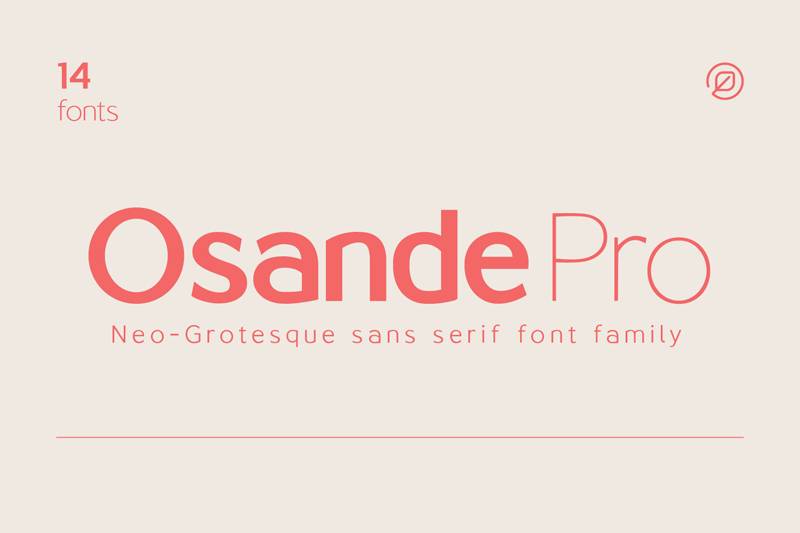
Modern grotesque designed for professional applications.
Balanced between personality and functionality.
Design Characteristics
- Neo-grotesque structure
- Professional character set
- Multiple weights
- Clean, readable forms
- Contemporary proportions
Similarity to Roboto
Osande Pro shares Roboto’s professional neutrality.
Both work across digital and print media. Osande Pro may offer different weight distributions.
Primary Use Cases
Corporate communications. Professional documentation.
Brand identity systems. Digital interfaces requiring polish.
License & Availability
Check specific foundry for licensing terms. May require commercial license.
Availability varies by region. Not typically on free platforms.
Technical Details
Font family variants:
- Multiple weights with italics
- Extended Latin support
- Professional character set
- OpenType features
File formats: OTF, TTF (varies)
Pairing Recommendations
Serif options for contrast. Other geometric sans for consistency.
Depends on specific design requirements.
Kinetica
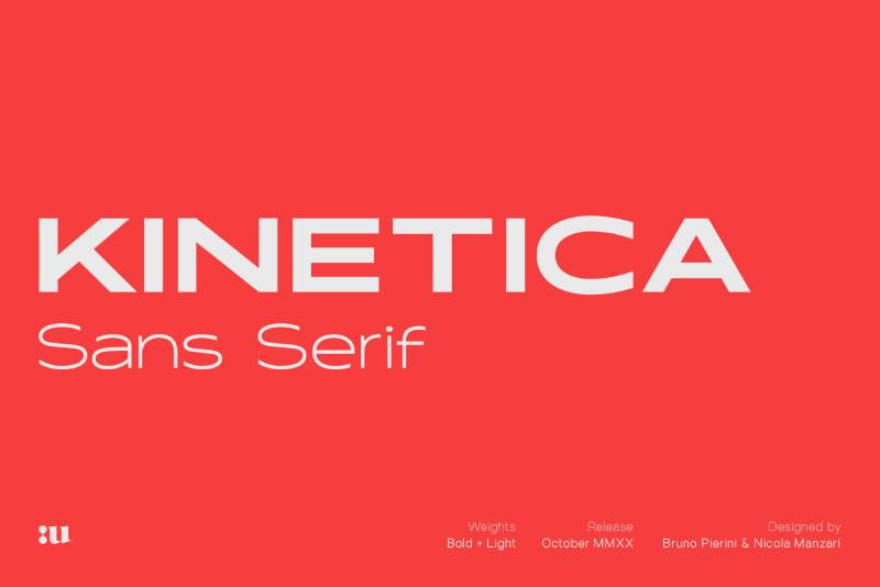
Technical, modern sans-serif with precise engineering.
Designed for clarity in technical contexts.
Design Characteristics
- Precise geometric construction
- Technical aesthetic
- Clean, efficient forms
- Multiple weights
- Engineered appearance
Similarity to Roboto
Kinetica and Roboto both prioritize legibility and technical precision.
Kinetica may emphasize engineering aesthetics more strongly. Both work well in tech and scientific contexts.
Primary Use Cases
Technical documentation. Engineering and scientific interfaces.
Data visualization labels. Industrial design presentations.
License & Availability
Check foundry for specific licensing. May require commercial purchase.
Availability depends on vendor. Professional license typically required.
Technical Details
Font family variants:
- Multiple weights
- Latin character support
- Technical symbol sets may be included
- OpenType features
File formats: OTF, TTF (varies)
Pairing Recommendations
Monospaced fonts for code. Other technical sans-serif options.
Depends on application needs.
Quadran
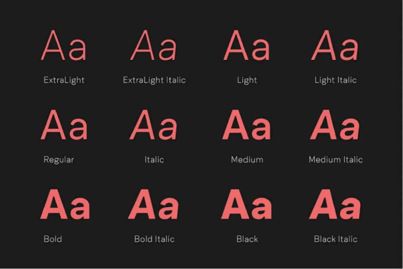
Geometric sans-serif with distinctive squared forms.
Modern typeface balancing geometry and readability.
Design Characteristics
- Squared geometric construction
- Clean, modern appearance
- Multiple weights available
- Distinctive corners
- Contemporary design
Similarity to Roboto
Quadran takes geometric principles to more angular extremes than Roboto.
Both maintain modern aesthetics. Quadran offers more personality; Roboto stays neutral.
Primary Use Cases
Tech branding wanting distinctive character. Modern editorial design.
Headlines and display typography. Interfaces where personality matters.
License & Availability
Licensing varies by source. Check specific vendor requirements.
May be commercial font. Availability depends on foundry.
Technical Details
Font family variants:
- Multiple weights (varies by version)
- Italic variants may be included
- Latin character support
- OpenType features depend on version
File formats: OTF, TTF (varies)
Pairing Recommendations
Rounded sans-serif for contrast. Neutral body text fonts.
Geometric companions for consistency.
FAQ on Fonts Similar To Roboto
What is the closest free font to Roboto?
Inter was literally designed to improve on Roboto’s limitations. Initially metrically compatible, it offers better kerning, more OpenType features, and superior legibility at small sizes. Available free under SIL Open Font License from rsms.me/inter.
Can I use Open Sans instead of Roboto?
Yes. Open Sans shares Roboto’s screen optimization and large x-height. It brings slightly wider characters and warmer humanist proportions. Both are free Google Fonts, making substitution straightforward for web projects.
Which font looks most like Roboto for commercial use?
Neue Haas Grotesk shares Roboto’s DNA through Helvetica lineage. Graphik offers similar neutrality with more width options. Both are commercial fonts from Commercial Type requiring licensing, but they provide refined alternatives worth the investment.
Is Lato similar to Roboto?
Lato and Roboto share geometric foundations and screen optimization. Lato adds more warmth through classical proportions and semi-rounded details. Both work brilliantly for UI design, with Lato offering 18 styles versus Roboto’s 12 weights.
What system font is closest to Roboto?
Segoe UI on Windows and San Francisco on macOS offer similar legibility. Arial provides universal availability but less refinement. System font stacks using font-family: -apple-system, BlinkMacSystemFont, "Segoe UI", Roboto guarantee optimal rendering across platforms.
Can I pair Montserrat with Roboto?
Yes. Montserrat and Roboto create balanced combinations for tech and e-commerce sites. Use Montserrat’s bold weights for headlines and Roboto Regular for body text. Their similar x-heights maintain visual hierarchy without awkward jumps.
What’s better than Roboto for web design?
Inter fixes Roboto’s spacing and rendering issues. Open Sans provides warmer personality. The “better” choice depends on your needs: Inter for interfaces, Lato for marketing, Montserrat for branding. All three offer free licensing through Google Fonts.
Is Helvetica Neue the same as Roboto?
No. Roboto drew inspiration from Helvetica Neue but added improvements for digital screens. Helvetica Neue is commercial (owned by Monotype), while Roboto is free. They share similar proportions but Roboto includes subtle refinements for modern rendering.
Which Roboto alternative has the most weights?
Lato offers 18 total styles (9 weights with italics) from Hairline to Black. Inter provides variable font flexibility with infinite weight adjustments between 100-900. Graphik leads commercial options with 9 weights across 8 widths (72 total styles).
What font should I use instead of Roboto for print?
Neue Haas Grotesk brings refined details that shine in print. Franklin Gothic adds American character for editorial work. Graphik’s various widths solve complex layout challenges. Print allows tighter tracking and smaller sizes than screen typography.
Conclusion
Finding fonts similar to Roboto doesn’t mean settling for second best.
Open Sans and Lato bring warmth that Roboto lacks. Inter fixes problems Roboto never solved. Montserrat adds personality without sacrificing professionalism.
Your choice depends on three factors: budget, technical requirements, and brand personality.
Free Google Fonts alternatives like Open Sans handle most projects brilliantly. Commercial options like Graphik and Neue Haas Grotesk justify their cost through refinement and flexibility.
System fonts guarantee availability but limit creative control.
Variable fonts like Inter offer unprecedented flexibility for responsive designs. Traditional static fonts provide simpler implementation.
Test your finalists at actual usage sizes. What looks perfect at 72pt might fail at 14px.
The right typeface makes your interface feel intentional rather than default.
If you enjoyed reading this article on fonts similar to Roboto, you should check out these articles with fonts similar to Gotham, Garamond, Helvetica, Futura, Times New Roman, Raleway, Bodoni, Lato, and Optima.

Renowned for his expertise in logo design and visual branding, Bogdan has developed a multitude of logos for various clients.
His skills extend to creating posters, vector illustrations, business cards, and brochures. Additionally, Bogdan's UI kits were featured on marketplaces like Visual Hierarchy and UI8.
He also wrote in the past years on sites like Design Your Way, WebDesignerDepot, WPDean, Designmodo, Speckyboy, Slider Revolution, and more.
- Versatile Georgia Font Pairing for Timeless Layouts - 24 October 2026
- How to Turn Inconsistent UI into One Design System (Without a Full Redesign) - 24 October 2026
- Beautiful Fonts Similar to Poppins You Should Try - 22 October 2026

Bogdan Sandu is a seasoned designer who has been designing websites since 2008. Renowned for his expertise in logo design and visual branding, Bogdan has developed a multitude of logos for various clients. His skills extend to creating posters, vector illustrations, business cards, and brochures. Additionally, Bogdan's UI kits were featured on marketplaces like Visual Hierarchy and UI8. He also wrote in the past years on sites like Design Your Way, WebDesignerDepot, WPDean, Designmodo, Speckyboy, Slider Revolution, and more.
You Might Also Like