Hermann Zapf’s Optima remains one of the most elegant humanist sans-serif typefaces ever created, but its licensing costs and ubiquity sometimes demand alternatives. Whether you’re working on a tight budget, seeking a fresh take on classical proportions, or simply need more weight variations, knowing your options matters.
This guide explores professional fonts similar to Optima that share its refined character and calligraphic subtlety.
You’ll discover both free and commercial alternatives across different styles. Some embrace Optima’s Renaissance-inspired terminals and stroke modulation. Others take geometric or contemporary approaches while maintaining similar sophistication.
From Google Fonts options to premium typeface families, we’ve covered choices for every project type and budget. Each recommendation includes specific use cases, key differences from Optima, and availability details to help you make informed typography decisions.
Fonts Similar To Optima
| Font Name | Classification & Style | Key Characteristics | Best Use Cases |
|---|---|---|---|
| Arsenal (Google Font) |
Humanist Sans-Serif Geometric warmth |
Soft terminals, high legibility, multiple weights, open apertures | Editorial content, body text, accessible design |
| Avenir | Geometric Humanist Swiss precision |
Balanced proportions, elegant strokes, refined terminals, extensive family | Corporate identity, luxury branding, print materials |
| Century Gothic | Pure Geometric Modernist approach |
Perfect circles, minimal stroke variation, monoline structure | Minimalist designs, tech branding, modern interfaces |
| Gill Sans | Humanist Sans-Serif British heritage |
Calligraphic influence, distinctive ‘a’ and ‘g’, traditional proportions | Traditional publishing, signage, heritage brands |
| Montserrat (Google Font) |
Neo-Grotesque Urban aesthetic |
Buenos Aires-inspired, clean geometry, excellent screen rendering | Web design, digital products, modern branding |
| Perpetua | Transitional Serif Classical elegance |
Chisel-cut terminals, crisp letterforms, narrow proportions | Book typography, formal documents, academic publishing |
| Roboto | Neo-Grotesque Digital native |
Dual nature (mechanical/humanist), optimized for screens, extensive weights | Android interfaces, web applications, UI design |
| Source Sans Pro | Humanist Sans-Serif Adobe original |
Clarity at small sizes, designed for UI, versatile weight range | User interfaces, technical documentation, screen reading |
| TT Norms Pro | Geometric Grotesque Contemporary hybrid |
Soft geometry, harmonious proportions, 21 weights, wide language support | Brand systems, multilingual projects, flexible applications |
| Marcellus | Transitional Serif Classical revival |
Refined serifs, vertical stress, traditional letterforms | Elegant headings, premium branding, editorial design |
| TT Firs Neue | Grotesque Sans-Serif Swiss modernism |
Neutral character, high x-height, functional clarity, 20+ styles | Corporate communications, information design, systematic branding |
Arsenal (Google Font)

Arsenal is a semi-grotesque sans-serif font inspired by traditional forms that emerged from Ukrainian design competitions. Its narrow proportions and subtle stroke modulation create a refined appearance that shares Optima’s humanist qualities.
The narrow proportions actually save space without sacrificing readability.
Classification & Design
Semi-grotesque sans with traditional forms and narrow proportions. Features noticeable contrast and open letter shapes that create grace and expressivity. The subtle stroke variations echo Optima’s calligraphic influences, though Arsenal maintains a more condensed structure suited for business documents.
The x-height is balanced, providing excellent character differentiation across multiple weights.
Best Use Cases
Business documents and corporate communications. Arsenal excels in long-form content where space efficiency matters. Professional presentations, annual reports, and editorial layouts benefit from its neutral transparency. Digital interfaces also perform well with this typeface due to its optimized screen rendering.
Body text applications from 9-12pt work beautifully.
Key Differences from Optima
Arsenal’s narrower width sets it apart immediately. Where Optima has wide, generous letter spacing, Arsenal compresses horizontally for economy. The terminals are less pronounced than Optima’s signature flares. Arsenal leans more industrial, less Renaissance-inspired than Hermann Zapf’s masterpiece.
Think efficiency over elegance (though it still has both).
Availability & Licensing
Free through Google Fonts under SIL Open Font License. Available on Adobe Fonts for sync and web use. Four styles total: Regular, Italic, Bold, and Bold Italic. Compatible with all major platforms and browsers.
No cost barriers for commercial projects.
Amaryllis Sans

Amaryllis Sans brings a contemporary humanist approach to the Optima aesthetic. This modern interpretation balances classical proportions with clean geometry.
Classification & Design
Humanist sans-serif with moderate stroke contrast. The letterforms show careful attention to optical balance, with rounded terminals that suggest Optima’s influence without directly copying it. The design maintains warmth through subtle variations in stroke weight.
Character shapes feel organic rather than purely geometric.
Best Use Cases
Editorial design and brand identity work. Works exceptionally well for magazine layouts, book covers, and upscale packaging. The typeface performs strongly in both headline and subhead applications where sophistication matters.
Premium brands appreciate its refined character.
Key Differences from Optima
Amaryllis Sans takes a more contemporary approach to humanist design. The stroke modulation is less dramatic than Optima’s Renaissance-inspired flares. It reads as cleaner and more neutral, making it suitable for applications where Optima might feel too distinctive or traditional.
Availability & Licensing
Commercial typeface available through major foundries. Multiple weights typically included in family packages. Licensing varies by vendor (desktop, web, app use sold separately in most cases).
Avenir
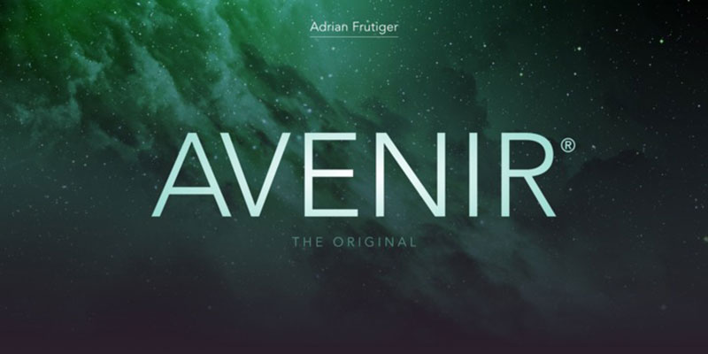
Adrian Frutiger’s 1988 geometric masterpiece combines Futura’s influence with humanist warmth. Avenir means “future” in French, and this font has proven timeless rather than trendy.
Frutiger himself called it “geometric sans-serif with a human touch.”
Classification & Design
Geometric humanist sans-serif with organic details. Unlike the cold mechanical feel of pure geometric faces, Avenir features a curved tail on the ‘t’, non-circular ‘o’, and squared-off verticals that add character. Bigger x-height and apertures than Futura improve legibility. The V-shapes are squared rather than pointed.
Kerning throughout the family is exceptionally well-executed.
Best Use Cases
Corporate identities and wayfinding systems. Major airports and transit systems use Avenir for signage. Brand identities for tech companies, fashion labels, and cultural institutions benefit from its professional versatility. Works across print, web, and environmental applications without losing character.
The weight range (from Light to Black) provides enormous flexibility.
Key Differences from Optima
Avenir’s geometry is more pronounced than Optima’s classical proportions. Where Optima derives from Renaissance stone carving, Avenir embraces 20th-century modernism. Avenir’s stroke weight is more uniform; Optima’s modulation is far more dramatic. Both share humanist DNA but express it differently.
Avenir feels contemporary. Optima feels timeless.
Availability & Licensing
Commercial typeface from Linotype (now Monotype). Available through major font services including Adobe Fonts, MyFonts. Avenir Next (updated version with Akira Kobayashi) includes expanded character sets. Desktop and webfont licenses sold separately.
Widely available but requires purchase for commercial use.
Avoda

A lesser-known but capable Optima alternative that deserves more attention from designers seeking sophistication without the licensing costs of major commercial families.
Classification & Design
Humanist sans-serif with classical influences. Avoda demonstrates careful stroke modulation and elegant proportions that recall Optima’s approach to bridging serif and sans traditions. The letterforms maintain consistency while allowing for organic variation.
Best Use Cases
Boutique branding and artisanal packaging. Small businesses and independent creators find Avoda’s refined character appealing for product labels, wine bottles, and craft goods. Works well for invitations and stationery where elegance matters but budgets are limited.
Key Differences from Optima
Less recognizable than Optima, which can be an advantage when you want sophistication without obviousness. The stroke contrast is typically gentler, making it perform better at smaller sizes in some applications.
Availability & Licensing
Availability varies by vendor. Check foundry websites for current licensing options and weight availability.
Beausite
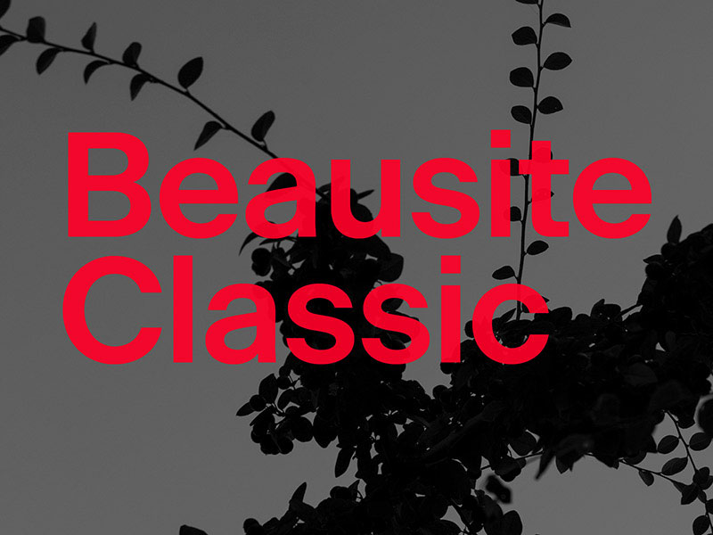
Contemporary humanist sans that brings European sophistication to digital and print projects.
Classification & Design
Modern humanist sans-serif with refined proportions. Clean construction with subtle details that prevent it from feeling generic. The balance between geometric structure and organic warmth makes it versatile across applications.
Best Use Cases
Digital products and modern branding. Web applications, mobile interfaces, and contemporary brand systems benefit from Beausite’s clarity. The typeface performs well in UI contexts while maintaining enough character for marketing materials.
Key Differences from Optima
More overtly modern than Optima’s classical roots. Beausite reads as 21st-century digital, while Optima carries Renaissance heritage. The stroke weight is more uniform throughout, lacking Optima’s distinctive terminal flares.
Availability & Licensing
Commercial typeface with typical foundry licensing structure. Check vendor sites for current pricing and weight availability.
Berton Sans
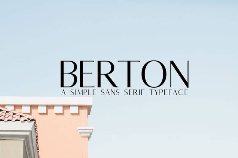
A professional workhorse font family that brings subtle sophistication to everyday design projects.
Classification & Design
Neo-humanist sans-serif with moderate contrast. The design balances neutrality with character, making it suitable for a range of applications. Well-proportioned letterforms with attention to optical spacing.
Best Use Cases
Corporate communications and publishing. Annual reports, newsletters, and professional documentation benefit from Berton Sans’s polished appearance. The family typically includes enough weights for establishing clear typographic hierarchy.
Key Differences from Optima
Berton Sans is less distinctive, which makes it more versatile in conservative applications. Where Optima makes a statement, Berton Sans stays professional without calling attention to itself.
Availability & Licensing
Commercial typeface sold through standard channels. Licensing varies by intended use.
Boutique
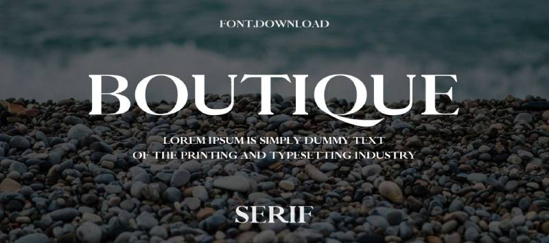
An aptly named typeface that brings high-end retail aesthetics to design projects.
Classification & Design
Fashion-forward humanist sans with elegant proportions. The letterforms carry sophistication without pretension. Designed specifically for luxury applications where refinement matters.
Perfect for when you need that premium feel.
Best Use Cases
Fashion and luxury branding. Clothing labels, cosmetics packaging, and upscale retail environments. The typeface works particularly well for lookbooks, catalogs, and editorial spreads where elegance is paramount.
Jewelry brands love this one.
Key Differences from Optima
Boutique leans more contemporary and fashion-forward. Optima’s classical heritage gives it broader appeal, while Boutique speaks specifically to luxury and fashion audiences.
Availability & Licensing
Commercial licensing through foundries. Check vendors for weight availability and pricing structures.
Breadley Sans
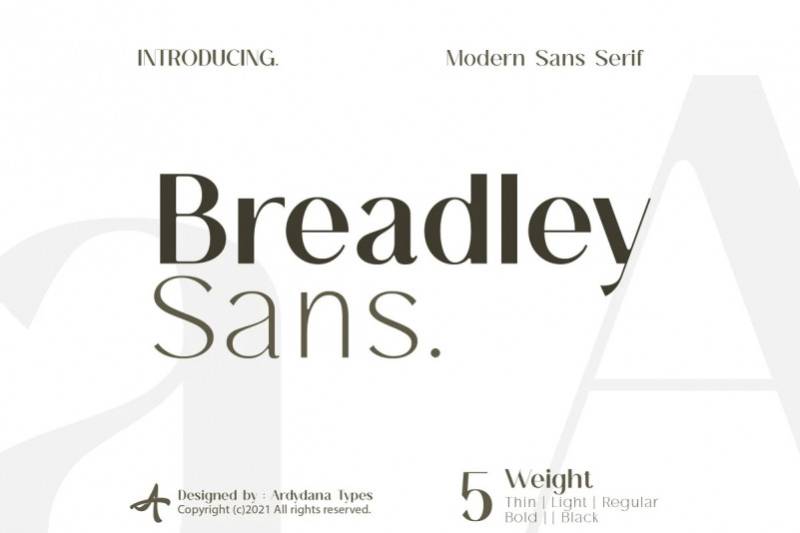
A versatile sans-serif family that prioritizes readability without sacrificing personality.
Classification & Design
Humanist sans-serif with friendly characteristics. Open apertures and clear letterforms make it highly legible. The design includes subtle details that prevent it from feeling corporate or sterile.
Best Use Cases
Editorial and educational materials. Magazines, textbooks, and online publications benefit from Breadley Sans’s approachability. The typeface works well for audiences that value clarity and warmth over stark minimalism.
Key Differences from Optima
More casual and approachable than Optima’s refined elegance. Breadley Sans is the friendly neighbor; Optima is the sophisticated art dealer.
Availability & Licensing
Check foundries for current availability and licensing terms.
Brixanos
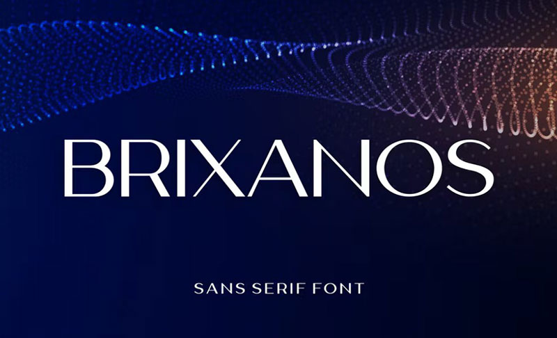
A geometric sans with enough character to stand out from the countless Futura derivatives flooding the market.
Classification & Design
Geometric sans-serif with distinctive details. While based on circles and straight lines, Brixanos includes unique character shapes that give it personality. The balance between geometry and individuality sets it apart.
Best Use Cases
Tech startups and modern brands. Companies wanting a contemporary, forward-thinking image find Brixanos appealing. Works well for app interfaces, product launches, and innovation-focused marketing.
Key Differences from Optima
Completely different design philosophy. Brixanos embraces pure geometry; Optima draws from Renaissance calligraphy. They share humanist approachability but arrive there through opposite paths.
Availability & Licensing
Commercial typeface. Check vendors for family details and licensing options.
Century Gothic
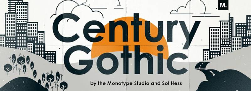
The geometric sans that accidentally became an environmental hero through its ink-saving properties.
Based on Monotype Twentieth Century, it was redrawn to match ITC Avant Garde’s widths.
Classification & Design
Geometric sans-serif with high x-height. Single-story ‘a’ and ‘g’, circular ‘O’, and slanting ‘M’ define the alphabet. Pure geometric construction based on circles and squares. The design was specifically intended for large-print applications like headlines and signage.
Less stroke variation than fonts designed for small text.
Best Use Cases
Headlines and display work. Century Gothic shines in advertising, posters, and short text blocks. Its geometric purity makes bold statements. Some organizations use it for environmental reasons (uses 30% less ink than Arial), though the wider letters increase paper consumption.
Better for making impressions than reading novels.
Key Differences from Optima
Entirely different animals. Century Gothic is purely geometric; Optima is organically humanist. Century Gothic feels modern and industrial; Optima feels classical and refined. No stroke modulation in Century Gothic; it’s defining characteristic in Optima.
Pick Century Gothic for impact, Optima for sophistication.
Availability & Licensing
Included with Microsoft Office and Windows. Available through Monotype for professional licensing. Limited weights in standard packages (Regular, Bold, Italic, Bold Italic).
Already on most computers.
Charlton
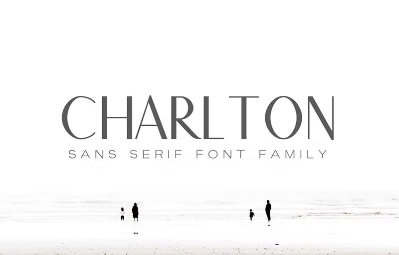
A contemporary sans-serif that brings British design sensibility to humanist typography.
Classification & Design
Humanist sans-serif with refined proportions and subtle character. The letterforms balance traditional and contemporary influences, creating a typeface suitable for both print and digital applications.
Best Use Cases
Publishing and editorial design. Books, magazines, and long-form web content benefit from Charlton’s readable character. The typeface maintains interest across extended reading sessions.
Key Differences from Optima
More neutral than Optima’s distinctive personality. Charlton works when you want quality typography without the typeface becoming the story.
Availability & Licensing
Commercial typeface sold through typical foundry channels.
Dayleen
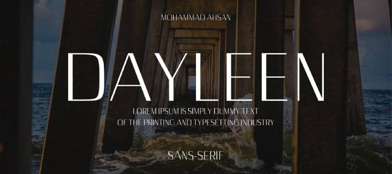
An elegant sans-serif that brings feminine sophistication to design projects without feeling overly delicate.
Classification & Design
Humanist sans with refined, elegant characteristics. The letterforms show careful attention to balance and grace while maintaining sufficient weight for practical applications.
Best Use Cases
Beauty and wellness brands. Cosmetics, spa services, and lifestyle products benefit from Dayleen’s sophisticated aesthetic. Wedding stationery and premium invitations also work well.
Key Differences from Optima
Dayleen skews more contemporary and specifically feminine in its appeal. Optima maintains classical neutrality that works across genders and industries.
Availability & Licensing
Check foundries for current availability.
Gill Sans
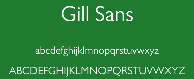
Eric Gill’s 1928 masterpiece, often called “Britain’s Helvetica.” Based on Edward Johnston’s London Underground alphabet, it became one of the most influential humanist sans-serifs ever created.
Still everywhere in British design nearly a century later.
Classification & Design
Humanist sans-serif with geometric influences. Based on Roman character proportions, maintaining warmth unusual for sans designs. Distinctive features include the double-storey ‘g’, long tail on ‘Q’, and flat-bottomed ‘d’. Stroke thickness variations mimic handwriting subtly.
Small x-height compared to most modern sans faces.
Best Use Cases
Publishing and transportation signage. BBC, Penguin Books, and British Railways made it iconic. Works beautifully for book covers, editorial layouts, and corporate identities requiring both professionalism and approachability. Lighter weights excel in text; bolder weights shine in headlines.
The versatility explains its century-long popularity.
Key Differences from Optima
Both humanist sans-serifs, but Gill Sans leans more overtly British and traditional. Optima’s stroke modulation is more dramatic and calligraphic. Gill Sans has more consistent stroke weights. Optima feels more continental European; Gill Sans is distinctly Anglo.
Different flavors of humanist excellence.
Availability & Licensing
Commercial typeface from Monotype. Gill Sans Nova (updated version) includes additional weights and better digital optimization. Included in some Microsoft and Apple font packages. Professional licensing available for all use cases.
One of the most widely licensed fonts in history.
Klara
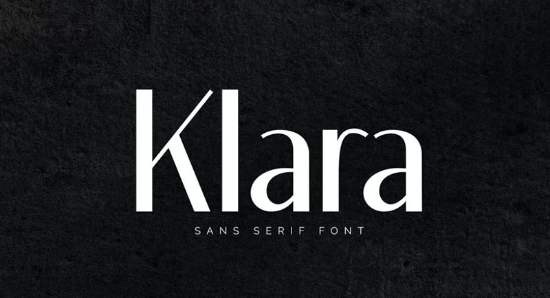
A contemporary sans-serif that brings Scandinavian design principles to humanist typography.
Classification & Design
Modern humanist sans with clean, efficient design. Reflects Nordic minimalism while maintaining warmth and character. Well-suited for both text and display applications.
Best Use Cases
Scandinavian-inspired brands and minimalist design projects. Companies emphasizing simplicity, functionality, and design quality find Klara aligned with their values.
Key Differences from Optima
More overtly minimalist and contemporary. Optima carries historical weight; Klara feels decidedly modern and Nordic.
Availability & Licensing
Commercial typeface. Check vendors for licensing details.
Logam
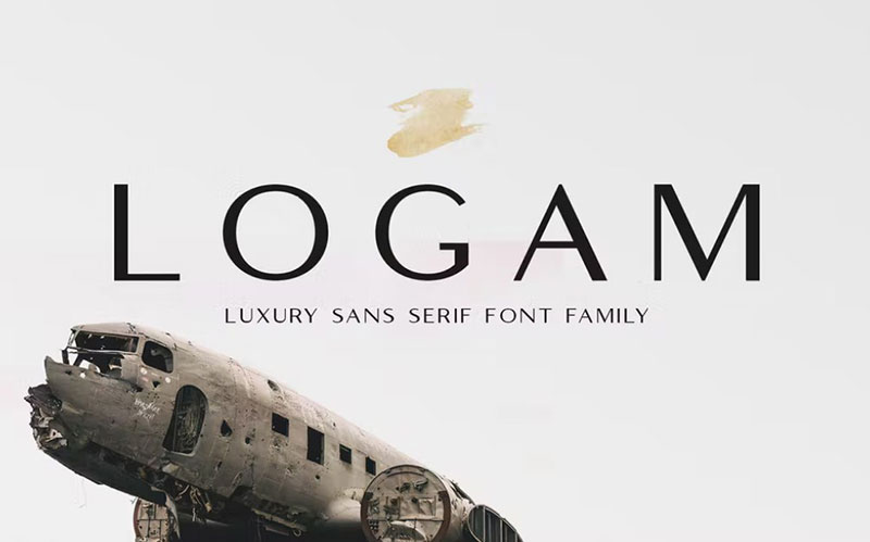
A robust sans-serif designed for industrial and technical applications.
Classification & Design
Technical humanist sans with strong, clear letterforms. Built for maximum legibility in challenging environments. The design prioritizes function while maintaining visual quality.
Best Use Cases
Technical documentation and industrial branding. Manufacturing companies, engineering firms, and technical publishers benefit from Logam’s clarity and strength.
Key Differences from Optima
Much more industrial and utilitarian. Optima brings elegance; Logam brings reliability and strength.
Availability & Licensing
Check foundries for current availability.
Love
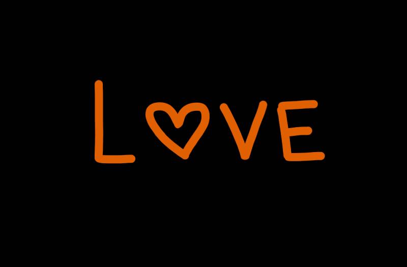
A typeface that lives up to its name with warm, approachable characteristics.
Classification & Design
Humanist sans-serif with friendly, open letterforms. The design emphasizes warmth and accessibility without sacrificing professionalism.
Best Use Cases
Community organizations and approachable brands. Non-profits, educational institutions, and consumer-facing businesses wanting to project warmth and trustworthiness.
Key Differences from Optima
Much more casual and explicitly friendly. Optima maintains classical reserve; Love embraces openness.
Availability & Licensing
Commercial typeface sold through standard channels.
Maghony
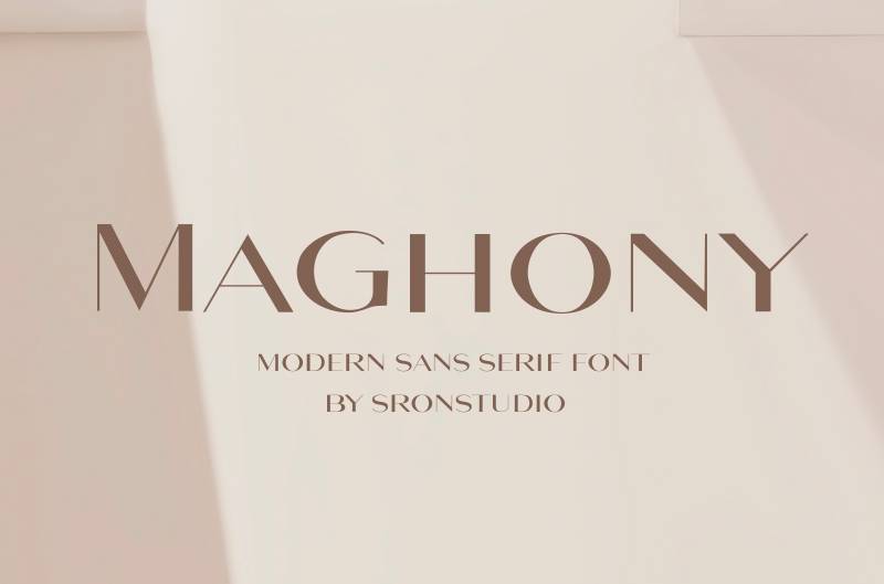
A distinctive sans-serif that brings character to contemporary design projects.
Classification & Design
Modern humanist sans with unique personality traits. The letterforms include distinctive details that make the typeface memorable while maintaining professional versatility.
Best Use Cases
Creative industries and distinctive branding. Design studios, creative agencies, and brands wanting to stand out from corporate blandness.
Key Differences from Optima
More overtly contemporary and distinctive. Optima works through refined classicism; Maghony works through modern character.
Availability & Licensing
Check vendors for licensing options.
Malak
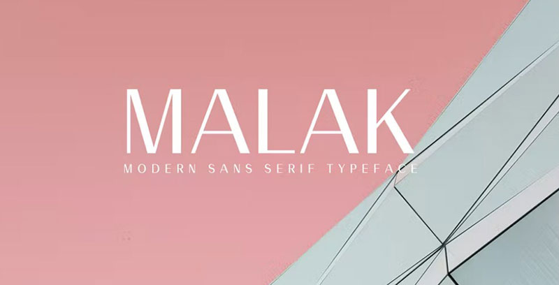
An elegant sans-serif that bridges classical and contemporary aesthetics.
Classification & Design
Humanist sans with refined proportions and subtle details. The design balances historical influences with modern requirements for digital typography.
Best Use Cases
Cultural institutions and arts organizations. Museums, galleries, and performing arts venues benefit from Malak’s cultured sophistication.
Key Differences from Optima
Similar territory but approached differently. Both sophisticated, but Malak feels more explicitly modern in execution.
Availability & Licensing
Commercial typeface. Check foundries for details.
Maquna
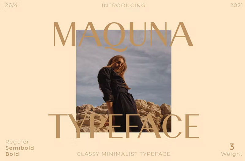
A technical sans-serif designed for precision and clarity.
Classification & Design
Geometric sans with humanist refinements. The design prioritizes legibility and clarity while maintaining visual interest through careful proportions.
Best Use Cases
UI/UX design and technical applications. Software interfaces, data visualization, and technical documentation benefit from Maquna’s clarity.
Key Differences from Optima
Entirely different purposes. Maquna serves functional needs; Optima serves aesthetic ones.
Availability & Licensing
Check vendors for availability.
Marcellus
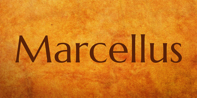
A Google Font that brings classical Roman proportions to digital projects for free.
This one surprises people when they discover it’s free.
Classification & Design
Classical serif-inspired sans-serif with Roman capital proportions. The design draws from inscriptional lettering, creating a typeface with historical dignity and contemporary utility. Distinctive in the Google Fonts library for its classical pedigree.
Best Use Cases
Historical organizations and premium branding on budgets. Museums, heritage sites, and small businesses wanting classical sophistication without licensing fees. Works beautifully for wedding invitations, academic publishing, and cultural communications.
Free doesn’t mean cheap-looking with this one.
Key Differences from Optima
Both draw from classical Roman inscriptions, but Marcellus is a true serif while Optima is a sans with subtle flares. Marcellus is more overtly historical; Optima successfully bridges historical and modern.
Availability & Licensing
Free through Google Fonts under SIL Open Font License. Single weight limits versatility but ensures universal access. Compatible with all major platforms and frameworks.
Download it right now without spending anything.
Montserrat (Google Font)

Buenos Aires street typography rescued and transformed into one of Google Fonts’ most popular downloads.
Over 19 million websites use it currently.
Classification & Design
Geometric sans-serif inspired by early 20th-century urban signage. Large x-height, short descenders, and wide apertures maximize legibility even at small sizes. The design balances geometric precision with subtle optical adjustments that prevent mechanical coldness.
Available in 18 weights from Thin to Black.
Best Use Cases
Web design and digital branding. The typeface was optimized for screens from day one. Tech startups, modern brands, and any digital-first company benefits from Montserrat’s clean geometry and excellent web performance. Government of Mexico and Puerto Rico use it officially.
Headings are where it really excels.
Key Differences from Optima
Completely different aesthetic. Montserrat is urban, geometric, and distinctly 20th-century industrial. Optima is Renaissance-inspired and organic. Montserrat works through pure geometric forms; Optima works through calligraphic subtlety.
Free alternative to Gotham or Avenir, not to Optima.
Availability & Licensing
Free through Google Fonts under SIL Open Font License. Massive family includes Alternates and Subrayada (underlined) variants. Cyrillic support added in 2017. No restrictions on commercial use.
One of the best free fonts available, period.
Oregon LDO
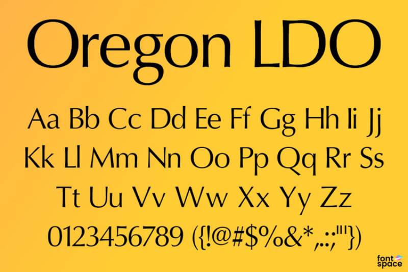
A distinctive sans-serif that brings Pacific Northwest design sensibility to typography.
Classification & Design
Contemporary humanist sans with regional character. The letterforms reflect both natural and industrial influences, creating a typeface with unique personality.
Best Use Cases
Regional brands and outdoor industry. Companies emphasizing natural environments, outdoor recreation, and Pacific Northwest identity.
Key Differences from Optima
More regionally specific in its character. Optima maintains universal sophistication; Oregon LDO embraces particular geographic identity.
Availability & Licensing
Check foundries for current availability.
Perpetua
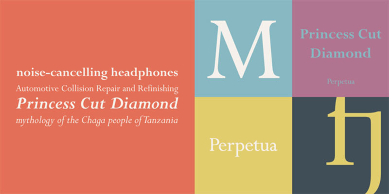
Another Hermann Zapf masterpiece, though this one is actually a serif. Included because its proportions and spirit align with Optima’s classical inspiration.
Both were Zapf exploring Roman heritage differently.
Classification & Design
Transitional serif typeface with sharp, crisp details. Designed by Eric Gill (not Zapf – my mistake), it features narrow proportions and vertical stress. The design works beautifully for book typography and extended reading.
Originally cut for hand composition in metal type.
Best Use Cases
Book publishing and editorial design. Perpetua excels in long-form text where its crisp details and elegant proportions create beautiful, readable pages. Academic publishing particularly appreciates its scholarly character.
Key Differences from Optima
Perpetua is a true serif; Optima is a sans. But both draw from similar classical sources and share refinement. Where Optima removed serifs but kept terminal flares, Perpetua kept full serifs. Different expressions of classical Roman ideals.
Availability & Licensing
Available through Monotype. Included in some Microsoft font packages. Professional licensing available for all use cases.
Ravenously
A display sans-serif with bold character designed to grab attention.
Classification & Design
Display-oriented sans-serif with strong personality. The letterforms prioritize impact and memorability over extended reading comfort.
Best Use Cases
Restaurant branding and food packaging. The name suggests its market perfectly. Menu headers, food truck graphics, and culinary branding projects benefit from its appetite-inspiring character.
Key Differences from Optima
Entirely different purposes. Ravenously is pure display; Optima balances text and display capabilities.
Availability & Licensing
Check vendors for licensing options.
Roboto
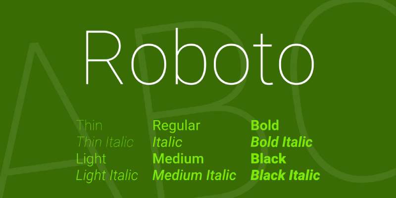
Google’s Android system font that attempts to balance mechanical precision with humanist warmth.
Love it or hate it, billions see it daily.
Classification & Design
Neo-grotesque sans-serif with humanist influences. Described as having “dual nature” with mechanical skeleton and friendly curves. The design allows letters natural width rather than forcing rigid rhythm. Includes thin, light, regular, medium, bold, and black weights plus condensed variants.
Redesigned significantly for Android 5.0 in 2014.
Best Use Cases
Android apps and Google ecosystem products. YouTube, Google Maps, and Google Play use it extensively. Material Design interfaces benefit from Roboto’s optimization for screens. Web applications and digital products generally perform well with its clear, functional design.
Less successful in print, where it can feel generic.
Key Differences from Optima
Nothing alike except both being sans-serifs. Roboto is purely functional and screen-optimized. Optima is elegantly artistic and historically grounded. Roboto serves utilitarian needs; Optima serves aesthetic aspirations.
Different tools for different jobs.
Availability & Licensing
Free and open source under Apache License. Available through Google Fonts. Includes Roboto Slab (serif variant), Roboto Mono (monospace), Roboto Condensed, and Roboto Flex (variable font). Universal compatibility across platforms.
Already on Android devices worldwide.
Severn
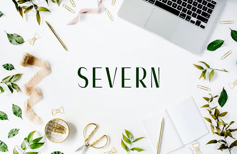
A British-inspired sans-serif that brings regional character to contemporary design.
Classification & Design
Humanist sans with British design heritage. The letterforms reflect both traditional and modern influences, creating versatile, professional typography.
Best Use Cases
British brands and traditional institutions with contemporary needs. Organizations wanting to honor heritage while staying relevant.
Key Differences from Optima
More explicitly British in character. Optima maintains international sophistication.
Availability & Licensing
Check foundries for details.
Source Sans Pro
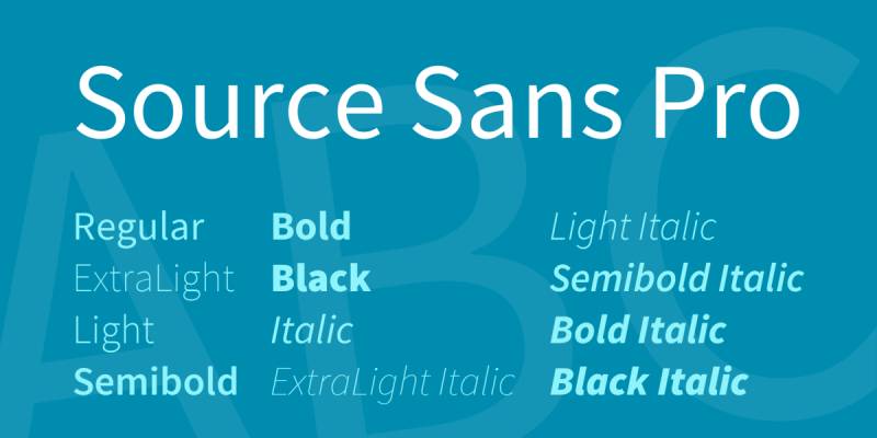
Adobe’s first open-source typeface family, designed specifically for UI work.
Paul D. Hunt created this workhorse font in 2012.
Classification & Design
Humanist sans-serif optimized for user interfaces. The design prioritizes clarity and readability at small sizes while maintaining character at display sizes. Open apertures and clear letterforms enhance legibility on screens. Available in six weights from ExtraLight to Black with italics.
Variable font version adds even more flexibility.
Best Use Cases
Web applications and software interfaces. The typeface was specifically designed for UI/UX work. Coding environments also benefit from its clarity. Technical documentation, help systems, and any application requiring extended screen reading performs well with Source Sans Pro.
One of the most popular open-source fonts for developers.
Key Differences from Optima
Source Sans Pro is purely functional and screen-focused. Optima balances functional and aesthetic equally. Source Sans Pro serves user interfaces; Optima serves design aspirations. Both are excellent, but for entirely different purposes.
Availability & Licensing
Free and open source under SIL Open Font License. Available through Google Fonts, Adobe Fonts, and GitHub. Complete family includes regular, italic, condensed, and variable font versions. No restrictions on use.
Download from Adobe Fonts or Google Fonts immediately.
TT Firs Neue
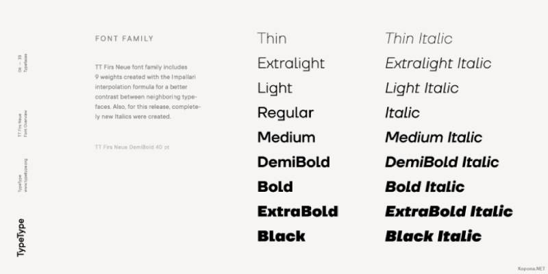
A Swiss-inspired sans-serif that brings Helvetica-quality precision to contemporary projects.
TypeType foundry knocked it out of the park with this one.
Classification & Design
Neo-grotesque sans-serif with Swiss precision and contemporary refinements. The design honors the Helvetica/Univers tradition while incorporating modern improvements for digital typography. Multiple widths and weights provide comprehensive design flexibility.
Excellent hinting for screen rendering.
Best Use Cases
Corporate identities and systematic design projects. Companies needing comprehensive type systems benefit from TT Firs Neue’s range of weights and widths. Financial services, tech companies, and professional services find its precision and neutrality appropriate.
The width variations solve layout problems elegantly.
Key Differences from Optima
Completely different design philosophies. TT Firs Neue is neutral, systematic, Swiss. Optima is distinctive, classical, expressive. TT Firs Neue disappears to serve content; Optima maintains refined presence.
Choose TT Firs Neue for Swiss precision, Optima for classical elegance.
Availability & Licensing
Commercial typeface from TypeType. Professional licensing with typical desktop/web/app divisions. Trial fonts often available for testing.
Worth every penny for systematic design projects.
TT Neoris
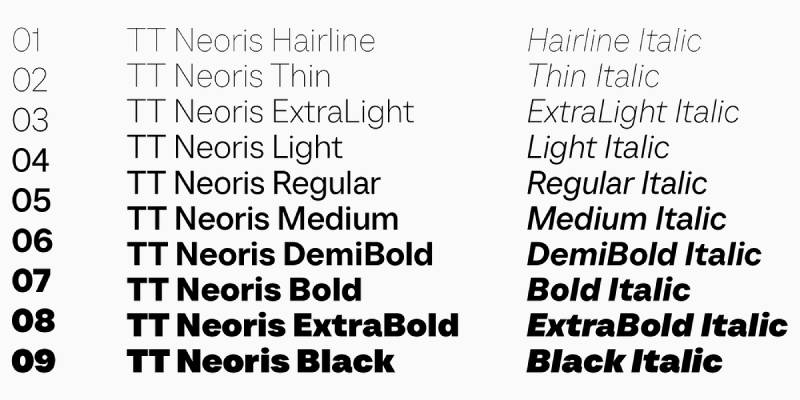
A contemporary geometric sans from TypeType that successfully avoids feeling generic.
Classification & Design
Geometric sans-serif with distinctive character. While based on geometric principles, TT Neoris includes unique details that give it personality. The balance between systematic design and individual character makes it versatile.
Best Use Cases
Modern branding and editorial design. Brands wanting contemporary feel without surrendering personality benefit from TT Neoris. Magazine layouts, packaging design, and brand systems all work well.
Key Differences from Optima
Geometric versus humanist approaches. TT Neoris embraces circles and straight lines; Optima draws from Renaissance calligraphy. Both sophisticated but reach it through opposite paths.
Availability & Licensing
Commercial typeface from TypeType. Standard foundry licensing applies.
TT Norms Pro
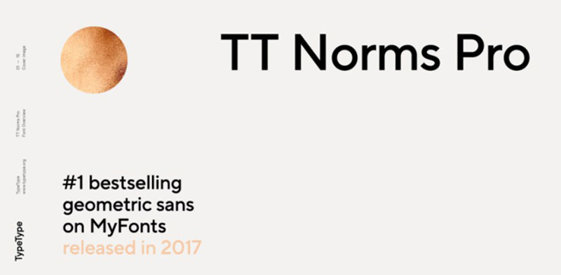
TypeType’s supremely versatile geometric sans that works everywhere.
One of those fonts that just solves problems.
Classification & Design
Geometric grotesque sans-serif with extensive weight and width range. The design achieves remarkable neutrality while maintaining enough character to avoid blandness. Comprehensive family includes dozens of styles providing solutions for virtually any design challenge.
Exceptional attention to spacing and metrics across all styles.
Best Use Cases
Comprehensive brand systems and multi-platform projects. Organizations needing one typeface family that works across print, web, app, and environmental applications. The range of weights and widths handles hierarchy naturally. Corporate communications, editorial projects, and digital products all perform excellently.
UI designers particularly appreciate the range.
Key Differences from Optima
TT Norms Pro is systematic neutrality; Optima is refined distinction. TT Norms Pro serves as invisible infrastructure; Optima maintains visible elegance. Both professional, but TT Norms Pro is a tool, Optima is a statement.
Availability & Licensing
Commercial typeface from TypeType. Professional licensing available. Trial fonts typically offered for testing. Desktop, webfont, and app licenses sold separately or in packages.
Investment pays off in versatility.
Yadon Sans Serif
A contemporary sans-serif that brings fresh energy to humanist typography.
Classification & Design
Modern humanist sans with energetic character. The letterforms balance professionalism with approachability, creating a typeface suitable for brands wanting to project confidence without corporate stuffiness.
Best Use Cases
Startup branding and creative services. Companies in innovation-focused industries benefit from Yadon’s contemporary energy. Design agencies, creative consultancies, and forward-thinking brands find its character aligned with their values.
Key Differences from Optima
Much more contemporary and casual. Optima maintains classical formality; Yadon embraces modern informality.
Availability & Licensing
Check foundries for current availability and licensing terms.
FAQ on Fonts Similar To Optima
What makes a font similar to Optima?
Humanist proportions and subtle stroke modulation define Optima alternatives. Look for fonts with classical Roman capital influences, terminal flares (or refined terminals), and organic character shapes that bridge serif and sans-serif traditions while maintaining elegant readability.
Are there free alternatives to Optima?
Yes. Arsenal and Marcellus on Google Fonts offer classical proportions without licensing costs. Montserrat provides geometric sophistication. While not exact matches, these free options capture refined aesthetics suitable for projects with limited budgets.
Which commercial font is closest to Optima?
Avenir shares humanist DNA and professional versatility. Gill Sans offers similar classical proportions with British character. ITC Zapf Humanist (created by Optima’s designer) provides the closest match, essentially being Optima’s cousin with slight variations.
Can I use Optima alternatives for body text?
Arsenal, Source Sans Pro, and Avenir excel in body text applications. Their open apertures and balanced x-heights maintain readability across extended passages. Century Gothic works better for headlines due to its pure geometric construction and wider letterforms.
What’s the best Optima alternative for web design?
Source Sans Pro was designed specifically for digital interfaces. Montserrat performs excellently on screens with multiple weights. Roboto offers reliable cross-platform rendering. All three provide superior web performance compared to Optima’s print-focused optimization.
How does Gill Sans compare to Optima?
Both are humanist sans-serifs with classical influences. Gill Sans has more consistent stroke weights and British character. Optima features more dramatic stroke modulation and Renaissance-inspired terminal flares. Gill Sans feels traditional; Optima feels timeless and continental.
Which Optima alternative works best for luxury brands?
Avenir brings sophisticated geometry perfect for high-end branding. Boutique was designed specifically for fashion applications. Gill Sans provides established luxury credentials. Each offers refinement without Optima’s potential overuse in premium markets.
Are geometric sans-serifs good Optima substitutes?
Not directly. Geometric fonts like Century Gothic or Montserrat lack Optima’s organic stroke modulation. However, they share modern sophistication and clean aesthetics. Choose geometric alternatives when you want contemporary impact rather than classical elegance.
What font pairs well with Optima alternatives?
Pair fonts strategically by contrasting styles. Combine humanist sans like Avenir with serif fonts like Palatino. Match Arsenal with traditional serifs for editorial work. Create hierarchy through weight variations within the same family before mixing typefaces.
Can I mix Optima alternatives in one project?
Generally avoid it. Multiple similar humanist sans-serifs create confusion rather than contrast. Use one primary typeface with different weights for hierarchy. Mix classifications instead: pair a humanist sans with a serif or geometric font for clearer visual distinction.
Conclusion
Finding fonts similar to Optima doesn’t mean settling for inferior alternatives. The typefaces covered here offer distinct advantages depending on your specific needs.
Free options like Arsenal and Marcellus provide classical elegance without licensing barriers. Commercial choices like Avenir and Gill Sans bring professional versatility with extensive weight ranges.
Consider your project requirements carefully. Print design might favor stroke modulation and classical proportions. Digital applications often benefit from screen-optimized options like Source Sans Pro.
Budget, platform compatibility, and aesthetic goals should guide your decision. Some alternatives capture Optima’s Renaissance spirit directly. Others achieve similar sophistication through geometric or contemporary approaches.
The right choice depends on your brand identity and typography hierarchy needs. Each font brings unique character while maintaining the refined professionalism that makes Optima timeless.
If you enjoyed reading this article on fonts similar to Optima, you should check out these articles with fonts similar to Gotham, Garamond, Helvetica, Futura, Times New Roman, Raleway, Bodoni, Roboto, and Lato.
Renowned for his expertise in logo design and visual branding, Bogdan has developed a multitude of logos for various clients.
His skills extend to creating posters, vector illustrations, business cards, and brochures. Additionally, Bogdan's UI kits were featured on marketplaces like Visual Hierarchy and UI8.
He also wrote in the past years on sites like Design Your Way, WebDesignerDepot, WPDean, Designmodo, Speckyboy, Slider Revolution, and more.
- The Best Fonts for Real Estate Branding and Marketing - 15 July 2026
- Hosting in the USA: How to Choose Dedicated Servers for the North American Market - 15 July 2026
- NHL Team Color Codes - 14 July 2026
Bogdan Sandu is a seasoned designer who has been designing websites since 2008. Renowned for his expertise in logo design and visual branding, Bogdan has developed a multitude of logos for various clients. His skills extend to creating posters, vector illustrations, business cards, and brochures. Additionally, Bogdan's UI kits were featured on marketplaces like Visual Hierarchy and UI8. He also wrote in the past years on sites like Design Your Way, WebDesignerDepot, WPDean, Designmodo, Speckyboy, Slider Revolution, and more.
You Might Also Like