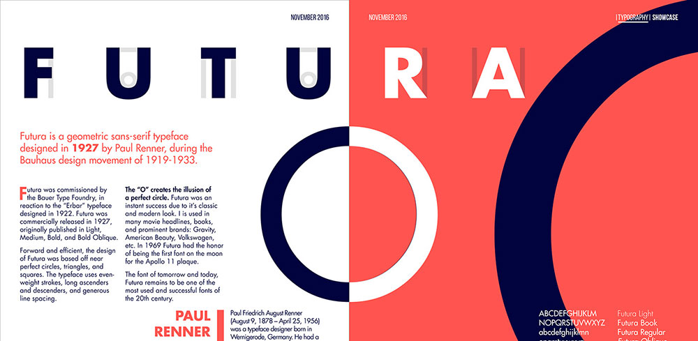
Futura defined geometric sans serif design in 1927, but licensing costs and limited web availability push designers toward alternatives. Finding fonts similar to Futura means understanding what makes Paul Renner’s typeface work: perfectly circular forms, single-story lowercase letters, and rationalist precision rooted in Bauhaus design principles.
This guide examines 24 geometric sans serif alternatives across free and premium options.
You’ll learn which fonts match Futura’s aesthetic while offering better kerning, expanded weight ranges, or improved screen rendering. Each option includes design characteristics, key differences, use cases, and pairing fonts recommendations.
Whether you need a Google Fonts substitute for web projects or a premium typeface for brand identity work, these alternatives deliver Futura’s modernist geometry with practical advantages for contemporary design.
Fonts Similar To Futura
| Font Name | Geometric Character | Best Use Context | Futura Similarity |
|---|---|---|---|
| Avenir | Humanist with warmer curves | Corporate branding, body text | High (refined) |
| Jost | Pure geometric, near-identical | Digital design, web typography | Very High (closest) |
| Spartan | Precise geometric forms | Modern interfaces, headlines | Very High |
| Century Gothic | Rounded geometric, softer | Friendly branding, casual design | High (warmer) |
| Gill Sans | Humanist proportions, organic | Editorial, traditional branding | Medium (classical) |
| Avant Garde Gothic | Strictly geometric circles | Logo design, art direction | High (stricter) |
| Helvetica Neue | Grotesque neutrality | Universal applications, tech | Low (different class) |
| Proxima Nova | Hybrid geometric-humanist | Web content, UI design | Medium-High |
| Lato | Semi-rounded humanist | Digital reading, apps | Medium |
| Montserrat | Urban geometric, open apertures | Web headlines, posters | High |
| Neuzeit Grotesk | Classic geometric, balanced | Premium editorial, branding | High (historical) |
| Quasimoda | Contemporary geometric | Fashion, luxury branding | High |
| Nobel | Refined geometric structure | Professional documents, web | High |
| Nunito Sans | Rounded terminals, friendly | UI elements, accessible design | Medium (softer) |
| Didact Gothic | Simple geometric, educational | Learning materials, clean UI | Medium-High |
| Questrial | Minimal geometric, narrow | Compact layouts, mobile | Medium-High |
| HK Nova | Modern geometric, versatile | Tech branding, startups | High |
| Twentieth Century | Period geometric, authentic | Retro design, vintage projects | Very High (original era) |
| Muli (Mulish) | Neo-grotesque, minimal | Screen reading, web apps | Medium |
| Raleway | Elegant geometric, thin weights | Fashion, elegant branding | High (refined) |
| DM Sans | Low-contrast geometric | UI text, digital products | Medium-High |
| Bergen Sans | Nordic geometric, sturdy | Scandinavian design, outdoor | High |
| Regime Grotesk | Industrial geometric, bold | Impact design, exhibitions | Medium-High |
| Lorin | Soft geometric, approachable | Lifestyle brands, wellness | High (gentler) |
Avenir
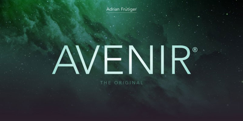
Designed by Adrian Frutiger in 1988, Avenir translates to “future” in French and shares Futura’s geometric foundation while adding humanist warmth.
Design Characteristics
Avenir uses geometric letterforms with subtle organic adjustments. The verticals maintain consistent stroke width while curves show slight modulation. Terminals are clean and perpendicular, creating a modern yet approachable aesthetic. The ‘a’ and ‘g’ feature simplified single-story construction similar to Futura.
Key Differences from Futura
X-height sits noticeably taller than Futura, improving readability at small sizes. Stroke terminals are subtly curved rather than perfectly geometric. The ‘O’ appears slightly wider with less perfect circularity. Character width varies more naturally across the alphabet, avoiding Futura’s extreme condensed forms in letters like ‘M’ and ‘W’.
Best Use Cases
Excels in corporate identity systems and digital interfaces. Apple used Avenir extensively before switching to San Francisco. Works well for body text between 10-14pt and headlines above 24pt. Performs consistently across print and screen applications. Maintains legibility in wayfinding and signage projects.
Available Weights & Styles
Comes in six weights: Light, Book, Roman, Medium, Heavy, and Black. Each weight includes italic variations. Avenir Next expands the family with condensed and ultra-light options. Total family contains 24 styles providing extensive hierarchy options.
Pairing Recommendations
Pairs effectively with serif fonts like Freight Text or Lyon for editorial work. Combines with Georgia for web applications requiring system font fallbacks. Works alongside Garamond for traditional print layouts. Avenir Book pairs with Avenir Heavy for single-family hierarchies.
Notable Brands Using Avenir
Apple, Bloomberg, The New Yorker, Toyota, and Philadelphia use Avenir in their brand systems. The Amsterdam airport signage relies on Avenir for wayfinding clarity.
Jost
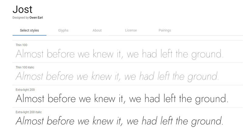
Released as an open-source alternative to Futura, Jost captures the 1920s geometric spirit while optimizing for modern screen rendering.
Design Characteristics
Built on pure geometric shapes with minimal deviation from circular and square forms. Single-story ‘a’ and ‘g’ mirror Futura’s approach. Straight leg on ‘R’ extends without curve. High contrast between character width creates distinctive rhythm in text blocks.
Key Differences from Futura
Slightly condensed proportions make Jost more economical for tight layouts. Apertures open wider on ‘C’ and ‘S’. The numeral set features more consistent weight distribution. Digital-native design includes better hinting for screen display at low resolutions.
Best Use Cases
Ideal for web design projects needing vintage modernist aesthetics. Works well in hero sections and large display type above 36pt. Suitable for branding applications targeting retro-modern positioning. Variable font version allows precise weight adjustments for responsive design.
Available Weights & Styles
Available in nine weights from Hairline to Black. Includes italic variants for all weights. Variable font format enables infinite weight adjustments between extremes. Open-source licensing removes cost barriers for commercial projects.
Pairing Recommendations
Combines with Lora or Crimson Text for editorial contrast. Works alongside system fonts like -apple-system for fallback stacks. Pairs with itself using dramatic weight contrasts (Hairline with Black). Matches well with geometric slab serifs like Zilla Slab.
Notable Brands Using Jost
Primarily adopted by design agencies and startups due to open-source availability. Gained traction in European design studios for client projects requiring license-free alternatives.
Spartan
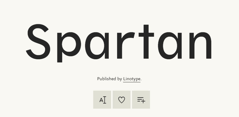
Created as a Google Fonts interpretation of geometric sans principles, Spartan offers Futura-like aesthetics with web optimization.
Design Characteristics
Geometric construction follows strict circular and linear forms. Uniform stroke weight maintains consistency across all characters. Tall ascenders and descenders create elegant proportions. Capital letters align with geometric purity while lowercase forms show practical adjustments.
Key Differences from Futura
Slightly wider character proportions improve screen legibility. The ‘M’ uses splayed legs rather than straight verticals. Counter spaces open wider in ‘e’ and ‘a’. Overall color appears lighter on screen due to optimized stroke weight for digital rendering.
Best Use Cases
Best deployed in digital interfaces requiring clean modernist aesthetics. Works for mobile apps where geometric sans serif character supports minimalist design. Suitable for headlines and navigation elements. Free licensing makes it practical for client work and rapid prototyping.
Available Weights & Styles
Available in nine weights: Thin, ExtraLight, Light, Regular, Medium, SemiBold, Bold, ExtraBold, and Black. No italic variants included. Variable font version enables smooth weight transitions for animation and responsive typography.
Pairing Recommendations
Works with Merriweather for body text in blog layouts. Combines with serif fonts like PT Serif for content-heavy applications. Pairs with Roboto Condensed for multi-level hierarchies. Self-pairs using weight contrast between Thin and Black.
Notable Brands Using Spartan
Widely adopted by small businesses and web developers due to Google Fonts availability. Common in portfolio sites and startup landing pages requiring geometric aesthetics without licensing costs.
Century Gothic
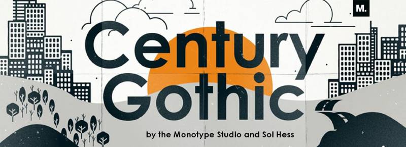
Based on Twentieth Century by Sol Hess, Century Gothic emerged in 1991 as a digital revival with Futura-inspired geometry.
Design Characteristics
Built on geometric circles and straight lines with consistent stroke weight. Single-story ‘a’ and ‘g’ maintain simplicity. Wide letter spacing creates airy texture in text blocks. Perfectly circular ‘O’ and ‘Q’ emphasize geometric purity.
Key Differences from Futura
Significantly wider character proportions make Century Gothic more spacious. The ‘M’ has vertical rather than splayed legs. Terminals appear more blunt and perpendicular. Overall color appears lighter due to uniform stroke weight and generous spacing.
Best Use Cases
Performs well in advertising and display applications requiring friendly modernism. Works for logo design when geometric simplicity supports brand positioning. Suitable for short text blocks and headlines. Avoid extended reading lengths due to wide proportions.
Available Weights & Styles
Available in Regular, Italic, Bold, and Bold Italic. Limited weight range restricts hierarchical flexibility. No light or black weights available in standard versions. Often bundled with Windows operating systems.
Pairing Recommendations
Combines with script fonts like Pacifico for contrast in wedding materials. Works alongside Georgia or Baskerville for traditional print layouts. Pairs with Freight Sans for more weight options. Self-pairs using regular and bold for basic hierarchy.
Notable Brands Using Century Gothic
Teletubbies, Wisconsin tourism campaigns, and various educational institutions use Century Gothic for approachable geometric branding. Common in retail signage requiring clean, friendly aesthetics.
Gill Sans
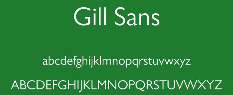
Eric Gill created this humanist sans serif in 1928, blending Futura’s geometric ideas with calligraphic influences.
Design Characteristics
Geometric structure softened by humanist proportions and optical corrections. The lowercase ‘a’ and ‘g’ feature single-story simplified forms. Capital ‘R’ has distinctive curved leg. Characters show subtle weight variation suggesting pen-drawn origins. Kerning pairs are carefully refined for even texture.
Key Differences from Futura
Proportions reflect classical Roman letterforms rather than pure geometry. The ‘M’ has splayed legs and the ‘W’ shows pointed apex. Lowercase ‘t’ has angled terminal adding personality. Overall warmth contrasts with Futura’s cold precision. Character widths vary more naturally across the alphabet.
Best Use Cases
Traditional choice for British railway signage and wayfinding systems. Works well in editorial design for magazines and book covers. Suitable for corporate identity when approachability matters more than stark modernism. Performs in both display and text sizes.
Available Weights & Styles
Extensive family includes Light, Regular, Medium, Bold, Extra Bold, and Ultra Bold. Each weight has italic and condensed variants. Total family exceeds 20 styles. Shadowed and outline versions available for display use.
Pairing Recommendations
Combines with Joanna or Perpetua (both Gill designs) for harmonious layouts. Works alongside Baskerville for traditional book typography. Pairs with slab serif fonts like Rockwell for industrial aesthetics. Self-pairs effectively using weight and width variations.
Notable Brands Using Gill Sans
BBC, British Railways, Tommy Hilfiger, and Penguin Books use Gill Sans extensively. The UK road sign system relies on modified Gill Sans variants called Transport.
Avant Garde Gothic
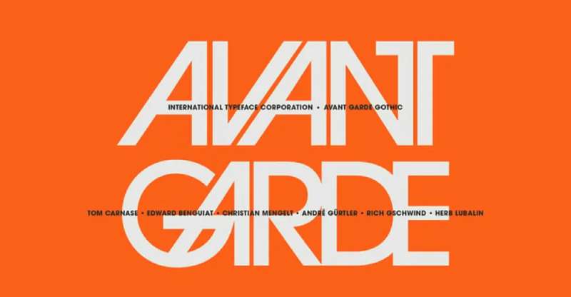
Herb Lubalin’s 1970 design for Avant Garde magazine pushed geometric sans serif concepts toward extreme circularity and tight spacing.
Design Characteristics
Perfect circles dominate the ‘O’, ‘Q’, and ‘C’. Square forms define ‘H’, ‘E’, and ‘F’. Ultra-tight default spacing creates dense texture. Ligatures and alternate characters expand design possibilities. Geometric purity exceeds even Futura’s rationalist approach.
Key Differences from Futura
More condensed horizontal proportions create tighter rhythm. Lowercase characters appear more circular. The ‘Q’ tail extends horizontally rather than diagonally. Five weights offer more hierarchy than original Futura. Extensive ligature set includes unconventional character combinations.
Best Use Cases
Strongest in display font applications above 24pt. Works for logo design requiring geometric precision and 1970s nostalgia. Suitable for headlines and short marketing copy. Avoid body text due to tight spacing and extreme geometry.
Available Weights & Styles
ITC Avant Garde Gothic includes five weights: Book, Medium, Demi, Bold, and Extra Bold. Each weight has oblique variants. Condensed versions available for tight spaces. Pro versions include expanded character sets and OpenType features.
Pairing Recommendations
Contrasts effectively with Renaissance serifs like Caslon or Garamond. Works alongside geometric slabs for unified geometric systems. Combines with script fonts for wedding and event materials. Self-pairs using dramatic weight contrast between Book and Bold.
Notable Brands Using Avant Garde Gothic
Adidas, Calvin Klein, and numerous fashion brands adopted Avant Garde Gothic during 1970s-1990s. Still appears in retro-themed branding and nostalgia-driven campaigns.
Helvetica Neue
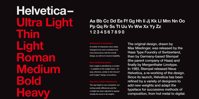
Max Miedinger’s 1957 Neue Haas Grotesk evolved into Helvetica, with Neue version offering refined spacing and expanded weights.
Design Characteristics
Neutral letterforms prioritize clarity over personality. Uniform stroke weight maintains even texture. Horizontal terminals on ‘C’, ‘S’, and ‘G’ create distinctive rhythm. High x-height improves legibility at small sizes. Slightly condensed proportions maintain efficiency.
Key Differences from Futura
Grotesque rather than geometric construction creates different proportions. Characters show width variation reflecting 19th-century sans serif origins. The ‘a’ and ‘g’ use double-story forms. Apertures remain more closed on ‘C’ and ‘e’. Overall personality reads more neutral and universal.
Best Use Cases
Industry standard for corporate identity and branding systems. Works across all media from signage to mobile apps. Suitable for body text and display. Maintains legibility across size ranges. Apple used Helvetica Neue as system font before San Francisco.
Available Weights & Styles
Comprehensive family includes Ultra Light through Black in roman and oblique styles. Condensed and Extended variants multiply options. Total family exceeds 50 styles. Neue versions improve spacing and stroke consistency over original Helvetica.
Pairing Recommendations
Works with virtually any serif font due to neutral character. Combines with Times New Roman for traditional layouts. Pairs with Freight Text for editorial applications. Self-pairs using weight contrast for complete hierarchies.
Notable Brands Using Helvetica Neue
American Airlines, BMW, Target, and countless corporations rely on Helvetica Neue. The New York City subway system uses Helvetica for all signage.
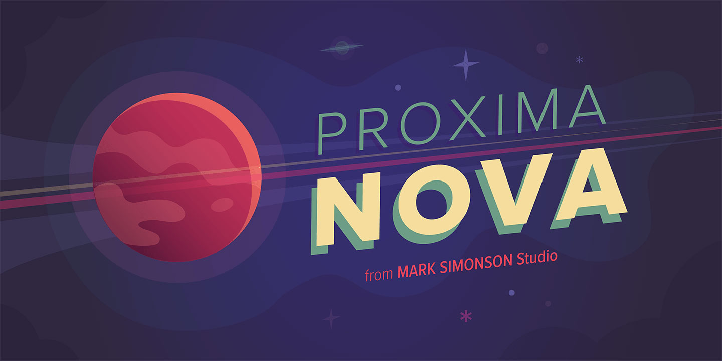
Proxima Nova
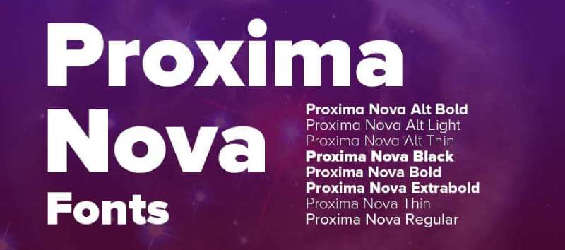
Mark Simonson’s 2005 design bridges geometric and humanist sans serif traditions, offering modern versatility.
Design Characteristics
Geometric structure softened by slight optical adjustments. Even stroke weight maintains clean appearance. Moderate x-height balances legibility and elegance. Character widths show subtle variation for natural rhythm. Open apertures improve legibility at small sizes.
Key Differences from Futura
More neutral personality with less dogmatic geometry. The ‘a’ and ‘g’ use modern simplified forms without extreme geometric purity. Stroke terminals show subtle curves rather than perfect perpendicular cuts. Extensive weight range provides more hierarchy options than Futura.
Best Use Cases
Workhorse font for digital interfaces and web design. Functions well for body text and display applications. Suitable for mobile apps requiring clean modern aesthetics. Works in branding systems needing flexibility. Performs consistently across print and screen.
Available Weights & Styles
Eight weights from Thin through Black with matching italics. Condensed versions available in six weights. Total family includes 48 styles. Extra Bold weight added in updated releases.
Pairing Recommendations
Combines with Freight Text or Merriweather for editorial layouts. Works alongside Georgia for web applications. Pairs with slab serif fonts like Arvo for technology branding. Self-pairs using weight and width variations for complete systems.
Notable Brands Using Proxima Nova
BuzzFeed, Wired, NBC News, and Spotify use Proxima Nova in digital properties. Popular choice for startups and tech companies requiring modern sans serif aesthetics.
Lato

Lukasz Dziedzic designed Lato in 2010 as a humanist sans serif with warm character and professional appearance.
Design Characteristics
Semi-rounded letterforms create friendly yet serious tone. Subtle curves soften geometric structure. Wide proportions improve legibility at small sizes. Slightly condensed in some characters maintains efficiency. Stroke weight remains consistent with subtle humanist modulation.
Key Differences from Futura
Humanist rather than geometric construction creates warmer personality. Double-story ‘a’ and ‘g’ add traditional character. Lowercase letters show more width variation. The ‘O’ appears slightly squared rather than perfectly circular. Overall color appears darker due to wider proportions.
Best Use Cases
Ideal for body text in web design and digital applications. Works well in corporate communications requiring professional warmth. Suitable for presentations and slide decks. Performs across sizes from 9pt body text to 48pt headlines. Free licensing through Google Fonts drives widespread adoption.
Available Weights & Styles
Available in ten styles: five weights (Hairline, Light, Regular, Bold, Black) with italic variants. Recent updates added Thin and Heavy weights. Extensive character set supports multiple languages.
Pairing Recommendations
Combines with Merriweather or Lora for editorial applications. Works alongside Roboto Slab for technology content. Pairs with Playfair Display for elegant contrast. Self-pairs using weight variations for single-family systems.
Notable Brands Using Lato
Widely adopted by small businesses, nonprofits, and web developers due to Google Fonts availability. Common in WordPress themes and template systems requiring professional sans serif options.
Montserrat

Julieta Ulanovsky created Montserrat in 2011 as an homage to urban typography in Buenos Aires’ Montserrat neighborhood.
Design Characteristics
Geometric structure with distinctive character details. Consistent stroke weight maintains clean appearance. Slightly condensed proportions improve economy. Single-story ‘a’ echoes Futura’s approach. Character terminals show subtle curves adding warmth to geometric foundation.
Key Differences from Futura
More humanist proportions soften pure geometry. The ‘M’ has vertical legs rather than splayed forms. Lowercase ‘g’ uses simplified single-story construction. Apertures open wider on ‘C’ and ‘S’. Overall personality reads friendlier than Futura’s cold rationalism.
Best Use Cases
Popular for web design projects requiring geometric sans with personality. Works well in branding for startups and creative agencies. Suitable for headlines and short text blocks. Performs in digital interfaces and mobile apps. Free licensing enables widespread adoption.
Available Weights & Styles
Eighteen styles include nine weights from Thin through Black with italic variants. Variable font version enables smooth weight transitions. Extensive language support covers Latin-based alphabets.
Pairing Recommendations
Combines with Crimson Text or Lora for editorial contrast. Works alongside Open Sans for hierarchical systems. Pairs with Playfair Display for elegant layouts. Self-pairs using dramatic weight contrast between Thin and Black.
Notable Brands Using Montserrat
Popular among independent designers and small studios. Frequently appears in portfolio sites, agency websites, and startup branding due to Google Fonts availability.
Neuzeit Grotesk

Wilhelm Pischner designed Neuzeit Grotesk in 1928, making it a contemporary of Futura with distinct character.
Design Characteristics
Geometric construction with rationalist precision. Consistent stroke weight creates even texture. Single-story lowercase forms maintain simplicity. Wide apertures improve legibility. Character proportions reflect 1920s modernist ideals.
Key Differences from Futura
Slightly wider proportions create more spacious rhythm. The ‘M’ uses more vertical construction. Lowercase ‘t’ has curved terminal. Overall appearance reads slightly warmer than Futura despite similar geometric approach. Less extreme contrast between narrow and wide characters.
Best Use Cases
Strong choice for editorial design and magazine layouts. Works well in cultural branding requiring historical modernist references. Suitable for display applications and headlines. Performs in both print and digital contexts. Popular in European design studios.
Available Weights & Styles
Available in Light, Regular, Bold, and Black weights. Recent digital versions expanded to include Medium. Condensed variants available for tight layouts. Total family includes approximately 12 styles.
Pairing Recommendations
Combines with classic serifs like Garamond or Caslon. Works alongside Freight Text for contemporary editorial. Pairs with geometric slabs for unified modernist systems. Self-pairs using weight contrast for hierarchies.
Notable Brands Using Neuzeit Grotesk
Popular in European publishing and cultural institutions. Used by design studios for clients requiring authentic 1920s geometric aesthetics without defaulting to Futura.
Quasimoda
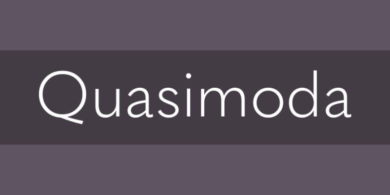
Botio Nikoltchev’s geometric sans serif provides contemporary take on Futura’s principles with refined details.
Design Characteristics
Pure geometric construction with mathematical precision. Perfectly circular forms dominate curved characters. Uniform stroke weight maintains consistency. Single-story ‘a’ and ‘g’ follow Futura conventions. Character spacing optimized for modern rendering.
Key Differences from Futura
Slightly taller x-height improves screen legibility. The ‘M’ width appears more moderate. Stroke terminals show subtle refinements for digital display. Overall proportions slightly more generous than Futura’s compressed forms. Contemporary spacing standards replace Futura’s tighter defaults.
Best Use Cases
Ideal for web design requiring pure geometric aesthetics. Works well in technology branding and startup identities. Suitable for headlines and display applications. Performs in digital interfaces needing clean modernist character.
Available Weights & Styles
Available in Light, Regular, Medium, Bold, and ExtraBold weights. No italic variants in standard version. Condensed version available separately. Total family includes approximately 10 styles.
Pairing Recommendations
Combines with humanist serifs like Freight Text. Works alongside system fonts for web stacks. Pairs with slab serif fonts for technology applications. Self-pairs using weight contrast.
Notable Brands Using Quasimoda
Adopted by European design agencies and digital studios. Common in tech startup branding requiring geometric precision without vintage associations.
Nobel
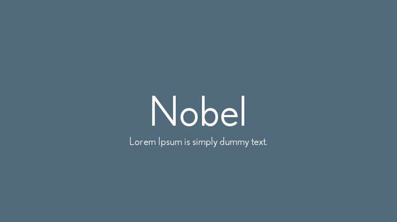
Created by Sjoerd Hendrik de Roos in 1929, Nobel offers Dutch approach to geometric sans serif design.
Design Characteristics
Geometric structure with practical refinements. Consistent stroke weight creates clean appearance. Slightly condensed proportions maintain efficiency. Character details show subtle personality. Overall construction balances geometry with readability.
Key Differences from Futura
More condensed proportions create different rhythm. The ‘a’ and ‘g’ maintain single-story simplicity with slight variations. Character widths show more consistency across alphabet. Overall personality reads more neutral and workmanlike than Futura’s designed precision.
Best Use Cases
Suitable for corporate communications and business applications. Works in editorial contexts requiring efficient layouts. Performs well in both display and text sizes. Common in European design projects. Less distinctive than Futura makes it versatile for various contexts.
Available Weights & Styles
Available in Light, Regular, Medium, and Bold weights. Condensed versions expand layout options. Total family includes approximately 8-10 styles depending on version.
Pairing Recommendations
Combines with traditional serifs like Times or Garamond. Works alongside humanist sans serifs for hierarchies. Pairs with slab serif fonts for industrial aesthetics. Self-pairs using weight contrast.
Notable Brands Using Nobel
Popular in Dutch design studios and European corporate applications. Less common globally than Futura but maintains regional presence.
Nunito Sans
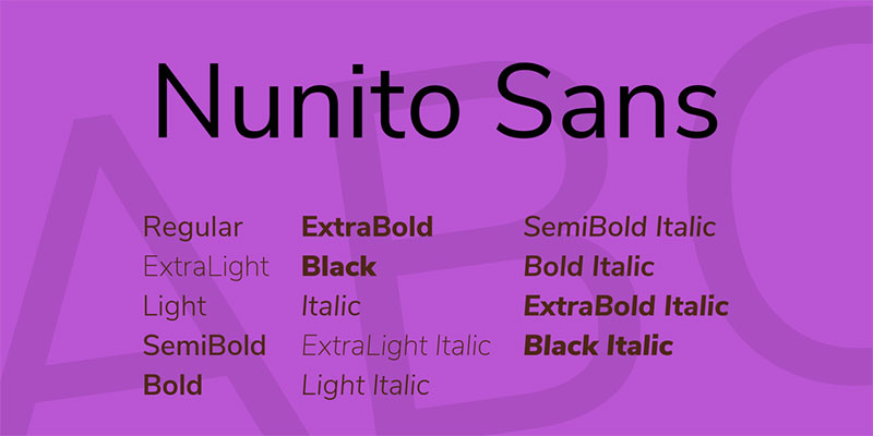
Vernon Adams created Nunito as a rounded geometric sans serif, with Jacques Le Bailly later developing Nunito Sans.
Design Characteristics
Geometric structure with rounded terminals creating friendly character. Even stroke weight maintains clean appearance. Slightly condensed proportions improve economy. Open apertures enhance legibility. Character details balance geometry with warmth.
Key Differences from Futura
Rounded terminals create completely different personality. Double-story ‘a’ and ‘g’ add traditional character absent from Futura. Overall warmth contrasts with Futura’s cold precision. Slightly wider proportions improve readability in text sizes.
Best Use Cases
Ideal for user interfaces requiring approachable aesthetics. Works well in mobile apps and digital products. Suitable for websites targeting consumer audiences. Performs in educational materials and children’s content. Free licensing drives adoption.
Available Weights & Styles
Twelve styles include six weights (ExtraLight through Black) with italic variants. Variable font version enables smooth transitions. Extensive character set supports multiple languages.
Pairing Recommendations
Combines with serif fonts like Lora or Merriweather. Works alongside Roboto for hierarchical systems. Pairs with itself using weight contrast. Matches with Open Sans for multi-family systems.
Notable Brands Using Nunito Sans
Widely adopted in web design and application development due to Google Fonts availability. Common in dashboard interfaces and SaaS products requiring friendly professionalism.
Didact Gothic
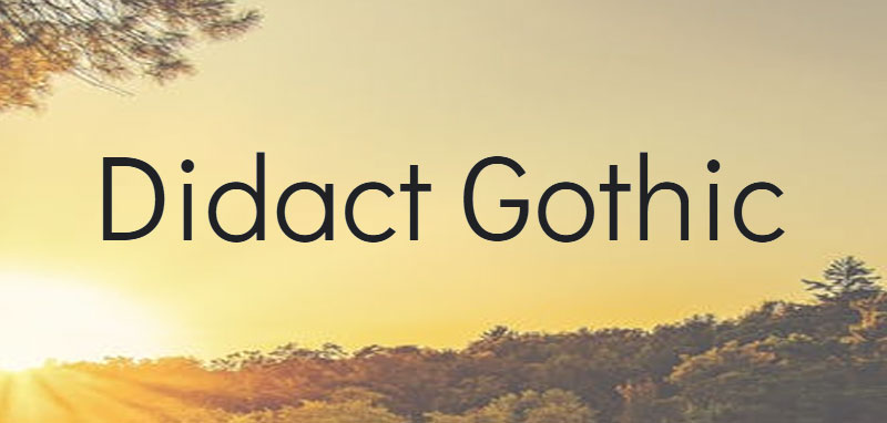
Created as an educational typeface optimizing legibility for beginning readers and screen display.
Design Characteristics
Simplified geometric structure prioritizes clarity. Consistent stroke weight maintains even color. Open apertures maximize character recognition. Slightly condensed proportions balance economy and readability. Character details minimize ambiguity between similar letters.
Key Differences from Futura
More open letterforms improve recognition for struggling readers. The ‘a’ uses double-story construction aiding letter identification. Character proportions reflect readability research rather than pure aesthetics. Overall design prioritizes function over geometric purity.
Best Use Cases
Ideal for educational materials and children’s content. Works well in accessibility contexts requiring maximum legibility. Suitable for instructional interfaces and e-learning platforms. Performs well at small sizes on screens. Free licensing enables educational adoption.
Available Weights & Styles
Single weight optimized for body text applications. No italic or bold variants in standard version. Simplicity supports consistent implementation across educational materials.
Pairing Recommendations
Combines with other educational fonts like OpenDyslexic. Works alongside sans-serif fonts with multiple weights for hierarchy. Pairs with clear serifs like Crimson Text for traditional reading materials.
Notable Brands Using Didact Gothic
Popular in educational technology companies and e-learning platforms. Used by schools and nonprofits requiring accessible typography without licensing costs.
Questrial
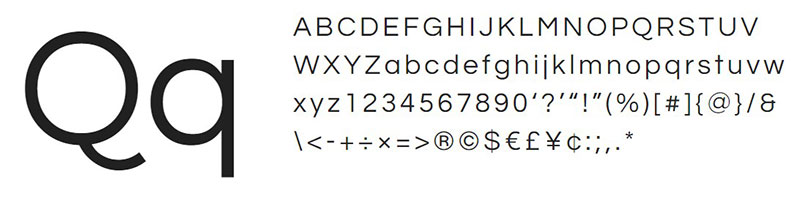
Created as a clean geometric sans serif optimized for both display and text applications.
Design Characteristics
Geometric structure with refined proportions. Even stroke weight creates consistent texture. Moderate x-height balances elegance and legibility. Open apertures improve recognition. Character details show careful optical adjustments.
Key Differences from Futura
More neutral personality with less extreme geometry. Character widths show better balance across alphabet. The lowercase forms use simplified construction without rigid geometric rules. Overall appearance reads more contemporary and less historically loaded.
Best Use Cases
Versatile for web design projects requiring clean aesthetics. Works well in branding for professional services. Suitable for both headlines and body text. Performs consistently across digital applications. Free licensing enables widespread use.
Available Weights & Styles
Single regular weight in standard version limits hierarchical options. No bold, italic, or additional weights available. Simplicity requires pairing with other fonts for complex layouts.
Pairing Recommendations
Combines with weighted sans serifs like Open Sans for hierarchy. Works alongside serifs like Lora for contrast. Pairs with geometric sans families having multiple weights. Often used for body text with bolder fonts for headlines.
Notable Brands Using Questrial
Adopted by small businesses and independent designers due to Google Fonts availability. Common in portfolio sites and simple web projects requiring clean geometric aesthetics.
HK Nova
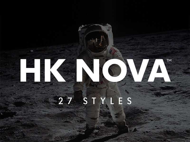
Contemporary geometric sans serif offering refined proportions and extensive weight range for modern branding.
Design Characteristics
Geometric foundation with contemporary refinements. Consistent stroke weight maintains clean appearance. Moderate proportions balance efficiency and elegance. Open apertures improve legibility. Character details show precision without rigidity.
Key Differences from Futura
More generous proportions create different rhythm. The lowercase forms use simplified construction with contemporary sensibility. Stroke terminals show subtle refinements. Overall personality reads less historical and more current than Futura.
Best Use Cases
Strong choice for contemporary branding systems. Works well in technology and startup identities. Suitable for digital interfaces and applications. Performs across print and screen contexts. Extensive weight range supports complex hierarchies.
Available Weights & Styles
Multiple weights from Light through Black with italic variants. Condensed versions available for tight layouts. Total family provides comprehensive options for system design.
Pairing Recommendations
Combines with humanist serifs for editorial applications. Works alongside slab serif fonts for technology branding. Pairs with itself using weight and width variations. Self-sufficient for complete brand systems.
Notable Brands Using HK Nova
Adopted by design agencies for client branding projects. Common in technology sector and contemporary corporate identities requiring modern geometric aesthetics.
Twentieth Century
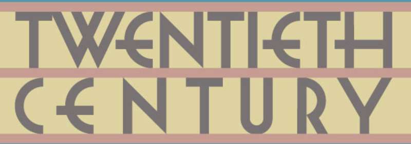
Sol Hess designed Twentieth Century for Lanston Monotype in 1937, offering American take on geometric modernism.
Design Characteristics
Geometric structure with American industrial character. Consistent stroke weight creates even texture. Wide proportions create spacious rhythm. Single-story ‘a’ and ‘g’ follow geometric conventions. Character details reflect mid-century American design sensibility.
Key Differences from Futura
Significantly wider proportions create more generous spacing. The ‘M’ uses vertical construction. Overall personality reads warmer and less austere than Futura. Character widths show American preference for spaciousness over European economy.
Best Use Cases
Suitable for retro branding requiring mid-century American aesthetics. Works well in advertising and display applications. Performs in contexts where wide spacing creates desired effect. Best above 14pt due to wide proportions.
Available Weights & Styles
Available in Light, Medium, Bold, and Extra Bold weights. Some versions include condensed variants. Digital revivals vary in style count and quality.
Pairing Recommendations
Combines with American serifs like Century or Bookman. Works alongside script fonts for retro aesthetics. Pairs with geometric slabs for unified period design. Self-pairs using weight contrast.
Notable Brands Using Twentieth Century
Historical use in American advertising and publishing. Century Gothic’s popularity overshadowed original Twentieth Century in digital era.
Muli
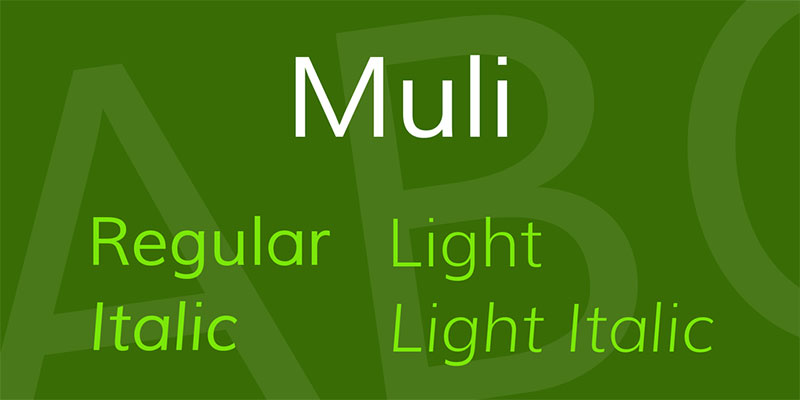
Vernon Adams designed Muli as a minimalist sans serif with geometric influences and contemporary character.
Design Characteristics
Simplified geometric structure prioritizes clarity. Consistent stroke weight maintains clean appearance. Slightly condensed proportions improve efficiency. Open apertures enhance legibility. Character details show minimal ornamentation.
Key Differences from Futura
More neutral personality with less dogmatic geometry. Character proportions reflect contemporary digital design standards. The lowercase forms use simplified construction balancing geometry and readability. Overall appearance optimized for screen rendering.
Best Use Cases
Ideal for web design requiring clean minimalist aesthetics. Works well in user interfaces and digital applications. Suitable for body text in blogs and content sites. Performs consistently across devices. Free licensing drives adoption.
Available Weights & Styles
Multiple weights from ExtraLight through Black with italic variants. Variable font version enables smooth transitions. Updated version renamed to Mulish with expanded character set.
Pairing Recommendations
Combines with serifs like Lora or Merriweather. Works alongside other Google Fonts for web stacks. Pairs with itself using weight contrast. Matches with geometric sans families for layered hierarchies.
Notable Brands Using Muli
Popular among web designers and developers using Google Fonts. Common in blog themes, portfolio sites, and simple web applications requiring clean sans serif aesthetics.
Raleway
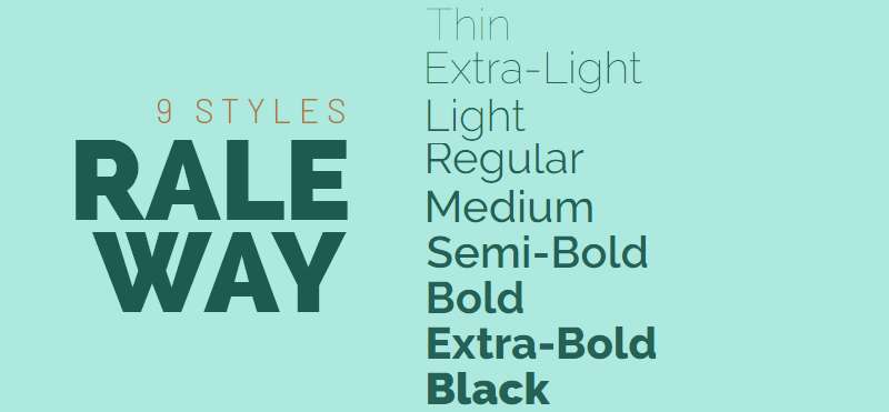
Matt McInerney created Raleway as an elegant geometric sans serif with distinctive thin weights.
Design Characteristics
Geometric structure with refined elegance. Wide proportions create distinctive rhythm. Thin weights show delicate character uncommon in geometric sans serifs. Single-story ‘a’ maintains simplicity. Character details balance geometry with sophistication.
Key Differences from Futura
More elegant personality with emphasis on thin weights. Character proportions appear wider and more generous. The ‘W’ shows distinctive construction. Overall appearance reads more fashion-oriented than Futura’s industrial modernism.
Best Use Cases
Strong for fashion and luxury branding requiring geometric sophistication. Works well in web design for elegant sites. Suitable for headlines and display applications. Performs best above 18pt where thin weights remain legible. Free licensing enables widespread use.
Available Weights & Styles
Eighteen styles include nine weights from Thin through Black with italic variants. Variable font version enables smooth transitions. Extensive character set supports multiple languages.
Pairing Recommendations
Combines with elegant serifs like Playfair Display or Cormorant. Works alongside Lora for editorial applications. Pairs with itself using dramatic weight contrast between Thin and Black. Matches with script fonts for luxury branding.
Notable Brands Using Raleway
Popular in fashion and lifestyle web design. Common in portfolio sites and agency websites requiring elegant geometric aesthetics. Widely adopted due to Google Fonts availability.
DM Sans
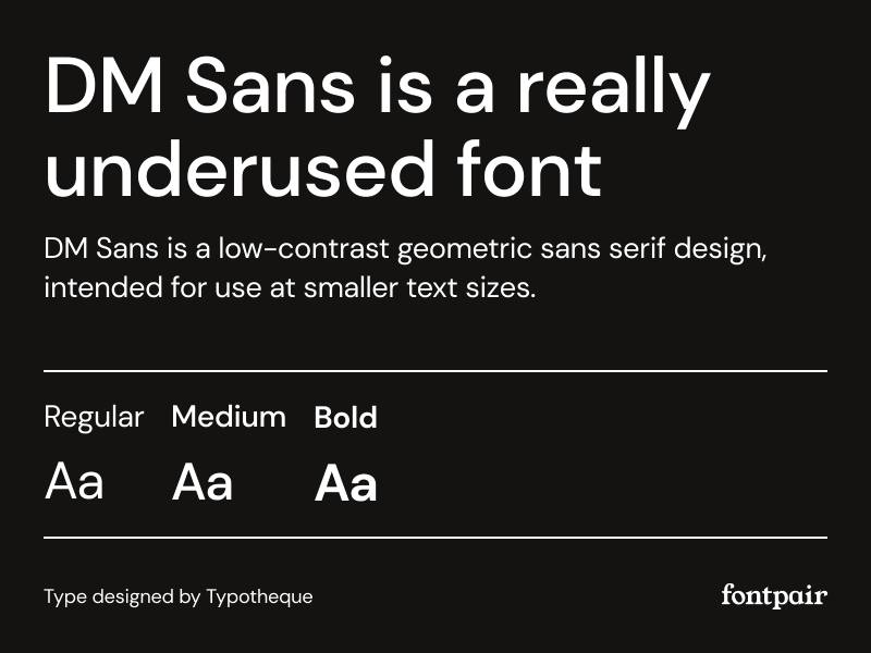
Colophon Foundry designed DM Sans as a geometric grotesque optimized for user interfaces and digital applications.
Design Characteristics
Geometric structure with low-contrast proportions. Consistent stroke weight maintains even texture. Slightly condensed construction improves economy. Open apertures enhance screen legibility. Character details show careful optical refinements for digital display.
Key Differences from Futura
More neutral personality optimized for interface design. Character proportions reflect contemporary UI standards. The lowercase forms use simplified construction balancing geometry and readability. Overall appearance prioritizes function over aesthetic statement.
Best Use Cases
Ideal for user interfaces and mobile apps. Works well in dashboards and SaaS products. Suitable for body text in digital applications. Performs consistently across screen densities. Free licensing drives adoption in product design.
Available Weights & Styles
Available in Regular, Medium, and Bold weights with italic variants. Limited weight range maintains focus on UI applications. Variable font version enables precise weight adjustments.
Pairing Recommendations
Combines with serifs like Lora for editorial contrast. Works alongside itself using weight variations. Pairs with other geometric sans families for layered hierarchies. Self-sufficient for simple interface systems.
Notable Brands Using DM Sans
Popular among UI designers and product teams using Google Fonts. Common in web applications, SaaS products, and digital tools requiring clean functional typography.
Bergen Sans
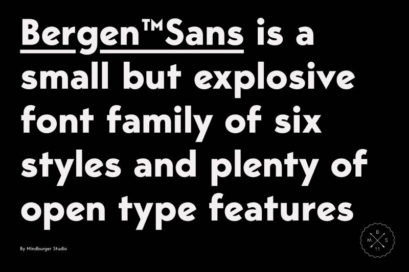
Contemporary geometric sans serif offering Norwegian design sensibility with refined proportions.
Design Characteristics
Geometric structure with Scandinavian restraint. Consistent stroke weight creates clean appearance. Moderate proportions balance efficiency and elegance. Character details show precision without ornamentation. Overall design reflects Nordic design values.
Key Differences from Futura
More neutral personality with contemporary refinements. Character proportions show careful optical adjustments. The lowercase forms use simplified construction balancing geometry and warmth. Overall appearance reads more current and less historically loaded.
Best Use Cases
Suitable for contemporary branding systems. Works well in technology and professional services. Performs across print and digital contexts. Strong choice for corporate identity requiring modern geometric aesthetics without vintage associations.
Available Weights & Styles
Multiple weights from Thin through Black with italic variants. Comprehensive family supports complex hierarchies. Total family provides extensive options for system design.
Pairing Recommendations
Combines with humanist serifs for editorial layouts. Works alongside slab serif fonts for technology applications. Pairs with itself using weight variations. Self-sufficient for complete brand systems.
Notable Brands Using Bergen Sans
Adopted by Scandinavian design studios and contemporary brands. Growing presence in European corporate identity projects requiring modern geometric sans serif aesthetics.
Regime Grotesk
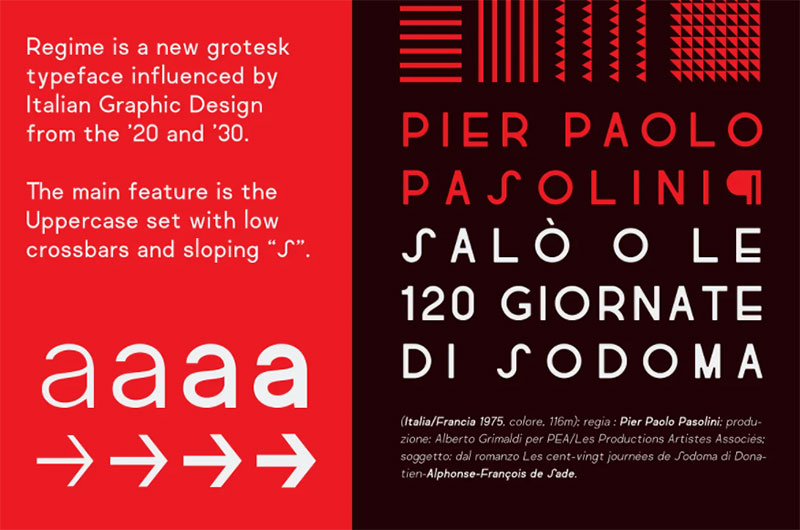
Contemporary geometric sans serif offering distinctive character through refined details and extensive weight range.
Design Characteristics
Geometric foundation with contemporary personality. Consistent stroke weight maintains clean appearance. Distinctive details in select characters create memorable identity. Moderate proportions balance efficiency and character. Overall design shows careful attention to contemporary typographic trends.
Key Differences from Futura
More contemporary personality with distinctive character details. The lowercase forms use simplified construction with unique touches. Stroke terminals show refined contemporary treatment. Overall appearance prioritizes current design trends over historical references.
Best Use Cases
Strong choice for contemporary branding requiring distinctive geometric sans serif. Works well in fashion and lifestyle applications. Suitable for editorial design and cultural institutions. Performs across print and digital contexts. Extensive weight range supports complex hierarchies.
Available Weights & Styles
Comprehensive weight range from Thin through Black with italic variants. Total family provides extensive options for sophisticated typography systems.
Pairing Recommendations
Combines with contemporary serifs for editorial applications. Works alongside display fonts for layered hierarchies. Pairs with itself using weight and style variations. Self-sufficient for complete brand systems.
Notable Brands Using Regime Grotesk
Adopted by design studios and contemporary brands seeking distinctive geometric sans serif character. Growing presence in fashion, culture, and lifestyle branding.
Lorin
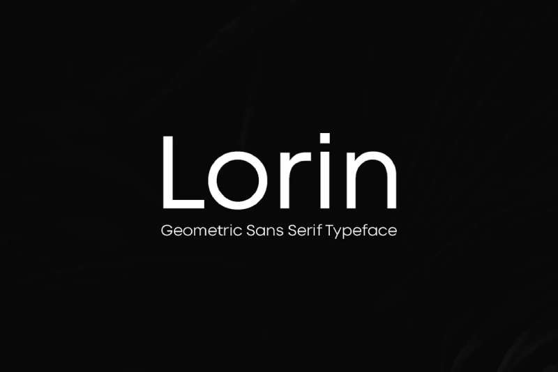
Geometric sans serif offering clean modernist aesthetics with practical refinements for contemporary applications.
Design Characteristics
Geometric structure with contemporary sensibility. Consistent stroke weight creates even texture. Balanced proportions optimize legibility and economy. Character details show careful refinements. Overall design balances geometric purity with practical considerations.
Key Differences from Futura
More balanced proportions create different rhythm. Character details show contemporary refinements absent from Futura’s 1920s design. The lowercase forms use simplified construction with practical adjustments. Overall personality reads more neutral and versatile.
Best Use Cases
Versatile for various branding and design applications. Works well in both print and digital contexts. Suitable for corporate communications and professional materials. Performs across size ranges from body text to display.
Available Weights & Styles
Multiple weights with corresponding italics. Family structure supports hierarchical typography systems. Total style count varies depending on version and foundry.
Pairing Recommendations
Combines with various serif styles depending on project needs. Works alongside other geometric sans serifs for comparative systems. Pairs with itself using weight variations for single-family hierarchies.
Notable Brands Using Lorin
Adopted by designers seeking geometric sans serif alternatives with contemporary character. Usage spans various industries and applications requiring clean modernist aesthetics.
FAQ on Fonts Similar To Futura
What makes a font similar to Futura?
Geometric sans serif construction defines Futura alternatives. Look for circular ‘O’ forms, single-story ‘a’ and ‘g’, uniform stroke weight, and rationalist proportions rooted in 1920s modernist design principles. Typography experts prioritize mathematical precision over organic curves.
Is Avenir better than Futura?
Avenir offers taller x-height and humanist warmth while maintaining geometric structure. It works better for body text and extended reading. Futura excels in display applications requiring pure geometric character. Adrian Frutiger designed Avenir specifically to address Futura’s legibility limitations.
What free fonts look like Futura?
Jost, Spartan, and Montserrat provide closest free alternatives through Google Fonts. Each captures geometric sans serif aesthetics with optimized web rendering. Jost mirrors Futura’s proportions most closely. Licensing restrictions make these ideal for client work and commercial projects.
Does Century Gothic replace Futura effectively?
Century Gothic shares geometric construction but uses significantly wider proportions and lighter stroke weight. Best for friendly branding rather than austere modernism. It comes bundled with Windows systems, making it accessible. The spacious character creates different rhythm than Futura’s compressed forms.
Which Futura alternative works best for logos?
Proxima Nova and Gotham dominate contemporary logo design requiring geometric sans character. Both offer extensive weight ranges and refined proportions. Avenir and Brandon Grotesque provide alternatives with distinctive personality. Consider brand positioning when selecting between cold precision and warm approachability.
Can Helvetica substitute for Futura?
Helvetica belongs to grotesque category rather than geometric classification. Different construction principles create distinct personalities. Helvetica reads neutral and universal while Futura appears designed and geometric. Both work for modernist branding but serve different aesthetic goals rooted in separate graphic design movements.
What’s the difference between geometric and grotesque sans serifs?
Geometric sans serifs use circles and straight lines as structural foundation. Grotesque typefaces evolved from 19th-century letterforms with subtle character width variation. Futura exemplifies geometric construction while Helvetica represents grotesque tradition. Understanding this distinction helps select appropriate typeface alternatives.
Which Futura alternative has the most weights?
Avenir Next and Proxima Nova offer most comprehensive weight ranges with 24+ styles. Extensive families support complex typographic hierarchy in brand systems. Montserrat provides 18 free styles through Google Fonts. Weight variety enables single-family design systems without additional pairing fonts.
Are there variable font versions of Futura alternatives?
Jost, Spartan, Montserrat, and Raleway offer variable font technology enabling infinite weight adjustments. This format improves web performance and provides precise font weight control for responsive design. Original Futura lacks variable version, making alternatives technically superior for modern applications.
What’s the best Futura alternative for web design?
DM Sans and Proxima Nova optimize specifically for digital interfaces and mobile apps. Both offer excellent screen rendering and functional proportions. Free alternatives include Jost and Nunito Sans through Google Fonts. Consider web font optimization and loading performance alongside aesthetics.
Conclusion
Selecting fonts similar to Futura depends on project requirements, licensing budgets, and technical constraints. Free options like Jost and Montserrat deliver geometric sans serif aesthetics for web projects, while premium choices like Avenir and Proxima Nova offer refined proportions and extensive weight ranges for complex brand systems.
Font licensing considerations, visual hierarchy needs, and rendering performance should guide your selection process.
Test candidates across intended applications before committing to ensure proper kerning, leading, and character recognition at target sizes.
The modernist geometry that made Futura iconic in 1927 continues evolving through contemporary typeface design. These alternatives prove Paul Renner’s rationalist principles remain relevant when adapted for digital screens, variable font technology, and current graphic design principles.
If you enjoyed reading this article about fonts similar to Futura, you should check out these articles with fonts similar to Gotham, Garamond, Helvetica, Lato, Times New Roman, Raleway, Bodoni, Roboto, and Optima.

Renowned for his expertise in logo design and visual branding, Bogdan has developed a multitude of logos for various clients.
His skills extend to creating posters, vector illustrations, business cards, and brochures. Additionally, Bogdan's UI kits were featured on marketplaces like Visual Hierarchy and UI8.
He also wrote in the past years on sites like Design Your Way, WebDesignerDepot, WPDean, Designmodo, Speckyboy, Slider Revolution, and more.
- Versatile Georgia Font Pairing for Timeless Layouts - 24 October 2026
- How to Turn Inconsistent UI into One Design System (Without a Full Redesign) - 24 October 2026
- Beautiful Fonts Similar to Poppins You Should Try - 22 October 2026

Bogdan Sandu is a seasoned designer who has been designing websites since 2008. Renowned for his expertise in logo design and visual branding, Bogdan has developed a multitude of logos for various clients. His skills extend to creating posters, vector illustrations, business cards, and brochures. Additionally, Bogdan's UI kits were featured on marketplaces like Visual Hierarchy and UI8. He also wrote in the past years on sites like Design Your Way, WebDesignerDepot, WPDean, Designmodo, Speckyboy, Slider Revolution, and more.
You Might Also Like