Your readers decide whether to stay or leave before they read a single word. That decision happens in milliseconds, and your font is part of it.
Choosing the best fonts for blogs is not a stylistic preference. It directly affects readability, time on page, and how much trust your content earns at first glance.
Most bloggers pick a font because it looks good in a theme preview. That’s the wrong filter. The right filter is how a typeface performs at 16px on a 375px mobile screen, across thousands of words, for a reader who didn’t come to admire your typography.
This guide covers the 10 best blog fonts — serif and sans-serif — with the structural attributes, pairing recommendations, and size guidelines you need to make an informed choice for your specific blog type.
The Best Fonts For Blogs
Blog font choice directly shapes how long readers stay and how much they trust your content. The wrong typeface kills readability. The right one becomes invisible — readers just absorb the text without friction.
A UCF study found that the right font can boost reading speed by 35% without reducing comprehension. That number matters a lot when your goal is time-on-page.
Below are the 10 best fonts for blog typography, each chosen based on structural attributes, not aesthetics alone.
—
Georgia
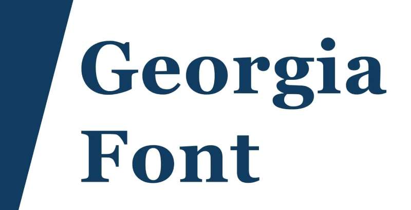
Georgia is a transitional serif typeface designed by Matthew Carter in 1993, released by Microsoft in 1996. It delivers clear, legible body text on low-resolution screens through a high x-height and simplified fine details.
Georgia suits long-form blog body text because its x-height is measurably larger than comparable serifs like Times New Roman, keeping lowercase letters distinct at 14px–18px on screen. The New York Times switched from Times New Roman to Georgia for its digital articles in 2007, citing its superior screen legibility.
What makes Georgia suitable for blogs?
Georgia has a large x-height relative to its cap height, which keeps lowercase characters readable at small display sizes. Its stroke contrast follows the transitional serif model — thick verticals, thin horizontals — but the thin strokes are heavier than in print-first serifs, preventing blurring on screen. Letter-spacing defaults are generous, reducing crowding in dense paragraphs.
Key attributes:
| Attribute | Value |
| Classification | Transitional serif (Scotch Roman) |
| Designer | Matthew Carter, 1993 |
| Weight range | Regular 400, Bold 700 (Georgia Pro adds more) |
| Variable font | No (Georgia Pro: partial) |
| Recommended sizes | 16px–21px body; 28px+ headings |
| License | Free (pre-installed); Georgia Pro: free via Windows 10+ |
| Available on | System font (Windows, macOS); Google Fonts (partial) |
| Price | Free |
How does Georgia perform for blog body text?
Georgia renders cleanly on both Windows ClearType and macOS sub-pixel rendering. Its ball terminals and bracketed serifs hold their form at 16px on standard DPI screens. The limited weight range (Regular and Bold only in the base version) constrains typographic hierarchy, though this is offset by widespread availability and zero loading time as a system font.
What are the best pairings for Georgia in blogs?
Georgia pairs with Verdana for body-to-UI contrast — both were designed by Carter for screen use and share proportional harmony. It pairs with Helvetica for a stronger serif-to-grotesque contrast in editorial layouts where the heading needs more visual weight than the body.
What are the limitations of Georgia for blogs?
The base Georgia family offers only two weights (Regular, Bold), restricting typographic hierarchy without a third font. At sizes above 28px, the stroke contrast becomes visually dated compared to contemporary display serifs like Playfair Display.
Georgia — Recommended Use Cases Within Blog Typography
- Best for: Long-form article body text; editorial news blogs; content-heavy niche sites
- Avoid for: Display headlines above 36px; blogs targeting a contemporary design audience
- Optimal weight: Regular 400 for body; Bold 700 for post titles
- Optimal size range: 16px–21px body text; 32px+ for post headings
—
Merriweather
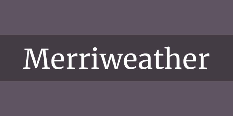
Merriweather is a transitional serif typeface designed by Eben Sorkin, initially released in 2011, available through Google Fonts. It renders long-form text clearly on screens across a wide range of device resolutions.
Merriweather suits blog body text because its x-height is large and its letterforms are slightly condensed, producing a space-efficient layout without sacrificing legibility. It is consistently listed among the top blog fonts on sites with text-dense content.
What makes Merriweather suitable for blogs?
Merriweather uses low stroke contrast relative to other transitional serifs — its thin strokes are heavier than Playfair Display’s — which prevents strokes from disappearing on mid-range DPI screens. Its slightly condensed width lets more characters fit per line at a given font size, reducing line breaks in mobile layouts. Open counters in letters like “e,” “c,” and “a” maintain legibility at 14px.
Key attributes:
| Attribute | Value |
| Classification | Transitional serif |
| Designer | Eben Sorkin, 2011 |
| Weight range | Light 300 – Black 900 (variable font: wght axis) |
| Variable font | Yes (weight + width + optical size axes) |
| Recommended sizes | 16px–20px body; 26px+ headings |
| Letter-spacing default | Slightly wide (aids readability) |
| License | OFL (free, commercial use permitted) |
| Available on | Google Fonts, Adobe Fonts |
| Price | Free |
How does Merriweather perform for long-form blog content?
Merriweather’s variable font version supports optical size adjustment, meaning the letterforms automatically tune for readability at small body sizes versus large display sizes. This makes it especially practical for blogs that reuse the same typeface for both post headings and body paragraphs. The heavier serif terminals stay intact at 14px on both Windows and macOS rendering engines.
What are the best pairings for Merriweather in blogs?
Merriweather pairs with Open Sans for a high-contrast serif-body/sans-heading system, a combination used on numerous content-heavy WordPress blogs. It also pairs with Lato for a warmer, slightly less formal contrast when targeting lifestyle or personal blog audiences.
What are the limitations of Merriweather for blogs?
Merriweather’s slightly condensed letterforms can feel dense in justified text blocks on narrow mobile columns below 320px. The Black weight (900) is too heavy for body text and should be limited to display use only.
Merriweather — Recommended Use Cases Within Blog Typography
- Best for: Body text in content-heavy blogs; informational and educational sites; news blogs
- Avoid for: Decorative headings; blogs with short-form content where a sans-serif would scan faster
- Optimal weight: Regular 400 for body; Bold 700 for subheadings; Black 900 for hero headings only
- Optimal size range: 16px–20px body; 28px–40px headings
—
Lora
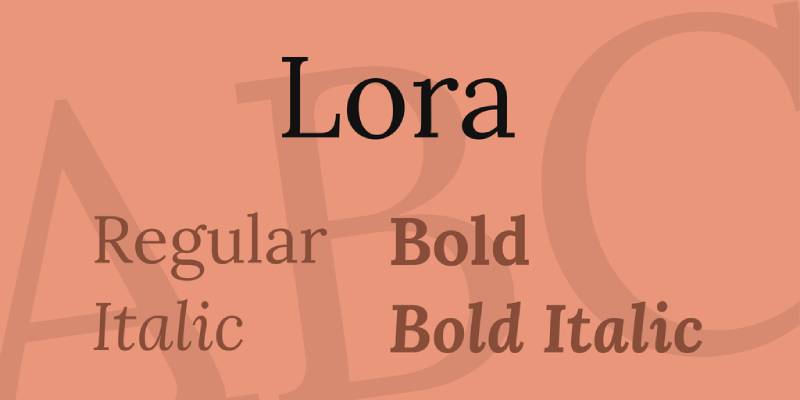
Lora is a calligraphic serif typeface designed by Olga Karpushina for Cyreal, released in 2011 and updated to a variable font family in March 2019. It balances calligraphic character with structural discipline suitable for screen body copy.
Lora works well for blog body text because its moderate stroke contrast and brushed curves maintain personality without compromising legibility at standard web sizes. It ranks among the top 10 most popular serif fonts on Google Fonts, widely used on literary, culture, and editorial blogs.
What makes Lora suitable for blogs?
Lora’s stroke contrast is moderate — not as high as Playfair Display and not as uniform as Merriweather — which keeps it readable at 16px while retaining visible calligraphic character at heading sizes. Its driving serifs (serifs that flow from the stroke rather than sitting perpendicular to it) create a distinct aesthetic that differentiates content visually from generic system serifs. The variable font version gives access to weights from 400 to 700 from a single file.
Key attributes:
| Attribute | Value |
| Classification | Calligraphic serif (contemporary) |
| Designer | Olga Karpushina, Cyreal, 2011 |
| Weight range | Regular 400 – Bold 700 (static); variable: 400–700 wght axis |
| Variable font | Yes (weight axis) |
| Recommended sizes | 16px–20px body; 28px+ headings |
| License | OFL (free, commercial use permitted) |
| Available on | Google Fonts, Font Squirrel, Adobe Fonts |
| Price | Free |
How does Lora perform for blog body text?
Lora renders clearly at 16px on high-DPI screens (Retina, QHD), where its calligraphic details are visible without distortion. On standard 96 DPI Windows screens, the moderate stroke contrast holds — thin strokes do not disappear the way high-contrast serifs like Playfair Display can. The italic style is a genuine calligraphic italic, not a slanted roman, making it effective for pull quotes and emphasized passages.
What are the best pairings for Lora in blogs?
Lora font pairing works especially well with Nunito for warmth-to-warmth body/heading contrast on lifestyle and personal blogs. Pairing Lora body text with Montserrat headings is the more common editorial choice, using geometric contrast against the calligraphic base.
What are the limitations of Lora for blogs?
The static font family covers only Regular and Bold (400, 700), plus their italics, which limits hierarchy options for blogs that need Medium or SemiBold weights. At sizes below 14px, the calligraphic fine details in letters like “g” and “a” begin to blur on standard-DPI displays.
Lora — Recommended Use Cases Within Blog Typography
- Best for: Body text on literary, cultural, lifestyle, and travel blogs
- Avoid for: Tech or SaaS blogs where a sans-serif conveys more appropriate tone; body text below 14px
- Optimal weight: Regular 400 for body; Bold 700 for post titles and H2 headings
- Optimal size range: 16px–19px body; 30px+ headings
—
Playfair Display
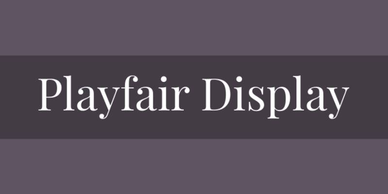
Playfair Display is a transitional serif display font designed by Claus Eggers Sørensen in 2011, available through Google Fonts under OFL. It delivers high-contrast heading typography suited to editorial and fashion-oriented blogs.
Playfair Display is best used for blog headings (H1, H2) rather than body text, because its high stroke contrast — thick verticals against hairline-thin horizontals — becomes illegible below 18px on standard DPI screens. Vogue has featured Playfair Display in editorial layouts, reflecting its positioning in high-end content contexts.
What makes Playfair Display suitable for blogs?
Playfair Display carries a high x-height for a transitional serif, and its short descenders allow tight line-height settings in heading blocks without characters colliding. The high stroke contrast (thick/thin ratio significantly higher than Merriweather) creates strong visual hierarchy when set against a low-contrast sans-serif body font. The variable font version (v2.0, released 2022) adds width and optical size axes, making it more adaptable across heading levels.
Key attributes:
| Attribute | Value |
| Classification | Transitional serif (high contrast) |
| Designer | Claus Eggers Sørensen, 2011 |
| Weight range | Regular 400 – Black 900 |
| Variable font | Yes (v2.0+: weight, width, optical size axes) |
| Optical sizes | Yes — Needlepoint, Hairline, Titling, Display, Headline, Trumpet |
| Recommended sizes | 24px+ headings; avoid below 18px |
| License | OFL (free, commercial use permitted) |
| Available on | Google Fonts, Adobe Fonts, Font Squirrel |
| Price | Free |
How does Playfair Display perform for blog headings?
At 28px and above on high-DPI screens, Playfair Display renders with full stroke contrast visible, creating strong visual stops between heading and body sections. The italic variant includes calligraphic flourishes that work well for pull quotes and article kicker text. On standard 96 DPI Windows rendering, hairline strokes become fragile below 22px — use Regular or Medium weight at smaller heading sizes.
What are the best pairings for Playfair Display in blogs?
Playfair Display font pairing works best with Source Sans Pro for body text — the high-contrast heading against a neutral humanist sans-serif creates strong editorial hierarchy. Pairing it with Georgia body text is a classical approach used in news and literary blogs where a consistent serif tone matters throughout.
What are the limitations of Playfair Display for blogs?
Playfair Display is unsuitable as a body text font — hairline strokes disappear at 16px on standard-DPI screens. It is a heading-only typeface for most blog contexts, which means it always requires a second font for body copy.
Playfair Display — Recommended Use Cases Within Blog Typography
- Best for: Post titles, H2 headings, pull quotes on fashion, lifestyle, food, and editorial blogs
- Avoid for: Body text at any size; tech or B2B blogs where high-contrast serifs feel out of place
- Optimal weight: Regular 400 or SemiBold 600 for headings; Italic for pull quotes
- Optimal size range: 28px–56px for headings; 20px+ for subheadings
—
Open Sans
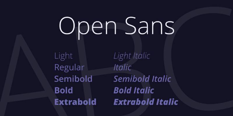
Open Sans is a humanist sans-serif font designed by Steve Matteson, Type Director at Ascender Corp, released in 2011 for Google. It provides neutral, high-legibility body text across a wide weight range.
Open Sans suits blogs that prioritize clean readability over typographic personality, particularly tech, B2B, and informational sites. As of 2018, it was served over 4 billion times daily across more than 20 million websites, making it one of the most widely adopted web fonts globally.
What makes Open Sans suitable for blogs?
Open Sans has wide apertures in letters like “c,” “e,” and “s” — the openings that prevent characters from being misread at small sizes. Its x-height is large relative to its cap height, keeping lowercase text legible at 14px on low-DPI displays. The 2021 variable font update added Hebrew support and expanded the weight range to a continuous axis, reducing HTTP requests when loading multiple weights.
Key attributes:
| Attribute | Value |
| Classification | Humanist sans-serif |
| Designer | Steve Matteson, 2011 |
| Weight range | Light 300 – ExtraBold 800 (6 weights + italics) |
| Variable font | Yes (updated 2021) |
| Recommended sizes | 15px–18px body; 24px+ headings |
| Letter-spacing default | 0 (open, comfortable) |
| License | OFL (free, commercial use permitted) |
| Available on | Google Fonts, Adobe Fonts |
| Price | Free |
How does Open Sans perform as a blog body font?
Open Sans renders consistently across Chrome, Safari, and Firefox on both Windows and macOS due to extensive hinting in the original files. Its neutral character makes it pairable with almost any display serif without visual conflict. The wide apertures maintain legibility on mobile screens at 15px, which is below the typical recommended minimum for serif fonts.
What are the best pairings for Open Sans in blogs?
Open Sans font pairing with Merriweather for headings is one of the most reliable combinations in blog web design — the sturdy serif heading against the neutral sans body creates clear hierarchy without stylistic conflict. Open Sans also pairs with Playfair Display when the blog targets a more editorial or fashion-adjacent audience.
What are the limitations of Open Sans for blogs?
Open Sans lacks strong typographic personality — it functions as a reliable neutral, not a distinctive voice. Blogs that want a recognizable aesthetic or warm character should look at Lato, Nunito, or a serif alternative instead.
Open Sans — Recommended Use Cases Within Blog Typography
- Best for: Body text on tech, B2B, educational, and high-traffic informational blogs
- Avoid for: Blogs where tone and personality matter more than neutrality (lifestyle, personal, creative)
- Optimal weight: Regular 400 for body; SemiBold 600 for subheadings; Bold 700 for post titles
- Optimal size range: 15px–18px body; 24px–40px headings
—
Roboto
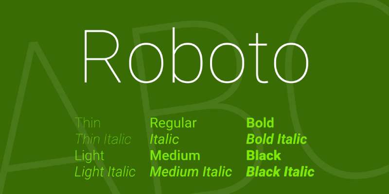
Roboto is a neo-grotesque sans-serif typeface designed by Christian Robertson, released by Google in 2011 as the system font for Android 4.0. It delivers mechanically consistent letterforms with humanist curve details suited to interface-oriented and content blogs.
Roboto works for blog typography because it is the default font in Google’s Material Design system and pre-loaded in most Android browsers, reducing font loading latency for mobile audiences. It is the most popular font on Google Fonts, used on hundreds of millions of websites.
What makes Roboto suitable for blogs?
Roboto’s letterforms are slightly wider than geometric sans-serifs like Futura, which improves per-character legibility on narrow mobile columns. Its six static weights (Thin 100 through Black 900) provide enough range to establish clear typographic hierarchy within a single-font blog system. The neo-grotesque structure gives uniform stroke widths across most letters, which maintains even text color in long paragraphs.
Key attributes:
| Attribute | Value |
| Classification | Neo-grotesque sans-serif |
| Designer | Christian Robertson, Google, 2011 |
| Weight range | Thin 100 – Black 900 (variable: Roboto Flex, 12 axes) |
| Variable font | Yes (Roboto Flex: 12 axes including optical size) |
| Recommended sizes | 14px–18px body; 22px+ headings |
| Letter-spacing default | 0 (comfortable, not tight) |
| License | OFL (most versions); Apache 2.0 (older versions) |
| Available on | Google Fonts, Adobe Fonts; system font on Android, Chrome OS |
| Price | Free |
How does Roboto perform for blog readability?
Roboto’s humanist open curves in letters like “C,” “G,” and “S” keep characters distinct at 14px on Android’s range of screen densities (160–640 DPI). On desktop, Roboto Regular at 16px–18px produces comfortable line texture in long blog posts. The Roboto Flex variable font supports an optical size axis, which automatically adjusts letter spacing and proportions between body and display sizes.
What are the best pairings for Roboto in blogs?
Roboto font pairing with Lora for headings creates a clean sans-serif body against calligraphic serif headings — a combination common in tech and developer blogs that want some editorial warmth. Roboto also pairs with Merriweather in the reverse configuration (Merriweather body, Roboto headings) for a more structured, utilitarian blog layout.
What are the limitations of Roboto for blogs?
Roboto’s neo-grotesque character lacks the warmth of humanist sans-serifs like Lato or Nunito. For blogs targeting casual or personal audiences, this neutrality can feel clinical rather than inviting. Roboto’s true italics are oblique styles (slanted romans), not genuine italics, which limits expressive styling in long-form prose.
Roboto — Recommended Use Cases Within Blog Typography
- Best for: Tech blogs, developer blogs, mobile-first blogs, Android-centric content sites
- Avoid for: Lifestyle, personal, or creative blogs where tone and warmth are key
- Optimal weight: Regular 400 for body; Medium 500 for subheadings; Bold 700 for post titles
- Optimal size range: 14px–18px body; 22px–38px headings
—
Lato
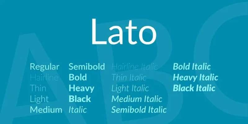
Lato is a humanist sans-serif typeface designed by Łukasz Dziedzic of tyPoland, released in December 2010 under the SIL Open Font License. It provides warm, approachable body text through semi-rounded details and classical uppercase proportions.
Lato suits lifestyle, personal, and general-purpose blogs because its “serious but friendly” character (Dziedzic’s own description) maintains professionalism without the clinical neutrality of geometric or neo-grotesque alternatives. As of 2018, Lato was used on more than 9.6 million websites and served over 1 billion views per day via Google Fonts.
What makes Lato suitable for blogs?
Lato has semi-rounded terminals on letters like “a,” “c,” and “t” that introduce subtle warmth without the full roundness of fonts like Nunito. Its classical uppercase proportions — particularly visible in wide capitals like “M” and “W” — give it a professional baseline that distinguishes it from softer rounded alternatives. The weight range spans Hairline to Black (nine weights), which is broader than Open Sans and supports fine-grained typographic hierarchy.
Key attributes:
| Attribute | Value |
| Classification | Humanist sans-serif |
| Designer | Łukasz Dziedzic, tyPoland, 2010 |
| Weight range | Hairline – Black (9 weights + italics in Lato 2.0) |
| Variable font | No (static files only on Google Fonts) |
| Recommended sizes | 15px–18px body; 24px+ headings |
| License | OFL (free, commercial use permitted) |
| Available on | Google Fonts (v1.0), Adobe Fonts (v2.0 via Typekit) |
| Price | Free |
How does Lato perform for blog body text?
Lato Regular renders cleanly at 15px–18px on both high and standard DPI screens. Its semi-rounded terminals reduce the visual harshness of fully geometric sans-serifs at reading sizes, producing a slightly warmer text color in long paragraphs. The Thin and Light weights are fragile below 14px on Windows rendering — use Regular 400 as the minimum for body copy.
What are the best pairings for Lato in blogs?
Lato font pairing with Merriweather headings is a common and reliable blog combination — the warm sans body against the sturdy serif heading creates clear visual contrast. Lato also pairs with Playfair Display for a more editorial feel, using Lato’s warmth to soften the high-contrast heading.
What are the limitations of Lato for blogs?
Google Fonts hosts Lato v1.0, not the expanded v2.0 (2,300+ glyphs, four additional weights). Blogs needing full extended Latin or Cyrillic coverage must load Lato from Adobe Fonts or self-host v2.0 files. Lato is not available as a variable font, which means each weight requires a separate file and HTTP request.
Lato — Recommended Use Cases Within Blog Typography
- Best for: Body text on lifestyle, personal, food, parenting, and general-interest blogs
- Avoid for: Blogs that need extended multilingual support beyond basic Latin from Google Fonts
- Optimal weight: Regular 400 for body; Bold 700 for headings; Light 300 for large captions
- Optimal size range: 15px–18px body; 26px–42px headings
—
Inter

Inter is a humanist sans-serif typeface designed by Rasmus Andersson (formerly at Figma), first published in 2017 with a major v4.0 release in 2023 adding variable font support. It is built for screen readability with a large x-height and wide apertures.
Inter suits tech and developer blogs because its character set includes tabular figures by default — a detail that matters for content with inline data, code comparisons, or pricing tables. GitHub, Figma, and Mozilla all use Inter as their primary UI typeface, making it a credible default for technically oriented content.
What makes Inter suitable for blogs?
Inter has one of the largest x-heights among sans-serif web fonts, keeping lowercase text distinct and readable at 13px–14px in dense layouts. Its wide apertures — measurably open in “c,” “e,” “a,” and “s” — reduce character misreads at small sizes on both high and standard DPI displays. The v4.0 variable font includes weight, slant, and optical size axes, allowing a single font file to cover all hierarchy levels.
Key attributes:
| Attribute | Value |
| Classification | Humanist sans-serif |
| Designer | Rasmus Andersson, 2017 (v4.0: 2023) |
| Weight range | Thin 100 – Black 900 (9 weights) |
| Variable font | Yes (v4.0: weight, slant, optical size) |
| Recommended sizes | 13px–18px body; 22px+ headings |
| Letter-spacing default | 0 (optimized; contextual alternates auto-adjust) |
| License | OFL (free, commercial use permitted) |
| Available on | Google Fonts, rsms.me/inter (self-host), Adobe Fonts |
| Price | Free |
How does Inter perform for blog readability?
Inter includes contextual alternates that automatically switch letter forms in situations where similar characters could be confused (e.g., uppercase “I,” lowercase “l,” numeral “1”). This feature is particularly useful in blogs that publish code snippets or technical data inline. At 16px on Retina displays, Inter renders with sharp, high-contrast edges that suit minimalist blog designs.
What are the best pairings for Inter in blogs?
Inter font pairing with Playfair Display for post headings creates a high-contrast editorial pairing suited to tech and startup blogs that want a more polished feel. Inter also pairs with Source Serif Pro for a clean sans/serif combination common in developer documentation and technical blogs.
What are the limitations of Inter for blogs?
Inter’s design priority is UI and interface legibility, not extended reading comfort — at sizes above 20px in long paragraphs, the large x-height can feel dense compared to fonts with more generous line height defaults like Lato or Open Sans. Inter’s personality is minimal, which suits tool-focused blogs but can feel cold on content-first sites.
Inter — Recommended Use Cases Within Blog Typography
- Best for: Tech, developer, SaaS, fintech, and data-driven blogs; content with inline code or figures
- Avoid for: Long-form prose-heavy blogs where warmth and reading comfort outweigh neutrality
- Optimal weight: Regular 400 for body; Medium 500 for subheadings; Bold 700 for post titles
- Optimal size range: 14px–17px body; 22px–40px headings
—
Nunito

Nunito is a rounded terminal sans-serif typeface designed by Vernon Adams, available through Google Fonts under OFL. It delivers approachable, friendly body text through fully rounded terminals across all stroke endings.
Nunito suits personal blogs, parenting sites, wellness content, and any blog where a welcoming tone is a priority. Its rounded terminals (distinct from the semi-rounded details in Lato) give it a visually softer character that differentiates it from neutral workhorse fonts.
What makes Nunito suitable for blogs?
Nunito’s stroke widths are harmonious — thin and thick strokes vary less than in humanist fonts like Lato or Open Sans — which produces an even text color in long paragraphs. The full rounding of all terminals (rather than just select letters) creates a consistent visual rhythm. Nunito supports weights from Light 200 to Black 900, giving more range than many rounded alternatives.
Key attributes:
| Attribute | Value |
| Classification | Rounded terminal sans-serif |
| Designer | Vernon Adams |
| Weight range | Light 200 – Black 900 (variable font available) |
| Variable font | Yes |
| Recommended sizes | 15px–18px body; 24px+ headings |
| License | OFL (free, commercial use permitted) |
| Available on | Google Fonts, Adobe Fonts |
| Price | Free |
How does Nunito perform for blog body text?
Nunito Regular renders clearly at 16px on both mobile and desktop screens. The rounded terminals do not cause spacing issues at standard body sizes — they become visually prominent above 24px, where the rounded style adds character to headings. The ExtraBold and Black weights work well for post titles on blogs targeting a friendly, casual audience.
What are the best pairings for Nunito in blogs?
Nunito font pairing with Lora for headings works well on personal and lifestyle blogs — the calligraphic serif heading against the rounded sans body creates warmth-to-warmth contrast without clashing. Nunito also pairs with Merriweather for a slightly more structured editorial approach while preserving the warm body tone.
What are the limitations of Nunito for blogs?
The fully rounded terminals make Nunito unsuitable for formal, authoritative, or B2B blog contexts where a more neutral or structured sans-serif reads as more credible. At Light 200 and ExtraLight 300 weights, thin strokes become fragile on standard-DPI Windows screens below 15px.
Nunito — Recommended Use Cases Within Blog Typography
- Best for: Personal blogs, parenting sites, wellness and mental health blogs, creative portfolio blogs
- Avoid for: B2B, finance, legal, or tech blogs where tone formality matters
- Optimal weight: Regular 400 for body; SemiBold 600 for subheadings; Bold 700 for post titles
- Optimal size range: 15px–18px body; 26px–44px headings
—
Charter
Charter is a transitional serif typeface designed by Matthew Carter in 1987, originally released by Bitstream. It is optimized for low-resolution output devices and remains widely used on high-traffic editorial blogs and publications.
Charter suits blogs that publish long-form content where body text reading comfort over thousands of words is the primary concern. Research across the top 50 most popular global blogs found Charter to be the most commonly used serif typeface among major publications, appearing on sites including Men’s Health and Cosmopolitan’s digital editions.
What makes Charter suitable for blogs?
Charter was designed for legibility at low resolutions — originally for early laser printers — which translates directly to strong screen performance at 16px on standard-DPI displays. Its stroke contrast is lower than typical transitional serifs (thinner strokes are heavier relative to thick strokes), keeping fine details intact at small sizes. The wide letter spacing default creates generous text color across paragraphs, reducing eye strain in long reading sessions.
Key attributes:
| Attribute | Value |
| Classification | Transitional serif (screen-optimized) |
| Designer | Matthew Carter, 1987 (Bitstream) |
| Weight range | Regular, Bold, Black (+ italics) |
| Variable font | No |
| Recommended sizes | 16px–20px body; 28px+ headings |
| License | Bitstream Charter: Free (open license); XCharter (OFL derivative): Free |
| Available on | Bitstream direct; XCharter on CTAN, Font Squirrel; not on Google Fonts |
| Price | Free (Bitstream Charter open license) |
How does Charter perform for long-form blog reading?
Charter’s robust serifs and lower stroke contrast hold up well on both standard and high-DPI screens without hinting adjustments. Its wider letter spacing default produces comfortable paragraph texture in 600px–750px content columns. Medium remains the only missing mid-weight — Charter provides Regular, Bold, and Black — which is limiting for blogs that want a three-level serif hierarchy.
What are the best pairings for Charter in blogs?
Georgia and Charter share a transitional serif heritage and are sometimes used together across headline/body levels on editorial sites. For a sans-serif pairing, Inter provides a high-contrast, screen-optimized companion that matches Charter’s serious, editorial tone without visually competing with its serifs.
What are the limitations of Charter for blogs?
Charter is not available on Google Fonts, which increases implementation effort for WordPress and web-builder users who rely on the Google Fonts CDN. The static font family has no variable font version, and the weight range (Regular, Bold, Black) lacks a Medium or SemiBold option.
Charter — Recommended Use Cases Within Blog Typography
- Best for: Long-form editorial body text; news blogs; magazine-style content sites with self-hosted font control
- Avoid for: Blogs relying on Google Fonts CDN; platforms without font self-hosting capability
- Optimal weight: Regular 400 for body; Bold 700 for post titles; Black for hero text
- Optimal size range: 16px–20px body; 30px+ headings
—
How to Choose the Right Font for Your Blog
The right font depends on three variables: your content format, your audience, and your platform constraints. None of these work in isolation.
Short-form content (news, quick tips, listicles) reads faster in sans-serif fonts with open apertures — Open Sans, Inter, Lato. Long-form articles (3,000+ words) benefit from the natural reading rhythm that serif fonts provide — Georgia, Merriweather, Charter, Lora.
Platform matters too. Google Fonts is free and fast, but Charter isn’t on it. If you’re on WordPress with a theme editor, WordPress font options vary by theme. Self-hosting gives more control but requires manual WOFF2 file management and caching setup.
Pairing fonts effectively comes down to contrast. Serif heading + sans-serif body is the most reliable system. Two fonts from the same classification often look similar enough to seem unintentional. Use a font pairing generator if you want to visualize combinations before committing to a system.
Also consider font spacing — tracking and line-height affect readability as much as the typeface itself. Most body fonts read best between 1.5x–1.7x line-height at 16px–18px. Tight spacing at small sizes is one of the fastest ways to lose readers on mobile.
Finally, check font licensing before deploying to a commercial blog. OFL fonts (most Google Fonts) permit commercial use without restriction. Some premium fonts require a web license tied to monthly page view thresholds — this matters if your blog scales.
Quick reference by blog type:
| Blog Type | Best Body Font | Best Heading Font |
| Tech / Developer | Inter, Roboto | Playfair Display, Inter Bold |
| Editorial / News | Charter, Merriweather | Playfair Display, Georgia Bold |
| Lifestyle / Personal | Lato, Nunito | Lora, Playfair Display |
| Food / Travel | Lora, Georgia | Playfair Display, Lato Bold |
| B2B / SaaS | Open Sans, Roboto | Inter, Merriweather |
| General Purpose | Open Sans, Lato | Merriweather, Georgia |
What Makes a Font Suitable for a Blog?
Not every typeface that looks good in a logo or poster works for long-form reading. Blog typography operates under specific screen constraints that filter out most display and decorative options before you even start.
A UCF study found that font choice alone can improve reading speed by 35% without reducing comprehension — which is a bigger UX variable than most bloggers account for.
| Attribute | Why It Matters for Blogs | Minimum Threshold |
| X-height | Lowercase legibility at 16px | Medium to high |
| Stroke contrast | Thin strokes must survive screen rendering | Low to moderate |
| Weight range | Hierarchy without a second font | 3+ weights minimum |
| Letter-spacing | Text density in narrow mobile columns | Default 0 or slightly wide |
How does x-height affect blog readability on mobile?
X-height is the height of lowercase letters relative to uppercase. A high x-height keeps “a,” “e,” “c,” and similar characters visually large at small sizes, which is the primary variable in legibility on 320px–375px mobile screens.
Georgia’s x-height is measurably larger than Times New Roman’s at the same point size. That structural difference is why Georgia became the default for major publications like The New York Times when they moved content online, while Times New Roman stayed in print.
Mobile devices account for 60–65% of all global web traffic in 2024 (StatCounter). A font that breaks down at 16px on a 375px viewport is failing the majority of your readers.
Fonts with high x-heights suited for blog mobile reading:
- Georgia (transitional serif, designed for screen)
- Merriweather (slightly condensed, open counters)
- Inter (widest apertures in its class)
- Open Sans (humanist, high x-height by design)
What is the difference between a body font and a display font for blogs?
Body fonts are optimized for continuous reading at 16px–21px. Low stroke contrast, open counters, generous spacing. Built for thousands of words.
Display fonts are optimized for impact at 28px+. High stroke contrast, tight spacing, distinctive details. Built for headlines and pull quotes — not paragraphs.
Playfair Display is the clearest example of this split in blog typography. Its hairline strokes disappear at 16px on standard Windows DPI screens, making it a heading-only choice despite being one of the most popular typefaces on Google Fonts.
Using a display font as body text is the most common typography mistake on content blogs. The fix is simple: keep display fonts above 24px and use a purpose-built body font for everything else.
—
How Do Serif and Sans-Serif Fonts Perform Differently in Blog Typography?
An analysis of 1,000 websites found that 85% use sans-serif fonts as their primary web typeface (Toner Buzz, 2024). But that statistic covers all websites, including apps, dashboards, and e-commerce — not specifically long-form content blogs, where serif performance is considerably stronger.
The right choice depends on content format, not trend.
When does a serif font outperform a sans-serif for blog body text?
Research on computer screen reading shows that font type affects reading speed on screens (but not in print), and that serif fonts can outperform sans-serifs in reading accuracy for long passages.
The structural reason: serif terminals create horizontal flow along the text line. In long paragraphs above 200 words, that flow reduces eye fatigue by giving the eye a path to follow rather than individual letter forms to decode.
Serif wins for: articles over 800 words, editorial blogs, literary and culture content, any format where retention matters more than speed.
Sans-serif wins for: scannable posts, listicles, how-to guides, technical content where readers jump between sections rather than read linearly.
Medium uses a 21px body size with a serif default on long articles. That choice is deliberate — their internal data consistently pointed to longer time-on-page when readers stayed in a serif environment for extended articles.
Which font classification suits tech and B2B blogs versus editorial and lifestyle blogs?
The classification match isn’t about aesthetics — it’s about what the font signals structurally at first glance.
| Blog Type | Recommended Classification | Example Fonts |
| Tech / Developer | Neo-grotesque or humanist sans-serif | Inter, Roboto |
| Editorial / News | Transitional serif | Charter, Merriweather, Georgia |
| Lifestyle / Personal | Humanist sans-serif or calligraphic serif | Lato, Lora, Nunito |
| Fashion / Culture | High-contrast transitional serif (headings) | Playfair Display + Open Sans |
The rendering difference between Windows ClearType and macOS sub-pixel antialiasing also plays a role here. High-contrast serifs like Playfair Display render with visible hairline strokes on macOS Retina — those same strokes can fragment on Windows at 96 DPI, which affects which fonts you can safely deploy without browser-specific fallbacks.
—
What Font Size and Spacing Standards Apply to Blog Typography?
Font selection and font size are separate decisions. A well-chosen typeface set at the wrong size or line height reads worse than a mediocre typeface set correctly.
The median font size across websites is 14px (Dribbble data via Toner Buzz, 2024). That number is too small for long-form blog reading. The ODPHP health literacy standard recommends a minimum of 16px (12pt) for body text on screen, with 19px+ suggested for older audiences.
Body size and line-height targets for blogs
Body text: 16px minimum, 18px–21px optimal for long-form. Most high-traffic editorial blogs (Medium, Substack, The New York Times digital) use 18px–21px.
Line-height: 1.5x–1.7x for body paragraphs. Tighter at 1.2x–1.4x for display headings. Below 1.4x in body copy, lines merge visually at paragraph length — especially on narrow mobile columns.
Characters per line: 60–75 characters for desktop columns. At 375px mobile width and 16px body size, most fonts land at 45–55 characters per line, which is acceptable. Justifying text on mobile almost always creates irregular word gaps — left-aligned is the correct default.
Optimizing spacing can make smaller characters up to 20% easier to read compared to default settings, according to research published in the International Journal of Research and Innovation in Social Science, citing inter-letter spacing studies by Arditi (2004).
Letter-spacing adjustments by weight and use case
Letter-spacing defaults are set for the Regular weight. Bold and Black weights need less tracking; Light and Thin weights often need more.
- Uppercase headings: add +0.02em–+0.05em to prevent crowding in all-caps labels
- Body Regular 400: default 0 (do not adjust unless the font explicitly needs it)
- Light/ExtraLight weights below 14px: add +0.01em–+0.02em for screen rendering clarity
Variable fonts handle this automatically through the optical size axis. When a font with an opsz axis is set, the browser adjusts letter spacing, contrast, and weight proportions based on the current rendered size — removing the need for manual tracking adjustments at each heading level.
—
How Does Font Pairing Work in Blog Design?
Font pairing is a structural decision, not an aesthetic one. The goal is creating clear visual hierarchy — readers should be able to identify headings, subheadings, and body text instantly without consciously thinking about it.
Most blogs use 2 typefaces. Three is the practical ceiling. Beyond three, file loading increases and visual coherence drops without a clear benefit.
What pairing structures work for editorial and news blogs?
Editorial blogs prioritize authority and reading comfort over personality. The pairing formula that consistently works here: transitional serif headings + neutral sans-serif body.
The contrast axis is stroke classification (serif vs. sans), not weight. Both fonts should sit at similar x-heights so the shift between heading and body doesn’t feel like a scale jump.
Standard editorial pairings:
- Charter headings + Inter body (high-authority news aesthetic)
- Georgia headings + Open Sans body (classic web editorial, used widely since 2010s)
- Playfair Display headings + Source Sans Pro body (magazine-style, fashion-adjacent)
The reverse configuration — sans heading + serif body — also works for editorial blogs that want a more modern feel. Roboto or Inter headings with Merriweather body text is the most common execution of this approach in tech editorial and developer blogs.
What pairing structures work for personal, lifestyle, and food blogs?
Warmth-to-warmth contrast is the operating principle here. Both fonts should carry some visual softness — avoiding the clinical neutrality of geometric sans-serifs paired with cold display serifs.
Recommended pairings by tone:
- Personal / casual: Nunito (body) + Lora (headings) — rounded terminals against calligraphic serif
- Food / travel: Lato (body) + Playfair Display (headings) — humanist warmth anchors the high-contrast heading
- Wellness / parenting: Nunito (body and headings, weight contrast only) — single-font system with ExtraBold headings against Regular body
A single-font system using weight contrast (Regular body vs. Bold or Black headings) is underused in lifestyle blogging. When the font has enough weight range — Lato has 9 weights, Nunito has 8 — it eliminates the pairing problem entirely and reduces font file loading to one HTTP request.
Use a font pairing generator to visualize weight contrast within a single family before committing to a two-font system that adds load overhead without clear typographic benefit.
—
What Technical Factors Affect Blog Font Performance?
Font choice affects load time, Core Web Vitals scores, and in some cases legal compliance. These are implementation decisions that follow font selection, but they constrain which fonts are practical to deploy on high-traffic blogs.
Unoptimized fonts can add 500ms–2,000ms to page load times (font-converters.com, 2026). That range covers the difference between a blog that passes Core Web Vitals and one that fails LCP.
How does font loading method affect blog page speed?
WOFF2 is the standard. It is used on 81% of desktop websites as of 2024, up from 78% in 2022 (HTTP Archive Web Almanac 2024). WOFF2 compresses approximately 30% better than WOFF1 due to Brotli versus GZIP compression — that difference translates directly to faster first-paint times.
Three loading methods, ranked by performance:
- System font stack: Zero network requests, zero CLS, zero loading time. No design control.
- Self-hosted WOFF2: Full caching control, no external DNS resolution, GDPR-compliant. Adds 1–3 HTTP requests.
- Google Fonts CDN: Zero setup, but adds 500ms–1,000ms latency from external DNS resolution and SSL negotiation (Agence Web Performance, 2023).
Variable fonts reduce this further. About 33% of websites now use variable fonts (Web Almanac 2024), up from 20% in 2022. A single variable WOFF2 file replaces 6–8 static weight files, cutting HTTP requests and reducing total font payload by 60–80%.
What font licenses apply to commercial blogs?
License type is the most consistently overlooked factor in blog font selection. Most bloggers discover license restrictions after deployment, not before.
| License Type | Commercial Use | Common Fonts |
| OFL (SIL Open Font License) | Yes, no restrictions | Most Google Fonts, Lora, Merriweather, Inter |
| Bitstream open license | Yes, no restrictions | Charter (Bitstream Charter) |
| Web font license (commercial) | Yes, with page view limits | Many Adobe Fonts, premium foundry fonts |
| Desktop-only license | No (web use requires separate license) | Some premium display fonts |
OFL fonts cover the overwhelming majority of practical blog needs. Every font covered in this article is either OFL or an open license equivalent. The only common trap is downloading a font from a third-party aggregator where the OFL-licensed version has been modified — always pull OFL fonts from the original source (Google Fonts, the foundry’s GitHub, or Font Squirrel’s verified library).
For more on how licensing works across use cases, the font licensing guide covers web, desktop, commercial, and embedding restrictions in detail.
FAQ on The Best Fonts For Blogs
What is the best font for a blog?
There is no single best font. For long-form content, Georgia and Merriweather lead on readability. For tech or B2B blogs, Inter and Open Sans perform better. Match the font to your content format and audience, not to visual preference.
What font size should I use for blog body text?
Use a minimum of 16px for body text. Most high-traffic editorial blogs, including Medium, use 18px–21px. The ODPHP health literacy standard recommends at least 16px for on-screen reading, with 19px suggested for broader audiences.
Should I use a serif or sans-serif font for my blog?
Use a serif font for long-form, editorial, or literary blogs. Use sans-serif for tech, B2B, or scannable content. Research shows serif fonts improve reading accuracy in extended text passages on screens, while sans-serifs aid faster scanning.
What is the best Google Font for a blog?
Merriweather is the strongest Google Font for blog body text. It was designed specifically for screen readability, has a large x-height, and supports a full weight range from Light to Black. Lora is the best calligraphic serif option.
How many fonts should a blog use?
Two fonts is the standard. One for headings, one for body text. Three is the practical ceiling. Beyond that, loading overhead increases and visual coherence drops. A single font with a wide weight range can replace a two-font system entirely.
What font do most professional blogs use?
Charter is the most common serif among top-traffic editorial blogs. A study of the 50 most popular global blogs found Charter used more than any other typeface. Inter and Open Sans dominate among tech and B2B content sites.
What is the best font pairing for a blog?
Playfair Display headings with Open Sans body text works well for editorial and lifestyle blogs. For tech content, Inter headings with Merriweather body is a reliable combination. The rule is simple: contrast the classifications, match the x-heights.
Does font choice affect blog SEO?
Indirectly, yes. Font loading affects Core Web Vitals, particularly LCP and CLS. Poorly loaded fonts add 500ms–2,000ms to page load times. Time on page and bounce rate, both influenced by readability, are behavioral signals Google uses in ranking.
What is the best font for a WordPress blog?
Open Sans, Merriweather, and Lato are the most widely used WordPress fonts across popular themes. All three are available through Google Fonts, load efficiently via CDN, and cover enough weight range to handle full typographic hierarchy without a second typeface.
Are variable fonts better for blogs?
Yes, for performance. A single variable font file replaces 6–8 static weight files, cutting HTTP requests significantly. About 33% of websites use variable fonts as of 2024 (Web Almanac). Merriweather, Inter, and Lora all have variable font versions available.
Conclusion
This conclusion is for an article presenting the best fonts for blogs, and the core takeaway is straightforward: typeface selection is a structural decision, not a decorative one.
Georgia and Charter handle long-form editorial content. Inter and Roboto suit tech and B2B. Lora and Nunito bring warmth to personal and lifestyle writing.
Get the body font right first. Set it at 16px minimum, pair it with a contrasting heading typeface, and serve it in WOFF2 format to keep load times clean.
Web typography rewards consistency. Two well-chosen fonts with proper line-height and letter-spacing outperform six poorly implemented ones every time.
Pick your font based on your readers, your content format, and your rendering environment. Everything else follows from that.

Renowned for his expertise in logo design and visual branding, Bogdan has developed a multitude of logos for various clients.
His skills extend to creating posters, vector illustrations, business cards, and brochures. Additionally, Bogdan's UI kits were featured on marketplaces like Visual Hierarchy and UI8.
He also wrote in the past years on sites like Design Your Way, WebDesignerDepot, WPDean, Designmodo, Speckyboy, Slider Revolution, and more.
- Versatile Georgia Font Pairing for Timeless Layouts - 24 October 2026
- How to Turn Inconsistent UI into One Design System (Without a Full Redesign) - 24 October 2026
- Beautiful Fonts Similar to Poppins You Should Try - 22 October 2026

Bogdan Sandu is a seasoned designer who has been designing websites since 2008. Renowned for his expertise in logo design and visual branding, Bogdan has developed a multitude of logos for various clients. His skills extend to creating posters, vector illustrations, business cards, and brochures. Additionally, Bogdan's UI kits were featured on marketplaces like Visual Hierarchy and UI8. He also wrote in the past years on sites like Design Your Way, WebDesignerDepot, WPDean, Designmodo, Speckyboy, Slider Revolution, and more.
You Might Also Like