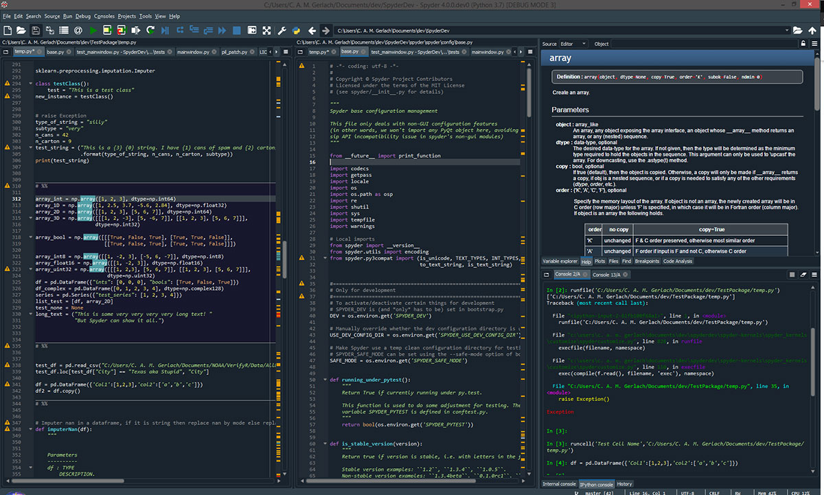
Your font choice is doing more damage than you think.
Most developers spend 8+ hours a day staring at a code editor, yet the default monospace font that shipped with their IDE gets zero scrutiny. The wrong typeface makes 0 and O indistinguishable, turns l and 1 into the same glyph, and builds up real eye strain over long sessions.
Picking the best fonts for coding isn’t about aesthetics. It’s about character disambiguation, rendering quality, ligature support, and how your font behaves across editors like VS Code, Neovim, and JetBrains IDEs.
This guide covers 10 programming fonts that actually hold up under real conditions, plus what to look for in terms of variable font support, platform rendering, licensing, and how to match the right typeface to your specific setup.
The Best Fonts for Coding
Picking a monospaced font for your editor is one of those decisions that feels minor until you’ve spent eight hours staring at the wrong one. The fonts below are chosen based on character disambiguation, weight range, ligature support, rendering quality, and license terms.
No decorative typefaces here. No display fonts or script fonts. Just fixed-width typefaces that actually hold up under real coding conditions.
—
Fira Code
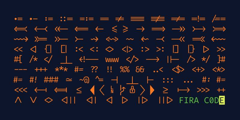
Fira Code is a monospace typeface designed by Nikita Prokopov in 2014, extending the Fira Mono font originally commissioned by Mozilla. It delivers programming ligatures that visually merge multi-character operators into single glyphs.
Fira Code suits long coding sessions because its ligature system reduces the number of individual symbols the eye needs to process per line. VS Code, Neovim, and most JetBrains IDEs support it out of the box.
What makes Fira Code suitable for coding?
Fira Code uses a variable weight axis and includes over 100 programming-specific ligatures for sequences like !=, =>, and ===. Its letterforms use moderate stroke contrast with open counters, keeping characters distinct at sizes as small as 11px. The slashed zero and clearly differentiated 1/l/I glyphs reduce misreads in dense syntax.
Key attributes:
| Attribute | Value |
| Classification | Monospace sans-serif |
| Designer | Nikita Prokopov, 2014 |
| Weight range | Light 300 – Bold 700 (variable) |
| Variable font | Yes |
| Recommended sizes | 12px–16px for editors |
| License | OFL 1.1 – free for commercial use |
| Available on | GitHub (free), Adobe Fonts, Google Fonts |
| Price | Free |
How does Fira Code perform in coding environments?
Fira Code renders clearly on both retina and standard displays. Its ligature rendering requires editor-level OpenType support (setting "fontLigatures": true in VS Code), meaning it may render as individual characters in editors without that support. At 12px–13px in dark mode, glyphs remain sharp and well-spaced.
What are the best pairings for Fira Code in coding?
Fira Code pairs with Inter for UI documentation because the humanist proportions complement each other without competing. It works with Source Serif 4 for README files or technical documentation where a contrast between code blocks and body text helps visual hierarchy.
What are the limitations of Fira Code for coding?
Ligatures require explicit editor configuration and do not render in all terminal emulators. Some developers find the ligature rendering disorienting because it creates a visual mismatch between what appears on screen and the actual characters in the file.
Fira Code – Recommended Use Cases Within Coding
- Best for: VS Code, Neovim, JetBrains IDEs where ligature support is built in
- Avoid for: Terminal emulators without OpenType ligature support
- Optimal weight: Regular 400 for standard code; Medium 500 for low-DPI screens
- Optimal size range: 12px–16px
—
JetBrains Mono
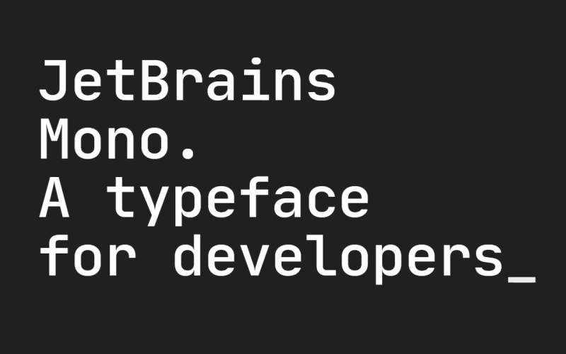
JetBrains Mono is a monospace typeface designed by Philipp Nurullin and Konstantin Bulenkov, released by JetBrains in 2020. It targets reading speed in IDE environments through a taller x-height and simplified letterforms.
JetBrains Mono works best in JetBrains IDEs and VS Code because its increased x-height keeps lowercase letters more open at small sizes, reducing vertical scanning effort across deeply nested code blocks.
What makes JetBrains Mono suitable for coding?
The font uses a 9-degree italic angle instead of the typical 11–12 degrees, maintaining readability contrast without introducing distraction. Its oval letterforms are shaped to approach rectangular symbols, which reduces visual noise in syntax-heavy code. It supports 8 weights from Thin (100) to ExtraBold (800), each with matching italics, giving it one of the widest weight ranges in any free coding font.
Key attributes:
| Attribute | Value |
| Classification | Monospace sans-serif |
| Designer | Philipp Nurullin, Konstantin Bulenkov, 2020 |
| Weight range | Thin 100 – ExtraBold 800 (variable axis) |
| Variable font | Yes |
| Recommended sizes | 13px–16px for editors; 11px minimum for terminals |
| License | OFL 1.1 – free for commercial use |
| Available on | JetBrains (bundled), Google Fonts, GitHub |
| Price | Free |
How does JetBrains Mono perform in coding environments?
JetBrains Mono is the default font in all JetBrains IDEs (IntelliJ IDEA, WebStorm, PyCharm) since version 2019.3. It includes 138 code-specific ligatures and a no-ligatures variant (JetBrains Mono NL) for environments that don’t support OpenType features. The font renders crisply at small sizes because its simplified forms avoid unnecessary stroke detail.
What are the best pairings for JetBrains Mono in coding?
JetBrains Mono pairs with Inter for technical documentation because both share a neutral, utilitarian tone without decorative contrast. It works alongside IBM Plex Sans when a slightly warmer companion is needed for prose sections in developer-facing content.
What are the limitations of JetBrains Mono for coding?
The font’s standard character width can push lines slightly longer than expected compared to narrower alternatives like Iosevka, which matters on smaller screens. The Thin 100 weight is too light for most display resolutions below 1080p.
JetBrains Mono – Recommended Use Cases Within Coding
- Best for: JetBrains IDEs, VS Code, multi-language projects requiring wide weight range
- Avoid for: Terminals with no ligature support (use JetBrains Mono NL instead)
- Optimal weight: Regular 400 for body code; Medium 500 for headings in docs
- Optimal size range: 13px–16px
—
Source Code Pro
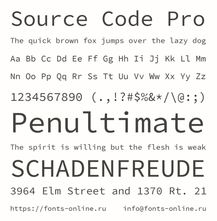
Source Code Pro is a monospace sans-serif typeface designed by Paul D. Hunt for Adobe Systems, released September 24, 2012. It standardizes character widths across all weights for consistent layout in code editors and terminal environments.
Source Code Pro suits web developers and designers who work across Adobe tools because it integrates directly with Adobe Fonts and maintains visual consistency with the broader Source type family.
What makes Source Code Pro suitable for coding?
Source Code Pro uses subtle serifs on specific glyphs (like 1 and I) to improve disambiguation without converting to a slab-serif design. All seven weights share identical character widths, so switching between Regular and Bold in the same file produces no layout shift. Variable font formats, introduced in 2018, support a weight axis from 200 to 900.
Key attributes:
| Attribute | Value |
| Classification | Monospace sans-serif |
| Designer | Paul D. Hunt (Adobe), 2012 |
| Weight range | ExtraLight 200 – Black 900 (7 static weights + variable) |
| Variable font | Yes (since 2018) |
| Recommended sizes | 11px–15px for editors |
| License | OFL 1.1 – free for commercial use |
| Available on | Google Fonts, Adobe Fonts, GitHub |
| Price | Free |
How does Source Code Pro perform in coding environments?
Source Code Pro has been the default in Adobe Brackets and remains widely used in web development contexts. It supports Greek and Cyrillic scripts (upright only), which covers multilingual projects. Rendering at 11px–12px on standard displays is solid, though it lacks ligatures entirely.
What are the best pairings for Source Code Pro in coding?
Source Code Pro pairs with Source Sans 3 for documentation because both share the same type family and vertical proportions. It works with Roboto when a more neutral, system-feel companion is needed for UI text around code blocks.
What are the limitations of Source Code Pro for coding?
Source Code Pro has no programming ligatures. Developers who rely on ligature-based operator rendering need a different font. Italic support was added only in 2015, and variable italics arrived later than the variable upright, so older builds may not include them.
Source Code Pro – Recommended Use Cases Within Coding
- Best for: Adobe workflows, documentation, terminal environments without ligature support
- Avoid for: Setups where ligature-based operators are part of the workflow
- Optimal weight: Regular 400 for code; SemiBold 600 for UI labels
- Optimal size range: 12px–15px
—
Cascadia Code
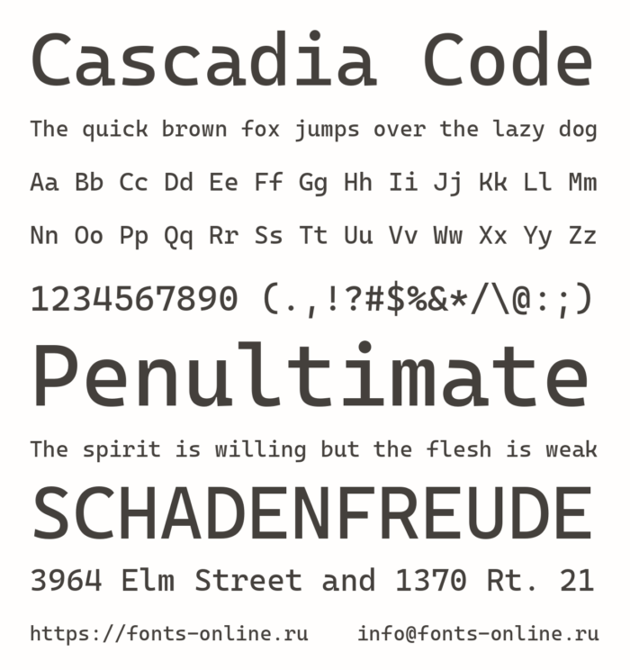
Cascadia Code is a monospace typeface designed by Aaron Bell of Saja Typeworks, released by Microsoft on September 18, 2019. It was built alongside Windows Terminal to provide an optimized fixed-width font for command-line environments and code editors.
Cascadia Code works best on Windows-native setups because it ships bundled with Windows Terminal and Windows 11, eliminating installation steps for the default development environment.
What makes Cascadia Code suitable for coding?
The variable font supports weights from 200 to 700. It includes programming ligatures (in the “Code” variants) and ships in a Mono variant without ligatures for purists. The 2024 release added native Nerd Font support (9,209 glyphs), removing the need for a separately patched version. Cascadia Code PL includes embedded Powerline symbols, making it drop-in compatible with terminal prompt frameworks.
Key attributes:
| Attribute | Value |
| Classification | Monospace sans-serif |
| Designer | Aaron Bell (Saja Typeworks), 2019 |
| Weight range | ExtraLight 200 – Bold 700 (variable) |
| Variable font | Yes |
| Recommended sizes | 12px–16px for terminals and editors |
| License | OFL 1.1 – free for commercial use |
| Available on | GitHub, bundled with Windows Terminal / Windows 11 |
| Price | Free |
How does Cascadia Code perform in coding environments?
Cascadia Code is optimized for TrueType hinting on Windows GDI/DWrite rendering, giving it an edge on Windows displays compared to fonts tuned primarily for macOS. Some developers find the default Regular weight slightly heavy, but the variable axis lets you dial it back to 300 or 350. The cursive italic variant (“Cascadia Curve”) is one of the more distinctive italic styles among free coding fonts.
What are the best pairings for Cascadia Code in coding?
Cascadia Code pairs with Segoe UI Variable for Windows-native applications because both are Microsoft-developed and share rendering optimizations. It works with Calibri for documentation targeting Microsoft Office workflows, where font consistency across environments matters.
What are the limitations of Cascadia Code for coding?
The static OTF versions have lower hinting quality than the variable TTF. Weight range tops out at 700, with no ExtraBold or Black, which limits its use for heavy display contexts. On macOS, rendering can appear slightly softer compared to fonts tuned for Core Text.
Cascadia Code – Recommended Use Cases Within Coding
- Best for: Windows Terminal, VS Code on Windows, PowerShell environments
- Avoid for: macOS setups where fonts with Core Text optimization render better
- Optimal weight: Regular 400 for standard use; Light 300 on high-DPI displays
- Optimal size range: 12px–15px
—
Hack
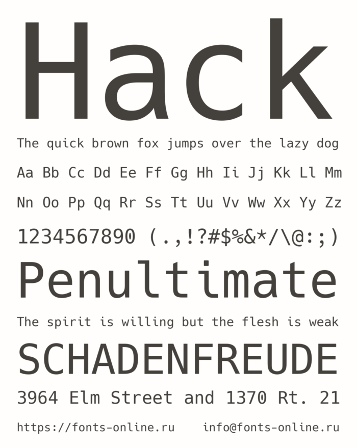
Hack is a monospace typeface derived from the Bitstream Vera and DejaVu Sans Mono lineage, developed by Source Foundry and first released publicly in 2015. It targets terminal use with over 1,500 glyphs and strong disambiguation across confusable characters.
Hack suits terminal-heavy developers because its glyph set includes Powerline symbols by default in the regular variant, with no patching required.
What makes Hack suitable for coding?
Hack’s character shapes are explicitly tuned to minimize ambiguity between 0/O, 1/l/I, and ;/:. It uses consistent stroke weights without ligatures, which keeps what you see identical to what’s in the file. The font is packaged in major Linux distributions (Debian, Fedora, Arch, OpenSUSE) as a native package.
Key attributes:
| Attribute | Value |
| Classification | Monospace sans-serif (Bitstream Vera lineage) |
| Designer | Source Foundry, 2015 |
| Weight range | Regular, Bold (2 static weights) |
| Variable font | No |
| Recommended sizes | 10px–14px for terminals; 12px–16px for editors |
| License | Bitstream Vera License + OFL 1.1 (mixed) |
| Available on | GitHub, major Linux package managers |
| Price | Free |
How does Hack perform in coding environments?
Hack renders well at small sizes on low-DPI screens, which is one of its strongest selling points. It maintains glyph clarity at 10px–11px where many other coding fonts start to blur. No ligature support is present, which keeps rendering predictable across every terminal and editor without configuration.
What are the best pairings for Hack in coding?
Hack pairs with Ubuntu Mono when building out a Linux-centric workflow with matched system fonts. It works alongside DejaVu Sans for documentation because both share the same typographic ancestry and visual tone.
What are the limitations of Hack for coding?
Hack offers only 2 static weights (Regular and Bold), which limits typographic hierarchy in editors that use weight variation for syntax highlighting. There is no variable font version, and the italic style is limited compared to newer options like JetBrains Mono or Cascadia Code.
Hack – Recommended Use Cases Within Coding
- Best for: Linux terminals, SSH sessions, environments without ligature support
- Avoid for: Setups that depend on multiple weights for syntax differentiation
- Optimal weight: Regular 400 for nearly all use cases
- Optimal size range: 10px–14px
—
Consolas
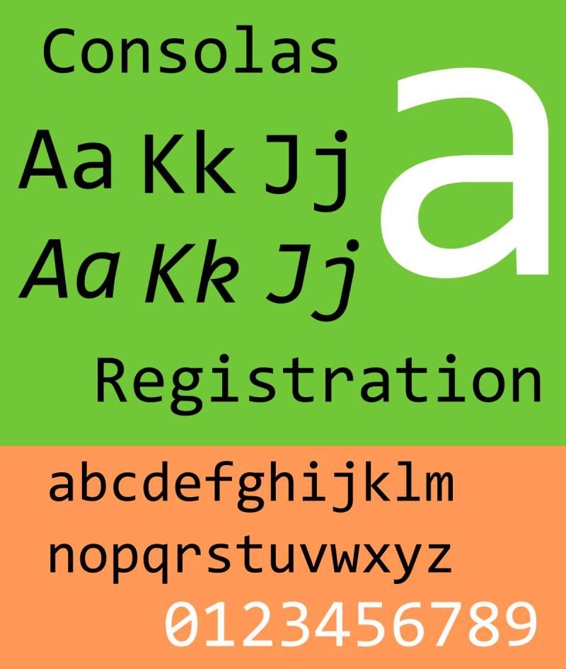
Consolas is a monospace typeface designed by Lucas de Groot for Microsoft, released in 2007 as part of the ClearType Font Collection. It standardizes coding typography on Windows by shipping as the default font in Visual Studio and Notepad.
Consolas works best on Windows environments because it is explicitly designed for ClearType subpixel rendering, which produces sharper results on standard LCD displays than most competing fonts.
What makes Consolas suitable for coding?
Consolas uses slightly rounded letterforms that remain stable under ClearType antialiasing. It includes multiple zero styles (dotted zero, slashed zero) via OpenType features, which lets developers pick based on language convention. Its moderate x-height keeps the font compact enough to display more lines per screen than taller-x-height alternatives.
Key attributes:
| Attribute | Value |
| Classification | Monospace sans-serif (humanist) |
| Designer | Lucas de Groot (Microsoft), 2007 |
| Weight range | Regular, Bold (2 static weights) |
| Variable font | No |
| Recommended sizes | 11px–15px for editors |
| License | Commercial (bundled with Windows and Microsoft Office) |
| Available on | Bundled with Windows, Visual Studio, Microsoft Office |
| Price | Free with Windows / Microsoft Office; $49/style standalone |
How does Consolas perform in coding environments?
Consolas performs best with ClearType enabled. Without it, rendering becomes noticeably aliased. On macOS or Linux it looks softer, because Core Text and FreeType handle its hinting differently than Windows GDI does. It has no ligature support and no variable axis.
What are the best pairings for Consolas in coding?
Consolas pairs with Segoe UI for Windows-native documentation because both are ClearType-optimized Microsoft fonts. For editors that mix code and comments, it works alongside Georgia in any output documentation where contrast between monospace code and proportional prose is needed.
What are the limitations of Consolas for coding?
Consolas is a commercial font tied to Microsoft’s licensing. It does not render well outside of ClearType-enabled Windows environments. No ligature support, no variable axis, and only 2 weights limit its flexibility compared to free alternatives.
Consolas – Recommended Use Cases Within Coding
- Best for: Visual Studio on Windows, developers who prefer the default and don’t want to configure a custom font
- Avoid for: macOS or Linux setups, or anywhere ClearType is unavailable
- Optimal weight: Regular 400
- Optimal size range: 11px–14px
—
IBM Plex Mono
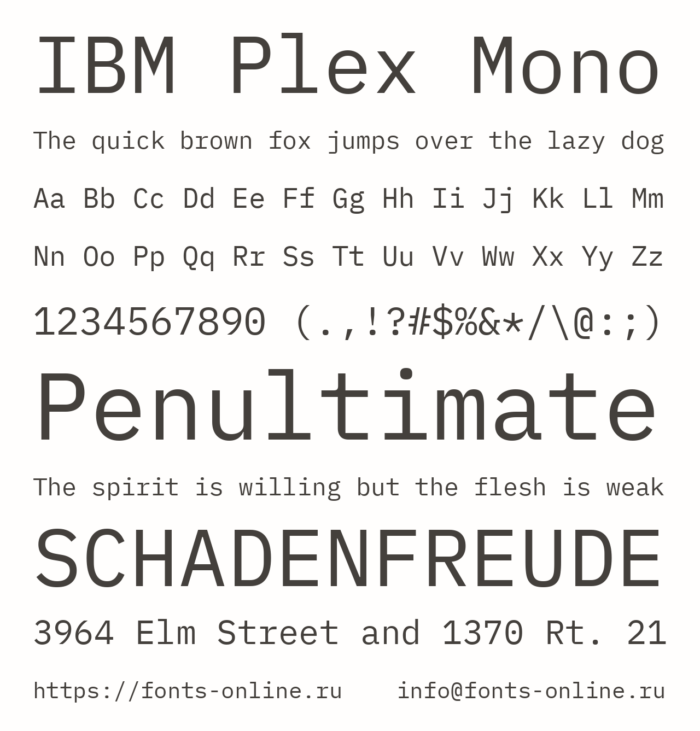
IBM Plex Mono is the monospace member of the IBM Plex type family, developed by IBM’s Brand and Experience team with external type designers, released in 2017. It fits each glyph into a 600-unit space based on typewriter-era proportions.
IBM Plex Mono suits enterprise developers and teams standardizing on IBM products because it is IBM’s official corporate typeface, available under OFL and directly integrated into IBM Design Language.
What makes IBM Plex Mono suitable for coding?
IBM Plex Mono ships in 8 weights (Thin 100 through Bold 700) with matching italics, providing 14 distinct styles. It has a slight humanist quality from its typewriter-era proportions, which distinguishes it from purely geometric alternatives. The font covers 100+ languages including Arabic, Cyrillic, Devanagari, Greek, Hebrew, and Thai.
Key attributes:
| Attribute | Value |
| Classification | Monospace sans-serif (humanist) |
| Designer | IBM Brand and Experience team, 2017 |
| Weight range | Thin 100 – Bold 700 (8 static weights) |
| Variable font | No |
| Recommended sizes | 12px–16px for editors |
| License | OFL 1.1 – free for commercial use |
| Available on | Google Fonts, Adobe Fonts, IBM GitHub, IBM Plex website |
| Price | Free |
How does IBM Plex Mono perform in coding environments?
IBM Plex Mono has no programming ligatures. Its italic style uses a slightly serif-influenced construction that some developers find adds visual noise rather than removing it. That said, its multilingual coverage is broader than most coding fonts, making it a strong choice for international projects. The font renders cleanly on both macOS and Windows.
What are the best pairings for IBM Plex Mono in coding?
IBM Plex Mono pairs with IBM Plex Sans for full-family consistency in IBM-adjacent products or enterprise documentation. It works with Source Sans 3 when a neutral, wide-coverage alternative to the Plex family is needed for prose.
What are the limitations of IBM Plex Mono for coding?
IBM Plex Mono has no variable font format, meaning each weight requires a separate file. Its top weight caps at Bold 700, with no ExtraBold or Black. There are also no programming ligatures for operators.
IBM Plex Mono – Recommended Use Cases Within Coding
- Best for: International projects, IBM ecosystem tools, multilingual codebases
- Avoid for: Ligature-dependent workflows, single-file variable font setups
- Optimal weight: Regular 400 for code; Light 300 on retina displays
- Optimal size range: 12px–16px
—
Inconsolata
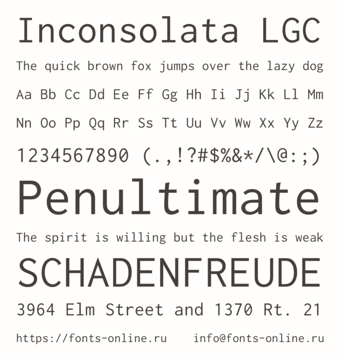
Inconsolata is a humanist monospace typeface designed by Raph Levien, originally released under the OFL and later updated to a variable font in April 2020 when it was expanded on Google Fonts. It draws design influence from Consolas, Avenir, and IBM’s Letter Gothic.
Inconsolata works best for developers who want a clean, lightweight monospace without the visual weight of most terminal fonts. It is a frequent default in minimalist editor setups.
What makes Inconsolata suitable for coding?
Inconsolata’s stroke weight is lighter than most coding fonts, which makes it appear less dense on screen at standard sizes. The 2020 variable update added a full weight axis and improved hinting. It handles both regular and bold, and the variable format enables intermediate weights between them. Its screen readability is strong, particularly at high resolution.
Key attributes:
| Attribute | Value |
| Classification | Monospace sans-serif (humanist lineal) |
| Designer | Raph Levien |
| Weight range | Regular, Bold (variable since 2020) |
| Variable font | Yes (since 2020) |
| Recommended sizes | 12px–16px for editors; performs well at high resolution |
| License | OFL 1.1 – free for commercial use |
| Available on | Google Fonts, GitHub |
| Price | Free |
How does Inconsolata perform in coding environments?
Inconsolata renders well on high-DPI screens and has improved significantly since its Google Fonts rework. On non-ClearType Windows rendering, it performs better than Consolas. It lacks ligatures and has no italic style, which is a meaningful limitation for editors that use italics for comments or keywords in syntax themes.
What are the best pairings for Inconsolata in coding?
Inconsolata pairs with Lato for documentation because both share humanist proportions and a similarly light stroke weight. It works with Roboto for Android or Google-adjacent developer tools, where the design language overlap is intentional.
What are the limitations of Inconsolata for coding?
Inconsolata has no italic variant, which breaks syntax highlighting themes that render comments or type annotations in italics. No programming ligatures are included. The original pre-2020 version lacked good hinting at small sizes, and some older builds may still be in circulation.
Inconsolata – Recommended Use Cases Within Coding
- Best for: High-resolution setups, minimalist editors, themes that don’t rely on italic differentiation
- Avoid for: Syntax themes that use italics for comments or annotations
- Optimal weight: Regular 400; Medium via variable axis on retina displays
- Optimal size range: 13px–16px
—
Iosevka
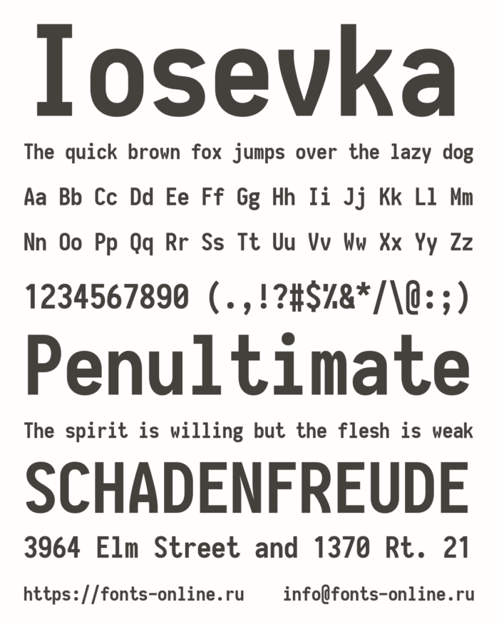
Iosevka is a highly customizable monospace typeface developed by Belleve Invis (be5invis), with the first public release appearing around 2015. It targets narrow column widths and custom build configurations, making it unique among free coding fonts.
Iosevka suits developers who want precise control over glyph shape, width, ligatures, and spacing at build time, rather than after installation.
What makes Iosevka suitable for coding?
Iosevka is approximately 25–35% narrower than most monospace fonts by default, fitting more code on each line without reducing font size. Developers can specify glyph variants, widths, and ligature sets at build time using a configuration file, producing a customized font binary. Pre-built packages are available for users who don’t want to build from source. It supports a wide range of extended character sets and Nerd Font patching.
Key attributes:
| Attribute | Value |
| Classification | Monospace sans-serif (narrow) |
| Designer | Belleve Invis (be5invis), 2015 |
| Weight range | Thin 100 – Heavy 900 (variable) |
| Variable font | Yes |
| Recommended sizes | 12px–16px; narrow width allows smaller sizes on wide monitors |
| License | OFL 1.1 – free for commercial use |
| Available on | GitHub (pre-built packages and source) |
| Price | Free |
How does Iosevka perform in coding environments?
Iosevka renders well across macOS, Windows, and Linux. The narrow default width means more code fits per line, which suits wide-monitor setups with split panes. Ligature support is available but must be selected during the build configuration or via pre-built “SS” variants that match the style of other popular fonts. The Zed editor uses a custom Iosevka build as its default monospace font.
What are the best pairings for Iosevka in coding?
Iosevka pairs with Inter for documentation because the high-clarity proportions of Inter complement Iosevka’s narrow code columns without visual tension. It works alongside Space Grotesk in developer tools or landing pages where a slightly more expressive UI companion is needed.
What are the limitations of Iosevka for coding?
Custom builds require Python 3.9.5+, Node.js, and font toolchain dependencies, which is a significant setup barrier. Pre-built packages simplify this but don’t cover all configuration options. The narrow default width can feel cramped on smaller or low-resolution screens.
Iosevka – Recommended Use Cases Within Coding
- Best for: Wide-monitor setups, multi-pane coding environments, developers who want maximum lines per screen
- Avoid for: Small or low-resolution screens where narrow characters reduce readability
- Optimal weight: Regular 400; Medium 500 on non-retina displays
- Optimal size range: 12px–16px
—
Monaco

Monaco is a monospace typeface developed by Apple, originally designed as a 9pt bitmap font for the original Macintosh in 1984. It was the default monospace font on macOS before Snow Leopard (2009) replaced it with Menlo.
Monaco suits macOS developers who prefer a compact, high-density coding font with a distinct character, particularly in terminal-heavy setups on older or smaller screens.
What makes Monaco suitable for coding?
Monaco was originally designed as a bitmap font, which gives it excellent legibility at non-antialiased small sizes. Its curly braces and brackets are visually oversized relative to the surrounding text, making bracket matching easier during deep nesting. The zero glyph, parentheses, and square brackets are each geometrically distinct with no overlap in shape.
Key attributes:
| Attribute | Value |
| Classification | Monospace sans-serif |
| Designer | Apple, 1984 |
| Weight range | Regular only |
| Variable font | No |
| Recommended sizes | 11px–14px for terminals; 13px+ for editors |
| License | Proprietary – bundled with macOS only |
| Available on | macOS (system font, not redistributable) |
| Price | Free with macOS |
How does Monaco perform in coding environments?
Monaco renders well on macOS Core Text at 11px–13px, particularly in terminal emulators like iTerm2. Its bitmap origins mean it performs better than most fonts at very small non-antialiased sizes. On non-Mac systems it is not officially available, and patched versions circulate informally without license compliance.
What are the best pairings for Monaco in coding?
Monaco pairs with San Francisco (SF Pro) for macOS-native developer documentation because both are Apple system fonts with matching visual weight. It works alongside Helvetica Neue in older macOS UI contexts where system font consistency matters.
What are the limitations of Monaco for coding?
Monaco is proprietary and bundled exclusively with macOS. It has only one weight (Regular), no ligature support, no bold or italic styles, and cannot be legally redistributed or used on non-Apple platforms. It has not received significant updates since the Snow Leopard era.
Monaco – Recommended Use Cases Within Coding
- Best for: Terminal emulators on macOS, developers preferring compact character density
- Avoid for: Any non-macOS environment; editors that depend on bold or italic weights for syntax themes
- Optimal weight: Regular only
- Optimal size range: 11px–14px
—
Coding Font Comparison
Quick-reference overview of all ten fonts across the criteria that matter most for day-to-day coding decisions.
| Font | Ligatures | Variable | Weights | License | Best Platform |
| Fira Code | Yes | Yes | 300–700 | OFL (free) | All |
| JetBrains Mono | Yes | Yes | 100–800 | OFL (free) | All |
| Source Code Pro | No | Yes | 200–900 | OFL (free) | All |
| Cascadia Code | Yes | Yes | 200–700 | OFL (free) | Windows |
| Hack | No | No | Regular, Bold | Bitstream + OFL | Linux |
| Consolas | No | No | Regular, Bold | Commercial | Windows |
| IBM Plex Mono | No | No | 100–700 | OFL (free) | All |
| Inconsolata | No | Yes | Regular, Bold | OFL (free) | All |
| Iosevka | Optional | Yes | 100–900 | OFL (free) | All |
| Monaco | No | No | Regular only | Proprietary | macOS only |
If you’re just starting out and don’t want to think too hard about it: JetBrains Mono or Fira Code cover the most ground across platforms, editors, and use cases. Both are free, variable, and well-maintained.
Want to know more about how font spacing affects readability in code editors, or how variable fonts work under the hood? Those details matter more than most developers expect when picking a long-term setup. You might also find it useful to look at fonts for apps if your coding work bleeds into UI design.
What Makes a Font Good for Coding?
Not every monospace typeface qualifies as a good coding font. The criteria are structural, not aesthetic.
Computer vision syndrome affects 75% of people who work on computers, according to research cited by the American Optometric Association. Font design is one of the few variables a developer can control directly.
Monospaced design: Every character occupies the same horizontal space. This keeps indentation consistent, aligns operators across lines, and makes bracket matching predictable. A variable-width font in a code editor is a readability failure, not a preference issue.
Character disambiguation: The pairs that cause bugs. Good coding fonts design each glyph to be visually distinct with no ambiguity.
0vsO(zero vs capital O): solved with a dotted or slashed zero1vslvsI(one, lowercase L, capital I): solved with distinct terminal strokes;vs:(semicolon vs colon): solved with visible weight difference
X-height and stroke weight: A taller x-height keeps lowercase letters more open at small sizes. Balanced stroke weight prevents glyphs from blurring on lower-DPI displays. JetBrains Mono and Fira Code both use this principle explicitly in their design documentation.
Rendering engine compatibility: The same font looks different across ClearType (Windows), Core Text (macOS), and FreeType (Linux). A font tuned for one engine may render poorly on another without additional configuration.
Ligature support: Optional, not required. OpenType ligatures replace multi-character sequences with single display glyphs. Some developers find them helpful. Others find the visual mismatch between rendered output and source code disorienting. The best fonts let you turn them off without losing anything else.
| Criterion | What It Solves | Key Metric |
| Monospaced design | Code alignment, indentation consistency | Fixed-width character grid |
| Character disambiguation | Misread characters, syntax bugs | 0/O, 1/l/I glyph distinction |
| X-height | Lowercase readability at small sizes | Ratio of x-height to cap height |
| Ligature support | Operator visual clarity (optional) | Number of programming ligatures |
—
What Is the Difference Between a Variable Font and a Static Font for Coding?
Variable fonts ship as a single file containing a continuous weight axis. Static fonts require a separate file per weight.
In 2024, 33% of desktop websites used variable fonts, up from 29% in 2023, according to the HTTP Archive Web Almanac. The trend in general web use reflects the same shift happening in developer tooling.
How variable fonts work in code editors
A variable font with a weight axis from 100 to 800 lets you set your editor font to weight 350, between Light and Regular, without loading an additional file. Static fonts force a binary choice.
Monotype’s 2023 variable font suite launch reported that 54% of developers cited faster load times with variable fonts, and 61% of UI/UX designers reported improved design flexibility. Those numbers apply to applications embedding fonts, not just editors, but the principle holds.
Editors with variable font support:
- VS Code: full variable font axis support via CSS font-weight
- JetBrains IDEs: variable weight support in recent versions
- Neovim: depends on terminal emulator, not the editor itself
- iTerm2, WezTerm, Alacritty: variable font support varies by build
When static fonts remain the better choice
Legacy terminal emulators often do not support OpenType variable font axes. PuTTY on Windows, for instance, renders fonts through the GDI layer, which does not handle variable weight interpolation.
Static font advantage: predictable rendering across every environment. No configuration needed. Hack, Consolas, and IBM Plex Mono all ship as static files only, and this is rarely a practical limitation for developers on standard setups.
| Font | Variable | Weight Range | File Count |
| Fira Code | Yes | 300–700 | 1 variable + static backups |
| JetBrains Mono | Yes | 100–800 | 1 variable + 16 static |
| Source Code Pro | Yes (since 2018) | 200–900 | 1 variable + 7 static uprights |
| Hack | No | Regular, Bold | 4 static files |
| Consolas | No | Regular, Bold | 4 static files |
—
How Do Programming Ligatures Work in Code Editors?
A programming ligature is an OpenType glyph substitution. The font’s lookup table detects a multi-character sequence and renders a single display glyph in its place. The source file is unchanged.
Fira Code is the most-starred programming font repository on GitHub, with over 78,000 stars as of 2026, largely driven by its ligature system (The Plus Addons, 2026). That popularity doesn’t mean ligatures are universally adopted, but it signals how much developer interest they attract.
Which sequences get ligature treatment
The most common targets are operator combinations that appear constantly in source code.
!=renders as a “not equal” glyph=>renders as an arrow===renders as a triple-equals glyph<=and>=render as comparison symbols->renders as a directional arrow//renders as a unified double-slash
How to enable ligatures per editor
Ligatures require both a supporting font and an editor setting. Neither alone is enough.
VS Code: Add "editor.fontLigatures": true to settings.json, then set "editor.fontFamily" to a ligature-capable font.
JetBrains IDEs (IntelliJ IDEA, WebStorm, PyCharm): Go to Settings, Editor, Font, and check “Enable ligatures.” JetBrains Mono is pre-installed and pre-configured since version 2019.3.
Neovim: Ligature rendering depends on the terminal emulator, not Neovim itself. WezTerm, Kitty, and Alacritty all support OpenType ligatures with appropriate configuration.
The case against ligatures
Ligatures create a disconnect between what appears on screen and what exists in the file. A developer new to the codebase may not recognize that => rendered as a single arrow symbol is actually two characters. Pair programming sessions where one person’s editor shows ligatures and another doesn’t can cause confusion.
Fonts without any ligatures: Hack, Source Code Pro, Consolas, IBM Plex Mono, Inconsolata, Monaco. All remain fully capable coding fonts without this feature.
—
How Do Coding Fonts Render Differently on Windows, macOS, and Linux?
The same font file produces visually different output on each platform because each operating system uses a different rendering engine with different hinting strategies.
The AOA-Deloitte 2024 report found 69% of office workers experience digital eye strain symptoms at least once a week. For developers spending 8+ hours in an editor, rendering quality directly affects how long they can work before symptoms start.
How do coding fonts render on Windows with ClearType?
ClearType uses subpixel rendering on LCD panels, snapping glyphs to the pixel grid both horizontally and vertically. This produces sharp, high-contrast letterforms at standard sizes.
Fonts optimized for ClearType: Consolas and Cascadia Code are explicitly designed for this pipeline. Both were built by Microsoft engineers with GDI/DirectWrite hinting quality as a primary constraint. On a 1080p Windows display, these two fonts look noticeably crisper than fonts without strong TrueType hinting instructions.
Fonts not tuned for ClearType render acceptably but may appear slightly softer. JetBrains Mono and Fira Code both perform well on Windows, but they are not ClearType-native.
How do coding fonts render on macOS with Core Text?
macOS Core Text does not use aggressive hinting. It renders fonts closer to their designed shapes at any size, prioritizing design fidelity over pixel-grid alignment. This produces smoother but slightly less sharp results at small sizes on non-retina displays.
Monaco was designed as a 9pt bitmap font for original Mac hardware. At small sizes on standard displays, it retains its bitmap-era clarity because it was never designed to scale gracefully. On retina displays, this distinction largely disappears.
Menlo, the macOS default since Snow Leopard (2009), shares the same Bitstream Vera lineage as Hack. Both render cleanly under Core Text without additional configuration.
How do coding fonts render on Linux with FreeType?
FreeType is the rendering library used across Linux desktop environments. It supports three TrueType hinting engines (v35, v38, v40), an autohinter, and optional ClearType color filtering (since ClearType patents expired in August 2019, per the FreeType project).
Ubuntu Linux has used non-crippled FreeType with subpixel rendering enabled by default for years. The result on standard 1080p displays is generally considered the best-configured Linux font rendering available without manual setup.
Hack ships in the native package repositories of Debian, Ubuntu, Fedora, Arch Linux, and OpenSUSE. It was specifically tuned for FreeType rendering at 10px–14px, making it the most practical default for Linux terminal users who want a pre-installed option that actually looks good.
On HiDPI Linux setups, rendering differences between ClearType-tuned and FreeType-tuned fonts become negligible. At 192 DPI or higher, hinting matters far less because the pixel density provides enough resolution for shape fidelity without grid-snapping.
—
How Do Font License Terms Affect Coding Font Use in Commercial Projects?
Most developers never read font licenses. That’s fine for personal use, but it becomes a compliance issue when fonts get bundled into distributed software, embedded in PDFs, or deployed via @font-face in a commercial application.
For more context on how font licensing works across different license types, the distinctions between OFL, commercial, and proprietary terms matter well beyond coding fonts.
What OFL 1.1 permits and restricts
Eight of the ten fonts in this list use the SIL Open Font License 1.1. The OFL-FAQ was last updated in November 2023. Here is what the license actually allows.
Permitted under OFL 1.1:
- Use in any project (personal or commercial) at no cost
- Bundling inside a desktop application or mobile app and distributing or selling that application
- Embedding in PDFs, documents, or web pages via
@font-face - Modifying glyphs and releasing the modified font under OFL
Not permitted under OFL 1.1: Selling the font file itself as a standalone product. You cannot take Fira Code, package it, and charge for it independently.
Consolas and Monaco: the proprietary exceptions
Consolas is a Microsoft commercial font. It ships bundled with Windows and Microsoft Office, which gives licensed users the right to use it. Distributing it with your own application requires a separate commercial license from Microsoft, priced at $49 per style as a standalone purchase.
Monaco is proprietary Apple typography. It is non-redistributable outside of macOS. You cannot legally include it in a cross-platform application or deploy it on a Linux server, even if it’s installed on your Mac. IBM chose JetBrains Mono for its own internal developer tooling precisely to avoid this kind of platform-tied licensing dependency.
Embedding scenarios that require attention
Web app via @font-face: All OFL fonts can be self-hosted and served via @font-face. No additional license required.
Desktop app distribution: OFL fonts can be bundled. The font files must retain their copyright notices and OFL license text. The application itself is not subject to OFL terms.
PDF generation: Embedding OFL fonts in server-generated PDFs is permitted. The PDF document is not considered a derivative work of the font.
Editor theme redistribution: Distributing a VS Code theme that specifies “Fira Code” as the font does not require bundling the font itself, as users install it separately. No license issue arises.
—
How to Choose the Right Coding Font for Your Editor and Setup
VS Code is the most-used IDE at 73.6% according to the Stack Overflow 2024 Developer Survey (65,437 respondents). The default font in VS Code is Consolas on Windows and Menlo on macOS. Both are fine starting points, but neither represents the best option for most setups.
Start with your platform. Then decide on ligatures. Then pick based on screen density.
Decision by platform
Windows: Cascadia Code is the natural first choice. It ships with Windows Terminal and Windows 11, requires zero installation, and renders well on ClearType. Consolas is the safe fallback if you already have Visual Studio installed.
macOS: JetBrains Mono or Fira Code are the strongest upgrades over the default Menlo. Both install via Homebrew (brew install --cask font-jetbrains-mono). Monaco remains usable for terminal work but has no bold or italic variants.
Linux: Install Hack from your package manager (apt install fonts-hack, dnf install font-hack-ttf). For a ligature-capable alternative, JetBrains Mono or Fira Code install cleanly on any distribution and render well under FreeType with subpixel rendering enabled.
Decision by use case
Not all coding contexts have the same requirements. Here is a practical mapping.
| Use Case | Best Font | Reason |
| JetBrains IDE (any) | JetBrains Mono | Pre-installed, pre-configured, ligatures on by default |
| VS Code on Windows | Cascadia Code | Bundled, ClearType-optimized, Nerd Font variant available |
| Linux terminal | Hack | Package manager install, strong FreeType hinting at small sizes |
| Wide monitor, split panes | Iosevka | 25-35% narrower than standard, fits more code per line |
| Multilingual codebase | IBM Plex Mono | 100+ language coverage including Arabic, Cyrillic, Devanagari |
| Adobe/Creative workflow | Source Code Pro | Adobe Fonts integration, consistent with Source type family |
The ligature question, resolved
Enable ligatures if you work alone in a personal setup and want operators to render as unified symbols. Disable them if you pair program, record screen shares, or use terminals without OpenType support.
The font spacing inside your editor also plays a role here. A ligature-heavy font at tight line height can produce a visually dense result that undercuts the readability benefits the ligatures were supposed to deliver.
If you’re unsure: start with JetBrains Mono at Regular 400, 14px. It works on every platform, supports ligatures you can toggle, and has 8 weights if you want to adjust later. That covers the majority of setups without any additional configuration.
For broader typography decisions beyond the terminal, resources on variable fonts and how they work across design contexts connect directly to why the variable font versions of these coding fonts are worth using when your editor supports them.
FAQ on The Best Fonts For Coding
What is the best font for coding overall?
JetBrains Mono and Fira Code are the top choices for most developers. Both are free, variable, and work across VS Code, Neovim, and JetBrains IDEs. JetBrains Mono ships pre-installed in all JetBrains products, making it the lowest-friction option.
What makes a font good for coding?
A good programming font uses a monospaced design with clear distinction between similar characters like 0/O and 1/l/I. X-height, stroke weight, and rendering engine compatibility matter more than aesthetics for long sessions.
Does Fira Code work in VS Code?
Yes. Set "editor.fontFamily": "Fira Code" and "editor.fontLigatures": true in settings.json. VS Code is the most-used IDE at 73.6% (Stack Overflow 2024), and Fira Code is one of its most popular font upgrades.
Are programming ligatures worth using?
It depends on your workflow. Ligatures merge operators like != and => into single glyphs visually, without changing the source file. They help in personal setups but can confuse pair programming sessions or screen recordings.
What is the best free monospace font for coding?
Fira Code, JetBrains Mono, Source Code Pro, Cascadia Code, and Hack are all free under the SIL Open Font License. All work commercially. Hack is the best pre-packaged option for Linux users via native package managers.
What font does VS Code use by default?
VS Code defaults to Consolas on Windows and Menlo on macOS. Both are static fonts with no ligature support. Most developers replace them within the first week of using a new setup.
What is the difference between Fira Code and JetBrains Mono?
Fira Code focuses on ligatures with 100+ programming-specific glyph substitutions. JetBrains Mono prioritizes reading speed through a taller x-height and a 9-degree italic angle. JetBrains Mono covers 8 weights; Fira Code covers 5.
Can I use coding fonts in commercial projects?
All OFL-licensed fonts, including Fira Code, JetBrains Mono, and Cascadia Code, allow commercial use, bundling in apps, and web embedding via @font-face. Consolas and Monaco are proprietary and cannot be redistributed freely.
What is the best coding font for dark mode?
Fonts with moderate stroke weight perform best on dark backgrounds. JetBrains Mono and Cascadia Code both render clearly in dark themes without bleeding or halation. Avoid thin weights like 100 or 200 on dark mode setups.
What coding font is best for Linux terminals?
Hack is the top choice for Linux terminal environments. It is available in Debian, Fedora, Arch, and OpenSUSE package repositories and was specifically tuned for FreeType rendering at small sizes like 10px–14px.
Conclusion
This conclusion is for an article presenting the best fonts for coding, and the takeaway is straightforward: the right programmer font is a decision rooted in structure, not style.
Character disambiguation, x-height, weight range, and rendering engine compatibility determine whether a typeface actually works across your IDE, terminal emulator, and operating system.
Most OFL-licensed options like Cascadia Code, Source Code Pro, and Inconsolata cost nothing and cover commercial use without restrictions.
If you’re still on a default system font, start with JetBrains Mono at Regular 400, 14px. It works on Windows, macOS, and Linux with zero configuration.
Swap it out only when you have a specific reason. Fixed-width fonts are a small change with a disproportionate return over thousands of hours of coding.

Renowned for his expertise in logo design and visual branding, Bogdan has developed a multitude of logos for various clients.
His skills extend to creating posters, vector illustrations, business cards, and brochures. Additionally, Bogdan's UI kits were featured on marketplaces like Visual Hierarchy and UI8.
He also wrote in the past years on sites like Design Your Way, WebDesignerDepot, WPDean, Designmodo, Speckyboy, Slider Revolution, and more.
- 5 Brand Compliance Checkpoints Every Enterprise Should Automate - 23 July 2026
- Timeless Open Sans Font Pairing for Any Project - 22 July 2026
- Pantone to HEX converter - 21 July 2026

Bogdan Sandu is a seasoned designer who has been designing websites since 2008. Renowned for his expertise in logo design and visual branding, Bogdan has developed a multitude of logos for various clients. His skills extend to creating posters, vector illustrations, business cards, and brochures. Additionally, Bogdan's UI kits were featured on marketplaces like Visual Hierarchy and UI8. He also wrote in the past years on sites like Design Your Way, WebDesignerDepot, WPDean, Designmodo, Speckyboy, Slider Revolution, and more.
You Might Also Like