The wrong font can make a diamond ring look like costume jewellery.
Choosing the best jewellery fonts shapes how customers perceive your brand before they ever see your products. Typography communicates luxury, craftsmanship, and trust in ways imagery alone cannot.
Whether you’re launching an engagement ring collection or refreshing your brand identity, font selection matters.
This guide covers 17 typefaces suited for jewellery design. You’ll find options ranging from elegant script fonts to modern sans-serif choices, each with specific use cases for logos, packaging, and digital applications.
We break down visual characteristics, legibility factors, and real brand examples so you can make informed decisions for your jewellery business.
The Best Jewellery Fonts
| Font Name | Classification | Key Attributes | Jewellery Context |
|---|---|---|---|
| Bodoni | Didone Serif | High contrast strokes, vertical stress, unbracketed hairline serifs | High-end fashion jewellery, luxury brand logos, editorial layouts |
| Didot | Didone Serif | Extreme thick-thin contrast, geometric construction, refined serifs | Premium jewellery branding, sophisticated marketing materials |
| Garamond | Old Style Serif | Organic stress, bracketed serifs, humanist proportions | Heritage jewellery brands, antique collections, traditional marketing |
| Times New Roman | Transitional Serif | High legibility, moderate contrast, sharp serifs | Jewellery certificates, documentation, product descriptions |
| Baskerville | Transitional Serif | Increased contrast, crisp edges, vertical axis | Fine jewellery catalogues, upscale brochures, elegant presentations |
| Playfair Display | Transitional Display | High contrast, transitional design optimized for large sizes | Digital jewellery headers, web banners, social media graphics |
| Futura | Geometric Sans-Serif | Perfect circles, near-equal stroke width, geometric forms | Contemporary jewellery brands, minimalist designs, modern aesthetics |
| Helvetica | Neo-Grotesque Sans | Neutral appearance, uniform stroke width, tight spacing | Swiss jewellery brands, technical specifications, clean layouts |
| Avenir | Geometric Humanist Sans | Organic curves, geometric structure, approachable warmth | Boutique jewellery stores, accessible luxury brands, friendly tone |
| Gotham | Geometric Sans-Serif | Strong geometric base, wide apertures, masculine feel | Men’s jewellery collections, bold branding, urban aesthetics |
| Montserrat | Geometric Sans-Serif | Urban inspiration, balanced proportions, web-optimized | E-commerce jewellery sites, digital campaigns, online catalogues |
| Lato | Humanist Sans-Serif | Semi-rounded details, strong structure, warm appearance | Body text in jewellery websites, informational content, descriptions |
| Edwardian Script | Formal Script | Elegant flourishes, connected letters, vertical slant | Wedding jewellery invitations, romantic branding, special occasions |
| Bickham Script | Formal Calligraphic Script | Decorative swashes, copperplate style, ornamental caps | Luxury jewellery certificates, premium packaging, exclusive events |
| Copperplate | Engraved Serif | Small serifs, wide spacing, formal elegance | Jewellery business cards, engraving templates, formal stationery |
| Great Vibes | Casual Brush Script | Flowing strokes, handwritten feel, loose connections | Bohemian jewellery brands, artisan collections, casual elegance |
| Parisienne | Casual Script | Irregular baseline, whimsical curves, playful character | Fashion jewellery, youthful brands, trendy accessories |
| Trajan | Glyphic Serif | Roman capitals only, classical proportions, carved appearance | Classical jewellery collections, museum pieces, timeless brands |
| Caslon | Old Style Serif | Refined letterforms, slight contrast, elegant brackets | Established jewellers, traditional shops, classic advertising |
| Goudy Old Style | Old Style Serif | Distinctive character, diamond-shaped dots, unique quirkiness | Vintage jewellery shops, retro collections, nostalgic branding |
| Optima | Humanist Sans-Serif | Flared stroke endings, calligraphic influence, elegant simplicity | Refined jewellery branding, sophisticated simplicity, timeless appeal |
| Century Gothic | Geometric Sans-Serif | Circular forms, long ascenders, Art Deco influence | Art Deco jewellery, 1920s-inspired pieces, geometric designs |
| Broadway | Art Deco Display | Inline details, condensed proportions, theatrical style | Statement jewellery, theatrical collections, bold marketing |
| ITC Benguiat | Art Nouveau Serif | Heavy weight, decorative terminals, 1970s aesthetic | Retro jewellery brands, nostalgic campaigns, distinctive character |
| Poiret One | Geometric Display | Ultra-thin strokes, geometric Art Deco, high fashion influence | High-fashion jewellery, runway pieces, avant-garde branding |
Bodoni
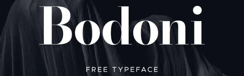
A dramatic modern serif font with extreme contrast between thick and thin strokes. Bodoni commands attention in high-end jewellery branding where elegance meets bold statement-making.
Visual Characteristics
Flat, unbracketed hairline serifs meet vertical strokes at sharp angles.
The thick-to-thin stroke contrast is severe. Almost startling, actually.
- Geometric construction with vertical stress
- Small apertures create dense, solid letterforms
- Overall aesthetic reads as formal and luxurious
The x-height sits moderate, while ascenders climb tall above the cap line.
Best Use Cases
Fine jewellery brands targeting sophisticated clientele. Think engagement ring collections and luxury watch packaging.
Works beautifully for:
- Brand logos requiring dramatic flair
- High-end packaging design and certificates
- Editorial spreads in jewellery catalogues
Valentino, Vogue, and Giorgio Armani all rely on Bodoni. Zara adopted it during their 2019 rebrand.
Legibility Factors
Here’s the thing. Bodoni struggles at small sizes.
The hairline strokes can disappear entirely below 12pt, creating what designers call “dazzle.” Your eyes fight to distinguish letters. Not ideal for jewellery tags or engraving.
Use display sizes (18pt+) for print. Digital requires even larger sizing to maintain those delicate thin strokes.
Pairing Considerations
Pair with simple sans-serif fonts like Helvetica or Futura for body copy. The geometric neutrality balances Bodoni’s drama without competing for attention.
Avoid pairing with other high-contrast serifs. That’s just visual chaos.
Brand Examples
Calvin Klein uses Bodoni extensively. So does Elizabeth Arden for their luxury skincare line. The dramatic stroke contrast signals premium positioning without saying a word.
Didot
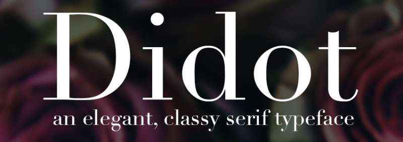
Created by the Didot family in France between 1784 and 1811, this neoclassical serif defines luxury fashion typography. Didot’s extreme stroke contrast and mathematical precision make it fashion’s go-to typeface.
Visual Characteristics
Hairline serifs with zero bracketing. Completely flat.
The vertical stress is absolute. Letters stand perfectly upright, almost architectural in their posture.
- Extreme thick-thin stroke contrast (even more dramatic than Bodoni)
- Ball terminals on lowercase letters add subtle refinement
- High x-height maintains readability at display sizes
The delicate hairlines require quality printing. Cheap paper will destroy them.
Best Use Cases
Fashion jewellery brands. Editorial spreads. Magazine covers where text floats over photography.
Didot functions as what some call a “typographic veil.” Those skeletal letterforms overlay images without obscuring them. Perfect for jewellery lookbooks.
Best applications:
- High-fashion jewellery campaigns
- Luxury brand logos
- Upscale catalogue headlines
Legibility Factors
Display only. Seriously.
Those hairlines vanish at text sizes. Optical sizing is critical. HTF Didot from Hoefler & Co. includes versions specifically designed for different point sizes.
Digital screens amplify the readability problems. Stick to 22px minimum for web headers.
Pairing Considerations
Proxima Nova works beautifully underneath Didot headlines. Futura creates modernist tension against the classical formality.
Montserrat and Avenir both complement without competing. The goal is geometric neutrality in the supporting cast.
Brand Examples
Vogue has used Didot since 1947. Harper’s Bazaar commissioned a custom version in 1991.
Giorgio Armani, CBS Television, Vanity Fair, Elle. The list goes on. If it signals feminine sophistication and timeless luxury, Didot probably appears somewhere.
Garamond

One of the most elegant old-style serif typefaces. Designed by Claude Garamond in 16th-century France. Still going strong five centuries later for books, branding, and refined jewellery presentations.
Visual Characteristics
Flowing, bracketed serifs. Nothing harsh here.
The stroke contrast is subtle compared to Bodoni or Didot. Even weight distribution creates visual harmony across text blocks.
- Low x-height gives generous white space
- Diagonal stress on rounded characters
- Sharp upward hook on the lowercase ‘a’
- Slightly condensed proportions
The top serifs on ascenders slope downward and extend above the cap height. That little detail? Pure Renaissance craftsmanship.
Best Use Cases
Heritage jewellery brands. Estate pieces. Antique collections.
Garamond communicates scholarly elegance and old-world sophistication. Perfect for:
- Jewellery brand certificates and documentation
- Long-form catalogue descriptions
- Classic brand identities
Apple used Garamond for years. So did Abercrombie & Fitch.
Legibility Factors
Excellent readability in print. The even stroke weight and balanced letterforms guide eyes smoothly across paragraphs.
Screen performance is another story. The fine details and low contrast struggle on lower-resolution displays. EB Garamond improves online readability somewhat.
Bump up the point size for digital use. Match the x-height to something like Times New Roman for comparable apparent size.
Pairing Considerations
Futura PT creates striking old-style versus geometric contrast. Helvetica Neue offers universal minimalism alongside refined tradition.
Lato delivers soft, human warmth next to Garamond’s classical form.
Brand Examples
Harry Potter books. The Hunger Games series. Dr. Seuss titles.
Duke University uses Garamond in their wordmark. The scholarly associations make it popular across academic and heritage-focused jewellery brands.
Times New Roman
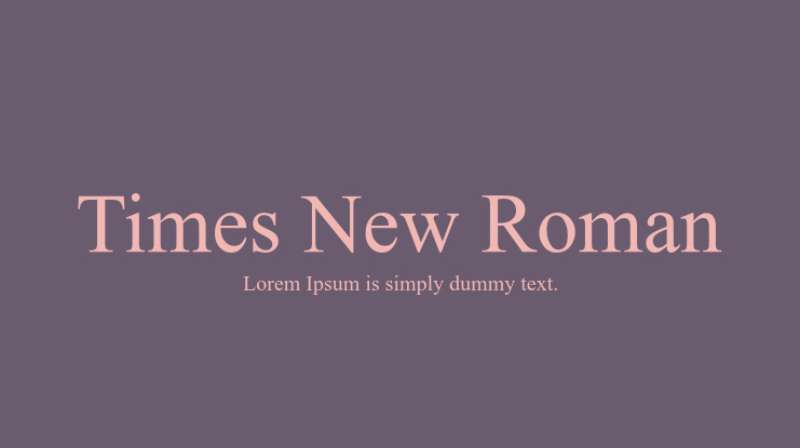
The world’s most familiar serif. Designed by Stanley Morison for The Times of London in 1932. Efficient, readable, and honestly a bit overused. But it works.
Visual Characteristics
Sharp, angled serifs with moderate bracketing.
Higher stroke contrast than traditional old-style faces. The design borrows elements from transitional typefaces like Baskerville.
- Tall x-height improves distance readability
- Narrower letterforms pack more text per line
- Ball terminals add subtle refinement
The ‘e’ and ‘a’ feature large counters and apertures. These open shapes boost legibility at small sizes.
Best Use Cases
I’ll be honest. Times New Roman carries baggage.
It says “I didn’t bother choosing a font.” That’s fine for legal documents. Less fine for luxury jewellery.
Where it works:
- Internal documentation
- Jewellery certificates where formality trumps style
- Body copy in traditional catalogues
The American Psychological Association still requires it for submissions. Courts accept it without question.
Legibility Factors
Superb readability. That’s the whole point.
Designed for newsprint at small sizes under poor printing conditions. Modern jewellery applications rarely push those limits.
Digital performance is solid. The robust strokes survive screen rendering better than more delicate serifs.
Pairing Considerations
Gotham pairs well for a serif/sans contrast. Source Sans Pro functions almost like a sans-serif version of Times itself.
Georgia offers similar transitional characteristics with better screen optimization.
Brand Examples
The Times of London (obviously). The U.S. Department of State used it exclusively from 2004 to 2023.
For jewellery brands, Times New Roman appears more often in supporting materials than primary branding. It lacks the distinctive character that premium positioning demands.
Baskerville

A transitional serif bridging old-style and modern typefaces. John Baskerville designed it in 1757 in Birmingham, England. Crisp, elegant, and surprisingly persuasive. Studies suggest readers find statements in Baskerville more believable.
Visual Characteristics
High contrast between thick and thin strokes. But softer than Bodoni or Didot.
Rounded, bracketed serifs flow organically from main strokes. Nothing harsh or abrupt.
- Near-vertical axis on rounded characters
- Generous letter spacing
- The uppercase Q features an elegant flowing swash
- Italic versions include beautiful calligraphic flourishes
The refinement shows in details. The tail of the uppercase R extends gracefully outward. The ampersand is genuinely iconic.
Best Use Cases
Refined jewellery brands seeking sophistication without drama.
Works beautifully for:
- High-end real estate and financial services (think estate jewellery auctions)
- Academic and heritage-focused positioning
- Book typography and long-form content
Kate Spade New York uses Baskerville. So does Better Homes and Gardens magazine.
Legibility Factors
Exceptional readability. Baskerville improved upon Caslon specifically for legibility.
The generous spacing and clear letterforms perform well across sizes. Even Amazon’s Kindle offers Baskerville as a reading option.
Print reproduction requires quality paper to capture the subtle stroke modulation. Cheap newsprint flattens the elegance.
Pairing Considerations
Helvetica Neue provides clean modernist balance. Apercu Pro Mono adds contemporary edge for digital applications.
Avenir Next and Proxima Nova both work as geometric sans counterpoints.
Brand Examples
Bob Evans restaurants. The Metropolitan Opera. Canada’s government wordmark.
For jewellery, Baskerville fits heritage brands and vintage-inspired collections. The scholarly connotations suit estate pieces and antique specialists.
Playfair Display

A transitional serif designed by Claus Eggers Sørensen for Google Fonts. Inspired by 18th-century European Enlightenment type. High contrast. Dramatic flair. Free to use.
Visual Characteristics
Strong contrast between thick and thin strokes. Ball terminals on lowercase letters like ‘a’ and ‘c’.
The design captures Enlightenment-era aesthetics when pointed steel pens replaced broad nib quills.
- Large x-height relative to cap height
- Delicate hairlines at display sizes
- Bold versions maintain the high contrast
- Italics feature additional flourishes
The overall effect? Elegant. Sophisticated. Fashion-forward.
Best Use Cases
Fashion jewellery editorials. Luxury branding on a budget (since it’s free).
Perfect for:
- Wedding jewellery invitations and stationery
- Jewellery e-commerce headers
- Social media graphics
- Lookbook headlines
Medium uses a similar high-contrast serif for their platform. The editorial voice translates well to jewellery marketing.
Legibility Factors
Display font only. The thin strokes break down at small scales.
Use 88px for web headers. Body text at 34px minimum. Anything smaller and those hairlines disappear.
Print holds up better than screen. But still, keep it large.
Pairing Considerations
Lato delivers excellent body text readability underneath Playfair headlines. Open Sans and Roboto both work.
Montserrat creates modern edge. Poppins adds friendly approachability.
The pairing fonts strategy is simple: geometric sans-serifs balance the ornate display style.
Brand Examples
Widely used by independent jewellery designers and boutique brands on Etsy and Shopify.
The free licensing makes it accessible. But that accessibility means you’ll see it everywhere. Consider whether ubiquity fits your brand positioning.
Futura

The geometric sans-serif that defined modernism. Paul Renner designed it in 1927 based on circles, triangles, and squares. Clean. Confident. Timeless.
Visual Characteristics
Near-perfect geometric construction. The capital O is almost exactly circular.
- Single-story lowercase ‘a’ and ‘g’
- Uniform stroke width throughout
- Tall ascenders rising above the cap line
- Low contrast, even-weight strokes
The uppercase characters echo Roman square capital proportions. Classical roots meet modernist execution.
Best Use Cases
Contemporary jewellery brands. Minimalist aesthetics. Brands wanting modern sophistication without pretension.
Works beautifully for:
- Brand logos and wordmarks
- Jewellery packaging requiring clean lines
- Web design interfaces
- Signage and wayfinding
Nike uses Futura Extra Bold Condensed Oblique. Louis Vuitton incorporates it across branding. Dolce & Gabbana, Omega, Volkswagen. The list is long.
Legibility Factors
Highly readable even at small sizes. The uniform stroke weight survives scaling better than high-contrast faces.
That said, the geometric purity can feel cold. Some critics argue it lacks personality for certain applications.
Works across print and digital equally well. The simplicity translates to screens without degradation.
Pairing Considerations
Bodoni or Didot provide classical counterweight to Futura’s modernist geometry. The old versus new tension creates visual interest.
Georgia works for a serif/sans contrast. Garamond creates striking genre-crossing combinations.
Brand Examples
The Apollo 11 moon plaque uses Futura. Calvin Klein, IKEA (until 2010), Supreme, Crayola.
For jewellery, Futura suits contemporary, design-forward brands. Think architectural jewellery. Geometric forms. Modern minimalism.
Helvetica
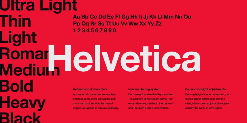
The world’s most famous font. Max Miedinger and Eduard Hoffmann designed it in 1957 in Switzerland. Neutral. Clean. Everywhere.
Visual Characteristics
Neo-grotesque design with uniform stroke width.
- Tall x-height for distance readability
- Tight letter spacing
- Horizontal and vertical stroke terminators
- Narrow apertures create dense appearance
The ‘R’ has a distinctive curved leg. The ‘G’ features a horizontal spur. These subtle details separate Helvetica from imitators.
Best Use Cases
Contemporary luxury jewellery. Streetwear-adjacent brands. Minimalist positioning.
Best applications:
- Clean brand wordmarks
- Jewellery website navigation
- Modern packaging
- Corporate materials
The North Face, Fendi, A.P.C., American Airlines, BMW. NASA used it extensively on space shuttle signage.
Legibility Factors
Generally excellent. But those narrow apertures limit performance at very small sizes.
Screen rendering works well thanks to the uniform strokes. No delicate hairlines to disappear.
For body text, consider Helvetica Neue. The 1983 revision improved legibility and added more weights.
Pairing Considerations
Garamond creates elegant contrast as a classical serif counterpoint. Georgia provides similar benefits with better screen optimization.
Really, Helvetica pairs with almost anything. Its neutrality is both strength and criticism.
Brand Examples
Burberry, Balmain, Celine, Saint Laurent. Fashion houses have adopted Helvetica (or similar sans-serifs) to signal new chapters and attract younger audiences.
For jewellery, Helvetica works when the product should speak louder than the typography. It’s a neutral vessel. A clean stage.
The risk? Blanding. When every luxury brand uses similar minimalist typography, differentiation becomes harder. Something to consider.
Avenir
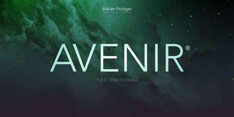
Adrian Frutiger designed Avenir in 1988, aiming to create a geometric sans-serif that felt warmer than Futura. The name means “future” in French.
It works beautifully for contemporary jewellery brands seeking a clean yet refined look.
Visual Characteristics
Avenir sits in the sans-serif font category with humanist touches. Vertical strokes are thicker than horizontals. The “O” isn’t a perfect circle.
Key features include:
- Shortened ascenders for compact proportions
- Medium x-height for balanced appearance
- Six weights from Light to Black
- Oblique variants rather than true italics
The overall aesthetic feels modern without being cold. Frutiger himself considered it his best work.
Best Use Cases
Avenir excels in minimalist jewellery branding. Think clean-lined contemporary pieces.
Works well for:
- High-end watch brands needing understated elegance
- Modern fine jewellery collections
- E-commerce websites requiring crisp readability
- Luxury packaging design and hang tags
The font positions brands as sophisticated and forward-thinking without flashiness.
Legibility Factors
Small text performs excellently. Those humanist touches Frutiger built in make it readable at tiny sizes.
Digital screens love this font. Apple includes Avenir Next as a system font for good reason. Print reproduction stays sharp even on textured paper stocks.
The lighter weights need care at very small sizes though. Stick to Book or Medium for body copy.
Pairing Considerations
Avenir pairs naturally with classic serifs. Garamond or Caslon for body text creates lovely contrast.
For all-sans systems, try different weights within the Avenir family itself. Light headlines with Medium body text. Works especially well when you understand typographic hierarchy principles.
Avoid pairing with Futura. Too similar, too boring.
Brand Examples
Best Buy uses a custom version. Amsterdam adopted it for city branding. Dublin Airport relies on it for wayfinding.
In jewellery specifically, many contemporary designers choose Avenir for its balance of warmth and precision.
Gotham
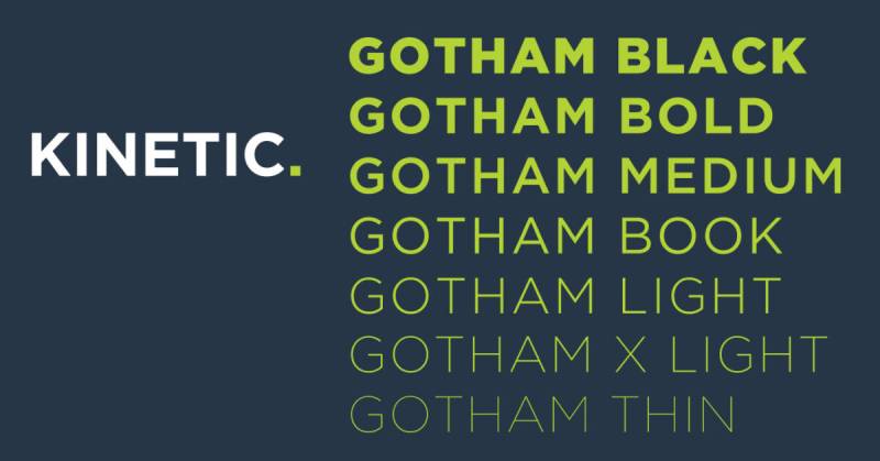
Tobias Frere-Jones created Gotham in 2000 for GQ magazine. They wanted something “masculine, new, and fresh.”
The font draws inspiration from mid-century New York architectural signage. Particularly the Port Authority Bus Terminal.
Visual Characteristics
Geometric sans-serif with a distinctly American feel. Broad letterforms with high x-height.
Defining traits:
- Wide apertures for excellent readability
- Circular shapes in letters like O and C
- Limited ascender and descender heights
- Eight weights across four widths
- Rounded variant available
The aesthetic reads as confident and approachable. Honest but never boring.
Best Use Cases
Gotham suits jewellery brands wanting bold, contemporary positioning. Not delicate or ornate pieces.
Perfect for:
- Statement jewellery collections
- Fashion-forward accessories
- Men’s jewellery and watches
- Brand logo wordmarks requiring presence
The font carries authority without pretension. Obama’s campaign used it because it felt trustworthy.
Legibility Factors
Gotham performs brilliantly across sizes. Those wide apertures help enormously.
Digital display works great. ScreenSmart versions exist specifically for web use. Print holds up perfectly on everything from business cards to billboards.
Very small sizes (under 8pt) may lose some personality. The geometric structure stays legible though.
Pairing Considerations
Gotham pairs well with serif fonts like Mercury or Chronicle. Creates nice formal/informal tension.
Within the family, mix Gotham Narrow for headlines with standard width for body. The Rounded variant adds friendliness when needed.
Don’t pair with Montserrat. They’re too similar and the visual comparison isn’t flattering to either.
Brand Examples
One World Trade Center cornerstone features Gotham. Netflix used it before creating their custom font.
The National September 11 Memorial uses it. Starbucks incorporated it during their 2008 voting campaign.
Montserrat

Julieta Ulanovsky designed Montserrat starting in 2010. Inspired by old signs in her Buenos Aires neighbourhood.
Released through Google Fonts in 2011, it’s now one of the most popular typefaces on the web.
Visual Characteristics
Geometric sans-serif with urban soul. Large x-height and short descenders.
Features include:
- Nine weights from Thin to Black
- Wide apertures for screen readability
- Alternates family with distinctive letterforms
- Subrayada (underlined) variant
The look balances geometric precision with human warmth. Less rigid than Futura, more contemporary than Gotham.
Best Use Cases
Montserrat works for accessible luxury jewellery brands. Not ultra-high-end, but quality-focused.
Ideal applications:
- Jewellery e-commerce websites
- Social media graphics
- Brand identity for emerging designers
- Lookbooks and digital catalogues
Positions brands as modern and approachable. Great for direct-to-consumer jewellery companies.
Legibility Factors
Exceptional screen performance. That’s why 19+ million websites use it.
Small text stays clear thanks to wide apertures and generous x-height. Works across devices without hinting issues.
Print requires care in lighter weights. Medium or SemiBold holds up better on lower-quality paper.
Pairing Considerations
Pairs beautifully with classic serifs like Lora or Playfair Display. The geometric/organic contrast creates interest.
For pairing fonts within a family, use Black for headlines and Regular for text. The weight difference provides clear hierarchy.
Works alongside Merriweather for extended reading situations.
Brand Examples
Often called the free alternative to Gotham. Many startups and independent jewellery brands use it.
The Polish Government adopted it. Various university systems use it for branding.
Lato

Łukasz Dziedzic designed Lato in 2010. “Lato” means “summer” in Polish.
Originally created for a Polish bank that ultimately chose a different direction. Their loss became everyone’s gain.
Visual Characteristics
Humanist sans-serif balancing “serious but friendly.” Semi-rounded details provide warmth.
Characteristics:
- Nine weights from Hairline to Black
- Matching italics for each weight
- Classical proportions in uppercase
- Strong structure with soft terminals
The aesthetic achieves what Dziedzic called “warm professionalism.” Transparent in body text, distinctive in headlines.
Best Use Cases
Lato suits wedding jewellery and bridal brands. Warm enough for romance, professional enough for business.
Works for:
- Engagement ring retailers
- Bridal jewellery collections
- Web design requiring extended reading
- Customer communications and email
Positions brands as trustworthy and approachable without being casual.
Legibility Factors
One of the most readable sans-serifs available. Google Fonts serves it over a billion times daily.
That Hairline weight looks gorgeous but needs large sizes. Regular through Bold work perfectly for text.
Digital and print both perform excellently. Extended Latin, Cyrillic, and Greek support covers global needs.
Pairing Considerations
Pairs with Merriweather for content-heavy sites. The humanist characteristics complement each other.
Libre Baskerville provides nice contrast for elegant applications. Both are Google Fonts, so licensing stays simple.
Use multiple Lato weights to create hierarchy within a single family.
Brand Examples
Save the Children uses Lato for branding. Bank Pekao in Poland adopted it. The Consumer Financial Protection Bureau relies on it.
Popular choice for jewellery websites needing professional warmth.
Edwardian Script

Edward Benguiat designed ITC Edwardian Script in 1994. Named for the elegance of the Edwardian era (1901-1910).
The design mimics writing with a flexible steel-point pen. That instrument produces thick-thin contrast through pressure variation.
Visual Characteristics
Formal script font with calligraphic heritage. Flowing, connected letterforms.
Defining features:
- High stroke contrast (thick/thin variation)
- Elaborate capital letters with flourishes
- Smooth connecting strokes between letters
- Delicate hairline elements
The aesthetic screams traditional luxury. Sophisticated and formal in every way.
Best Use Cases
Edwardian Script belongs on heritage jewellery brands and fine estate pieces.
Perfect applications:
- Wedding invitation suites
- Formal certificates of authenticity
- Luxury brand logotypes
- High-end restaurant menus (in jewellery venues)
Positions brands as timeless and refined. Not for contemporary or minimalist aesthetics.
Legibility Factors
Display use only. Never set body text in this font.
Works at large sizes for headlines and accents. Below 18pt, those delicate hairlines start disappearing.
Print on quality paper stock. Digital display requires careful rendering. Avoid backgrounds with texture.
Pairing Considerations
Pair with clean serif fonts for body text. Garamond or Times work well.
Copperplate Gothic provides nice contrast for secondary headlines. Both evoke traditional luxury.
Limit Edwardian Script to accent use. A little goes a long way.
Brand Examples
Seen extensively in wedding stationery. Common on formal event materials.
Many estate jewellery dealers use similar scripts for authenticity certificates.
Bickham Script

Richard Lipton designed Bickham Script for Adobe in 1996. Based on 18th-century English roundhand calligraphy.
Named after George Bickham, whose 1741 book “The Universal Penman” collected the era’s finest penmanship.
Visual Characteristics
Formal script with extensive OpenType features. Flowing, romantic letterforms.
Key characteristics:
- Dramatic thick-thin stroke contrast
- Dozens of alternate letterforms
- Extensive swash options
- Three weights (Light to Bold)
- Over 1,700 glyphs in Pro version
The aesthetic captures copperplate elegance. More ornate than Edwardian Script when fully utilized.
Best Use Cases
Bickham Script suits haute couture jewellery and prestigious occasions.
Ideal for:
- Luxury brand monograms
- Award certificates
- Exclusive event invitations
- Fine wine labels (for jewellery industry events)
Positions brands at the highest tier of refinement. Aristocratic without apology.
Legibility Factors
Strictly display font territory. Large sizes only.
The alternate characters require OpenType-savvy applications. Without proper software, you miss the magic.
Print on premium materials. Those delicate hairlines demand quality reproduction.
Pairing Considerations
Pair with readable serifs like Adobe Garamond. The historical periods align nicely.
For modern contrast, try a clean geometric sans. The unexpected combination can work.
Use sparingly. Bickham Script should accent, not dominate.
Brand Examples
Common in luxury hospitality branding. Fine dining restaurants love it.
Jewellery brands use it for special edition releases and limited collections.
Copperplate
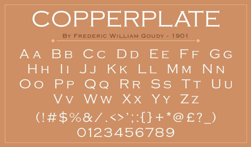
Frederic W. Goudy designed Copperplate Gothic in 1901 for American Type Founders. An early career commission he later treasured.
Despite the “Gothic” name (meaning sans-serif), tiny serifs punctuate each stroke. They’re barely visible but make a difference.
Visual Characteristics
All-capitals typeface with glyphic serifs. Wide letterforms with Victorian influence.
Features:
- Small triangular serifs at stroke terminals
- Wide horizontal axis
- Multiple weights (Light to Heavy)
- Capitals and small capitals only
The aesthetic suggests stone carving or engraved lettering. Authoritative and established.
Best Use Cases
Copperplate works for traditional fine jewellery establishments. Family businesses. Heritage brands.
Applications include:
- Business cards and stationery
- Shop signage and window lettering
- Legal documents and certificates
- Brand guidelines for classic brands
Positions brands as established and trustworthy. Banks and law firms use it for good reason.
Legibility Factors
Surprisingly readable at small sizes. Those tiny serifs help letter recognition.
All-caps limits extended reading. Use for short text blocks only.
Excellent in both print and acid-etched glass. Common on office doors for upscale businesses.
Pairing Considerations
Pairs with traditional serifs like Garamond for body text. Both evoke historical refinement.
Within Copperplate, mix weights for emphasis. Light for secondary text, Bold for headlines.
Avoid pairing with other all-caps fonts. The visual monotony becomes exhausting.
Brand Examples
Classic choice for law offices, banks, and upscale restaurants. Very common on business cards.
In jewellery, traditional Fifth Avenue establishments often use it.
Great Vibes
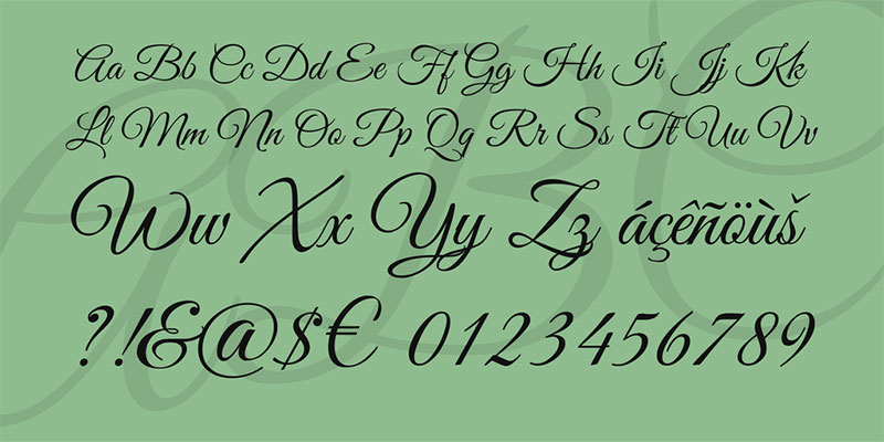
Rob Leuschke of TypeSETit designed Great Vibes. Released through Google Fonts as an open-source option.
Updated in March 2024 with extended language support including Cyrillic.
Visual Characteristics
Flowing script with casual/formal hybrid character. Over 2,000 glyphs available.
Features:
- Cleanly looping ascenders and descenders
- Elegant uppercase forms
- Smooth connecting strokes
- Single weight only
The aesthetic feels romantic but accessible. Less formal than Bickham, more refined than casual scripts.
Best Use Cases
Great Vibes works for romantic jewellery without the stuffiness. Valentine’s collections. Anniversary gifts.
Perfect applications:
- Jewellery gift cards
- Romantic occasion marketing
- Social media graphics
- DIY wedding stationery
Positions brands as warm and personal. The free licensing makes it accessible to small businesses.
Legibility Factors
Display use only. Those connected letters require size to read clearly.
Digital rendering works well thanks to careful design. Web embedding is free and simple.
Print at 24pt or larger. Below that, letterforms start blending together.
Pairing Considerations
Pair with Montserrat or Open Sans for body text. The casual/clean contrast works nicely.
Lora provides elegant serif contrast. Both are Google Fonts for easy licensing.
Limit Great Vibes to headlines and accents. Extended use becomes difficult to read.
Brand Examples
Extremely popular on wedding vendor sites. Etsy jewellery sellers use it frequently.
Common choice for small jewellery businesses and independent designers working with limited budgets.
Parisienne
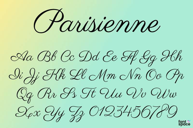
Brian J. Bonislawsky of Astigmatic designed Parisienne. The inspiration? A 1960s bra advertisement. Seriously.
That quirky origin produced a casual connecting script with intentional bounce and slight irregularity. Free-spirited yet classic.
Visual Characteristics
Connecting script with casual flair. Smooth letterforms with a gentle rhythm.
Features include:
- Slight bounce between letters
- Intentional irregularity in connections
- Single weight only
- Over 360 glyphs
The aesthetic feels Parisian in the romantic sense. Approachable elegance without stuffiness.
Best Use Cases
Parisienne works for affordable luxury jewellery brands. Think boutique shops rather than Fifth Avenue.
Ideal applications:
- Gift shop signage
- Social media graphics
- Jewellery gift cards
- Small business branding
Positions brands as charming and accessible. The free Google Fonts licensing makes it budget-friendly.
Legibility Factors
Display use only. Those connecting letters need size to read clearly.
Digital rendering works well through Google Fonts. Print at 20pt or larger for best results.
The slight irregularity that makes it charming can hurt readability at small sizes.
Pairing Considerations
Pair with Lato or Montserrat for body text. The geometric/script contrast works nicely.
Merriweather provides elegant serif contrast. All are Google Fonts for simple licensing.
Keep Parisienne for headlines and accents only.
Brand Examples
Popular on Etsy jewellery shops. Common choice for small boutique businesses seeking French-inspired elegance.
Trajan
Carol Twombly designed Trajan for Adobe in 1989. Based on inscriptions from Trajan’s Column in Rome, dating to 113 AD.
An all-capitals typeface because Romans didn’t use lowercase. Those carved letters reached their peak refinement in the first century.
Visual Characteristics
Old-style serif with Roman monumental proportions. Sharp, elegant letterforms.
Key features:
- All capitals (small caps for lowercase)
- Variable stroke width mimicking chisel marks
- Bracketed serifs
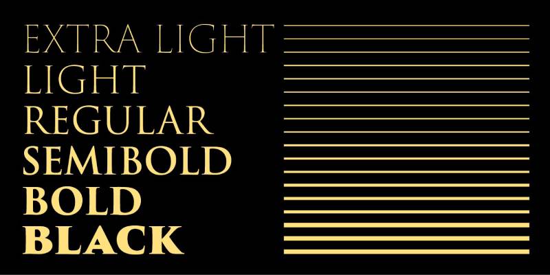
- Six weights from Light to Black
The aesthetic reads as authoritative and timeless. Stoic elegance with imperial presence.
Best Use Cases
Trajan suits prestigious jewellery houses and heritage brands. Old-money sophistication.
Works for:
- Luxury brand wordmarks
- Certificate of authenticity documents
- Award ceremonies and formal events
- Institutional jewellery collections
Positions brands at the pinnacle of tradition and quality.
Legibility Factors
Display use primarily. All-caps limits extended reading.
Works beautifully at large sizes. Those delicate serifs reproduce well in quality printing.
Digital display requires care. Light weights may appear fragile on screens.
Pairing Considerations
Pair with Adobe Garamond or Minion for body text. The historical periods complement each other.
For modern contrast, try Optima. Both share classical Roman influences.
Use Trajan sparingly for maximum impact.
Brand Examples
Ubiquitous on movie posters (Titanic, most notably). Columbia University, Rice University, and numerous institutions use it.
Common on high-end jewellery certificates and award programs.
Caslon
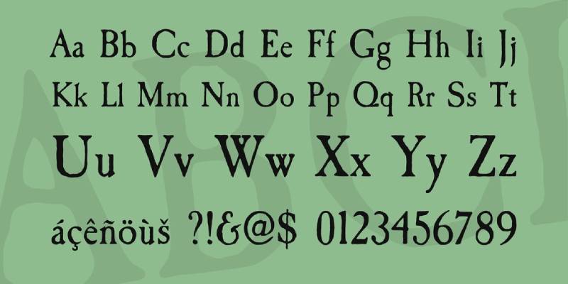
William Caslon designed his namesake typeface around 1722. The first original English typeface and a favourite of Benjamin Franklin.
“When in doubt, use Caslon” remains a design rule. The US Declaration of Independence was printed in Caslon.
Visual Characteristics
Old-style serif with organic, pen-influenced structure. Warm and readable.
Characteristics:
- Moderate stroke contrast
- Concave hollow on “A” at top left
- “G” without downward spur
- Relatively short ascenders and descenders
The aesthetic feels trustworthy and established. Warmth without coldness.
Best Use Cases
Caslon works for established jewellery houses with historical lineage.
Applications include:
- Book cover design for jewellery catalogues
- Formal correspondence
- Editorial design
- Historical or estate jewellery branding
Positions brands as refined and trustworthy.
Legibility Factors
Excellent for extended reading. Body text is where Caslon shines.
Works well at 9-14pt for text. Larger sizes reveal the beautiful details.
Print and digital both perform well. Adobe Caslon Pro optimized for modern use.
Pairing Considerations
Caslon pairs with geometric sans-serifs like Futura for contrast.
Within the Caslon family, use different weights for hierarchy. Bold for headlines, regular for body.
Avoid pairing with similar old-style serifs like Garamond. Too close visually.
Brand Examples
Harper’s Magazine uses Caslon extensively. Many book publishers rely on it.
Popular for fine jewellery catalogues and art auction houses.
Goudy Old Style

Frederic W. Goudy designed Goudy Old Style in 1915 for American Type Founders. It became an instant bestseller.
Inspired by Italian Renaissance lettering without copying specific historical models. Elegant yet surprisingly hardy.
Visual Characteristics
Old-style serif with distinctive eccentricities. Light colour on the page.
Unique features:
- Diamond-shaped dots on i, j, and punctuation
- Upward-curved ear on lowercase “g”
- Calligraphic tail on uppercase “Q”
- Upward slant on base of “E” and “L”
The aesthetic exudes class and antiquity. Gentle humanity without austerity.
Best Use Cases
Goudy Old Style suits refined jewellery brands wanting warmth with sophistication.
Works for:
- High-end magazine advertising
- Event programs and invitations
- Business cards and stationery
- Chapter headings in jewellery books
Positions brands as cultured and elegant.
Legibility Factors
Considered one of the most legible and readable typefaces ever made. For print.
Screen display suffers due to subtle forms. Not ideal for small digital text.
Printed materials at 10-12pt work beautifully.
Pairing Considerations
Pair with clean sans-serifs for modern contrast. Avenir works nicely.
Use Goudy Oldstyle Italic for emphasis rather than bold. The italic is particularly beautiful.
Limit to print applications where subtlety can be appreciated.
Brand Examples
Harper’s Magazine uses it for text. Northwestern University and Emory University adopted it for branding.
Popular for luxury print advertising in jewellery.
Optima
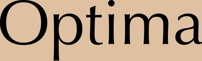
Hermann Zapf designed Optima between 1952-1958. Inspired by Renaissance tombstones in Florence’s Basilica di Santa Croce.
A humanist sans-serif with subtle terminal flares suggesting glyphic serifs. Zapf’s favourite among his own typefaces.
Visual Characteristics
Humanist sans-serif with variable stroke width. Classical yet modern.
Features:
- Subtle swelling at stroke terminals
- Roman capital proportions
- High stroke contrast for a sans-serif
- Multiple weights available
The aesthetic blends modern simplicity with classical elegance. Sophisticated and warm.
Best Use Cases
Optima excels for beauty and luxury jewellery brands. Think Estée Lauder aesthetic.
Ideal for:
- Luxury brand identity systems
- High-end print design materials
- Cosmetics-adjacent jewellery lines
- Premium packaging
Positions brands as elegant and refined without being cold.
Legibility Factors
Works for both body text and display. Zapf demonstrated this in his own book.
Readable at various sizes. Those terminal flares aid letter recognition.
Print performs excellently. Digital works but loses some subtlety.
Pairing Considerations
Pair with Palatino (also by Zapf) for harmonious serif companion.
For contrast, try Futura’s geometric precision against Optima’s organic curves.
Use multiple Optima weights for single-family solutions.
Brand Examples
Vietnam Veterans Memorial uses Optima. Estée Lauder Companies adopted it as brand typeface.
University of New South Wales and University of California Davis use it institutionally.
Century Gothic

Monotype created Century Gothic in 1991. Based on Sol Hess’s Twentieth Century design from the 1930s-40s.
A geometric sans-serif designed as a substitute for ITC Avant Garde. Purely digital, never manufactured as metal type.
Visual Characteristics
Geometric sans-serif with perfect circles. High x-height and wide apertures.
Features:
- Single-story “a” and “g”
- Perfectly circular letterforms
- Light weight in default
- 14 weights now available
The aesthetic reads as modern and clean. Futuristic without being cold.
Best Use Cases
Century Gothic suits contemporary minimalist jewellery brands.
Applications:
- Modern brand wordmarks
- Digital interfaces
- Advertising headlines
- Presentation materials
Positions brands as forward-thinking and accessible.
Legibility Factors
High x-height provides good screen readability. Wide letter spacing may feel loose for body text.
Works best for headlines and short text. Extended reading can tire eyes.
Ink-efficient for printing. U.S. government recommends it for documents.
Pairing Considerations
Pair with serif fonts like Garamond for contrast. The geometric/organic tension works.
Avoid pairing with Arial or Helvetica. Too similar visually.
Use bolder weights for better hierarchy contrast.
Brand Examples
Used in TV shows like House and The Ellen DeGeneres Show. Star Trek: Enterprise featured it.
Popular for modern jewellery e-commerce sites.
Broadway
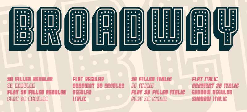
Morris Fuller Benton designed Broadway in 1927 for American Type Founders. The archetypal Art Deco typeface.
Originally capitals only. Sol Hess added lowercase in 1929. The design evokes Jazz Age glamour.
Visual Characteristics
Decorative display face with dramatic stroke contrast. High-impact presence.
Defining features:
- Thick strokes on left side of letters
- Dramatic thin strokes on right
- No descenders in lowercase
- Angular junctions where thick meets thin
The aesthetic screams 1920s glamour. Bold, theatrical, unmistakably vintage.
Best Use Cases
Broadway works for vintage-inspired jewellery and 1920s aesthetic.
Perfect for:
- Gatsby-themed events
- Art Deco jewellery collections
- Poster design for vintage showcases
- Theatre district jewellers
Positions brands firmly in Jazz Age sophistication.
Legibility Factors
Display only. Those dramatic stroke contrasts need size.
High contrast helps it remain visible on coloured backgrounds. Green on blue? Broadway handles it.
No descenders means bold underlining works without interference.
Pairing Considerations
Pair with clean body text fonts. Don’t compete with Broadway’s drama.
Garamond or simple sans-serifs work as supporting players.
Use sparingly for maximum vintage impact.
Brand Examples
Miami Vice and Rhoda TV shows used it. Radio City Music Hall promotions featured it historically.
Popular for vintage jewellery estate sales and Art Deco revival events.
ITC Benguiat
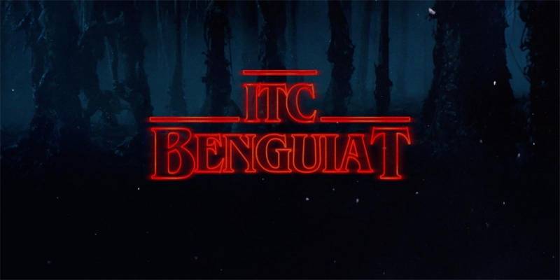
Ed Benguiat designed ITC Benguiat in 1977 for the International Typeface Corporation. Loosely based on Art Nouveau typography.
Famous now as the Stranger Things font. Also graced Stephen King book covers throughout the 1980s.
Visual Characteristics
Decorative serif with Art Nouveau influence. Extremely high x-height.
Features:
- Exaggerated sharp serifs
- Stress in upper half of capitals
- Open counters
- Multiple weights and widths
The aesthetic feels dramatic and nostalgic. 1980s meets turn-of-century elegance.
Best Use Cases
ITC Benguiat works for dramatic statement jewellery and bold vintage vibes.
Applications:
- Bold brand wordmarks
- Event promotional materials
- Display advertising
- Retro-inspired campaigns
Positions brands as confident and distinctive.
Legibility Factors
Display use only. Those decorative elements need size to work.
High x-height helps at moderate sizes. Avoid for body text.
Digital and print both work for headlines.
Pairing Considerations
Pair with neutral body fonts. Benguiat dominates, companions should support.
Simple sans-serifs or basic serifs work as contrast.
One headline weight is usually enough.
Brand Examples
Stranger Things title sequence revived its fame. Choose Your Own Adventure books used it.
Star Trek: Generations and Pulp Fiction credits featured it.
Poiret One
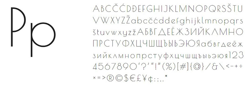
Denis Masharov designed Poiret One for Google Fonts. Released in 2012.
A decorative geometric grotesque with Art Deco and Constructivism influences. Light forms with pure elegance.
Visual Characteristics
Geometric sans-serif with extremely thin strokes. Delicate and airy.
Features:
- Uniform thin stroke weight
- Geometric construction
- Graceful curves
- Single weight only
The aesthetic feels sleek and stylish. Modern with vintage undertones.
Best Use Cases
Poiret One suits delicate minimalist jewellery and fine accessories.
Works for:
- Thin jewellery brand wordmarks
- Label and tag design
- Display headlines
- Motion graphics titles
Positions brands as refined and contemporary.
Legibility Factors
Large sizes only. Those thin strokes disappear at small scales.
Display and headlines work well. Never use for body text.
High-resolution screens handle it better than low-res displays.
Pairing Considerations
Pair with substantial body fonts. Poiret One is too delicate alone.
Lato or Open Sans provide readable contrast.
Free through Google Fonts makes licensing simple.
Brand Examples
Popular for fashion-forward jewellery startups. Common on minimalist brand identities.
Works well for contemporary artisan jewellery marketing.
FAQ on The Best Jewellery Fonts
What fonts work best for jewelry brand identity?
Serif fonts like Didot and Bodoni signal luxury. Script typefaces add elegance for feminine brands. Clean sans-serif options work for modern, minimalist jewelry businesses. Your choice depends on your target audience and the vibe you’re going for.
Should I use script or serif fonts for my jewelry logo?
It depends. Script fonts feel romantic and personal, perfect for bridal or artisan jewelry. Serif fonts communicate trust and heritage. Many jewelers combine both when pairing fonts for their logo design.
Where can I find quality free jewelry fonts?
Google Fonts offers excellent options like Playfair Display, Cormorant Garamond, and Cinzel. Font Squirrel and Dafont have decorative choices too. Just double-check the licensing terms before using them commercially.
What makes a font look luxurious and high-end?
Thin strokes, high contrast between thick and thin lines, and generous spacing. Classic typefaces like Bodoni convey sophistication through their refined details. Font psychology plays a huge role here. Avoid anything too trendy or casual.
How do I pair fonts for my jewelry website?
Contrast is key. Pair a decorative display font for headlines with a readable sans-serif font for body text. Stick to two or three fonts maximum. More than that looks cluttered.
Do I need a font license for my jewelry business?
Yes, usually. Free fonts often restrict commercial use. Font licensing varies by foundry. Adobe Fonts and Google Fonts include commercial rights. Always read the terms before using any typeface on products or marketing materials.
What fonts do luxury jewelry brands like Tiffany use?
Tiffany & Co uses a custom serif based on classical letterforms. Cartier employs elegant, refined typography. Most high-end brands commission custom typefaces. You can achieve similar sophistication with fonts like Didot or Libre Baskerville.
Are Google Fonts good enough for professional jewelry branding?
Absolutely. Fonts like Lora, Josefin Sans, and Raleway are used by successful brands. The key is how you apply them. Good typography principles matter more than expensive fonts.
What’s the difference between a font and a typeface for jewelry design?
A typeface is the design family (like Garamond). A font is a specific weight and style within that family (like Garamond Bold Italic). Most people use these terms interchangeably now.
Which fonts work best for jewelry packaging and tags?
Elegant serifs like Playfair Display or Cormorant look stunning on packaging. Script fonts add a personal touch to jewelry tags. Keep sizing readable. Small text needs simpler letterforms to remain legible.
Conclusion
Choosing the best jewellery fonts comes down to understanding your brand identity and audience. There’s no single right answer here.
Elegant typefaces like Didot, Playfair Display, and Cormorant Garamond consistently deliver that luxury feel jewelers need. They’ve proven themselves across countless successful brands.
Don’t overlook free resources. Google Fonts and Adobe Fonts offer premium quality without the price tag.
Your font selection shapes how customers perceive your jewelry business. It affects everything from your website to your packaging tags.
Test your choices across different applications. What looks gorgeous on screen might struggle on small jewelry tags or business cards.
Start simple. Pick one or two fonts that reflect your brand’s personality. You can always refine later as your jewelry brand grows.

Renowned for his expertise in logo design and visual branding, Bogdan has developed a multitude of logos for various clients.
His skills extend to creating posters, vector illustrations, business cards, and brochures. Additionally, Bogdan's UI kits were featured on marketplaces like Visual Hierarchy and UI8.
He also wrote in the past years on sites like Design Your Way, WebDesignerDepot, WPDean, Designmodo, Speckyboy, Slider Revolution, and more.
- The Cursor Logo History, Colors, Font, And Meaning - 24 September 2026
- Canva vs PowerPoint: Which Is Better for Presentations? - 22 September 2026
- How to Install Fonts on Mac (Step-by-Step Guide) - 20 September 2026

Bogdan Sandu is a seasoned designer who has been designing websites since 2008. Renowned for his expertise in logo design and visual branding, Bogdan has developed a multitude of logos for various clients. His skills extend to creating posters, vector illustrations, business cards, and brochures. Additionally, Bogdan's UI kits were featured on marketplaces like Visual Hierarchy and UI8. He also wrote in the past years on sites like Design Your Way, WebDesignerDepot, WPDean, Designmodo, Speckyboy, Slider Revolution, and more.
You Might Also Like