The typeface you choose for a poem is not decoration. It is part of the poem.
Finding the best fonts for poetry means understanding how letterform, spacing, and typographic rhythm either support or undercut the reading experience. A wrong choice breaks line integrity. A right one disappears entirely, letting the verse speak.
With self-publishing now accounting for roughly 40% of all new poetry books, more poets than ever are making these decisions without a designer’s guidance.
This guide covers what separates a readable poetry typeface from a damaging one, which serif and sans-serif fonts hold up across print and screen formats, how to pair fonts for chapbooks and collections, and where to find and license them correctly.
By the end, you will have a clear, practical framework for choosing fonts that serve the poem – not the other way around.
Choosing the right font for poetry matters more than most people realize. A poorly chosen typeface pulls the reader out of the verse. A well-chosen one disappears entirely, letting the words do their work.
Poetry typography sits in a different category from most text layout. Lines are short, spacing carries meaning, and the visual rhythm on the page is part of the reading experience. That changes which serif fonts perform best, and why most design defaults fall flat.
The fonts below cover print poetry books, chapbook layouts, poetry websites, and digital collections. Each one is evaluated against that specific context, not general readability theory.
| Font | Classification | Best for Poetry Context | License |
|---|---|---|---|
| Garamond | Old-style serif | Print poetry books, chapbooks | Commercial (free revivals via OFL) |
| Baskerville | Transitional serif | Academic and literary collections | Commercial (Libre Baskerville: OFL) |
| Palatino | Humanist serif | Multi-purpose print and digital | System-bundled / Commercial |
| Cormorant Garamond | Display serif | Titles, epigraphs, section headers | OFL (Free) |
| Playfair Display | Transitional display serif | Digital poetry headings | OFL (Free) |
| Merriweather | Screen-optimized serif | Poetry websites, digital journals | OFL (Free) |
| Lora | Calligraphic serif | Poetry blogs, literary websites | OFL (Free) |
| Georgia | Transitional screen serif | Web poetry, digital collections | System font (free) |
Best Fonts For Poetry
Garamond

Garamond is an old-style serif typeface originating with French punchcutter Claude Garamond in the 1530s–1540s, with widely-used modern revivals including Adobe Garamond Pro (Robert Slimbach, 1989) and EB Garamond (Georg Duffner, 2011), available through Adobe Fonts and Google Fonts respectively.
It sets body text at small sizes with low ink density, preserving readability across a full poem without visual fatigue.
The Harry Potter novels and multiple Dr. Seuss books were set in Garamond variants, demonstrating how the typeface handles extended literary reading across varied age groups.
What makes Garamond suitable for poetry?
Garamond uses angled, bracketed serifs and fine stroke contrast that guide horizontal eye movement along each line. Its letterforms have a low x-height relative to ascender length, which gives stanzas visual breathing room on the page. Old-style figures and true italic variants allow typographic nuance without switching typefaces.
Key attributes:
| Attribute | Value |
|---|---|
| Classification | Old-style serif |
| Designer | Claude Garamond (1530s); multiple revivals |
| Weight range | Varies by version; Adobe Garamond: Regular, Semibold, Bold |
| Variable font | EB Garamond: Yes |
| Recommended sizes | 11pt–14pt for print body; 16px–20px for digital |
| Letter-spacing default | 0 (tight) |
| License | Commercial (Monotype); EB Garamond: OFL |
| Available on | Adobe Fonts, Google Fonts (EB Garamond) |
| Price | Subscription (Adobe); Free (EB Garamond) |
How does Garamond perform for poetry typography?
Garamond’s moderate stroke contrast holds at 11pt–12pt in print without hairline breakup on standard paper stock. Its lighter ink coverage keeps a page of verse from looking crowded even when stanzas sit close together. At digital sizes below 14px, EB Garamond can appear slightly thin on Windows with ClearType rendering.
What are the best pairings for Garamond in poetry?
Garamond pairs with Optima or a clean sans-serif font for section titles when contrast is needed. Garamond font pairing options show it works well alongside Caslon for secondary text elements in a fully-serif poetry book layout.
What are the limitations of Garamond for poetry?
Garamond’s limited weight range in most digital versions (Regular, Italic, Bold) restricts typographic hierarchy in longer collections. Commercial versions require licensing for web embedding, and EB Garamond renders poorly on Windows at body sizes below 14px.
Garamond – Recommended Use Cases Within Poetry Typography
- Best for: Print poetry books and chapbooks at 11pt–13pt; academic literary collections
- Avoid for: Poetry websites serving Windows users at small sizes; high-contrast display headings
- Optimal weight: Regular 400 for body; Italic 400 for emphasis
- Optimal size range: 11pt–14pt print; 16px–20px digital
Baskerville

Baskerville is a transitional serif typeface designed by John Baskerville in Birmingham, England, first issued between 1752 and 1757. Modern digital versions include Libre Baskerville (Pablo Impallari, 2012, OFL) and commercial versions from Monotype and Linotype.
It delivers high stroke contrast and sharp serifs suited to formal literary typesetting.
What makes Baskerville suitable for poetry?
Baskerville has higher stroke contrast than old-style serifs, with near-vertical stress and sharply bracketed serifs. This contrast creates clear visual distinction between thick and thin strokes that aids legibility in short-line poetry layout. Its upright stance gives printed verse a formal, considered character.
Key attributes:
| Attribute | Value |
|---|---|
| Classification | Transitional serif |
| Designer | John Baskerville (1752–1757); Libre Baskerville: Pablo Impallari, 2012 |
| Weight range | Regular, Italic, Bold (Libre Baskerville) |
| Variable font | No |
| Recommended sizes | 11pt–13pt print; 16px–20px digital |
| Letter-spacing default | 0 |
| License | Libre Baskerville: OFL; Commercial versions: paid |
| Available on | Google Fonts (Libre Baskerville); Adobe Fonts; Monotype |
| Price | Free (Libre Baskerville); paid for commercial versions |
How does Baskerville perform for poetry typography?
Libre Baskerville was optimized for web body text at 16px with a taller x-height than the original, improving readability on modern screens. Commercial Baskerville versions perform better in print, where higher stroke contrast reads as refined rather than mechanical. The font’s formal structure makes it a natural fit for fonts for academic papers or literary collections that need a scholarly tone.
What are the best pairings for Baskerville in poetry?
Baskerville pairs with a neutral grotesque like Gill Sans for chapter headings, and with Futura for a strong historical-modern contrast. Baskerville font pairing works well when the body is set in Baskerville Regular and titles use a lighter weight sans-serif.
What are the limitations of Baskerville for poetry?
Libre Baskerville has only 3 styles (Regular, Italic, Bold), limiting weight-based typographic hierarchy in complex layout designs. At sizes below 14px on low-DPI screens, the hairline strokes in commercial versions thin out noticeably.
Baskerville – Recommended Use Cases Within Poetry Typography
- Best for: Print literary collections, formal chapbooks, academic poetry editions
- Avoid for: Display titles at large sizes; poetry on textured or low-quality paper stock
- Optimal weight: Regular 400 for body; Bold 700 for section titles sparingly
- Optimal size range: 11pt–13pt print; 16px–20px digital
Palatino
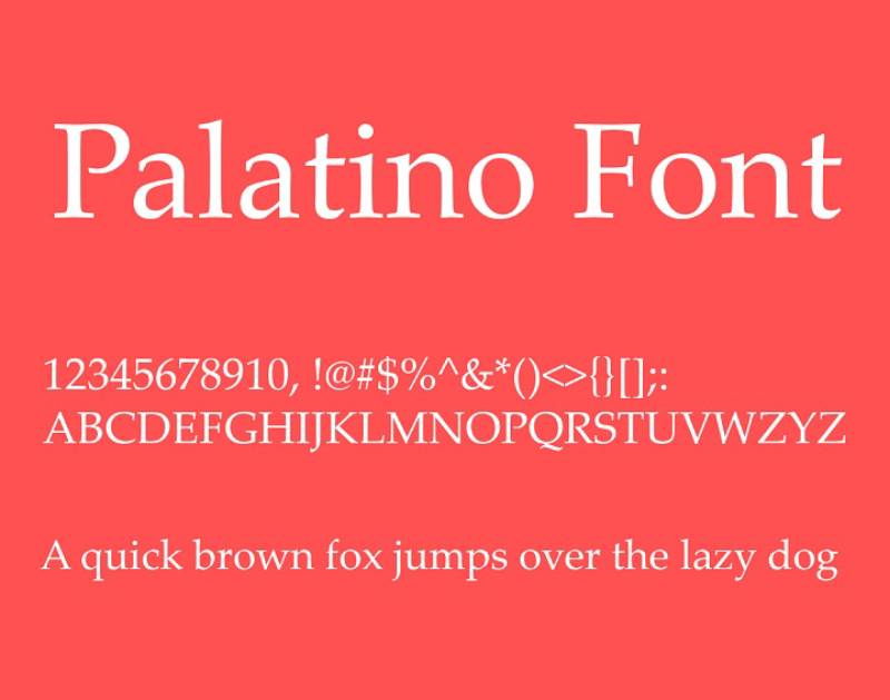
Palatino is a humanist serif typeface designed by Hermann Zapf and first released by D. Stempel AG in 1950, with the authoritative modern version Palatino Nova co-designed by Zapf and Akira Kobayashi, released by Linotype in 2005.
It handles both print and digital poetry layout because of its open counters and deliberately thickened stroke weights. Its calligraphic origins give it letter-to-letter rhythm that suits verse without introducing decorative complexity.
What makes Palatino suitable for poetry?
Palatino was designed with open counters to maintain legibility on poor-quality paper, giving it structural flexibility that other humanist serifs lack. Its stroke weights are slightly heavier than typical old-style serifs, which helps it hold at varied print resolutions. The calligraphic construction creates natural horizontal reading flow across short poetic lines.
Key attributes:
| Attribute | Value |
|---|---|
| Classification | Humanist serif |
| Designer | Hermann Zapf, 1950; Palatino Nova: Zapf + Akira Kobayashi, 2005 |
| Weight range | Roman, Italic, Bold, Bold Italic; Palatino Nova: Light–Bold |
| Variable font | No |
| Recommended sizes | 11pt–14pt print; 16px–22px digital |
| Letter-spacing default | 0 |
| License | System-bundled (personal use); Palatino Nova: Commercial |
| Available on | Pre-installed macOS, Windows; Linotype (commercial) |
| Price | Free (system version); paid for web embedding |
How does Palatino perform for poetry typography?
Palatino’s thicker-than-average stroke weights hold across different paper types, from coated stock to rough chapbook paper. The system version (Palatino Linotype on Windows) renders consistently at body sizes on screen. It performs well as a font for reading across long-form literary content, and Palatino Nova’s refined optical spacing improves the experience in professional print layouts.
What are the best pairings for Palatino in poetry?
Palatino pairs with Helvetica for a classic humanist-grotesque contrast, or with Optima (also designed by Zapf) for a cohesive family approach to heading and body hierarchy.
What are the limitations of Palatino for poetry?
The free system-bundled version lacks the OpenType features (ligatures, old-style figures, small caps) available in Palatino Nova, which limits fine typographic control for professional poetry publishing. Commercial web embedding requires a paid Linotype license.
Palatino – Recommended Use Cases Within Poetry Typography
- Best for: Multi-purpose print and digital poetry collections; personal poetry blogs using system fonts
- Avoid for: High-end commercial poetry publication where Palatino Nova licensing isn’t available
- Optimal weight: Regular for body; Bold used sparingly for titles only
- Optimal size range: 11pt–14pt print; 16px–22px digital
Cormorant Garamond
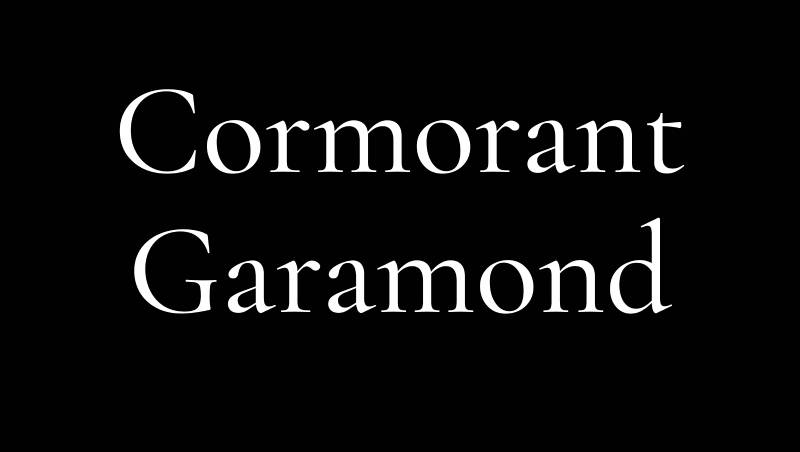
Cormorant Garamond is a display serif typeface designed by Christian Thalmann (Catharsis Fonts, Zurich) and released in 2015, available free on Google Fonts and Adobe Fonts under the SIL Open Font License. It spans 9 visual styles and 5 weights (Light through Bold), with 45 font files total.
Cormorant Garamond handles large-scale poetry titles and epigraphs where high stroke contrast and delicate hairlines create visual drama at display sizes.
What makes Cormorant Garamond suitable for poetry?
Cormorant Garamond’s high contrast between thick and thin strokes is intentionally exaggerated for display use, producing dramatic hairlines that are visible at 24pt+ but break down at text sizes. The 9 style variants (including Upright Cursive and Small Caps) provide unusual typographic flexibility for poetry section headings and formal epigraphs. Cormorant Garamond font pairing options are extensive given the breadth of the family.
Key attributes:
| Attribute | Value |
|---|---|
| Classification | Display old-style serif |
| Designer | Christian Thalmann, 2015 |
| Weight range | Light 300 – Bold 700 |
| Variable font | Yes (via GitHub) |
| Recommended sizes | 24pt+ print display; 28px+ digital |
| Letter-spacing default | Tight |
| License | OFL (free for personal and commercial use) |
| Available on | Google Fonts, Adobe Fonts |
| Price | Free |
How does Cormorant Garamond perform for poetry typography?
At display sizes (28px+), Cormorant Garamond renders its hairline strokes clearly on high-resolution screens and in print. Below 18px, hairlines become unreliable on standard-density displays and the font loses the contrast that defines its character. It excels in poetry websites as a heading or title font, particularly in fonts for blogs with a literary focus.
What are the best pairings for Cormorant Garamond in poetry?
Cormorant Garamond pairs with Lora for a high-contrast heading/body combination that keeps both typefaces within the calligraphic serif tradition. For sharper contrast, pairing it with a geometric sans-serif at body weight creates strong visual hierarchy on a poetry website or digital chapbook.
What are the limitations of Cormorant Garamond for poetry?
Cormorant Garamond is unsuitable as body text at sizes below 18px due to hairline stroke collapse. Its high contrast also means it renders poorly in print on absorbent, uncoated paper stocks where thin strokes fill in.
Cormorant Garamond – Recommended Use Cases Within Poetry Typography
- Best for: Poetry book titles, section headers, epigraphs, and pull quotes at display sizes
- Avoid for: Body text in any context; small-size digital use; print on uncoated or rough paper
- Optimal weight: Light 300 or Regular 400 for titles; SemiBold 600 for subheadings
- Optimal size range: 28px–72px digital; 18pt–60pt print
Playfair Display
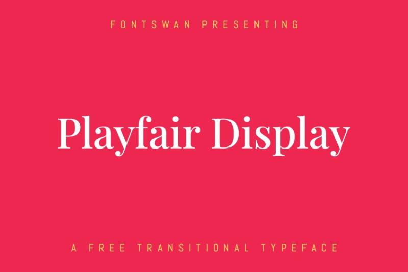
Playfair Display is a transitional display serif designed by Claus Eggers Sorensen (Amsterdam) and released on Google Fonts in 2011 under the SIL Open Font License. The family includes 6 weights from Regular 400 to Black 900, with matching italics, small caps, and a variable font axis added in August 2019.
It suits digital poetry headings where its high stroke contrast reads as editorial precision at screen resolutions of 150dpi+.
What makes Playfair Display suitable for poetry?
Playfair Display has a vertical stress axis and extreme thick-to-thin stroke contrast, drawing from the transitional tradition of Baskerville and the Scotch Roman designs that followed. Its extra-large x-height and short descenders allow tight line-spacing in heading contexts without letter collision. The true italic variants include decorative swash letterforms on k, v, w, and z, which suit short poetry titles and display epigraphs.
Key attributes:
| Attribute | Value |
|---|---|
| Classification | Transitional display serif |
| Designer | Claus Eggers Sorensen, 2011 |
| Weight range | Regular 400 – Black 900 |
| Variable font | Yes (wght axis, 2019) |
| Recommended sizes | 18px–72px digital; 14pt+ print |
| Letter-spacing default | 0 |
| License | OFL |
| Available on | Google Fonts, Adobe Fonts |
| Price | Free |
How does Playfair Display perform for poetry typography?
Playfair Display’s hairline strokes hold at 1920×1080 resolution and above, but visibly thin on screens below 150dpi. At 18px–72px on modern displays, it renders cleanly and its high contrast gives poetry headings an editorial presence. Its design shares many characteristics valued in fonts for magazines and editorial typography.
What are the best pairings for Playfair Display in poetry?
Playfair Display pairs with Georgia for body text (recommended in the font’s own documentation). For digital poetry sites, pairing it with Source Sans 3 or Merriweather at body weight creates clear visual hierarchy.
What are the limitations of Playfair Display for poetry?
Playfair Display is unsuitable for body text at any size. Its thin strokes break down below 16px on standard screens, and in print on uncoated paper the hairlines fill in, collapsing the contrast that defines the font.
Playfair Display – Recommended Use Cases Within Poetry Typography
- Best for: Poetry website headings, digital journal titles, section headers, cover typography
- Avoid for: Body text; print on uncoated stock; any use below 16px
- Optimal weight: Regular 400 or Medium 500 for titles; Bold 700 for prominent headings
- Optimal size range: 18px–72px digital; 14pt–60pt print
Merriweather
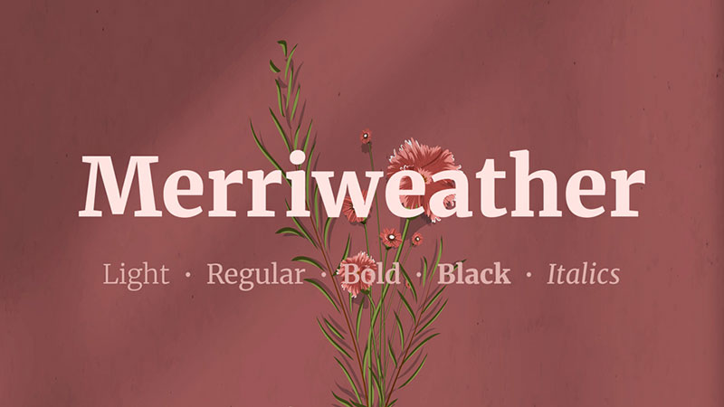
Merriweather is a screen-optimized serif designed by Eben Sorkin (Sorkin Type Co., Boston) and released in 2011 through Google Fonts under the SIL Open Font License. The family includes 4 weights: Light 300, Regular 400, Bold 700, and Black 900, each with italic companions (8 styles total). A variable GX version was built in 2019.
It sets poetry body text on screens with strong hinting that maintains legibility across Windows (ClearType), macOS (Quartz), and Linux rendering environments.
What makes Merriweather suitable for poetry?
Merriweather has a large x-height, slightly condensed letterforms, sturdy serifs, and open letterform apertures engineered for on-screen legibility at 14px–18px. Its diagonal stress and mild stroke contrast give it enough character for literary contexts without the fragility of high-contrast display faces. The condensed proportions allow more characters per line, useful in digital poetry layouts where line length control matters.
Key attributes:
| Attribute | Value |
|---|---|
| Classification | Screen-optimized serif |
| Designer | Eben Sorkin, 2011 |
| Weight range | Light 300 – Black 900 |
| Variable font | Yes (GX axis) |
| Recommended sizes | 14px–22px digital body text |
| Letter-spacing default | 0 |
| License | OFL |
| Available on | Google Fonts, Adobe Fonts |
| Price | Free |
How does Merriweather perform for poetry typography?
Merriweather’s extensive hinting produces consistent rendering across different operating systems and display densities, a practical advantage for poetry websites with wide device reach. It handles extended fonts for reading tasks well at 16px–20px with line-height 1.6–1.8. At print sizes, it runs slightly heavier than traditional literary serifs, which can feel dense for short-line verse.
What are the best pairings for Merriweather in poetry?
Merriweather pairs with Playfair Display for a high-contrast heading/body combination on poetry websites. Merriweather font pairing recommendations consistently point to neutral sans-serifs (Lato, Open Sans) as the strongest counterparts.
What are the limitations of Merriweather for poetry?
Merriweather’s heavier stroke weight can feel dense when short poetic lines create significant white space around the text. The Light 300 weight has less precise hinting than Regular and Bold.
Merriweather – Recommended Use Cases Within Poetry Typography
- Best for: Poetry websites and digital literary journals; fonts for ebooks containing poetry collections
- Avoid for: Print poetry layout; display titles; any context needing a light typographic texture
- Optimal weight: Regular 400 for body; Bold 700 for subheadings
- Optimal size range: 16px–22px digital
Lora
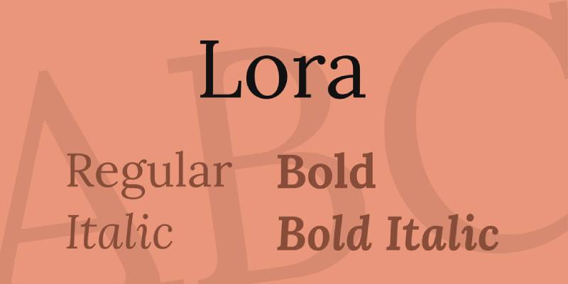
Lora is a calligraphic-rooted contemporary serif designed by Olga Karpushina and Alexei Vanyashin for the Cyreal foundry, released in 2011 on Google Fonts under the SIL Open Font License. The family includes 4 weights (Regular 400 through Bold 700) with matching italics, updated to a variable font format with a wght axis (400–700) in March 2019.
Lora handles poetry body text on both screen and print by combining calligraphic brushed curves with structured serifs that guide reading movement.
What makes Lora suitable for poetry?
Lora’s brushed curves come from calligraphic construction methods, giving individual letterforms a handmade quality suited to literary contexts. Its moderate stroke contrast avoids both the frailty of high-contrast display faces and the blandness of utilitarian screen serifs. The variable font axis (wght 400–700) allows precise weight tuning in digital poetry layouts without loading multiple font files.
Key attributes:
| Attribute | Value |
|---|---|
| Classification | Calligraphic serif |
| Designer | Olga Karpushina, Alexei Vanyashin (Cyreal), 2011 |
| Weight range | Regular 400 – Bold 700 (variable) |
| Variable font | Yes (wght 400–700, since 2019) |
| Recommended sizes | 15px–22px digital; 11pt–14pt print |
| Letter-spacing default | 0 |
| License | OFL |
| Available on | Google Fonts, Adobe Fonts |
| Price | Free |
How does Lora perform for poetry typography?
Lora renders cleanly at 16px+ on both high and standard density screens, with calligraphic detail visible above 18px. Its brushed curves create a slightly more expressive reading texture than Merriweather at comparable sizes, which suits the poetic context. The Cyreal foundry describes its typographic voice as suited to “a modern-day story, or an art essay,” making it a natural fit for poetry that sits between literary fiction and essay writing.
Lora font pairing works well with humanist sans-serifs in digital poetry contexts.
What are the best pairings for Lora in poetry?
Lora pairs with Alegreya Black for a dramatic heading/body combination in literary magazine contexts. For digital poetry blogs, Open Sans at heading weight gives clear hierarchy with minimal friction. Libre Baskerville font pairing with Lora is also viable when a pure-serif system is preferred.
What are the limitations of Lora for poetry?
Lora’s weight range tops at Bold 700 with no Black or ExtraBold available, limiting typographic impact in display contexts. Below 14px it loses the brushed curve detail that distinguishes it from simpler screen serifs.
Lora – Recommended Use Cases Within Poetry Typography
- Best for: Poetry blog body text; literary website layouts; digital poetry collections requiring calligraphic warmth
- Avoid for: Display titles; print on very small page sizes; contexts requiring weights above 700
- Optimal weight: Regular 400 for body; SemiBold 600 for subheadings; Italic 400 for emphasis
- Optimal size range: 16px–22px digital; 11pt–14pt print
Georgia
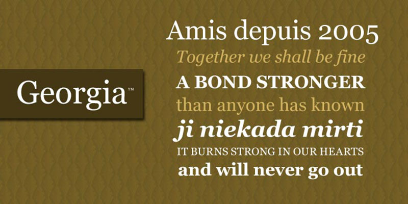
Georgia is a transitional serif designed by Matthew Carter and hinted by Thomas Rickner for Microsoft in 1993, released in 1996 as part of the Core Fonts for the Web initiative. The base family includes Regular, Italic, Bold, and Bold Italic. Georgia Pro (2011) adds 5 weights, condensed variants, and OpenType features.
Georgia sets poetry body text across the widest range of devices and operating systems of any font on this list, with zero loading overhead as a pre-installed system font.
What makes Georgia suitable for poetry?
Georgia has a large x-height, open counters in letters like ‘a’ and ‘e’, and non-aligning numerals that give it a personality distinct from mechanical serif defaults. Carter designed it with ascenders that rise above the cap height, which gives poetic lines natural vertical rhythm. Its true italic includes single-story ‘a’ and ‘g’ forms that read as more literary than upright roman alternates common in transitional serif italics.
Key attributes:
| Attribute | Value |
|---|---|
| Classification | Transitional serif |
| Designer | Matthew Carter, 1993; released Microsoft 1996 |
| Weight range | Regular, Italic, Bold, Bold Italic (base); Georgia Pro adds 5 weights |
| Variable font | No |
| Recommended sizes | 14px–20px digital; 11pt–13pt print |
| Letter-spacing default | 0 |
| License | Free (system font); Georgia Pro: commercial |
| Available on | Pre-installed Windows, macOS, iOS, Android |
| Price | Free (system); Georgia Pro: paid |
How does Georgia perform for poetry typography?
Georgia was engineered for 72dpi CRT monitors, which means it holds well even on lower-density screens still common in many markets. At 14px–20px it maintains strong legibility with no font loading required, making it the most practical choice for fonts for websites with broad accessibility requirements.
The New York Times switched its standard digital font from Times New Roman to Georgia in 2007, establishing its role as a credible editorial screen serif.
What are the best pairings for Georgia in poetry?
Georgia pairs with Verdana (its companion typeface) for a historically consistent system font combination on poetry websites. Georgia font pairing with a geometric sans-serif like Futura creates sharp visual separation between heading and body levels.
What are the limitations of Georgia for poetry?
The base Georgia family has only 2 weights (Regular and Bold), severely limiting typographic hierarchy in complex poetry book or digital journal layouts. Its bolder weights and thicker serifs can appear heavy at comparable print sizes, reflecting its screen-first origins.
Georgia – Recommended Use Cases Within Poetry Typography
- Best for: Poetry websites requiring zero font-loading overhead; accessibility-first digital poetry layouts
- Avoid for: Print poetry books where typographic refinement matters; layouts requiring more than 2 weights
- Optimal weight: Regular 400 for body; Bold 700 used sparingly for headings only
- Optimal size range: 14px–20px digital; 11pt–13pt print (with caution)
Supporting Decisions: Font Psychology, Pairing, and Spacing
Font psychology plays a real role in how a poem lands. Old-style serifs like Garamond and Caslon read as historically grounded and intimate. High-contrast transitional faces like Baskerville and Playfair Display signal formality and academic weight. Calligraphic serifs like Lora and Palatino sit in between: warm enough for personal verse, structured enough for literary publication.
Understanding how to pair fonts matters as much as the individual font choice. A poetry website using Cormorant Garamond for titles and Lora for body text makes a coherent visual argument that the content is literary.
Font spacing is the variable most poetry typography gets wrong. Standard web line-height of 1.4 is too tight for verse. Short lines need ample leading (1.7–2.0 for digital, 130%–150% for print) to let each line stand as a discrete unit.
For poets publishing online, variable fonts are an underused tool. Lora and Cormorant Garamond both have variable weight axes, meaning a single font file can serve multiple hierarchy levels on a poetry website and reduce load time without sacrificing control.
Font licensing is worth checking before committing to a font for any commercial poetry publication. Every OFL font on this list (Cormorant Garamond, Playfair Display, Merriweather, Lora, Libre Baskerville) is free for commercial use. Georgia is free for standard use but requires a paid license for web embedding via @font-face beyond system font stack declarations.
What Makes a Typeface Suitable for Poetry?
Not every readable font works for poetry. Verse imposes a specific set of demands that prose does not.
A poem’s line breaks are intentional. They carry meaning. A typeface that distorts those line breaks, rushes the eye, or introduces visual noise between stanzas undermines the work before the reader processes a single word.
Research in vision science shows that proper typography can improve reading accuracy by up to 20% and reduce eye strain by 30% (adoc-studio, 2026). For poetry, where rereading is part of the experience, these numbers matter more than in any other genre.
X-height, spacing, and legibility
X-height refers to the height of lowercase letters relative to capitals. A generous x-height keeps individual letterforms clear at smaller sizes, which is critical in poetry books printed at 12–14pt.
Font spacing – the horizontal distance between letters and words – shapes how a poetic line reads as a unit. Too tight, and the line collapses. Too loose, and the eye loses the phrase.
Leading (line spacing) is equally decisive. Poetry depends on the visual breath between lines. A font with tight default leading fights that rhythm rather than supporting it.
Font psychology and poetic tone
Font psychology connects typeface personality to emotional register. A humanist serif signals warmth and literary heritage. A geometric sans-serif signals precision and modernity.
Matching a font’s psychological register to a collection’s tone is not aesthetic decoration. It is part of the reading experience.
Rupi Kaur’s Milk and Honey used a minimal, unornamented typeface with deliberate white space to echo the poems’ directness and emotional rawness. The font choice was inseparable from the work’s impact.
Print vs. screen poetry typography
| Context | Recommended size | Leading range | Primary concern |
|---|---|---|---|
| Print poetry book | 12–14pt | 140–160% | Line integrity and x-height |
| Poetry blog / website | 16–18px | 150–170% | Screen rendering and contrast |
| E-reader (Kindle, Kobo) | 12–14pt (device-scaled) | Variable | Reflowability and font substitution |
| Social media poetry | 18–24px | Generous | Legibility at thumbnail size |
Poetry books typically run under 100 pages, with 80–100 poems fitting that length (Dazzle Printing, 2024). That compact format means typographic choices on each page carry greater weight than in a novel.
Serif Fonts for Poetry: Classical Voices, Proven Readability
Oldstyle and transitional serif fonts dominate literary typography for good reason. Their stroke variation, bracketed serifs, and humanist proportions evolved alongside book printing itself.
Self-publishing now accounts for roughly 40% of all new poetry books (From Whispers to Roars, 2023). That means more poets than ever are making their own typeface decisions, without a press designer involved.
Garamond and its modern variants
EB Garamond is the most-used free serif for poetry. It traces to Claude Garamond’s 16th-century French designs, and the revival by Georg Duffner preserves the low contrast and gentle stroke modulation that makes it effortless to read across a full collection.
Its x-height is modest, which gives the page an open, classical feel. Works particularly well for formal verse – sonnets, odes, elegies.
Cormorant Garamond is a more refined alternative. Designed by Christian Thalmann, it carries slightly higher contrast and more pronounced italics, which makes it especially effective for collections where italic lines carry emotional weight.
Baskerville for high-contrast verse
Baskerville is a transitional serif: sharper stroke contrast than Garamond, more vertical axis, stronger overall presence on the page.
That sharpness suits dramatic, high-stakes poetry. John Baskerville designed it in 18th-century Birmingham with the explicit goal of improving print legibility, and the design holds up on modern paper stock.
Libre Baskerville (Google Fonts) gives a faithful web-optimized version. It renders cleanly at 16–18px and holds its character in both light and dark mode – a reliable choice for poetry blogs hosted on WordPress or similar platforms.
Oldstyle vs. transitional serifs: a direct comparison
| Attribute | Oldstyle (Garamond) | Transitional (Baskerville) |
|---|---|---|
| Stroke contrast | Low | High |
| Axis angle | Diagonal | Vertical |
| Emotional register | Warm, intimate | Formal, precise |
| Best for | Lyric, confessional verse | Dramatic, narrative poetry |
| Free options | EB Garamond, Cormorant | Libre Baskerville |
A 2023 MIT Press study with 145 participants found that fonts with serifs were read slightly faster than Arial-style sans-serifs, reinforcing the case for serif selections in sustained literary reading (Sieghart, Design Issues, 2023).
Sans-Serif and Script Options for Contemporary and Expressive Poetry
Oldstyle serifs are not the only answer. Modern, experimental, and digital-first poetry often calls for a different typographic voice.
Nearly 28% of readers under 30 read poetry regularly as of 2023, up from 21% in 2020 (National Endowment for the Arts). That younger audience encounters poetry primarily on screens, in formats where minimalist sans-serifs often perform as well as serifs.
When sans-serifs work for poetry
Best use cases:
- Concrete or visual poetry where letterform neutrality lets form speak
- Spoken word transcriptions where informal register matters
- Digital zines, PDF collections, and social media poetry
- Contemporary free verse collections with a spare, modern aesthetic
Lora sits between categories: a serif with calligraphic origins and generous spacing that reads warmly on screen without the historical weight of Garamond. It is one of the more versatile fonts for reading in a poetry context.
Merriweather was explicitly designed for screens. Its large x-height and slightly condensed proportions maintain legibility across resolution ranges, making it a practical choice for poetry websites with variable traffic from mobile readers.
Script fonts: where they work and where they break down
Script fonts carry strong associations with handwriting, romance, and lyric intimacy. But most script fonts fail at body text sizes.
Connecting letterforms that look elegant at 36pt become illegible at 11pt. The reader’s eye cannot track word shapes across a stanza without separation cues.
Where script typefaces belong in poetry design:
- Cover titles and collection names
- Epigraphs and single pull-quotes
- Section headers in chapbooks
- Dedication pages
Not in stanzas. Not as body text. A script font in running verse text signals inexperience in poetry book design, regardless of how beautiful the letterform looks in isolation.
Display fonts follow the same rule. Playfair Display is elegant for section headers and titles, but its high contrast and optical sizing make it unsuitable as a body typeface across a full collection.
How Font Pairing Works in Poetry Book and Chapbook Design
Most poetry collections use two typefaces: one for titles and section headers, one for the poems themselves.
The global self-publishing market reached $1.85 billion in 2024, growing at 16.7% annually (Automateed, 2026). Typography services are part of that ecosystem, and the ability to make informed pairing decisions has become a practical skill for self-publishing poets.
Hierarchy and contrast in poetry books

Title font: carries the collection’s personality. Can be expressive, high-contrast, or even a restrained display serif.
Body font: must disappear. The reader should not notice it. It serves the poem.
Section headers: optional third element. If used, they bridge the expressiveness of the title font and the neutrality of the body font.
A common mistake is pairing two serif fonts with similar proportions. The result looks inconsistent rather than harmonious. The better principle: contrast in style, harmony in weight and proportion.
Recommended pairings for poetry
Cormorant Garamond font pairing works consistently as a body font paired with a minimal geometric sans-serif (like Inter or DM Sans) for section headers. The contrast between the calligraphic serif and the neutral sans-serif creates typographic hierarchy without visual conflict.
Lora font pairing is a strong single-family solution for poetry websites where simplicity matters. Use Lora regular for body text and Lora bold italic for poem titles – no second font required.
Playfair Display font pairing with a neutral sans-serif like Source Sans Pro is a reliable choice for contemporary chapbooks. Playfair handles cover and section titles; Source Sans Pro carries body text at smaller sizes.
Use a font pairing generator to test combinations on-screen before committing to a print layout. What reads well at 18px on a monitor can look entirely different at 11pt on paper.
Common pairing mistakes in poetry design
- Matching stroke weight: two fonts of identical visual weight create monotony, not hierarchy
- Decorative overload: using a script cover font with an ornate body font produces visual chaos
- Ignoring italic quality: in poetry, italics carry semantic weight. Check that your body font’s italic is genuinely distinct, not just slanted
- Mismatched historical period: a Renaissance oldstyle paired with a late-modernist display font creates unresolved stylistic tension
Where to Find and License Poetry Fonts
Font choice and font access are two different decisions. A typeface that is aesthetically right may carry licensing restrictions that create legal problems for published work.
The web font market is growing at a 6% CAGR from 2024 to 2031 (Cognitive Market Research). Google Fonts alone has over 50 million websites using its library, with more than 50 trillion total views to date (Linearity / Photutorial, 2025).
Google Fonts for poetry publishing
Free for commercial use. Every font in the Google Fonts library is licensed under open licenses (typically SIL Open Font License or Apache), covering desktop, web, and ebook use.
Top picks for poetry:
- EB Garamond – classical body text
- Cormorant Garamond – refined literary serif
- Libre Baskerville – screen-optimized transitional serif
- Lora – calligraphic warmth for web poetry
- Playfair Display – high-contrast titles and headers
Google Fonts usage represented 57% of all web font service requests in 2024 (HTTP Archive Web Almanac, 2024). For poetry blogs and websites, it is the most practical starting point.
Adobe Fonts and professional options
Google Fonts vs Adobe Fonts comes down to one core trade-off: breadth versus quality control.
Adobe Fonts (included in Creative Cloud) offers Minion Pro, Freight Text, and Arno Pro – all typefaces with superior optical sizing and print refinement compared to most free alternatives. For poets working in InDesign on a professionally printed collection, these represent a meaningful quality step up.
Adobe Fonts usage increased from 3.7% to 4.1% of web font service requests between 2022 and 2024 (HTTP Archive Web Almanac, 2024), reflecting steady professional adoption.
Understanding font licensing for poetry publishing
Font licensing is where most self-publishing poets make avoidable legal errors. A desktop license does not automatically cover ebook embedding.
License types to check before publishing:
- Desktop license: covers use in print files (InDesign, Word, PDF for print)
- Web license: covers CSS embedding on poetry websites and blogs
- Ebook license: required for Kindle Direct Publishing and Smashwords epub files
- App license: required if the font appears in a poetry app or interactive digital work
Font Squirrel filters specifically for fonts cleared for commercial use, including ebook and web applications. It is the most reliable free-font source for poets who need license certainty without legal expertise.
Font Settings That Shape How a Poem Reads
Choosing the right typeface is half the decision. How it is configured on the page determines whether the poem breathes or suffocates.
Proper typography can improve reading accuracy by up to 20% and reduce eye strain by 30% – and those gains depend as much on spacing and sizing as on the font itself (adoc-studio, 2026).
Line spacing and leading for poetry
Standard leading range for printed poetry: 140–160% of font size.
At 12pt body text, that means 16.8–19.2pt of leading. Poetry books need the upper end of that range. The white space between lines is not emptiness – it is where the reader pauses, re-reads, and absorbs.
Dense leading (below 130%) forces stanzas into blocks of prose. The visual identity of the poem collapses. Generous leading (above 180%) can fragment even short lines into isolated words, losing the sense of the phrase.
Font size standards: print vs. screen
| Format | Body text size | Min line length | Alignment |
|---|---|---|---|
| Print poetry book | 12–14pt | 45–60 characters | Left-aligned (ragged right) |
| Poetry website | 16–18px | 45–75 characters | Left-aligned |
| E-reader | 12–14pt (device-scaled) | Device-dependent | Left-aligned |
| Poetry chapbook | 11–13pt | 40–55 characters | Left-aligned |
Poetry books recommend 12–14pt as a slightly larger standard than general prose, because less text per page means each line needs more visual presence (PaperTrue, 2024).
Variable fonts and responsive poetry websites
Variable fonts contain multiple design axes (weight, width, optical size) in a single file. Approximately 25% of all Google Font families are now variable fonts (Photutorial, 2025).
For poetry websites, this matters because a single variable font can adjust its weight and width fluidly across screen sizes – keeping stanza line lengths and visual rhythm intact whether the reader is on a desktop monitor or a phone.
Justified text alignment is the most consistent error in poetry typography. Research and WCAG accessibility guidelines both recommend against it for continuous text, and the damage is amplified in poetry: word-spacing variations introduced by full justification visually break the line mid-phrase, disrupting exactly the reading rhythm the poet built into the lineation.
Left-aligned text – ragged right – is the near-universal standard in published poetry for this reason. The irregular right margin is not a flaw. It reflects the poem’s actual line structure.
FAQ on The Best Fonts For Poetry
What is the best font for a poetry book?
Garamond is the most widely used typeface for printed poetry. EB Garamond (free on Google Fonts) and Cormorant Garamond both offer classical proportions, low stroke contrast, and generous letterform spacing that supports sustained verse reading without visual fatigue.
What font size should I use for poetry?
Poetry books typically use 12–14pt for body text – slightly larger than prose standards. The lower word count per page means each line needs more visual presence. For poetry websites, 16–18px is the reliable minimum for screen legibility.
Are serif or sans-serif fonts better for poetry?
Neither is universally superior. Research shows no significant readability difference between serif and sans-serif when layout is handled well. Oldstyle serifs like Garamond suit formal, lyric verse. Sans-serif fonts work better for modern, experimental, or digital-first poetry formats.
What Google Fonts work best for poetry?
Strong free options include EB Garamond, Cormorant Garamond, Libre Baskerville, Lora, and Playfair Display. All are licensed for commercial use, covering print books, ebooks, and poetry blogs. Lora is particularly well-suited for screen-based poetry due to its generous x-height.
Can I use a script font for poetry?
Only for titles, covers, and epigraphs. Script fonts become illegible at body text sizes – connecting letterforms that look elegant at 36pt collapse at 11pt. Using script for stanza text signals a lack of poetry book design experience, regardless of the font’s visual appeal.
What font do professional poetry publishers use?
Traditional publishers frequently use Minion Pro, Freight Text, and Arno Pro – all available via Adobe Fonts. These offer superior optical sizing for print. Copper Canyon Press and similar literary publishers consistently favor humanist oldstyle serifs for their warmth and literary heritage.
How much line spacing should a poetry book have?
Use 140–160% leading relative to font size. At 12pt, that means 16.8–19.2pt of line spacing. Poetry needs the upper range. The white space between lines is structural – it gives readers room to pause, absorb, and reread without the stanza visually collapsing into prose.
Should poetry be left-aligned or justified?
Always left-aligned (ragged right). Justified text introduces variable word spacing that visually fractures poetic lines mid-phrase. This directly disrupts the reading rhythm the poet built into the lineation. WCAG accessibility guidelines also recommend against justified text for continuous reading.
What fonts work for poetry on WordPress or a poetry blog?
Libre Baskerville, Lora, and Merriweather render cleanly on screen at 16–18px and load efficiently via Google Fonts. Merriweather was specifically designed for screen readability. All three maintain legibility across mobile and desktop without requiring custom font licensing or self-hosting setup.
Do I need a special font license to publish a poetry ebook?
Yes. A desktop license does not automatically cover ebook embedding. For Kindle Direct Publishing or Smashwords, you need an ebook license. Google Fonts (SIL Open Font License) and Font Squirrel’s commercial-use collection both cover ebook use – the safest starting points for self-publishing poets.
Conclusion
The best fonts for poetry are the ones readers never notice. That invisibility is the goal.
Oldstyle serifs like EB Garamond and Cormorant Garamond remain the standard for printed verse because their humanist proportions and low stroke contrast support sustained reading without interference. For screen-based poetry, Lora and Merriweather hold up across devices where rendering conditions vary.
Beyond typeface selection, the decisions that matter most are often the quieter ones: leading, x-height, font size, and alignment.
Get those right, and the typographic rhythm of the page reinforces the poem’s own rhythm.
Whether you are typesetting a chapbook in InDesign, building a poetry blog on WordPress, or formatting an ebook for Kindle Direct Publishing, the principles stay consistent. Serve the poem. Everything else follows.

Renowned for his expertise in logo design and visual branding, Bogdan has developed a multitude of logos for various clients.
His skills extend to creating posters, vector illustrations, business cards, and brochures. Additionally, Bogdan's UI kits were featured on marketplaces like Visual Hierarchy and UI8.
He also wrote in the past years on sites like Design Your Way, WebDesignerDepot, WPDean, Designmodo, Speckyboy, Slider Revolution, and more.
- The Windsurf Logo History, Colors, Font, And Meaning - 10 October 2026
- How Designers can Build a Stronger Online Creative Identity - 9 October 2026
- Minecraft Font Generator - 8 October 2026

Bogdan Sandu is a seasoned designer who has been designing websites since 2008. Renowned for his expertise in logo design and visual branding, Bogdan has developed a multitude of logos for various clients. His skills extend to creating posters, vector illustrations, business cards, and brochures. Additionally, Bogdan's UI kits were featured on marketplaces like Visual Hierarchy and UI8. He also wrote in the past years on sites like Design Your Way, WebDesignerDepot, WPDean, Designmodo, Speckyboy, Slider Revolution, and more.
You Might Also Like