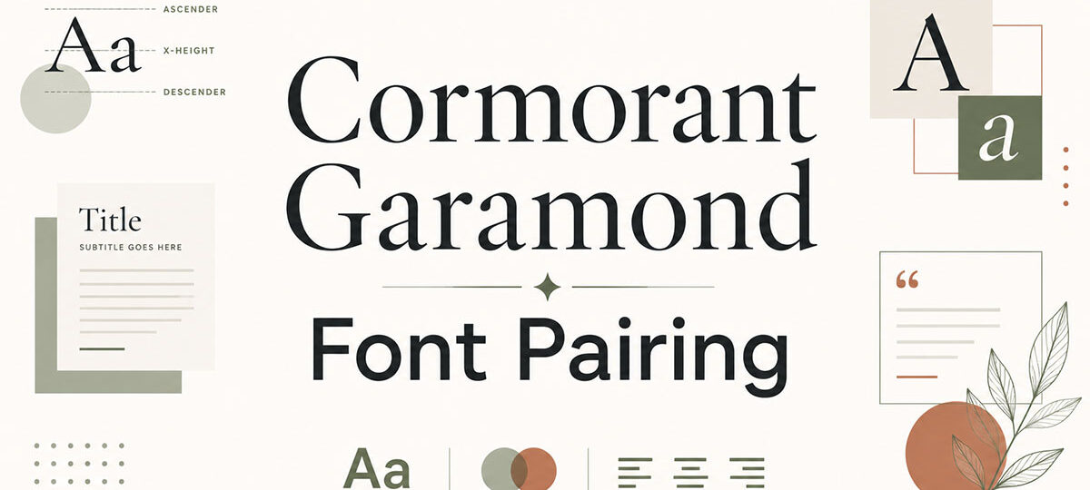
Cormorant Garamond is one of those display serif fonts that looks stunning in a heading and completely falls apart when you pair it with the wrong typeface.
Designed by Christian Thalmann and inspired by Claude Garamond’s 16th-century letterforms, it brings high stroke contrast and calligraphic detail to any layout. But that elegance comes with a catch: it needs the right companion to hold the design together.
This guide covers the best Cormorant Garamond font pairing options available on Google Fonts, with practical setup details for each one.
You’ll find out which sans-serif fonts work best for body text, which combinations suit luxury branding versus editorial design, and what to watch out for with spacing and font weight choices.
Best Cormorant Garamond Font Pairings
Cormorant Garamond + Montserrat

What This Pairing Does
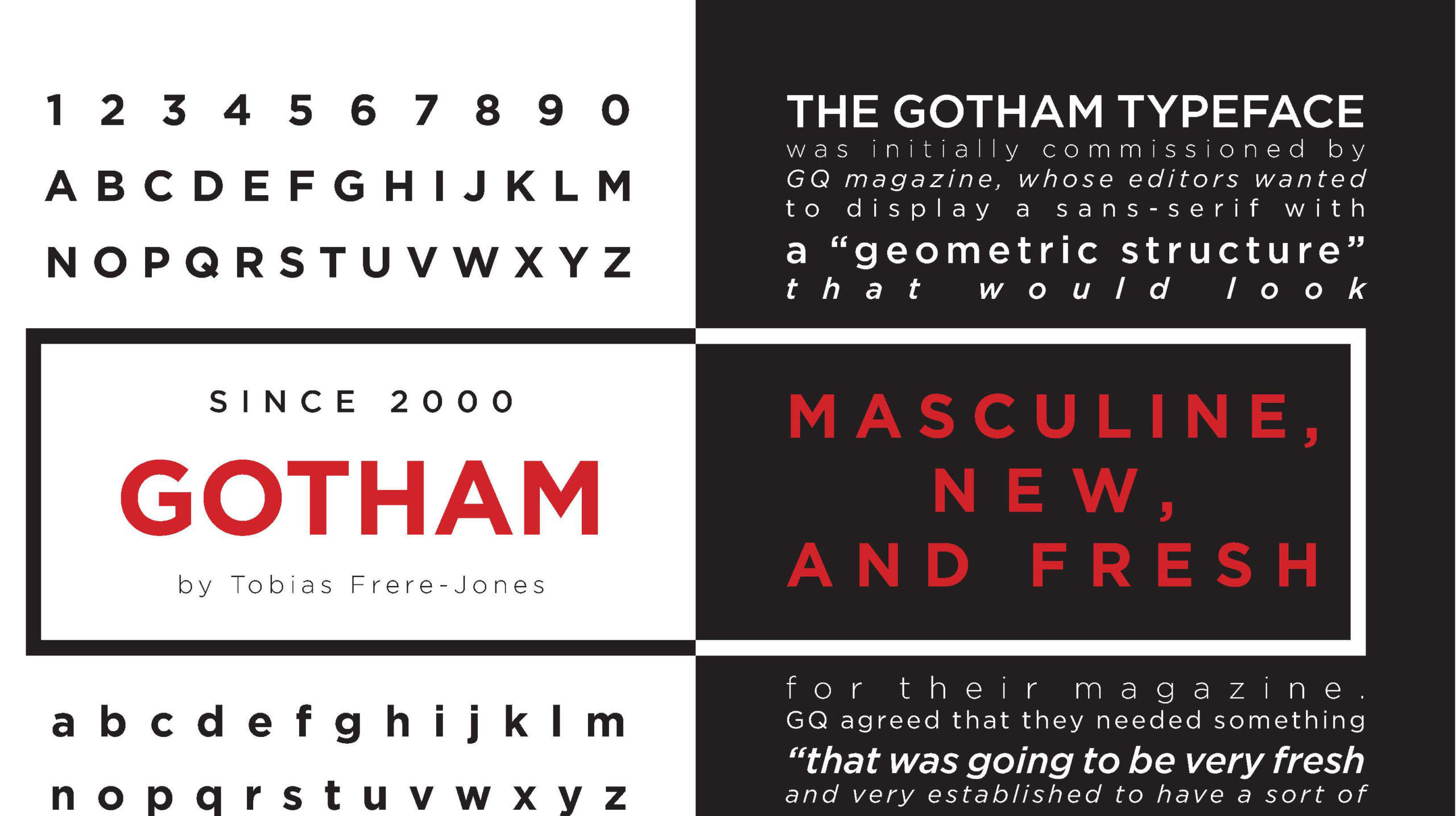
Montserrat’s geometric structure and even stroke weights sit cleanly against Cormorant Garamond’s high-contrast, calligraphic letterforms. The result is a strong serif and sans-serif combination that balances editorial elegance with modern readability.
Best Use Cases
- Luxury brand websites and wine labels
- Wedding websites and high-end real estate
- Brand collateral and print materials
How to Set It Up
- Cormorant Garamond: Headings and hero text, Bold or SemiBold, 36px and above
- Montserrat: Body text, navigation, and UI elements, Regular or Medium, 15-17px
Tone and Style Fit
Works best for brands that want a luxury feel without looking dated. Both fonts are free on Google Fonts.
Potential Issues
Cormorant Garamond’s hairline strokes disappear at small sizes. Keep it strictly as a display font and let Montserrat handle everything below 24px.
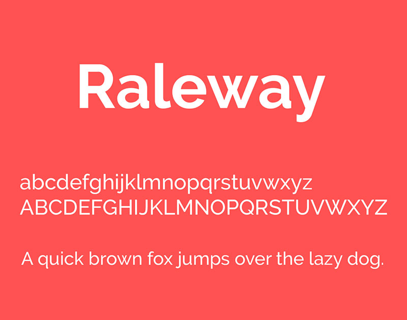
Cormorant Garamond + Raleway
What This Pairing Does
Both fonts share a refined, delicate sensibility. Raleway’s thin geometric strokes complement Cormorant’s fine hairlines, creating a pairing that feels light and cohesive without being identical. It’s one of the most popular display font pairings for elegant web design.
Best Use Cases
- Wedding design and event branding
- Fashion-adjacent websites and portfolios
- Editorial layouts where the aesthetic needs to feel airy
How to Set It Up
- Cormorant Garamond: Headings, Regular or Light, 36px and above
- Raleway: Body copy, ExtraLight or Light, 16px minimum
Tone and Style Fit
Elegant and understated. This combination suits brands where the overall tone needs to feel soft, curated, and upscale.
Potential Issues
Both fonts favor lighter weights, so watch your contrast ratio. If body text feels washed out, bump Raleway up to Regular and increase line height. Understanding leading matters a lot here.
Cormorant Garamond + Lato

What This Pairing Does
Lato’s semi-rounded letterforms and warm proportions offset Cormorant Garamond’s high-contrast drama. It’s a more grounded combination than Raleway, making it a reliable pick for typography for luxury websites that also need to feel approachable.
Best Use Cases
- Luxury fashion and premium cosmetics
- Cultural institutions and museum sites
- Portfolio sites for photographers and artists
How to Set It Up
- Cormorant Garamond: Hero text and H1-H2 headings, Bold, 40px and above
- Lato: Body text and subheadings, Regular or Light, 16-18px
Tone and Style Fit
Polished and professional. Works well when elegance is required but the content itself needs to stay readable over long passages.
Potential Issues
The contrast between Cormorant’s decorative feel and Lato’s clean neutrality is a strength, but only if you maintain a clear typographic hierarchy. Mix up the sizing generously.
Cormorant Garamond + Open Sans

What This Pairing Does
Open Sans was designed by Steve Matteson specifically for legibility across screens and print. Its open, friendly letterforms provide a warm, readable counterpart to Cormorant’s display drama. This is one of the most practical serif and sans-serif combinations for content-heavy websites.
Best Use Cases
- Editorial websites and blogs
- Digital publications with long-form content
- Brand sites where readability is the priority
How to Set It Up
- Cormorant Garamond: Headings, SemiBold or Bold, 32px and above
- Open Sans: Body text, Regular, 16px with a line height of at least 1.6
Tone and Style Fit
Editorial and accessible. Good for sites that need to convert readers, not just impress them.
Potential Issues
Open Sans is very neutral, which means Cormorant has to do all the visual heavy lifting. Use generous baseline grid spacing to avoid a flat layout.
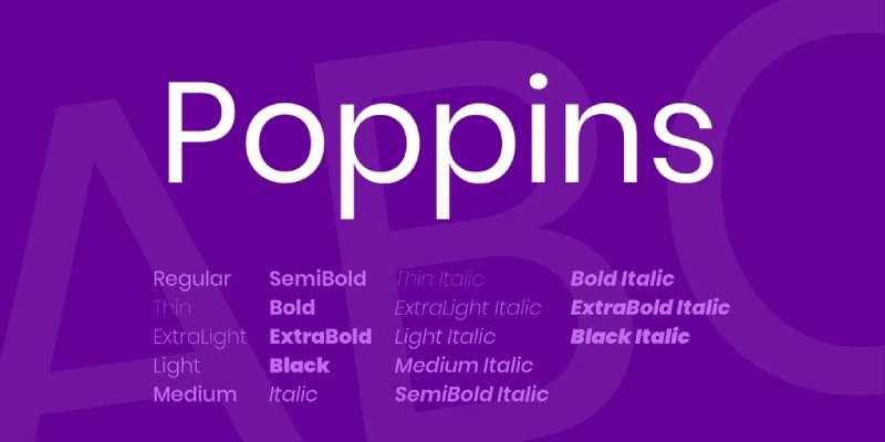
Cormorant Garamond + Poppins
What This Pairing Does
Poppins is a geometric sans-serif font with perfectly circular curves and even stroke widths. It creates a modern, contemporary backdrop that contrasts sharply against Cormorant Garamond’s historically-rooted, calligraphic details.
Best Use Cases
- Luxury brands with a contemporary edge
- Editorial projects blending classical and modern aesthetics
- Fashion and lifestyle websites
How to Set It Up
- Cormorant Garamond: Display headings, Light or Regular, 48px and above
- Poppins: Body text and UI elements, Regular or Medium, 15-17px
Tone and Style Fit
This pairing communicates both tradition and modernity at the same time. It fits brands that want to signal heritage without feeling stiff.
Potential Issues
Poppins can feel playful at larger sizes. Keep it small and let Cormorant handle all display-level emphasis.
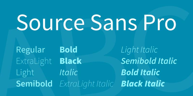
Cormorant Garamond + Source Sans Pro
What This Pairing Does
Source Sans Pro is Adobe’s open-source workhorse. It’s neutral, well-constructed, and highly legible at all sizes. Paired with Cormorant Garamond, it creates a clean font weight contrast that prioritizes function without losing elegance.
Best Use Cases
- Brand guidelines and corporate websites
- Editorial platforms with dense content
- Any context where readability is non-negotiable
How to Set It Up
- Cormorant Garamond: Headings only, Bold or SemiBold, 36px and above
- Source Sans Pro: Body, captions, and UI, Regular or Light, 15-17px
Tone and Style Fit
Practical and refined. This is a no-nonsense pairing for designers who need Cormorant’s elegance to do the decorative work while keeping everything else out of the way.
Potential Issues
Source Sans Pro’s neutrality means the pairing can feel plain if the layout lacks strong visual hierarchy. Add size contrast and generous white space.
Cormorant Garamond + Josefin Sans

What This Pairing Does
Josefin Sans is a vintage-inspired geometric sans with an Art Deco sensibility. Its tall, elegant proportions and distinctive letterforms create a pairing that feels intentionally stylized and curated. This is one of the more high contrast font combinations on this list.
Best Use Cases
- Fashion branding and boutique hotel identities
- Event design and upscale invitations
- Portfolio sites with a decorative, refined aesthetic
How to Set It Up
- Cormorant Garamond: Main headings, Light Italic, 40px and above
- Josefin Sans: Subheadings and body, Thin or Light, 14-16px
Tone and Style Fit
Decorative and deliberate. This combination has a strong personality, so it works best when the brand itself is also highly styled. Check the Josefin Sans font pairing guide for more context.
Potential Issues
Josefin Sans in Thin weight at small sizes loses legibility fast. Use Light weight for anything below 16px and test on mobile.
Cormorant Garamond + Nunito

What This Pairing Does
Nunito’s rounded terminals and soft geometry give it a warm, approachable quality that tones down Cormorant Garamond’s formality. This is one of the friendlier combinations on this list, and it works well when the content needs to be welcoming rather than imposing.
Best Use Cases
- Wellness brands and lifestyle blogs
- Small business websites that want elegance without intimidation
- Wedding sites that lean warm rather than cold and formal
How to Set It Up
- Cormorant Garamond: Headings, Regular or Medium, 36px and above
- Nunito: Body text, Regular, 16-18px with a line height of 1.7
Tone and Style Fit
Warm and elegant. This pairing is the right pick when you want Cormorant’s class without the cold, editorial stiffness. Also worth exploring the Nunito font pairing guide for additional combinations.
Potential Issues
Nunito can read as informal at larger sizes. Stick to Regular weight for headings if you use it there, and avoid bold.
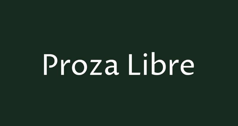
Cormorant Garamond + Proza Libre
What This Pairing Does
Proza Libre is a humanist sans-serif built specifically to render well on screens. Both fonts share a strong calligraphic feel, which is why this pairing is recommended by Typewolf as a top combination. The shared DNA makes them feel designed to complement each other.
Best Use Cases
- Publishing platforms and long-form editorial sites
- Digital magazines and content-driven brand sites
- Any project where screen readability is the main concern
How to Set It Up
- Cormorant Garamond: Headings, Regular or SemiBold, 36px and above
- Proza Libre: Body copy and subheadings, Regular, 16px minimum
Tone and Style Fit
Classic and screen-ready. This is one of the most typographically coherent pairings on the list, and it reads as considered rather than accidental.
Potential Issues
Because both fonts share calligraphic roots, the pairing can feel low-contrast. Use size and weight differences to build a clear tracking and hierarchy separation.
Cormorant Garamond + EB Garamond

What This Pairing Does
This is a serif-on-serif combination using two Garamond-inspired serif fonts. EB Garamond is the more text-friendly of the two, with a moderate contrast and consistent weight that makes it comfortable at body sizes. Cormorant Garamond handles the display role. The result is a print-inspired typography system that feels like it belongs in a book or magazine.
Best Use Cases
- Book layouts and literary magazine sites
- Academic or cultural institution websites
- High-end editorial projects where the serif-only aesthetic is intentional
How to Set It Up
- Cormorant Garamond: Display headings, Bold or SemiBold, 48px and above
- EB Garamond: Body text, Regular, 16-18px with generous line height
Tone and Style Fit
Literary and classic. If the design needs to feel like a well-made book, this pairing delivers that mood better than any serif-sans combination. Also consider looking at the Garamond font pairing guide for related options.
Potential Issues
Serif-on-serif pairings are tricky on screens. Keep strong size contrast between headings and body, and make sure the x-height difference between the two fonts is obvious enough to establish clear typographic roles.
FAQ on Cormorant Garamond Font Pairing
What is the best font to pair with Cormorant Garamond?
Montserrat is the most popular choice. Its geometric structure and even stroke weights create strong typographic contrast against Cormorant’s delicate serifs. Raleway and Lato are close runners-up, especially for luxury and editorial web design.
Should Cormorant Garamond be used for headings or body text?
Headings. Cormorant Garamond is a display serif font with hairline strokes that disappear at small sizes. Use it at 36px and above. For body text, pair it with a legible sans-serif like Open Sans or Source Sans Pro.
Is Cormorant Garamond free to use?
Yes. It is available on Google Fonts under an open-source license, free for both personal and commercial use. It is also available through Adobe Fonts with a Creative Cloud subscription.
What makes Cormorant Garamond different from regular Garamond?
Cormorant Garamond has more extreme stroke contrast and was designed specifically for large display sizes. Standard Garamond revivals like EB Garamond are built for text-level font legibility. Cormorant prioritizes elegance over readability at small sizes.
Can you pair Cormorant Garamond with another serif font?
Yes, but carefully. EB Garamond works well as the body font in a serif-on-serif combination, giving the layout a print-inspired, editorial feel. Keep strong size contrast between the two to avoid the design looking like a mistake.
What font weight should I use for Cormorant Garamond headings?
SemiBold or Bold at large display sizes. Light and Regular weights look beautiful but rely on high-resolution screens to render the hairline strokes properly. For web use, test on mobile before committing to lighter weights.
Is Cormorant Garamond good for luxury brand typography?
Yes. Its calligraphic details and high stroke contrast make it a natural fit for luxury website typography. It is widely used in fashion, cosmetics, hospitality, and high-end real estate branding, often paired with Montserrat or Raleway.
How do I use Cormorant Garamond in CSS?
Import it from Google Fonts and apply it via font-family: 'Cormorant Garamond', serif. Set font spacing carefully. A letter-spacing of 0.02em and a line-height of 1.2 to 1.4 works well for display headings.
What design styles suit Cormorant Garamond font combinations?
Editorial, luxury, fashion, and wedding design. It fits any layout where typographic elegance matters more than neutral functionality. It is less suited to technical, utilitarian, or technology-focused designs where clean readability takes priority.
How is Cormorant Garamond different from Playfair Display?
Both are display serifs, but Playfair Display has a heavier stroke weight and reads more boldly. Cormorant Garamond is lighter, more delicate, and more historically rooted. For pairing fonts, Playfair Display is easier to use at smaller sizes.
Conclusion
This conclusion is for an article presenting the strongest Cormorant Garamond font pairing options across web design, branding, and editorial layouts.
The core principle stays the same across all ten combinations: use Cormorant Garamond for display headings and let a cleaner typeface handle body text and UI elements.
Whether you go with Montserrat for a modern luxury feel, Proza Libre for screen-optimized editorial work, or EB Garamond for a fully print-inspired typography system, the right choice depends on your project’s tone and audience.
Pay attention to kerning, size contrast, and weight relationships. Those details separate a polished layout from one that just looks like two fonts sitting next to each other.
Get those right, and Cormorant Garamond delivers.

Renowned for his expertise in logo design and visual branding, Bogdan has developed a multitude of logos for various clients.
His skills extend to creating posters, vector illustrations, business cards, and brochures. Additionally, Bogdan's UI kits were featured on marketplaces like Visual Hierarchy and UI8.
He also wrote in the past years on sites like Design Your Way, WebDesignerDepot, WPDean, Designmodo, Speckyboy, Slider Revolution, and more.
- The Windsurf Logo History, Colors, Font, And Meaning - 10 October 2026
- How to Remove Background From Product Photos (No Photoshop) - 10 October 2026
- How Designers can Build a Stronger Online Creative Identity - 9 October 2026

Bogdan Sandu is a seasoned designer who has been designing websites since 2008. Renowned for his expertise in logo design and visual branding, Bogdan has developed a multitude of logos for various clients. His skills extend to creating posters, vector illustrations, business cards, and brochures. Additionally, Bogdan's UI kits were featured on marketplaces like Visual Hierarchy and UI8. He also wrote in the past years on sites like Design Your Way, WebDesignerDepot, WPDean, Designmodo, Speckyboy, Slider Revolution, and more.
You Might Also Like