The font you pick for your website does more than set a visual tone. It affects how long people stay, how much they trust you, and whether they actually read what you wrote.
With over 1,500 free typefaces in the Google Fonts library, the options are overwhelming. Most articles give you a list. This one gives you a reason.
Every font below was chosen based on readability, web font performance, cross-browser rendering, and real-world use across different site types.
By the end, you will know exactly which typeface fits your project, whether you need clean sans-serif fonts for a SaaS dashboard, an elegant serif font for editorial content, or a versatile option that handles both headings and body text without falling apart on mobile.
The Best Google Fonts for Websites
Inter

A sans-serif font built specifically for screens, with tall x-height and open apertures that make text sharp at any size.
Font Characteristics
- Type: Neo-grotesque sans-serif
- Weights available: 9 (Thin 100 to Black 900)
- Variable font: Yes (wght + opsz axes)
- Designer: Rasmus Andersson (2017)
Best Used For
SaaS platforms, dashboards, product interfaces, and fintech sites. Inter handles both body text and UI labels without breaking a sweat. It is one of the go-to choices for any site where clarity of information matters most.
Readability and Performance
The tall x-height keeps mixed-case text readable even at 12px. As a variable font, a single file serves all weights, cutting HTTP requests and improving web font performance. The optical size axis adjusts letter spacing automatically based on font size.
Font Pairing Suggestions
- With a serif: Playfair Display
- With a sans-serif: DM Serif Display
- For headings: Fraunces
How to Load It
@import url('https://fonts.googleapis.com/css2?family=Inter:wght@400;600;700&display=swap');
Who Uses It
Inter is the default typeface in Figma and used across NASA instrumentation, GitHub, and dozens of major design systems. It is one of the most widely deployed fonts on the web.
Roboto

A neo-grotesque font with a mechanical skeleton and open curves. Google’s official Android typeface since 2011.
Font Characteristics
- Type: Neo-grotesque sans-serif
- Weights available: 6 standard + condensed and slab variants (12 styles total)
- Variable font: Yes (Roboto Flex)
- Designer: Christian Robertson (2011)
Best Used For
Business websites, mobile apps, and general-purpose web content. Roboto’s slightly condensed letterforms fit more characters per line, which makes it efficient for content-heavy layouts. It is also the default typeface for Material Design.
Readability and Performance
Consistent stroke width and open counters make it highly legible at small sizes. Cross-browser font rendering is reliable, and it supports Cyrillic, Greek, and Vietnamese scripts. One of the most-used fonts on the web for a reason.
Font Pairing Suggestions
- With a serif: Merriweather
- With a sans-serif: Open Sans
- For headings: Montserrat
How to Load It
@import url('https://fonts.googleapis.com/css2?family=Roboto:wght@400;500;700&display=swap');
Who Uses It
Google itself uses Roboto across Android and many of its own products. It is installed on billions of devices, making it a genuinely cross-platform web font choice.
Open Sans
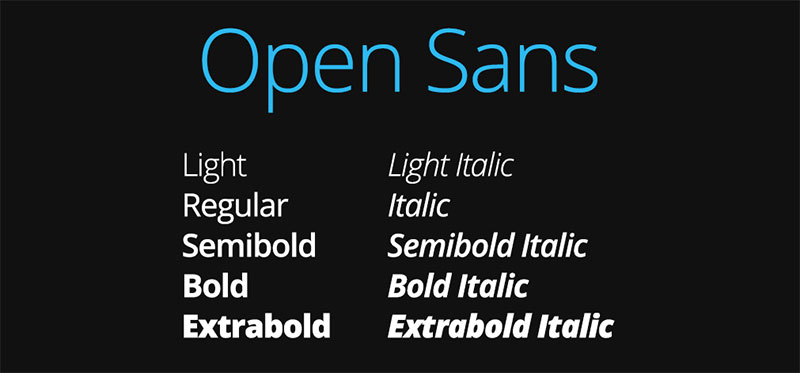
A humanist sans-serif with upright stress and open forms. Designed for legibility across print, web, and mobile.
Font Characteristics
- Type: Humanist sans-serif
- Weights available: 10 styles (Light to ExtraBold with italics)
- Variable font: Yes (wdth + wght axes)
- Designer: Steve Matteson
Best Used For
Body copy on business sites, email templates, web applications, and blogs. Open Sans has a neutral, professional tone that works across virtually any industry. Its generous letter spacing makes long paragraphs comfortable to read.
Readability and Performance
Open letterforms and wide apertures keep it sharp on low-resolution screens. The variable font version covers both width and weight axes from a single file. Multilingual support includes Hebrew and Greek scripts.
Font Pairing Suggestions
- With a serif: Playfair Display
- With a sans-serif: Roboto
- For headings: Oswald
How to Load It
@import url('https://fonts.googleapis.com/css2?family=Open+Sans:wght@400;600;700&display=swap');
Who Uses It
WordPress, Google, and countless CMS themes use Open Sans as a default. It consistently ranks among the top three most-used web fonts globally.
Montserrat
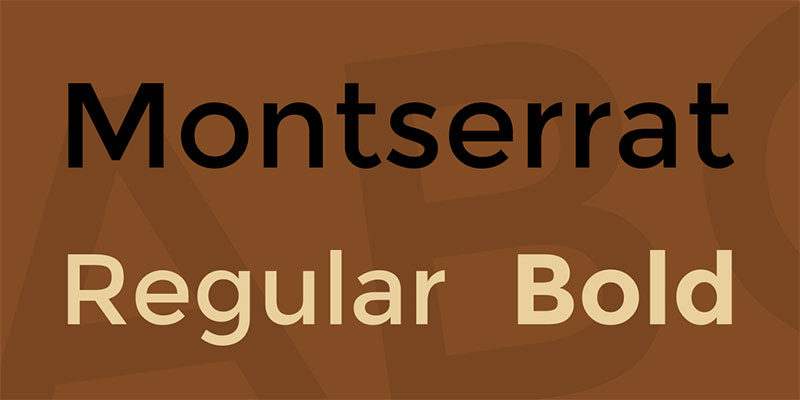
A geometric sans-serif inspired by early 20th-century signage in the Montserrat neighborhood of Buenos Aires.
Font Characteristics
- Type: Geometric sans-serif
- Weights available: 9 weights with matching italics (18 styles)
- Variable font: Yes
- Designer: Julieta Ulanovsky (2011)
Best Used For
Headings, logos, landing pages, and branding. Montserrat is used on over 19 million websites. It works well for display text but also holds up in body copy thanks to its large x-height and wide apertures.
Readability and Performance
Short descenders and a large x-height give it strong legibility at small sizes. The geometric structure creates clean visual hierarchy on the page. One thing to watch out for: at very small sizes (below 13px), lighter weights can feel too thin on mobile screens.
Font Pairing Suggestions
- With a serif: Merriweather
- With a sans-serif: Roboto
- For body text: Lora
How to Load It
@import url('https://fonts.googleapis.com/css2?family=Montserrat:wght@400;600;700&display=swap');
Who Uses It
Montserrat is a staple for startups, creative agencies, and e-commerce brands. Its clean lines suit a wide range of brand personalities, from minimal to bold.
Lato

A dual-personality sans-serif: serious at first glance, with subtle rounded details that add warmth. Lato is Polish for “summer.”
Font Characteristics
- Type: Humanist sans-serif
- Weights available: 10 styles (Thin to Black with italics)
- Variable font: No
- Designer: Lukasz Dziedzic
Best Used For
Corporate websites, blogs, and professional documents. Lato handles body text well but its Bold and Black weights also work for headings. A reliable, non-distracting choice for content-first sites.
Readability and Performance
Semi-rounded letter details create a warm feel while the overall structure stays professional. It renders cleanly across all major browsers. Since Lato is not yet a variable font, you will need to load individual weight files, so keep the selection lean for fast page load performance.
Font Pairing Suggestions
- With a serif: Merriweather
- With a sans-serif: Oswald
- For headings: Playfair Display
How to Load It
@import url('https://fonts.googleapis.com/css2?family=Lato:wght@400;700&display=swap');
Who Uses It
Lato is one of the most downloaded fonts in the Google Fonts library and a default choice in many popular WordPress themes and website builders.
Poppins
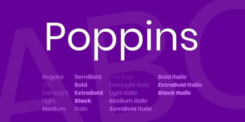
A rounded geometric sans-serif with a friendly, modern character. It supports both Latin and Devanagari scripts.
Font Characteristics
- Type: Geometric sans-serif
- Weights available: 9 weights with matching italics (18 styles)
- Variable font: No
- Designer: Indian Type Foundry and Jonny Pinhorn
Best Used For
Startup landing pages, mobile apps, and international websites. The circular letter forms give Poppins an open, accessible feel. It pairs well with both serif and sans-serif fonts, making pairing fonts with it straightforward.
Readability and Performance
Consistent circular geometry and generous line height make Poppins very readable at body text sizes. It is not a variable font, so load only the weights you need. At sizes below 12px, the rounded forms can look slightly soft, so bump the weight up slightly for small UI labels.
Font Pairing Suggestions
- With a serif: Playfair Display
- With a serif: Merriweather
- For headings: Poppins Bold over a lighter body weight works well on its own
How to Load It
@import url('https://fonts.googleapis.com/css2?family=Poppins:wght@400;600;700&display=swap');
Who Uses It
Poppins consistently ranks in the top ten most popular families on Google Fonts, with billions of weekly views. It is a go-to for SaaS products and consumer-facing apps.
Merriweather
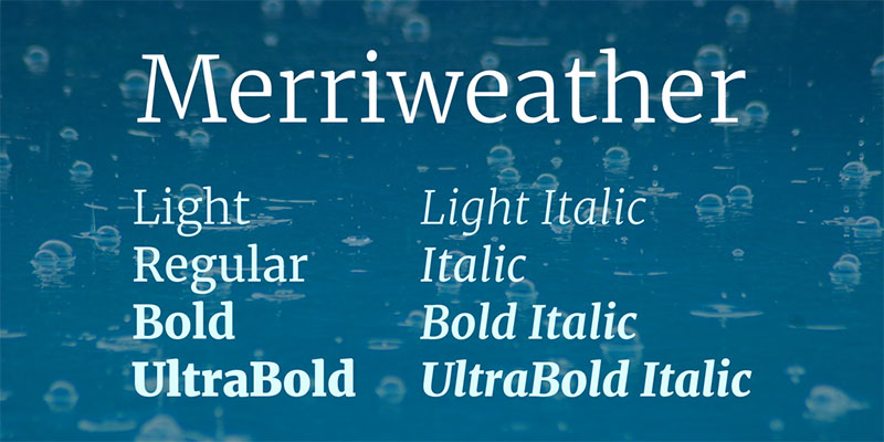
A serif font built from the ground up for on-screen reading. It tackles the classic problem of serifs looking thin and fragile on digital displays.
Font Characteristics
- Type: Serif
- Weights available: 4 weights with italics
- Variable font: No
- Designer: Eben Sorkin (Sorkin Type)
Best Used For
Long-form content, editorial sites, blogs, and news platforms. Merriweather is the serif to reach for when readability at body text sizes matters more than decorative style. Works well for any site with a lot of text to get through.
Readability and Performance
Sturdy serifs, generous leading, and a tall x-height keep text readable even on older or lower-density screens. The carefully spaced letterforms reduce eye strain in long reading sessions.
Font Pairing Suggestions
- With a sans-serif: Roboto
- With a sans-serif: Montserrat
- For headings: Oswald
How to Load It
@import url('https://fonts.googleapis.com/css2?family=Merriweather:wght@400;700&display=swap');
Who Uses It
News sites, educational platforms, and content-heavy blogs favor Merriweather. It is the default body font on many reading-focused WordPress themes.
Playfair Display
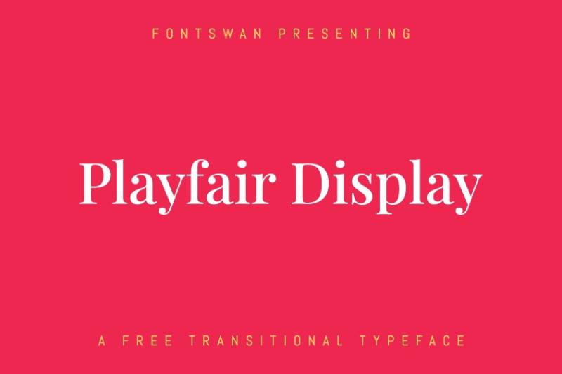
A high-contrast serif with dramatic thick-to-thin transitions. Inspired by 18th-century letter design.
Font Characteristics
- Type: Transitional serif
- Weights available: 6 weights with matching italics
- Variable font: Yes
- Designer: Claus Eggers Sorensen (2011)
Best Used For
Display headings, editorial layouts, luxury brands, and portfolio sites. Playfair Display is a heading font first. Use it at 32px and above where the thick-thin contrast reads clearly. It has a natural typographic hierarchy built in.
Readability and Performance
The high stroke contrast makes Playfair Display tricky at small sizes. Below 18px it can look fragile, especially on mobile. Stick to headings and pull quotes. As a variable font, a single file covers all weights.
Font Pairing Suggestions
- With a sans-serif: Poppins
- With a sans-serif: Roboto
- With a sans-serif: Lato
How to Load It
@import url('https://fonts.googleapis.com/css2?family=Playfair+Display:wght@400;700&display=swap');
Who Uses It
Portfolio sites, boutique e-commerce brands, and editorial blogs use Playfair Display for its editorial authority. It has over 9 billion total views on Google Fonts.
DM Sans
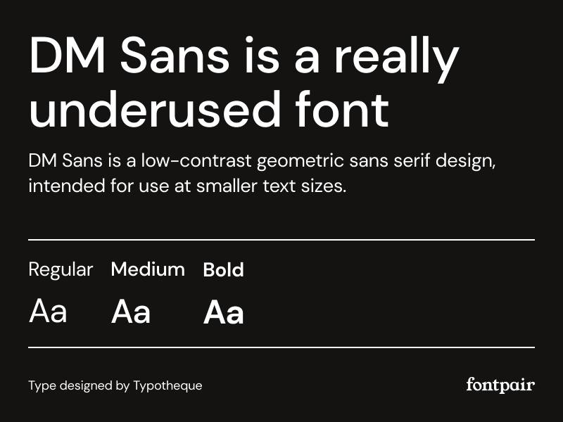
A clean geometric sans-serif with low stroke contrast and optical sizing built in. Designed by Colophon Foundry for Google.
Font Characteristics
- Type: Geometric sans-serif
- Weights available: 9 weights with italics (variable font covers them all)
- Variable font: Yes
- Designer: Colophon Foundry
Best Used For
Fintech dashboards, product interfaces, and modern branding sites. DM Sans is clean without being cold, which is harder to pull off than it sounds. It sits comfortably between Inter’s technical feel and Poppins’ softness.
Readability and Performance
Low contrast strokes stay sharp at small sizes and across different screen densities. As a variable font it is very efficient to load. The optical size axis means character spacing adapts automatically between body text and display sizes.
Font Pairing Suggestions
- With a serif: DM Serif Display (the natural companion)
- With a serif: Playfair Display
- For headings: Space Grotesk
How to Load It
@import url('https://fonts.googleapis.com/css2?family=DM+Sans:wght@400;500;700&display=swap');
Who Uses It
DM Sans is used across Google Design projects and has quickly become a favorite among product designers building clean, modern interfaces.
Nunito

A well-rounded sans-serif with fully rounded terminals. Friendlier than most geometric fonts without looking childish.
Font Characteristics
- Type: Rounded sans-serif
- Weights available: 8 weights with italics
- Variable font: Yes
- Designer: Vernon Adams
Best Used For
Education platforms, healthcare sites, community apps, and any brand that wants to feel approachable. Nunito reads well at body text sizes and also works for headings in bolder weights. It is a good all-rounder when you need warmth without decoration.
Readability and Performance
Rounded terminals and open spacing give Nunito excellent legibility at mid-range sizes (14px to 22px). It holds up well on mobile. The variable font covers the full weight range from a single file.
Font Pairing Suggestions
- With a serif: DM Serif Display
- With a sans-serif: Montserrat for headings
- For contrast: Playfair Display
How to Load It
@import url('https://fonts.googleapis.com/css2?family=Nunito:wght@400;600;700&display=swap');
Who Uses It
Nunito has over 4 billion total views on Google Fonts. It is a popular choice for SaaS onboarding flows, children’s education apps, and community-driven platforms.
What Makes a Google Font Work Well on a Website?
A Google Font works well on a website when it stays readable at multiple screen sizes, loads without hurting performance, and fits the visual tone of the site without pulling attention away from the content.
85% of websites use sans-serif fonts, and 93% of those apply them specifically to paragraph text (Dribbble research). That preference isn’t aesthetic. It’s functional.
Readability Across Sizes and Weights
X-height is the most practical indicator of how a font reads on screen. A tall x-height, where lowercase letters take up more vertical space relative to capitals, keeps characters distinct at small sizes without requiring the user to zoom in.
Font weight range matters too. A typeface that only ships in Regular and Bold gives you limited hierarchy options.
Good web fonts typically offer at least 4 weight variants: Light (300), Regular (400), Medium (500), and Bold (700). That range covers body text, subheadings, navigation, and display use without switching families.
Font Rendering and Performance
Every Google Font variant you load is a separate HTTP request to fonts.gstatic.com.
Loading 6 weights of a single family adds more latency than loading 2 weights of 2 families. The practical rule: load only the weights you actually use in CSS.
The font-display CSS property controls what the browser shows while the font file downloads. Setting it to swap shows fallback text immediately, then swaps when the web font loads. Setting it to optional skips the web font entirely on slow connections. Each choice trades visual consistency for loading speed differently.
Licensing
All Google Fonts are released under the SIL Open Font License (OFL) or Apache 2.0. Both allow free commercial use, modification, and redistribution. There are no per-seat fees, no pageview limits, and no font licensing costs to track.
This matters for agencies building client sites and for developers distributing themes or templates.
Pairing Flexibility
A font that only works in one context is a liability.
The most useful Google Fonts pair naturally with a wide range of complementary typefaces, whether that’s a contrasting serif, a different weight of the same family, or a geometric sans-serif with different proportions. Rigid, highly stylized typefaces (think decorative display fonts) tend to narrow your pairing options significantly.
What Are the Best Google Fonts for Website Body Text?
The best Google Fonts for body text combine a tall x-height, open apertures, and consistent stroke width to stay legible at 14px-18px across desktop and mobile screens.
The median font size across websites is 14px (Dribbble), which means body text fonts get tested at their lower limits constantly.
Best Sans-Serif Google Fonts for Body Text
Inter is the strongest option for most websites right now. Rasmus Andersson designed it specifically for screen interfaces, and that intent shows. The letter spacing, stroke contrast, and x-height are all calibrated for pixel rendering rather than print output.
It’s become the default body font for a large portion of SaaS products, including Linear and Vercel. The HTTP Archive’s 2024 Web Almanac noted Inter’s rapid rise in usage, projecting it will reach the top 10 most-used web fonts within the next few years.
DM Sans works particularly well for mobile-first sites. Its low stroke contrast renders cleanly at small sizes and holds up on lower-resolution screens without blurring at character joints.
| Font | Best For | Weight Range | Variable Font |
|---|---|---|---|
| Inter | SaaS, UI-heavy sites | 100–900 | Yes |
| DM Sans | Mobile-first, clean interfaces | 100–900 | Yes |
| Lato | Business, editorial, government | 100–900 | No |
| Source Sans 3 | Dense copy, documentation | 200–900 | Yes |
Lato, designed by Łukasz Dziedzic, brings a humanist warmth that Inter lacks. It’s been among the top 3 most-downloaded Google Fonts for years, with over 15 billion total views recorded (UMA Technology, 2024). Government websites and educational platforms lean on it heavily because of its neutral but friendly tone.
Source Sans 3 (formerly Source Sans Pro) is Adobe’s open-source contribution to the Google Fonts library. It was built for UI and documentation contexts, which makes it a natural fit for knowledge bases, help centers, and content-dense product sites.
Best Serif Google Fonts for Body Text
Serif fonts for body text work best on editorial sites, blogs, and any context where sustained reading matters more than interface clarity.
Merriweather is the most defensible choice here. It has over 10 billion total views (UMA Technology, 2024) and was designed by Eben Sorkin with one explicit goal: readability on screens. The large x-height, sturdy serifs, and generous letter spacing reduce eye fatigue on long-form content.
Lora suits storytelling-based websites and literary blogs. Its calligraphic character and gentle stroke stress create a sense of warmth that purely geometric typefaces can’t match. Paired against a clean sans-serif font in the heading role, Lora gives body text visible personality without slowing reading speed.
What Are the Best Google Fonts for Website Headings?
The best Google Fonts for headings perform at large sizes (24px and above), carry enough visual weight to establish hierarchy, and stay distinct from the body font without creating typographic conflict.
58% of websites use sans-serif fonts for H1 headings, compared to 93% for body text, which means there’s more stylistic range in heading choices (Dribbble).
Best Serif Google Fonts for Headings
Playfair Display has over 9 billion total views (UMA Technology, 2024). It’s a high-contrast serif font with thin hairline strokes against thick main strokes, which creates strong editorial presence at large display sizes.
Lifestyle brands, luxury sites, and editorial publications use it regularly. It doesn’t work well at small sizes (the thin strokes disappear), but that’s not what it’s for.
Cormorant Garamond is the more refined option for brands that want old-style elegance. The stroke contrast is even higher than Playfair Display, which limits it to large headings only. But in that role, it’s hard to match for a sense of refined authority.
Best Sans-Serif Google Fonts for Headings
Montserrat leads this category by usage volume, with over 11 billion total views (UMA Technology, 2024).
It’s a geometric display font built on the classic poster lettering of Buenos Aires. Bold and ExtraBold weights dominate hero sections on startup and creative agency sites. Canva uses Montserrat across its visual templates.
Oswald is the right call when compactness matters. It’s a condensed sans-serif that fits long heading text into narrow columns without wrapping. News sites, sports platforms, and media-heavy layouts use it specifically because it creates impact without consuming horizontal space.
Raleway sits in a different register. Its elegant thin-to-bold range and distinctive capital W make it a recognizable choice for portfolio sites and design-forward agencies. It’s less neutral than Montserrat, which is exactly the point.
What Are the Best Google Font Pairings for Websites?
A good Google Font pairing creates clear typographic hierarchy using contrast between heading and body typefaces. The most reliable contrast comes from pairing a serif font with a sans-serif font, or from using weight variation within a single family.
Pairing fonts requires balancing visual contrast with tonal consistency. Too much contrast and the typefaces fight each other. Too little and there’s no hierarchy.
Proven Google Font Combinations
Playfair Display + Source Sans 3 is the most-used editorial combination in the Google Fonts library.
Playfair Display’s high-contrast serifs set headings apart clearly. Source Sans 3 handles body text with neutral precision. The contrast is structural (serif vs. sans-serif) rather than tonal, so the two typefaces read as complementary rather than competing.
Montserrat + Merriweather works particularly well for content-heavy blogs and marketing sites.
Montserrat’s geometric weight handles headings with authority. Merriweather’s screen-optimized serifs make long body text comfortable to read. This pairing appears across hundreds of WordPress themes and blog templates, which gives some indication of how well it holds up across varied contexts.
| Heading Font | Body Font | Best Context |
|---|---|---|
| Playfair Display | Source Sans 3 | Editorial, publishing |
| Montserrat | Merriweather | Blogs, content marketing |
| Oswald | Lato | News, sports, media |
| DM Sans | Inter | SaaS, product UI |
| Cormorant Garamond | Lato | Luxury, fashion brands |
Oswald + Lato solves a specific problem: impact in the heading without a heavy font file. Oswald’s condensed structure keeps headlines tight. Lato’s humanist warmth in the body prevents the overall layout from feeling too cold or mechanical.
Inter used alone is worth mentioning. Many product teams and SaaS developers run a single-family typographic system using only Inter’s weight range. Bold or ExtraBold for headings, Regular for body, Medium for UI labels. The result is visually coherent and fast to load since it’s only one font family.
A font pairing generator can show combinations in context before committing to them in code, which is especially useful when testing heading and body contrast at actual screen sizes.
How Do Google Fonts Affect Website Performance?
Google Fonts affect website performance through 3 mechanisms: additional DNS lookups, render-blocking font file downloads, and Cumulative Layout Shift caused by font swapping.
79% of websites use either self-hosted fonts, Google web fonts, or both (HTTP Archive Web Almanac, 2024). The way those fonts load determines their performance impact.
Self-Hosting vs. Google CDN: Which Is Faster?
Loading Google Fonts from the Google CDN requires 2 DNS connections: one to fonts.googleapis.com for the CSS, and one to fonts.gstatic.com for the actual font files.
Self-hosting eliminates both external connections. The browser loads fonts from the same origin as the rest of the page, reducing DNS lookup time and enabling aggressive caching with long Cache-Control headers.
31.5% of desktop sites now exclusively self-host their fonts, up from 28% in 2024, according to the 2025 Web Almanac. The trend is clear.
There’s also a GDPR consideration for European sites. Loading Google Fonts from Google’s CDN sends the visitor’s IP address to Google’s servers. German courts have ruled this a GDPR violation in some cases. Self-hosting removes that exposure entirely.
Key self-hosting steps:
- Download font files in WOFF2 format (75% of web fonts now use WOFF2, per HTTP Archive 2024)
- Set
Cache-Control: max-age=31536000for long-term caching - Add
<link rel="preload">for critical font weights - Use
font-display: swaporfont-display: optionalin the@font-facedeclaration
Variable Google Fonts and File Size Reduction
A variable font stores the entire weight range in a single file rather than shipping separate files for each weight.
Loading Inter as a variable font means one HTTP request covers Regular, Medium, SemiBold, and Bold. Loading those as static fonts requires 4 separate requests.
Google Fonts served 92% of all variable fonts in 2024, down from 97% in 2022 as self-hosting grew (HTTP Archive Web Almanac, 2024). Variable fonts are available for Inter, DM Sans, Source Sans 3, Montserrat, Open Sans, and most of the major Google Fonts families.
The performance tradeoff: variable font files are larger than single static weight files. But they’re smaller than loading 3 or more separate static weights, which is the realistic comparison for most sites.
Which Google Fonts Do Major Websites Actually Use?
The most-used Google Fonts on major websites reflect functional priorities: neutral rendering, wide weight ranges, multilingual character support, and compatibility with design systems built around Material Design and modern UI frameworks.
Google Fonts is used by over 50 million websites globally, with more than 11.9 million using the Google Fonts API directly (Toner Buzz research).
Font Choices by Product Type
Roboto is the most-viewed Google Font of all time with 28 trillion all-time views (Photutorial). Google built it as the default typeface for Android and Material Design, which explains the reach. It’s the default font across Google Maps, Google Drive, and most Google product interfaces.
Inter has become the de facto standard for SaaS product design. Linear, Vercel, and a large number of developer-facing products use it as their primary typeface. Its rise in the HTTP Archive data, climbing toward the top 10 across all web fonts, reflects its growing adoption in frontend frameworks and component libraries.
Open Sans was the most-used web font globally for several years running. It has over 17 billion total views and 5.4 billion total downloads (UMA Technology, 2024). Zalando uses Open Sans across its platform. WordPress default themes have shipped with it. Its neutrality is both its strength and its limitation. It fits almost any context, which makes it safe but rarely distinctive.
Noto Sans solves a problem the other fonts don’t: complete multilingual coverage. Google developed the Noto family to eliminate blank boxes in text rendered in unsupported scripts. It covers over 1,000 languages. Sites with non-Latin content, multilingual audiences, or global reach use it specifically for this reason.
| Font | Primary Use Case | Notable Users |
|---|---|---|
| Roboto | Android apps, Material Design UIs | Google Maps, Google Drive |
| Inter | SaaS dashboards, product interfaces | Linear, Vercel |
| Open Sans | Business sites, WordPress themes | Zalando, government sites |
| Montserrat | Creative agencies, startup marketing | Canva templates |
| Noto Sans | Multilingual and global sites | Google cross-language products |
For fonts for websites more broadly, the pattern is consistent: the most widely adopted typefaces succeed because they perform predictably across contexts, not because they make a strong stylistic statement.
Understanding font psychology helps explain why certain brands gravitate toward geometric sans-serifs versus humanist options. The functional differences between typefaces are often smaller than the perceptual differences they create.
FAQ on The Best Google Fonts For Websites
What is the best Google Font for websites?
Inter is widely considered the top choice for modern websites. It was built specifically for screens, with a tall x-height and open apertures that keep text sharp at any size. SaaS platforms, dashboards, and product interfaces all rely on it heavily.
What is the most readable Google Font for body text?
Merriweather leads for serif body text. For sans-serif, Inter and Open Sans both perform well. All three were designed with on-screen legibility as the primary goal, making long-form reading noticeably more comfortable across devices.
Are Google Fonts free to use on commercial websites?
Yes. Every typeface in the Google Fonts library is released under open-source licenses, mostly SIL Open Font License. You can use them on commercial sites without paying font licensing fees.
Do Google Fonts slow down my website?
They can, if loaded carelessly. Loading too many weights or styles adds render-blocking requests. Use variable fonts where available, add display=swap to your embed, and load only the weights your design actually needs.
What is the best Google Font for headings?
Playfair Display works well for editorial and luxury sites. Montserrat suits modern, minimal brands. For a neutral option that pairs with almost anything, Poppins Bold handles headings cleanly without drawing too much attention to itself.
What Google Font pairs well with serif fonts?
Roboto, Inter, and DM Sans all pair well with serifs. The key is contrast. A clean geometric sans-serif next to a high-contrast serif like Playfair Display creates clear typographic hierarchy without visual noise.
How many Google Fonts should I use on one website?
Two is the standard. One for headings, one for body text. Using three or more typefaces on a single site usually creates visual inconsistency rather than personality. Stick to two and vary weight instead.
What is the best Google Font for a professional business website?
Open Sans, Roboto, and Lato are reliable choices. They read as neutral and professional without feeling generic. For a slightly more distinctive look, Inter gives a modern, product-focused feel that still works across most business contexts.
Which Google Fonts support multiple languages?
Noto Sans was designed specifically for multilingual support and covers hundreds of scripts. Inter, Roboto, and Open Sans also support Cyrillic, Greek, and extended Latin. Poppins adds Devanagari, making it strong for sites targeting South Asian audiences.
What is the difference between a font and a typeface?
A typeface is the design family, like Roboto or Inter. A font is a specific instance of that family, such as Roboto Bold 700. Most people use the terms interchangeably, but the distinction matters in professional type settings.
Conclusion
This conclusion is for an article presenting the best Google Fonts for websites, and the takeaway is simple: typeface selection directly shapes how visitors experience your content.
Inter and Roboto handle modern interfaces cleanly. Merriweather and Playfair Display bring editorial weight to long-form reading. Montserrat, Poppins, and Nunito cover everything from startup landing pages to community platforms.
None of these are guesses. Each one has a proven track record in real-world web design, with strong cross-browser font rendering and reliable font loading behavior.
Pick one for headings, one for body text, and load only the weights you need. That alone puts your web typography ahead of most sites.

Renowned for his expertise in logo design and visual branding, Bogdan has developed a multitude of logos for various clients.
His skills extend to creating posters, vector illustrations, business cards, and brochures. Additionally, Bogdan's UI kits were featured on marketplaces like Visual Hierarchy and UI8.
He also wrote in the past years on sites like Design Your Way, WebDesignerDepot, WPDean, Designmodo, Speckyboy, Slider Revolution, and more.
- Canva vs PowerPoint: Which Is Better for Presentations? - 22 September 2026
- How to Install Fonts on Mac (Step-by-Step Guide) - 20 September 2026
- From Mockup to Code: How AI-Augmented Development Speeds Up the Design Handoff - 19 September 2026

Bogdan Sandu is a seasoned designer who has been designing websites since 2008. Renowned for his expertise in logo design and visual branding, Bogdan has developed a multitude of logos for various clients. His skills extend to creating posters, vector illustrations, business cards, and brochures. Additionally, Bogdan's UI kits were featured on marketplaces like Visual Hierarchy and UI8. He also wrote in the past years on sites like Design Your Way, WebDesignerDepot, WPDean, Designmodo, Speckyboy, Slider Revolution, and more.
You Might Also Like