The font on your website is doing more work than you think.
Choosing the best fonts for websites affects readability, load speed, brand perception, and whether users stay or leave. It is not a decoration decision. It is a performance decision.
Monotype research confirms that typeface choices increase positive user responses by up to 13%. Adobe found that 38% of people stop engaging with a site when the layout feels off, and poor typography is a leading cause.
This guide covers the top 10 web fonts used by designers in 2025, from screen-optimized sans-serifs like Inter and Roboto to editorial serifs like Georgia and Playfair Display.
You will find out which font works best for body text, which suits headings, how to pair them, and what to check before committing to any typeface for your site.
The Best Fonts For Websites
Choosing the right font for your website affects readability, load speed, and how people perceive your brand. The options below are not just popular — they are structurally suited for web use, backed by measurable attributes like x-height, weight range, and rendering behavior.
| Font | Classification | Best For | License |
| Inter | Neo-grotesque sans-serif | UI, dashboards, body text | OFL (Free) |
| Roboto | Neo-grotesque sans-serif | Android, Material Design | Apache 2.0 (Free) |
| Montserrat | Geometric sans-serif | Headings, branding | OFL (Free) |
| Poppins | Geometric sans-serif | Landing pages, UI | OFL (Free) |
| Open Sans | Humanist sans-serif | Body text, multilingual sites | Apache 2.0 (Free) |
| Lato | Humanist sans-serif | Corporate, editorial | OFL (Free) |
| Merriweather | Slab serif | Long-form reading | OFL (Free) |
| Playfair Display | Transitional serif | Editorial headings | OFL (Free) |
| DM Sans | Geometric sans-serif | Small UI text, interfaces | OFL (Free) |
| Georgia | Transitional serif | Long-form web content | Web-safe (pre-installed) |
—
Inter
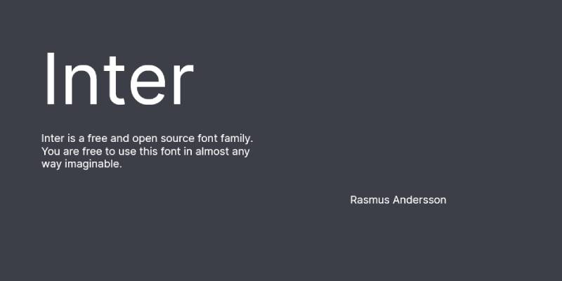
Inter is a neo-grotesque sans-serif typeface designed by Rasmus Andersson in 2017, available through Google Fonts and the official Inter website (rsms.me/inter). It delivers screen-optimized legibility across UI components, data tables, and body copy at sizes from 10px to 32px+.
Inter suits web interfaces because it features a tall x-height and open apertures in letters like ‘c’, ‘e’, and ‘a’, which reduce misread characters at small display sizes. Figma adopted Inter as its default UI font in 2021, accelerating its adoption across design systems worldwide.
What makes Inter suitable for websites?
Inter has a tall x-height (approximately 0.73 of cap height) that keeps lowercase letters distinct and readable at 12px–16px on low-DPI screens. Its open apertures improve character discrimination between similar glyphs. The optical size axis (opsz) allows the font to automatically adjust stroke contrast for captions vs. display headings.
Key attributes:
| Attribute | Value |
| Classification | Neo-grotesque sans-serif |
| Designer | Rasmus Andersson, 2017 |
| Weight range | Thin 100 – Black 900 |
| Variable font | Yes (weight + optical size axes) |
| Optical sizes | Yes — text and display |
| Recommended sizes | 12px–16px body; 24px+ headings |
| Letter-spacing default | 0 |
| License | OFL — free for commercial use |
| Available on | Google Fonts, rsms.me/inter |
| Price | Free |
How does Inter perform on websites?
Inter renders clearly at 12px–16px on both retina and standard displays. Its contextual alternates and tabular figures activate automatically, making it reliable for data-heavy interfaces without custom CSS. Over 2,000 glyphs cover 147 languages across Latin, Greek, and Cyrillic scripts.
What are the best pairings for Inter on websites?
Inter pairs with Playfair Display for contrast between a neutral sans-serif body and a high-contrast serif headline. It also works with Source Serif 4 when a warmer tone is needed for editorial or documentation contexts — both share a screen-first design philosophy and similar x-heights.
What are the limitations of Inter for websites?
The Google Fonts version of Inter is outdated and lacks italic styles — using it from Google Fonts is not recommended by the designer. Self-hosting from rsms.me/inter is the correct approach for full feature access.
Inter — Recommended Use Cases Within Website Typography
- Best for: UI labels, navigation, dashboards, SaaS interfaces, body copy at 14px–18px
- Avoid for: Expressive display headlines where personality is required
- Optimal weight: Regular 400 for body; SemiBold 600 for subheadings; Bold 700 for CTAs
- Optimal size range: 14px–18px for body; 28px–48px for headings
—
Roboto
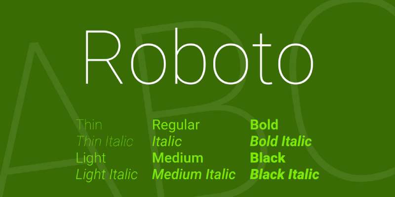
Roboto is a neo-grotesque sans-serif typeface designed by Christian Robertson in 2011, released by Google. It serves as the default font for Android and Google’s Material Design system, making it one of the most widely deployed typefaces on the web.
Roboto suits high-traffic websites because its dual-nature skeleton — geometric structure with open, humanist curves — renders consistently across Android, Chrome OS, and web browsers without requiring custom hinting adjustments.
What makes Roboto suitable for websites?
Roboto has a large x-height and even stroke widths that maintain legibility at 14px on mobile screens. The Roboto Flex variable font (released 2022 with Font Bureau) adds weight, width, optical size, and grade axes, giving designers precise control from a single file. Its superfamily includes Roboto Condensed, Roboto Slab, and Roboto Mono for extended typographic systems.
Key attributes:
| Attribute | Value |
| Classification | Neo-grotesque sans-serif |
| Designer | Christian Robertson, 2011 |
| Weight range | Thin 100 – Black 900 |
| Variable font | Yes (Roboto Flex — weight, width, opsz, grade) |
| Recommended sizes | 14px–18px body; 24px+ headings |
| Letter-spacing default | 0 |
| License | Apache 2.0 — free for commercial use |
| Available on | Google Fonts, Adobe Fonts |
| Price | Free |
How does Roboto perform on websites?
Roboto is the most downloaded font on Google Fonts. Its neutral character — not cold like Helvetica, not warm like humanist typefaces — makes it safe across brand contexts. At 14px on mobile, its open counters keep characters distinct. The original Roboto static family covers 12 weights and styles; Roboto Flex covers far more through variable axes.
What are the best pairings for Roboto on websites?
Roboto pairs with Lora for editorial warmth — both share a similar x-height, and Lora’s calligraphic italic contrasts Roboto’s clean upright forms. For a same-family system, Roboto Slab works as a heading companion within Material Design implementations.
What are the limitations of Roboto for websites?
Roboto’s ubiquity means websites using it without customization risk blending into the background — it’s the default on so many platforms that it reads as “generic” to frequent web users. Roboto Flex requires careful CSS implementation; incorrect axis values can cause unexpected layout shifts.
Roboto — Recommended Use Cases Within Website Typography
- Best for: Android-first web apps, Material Design systems, body copy on high-traffic content sites
- Avoid for: Premium or luxury brand websites where a neutral default is a liability
- Optimal weight: Light 300 for legal/caption text; Regular 400 for body; Bold 700 for headings
- Optimal size range: 14px–18px for body; 24px–40px for headings
—
Montserrat
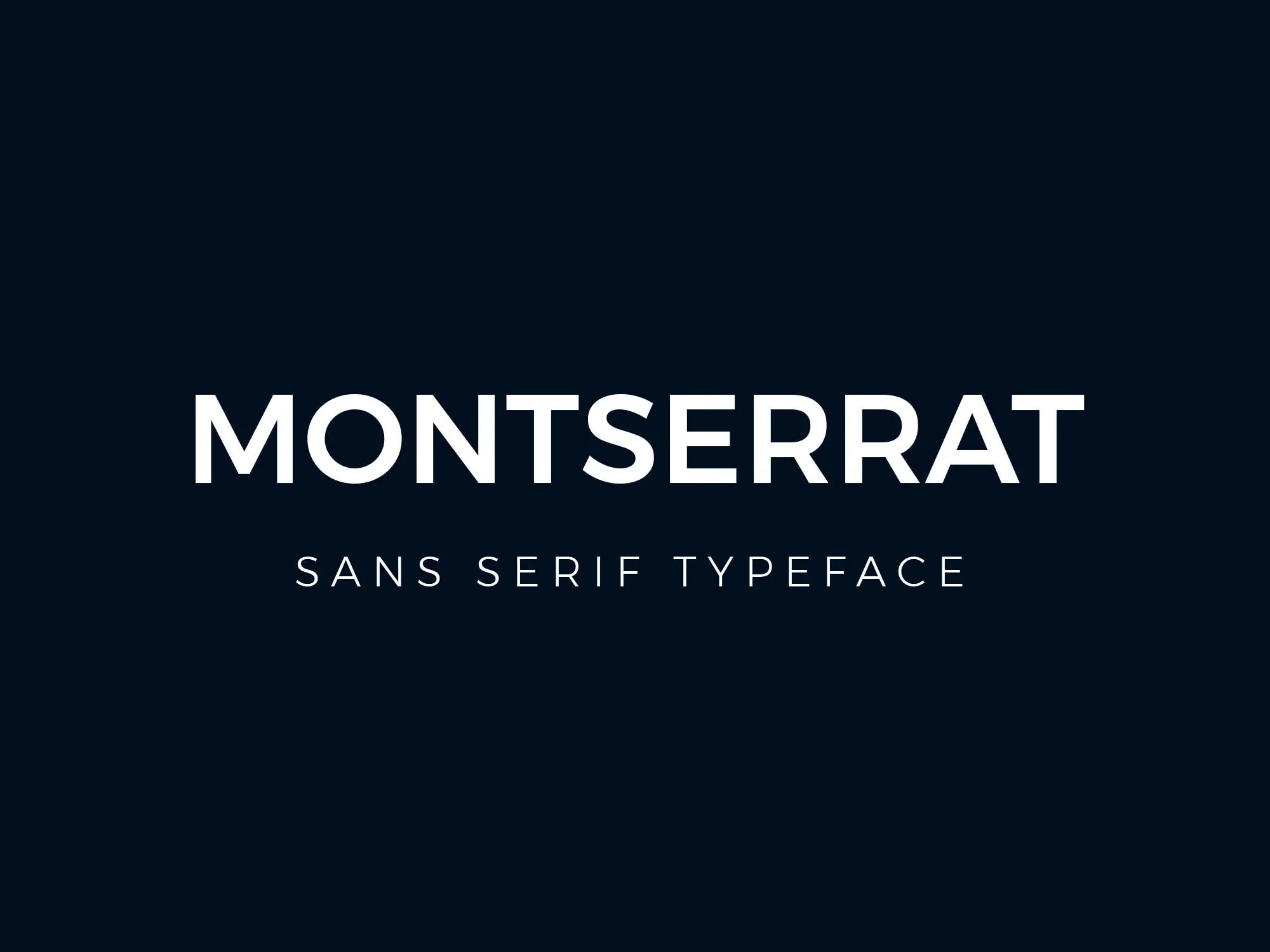
Montserrat is a geometric sans-serif font designed by Julieta Ulanovsky in 2011, released through Google Fonts. Inspired by early 20th-century signage in the Montserrat neighborhood of Buenos Aires, it delivers strong typographic presence in headings and branding contexts.
Montserrat works best for website headings because its large x-height and wide apertures keep letterforms distinct at large display sizes (36px+). It is used on over 19 million websites and ranks as the fourth most popular font on Google Fonts, with over 2.7 trillion views as of 2023.
What makes Montserrat suitable for websites?
Montserrat features 9 weights from Thin (100) to Black (900) with matching italics, providing enough internal contrast to build a complete heading hierarchy within a single family. Its large x-height improves uppercase-to-lowercase legibility ratios. Short descenders reduce line-height requirements, which helps with compact heading layouts.
Key attributes:
| Attribute | Value |
| Classification | Geometric sans-serif |
| Designer | Julieta Ulanovsky, 2011 |
| Weight range | Thin 100 – Black 900 |
| Variable font | Yes |
| Recommended sizes | 24px+ for headings; 16px–18px body (lighter weights) |
| Letter-spacing default | 0 to slight negative at large sizes |
| License | OFL — free for commercial use |
| Available on | Google Fonts, Adobe Fonts, Font Squirrel |
| Price | Free |
How does Montserrat perform on websites?
At 36px–72px, Montserrat’s geometric forms and consistent stroke widths create strong visual hierarchy in hero sections and landing pages. At body text sizes (below 16px), the Regular weight can feel slightly tight — pairing Montserrat headings with a more legible body font like Open Sans or Merriweather is standard practice. Its free alternative positioning to Gotham and Proxima Nova makes it a go-to for budget-conscious brand projects.
What are the best pairings for Montserrat on websites?
Montserrat pairs with Merriweather for a strong sans/serif contrast in editorial layouts. It also pairs with Open Sans when a neutral, highly readable body text is needed — both fonts share similar x-heights and were designed with digital legibility in mind.
What are the limitations of Montserrat for websites?
Montserrat lacks full Greek script support, which limits its use on multilingual websites serving Greek-language audiences. At body text sizes below 15px, the Regular weight’s tight geometry reduces per-character distinction compared to humanist alternatives like Lato.
Montserrat — Recommended Use Cases Within Website Typography
- Best for: Hero headings, navigation labels, landing page titles, branding-forward websites
- Avoid for: Long-form body text below 16px; websites requiring Greek script support
- Optimal weight: SemiBold 600 or Bold 700 for headings; Light 300 for large decorative text
- Optimal size range: 28px–72px for headings; 16px–18px if used for body text (use Light or Regular)
—
Poppins
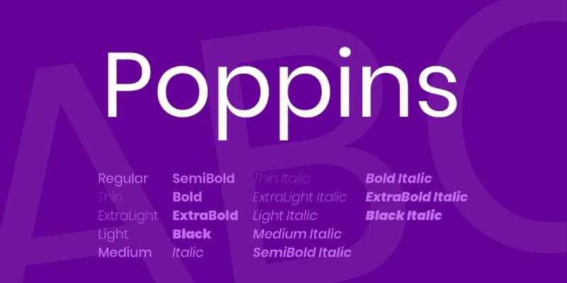
Poppins is a geometric sans-serif typeface released in 2014 by the Indian Type Foundry (ITF) through Google Fonts. Designed by Jonny Pinhorn (Latin) and Ninad Kale (Devanagari), it provides consistent legibility across Latin and Devanagari scripts from a single typeface system.
Poppins ranks consistently in the top 10 on Google Fonts with billions of weekly views. Its monolinear construction — nearly uniform stroke weight throughout — gives it a clean, structured appearance that performs reliably in both UI and marketing contexts.
What makes Poppins suitable for websites?
Poppins letterforms are based on pure geometric circles, with a high x-height and rationalist construction. The Latin caps are shorter than the Devanagari characters, which creates a distinctive proportion that sets it apart from purely Latin geometric fonts. Nine weights from Thin (100) to Black (900) — each with matching italics — cover the full range needed for heading and body hierarchies.
Key attributes:
| Attribute | Value |
| Classification | Geometric sans-serif |
| Designer | Jonny Pinhorn & Ninad Kale / Indian Type Foundry, 2014 |
| Weight range | Thin 100 – Black 900 |
| Variable font | No |
| Recommended sizes | 16px–20px body; 28px+ headings |
| Letter-spacing default | 0 |
| License | OFL — free for commercial use |
| Available on | Google Fonts |
| Price | Free |
How does Poppins perform on websites?
Poppins renders consistently across Chrome, Firefox, and Safari at 16px+. Its monolinear strokes mean there’s no thin-stroke degradation at smaller sizes, though at 12px–14px the perfectly circular ‘o’, ‘c’, and ‘e’ can blur on low-DPI screens. It’s a strong performer in e-commerce and SaaS landing pages where a friendly but structured look is the goal.
What are the best pairings for Poppins on websites?
Poppins pairs with Merriweather for contrast between its geometric sans-serif structure and Merriweather’s screen-optimized slab serif. It also works with Lato when a warmer sans-serif body is needed — Lato’s semi-rounded details soften the combination without clashing stylistically.
What are the limitations of Poppins for websites?
Poppins is not available as a variable font, meaning loading all 9 weights requires multiple HTTP requests unless subsetting is applied. At body text sizes below 14px, its circular letterforms lose crispness on standard-resolution screens.
Poppins — Recommended Use Cases Within Website Typography
- Best for: Landing pages, e-commerce product headings, marketing sites, multilingual Latin/Devanagari layouts
- Avoid for: Body text below 14px; websites prioritizing variable font performance
- Optimal weight: Regular 400 for body; SemiBold 600 or Bold 700 for headings
- Optimal size range: 16px–20px for body; 28px–56px for headings
—
Open Sans
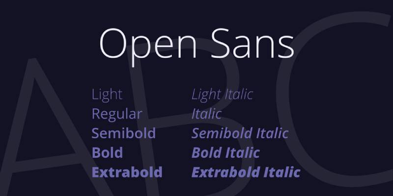
Open Sans is a humanist sans-serif font designed by Steve Matteson (Ascender Corp) in 2011, commissioned by Google. It delivers neutral, highly readable body text across print, web, and mobile interfaces — its primary design goal, stated explicitly by Google at release.
As of 2018, Open Sans served over 4 billion views per day across more than 20 million websites. The New York Times, WordPress (as of version 3.8), Mozilla, and the UK Liberal Democrat Party all use Open Sans as a primary typeface.
What makes Open Sans suitable for websites?
Open Sans has wide apertures on letters like ‘c’, ‘e’, and ‘s’ and a large x-height that maintain legibility at 14px on both high and standard-resolution screens. Its upright stress axis gives it a neutral, structured quality without the coldness of geometric fonts. The variable font version (updated March 2021) covers Light 300 to ExtraBold 800 in a single WOFF2 file, with a separate condensed variable version.
Key attributes:
| Attribute | Value |
| Classification | Humanist sans-serif |
| Designer | Steve Matteson / Ascender Corp, 2011 |
| Weight range | Light 300 – ExtraBold 800 |
| Variable font | Yes (weight + condensed width axes) |
| Recommended sizes | 14px–18px body; 24px+ headings |
| Letter-spacing default | 0 |
| License | Apache 2.0 — free for commercial use |
| Available on | Google Fonts, Adobe Fonts |
| Price | Free |
How does Open Sans perform on websites?
Open Sans is optimized for extended reading at 16px on mobile. Its humanist structure — closer to calligraphic origins than geometric or grotesque fonts — reduces eye fatigue in long-form content. The 897-character set covers Latin, Greek, and Cyrillic, making it a reliable choice for multilingual websites without separate font fallbacks for European languages.
What are the best pairings for Open Sans on websites?
Open Sans pairs with Playfair Display for a classic editorial contrast — Playfair’s high stroke variation against Open Sans’s even strokes creates clear heading/body separation. It also works with Montserrat as a heading companion when a consistent geometric tone is preferred across the full hierarchy.
What are the limitations of Open Sans for websites?
Open Sans reaches only ExtraBold 800 — it lacks a Black 900 weight, which limits its use in high-impact display headline contexts where maximum weight is needed. Its neutral character, while an advantage for body text, makes it a weak choice for branding-forward websites that need typographic personality.
Open Sans — Recommended Use Cases Within Website Typography
- Best for: Long-form blog content, documentation sites, multilingual websites, government and institutional pages
- Avoid for: Display headlines requiring a Black 900 weight; personality-driven brand sites
- Optimal weight: Regular 400 for body; SemiBold 600 for subheadings; Bold 700 for CTAs
- Optimal size range: 14px–18px for body; 24px–40px for headings
—
Lato
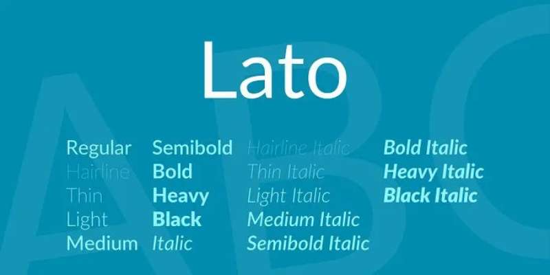
Lato is a humanist sans-serif typeface designed by Łukasz Dziedzic (tyPoland) in 2010, published under the Open Font License. It was originally created as a corporate typeface for a private client — when that project was shelved, Dziedzic released it publicly through Google Fonts.
Lato supports 100+ Latin-based languages and 50+ Cyrillic languages, making it one of the more capable free typefaces for multilingual European websites. Its semi-rounded letter details give it warmth at close range while its classical proportions read as clean and structured at a distance.
What makes Lato suitable for websites?
Lato’s design resolves a specific tension: it reads as transparent in body text but displays distinct character at larger sizes. Classical uppercase proportions give headings a structured quality, while semi-rounded terminals on ‘a’ and ‘e’ soften the reading experience in paragraphs. The family includes 9 weights including a Hairline style — useful for large decorative headings where extreme lightness is needed.
Key attributes:
| Attribute | Value |
| Classification | Humanist sans-serif |
| Designer | Łukasz Dziedzic / tyPoland, 2010 |
| Weight range | Hairline 100 – Black 900 |
| Variable font | No (static weights only on Google Fonts) |
| Recommended sizes | 14px–18px body; 24px+ headings |
| Letter-spacing default | 0 |
| License | OFL — free for commercial use |
| Available on | Google Fonts, latofonts.com |
| Price | Free |
How does Lato perform on websites?
Lato’s SemiBold 600 weight is particularly effective at 16px–20px for subheadings and navigation items — bold enough to establish hierarchy without competing with Bold 700 headline weights. Its multilingual glyph coverage makes it a practical choice for agencies building websites across European markets. The Hairline weight requires 36px+ to remain legible and should be used only for decorative display contexts.
What are the best pairings for Lato on websites?
Lato pairs with Merriweather for a classic sans/serif combination — Merriweather’s screen-optimized slab complements Lato’s neutral humanist structure. It also pairs with Playfair Display for editorial layouts where a strong heading contrast is needed against a clean body font.
What are the limitations of Lato for websites?
The Lato 2.0 version (with 3,000+ glyphs per style) is not available on Google Fonts — only the older 1.0 version is hosted there, which means teams requiring the full character set must self-host from latofonts.com. Lato has no variable font version, requiring separate file requests for each weight used.
Lato — Recommended Use Cases Within Website Typography
- Best for: Corporate and agency websites, multilingual European sites, professional portfolios, navigation and UI labels
- Avoid for: Projects requiring a variable font for performance; contexts needing Greek-only script without Latin mixing
- Optimal weight: Regular 400 for body; SemiBold 600 for subheadings; Bold 700 for CTAs and headings
- Optimal size range: 14px–18px for body; 24px–48px for headings
—
Merriweather
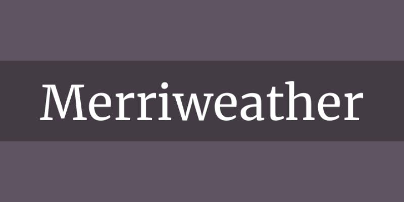
Merriweather is a slab serif font designed by Eben Sorkin, available through Google Fonts under the OFL. It was built specifically for on-screen reading — its structural decisions prioritize screen legibility over print refinement.
Merriweather suits websites with high volumes of long-form text because its slightly condensed letterforms and mild diagonal stress increase reading flow at 16px–20px on both desktop and mobile screens.
What makes Merriweather suitable for websites?
Merriweather has a tall x-height and slightly condensed letterforms that let more text fit per line without reducing per-character legibility. Its mild diagonal stress — rather than a pure vertical axis — creates a more natural reading rhythm. The family covers 4 weights (Light, Regular, Bold, Black) with matching italics, which covers most heading and body hierarchy needs.
Key attributes:
| Attribute | Value |
| Classification | Slab serif |
| Designer | Eben Sorkin |
| Weight range | Light 300 – Black 900 |
| Variable font | No |
| Recommended sizes | 16px–20px body; 28px+ headings |
| Letter-spacing default | 0 |
| License | OFL — free for commercial use |
| Available on | Google Fonts |
| Price | Free |
How does Merriweather perform on websites?
Merriweather reads comfortably at 16px on mobile, which is the minimum recommended size for serif fonts on screen. Its slab serifs provide more structure than thin-stroke transitional serifs like Playfair Display at small sizes, making it more reliable across a range of screen resolutions. It’s the default reading font used by some WordPress themes precisely for this reason.
What are the best pairings for Merriweather on websites?
Merriweather pairs with Lato for a well-balanced humanist sans/slab serif combination — both fonts share warmth without being expressive. It also pairs with Montserrat when a stronger contrast between geometric heading weight and a warm, readable body is the goal.
What are the limitations of Merriweather for websites?
Merriweather is not available as a variable font, and its weight range of 4 steps (Light, Regular, Bold, Black) is narrower than other options on this list. It lacks a Medium or SemiBold weight, which can make intermediate hierarchy levels — like subheadings — harder to achieve without switching to a different font.
Merriweather — Recommended Use Cases Within Website Typography
- Best for: Blog body text, news sites, documentation, any website with articles over 500 words
- Avoid for: Display headings above 60px; websites needing a variable font for load optimization
- Optimal weight: Regular 400 for body; Bold 700 for headings
- Optimal size range: 16px–20px for body; 28px–44px for headings
—
Playfair Display
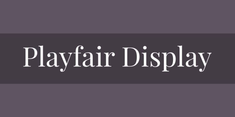
Playfair Display is a transitional serif font designed by Claus Eggers Sørensen, released in 2011 and available through Google Fonts. It is built for display and titling use — the word “Display” in its name is a structural specification, not a descriptor.
Playfair Display suits editorial website headings because its high stroke contrast (thick vertical strokes against thin horizontal hairlines) creates strong visual impact at 36px+, and its open counters maintain legibility in headlines where letterforms need to hold up against photographic or textured backgrounds.
What makes Playfair Display suitable for websites?
Playfair Display features pronounced stroke contrast — thick vertical stems against thin hairline horizontals — that maximizes visual weight at display sizes. Its open counters in ‘o’, ‘e’, and ‘a’ keep letterforms readable against dark or complex backgrounds common in hero sections. The family includes 6 weights from Regular to Black with matching italics.
Key attributes:
| Attribute | Value |
| Classification | Transitional serif |
| Designer | Claus Eggers Sørensen, 2011 |
| Weight range | Regular 400 – Black 900 (6 weights) |
| Variable font | No |
| Recommended sizes | 28px+ headings; not recommended for body text |
| Letter-spacing default | 0 to slight negative at large sizes |
| License | OFL — free for commercial use |
| Available on | Google Fonts, Adobe Fonts, Font Squirrel |
| Price | Free |
How does Playfair Display perform on websites?
At 36px–88px, Playfair Display’s high stroke contrast creates strong typographic hierarchy in hero sections, editorial headers, and pull quotes. At sizes below 24px, its thin hairline strokes degrade on low-DPI screens and become difficult to render cleanly. It should not be used for body text — at 16px, the hairlines become visually unstable and strain reading.
What are the best pairings for Playfair Display on websites?
Playfair Display pairs with Open Sans for high editorial contrast — Open Sans’s even stroke weight against Playfair’s dramatic variation creates a clear visual split between headings and body. It also works with Lato for a similar reason, and with Roboto when a slightly more neutral body tone is preferred on information-heavy pages.
What are the limitations of Playfair Display for websites?
Playfair Display is strictly a display font — using it below 24px results in hairline degradation on standard-resolution screens. It has no variable font version and only 6 weights, which limits mid-range hierarchy options. It is also not suitable for multilingual contexts requiring Cyrillic or Greek support.
Playfair Display — Recommended Use Cases Within Website Typography
- Best for: Hero headings, editorial page titles, luxury brand websites, magazine-style blogs
- Avoid for: Body text at any size; websites targeting low-DPI mobile screens as primary devices
- Optimal weight: Regular 400 for editorial headings; Bold 700 for high-impact display titles
- Optimal size range: 28px minimum; 36px–88px for best stroke contrast performance
—
DM Sans
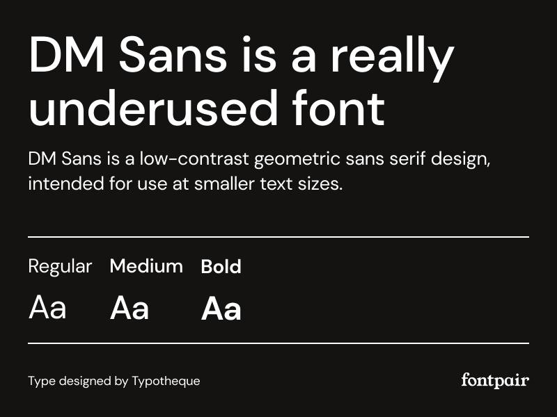
DM Sans is a geometric sans-serif font designed by Colophon Foundry, commissioned by Google and released in 2019. Derived from the Latin portion of Poppins by Jonny Pinhorn, it was built specifically for small text sizes in digital interfaces.
DM Sans suits websites requiring clean, compact UI text because its low stroke contrast and large x-height keep letterforms distinct at 12px–16px — the typical size range for labels, captions, and secondary navigation.
What makes DM Sans suitable for websites?
DM Sans has low stroke contrast (nearly monolinear construction) and open counters that prevent letter-blur at small display sizes. Its 2023 update expanded the weight range to Thin 100 through ExtraBlack 1000, and added a new optical size axis — meaning the font automatically adjusts its stroke weight and spacing for captions vs. display contexts from a single variable file.
Key attributes:
| Attribute | Value |
| Classification | Geometric sans-serif (low contrast) |
| Designer | Colophon Foundry, 2019 |
| Weight range | Thin 100 – ExtraBlack 1000 |
| Variable font | Yes (weight + optical size axes, updated 2023) |
| Optical sizes | Yes |
| Recommended sizes | 11px–16px UI labels; 18px+ headings |
| Letter-spacing default | 0 |
| License | OFL — free for commercial use |
| Available on | Google Fonts, Adobe Fonts |
| Price | Free |
How does DM Sans perform on websites?
DM Sans renders clearly at 12px on high-DPI screens, making it a strong choice for dense UI layouts where secondary text, tooltips, and metadata need to remain readable without increasing font size. Its ExtraBlack 1000 weight — added in the 2023 update — makes it usable for display headings too, which extends its range from caption to hero without switching typefaces.
What are the best pairings for DM Sans on websites?
DM Sans pairs with DM Serif Display for a same-family editorial system — Google commissioned both from Colophon Foundry as complementary typefaces, so they share proportional consistency. It also pairs with Georgia for a neutral interface sans against a warm web-safe serif body — a low-risk combination for content-heavy sites.
What are the limitations of DM Sans for websites?
DM Sans supports only Latin Extended characters — it lacks Cyrillic, Greek, and Devanagari coverage, making it unsuitable for multilingual websites serving non-Latin-script audiences. Before the 2023 update, the family included only 3 static weights, so projects using older installs may need to update their font files to access the full variable range.
DM Sans — Recommended Use Cases Within Website Typography
- Best for: UI labels at 12px–16px, SaaS dashboards, compact navigation, captions and metadata
- Avoid for: Multilingual websites requiring Cyrillic or Greek; long-form body text where humanist warmth improves reading comfort
- Optimal weight: Regular 400 for UI body; Medium 500 for labels; Bold 700 for headings
- Optimal size range: 12px–16px for UI; 20px–36px for headings
—
Georgia
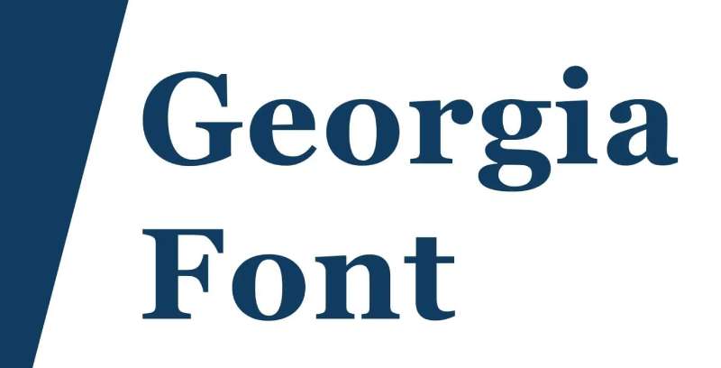
Georgia is a transitional serif font designed by Matthew Carter in 1993, commissioned by Microsoft and publicly released in 1996 as part of the Core Fonts for the Web initiative. It is pre-installed on Windows and macOS — zero load time, zero HTTP requests.
Georgia remains a practical choice for website body text because it was engineered for low-resolution screen rendering before webfonts existed. The New York Times switched from Times New Roman to Georgia in 2007 specifically for its superior screen legibility.
What makes Georgia suitable for websites?
Georgia has a larger x-height than Times New Roman and fewer fine details — both decisions made to improve legibility at low DPI. Its uppercase letters are lightened, ascenders rise above the cap height, and numerals are slightly non-aligning. The bold weight was deliberately made heavier than standard convention to ensure visual distinction from the regular weight at small screen sizes.
Key attributes:
| Attribute | Value |
| Classification | Transitional serif |
| Designer | Matthew Carter / Microsoft, 1993 (released 1996) |
| Weight range | Regular 400, Bold 700 (core); Georgia Pro adds 5 weights |
| Variable font | No |
| Recommended sizes | 16px–20px body; 28px+ headings |
| Letter-spacing default | 0 |
| License | Web-safe — pre-installed on Windows and macOS; Georgia Pro is commercial |
| Available on | Pre-installed on all major operating systems; Adobe Fonts (Pro version) |
| Price | Free (standard); Georgia Pro is paid |
How does Georgia perform on websites?
Georgia loads in 0ms — it requires no font file download. This makes it the fastest serif option on this list. At 16px on standard mobile screens, its thick serifs and high x-height render more clearly than thinner transitional serifs. The italic variant is a true italic (not a mechanical oblique), which matters for readability in inline emphasis and blockquotes.
What are the best pairings for Georgia on websites?
Georgia pairs with Verdana (also web-safe, also Matthew Carter) as a full web-safe typographic system that loads instantly. It also works with DM Sans for a modern interface sans against a warm, familiar serif body — a combination that performs well on content sites that prioritize load speed over typographic novelty.
What are the limitations of Georgia for websites?
The standard Georgia family includes only Regular and Bold weights — no Light, Medium, or SemiBold — which limits typographic hierarchy options. Georgia Pro (the extended version with 5 weights and small caps) is a paid font from Carter & Cone, not freely available. Its familiar appearance from the early web era may read as dated on brand-forward or high-design websites.
Georgia — Recommended Use Cases Within Website Typography
- Best for: Long-form reading on content-heavy sites, news websites, blogs where load performance is a constraint
- Avoid for: Sites requiring multiple weight options for hierarchy; brand-forward websites where a distinctive typographic personality is needed
- Optimal weight: Regular 400 for body; Bold 700 for headings
- Optimal size range: 16px–20px for body; 28px–44px for headings
How Do Website Fonts Affect Readability and User Behavior?
Font choice is not an aesthetic decision. It is a performance variable. The structural attributes of a typeface — x-height, stroke contrast, letter-spacing — determine whether a user reads, skips, or leaves.
Adobe research found that 38% of people stop engaging with a website if the content or layout is unattractive, with poor typography as a primary driver (Adobe, 2023).
Monotype’s neuroscience study confirmed that typeface choices can increase positive consumer responses by up to 13% — measurable, not theoretical.
| Font Attribute | What It Controls | Why It Matters |
| X-height | Lowercase letter height relative to cap height | Higher x-height = better legibility at 12px–16px |
| Stroke contrast | Difference between thick and thin strokes | High contrast degrades on low-DPI screens below 24px |
| Letter-spacing | Space between characters | Tight spacing causes character blur at small sizes |
| Open apertures | How open letters like ‘c’, ‘e’, ‘a’ are | Open apertures prevent misread characters in body text |
What Structural Font Attributes Determine Screen Legibility?
X-height is the single most reliable predictor of on-screen legibility. Fonts with an x-height above 0.70 of cap height — Inter sits at approximately 0.73 — keep lowercase letters distinct and readable at 12px–16px on standard screens.
Aperture width is equally important. Wide apertures in letters like ‘c’, ‘e’, and ‘a’ prevent character confusion on low-DPI screens, which is why humanist typefaces like Open Sans and Lato consistently outperform geometric fonts in extended body reading.
Stroke contrast is the opposite story. High stroke contrast — the defining trait of transitional serifs like Playfair Display — is an asset at 36px+ but a liability below 24px, where thin hairlines blur on anything below a Retina-class display.
How Do Web Fonts Affect Page Load Speed and Core Web Vitals?
64% of global web traffic comes from mobile devices as of 2025, according to StatCounter. Fonts that cause layout shifts or delayed rendering directly damage mobile performance.
Two Core Web Vitals metrics are directly connected to font loading:
- Largest Contentful Paint (LCP): delayed if font files block text rendering
- Cumulative Layout Shift (CLS): increases when fonts load late and reflow visible text
Font subsetting cuts file size dramatically. Tom Hazledine’s documented case from 2024 shows a reduction from 196.9 kB to 71.3 kB — over 60% — using Glyphhanger’s Latin subset option.
The font-display: swap CSS property is the baseline fix. It forces text to render using a system fallback immediately and swaps in the web font once it loads, eliminating render-blocking delays caused by font file requests.
—
What Are the Differences Between Serif, Sans-Serif, and Display Fonts for Websites?
Classification matters before selection. Using a display font for body text — or a body font for headings — causes measurable legibility problems regardless of how good the typeface is.
A Wichita State University study found no statistically significant readability difference between serif and sans-serif fonts overall. The performance gap appears only at specific size thresholds, not across the board.
| Classification | Optimal Use | Size Threshold | Examples |
| Humanist sans-serif | Body text, UI labels | 14px–20px | Open Sans, Lato |
| Geometric sans-serif | Headings, branding | 18px–72px | Montserrat, Poppins |
| Transitional serif | Long-form editorial | 16px–44px | Georgia, Merriweather |
| Display serif | Hero headings only | 28px minimum | Playfair Display |
When to Use a Serif Font on a Website
The New York Times switched from Times New Roman to Georgia in 2007, specifically because of its superior screen legibility at body text sizes. That decision still holds in 2025.
Serif fonts suit websites where extended reading is the core activity:
- Long-form blogs and editorial sites
- News websites with article-length content
- Documentation that users read sequentially
- Legal, academic, and financial sites where authority matters
The minimum viable size for a serif font in body text is 16px on mobile. Below that, stroke details degrade on standard-resolution screens and reading comfort drops.
When to Use a Sans-Serif Font on a Website
Sans-serif fonts dominate UI design for a structural reason: their uniform stroke widths render consistently at small sizes across all screen resolutions, without hairline degradation.
A sans-serif font is the default correct choice for:
- Navigation labels and UI elements at 12px–16px
- SaaS dashboards and data-heavy interfaces
- E-commerce product descriptions and CTAs
Figma adopted Inter as its default UI font in 2021. Every designer working in Figma sees Inter thousands of times per week, which explains its rapid spread into production interfaces across the industry.
What Is a Variable Font and Why Does It Matter for Web Performance?
A variable font encodes multiple weights, widths, and optical sizes in a single file. A static Roboto setup loading 12 weights generates 12 WOFF2 HTTP requests. Roboto Flex as a variable font does the same with one.
WOFF2 — the standard delivery format for variable fonts — has 97% global browser support as of 2025, according to TestMu AI. Internet Explorer is the only major browser that never added support, and its market share is negligible.
One important caveat: a variable font covering weights 100–900 can reach 50 kB, while two carefully selected static weights might total only 30 kB. Variable fonts are not automatically smaller. Measure before committing.
—
What Are the Best Free Fonts for Websites?
Every font below is available under either the OFL or Apache 2.0 license — both permit commercial use without restriction. The HTTP Archive’s 2024 Web Almanac confirms WOFF2 accounts for nearly 90% of all web font requests, so all options below are available in WOFF2 format.
Best Free Sans-Serif Fonts for Websites
The strongest free fonts for web design in the sans-serif category cover a wide range of use cases. None of these are interchangeable — each has a structural reason for its recommended context.
Inter — designed by Rasmus Andersson (2017). Neo-grotesque. Tall x-height (approx. 0.73), optical size axis, 9 weights from Thin 100 to Black 900. The standard choice for dashboards, SaaS interfaces, and data-dense layouts. Adopted by Figma as its default UI font. Self-host from rsms.me/inter; the Google Fonts version lacks italics.
Roboto — designed by Christian Robertson (2011). Neo-grotesque. 12 weights/styles in the static family; Roboto Flex (released 2022) adds weight, width, grade, and optical size axes. The most-downloaded font on Google Fonts globally. Default typeface for Android and Material Design. Neutral enough to suit most brand contexts.
Montserrat — designed by Julieta Ulanovsky (2011). Geometric sans-serif. 9 weights. Used on over 19 million websites. Large x-height and wide apertures give it strong heading presence at 28px+. Closest free alternative to Gotham and Proxima Nova. Weak below 15px in body text.
Poppins — released by the Indian Type Foundry (2014). Geometric. 9 weights with matching italics. Monolinear construction based on circular letterforms. Supports Latin and Devanagari scripts — one of the first geometric sans-serifs to do so. Top 10 on Google Fonts by weekly views. No variable font version; requires separate file requests per weight.
Open Sans — designed by Steve Matteson (2011). Humanist. 6 weights (Light 300 to ExtraBold 800) with italic variants. Updated to a variable font in March 2021 with Hebrew support added. Wide apertures and high x-height make it one of the most reliable body text options across screen types. Used on 20M+ websites; over 4 billion daily views as of 2018 (Google).
Lato — designed by Łukasz Dziedzic (2010). Humanist. 9 weights including Hairline. Supports 100+ Latin and 50+ Cyrillic languages. Semi-rounded terminals give it warmth without sacrificing structure. Note: the Google Fonts version is the older 1.0 release; self-host from latofonts.com for the full 3,000+ glyph set. No variable font version.
DM Sans — designed by Colophon Foundry, commissioned by Google (2019). Low-contrast geometric. Updated May 2023: weight range expanded to Thin 100 through ExtraBlack 1000, optical size axis added. Derived from Poppins’s Latin portion. Optimized for small UI text at 11px–16px. Supports Latin Extended only — no Cyrillic or Greek.
Best Free Serif Fonts for Websites
Research from MoldStud (2024) shows that well-implemented typography with appropriate font sizing contributes to a 40% reduction in bounce rates, according to Nielsen Norman Group data. Serif fonts used at correct size thresholds are a significant part of that outcome.
Merriweather — designed by Eben Sorkin. Slab serif. Built specifically for screen reading. Slightly condensed letterforms and mild diagonal stress increase reading flow at 16px–20px without requiring larger sizes. 4 weights (Light 300 to Black 900) with matching italics. No variable font. Missing Medium and SemiBold weights limits mid-hierarchy flexibility. Available on Google Fonts.
Playfair Display — designed by Claus Eggers Sørensen (2011). Transitional serif. 6 weights. High stroke contrast: thick vertical stems against thin horizontal hairlines. Built for display and titling use — the name is a structural descriptor. Strong from 28px to 88px. Hairlines degrade below 24px on standard-resolution screens. No Cyrillic support. Available on Font Squirrel and Google Fonts.
Georgia — designed by Matthew Carter for Microsoft (1993, released 1996). Transitional serif. Pre-installed on Windows and macOS. Zero load time. Zero HTTP requests. Larger x-height than Times New Roman, fewer fine details — both deliberate decisions for low-DPI screen rendering. Only 2 core weights (Regular 400, Bold 700). Used by The New York Times since 2007. The fastest font on this list, by definition.
—
What Are the Best Fonts for Website Headings vs. Body Text?
Heading and body fonts serve different functions at different size ranges. Using the same font family across both is valid — if the weight contrast is sufficient. Using a display font for body text is not.
Which Fonts Work Best for Website Headings?
Heading fonts need to establish hierarchy at a glance. That requires either high stroke contrast (transitional serifs) or strong weight availability (geometric sans-serifs).
Best heading fonts:
- Playfair Display Bold 700: high contrast, strong editorial presence at 36px–88px
- Montserrat Black 900: geometric structure, maximum weight for impact-first hero sections
- Poppins SemiBold 600 or Bold 700: friendly but structured; strong performer for landing pages
- Inter Bold 700: neutral authority; works across brand types without imposing personality
The minimum recommended heading size is 28px. Below that, the visual weight difference between heading and body collapses, and hierarchy disappears.
Which Fonts Work Best for Website Body Text?
Body text fonts must render cleanly at 14px–20px across mobile devices. The Wichita State University study confirmed sans-serif fonts like Arial outperform traditional serif fonts on computer screens by a measurable, if small, margin — enough to matter across millions of page visits.
Optimal body font selections by use case:
- SaaS and UI-heavy sites: Inter Regular 400 at 15px–17px
- E-commerce: Open Sans Regular 400 at 16px; wide apertures reduce misread product names
- Editorial and blog: Merriweather Regular 400 at 17px–20px; slightly condensed forms aid reading flow
- Corporate or multilingual: Lato Regular 400 at 16px; 100+ Latin and Cyrillic language coverage
px is the minimum for mobile body text. The WCAG accessibility standard specifies a 4.5:1 contrast ratio between text and background — contrast and size together determine whether body text is genuinely readable or just technically present.
How to Pair Fonts for a Website
Font pairing works on structural contrast, not stylistic similarity. Two geometric fonts paired together compete. A geometric sans-serif heading with a humanist serif body creates hierarchy without friction.
Standard pairing patterns that consistently work:
- Playfair Display headings + Open Sans body: high editorial contrast; the standard for content-heavy sites
- Montserrat headings + Merriweather body: geometric heading presence against a warm slab serif
- Inter throughout: single-family system using weight contrast (Bold 700 headings, Regular 400 body)
- Roboto + Lora: neutral sans-serif against a calligraphic serif; warm and professional
Limit to two font families per website. A font pairing generator helps test combinations visually before committing — but the structural logic above should determine the starting point, not visual preference alone.
More pairing options are catalogued in the Google Font pairings guide and the interactive font combinations tool.
—
How Do Font Licensing and Hosting Method Affect Website Font Choice?
Font licensing and delivery method are practical constraints that override aesthetic preference. A font you cannot legally use, or one that introduces GDPR liability, is not a valid option regardless of how well it renders.
Font License Types for Web Use
Three license types cover the fonts most commonly used on websites:
OFL (SIL Open Font License): covers Inter, Montserrat, Poppins, Merriweather, DM Sans, Lato, and Playfair Display. Free for commercial use. Modification permitted. Cannot sell the font file itself as a standalone product.
Apache 2.0: covers Roboto and Open Sans. Free for commercial use, including modification and redistribution. Google uses this for fonts commissioned directly.
Web-safe / pre-installed: Georgia and Verdana. No license action required. Pre-installed on Windows and macOS. No file download, no CDN dependency, no privacy risk.
For paid font licensing, always check whether the purchased license covers web use (pageview-based or domain-based) separately from desktop use. Most commercial foundry licenses do not include web use by default.
Google Fonts CDN vs. Self-Hosting
In January 2022, the Munich Regional Court (Landgericht München I, case 3 O 17493/20) ruled that loading Google Fonts via CDN without user consent violates GDPR. The court found that transmitting visitor IP addresses to Google’s US servers constitutes unlawful data processing. The website owner was ordered to pay €100 in damages, with a potential fine of €250,000 per future violation if the practice continued.
The ruling’s core finding: because self-hosting is possible, there is no legitimate reason to transfer that personal data to Google.
Self-hosting resolves the issue entirely. The process:
- Download WOFF2 files from fonts.google.com or google-webfonts-helper (gwfh.mranftl.com)
- Host files on your own domain or CDN
- Replace Google Fonts link tags with
@font-faceCSS declarations - Add
font-display: swapto prevent render-blocking
French (CNIL), Dutch (AP), and Austrian (DSB) data protection authorities have issued guidance reaching the same conclusion. Self-hosting is the recommended approach regardless of jurisdiction, not just within Germany.
Font Subsetting and the font-display Property
Font subsetting reduces WOFF2 file size by serving only the glyphs your content actually uses. For an English-language website, Latin subsetting cuts file size dramatically. Paul Conroy’s documented case shows a reduction from 400 kB to 140 kB for a news site’s font stack, improving Largest Contentful Paint by 20% and First Contentful Paint by 10%.
The font-display CSS property controls how browsers behave while a font file loads:
- swap: shows fallback immediately, swaps in web font when ready (best for body text)
- block: hides text briefly while font loads (causes layout shifts; avoid for body copy)
- fallback: brief block, then permanent fallback if font is slow (good for non-critical fonts)
font-display: swap is the default correct setting for any font used in body text or navigation.
—
How to Choose the Right Font for a Website
Font selection follows a sequence: technical constraints first, classification second, specific font third. Skipping the first step causes licensing problems or performance failures that override every aesthetic choice made afterward.
Match Font Classification to Website Type
Different website categories have different typographic needs. The table below maps site type to font classification and gives a concrete starting recommendation.
| Website Type | Classification | Starting Font |
| SaaS / Dashboard | Low-contrast geometric sans-serif | Inter or DM Sans |
| E-commerce | Humanist sans-serif | Open Sans or Poppins |
| Editorial / Blog | Transitional serif + humanist sans-serif | Merriweather + Lato |
| Luxury / Brand | Display serif + geometric sans-serif | Playfair Display + Montserrat |
| Corporate | Humanist sans-serif | Lato or Roboto |
Audit Technical Constraints Before Selecting Any Font
Four constraints should be checked before shortlisting any typeface:
GDPR compliance: EU-facing websites must self-host fonts or obtain explicit user consent before loading from a third-party CDN. The January 2022 Munich ruling applies across the EU, not only in Germany.
Variable font support: Check whether your build system and CSS setup can deliver variable font files with the correct font-weight range declarations. Without proper implementation, variable fonts fall back to a single static weight.
Language coverage: DM Sans covers Latin Extended only. Lato covers 100+ Latin and 50+ Cyrillic languages. If your site serves non-Latin audiences, verify glyph coverage before finalizing.
License scope: Confirm whether the license covers web use specifically. OFL and Apache 2.0 fonts are unrestricted. Commercial fonts often require a separate web license tied to pageview volume or domain count.
Test Across Devices and Resolutions Before Finalizing
Font rendering differs significantly across operating systems. The same typeface can look sharp on macOS Retina, acceptable on a 1080p Windows monitor, and blurry on a standard-DPI Android device. Platform rendering systems differ enough to change which weight reads as “Regular” and which reads as “Light.”
The minimum test matrix for web font selection:
- Desktop: macOS (Safari, Chrome), Windows 10/11 (Chrome, Edge)
- Mobile: Android at 1080p (Chrome), iPhone at 3x DPI (Safari)
- Low-DPI scenario: 1366×768 resolution, which still represents a significant share of desktop traffic
Framer and Figma both allow live font testing before any code is written. Use them. A font that looks correct in a design file can render differently in a browser, especially at 14px body sizes where hinting and sub-pixel rendering start to matter.
The web safe fonts list is a practical starting point for any project where load speed and cross-platform consistency outweigh typographic customization. Georgia and Verdana still hold up — designed in the 1990s specifically to solve the problems that custom web fonts still cause today.
For a broader look at how font statistics shape designer preferences and industry adoption, the pattern is clear: readability and accessibility rank ahead of visual novelty in every professional survey conducted since 2022.
FAQ on The Best Fonts For Websites
What is the best font for a website?
There is no single answer. Inter and Roboto lead for UI and body text. Playfair Display suits editorial headings. The best choice depends on your site type, audience, and whether readability or brand personality takes priority.
What is the most readable font for websites?
Inter, Open Sans, and Lato consistently rank highest for on-screen readability. All three feature open apertures, high x-heights, and even stroke widths that keep text clear at 14px–18px on both desktop and mobile screens.
Should I use a serif or sans-serif font for my website?
Use sans-serif fonts for UI labels, navigation, and body text on most sites. Use serif fonts — like Georgia or Merriweather — for editorial or long-form content where extended reading is the primary user activity.
How many fonts should a website use?
Two. One for headings, one for body text. A single family with weight contrast also works. More than two fonts creates visual noise, increases HTTP requests, and makes typographic hierarchy harder to control across devices.
Are Google Fonts free to use on commercial websites?
Yes. Most Google Fonts are licensed under the SIL Open Font License or Apache 2.0, both of which permit commercial use. Always check the individual font’s license page to confirm, as a small number have restrictions.
Does font choice affect website speed?
Yes. Each font weight loaded from a CDN adds an HTTP request and delays rendering. Using WOFF2 format, font subsetting, and font-display: swap reduces load time. Self-hosting also eliminates third-party DNS lookup delays.
What is the best font size for website body text?
px is the minimum for mobile. Most designers use 16px–18px for body text and 28px or above for headings. Below 16px on mobile, standard serif and display fonts degrade in readability on low-DPI screens.
Can I use Google Fonts if my website has EU visitors?
Not via CDN without consent. A 2022 Munich court ruling found that Google Fonts loaded from Google’s servers violates GDPR by transmitting visitor IP addresses to the US. Self-hosting the font files resolves the issue entirely.
What is a variable font and should I use one?
A variable font stores multiple weights in one file. It reduces HTTP requests and allows fine-grained weight control via CSS. Use one when you need three or more weights — otherwise two static WOFF2 files may be smaller overall.
What fonts do professional websites use?
Figma uses Inter. Google products use Roboto. The New York Times uses Georgia for body content. Most SaaS platforms default to geometric or humanist sans-serifs like Inter, DM Sans, or Open Sans for their clean rendering at small UI sizes.
Conclusion
This conclusion is for an article presenting the best fonts for websites, and the core takeaway is straightforward: font selection is a technical decision with measurable consequences.
Inter and DM Sans handle UI and small-screen legibility. Georgia and Merriweather carry long-form reading. Montserrat and Playfair Display lead heading hierarchies where visual weight matters.
Variable fonts reduce HTTP requests. Font subsetting cuts file size. Self-hosting protects GDPR compliance. These are not optional refinements — they directly affect Core Web Vitals and user retention.
Stick to two typefaces per site. Prioritize x-height and open apertures over style. Test across mobile resolutions before finalizing.
The right web typography system is invisible to users. That is exactly the point.

Renowned for his expertise in logo design and visual branding, Bogdan has developed a multitude of logos for various clients.
His skills extend to creating posters, vector illustrations, business cards, and brochures. Additionally, Bogdan's UI kits were featured on marketplaces like Visual Hierarchy and UI8.
He also wrote in the past years on sites like Design Your Way, WebDesignerDepot, WPDean, Designmodo, Speckyboy, Slider Revolution, and more.
- The Windsurf Logo History, Colors, Font, And Meaning - 10 October 2026
- How to Remove Background From Product Photos (No Photoshop) - 10 October 2026
- How Designers can Build a Stronger Online Creative Identity - 9 October 2026

Bogdan Sandu is a seasoned designer who has been designing websites since 2008. Renowned for his expertise in logo design and visual branding, Bogdan has developed a multitude of logos for various clients. His skills extend to creating posters, vector illustrations, business cards, and brochures. Additionally, Bogdan's UI kits were featured on marketplaces like Visual Hierarchy and UI8. He also wrote in the past years on sites like Design Your Way, WebDesignerDepot, WPDean, Designmodo, Speckyboy, Slider Revolution, and more.
You Might Also Like