The wrong font can quietly kill a presentation before you say a word.
Choosing the best fonts for PowerPoint presentations affects how your audience reads your slides, how far away they can sit and still follow along, and whether your deck looks polished or assembled in a hurry.
Most people pick a font by feel. That’s where layouts break, text overflows on shared machines, and body copy dissolves into noise on a dim projector.
This guide covers the top 10 fonts for PowerPoint, with specific guidance on slide titles, body text, font pairing, licensing, and size standards for projected slides. Whether you’re building a pitch deck, a corporate report, or an academic presentation, you’ll leave with a clear, defensible font choice.
The Best Fonts For PowerPoint Presentations
Font choice is one of the most overlooked decisions in slide design. Pick wrong and your audience spends mental energy decoding characters instead of absorbing content. The fonts below are chosen based on structural attributes: x-height, weight range, screen rendering, and cross-device compatibility.
A quick note on font licensing: always verify whether a typeface is cleared for commercial use before embedding it in a presentation you plan to share externally.
| Font | Classification | Best use in PowerPoint | License |
| Calibri | Humanist sans-serif | Body text, corporate decks | Proprietary (bundled with Microsoft) |
| Montserrat | Geometric sans-serif | Slide titles, modern branding | OFL (free) |
| Open Sans | Humanist sans-serif | Body text, neutral decks | Apache 2.0 (free) |
| Verdana | Humanist sans-serif | Small text, high legibility | Proprietary (bundled) |
| Lato | Humanist sans-serif | Body + heading, versatile | OFL (free) |
| Georgia | Transitional serif | Authority, formal decks | Proprietary (bundled) |
| Garamond | Old-style serif | Academic, literary topics | Proprietary (bundled) |
| Tahoma | Humanist sans-serif | Formal body text, labels | Proprietary (bundled) |
| Corbel | Humanist sans-serif | Clean headings, UI-style decks | Proprietary (bundled) |
| Century Gothic | Geometric sans-serif | Headlines, minimal layouts | Proprietary (bundled) |
—
Calibri
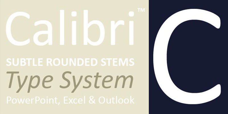
Calibri is a humanist sans-serif typeface designed by Lucas de Groot in 2002-2004, released by Microsoft as part of the ClearType Font Collection in 2007. It delivers screen-optimized text rendering across LCD monitors at standard office sizes.
Calibri suits corporate PowerPoint decks because its rounded stems and moderate x-height maintain readability from 18px through 48px without the letterforms breaking down at projector distances. It served as the default Microsoft Office font from 2007 to 2024, making it familiar to virtually every business audience.
What makes Calibri suitable for PowerPoint presentations?
Calibri uses subtly rounded stroke ends that reduce visual noise on low-resolution projector screens. Its x-height is above average for a sans-serif, which keeps lowercase letters readable at body text sizes (20-28pt). The font supports Regular, Light, and Bold weights with matching italics, covering the two-weight hierarchy most slides need.
Key attributes:
| Attribute | Value |
| Classification | Humanist sans-serif |
| Designer | Lucas de Groot, 2002-2004 |
| Weight range | Light 300, Regular 400, Bold 700 (+ italics) |
| Variable font | No |
| Recommended sizes | 20-28pt body; 32-48pt headings |
| Letter-spacing default | Tight |
| License | Proprietary, bundled with Microsoft Office and Windows |
| Available on | Microsoft Office, Windows (pre-installed) |
| Price | Included with Microsoft 365 / Windows |
How does Calibri perform in presentations?
Calibri renders clearly on LCD monitors and standard office projectors because it was built specifically for ClearType rendering. At 20-24pt body text, its open counters and moderate stroke contrast keep characters distinct even on lower-resolution displays.
At heading sizes (36-48pt), the rounded stems remain clean without looking inflated or amateurish.
What are the best pairings for Calibri in PowerPoint?
Calibri pairs with Georgia for title slides when a serif/sans contrast is needed, using Georgia Bold at 40pt+ for headings and Calibri Regular at 24pt for body. It also pairs with Corbel when a fully sans-serif deck is required and a slightly more assertive heading font is preferred.
The Calibri + Georgia pairing is common in financial and legal presentations. Calibri + Corbel is the less conventional pick, preferred in technical documentation decks.
What are the limitations of Calibri for presentations?
Calibri provides only 3 upright weights (Light, Regular, Bold), which limits typographic hierarchy in complex slide layouts that need 4 or more distinct levels. Since Microsoft replaced it with Aptos as the Office default in 2024, its visual association with older, less polished decks has grown.
Calibri – Recommended Use Cases Within PowerPoint Presentations
- Best for: Body text in corporate decks, financial reports, and internal business slides where cross-device compatibility matters most
- Avoid for: Presentations targeting design-forward or creative audiences where the font reads as generic
- Optimal weight: Regular 400 for body; Bold 700 for slide titles
- Optimal size range: 20-28pt for body text; 36-48pt for headings
—
Montserrat
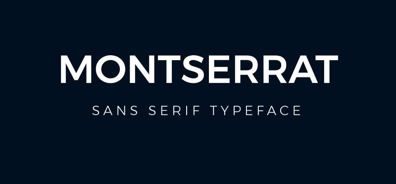
Montserrat is a geometric sans-serif typeface designed by Julieta Ulanovsky in 2011, released through Google Fonts under the SIL Open Font License. It delivers strong typographic hierarchy through 9 weights, from Thin 100 to Black 900.
Montserrat optimizes slide titles and headings because its high cap-height and geometric structure create immediate visual contrast against lighter body text. Brands like the government of Argentina and several international universities use it as their primary display typeface.
What makes Montserrat suitable for PowerPoint presentations?
Montserrat supports 9 weights (Thin 100 to Black 900), each with a matching italic, giving designers fine-grained control over visual hierarchy across title, subtitle, and body layers. Its geometric letterforms have consistent stroke widths, which render with high contrast on projected screens.
The x-height is moderate. At sizes above 28pt, the circular counters in letters like “O,” “C,” and “G” remain open and distinct at projection distances.
Key attributes:
| Attribute | Value |
| Classification | Geometric sans-serif |
| Designer | Julieta Ulanovsky, 2011 |
| Weight range | Thin 100 to Black 900 (18 styles including italics) |
| Variable font | Yes |
| Recommended sizes | 28pt+ for headings; 20-24pt for subheadings |
| Letter-spacing default | 0 (standard) |
| License | OFL (free for commercial use) |
| Available on | Google Fonts, Adobe Fonts |
| Price | Free |
How does Montserrat perform in presentations?
At heading sizes (32-54pt), Montserrat Bold and ExtraBold render with high stroke uniformity on projectors, which means letters don’t blur or soften at distance the way high-contrast serif fonts sometimes do. Its geometric construction also holds up well in dark-background slide themes.
Below 20pt in body text, the geometric uniformity reduces letter differentiation slightly. It’s not a strong body text choice at small sizes.
What are the best pairings for Montserrat in PowerPoint?
Montserrat pairs with Open Sans for body text when a fully sans-serif deck is needed, using Montserrat Bold (700) for headings and Open Sans Regular (400) for content. It pairs with Lora when a serif body font is needed to contrast the geometric heading style.
The Montserrat + Open Sans combination is the more standard pairing. Montserrat + Lora is a stronger choice for educational or editorial-style presentations.
What are the limitations of Montserrat for presentations?
Montserrat is not a system font and must be embedded or installed on any machine used to present the file. Without proper embedding, PowerPoint will substitute a fallback font and break the layout. As of 2025, Greek, Arabic, and Devanagari script support is missing, limiting its use in multilingual decks.
Montserrat – Recommended Use Cases Within PowerPoint Presentations
- Best for: Title slides, section headers, and modern brand decks targeting tech, design, or startup audiences
- Avoid for: Body text below 20pt; multilingual decks requiring non-Latin scripts
- Optimal weight: SemiBold 600 or Bold 700 for headings; Light 300 for large pull quotes
- Optimal size range: 32-54pt for headings; 22-28pt for subheadings
—
Open Sans
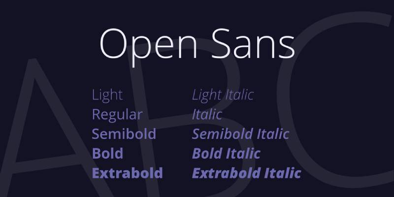
Open Sans is a humanist sans-serif typeface designed by Steve Matteson in 2010, commissioned by Google and released in 2011 under the Apache License 2.0. It delivers neutral, readable text across screen sizes and resolutions.
Open Sans works best as a body text font in presentations because its large x-height and wide apertures on letters like “c,” “e,” and “a” prevent misreads at 20-24pt viewing distances. As of 2018, it served over 4 billion views per day across 20 million websites, a scale that confirms its screen legibility at real-world conditions.
What makes Open Sans suitable for PowerPoint presentations?
Open Sans has a large x-height relative to its cap-height, which keeps lowercase letters visually prominent at standard body text sizes. Its open apertures reduce character ambiguity in dense text slides. The family provides 6 weights (Light 300 to Extra Bold 800), each with italics, plus a variable font version (since 2021) for precise weight control in a single file.
Key attributes:
| Attribute | Value |
| Classification | Humanist sans-serif |
| Designer | Steve Matteson, 2010 |
| Weight range | Light 300 to Extra Bold 800 (6 weights + italics) |
| Variable font | Yes (since 2021) |
| Recommended sizes | 18-24pt body; 28-40pt headings |
| Letter-spacing default | 0 (standard) |
| License | Apache 2.0 (free, including commercial use) |
| Available on | Google Fonts, Adobe Fonts |
| Price | Free |
How does Open Sans perform in presentations?
Open Sans renders cleanly at 18-24pt on both LCD monitors and standard projectors. Its upright stress and open counters reduce crowding in text-heavy slides, making it one of the more reliable body text options for content-dense decks like training materials or research summaries.
At heading sizes (32pt+), it lacks the visual weight of geometric fonts like Montserrat, so Bold 700 or Extra Bold 800 is recommended for title use.
What are the best pairings for Open Sans in PowerPoint?
Open Sans pairs with Montserrat Bold for headings, providing a clear weight contrast while keeping both fonts within the sans-serif category. It also works with Playfair Display when a serif heading is needed for formal or editorial-style presentations.
What are the limitations of Open Sans for presentations?
Open Sans is not a system font and requires installation or embedding for cross-device compatibility in PowerPoint. Its neutral design can read as undifferentiated in decks where strong brand personality is needed.
Open Sans – Recommended Use Cases Within PowerPoint Presentations
- Best for: Body text in training decks, research presentations, and content-heavy slides requiring sustained reading
- Avoid for: Title-only slides where more weight is needed; presentations to design-literate audiences who want more distinctive typography
- Optimal weight: Regular 400 for body; Bold 700 for headings
- Optimal size range: 18-24pt for body; 32-44pt for slide titles
—
Verdana
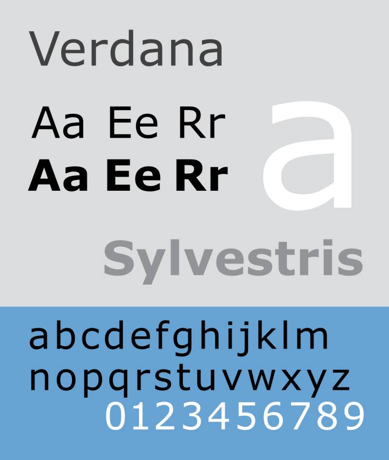
Verdana is a humanist sans-serif font designed by Matthew Carter for Microsoft in 1996, released with Windows 95. It was built specifically for screen legibility at small sizes on low-resolution displays.
Verdana suits presentations where text must remain readable at long throw distances or on lower-quality projectors, because its wide letter spacing, large x-height, and heavier strokes prevent characters from merging visually at smaller sizes.
What makes Verdana suitable for PowerPoint presentations?
Verdana has the widest default letter spacing of any system font in the Microsoft library. Its strokes are heavier than comparable humanist sans-serifs, which increases contrast on washed-out projected backgrounds. The digit “1” includes a horizontal base and upper hook, making it distinct from lowercase “l” and uppercase “I” — a character-differentiation detail that matters in data-heavy slides.
Key attributes:
| Attribute | Value |
| Classification | Humanist sans-serif |
| Designer | Matthew Carter, 1996 |
| Weight range | Regular 400, Bold 700 (+ italics) |
| Variable font | No (Verdana Pro adds more weights) |
| Recommended sizes | 18-24pt body; 28-40pt headings |
| Letter-spacing default | Wide |
| License | Proprietary, bundled with Windows and macOS |
| Available on | Windows, macOS (pre-installed) |
| Price | Included with OS |
How does Verdana perform in presentations?
Verdana’s wide spacing means it occupies more horizontal space than Calibri or Tahoma at the same point size. This limits how much text fits per slide, which can be a constraint in content-dense decks. That said, the spacing is precisely what makes it more readable than alternatives when projectors reduce contrast or when slides are displayed across a large room.
What are the best pairings for Verdana in PowerPoint?
Verdana pairs with Georgia for a complementary serif/sans mix, using Georgia for headings and Verdana for body text. Both were designed by Matthew Carter for screen use, so they share structural DNA that keeps the pairing visually consistent.
It also pairs with Palatino Linotype when a more formal serif heading is preferred in academic or legal presentations.
What are the limitations of Verdana for presentations?
Verdana’s wide default spacing makes it space-inefficient. A slide that fits 5 bullet points in Calibri may only fit 4 in Verdana at the same size. The weight options are limited to Regular and Bold, which constrains multi-level hierarchy in complex slide layouts.
Verdana – Recommended Use Cases Within PowerPoint Presentations
- Best for: Citations, disclaimers, data labels, and body text in presentations delivered to large rooms with lower-quality projection
- Avoid for: Dense bullet-point slides where space efficiency is needed; title-heavy layouts requiring multiple weight levels
- Optimal weight: Regular 400 for body; Bold 700 for headings
- Optimal size range: 20-24pt for body text
—
Lato
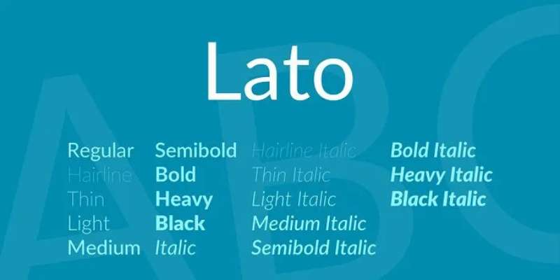
Lato is a humanist sans-serif typeface designed by Łukasz Dziedzic in 2010, released by tyPoland foundry under the SIL Open Font License with Google’s support. It balances transparent body text rendering with distinctive letterforms at display sizes.
Lato ranks as the third most-served font on Google Fonts with over 4.2 trillion views as of late 2025, reflecting its proven legibility across screen types and sizes used in real presentation environments.
What makes Lato suitable for PowerPoint presentations?
Lato provides 9 weights from Hairline to Black (plus italics), covering the full hierarchy range from thin accent text to bold headings in a single typeface family. Its semi-rounded stroke ends reduce sharpness on lower-resolution displays without sacrificing structural clarity. Classical uppercase proportions keep the font readable in mixed-case heading use.
Key attributes:
| Attribute | Value |
| Classification | Humanist sans-serif |
| Designer | Łukasz Dziedzic, 2010 |
| Weight range | Hairline 100 to Black 900 (9 weights + italics) |
| Variable font | No |
| Recommended sizes | 20-24pt body; 32-48pt headings |
| Letter-spacing default | 0 (standard) |
| License | OFL (free for commercial use) |
| Available on | Google Fonts, Adobe Fonts |
| Price | Free |
How does Lato perform in presentations?
Lato Regular and Lato Light perform well in body text roles at 20-24pt. The semi-rounded stroke ends soften the font enough that extended reading (multiple bullet points per slide) doesn’t feel harsh on audience eyes. Bold and Black weights render with strong contrast at heading sizes without the stroke weight becoming uneven at projector resolution.
What are the best pairings for Lato in PowerPoint?
Lato pairs with Merriweather for a classic sans/serif contrast, using Lato Bold for headings and Merriweather Regular for body. It also pairs with Montserrat when both fonts need to stay within the sans-serif family, using Montserrat SemiBold for titles and Lato Regular for all body text.
What are the limitations of Lato for presentations?
Lato does not have a variable font version, which means loading multiple static font files when several weights are needed in one deck. It is not a system font, so presentations must embed the font or require the recipient to install it before opening the file.
Lato – Recommended Use Cases Within PowerPoint Presentations
- Best for: Decks where a single typeface family needs to cover all hierarchy levels, from body text to bold slide titles
- Avoid for: Presentations shared with users who haven’t installed the font and where embedding is not confirmed
- Optimal weight: Regular 400 for body; Bold 700 for headings; Light 300 for supporting text
- Optimal size range: 20-24pt body; 36-48pt headings
—
Georgia
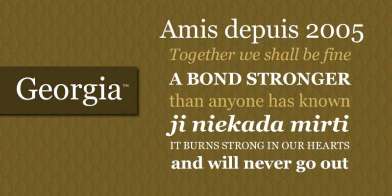
Georgia is a transitional serif font designed by Matthew Carter for Microsoft in 1993, released as part of the Windows core fonts package in 1996. It provides screen-optimized serif rendering across a wide range of display sizes.
Georgia suits formal presentation contexts including financial reports, legal slides, and academic decks because its large x-height and open counters maintain serif legibility on screens where older serif fonts like Times New Roman break down.
What makes Georgia suitable for PowerPoint presentations?
Georgia was designed specifically for screen rendering, which makes it unusual among serif fonts in the Microsoft library. Its x-height is larger than Times New Roman, keeping lowercase characters visible at smaller sizes. Thick-to-thin stroke contrast is moderate rather than extreme, which prevents the thin strokes from disappearing at lower projector resolutions.
Key attributes:
| Attribute | Value |
| Classification | Transitional serif |
| Designer | Matthew Carter, 1993 |
| Weight range | Regular 400, Bold 700 (+ italics) |
| Variable font | No (Georgia Pro adds more weights) |
| Recommended sizes | 20-28pt body; 32-48pt headings |
| Letter-spacing default | 0 (standard) |
| License | Proprietary, bundled with Windows and macOS |
| Available on | Windows, macOS (pre-installed) |
| Price | Included with OS |
How does Georgia perform in presentations?
Georgia handles projection better than most serif fonts because Carter hinted it for screen rendering at the pixel level. At 24pt on a standard office projector, the serifs remain intact and don’t dissolve into visual noise the way high-contrast serifs like Bodoni or Didot do at the same size.
At large heading sizes (40pt+), the moderate stroke contrast gives Georgia a distinguished look without the decorative excess of display serifs.
What are the best pairings for Georgia in PowerPoint?
Georgia pairs with Verdana as the natural complement, since both were designed by Matthew Carter for the same screen-use brief, and the two share optical spacing decisions that make them visually compatible. Georgia Bold headings with Verdana Regular body is one of the most structurally sound serif/sans pairings available in system fonts.
It also works with Calibri when a sans-serif body font is preferred under serif headings.
What are the limitations of Georgia for presentations?
Georgia provides only Regular and Bold weights, which limits hierarchy in presentations that need three or more distinct typographic levels. Its serif design can appear overly traditional in modern, design-forward decks targeting tech or startup audiences.
Georgia – Recommended Use Cases Within PowerPoint Presentations
- Best for: Heading text in financial reports, legal presentations, and academic or research decks
- Avoid for: Body text at sizes below 20pt on low-quality projectors; modern brand decks where the serif reads as dated
- Optimal weight: Bold 700 for headings; Regular 400 for subheadings or formal body text
- Optimal size range: 36-48pt headings; 22-28pt for section subheadings
—
Garamond
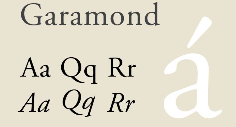
Garamond is an old-style serif typeface with origins in the 16th century work of French type designer Claude Garamond. The digital versions in use today (including Adobe Garamond, ITC Garamond, and Monotype Garamond) are bundled with various Microsoft and Adobe products. It delivers elegant, space-efficient text rendering with strong historical credibility in print contexts.
Garamond suits academic, literary, and formal executive presentations because its classical proportions signal authority. The U.S. General Services Administration’s PrintWise initiative specifically recommends Garamond for formal government documents alongside Century Gothic.
What makes Garamond suitable for PowerPoint presentations?
Garamond’s letterforms are narrower than most serif fonts at the same point size, making it space-efficient on text-heavy slides. The diagonal stress on rounded letters follows the pen-drawn tradition of Roman type, giving it high distinctiveness at heading sizes. Its fine stroke contrast is beautiful at 32pt+ but requires careful testing at smaller sizes on projected displays.
Key attributes:
| Attribute | Value |
| Classification | Old-style serif |
| Designer | Claude Garamond (original, 16th century); various digital revivals |
| Weight range | Regular and Bold (varies by version) |
| Variable font | No (for standard bundled versions) |
| Recommended sizes | 24pt+ body; 36pt+ headings for projected use |
| Letter-spacing default | 0 (standard) |
| License | Proprietary (Microsoft bundled) or commercial (Adobe) |
| Available on | Microsoft Office, Adobe Creative Cloud |
| Price | Included with Microsoft 365 / Adobe CC |
How does Garamond perform in presentations?
Garamond’s high stroke contrast (thick main strokes vs. fine hairlines) can cause thin strokes to disappear on low-resolution or washed-out projectors. It performs best in well-lit rooms with high-quality projection or on screens viewed close-up, such as laptop presentations in small meeting rooms.
At 36pt+ for headings in these conditions, it reads with high elegance and authority.
What are the best pairings for Garamond in PowerPoint?
Garamond pairs with Gill Sans for a classic serif/sans combination used in academic and publishing contexts. Garamond headings at 40pt with Gill Sans body at 22pt is a pairing with a long history in editorial design that translates well to formal presentation slides.
What are the limitations of Garamond for presentations?
Garamond’s thin strokes render poorly on low-quality projectors and at sizes below 24pt, which limits its use to heading or display roles in most presentation environments. Its old-style character set lacks the weight range needed for complex multi-level typographic hierarchies.
Garamond – Recommended Use Cases Within PowerPoint Presentations
- Best for: Slide titles and section headers in academic, legal, and executive presentations viewed at close range
- Avoid for: Body text at any projected size; presentations delivered in large rooms with standard office projectors
- Optimal weight: Regular for body text at 24pt+; Bold for headings at 36pt+
- Optimal size range: 36-54pt for heading use; 24-28pt for body in print-quality contexts only
—
Tahoma
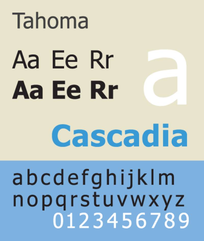
Tahoma is a humanist sans-serif typeface designed by Matthew Carter for Microsoft, released with Windows 95. It was built as a screen-optimized font using a bitmap-first design process, where Carter constructed bitmaps first and then wrapped TrueType outlines around them.
Tahoma suits formal body text and label use in presentations because its narrower letter spacing (compared to Verdana) allows more text per line without sacrificing the character differentiation that was Carter’s primary design goal.
What makes Tahoma suitable for PowerPoint presentations?
Tahoma is narrower than Verdana by design, making it more space-efficient for content-dense slides while keeping the screen-rendering precision of its sibling font. Its characters maintain strong differentiation between ambiguous pairs (I/l/1 and O/0), which matters in slides containing data tables, codes, or reference numbers. Tahoma has been a default UI font across multiple Windows and Office versions, so it’s installed on virtually every Windows machine.
Key attributes:
| Attribute | Value |
| Classification | Humanist sans-serif |
| Designer | Matthew Carter, 1994 (released 1995) |
| Weight range | Regular 400, Bold 700 (+ no italics in standard version) |
| Variable font | No |
| Recommended sizes | 18-24pt body; 28-44pt headings |
| Letter-spacing default | Tight |
| License | Proprietary, bundled with Windows |
| Available on | Windows (pre-installed) |
| Price | Included with Windows |
How does Tahoma perform in presentations?
Tahoma’s bitmap-origin construction gives it unusually clean rendering at screen sizes on both LCD monitors and projectors. It handles formal, technical presentations well because the tighter letter spacing gives text a structured, ordered appearance without becoming cramped at 18pt or above.
According to Microsoft’s own reporting, Tahoma is one of the most commonly used fonts in PowerPoint presentations alongside Calibri, Arial, and Verdana.
What are the best pairings for Tahoma in PowerPoint?
Tahoma pairs with Georgia for a serif/sans split, using Georgia Bold for headings and Tahoma Regular for body text. Both are Matthew Carter designs built for screen use. Tahoma also works alongside Palatino Linotype when a more elegant serif heading is needed above technical body text.
What are the limitations of Tahoma for presentations?
The standard Tahoma version provides only Regular and Bold weights with no italic styles, which limits expressive typographic options. The tight default spacing can make text feel dense in decks with large amounts of body copy per slide.
Tahoma – Recommended Use Cases Within PowerPoint Presentations
- Best for: Body text and data labels in technical, IT, and operations presentations; slides with reference numbers, codes, or mixed alphanumeric content
- Avoid for: Presentations requiring italic emphasis throughout; creative or brand-forward decks where tighter spacing reads as restrictive
- Optimal weight: Regular 400 for body; Bold 700 for headings
- Optimal size range: 18-24pt body; 28-40pt headings
—
Corbel
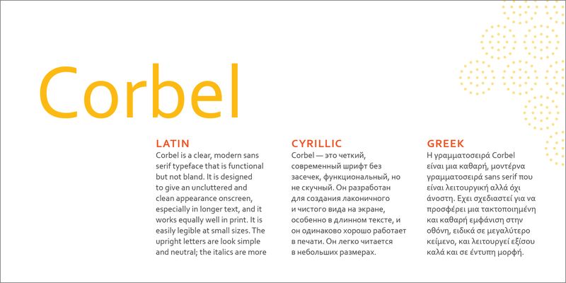
Corbel is a humanist sans-serif typeface designed by Jeremy Tankard in 2004, released by Microsoft as part of the ClearType Font Collection alongside Calibri. Tankard described its design intent as “less cuddly, more assertive” compared to other widely used sans-serif fonts.
Corbel works well for presentation headings and clean UI-style decks because its assertive proportions create visual authority at larger sizes while its old-style numerals (lowercase height, not cap-height) add a subtle typographic quality that distinguishes decks from default Calibri layouts.
What makes Corbel suitable for PowerPoint presentations?
Corbel was designed for cross-application use, requiring it to perform consistently across PowerPoint, Word, and web contexts. Its default numerals use old-style (lowercase) figures, which integrate more naturally into mixed text-number slides like financial summaries. The typeface uses two weights (Regular and Bold) with matching italics, covering the basic hierarchy most presentations need.
Key attributes:
| Attribute | Value |
| Classification | Humanist sans-serif |
| Designer | Jeremy Tankard, 2004 |
| Weight range | Regular 400, Bold 700 (+ italics) |
| Variable font | No |
| Recommended sizes | 20-26pt body; 32-48pt headings |
| Letter-spacing default | 0 (standard) |
| License | Proprietary, bundled with Windows and Microsoft Office |
| Available on | Windows, Microsoft Office (pre-installed) |
| Price | Included with Windows / Microsoft 365 |
How does Corbel perform in presentations?
Corbel renders with a soft, clean quality on LCD monitors and performs reliably at standard projector resolutions. Its ClearType optimization gives it similar screen performance to Calibri, but its slightly more assertive proportions create a stronger presence at heading sizes (36pt+).
For startup and technology presentations that need a professional look without Calibri’s now-dated visual association, Corbel is a practical system font alternative.
What are the best pairings for Corbel in PowerPoint?
Corbel pairs with Calibri in an all-sans deck, using Corbel Bold for headings and Calibri Regular for body text. The two fonts share the same ClearType design era and similar x-heights, making the pairing visually cohesive. It also works with Constantia (a bundled serif) for formal decks requiring a serif body font under sans-serif headings.
What are the limitations of Corbel for presentations?
Corbel provides only Regular and Bold weights, limiting its use in presentations that require Medium or SemiBold weight levels for subheading hierarchy. It is a Windows-only bundled font and may not be available on macOS without manual installation, which can cause substitution issues in shared decks.
Corbel – Recommended Use Cases Within PowerPoint Presentations
- Best for: Slide headings and section titles in corporate or technology decks; financial slides where old-style numerals improve text integration
- Avoid for: Multi-level hierarchy decks requiring more than two weights; presentations shared regularly with macOS users
- Optimal weight: Bold 700 for headings; Regular 400 for subheadings and supporting text
- Optimal size range: 32-48pt headings; 20-26pt body text
—
Century Gothic

Century Gothic is a geometric sans-serif typeface released by Monotype Imaging in 1990, based on Monotype’s own Twentieth Century (designed by Sol Hess in 1936-1947). It was developed to match the widths of ITC Avant Garde Gothic and competes directly with Futura.
Century Gothic suits modern, minimalist presentation designs because its wide letter spacing, circular geometric letterforms, and enlarged x-height create visual distinction on both light and dark slide backgrounds. The U.S. General Services Administration lists it as a recommended font for government documents, confirming its cross-context professional credibility.
What makes Century Gothic suitable for PowerPoint presentations?
Century Gothic has a larger x-height than Futura, which improves lowercase legibility at heading sizes (28pt+). Its consistent monolinear stroke weight (no thick-to-thin contrast) means letters render evenly on projected displays without hairline dropout. Wide default letter spacing reduces crowding in short heading lines, making it effective for title slides and section dividers.
Key attributes:
| Attribute | Value |
| Classification | Geometric sans-serif |
| Designer | Based on Sol Hess (1936-1947); digitized by Monotype, 1990 |
| Weight range | Regular 400, Bold 700 (+ italics) |
| Variable font | No |
| Recommended sizes | 28pt+ headings; 20-24pt for short body text blocks |
| Letter-spacing default | Wide |
| License | Proprietary, bundled with Microsoft Office |
| Available on | Microsoft Office (Windows and macOS) |
| Price | Included with Microsoft 365 |
How does Century Gothic perform in presentations?
Century Gothic’s wide spacing and circular letterforms create strong visual impact at heading sizes but consume significantly more horizontal space than Calibri or Tahoma at equivalent point sizes. At 24pt body text, a slide that fits 6 bullet points in Calibri may only fit 4-5 in Century Gothic.
Its monolinear strokes render without degradation on lower-resolution projectors, making it reliable for large-venue presentations where contrast quality varies.
What are the best pairings for Century Gothic in PowerPoint?
Century Gothic pairs with Garamond for a geometric/old-style contrast in formal or academic decks, using Century Gothic for headings and Garamond for body text. It also works well with Georgia as a more screen-reliable body font alternative when Garamond’s thin strokes present projection issues.
What are the limitations of Century Gothic for presentations?
Century Gothic’s wide spacing makes it impractical for body text in slides with more than 3-4 bullet points, as lines overflow or require text reduction to fit. It provides only Regular and Bold weights, which limits hierarchy depth. Extended body text in Century Gothic can fatigue readers more quickly than humanist alternatives due to its circular, less-differentiated letterform construction.
Century Gothic – Recommended Use Cases Within PowerPoint Presentations
- Best for: Title slides, section dividers, and short callout text in modern minimalist or brand-forward decks
- Avoid for: Body text in content-heavy slides; presentations where text density per slide is high
- Optimal weight: Regular 400 for short body blocks; Bold 700 for slide titles and headings
- Optimal size range: 32-54pt for headings; 22-26pt maximum for short body text only
—
How to Choose and Pair Fonts in PowerPoint
Most effective presentation slide decks use two typefaces: one for headings and one for body text. Three is the upper limit before visual consistency breaks down.
Knowing how to approach pairing fonts comes down to a few structural principles: contrast in classification (serif heading + sans-serif body, or geometric heading + humanist body), alignment in x-height so the two fonts feel optically balanced, and weight differentiation so hierarchy is immediately clear to the audience.
If you want to experiment before committing to a pairing, a font pairing generator can help you visualize combinations quickly without loading fonts into a slide deck manually.
Also worth checking: font spacing defaults vary significantly between typefaces. Verdana and Century Gothic default to wide spacing; Calibri and Tahoma default to tight. Adjusting tracking manually in PowerPoint can help normalize these differences when mixing fonts across a deck.
Font size guidelines for projected presentations
The minimum readable size on a projected slide depends on room depth and projector quality. A few practical rules from presentation design practice:
- Body text: 20pt minimum for standard conference rooms; 24pt for larger venues
- Headings: 32-40pt for standard; 44-54pt for large rooms
- Captions and footnotes: 16-18pt minimum (anything smaller reads as decoration, not content)
- Data labels in charts: 14-16pt with high-contrast colors; Verdana or Tahoma are strongest here
System fonts vs. custom fonts in shared decks
System fonts (Calibri, Georgia, Verdana, Tahoma, Corbel, Century Gothic, Garamond) open correctly on any Windows or Office machine without embedding. Custom fonts (Montserrat, Open Sans, Lato) require either embedding in the PowerPoint file or installation on every machine used to open the file.
PowerPoint’s font embedding option (File > Options > Save > Embed fonts in file) resolves most cross-device issues for custom fonts. Embedding increases file size but prevents substitution errors that break layout and spacing.
If you regularly present on unfamiliar machines, system fonts remain the more reliable choice. If you control the presentation environment, custom fonts from Google Fonts give you a much wider range of design options without licensing cost.
For teams working across Microsoft Office products, building a template with consistent font choices across PowerPoint, Word, and Outlook ensures brand consistency without requiring manual font installation on each user’s machine.
What Determines a Good Font for PowerPoint Presentations?
Font selection in PowerPoint is a structural decision, not an aesthetic one. The same typeface that reads cleanly on a printed page can collapse into illegible smear on a low-quality projector at the back of a conference room.
Monotype’s 2024 Global Font Use Survey, covering 4,777 designers across 13 countries, found that 76% of designers cite readability and accessibility as their primary concerns when selecting a typeface. That priority applies even more sharply in slide design, where audience distance compounds every legibility weakness.
Five structural factors determine whether a font works in a presentation context:
- Screen rendering optimization: ClearType-hinted fonts (Calibri, Verdana, Tahoma, Georgia) render with pixel-level precision on LCD monitors and standard office projectors. Non-hinted fonts blur at smaller sizes.
- X-height ratio: Fonts with a large x-height keep lowercase letters visually prominent at 20-24pt body text. A low x-height shrinks the readable area of each character at distance.
- Stroke weight and contrast: Monolinear fonts (Century Gothic, Montserrat) maintain stroke consistency under washed-out projection. High-contrast serifs (Garamond, Bodoni) risk hairline disappearance on lower-resolution displays.
- Weight range: Fonts with fewer than 3 weights (Verdana, Georgia, Corbel) limit typographic hierarchy to two levels. Fonts with 6-9 weights (Open Sans, Lato, Montserrat) enable heading, subheading, and body differentiation in a single family.
- License and cross-device compatibility: System fonts open identically on any Windows or Office machine. Custom fonts require embedding or installation, and embedding only works reliably for TTF (TrueType) fonts, not OTF formats.
Presentation Corner research shows that font choice influences perceived credibility by up to 35%, based on a meta-analysis of over 50 typography perception studies. That figure is relevant for pitch decks, client presentations, and executive briefings where authority signals matter.
How projector rendering differs from monitor rendering
LCD monitors render text at 72-144 DPI with high pixel density. Projectors typically output at 30-60 DPI equivalent on large screens, which reduces fine detail in thin strokes and tight letter spacing.
Fonts designed for screen use (Calibri, Verdana, Georgia, Tahoma) were hinted specifically for low pixel-density environments. Their stroke weights and spacing were tuned to remain legible when rendered coarsely. Fonts designed for print (Garamond, Times New Roman, Bodoni) were not, and show visible degradation under projection.
Why font license type affects team presentations
47% of users find font licensing challenging to navigate, according to Monotype research. In a team context, this creates real risk: a font used by the designer may not be licensed for use on colleagues’ machines, leading to substitution failures when the file is opened elsewhere.
Three license categories apply to presentation fonts:
- Bundled proprietary: Calibri, Verdana, Georgia, Tahoma, Corbel, Century Gothic. Licensed through Windows or Microsoft 365. Safe for any team member with Office installed.
- Open source (OFL / Apache 2.0): Montserrat, Open Sans, Lato. Free for commercial use. Require installation or embedding before sharing.
- Commercial / subscription: Adobe Fonts, Monotype library fonts. Require active subscription on every machine used to open or edit the file.
—
Which Font Classification Works Best for Slide Titles?
Heading fonts operate at 32-54pt, which changes the performance requirements entirely compared to body text. At these sizes, stroke consistency, cap-height clarity, and weight differentiation matter more than x-height.
From an analysis of 1,000 websites, Dribbble found that 70% of designers use sans-serif fonts for H2 headers, which aligns with what presentation designers consistently choose for slide title typography. The structural reasons are measurable.
| Classification | Performance at 36-54pt | Best presentation context |
| Geometric sans-serif | Monolinear strokes, high projector contrast | Tech, startup, modern brand decks |
| Humanist sans-serif | Semi-rounded ends, warm visual tone | Corporate, healthcare, education decks |
| Transitional serif | Moderate stroke contrast, screen-optimized | Financial, legal, academic presentations |
| Old-style serif | High stroke contrast, print-optimized | Close-range only; literary or executive contexts |
Geometric sans-serif vs. humanist sans-serif at display sizes
Geometric sans-serifs like Montserrat and Century Gothic use consistent monolinear strokes with circular letterforms. At 36pt+ on projected displays, the even stroke weight means no individual stroke disappears under lower-resolution output.
Montserrat is used as an official government typeface in Argentina and was adopted by multiple international universities for brand identity systems. Its SemiBold (600) and Bold (700) weights perform best in title roles, delivering visual authority without the letter shapes becoming overly heavy.
Humanist sans-serifs at heading sizes carry slightly more warmth. Lato and Corbel introduce subtle stroke variation without reaching the contrast levels that cause serif problems. At 36-44pt, Lato Bold renders with strong presence while the semi-rounded stroke ends prevent harshness at close viewing distances.
When serif fonts work as heading choices
Georgia Bold at 40pt+ is the most reliable serif heading option for projected use. Matthew Carter designed Georgia specifically for screen rendering, which gives it a moderate stroke contrast that survives projection degradation better than traditional serifs.
Two conditions where serif headings outperform sans-serif alternatives:
- Financial and legal presentations where authority signals influence audience perception
- Small-room presentations (10 seats or fewer) viewed on high-resolution displays, not projectors
Garamond and Times New Roman headings on projected slides fail at typical conference room throw distances. Their thin strokes dissolve at 30-60 DPI equivalent projection output, reducing character definition and making text harder to parse quickly.
—
Which Font Works Best for Body Text in PowerPoint Slides?
Body text in presentations operates between 18pt and 28pt. At this range, the critical attributes shift from visual impact to sustained legibility: x-height, aperture width, default letter spacing, and rendering consistency across devices.
Research from Toner Buzz (2024) shows that 94% of designers prioritize font size over weight for readability, and 82% use weight as a secondary signal. In slide body text, this means selecting fonts with a generous x-height first, then weight range second.
Open Sans and Lato: humanist options with measurable screen credentials
Open Sans has served over 4 billion daily views across more than 20 million websites since its release, according to Google Fonts data. That scale confirms its screen legibility under real-world conditions across display types and resolutions, not just controlled testing environments.
Its wide apertures on “c,” “e,” and “a” reduce misread characters at 20-24pt. At that size range on a projected slide, letter differentiation is the primary legibility factor, and Open Sans addresses it structurally.
Lato brings a different structural benefit: 9 weights from Hairline to Black. A single Lato family can cover heading (Bold 700), subheading (SemiBold 600), and body text (Regular 400) without introducing a second typeface. As of late 2025, Lato has accumulated over 4.2 trillion views on Google Fonts, ranking third after Roboto and Open Sans.
Calibri, Verdana, and Tahoma: the system font case
All three were built for screen rendering. The structural differences matter in practice:
| Font | Letter spacing | Weight options | Space efficiency |
| Calipers | Tight | Light, Regular, Bold | High (more text per line) |
| Verdana | Wide | Regular, Bold | Low (fewer words per slide) |
| Tahoma | Tight | Regular, Bold (no italic) | High (narrower than Verdana) |
Verdana’s wide default spacing reduces text density per slide but increases character differentiation under poor projection. It’s the right choice when the projector quality is uncertain and slide text density is low. Tahoma’s bitmap-origin construction gives it pixel-precise rendering at 18-24pt, making it strong for technical body text and data labels where character clarity matters more than aesthetic distinction.
Calibri’s post-2024 position is worth noting. Microsoft replaced it with Aptos as the Office default in 2024. Calibri still works well structurally, but its strong association with default, undesigned decks has grown.
—
How Do Font Pairings Work in PowerPoint Slide Decks?
Most effective slide decks use two typefaces: one for headings, one for body text. Three is the practical ceiling before visual consistency breaks down across a deck of 20+ slides.
The two-font rule isn’t arbitrary. It creates a clear signal-to-noise ratio: the heading font carries hierarchy weight, the body font carries content weight. When both compete visually, the audience’s attention splits between reading the content and processing the design.
Monotype’s 2024 research found that 83% of designers identify font selection as one of their top three creative decisions, and 75% consider a distinctive typeface critical to brand identity. In presentation contexts, the same principle applies to audience trust and perceived expertise.
Pairing logic: what makes two fonts work together
Three structural conditions determine whether a pairing succeeds:
- Classification contrast: Geometric heading + humanist body (Montserrat + Open Sans), or serif heading + sans-serif body (Georgia + Verdana). Same-classification pairings reduce visual hierarchy.
- X-height alignment: Fonts with significantly different x-heights create optical imbalance at mixed sizes. Georgia and Verdana share similar x-heights, making them visually stable as a pair.
- Weight differentiation: The heading font needs at least 2 weight steps above the body font. Montserrat Bold (700) over Open Sans Regular (400) works. Montserrat Regular (400) over Open Sans Regular (400) does not.
Proven pairings by presentation context
Corporate and business decks: Georgia Bold + Verdana Regular. Both are Matthew Carter designs built for identical screen-rendering conditions. They share optical spacing decisions that create visual consistency across a full slide deck.
Technology and startup decks: Montserrat Bold + Open Sans Regular. Strong geometric heading with warm humanist body. Both are available free under open-source licenses, resolving licensing issues in distributed decks.
Academic and research presentations: Garamond + Gill Sans. A pairing with a long editorial history that translates to formal presentation contexts. Garamond headings at 40pt+ in small-room settings, Gill Sans body text at 22pt.
Single-family decks: Lato Bold (700) + Lato Regular (400). One typeface, two weights. Eliminates pairing decisions entirely and guarantees visual coherence. Works across all contexts where Lato’s humanist warmth fits the presentation tone.
If you want to test pairings before committing to a deck, a font pairing generator lets you preview combinations at actual slide sizes before loading fonts into PowerPoint.
—
What Are the Font Compatibility and Licensing Rules for Shared Presentations?
Font substitution is one of the most common reasons a presentation breaks between machines. When PowerPoint can’t find the specified font, it substitutes a fallback, changing character widths, kerning, and line-breaking behavior. Text that fit cleanly on one slide overflows or wraps on another machine.
The problem scaled when Microsoft introduced Aptos as the new Office default in September 2023. Any file using Aptos opened in Office 2021 or earlier substitutes a different font, since Aptos wasn’t available before Microsoft 365’s 2023 update.
How to embed fonts in PowerPoint correctly
Windows path: File > Options > Save > check “Embed fonts in the file.” This applies to TTF fonts only. OTF fonts are not supported for embedding in PowerPoint.
Two embedding sub-options exist:
- Embed all characters: Larger file, but the recipient can edit text using the embedded font
- Embed only characters in use: Smaller file, but the recipient cannot type new text in the embedded font
Mac behavior changed around 2023. PowerPoint for Mac now supports font embedding for most TTF fonts, but the process requires the same File > Preferences > Save > Font Embedding path. Test embedded files by opening them on a machine that does not have the font installed before distributing.
Saving as PDF embeds fonts automatically but removes animations and makes the file difficult to edit. Use PDF export only for final distribution, not working copies.
Which fonts are safe for commercial use without additional licensing
License status by font category:
- Bundled system fonts (Calibri, Georgia, Verdana, Tahoma, Corbel, Century Gothic, Garamond): Licensed through Windows or Microsoft 365. Safe for commercial presentations without additional licensing.
- Apache 2.0 fonts (Open Sans): Free for any use including commercial, modification, and distribution. No restrictions on embedding.
- SIL Open Font License fonts (Montserrat, Lato): Free for commercial use. Can be embedded in documents. Cannot be sold on their own.
- Proprietary commercial fonts: Require per-seat licensing. Some prohibit embedding entirely. Check the specific font’s license agreement before distributing presentations externally.
For full background on font licensing terms and what each license type permits, the distinctions between OFL, Apache, and commercial licenses matter more than most presentation designers realize.
—
What Font Size and Spacing Standards Apply to Projected Presentations?
Font size for presentations is not a style decision. It’s a physics decision. The further the audience sits from the screen, the larger the minimum readable size becomes, and projector quality directly affects where that floor lands.
Presentation experts consistently set the minimum body text size for projected slides at 24pt for large venues, with 20pt acceptable only in small meeting rooms where no one sits more than 15 feet from the screen.
Minimum point sizes by context and audience distance
| Content type | Small room (under 15ft) | Conference room (15-30ft) | Large venue (30ft+) |
| Slide title | 32pt | 36-40pt | 44-54pt |
| Body text | 20pt | 22-24pt | 28-30pt |
| Data labels | 14pt | 16pt | 18pt |
| Footnotes / captions | 12pt (minimum) | 14pt | 16pt |
Letter spacing and line height adjustments for slides
Default font spacing varies significantly between typefaces and creates inconsistency when mixing fonts within a deck.
Wide default spacing (Verdana, Century Gothic): adds horizontal spread that reduces text density. Useful when slide content is sparse. Problematic when bullet points need to fit within a fixed slide width.
Tight default spacing (Calibri, Tahoma): maximizes text per line. Efficient for content-heavy slides but can crowd text at smaller sizes on projected displays.
Line height (leading) standards for slide legibility:
- Headings: 1.2x the point size (40pt heading = 48pt line height)
- Body text: 1.4-1.5x the point size (24pt body = 33-36pt line height)
- Data-heavy slides with labels: 1.2x, prioritizing density over readability comfort
Dark background vs. light background font adjustments
Dark slides require heavier stroke weights to maintain contrast. Light slides tolerate lighter weights without losing legibility.
Dark background: Use Montserrat Bold, Verdana Regular, or Lato Bold. Thin or light weights (Lato Hairline, Open Sans Light) disappear against dark backgrounds at projection distances, even at large sizes.
Light background: Open Sans Regular (400) and Lato Regular (400) perform well. Their moderate stroke weights read clearly without looking heavy against white or light-grey slide backgrounds.
For data labels in charts on either background type, Verdana and Tahoma are the strongest choices. Their character differentiation (clear “I/l/1” and “O/0” distinction) matters most when audiences scan numerical data quickly at distance.
For more on serif vs. sans-serif font performance across different contexts including presentation and screen use, the structural differences between classifications go deeper than the visual distinction most designers work from.
FAQ on The Best Fonts For PowerPoint Presentations
What is the best font for PowerPoint presentations?
There’s no single answer. Calibri, Montserrat, and Open Sans consistently rank as top choices because they render cleanly on projected screens. Your best font depends on context: corporate decks favor Calibri, modern brand decks lean toward Montserrat.
Should I use a serif or sans-serif font in PowerPoint?
Sans-serif fonts are the standard choice for slide body text and titles. They render more cleanly on LCD monitors and projectors at distance. Serif fonts like Georgia work in heading roles for formal presentations viewed at close range.
What is the minimum font size for a projected presentation?
For standard conference rooms, 20pt is the floor for body text and 32pt for slide titles. Large venues push those minimums to 24pt and 44pt respectively. Anything smaller forces the audience to squint rather than listen.
Can I use Google Fonts in PowerPoint?
Yes. Download the font files from Google Fonts, install them on your system, and they appear in PowerPoint’s font menu. Montserrat, Open Sans, and Lato are all free under open-source licenses and transfer cleanly into slide design workflows.
What fonts are safe to use in shared PowerPoint files?
System fonts bundled with Windows and Microsoft Office, including Calibri, Verdana, Georgia, Tahoma, and Century Gothic, are cross-device safe. They open identically on any machine with Office installed, without substitution or layout shifts.
How do I pair fonts in a PowerPoint presentation?
Use two fonts maximum: one for headings, one for body text. Pair across classifications for contrast, such as a geometric sans-serif for titles and a humanist sans-serif for body. Ensure the heading weight sits at least two steps above the body weight.
What font does Microsoft use in PowerPoint by default?
Microsoft replaced Calibri with Aptos as the default Office font in September 2023. Calibri held that position from 2007 to 2024. Files using Aptos may display incorrectly in Office 2021 or earlier unless the font is embedded.
How do I embed fonts in a PowerPoint file?
On Windows: File > Options > Save > check “Embed fonts in the file.” This works for TTF fonts only. OTF fonts cannot be embedded in PowerPoint. Always test the embedded file on a machine without the font installed before distributing.
What fonts work best for data-heavy slides?
Verdana and Tahoma are the strongest choices for data labels and chart text. Both were designed for screen use with clear character differentiation between I, l, 1 and O, 0. This distinction matters when audiences scan numerical content quickly at projection distance.
Are free fonts safe to use in professional presentations?
Yes, if the license permits commercial use. Montserrat, Open Sans, and Lato are released under open-source licenses that allow free commercial use, embedding, and distribution. Always check the specific font licensing terms before using any downloaded typeface in client-facing or commercial work.
Conclusion
This conclusion is for an article presenting the best fonts for PowerPoint presentations, and the core takeaway is simple: font selection is a structural decision, not a stylistic one.
Slide readability depends on x-height, stroke weight, weight range, and how a typeface renders at projection distance. Those factors don’t change based on personal preference.
For most slide decks, a humanist sans-serif for body text paired with a geometric sans-serif for headings covers the full range of professional presentation contexts. System fonts guarantee cross-device compatibility. Open-source options like Lato and Montserrat add typographic hierarchy without licensing cost.
Get the font right, and your presentation typography becomes invisible in the best possible way. Your audience reads the content, not the design.
Renowned for his expertise in logo design and visual branding, Bogdan has developed a multitude of logos for various clients.
His skills extend to creating posters, vector illustrations, business cards, and brochures. Additionally, Bogdan's UI kits were featured on marketplaces like Visual Hierarchy and UI8.
He also wrote in the past years on sites like Design Your Way, WebDesignerDepot, WPDean, Designmodo, Speckyboy, Slider Revolution, and more.
- The Airtable Logo History, Colors, Font, And Meaning - 12 July 2026
- How to Blur Background in Canva: A Quick Tutorial - 11 July 2026
- Typography Trends - 10 July 2026
Bogdan Sandu is a seasoned designer who has been designing websites since 2008. Renowned for his expertise in logo design and visual branding, Bogdan has developed a multitude of logos for various clients. His skills extend to creating posters, vector illustrations, business cards, and brochures. Additionally, Bogdan's UI kits were featured on marketplaces like Visual Hierarchy and UI8. He also wrote in the past years on sites like Design Your Way, WebDesignerDepot, WPDean, Designmodo, Speckyboy, Slider Revolution, and more.
You Might Also Like