The Husqvarna logo is one of the most recognizable marks in outdoor power equipment and motorsport branding. It combines a crown symbol with bold typography to reflect a heritage that stretches back to 1689. Few industrial brands carry that kind of visual continuity across three centuries.
Within the broader history of logo design for equipment manufacturers, Husqvarna stands out. Most brands in this space lean on aggressive, angular marks. Husqvarna went the other direction, keeping a regal crown at the center of its identity through multiple redesigns. That choice alone says something about how the company sees itself.
The current version uses a clean combination mark: the crown icon paired with the wordmark in a custom sans-serif style. It was introduced in its modern form around 2013. The brand itself was founded in Huskvarna, Sweden, and has gone through roughly six notable logo iterations since its early trademarks.
What is the Husqvarna Logo?
![]()
The Husqvarna logo is a combination mark featuring a stylized crown symbol above a bold, custom-lettered wordmark in blue and yellow. The modern version was formally introduced around 2013 and represents the brand’s Swedish royal heritage and over 330 years of manufacturing history.
Design Type: Combination mark (icon + wordmark)
Primary Elements: Stylized crown graphic, custom sans-serif wordmark
Official Introduction Date: Modern version introduced circa 2013
Designer/Agency: Developed internally by Husqvarna Group’s brand team
Trademark Status: Registered trademark held by Husqvarna AB, protected across multiple international markets
Color Palette:
- Husqvarna Blue: #273A60
- Husqvarna Yellow: #F8C300
- White (for reversed applications)
Usage Context: Applied across chainsaws, robotic mowers, motorcycles, construction equipment, product packaging, dealer signage, digital platforms, and branded merchandise
How Has the Husqvarna Logo Evolved Over Time?
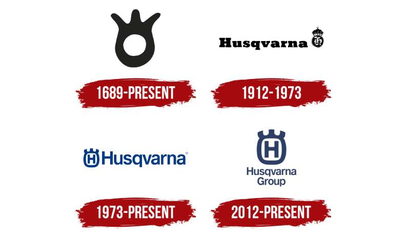
The Husqvarna logo has changed significantly since the brand’s founding in 1689, moving from ornate heraldic marks to a streamlined modern combination mark, while consistently keeping the crown as its core visual anchor through every major redesign.
Original Husqvarna Logo (1689-Early 1900s)
- Years Active: 1689 to early 1900s
- Design Description: Detailed heraldic-style crest with ornate lettering, reflecting the brand’s origins as a royal weapons manufacturer
- Color Scheme: Black and gold, typical of formal heraldic marks of the era
- Designer: Unknown
- Context: Founded under royal Swedish charter; the mark needed to communicate official status and craftsmanship
- Key Changes from Previous: N/A (founding mark)
- Cultural Significance: Signaled royal approval and Swedish industrial pride during a period when weapons manufacturing defined national prestige
Industrial Era Logo (Early 1900s-1950s)
- Years Active: Early 1900s to approximately 1950
- Design Description: Simplified crest with serif lettering; crown retained but reduced in complexity
- Color Scheme: Black and white primarily, with some applications in dark navy
- Designer: Unknown
- Context: The company had diversified into sewing machines, motorcycles, and bicycles; the mark needed broader product applicability
- Key Changes from Previous: Less ornate, more adaptable to print and product stamping
- Cultural Significance: Reflected Sweden’s industrial growth and Husqvarna’s expansion beyond weapons
Mid-Century Logo (1950s-1970s)
- Years Active: Approximately 1950 to 1970
- Design Description: Bolder wordmark with a cleaner crown motif; early use of blue as a brand color
- Color Scheme: Blue introduced alongside black
- Designer: Unknown
- Context: Post-war European branding trends pushed companies toward cleaner, more functional marks
- Key Changes from Previous: First consistent use of blue; wordmark became more prominent relative to the crown
- Cultural Significance: Positioned Husqvarna as a modern European manufacturer during motorsport’s growth years
Classic Blue and Yellow Logo (1970s-2000s)
- Years Active: Approximately 1970 to 2000
- Design Description: Established the blue-and-yellow color pairing with a more geometric crown; wordmark in bold serif-influenced lettering
- Color Scheme: Blue and yellow, mirroring the Swedish national flag
- Designer: Unknown
- Context: Brand was growing fast in outdoor power equipment and off-road motorcycles; needed a recognizable, globally consistent mark
- Key Changes from Previous: Yellow introduced as a primary accent; crown simplified further into a geometric form
- Cultural Significance: This is the version most older customers associate with the brand; it became iconic in forestry and motocross circles
Modern Logo (2013-Present)
- Years Active: 2013 to present
- Design Description: Refined combination mark with a clean, symmetrical crown icon above a custom bold sans-serif wordmark
- Color Scheme: Husqvarna Blue (#273A60) and Husqvarna Yellow (#F8C300)
- Designer: Husqvarna Group internal brand team
- Context: Full brand refresh to support digital-first marketing and product line expansion including robotic mowers
- Key Changes from Previous: More geometric crown, cleaner spacing, custom typography replacing earlier generic letterforms
- Cultural Significance: Brought the brand into digital and e-commerce environments without losing the heritage the crown represents
What Do the Design Elements of the Husqvarna Logo Mean?
The Husqvarna logo uses a crown and a bold wordmark to communicate royal Swedish heritage, manufacturing authority, and lasting durability. Every element connects back to either the brand’s 17th-century origins or its reputation for high-performance outdoor equipment.
The crown is the oldest and most loaded element in the mark.
It references Husqvarna’s founding under the charter of Swedish King Karl X Gustaf in 1689, when the company made weapons for the royal military.
That connection to authority and craftsmanship has carried forward through every product category the brand has entered since.
Why Did Husqvarna Choose These Specific Colors?

Blue (#273A60)
- Color name: Husqvarna Blue
- Pantone: Approx. Pantone 289 C
- Symbolic meaning: Trust, stability, precision
- Psychological impact: Builds confidence and signals reliability, important for safety-critical power equipment
- Brand connection: Reflects Swedish national colors and aligns with the serious, professional tone of the brand
Yellow (#F8C300)
- Color name: Husqvarna Yellow
- Pantone: Approx. Pantone 116 C
- Symbolic meaning: Energy, visibility, innovation
- Psychological impact: Grabs attention fast, which matters in retail and outdoor environments
- Brand connection: Matches the Swedish flag palette and differentiates Husqvarna from competitors using red or orange as accent colors
Together, blue and yellow create a complementary color scheme that is both nationally rooted and practically effective in product and retail contexts. Understanding the psychology behind these choices connects directly to broader color theory principles that serious brand teams apply.
What Typography Style Is Used in the Husqvarna Logo?
The wordmark uses a custom bold sans-serif typeface with tight letter spacing and strong, even stroke weights.
It reads clearly at small sizes, which matters a lot when you’re stamping it onto chainsaw housings or printing it on small product labels.
Earlier versions used heavier, more traditional letterforms closer to a serif font style.
The move to a cleaner sans-serif font approach in 2013 was a deliberate step toward digital legibility and scalability across screens and surfaces.
The tracking is tight but not compressed, keeping the wordmark solid and authoritative without feeling cramped.
What Are the Hidden Meanings in the Husqvarna Logo?
The crown’s five points are not arbitrary. Five-pointed crowns in Swedish heraldry traditionally represent civic or commercial authority rather than royal family lineage.
So while the crown references the royal charter, it technically signals “trusted institution” more than “monarchy.”
Most people miss that distinction entirely.
The symmetry of the mark is also intentional. Husqvarna builds precision equipment, and a perfectly balanced logo reinforces that idea without saying it out loud. The symmetry here does real work.
There’s no documented “hidden arrow” or negative space trick in the Husqvarna mark. What you see is what you get, and honestly that suits a brand that sells to people who value function over cleverness.
How Does the Husqvarna Logo Compare to Competitor Logos?
Husqvarna’s logo stands apart from competitors through its consistent use of a heritage symbol, while brands like STIHL, Deere, and KTM rely on wordmarks or abstract shapes. The crown gives Husqvarna a historical depth most rival marks simply don’t have.
STIHL uses an orange wordmark with no symbol, keeping things direct and industrial.
John Deere leans on its leaping deer icon, which has strong brand equity but a very different tone: agricultural, approachable, American.
The KTM logo goes aggressive and angular, reflecting its identity as a performance-first motorsport brand.
The Ducati logo uses a shield shape that signals Italian racing heritage, similar in spirit to Husqvarna’s crown but with a very different cultural reference point.
Among motorcycle and outdoor equipment brands, Husqvarna is genuinely unusual in maintaining a heraldic symbol this prominently. Most competitors moved away from that kind of traditional visual language decades ago. Husqvarna kept it, and it works because the brand actually has the history to back it up.
Compared to Kawasaki, Yamaha, and Suzuki, all of which use abstract marks or stylized initials, Husqvarna’s crown reads as more grounded and heritage-driven. That positioning serves them well in markets where professional users buy equipment expecting it to last for years.
What Are the Technical Specifications of the Husqvarna Logo?
Official Color Codes:
Primary Color: Husqvarna Blue
Secondary Color: Husqvarna Yellow
- Hex: #F8C300
- RGB: (248, 195, 0)
- CMYK: (1, 22, 100, 0) approx.
- Pantone: Approx. 116 C
Accent Color: White
- Hex: #FFFFFF
- RGB: (255, 255, 255)
- Used for reversed applications on dark backgrounds
Dimensions and Proportions:
- Aspect ratio: Approximately 3:1 (width to height) for the full combination mark
- Minimum size: Crown icon not recommended below 16px height in digital use; wordmark not below 60px width
- Clear space: Minimum clear space equal to the height of the crown symbol on all sides
- Official usage: Full brand guidelines available to authorized dealers and partners through Husqvarna’s brand portal; brand guidelines dictate approved color combinations, placement, and co-branding rules
The logo is distributed in vector graphics format for professional use, ensuring it scales without quality loss across both large-format signage and small product labels. DPI requirements for print applications follow standard brand guidelines, typically 300 DPI minimum for physical reproduction.
What Cultural Impact Has the Husqvarna Logo Had?
The Husqvarna logo has become a shorthand for durability and professional-grade performance across forestry, landscaping, and off-road motorsport communities worldwide, carrying recognition far beyond its Swedish origins into global markets where the crown mark is immediately understood.
In motocross and off-road racing, the blue-and-yellow crown is genuinely iconic.
Riders who grew up in the 1970s and 1980s associate it with Swedish dominance in world championship enduro and motocross events. That association still has weight today.
In the professional landscaping and forestry world, the logo signals something specific: this is not consumer-grade equipment. When a tree surgeon shows up with Husqvarna gear, the mark communicates expertise before they even start the chainsaw.
The brand’s storytelling through its visual identity has been consistent enough that even non-customers recognize the crown. That kind of recognition takes decades to build and is genuinely hard to replicate.
How Does the Husqvarna Logo Fit Into the Overall Brand Identity?
The Husqvarna logo anchors a broader visual identity system that connects product design, dealer environments, digital platforms, and motorsport sponsorships through consistent use of the crown mark, the blue-yellow palette, and bold typography that runs across every customer touchpoint.
The crown and the color system work as a semantic network.
The blue appears on product housings. The yellow shows up in safety markings and accent details. The wordmark locks the whole system together across packaging, brand style guide applications, and advertising.
Husqvarna also maintains separate but related visual languages for its consumer and professional product lines, while keeping the core logo consistent. That’s a tricky balance, and most brands get it wrong. Husqvarna has managed it reasonably well.
The visual hierarchy in Husqvarna’s branded materials always puts the crown mark first. Everything else, product photography, taglines, dealer information, supports the mark rather than competing with it.
How Should the Husqvarna Logo Be Used?
Official Usage Guidelines:
- Do: Use the logo on approved backgrounds (white, Husqvarna Blue, or dark neutral surfaces)
- Do: Maintain clear space equal to the crown height on all sides
- Do: Use only official file formats provided through the Husqvarna brand portal
- Do: Use the full combination mark (crown + wordmark) as the primary application
- Don’t: Alter, recolor, or distort the logo in any way
- Don’t: Place the logo on visually cluttered backgrounds that reduce legibility
- Don’t: Recreate the logo from scratch or use unofficial versions found on third-party sites
- Don’t: Use the crown icon alone without the wordmark unless explicitly approved for specific applications
Where to Access Official Logos:
Authorized dealers and media partners can access official logo files through Husqvarna’s brand asset portal. Press and media requests are handled through the Husqvarna Group communications team directly.
Licensing and Trademark Protection:
The Husqvarna name and crown mark are registered trademarks of Husqvarna AB. Use of the logo for commercial purposes without authorization is a trademark violation. This applies to merchandise, promotional materials, and digital content. Any co-branding arrangements require written approval from Husqvarna’s brand team. The font licensing for the custom wordmark typography is proprietary and not available for external use.
FAQ on The Husqvarna Logo
What does the Husqvarna logo represent?
The Husqvarna logo represents over 330 years of Swedish manufacturing heritage.
The crown symbol references the brand’s 1689 royal charter from King Karl X Gustaf, while the blue and yellow palette directly mirrors the Swedish national flag.
What is the crown in the Husqvarna logo?
It’s a five-pointed civic crown, not a royal family symbol.
In Swedish heraldic tradition, that specific crown shape signals institutional authority and trusted craftsmanship. It’s been part of the Husqvarna brand identity in some form since the company’s earliest trademarks.
What colors does the Husqvarna logo use?
The logo uses two official colors: Husqvarna Blue (hex #273A60) and Husqvarna Yellow (#F8C300).
White is used for reversed applications. The blue-and-yellow pairing connects the brand visually to Sweden and sets it apart from competitors using red or orange.
When was the current Husqvarna logo introduced?
The modern version was introduced around 2013 as part of a full brand refresh.
It brought cleaner geometry to the crown mark and replaced older letterforms with a custom bold sans-serif wordmark built for digital legibility and product-surface applications.
What font does the Husqvarna logo use?
The wordmark uses a custom sans-serif typeface with tight tracking and even stroke weights.
It’s proprietary, so it’s not available for public use. Earlier versions leaned closer to serif-influenced lettering before the 2013 redesign pushed things toward a cleaner, more functional style.
Has the Husqvarna logo always looked the same?
Not even close. The original mark was an ornate heraldic crest, reflecting its origins as a royal weapons manufacturer.
Over roughly six major iterations, the logo evolution moved steadily toward simplification, though the crown never disappeared from any version.
Where can I download the official Husqvarna logo?
Official logo files are available through Husqvarna’s brand asset portal, accessible to authorized dealers and media partners.
Third-party download sites often carry outdated or incorrect versions. For press use, contact Husqvarna Group’s communications team directly to get proper high-resolution vector files.
Is the Husqvarna logo trademarked?
Yes. Both the crown mark and the Husqvarna wordmark are registered trademarks of Husqvarna AB, protected across multiple international markets.
Using the logo commercially without authorization is a trademark violation. Any co-branding or logo usage outside official guidelines requires written approval.
How does the Husqvarna logo compare to other motorcycle brand logos?
Most motorcycle brands use abstract marks or stylized initials. Husqvarna keeps a full heraldic symbol, which is genuinely unusual in that space.
Compared to Triumph, Aprilia, and Royal Enfield, the Husqvarna crown logo carries a deeper historical reference point that most rivals simply don’t have.
What file formats is the Husqvarna logo available in?
The official logo is distributed in vector formats including SVG and EPS, plus PNG with transparent backgrounds for digital use.
Raster formats like JPEG are available for general web use, but vector files are always preferred for print and large-format applications to maintain quality at any size.
Conclusion
The Husqvarna logo is a rare case of a corporate mark that has genuinely earned its visual authority rather than just claimed it.
The crown wordmark combination, the blue-yellow color palette, and the custom typography all trace back to real history, not just brand strategy meetings.
Few equipment manufacturers can say the same. Whether you’re looking at it from a logo design principles perspective or simply as a consumer, the Husqvarna brand mark holds up, across formats, surfaces, and three centuries of product evolution.
Renowned for his expertise in logo design and visual branding, Bogdan has developed a multitude of logos for various clients.
His skills extend to creating posters, vector illustrations, business cards, and brochures. Additionally, Bogdan's UI kits were featured on marketplaces like Visual Hierarchy and UI8.
He also wrote in the past years on sites like Design Your Way, WebDesignerDepot, WPDean, Designmodo, Speckyboy, Slider Revolution, and more.
- The Airtable Logo History, Colors, Font, And Meaning - 12 July 2026
- How to Blur Background in Canva: A Quick Tutorial - 11 July 2026
- Typography Trends - 10 July 2026
Bogdan Sandu is a seasoned designer who has been designing websites since 2008. Renowned for his expertise in logo design and visual branding, Bogdan has developed a multitude of logos for various clients. His skills extend to creating posters, vector illustrations, business cards, and brochures. Additionally, Bogdan's UI kits were featured on marketplaces like Visual Hierarchy and UI8. He also wrote in the past years on sites like Design Your Way, WebDesignerDepot, WPDean, Designmodo, Speckyboy, Slider Revolution, and more.
You Might Also Like