The Ducati logo is one of the most recognized emblems in motorcycle culture. It represents speed, Italian craftsmanship, and a racing heritage that goes back decades. The shield-based design has gone through several changes, but its core identity has stayed remarkably consistent since the brand pivoted to motorcycles in the 1950s.
Ducati Motor Holding was founded in Bologna in 1926, originally as a radio components manufacturer. The company shifted to motorcycle production after World War II, and the logo has tracked that transformation closely. Today’s version carries a clean, confident look that fits both the racetrack and a brand style guide for global markets.
What Is the Ducati Logo?
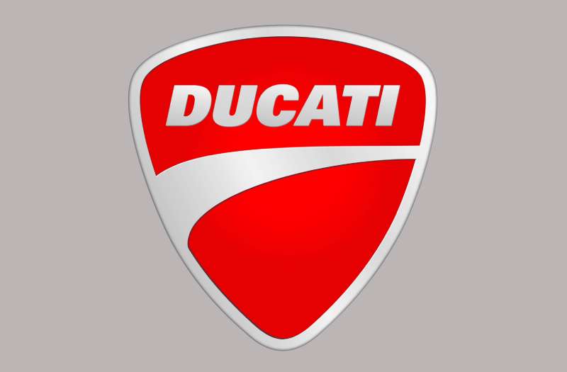
The Ducati logo is a red and white shield emblem featuring the “Ducati” wordmark in bold custom lettering. The current version was refined in the early 2000s and uses a strong geometric shield shape as its base. It signals Italian performance and motorsport authority.
- Design Type: Combination mark (emblem + wordmark)
- Primary Elements: Red shield, bold white “Ducati” lettering, outlined border
- Official Introduction Date: Current version introduced circa 2008, with earlier iterations from the 1950s onward
- Designer/Agency: Developed internally; no single external agency is officially credited for the modern version
- Trademark Status: Registered trademark owned by Ducati Motor Holding S.p.A., a subsidiary of Audi AG / Volkswagen Group
- Color Palette: Ducati Red (#CC0000), White (#FFFFFF), Black (#000000)
- Usage Context: Motorcycle fairings, helmets, apparel, merchandise, digital platforms, dealership signage, and MotoGP racing livery
How Has the Ducati Logo Evolved Over Time?
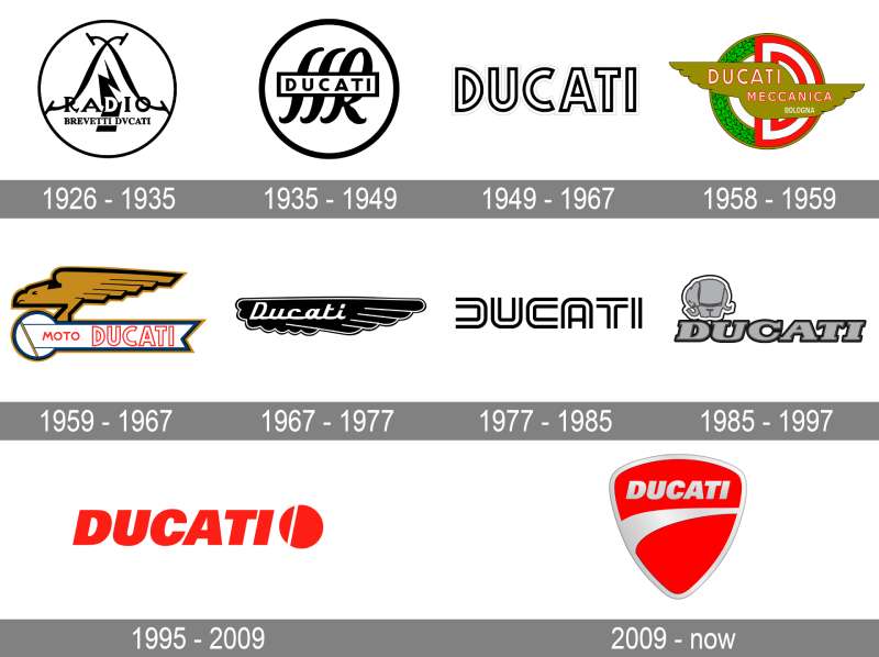
The logo has gone through roughly five distinct phases since the 1950s, shifting from ornate post-war badge design to the sharp, minimal shield used today. Each version reflected where the brand was at that moment, commercially and competitively.
Original Ducati Logo (1950s-1960s)
- Years Active: Early 1950s to late 1960s
- Design Description: Oval-shaped badge with detailed script lettering and decorative border elements
- Color Scheme: Red, gold, and white
- Designer: Unknown, developed in-house
- Context: Ducati was transitioning from electronics to motorcycles and needed a badge that felt premium and Italian
- Key Changes from Previous: First motorcycle-specific logo for the brand
- Cultural Significance: Reflected the post-war Italian optimism around engineering and speed
Shield-Based Logo Introduction (1970s-1980s)
- Years Active: Late 1960s through the 1980s
- Design Description: Shift toward a shield shape with simplified lettering; more industrial, less ornate
- Color Scheme: Red and white with black outline
- Designer: Internal design team
- Context: Ducati was gaining serious traction in racing; the logo needed to feel competitive, not decorative
- Key Changes from Previous: Dropped the oval format; introduced the shield that would define all future versions
- Cultural Significance: Aligned the brand visually with European performance motorcycle culture
Refined Shield Logo (1990s-2000s)
- Years Active: Early 1990s to mid-2000s
- Design Description: Cleaner shield with tighter proportions, bolder wordmark, and reduced decorative detail
- Color Scheme: Bright red and white
- Designer: Internal team, influenced by the Cagiva Group ownership period
- Context: Ducati’s 916 model (launched 1994) became iconic; the logo needed to match that level of design confidence
- Key Changes from Previous: More geometric, less hand-crafted feel; stronger contrast
- Cultural Significance: This is the era most enthusiasts associate with classic Ducati identity
Modern Logo (2008-Present)
- Years Active: Approximately 2008 to present
- Design Description: Sharp shield outline, clean white lettering on red, minimal border treatment
- Color Scheme: Ducati Red (#CC0000) and White (#FFFFFF)
- Designer: Refined under Ducati’s internal brand team during the Audi acquisition preparation period
- Context: Needed to work across digital platforms, merchandise, and global dealership networks at scale
- Key Changes from Previous: Removed decorative border details; optimized for small-scale digital use
- Cultural Significance: Represents Ducati’s shift into a fully global premium brand, not just a niche Italian maker
What Do the Design Elements of the Ducati Logo Mean?
The shield is the core of everything. It signals protection, strength, and heritage, all things that matter when your product runs at 200+ mph.
The bold white wordmark on red creates instant contrast. It reads clearly at racing speeds, on a fairing, on a patch, on a phone screen.
Nothing in the current logo is accidental. Every element earns its place.
Why Does the Shield Shape Matter in the Ducati Logo?
The shield connects to Italian heraldic tradition. Bologna, where Ducati is based, has deep roots in craft guilds and civic pride. A shield historically represented a family or institution worth trusting.
For a motorcycle brand, it also carries physical meaning. Riders wear armor. The logo echoes that instinct.
It sets Ducati apart from Japanese competitors who tend to use wordmarks or abstract geometric symbols. The shield feels older, more rooted.
Why Did Ducati Choose These Specific Colors?
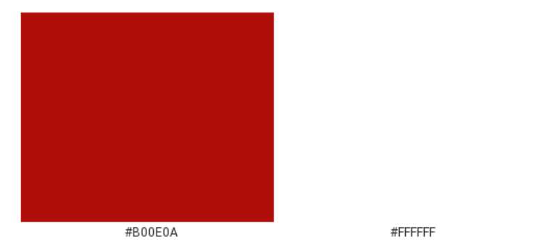
Ducati Red
- Hex: #CC0000
- Pantone: Pantone 485 C (approximate)
- Symbolic meaning: Speed, passion, Italian identity
- Psychological impact: Urgency, energy, confidence
- Brand connection: Red is deeply tied to Italian motorsport (Ferrari, Alfa Romeo, and MotoGP liveries all share this legacy)
White
- Hex: #FFFFFF
- Symbolic meaning: Clarity, precision, technical purity
- Psychological impact: Contrast and legibility; makes the red pop harder
- Brand connection: Used consistently in Ducati Corse racing liveries
Black
- Hex: #000000
- Symbolic meaning: Authority and premium positioning
- Psychological impact: Grounds the composition; used in outline and alternate colorways
- Brand connection: Appears heavily in Ducati’s Diavel and dark-themed merchandise lines
Understanding how color psychology works helps explain why red has been non-negotiable for Ducati across every logo iteration.
What Typography Style Is Used in the Ducati Logo?

The wordmark uses a custom bold sans-serif style. It is not an off-the-shelf typeface.
The letterforms are wide, with consistent stroke weight and tight spacing. No serifs. No thin strokes that would disappear at small sizes.
It reads instantly. Which, when your logo appears on a motorcycle going past at racing speed, is exactly what you need.
The letter spacing has tightened slightly across versions, giving the modern logo a more compressed, athletic feel compared to the wider-set lettering of the 1970s and 80s versions.
What Are the Hidden Meanings in the Ducati Logo?
There are no famously documented “hidden” elements the way there are in, say, the FedEx arrow. Ducati’s design language is more direct than that.
What’s interesting is the proportional relationship between the shield height and the wordmark size. The text fills almost the entire shield interior, which removes visual hierarchy between symbol and name. They are the same thing.
That is actually a statement. Ducati is saying: the name IS the symbol. No separate icon needed.
How Does the Ducati Logo Compare to Competitor Logos?
Ducati sits at the premium end of motorcycle branding. Its closest visual competitors are brands that use heraldic or badge-style logos rather than abstract marks.
Triumph uses a similar shield format but with a more traditional, almost British-heritage feel. Heavier lines, more ornate.
MV Agusta leans into Italian aristocracy with a crest design that feels more formal and less aggressive than Ducati’s approach.
Aprilia went the opposite direction entirely, using a modern, angular wordmark with no shield or emblem. It feels tech-forward rather than heritage-driven.
Harley-Davidson uses a bar-and-shield that’s conceptually similar to Ducati’s approach but targets a completely different cultural territory. American muscle vs. Italian precision.
KTM uses a bold orange wordmark with no emblem at all. Aggressive but not heritage-based.
Among premium vehicle brand logos broadly, Ducati’s combination of heraldic shape and minimal interior detail places it in a small category of brands that feel both historic and current at the same time.
What Are the Technical Specifications of the Ducati Logo?
Official Color Codes
Primary Color: Ducati Red
- Hex: #CC0000
- RGB: (204, 0, 0)
- CMYK: (0, 100, 100, 20)
- Pantone: 485 C (approximate; official value not publicly disclosed)
Secondary Color: White
- Hex: #FFFFFF
- RGB: (255, 255, 255)
- CMYK: (0, 0, 0, 0)
Accent Color: Black
- Hex: #000000
- RGB: (0, 0, 0)
- CMYK: (0, 0, 0, 100)
Dimensions and Proportions
- Aspect ratio: Approximately 1:1.2 (width to height), slightly taller than wide
- Minimum size requirements: Not publicly specified, but general brand practice recommends no smaller than 20px height for digital use
- Clear space: Standard brand practice requires clear space equal to the height of the “D” in the wordmark on all sides
- Official usage guidelines: Available through Ducati’s official press and brand portal for media and licensed partners
- File formats available: Vector formats (AI, EPS, SVG) for print and large-format use; PNG with transparent background for digital; JPEG for general media use
- Resolution requirements: Minimum 300 DPI for print applications
What Cultural Impact Has the Ducati Logo Had?
Few motorcycle logos carry the same cross-category recognition as Ducati’s. It shows up in fashion, in film, in lifestyle branding, in places that have nothing to do with motorcycles technically.
The red shield has become shorthand for a specific kind of aspiration. Italian, fast, precise, slightly obsessive about engineering. People get it tattooed. That does not happen with most red brand logos.
In MotoGP, the Ducati Desmosedici’s livery has made the logo globally visible across decades of racing coverage. Francesco Bagnaia’s back-to-back championships in 2022 and 2023 pushed that visibility to a new level.
The logo also travels well across merchandise. It works on a jacket, on a coffee mug, on a watch face. That kind of flexibility is something most logo designs struggle to achieve without diluting the brand feeling.
How Does the Ducati Logo Fit Into the Overall Brand Identity?
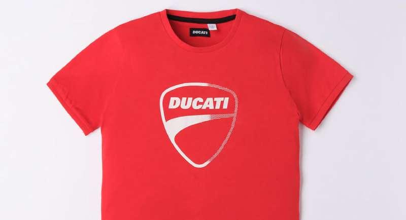
The logo is the anchor point for everything Ducati does visually. The red carries through to motorcycle paint, racing livery, retail spaces, and digital platforms without ever feeling inconsistent.
Ducati’s brand guidelines extend the logo’s visual language into typography choices, photography style (high contrast, motion-focused), and even interior design at Ducati dealerships worldwide.
The Ducati Corse sub-brand uses a variation of the main logo with adjusted proportions for racing applications. The Scrambler Ducati line deliberately uses a looser, more casual badge to target a younger, lifestyle-oriented audience without confusing it with the main brand.
That kind of structured flexibility, where sub-brands can exist without undermining the parent identity, is a sign of a well-built brand system. The brand style guide behind it clearly defines where each version lives and why.
Related entities in the Ducati brand network include Ducati Corse (racing division), Ducati Performance (accessories), Scrambler Ducati (lifestyle sub-brand), and the Ducati Museum in Bologna, all of which use logo variations governed by the same core system.
How Should the Ducati Logo Be Used?
Official Do’s:
- Use only approved color versions: full color (red/white), all-black, or all-white reversal
- Maintain required clear space on all sides
- Scale proportionally; never stretch or distort
- Download assets only from Ducati’s official media portal or licensed partner resources
- Use vector files for any print or large-format application
Official Don’ts:
- Do not recreate the logo from memory or approximate the colors
- Do not place the logo on backgrounds that reduce contrast below readable levels
- Do not combine the logo with other brand marks without written permission
- Do not use the logo on merchandise, apparel, or commercial materials without a licensing agreement
- Do not alter the proportions, colors, or typography in any way
Where to Access Official Logos: Ducati’s press portal at press.ducati.com provides approved assets for media use. Licensing inquiries for commercial use go through Ducati Motor Holding S.p.A. directly.
Trademark Protection: The Ducati name and shield logo are registered trademarks in multiple jurisdictions worldwide. Unauthorized commercial use is actively enforced. Any use outside personal, editorial, or officially licensed contexts requires prior written approval from Ducati Motor Holding S.p.A.
FAQ on The Ducati Logo
What Does the Ducati Logo Represent?
The shield emblem represents Italian craftsmanship, racing heritage, and mechanical precision.
It connects Ducati Motor Holding’s Bologna roots to its MotoGP identity. The red and white color combination signals speed and authority, which is consistent across every product line and racing livery the brand has produced.
What Shape Is the Ducati Logo?
It is a heraldic shield, slightly taller than wide.
This shape has been the foundation of Ducati’s visual identity since the 1960s. Every major redesign kept the shield format while adjusting proportions, border weight, and internal typography to suit the era.
What Color Is the Ducati Logo?
The primary color is Ducati Red, hex #CC0000, paired with white lettering.
A black outline version also exists for specific applications. Red was chosen partly due to its deep association with Italian motorsport, the same cultural logic that sits behind Ferrari and Alfa Romeo’s racing identities.
Has the Ducati Logo Changed Over the Years?
Yes, several times since the 1950s.
The brand moved from an ornate oval badge to the clean shield used today. Each iteration stripped away decorative detail. The current version, refined around 2008, was built to work across digital platforms and global merchandise at scale.
What Font Does the Ducati Logo Use?
The wordmark uses a custom bold sans-serif typeface, not a publicly available font.
The letterforms have consistent stroke weight, tight kerning, and no serifs. It was designed to stay readable at small sizes and at high speed, which matters when it appears on motorcycle fairings and racing livery.
Who Designed the Ducati Logo?
No single external designer or agency is officially credited for the modern version.
The current shield design was developed and refined internally by Ducati’s brand team. Earlier iterations from the Cagiva Group ownership period were also handled in-house, with adjustments made as the brand’s market positioning shifted.
What Is the Ducati Corse Logo?
Ducati Corse is the factory racing division, and it uses a variation of the main shield logo.
The proportions are adjusted slightly for racing applications. It appears on the Desmosedici MotoGP bike, team apparel, and official race merchandise. The core red and white identity stays consistent with the parent brand.
How Does the Ducati Logo Compare to Other Motorcycle Brand Logos?
Most competitors take a different visual approach entirely.
Kawasaki and Yamaha use wordmark-based logos with no emblem. Royal Enfield leans into heritage badge design similar to Ducati but targets a different market. Among premium Italian motorcycle brands, Ducati’s shield is the most globally recognized.
Where Can I Download the Official Ducati Logo?
Official assets are available through Ducati’s press portal at press.ducati.com.
Vector files in AI, EPS, and SVG formats are provided for media use. Commercial use requires a licensing agreement with Ducati Motor Holding S.p.A. Downloading from third-party sites risks getting outdated or incorrect versions of the logo.
Is the Ducati Logo Trademarked?
Yes. The Ducati name and shield logo are registered trademarks in multiple jurisdictions worldwide.
Ducati Motor Holding S.p.A., operating under the Volkswagen Group through Audi AG, actively enforces trademark rights. Using the logo on merchandise, apparel, or any commercial material without written permission is a legal violation.
Conclusion
The Ducati logo is one of the few motorcycle brand emblems that works as hard off the bike as it does on it.
From the Borgo Panigale factory floors to World Superbike Championship podiums, the red shield has stayed consistent where it counts.
The core design principles behind it are simple: strong contrast, a recognizable silhouette, and a color that owns its category.
For a brand with Ducati Motor Holding’s global reach, that kind of visual identity clarity is not accidental. It is the result of decades of deliberate refinement.

Renowned for his expertise in logo design and visual branding, Bogdan has developed a multitude of logos for various clients.
His skills extend to creating posters, vector illustrations, business cards, and brochures. Additionally, Bogdan's UI kits were featured on marketplaces like Visual Hierarchy and UI8.
He also wrote in the past years on sites like Design Your Way, WebDesignerDepot, WPDean, Designmodo, Speckyboy, Slider Revolution, and more.
- Canva vs PowerPoint: Which Is Better for Presentations? - 22 September 2026
- How to Install Fonts on Mac (Step-by-Step Guide) - 20 September 2026
- From Mockup to Code: How AI-Augmented Development Speeds Up the Design Handoff - 19 September 2026

Bogdan Sandu is a seasoned designer who has been designing websites since 2008. Renowned for his expertise in logo design and visual branding, Bogdan has developed a multitude of logos for various clients. His skills extend to creating posters, vector illustrations, business cards, and brochures. Additionally, Bogdan's UI kits were featured on marketplaces like Visual Hierarchy and UI8. He also wrote in the past years on sites like Design Your Way, WebDesignerDepot, WPDean, Designmodo, Speckyboy, Slider Revolution, and more.
You Might Also Like