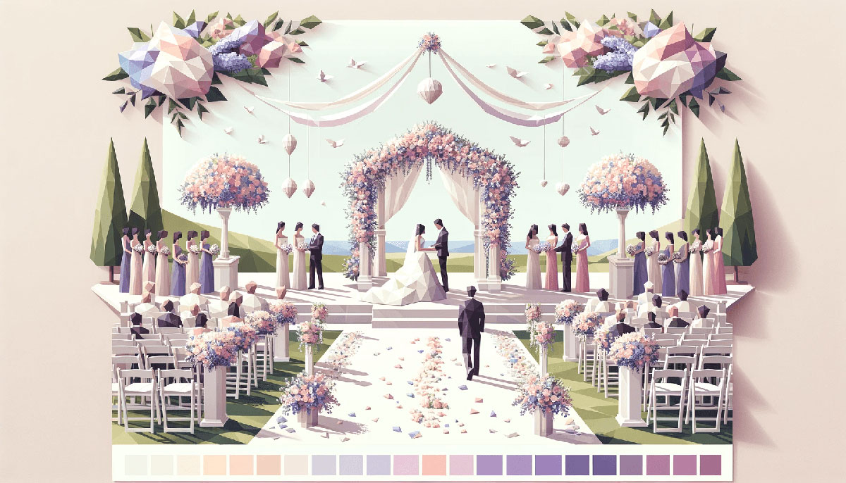
White isn’t just one color. It’s dozens of shades hiding behind the same name, each one changing how a room feels or how a brand reads.
Most people grab the first white they see and wonder why it looks wrong under their lighting. The difference between pure white and warm cream can make or break a design.
This guide breaks down 15 distinct white color palettes, from arctic cool to vintage cream. You’ll learn which whites work for interiors, which suit digital interfaces, and how undertones shift under different conditions.
Each palette includes hex codes, mood descriptions, and pairing strategies that actually work.
White Color Palettes
Pure Minimalist
| #FFFFFF | #FFFAFA | #F8F8FF | #F0F8FF |
Color Codes
Pure White sits at #FFFFFF with maximum saturation across all RGB channels.
Snow (#FFFAFA) adds the faintest pink undertone while Ghost White (#F8F8FF) leans slightly blue. Alice Blue (#F0F8FF) completes the palette with a soft aqua hint.
When to Use
Digital interfaces, medical brands, tech startups. Crisp whites work best on screens where contrast matters more than warmth.
Avoid in print unless paired with darker anchors.
Design Applications
UI backgrounds, minimalist design portfolios, SaaS landing pages. Perfect for creating breathing room in dense layouts.
Works in web design where readability drives conversions.
Mood & Atmosphere
Clinical precision. Sterile calm.
Feels modern, sometimes cold if not balanced with texture or warm accents.
Best Combinations
Pair with charcoal (#36454F) or navy for professional layouts. Add sage green or soft gray for warmth without sacrificing the clean aesthetic.
Test against different lighting, pure white can glare on OLED screens.
Common Mistakes
Using #FFFFFF for body text backgrounds causes eye strain during long reading sessions. Switch to off-white (#F7F7F7) instead.
Skipping texture in all-white rooms makes spaces feel unfinished, not minimal.
Warm Cream
| #FFFFF0 | #FFFDD0 | #F3E5AB | #F7E7CE |
Color Codes
Ivory (#FFFFF0) carries subtle yellow warmth. Cream (#FFFDD0) intensifies that glow.
Vanilla (#F3E5AB) and Champagne (#F7E7CE) deepen the palette with beige undertones.
When to Use
Hospitality brands, bakeries, wedding color palettes, home decor. Anywhere warmth and approachability matter more than stark modernity.
Design Applications
Interior walls, packaging design for artisan products, cafe menus. Cream whites soften harsh overhead lighting in physical spaces.
Use in print design where paper stock adds natural texture.
Mood & Atmosphere
Cozy. Inviting. Feels like Sunday mornings.
Lacks the crispness of pure whites but gains emotional warmth in return.
Best Combinations
Pair with terracotta, rust, or burnt sienna for earthy schemes. Add walnut wood tones or brass hardware in interiors.
Works beautifully with pastel color palettes in spring contexts.
Common Mistakes
Mixing cream whites with cool grays creates muddy, confused palettes. Stick to warm neutrals across the board.
Using cream on north-facing walls amplifies yellow undertones, choose cooler whites instead.
Modern Neutral
| #F2F0EF | #FAFAFA | #FAF0E6 | #FFF5EE |
Color Codes
Off-White (#F2F0EF) balances between warm and cool with gray undertones. Alabaster (#FAFAFA) reads nearly pure but softer than #FFFFFF.
Linen (#FAF0E6) and Seashell (#FFF5EE) add whispers of warmth without committing to cream territory.
When to Use
Contemporary interiors, modern color palettes for tech brands, Scandinavian-inspired spaces. Where you need versatility across warm and cool lighting.
Design Applications
Bedroom walls, corporate office spaces, portfolio color palettes. These whites adapt to different times of day without shifting dramatically.
Strong choice for brand guidelines requiring neutral color palettes.
Mood & Atmosphere
Sophisticated neutrality. Doesn’t force a temperature choice.
Feels intentional without being precious about it.
Best Combinations
Pair with charcoal, slate, or cool gray. Add black accents for sharp alignment in layouts.
Works with both warm color palettes and cold color palettes as supporting players.
Common Mistakes
Assuming “neutral” means “boring.” These whites need intentional typography and strong visual hierarchy to shine.
Pairing with too many mid-tones creates washed-out designs lacking anchor points.
Cool Gray-White
| #F4F4F4 | #EAE0C8 | #E5E4E2 | #C0C0C0 |
Color Codes
Porcelain (#F4F4F4) and Pearl (#EAE0C8) sit at the lightest end. Platinum (#E5E4E2) and Silver (#C0C0C0) add visible gray weight.
This palette skews cool, no yellow undertones allowed.
When to Use
Tech products, automotive design, industrial aesthetics. Anywhere metal finishes and concrete appear.
Design Applications
Product mockups, UI chrome elements, architectural renderings. Gray-whites photograph well under studio lighting without color casts.
Common in motion graphics where metallic surfaces need to read clearly.
Mood & Atmosphere
Professional distance. Engineered precision.
Feels expensive in the right contexts, sterile in the wrong ones.
Best Combinations
Pair with electric blue, steel blue, or midnight blue. Add black for maximum contrast, use sparingly to avoid harshness.
Complements gray color palettes in corporate environments.
Common Mistakes
Using cool grays in spaces with warm artificial lighting creates sickly green casts. Test under actual conditions first.
Overloading layouts with too many gray values muddles hierarchy instead of clarifying it.
Soft Beige-White
| #FAEBD7 | #E3DAC9 | #F0EAD6 | #F4E7D7 |
Color Codes
Antique White (#FAEBD7) carries historical weight with gentle yellow-beige undertones. Bone (#E3DAC9) deepens the palette toward tan.
Eggshell (#F0EAD6) and Sand (#F4E7D7) complete the range with natural warmth.
When to Use
Vintage color palettes, heritage brands, museums, antique shops. Where history and tradition need visual reinforcement.
Design Applications
Book covers, estate sale posters, retro color palettes for nostalgic campaigns. Beige-whites work in contexts where pure white feels too modern.
Perfect for beige color palettes needing lighter anchor points.
Mood & Atmosphere
Timeless comfort. Feels lived-in, not just designed.
Evokes grandmother’s house in the best possible way.
Best Combinations
Pair with brown color palettes, amber, or cognac. Add forest green or burgundy for traditional schemes.
Layer with cream color palettes for monochromatic depth.
Common Mistakes
Using beige-whites in modern minimalist spaces creates confused color psychology signals.
Assuming all beige-whites look the same. Test swatches side by side, undertone differences become obvious.
Classic Monochrome
| #FFFFFF | #D3D3D3 | #DCDCDC | #F5F5F5 |
Color Codes
White (#FFFFFF) anchors one end. Light Gray (#D3D3D3) and Gainsboro (#DCDCDC) build mid-range values.
Whisper (#F5F5F5) provides the subtlest gray tint possible before hitting pure white.
When to Use
Monochrome colors schemes, editorial layouts, photography portfolios. When color theory takes a back seat to form and composition.
Design Applications
Magazine spreads, art gallery websites, architectural photography. Grayscale palettes let content breathe without competing color stories.
Strong foundation for testing balance and emphasis before adding color.
Mood & Atmosphere
Timeless restraint. Swiss design energy.
Communicates seriousness and focus without drama.
Best Combinations
Add one accent color for strategic pops. Red color palettes create classic magazine tension, blue color palettes feel corporate.
Works with black for maximum contrast ratios in accessible design.
Common Mistakes
Forgetting that monochrome still needs tonal variety. Five shades of medium gray looks flat, not sophisticated.
Skipping texture in monochrome work removes the main source of visual interest.
Warm Off-White
| #FEFCF3 | #FFFACD | #FFF8DC | #FFEFD5 |
Color Codes
Coconut (#FEFCF3) barely registers as off-white. Buttercream (#FFFACD) and Cornsilk (#FFF8DC) push into visible yellow territory.
Papaya (#FFEFD5) adds peachy warmth at the palette’s edge.
When to Use
Food color palettes, tropical branding, summer color palettes. Where sunshine and warmth drive the entire concept.
Design Applications
Juice bar menus, beach resort materials, children’s book illustrations. These whites feel playful rather than formal.
Connects naturally with yellow color palettes and orange color palettes.
Mood & Atmosphere
Cheerful optimism. Tropical vacation mindset.
Can feel juvenile if not balanced with sophisticated typeface choices.
Best Combinations
Pair with turquoise color palettes, coral, or peach. Add wood textures to ground the sweetness.
Layer with light color palettes for airy compositions.
Common Mistakes
Using warm off-whites in clinical or tech contexts sends mixed signals about brand personality.
Combining with cool blues creates color temperature clashes that feel unresolved.
Bright Clean
| #FCFCFC | #FDFFF5 | #FFFEF2 | #FAFAF8 |
Color Codes
Bright White (#FCFCFC), Milk (#FDFFF5), Cotton (#FFFEF2), Paper (#FAFAF8). All hover just below pure white with barely perceptible warmth.
These shades require side-by-side comparison to distinguish.
When to Use
Product photography, luxury fashion, high-end cosmetics. Where pristine presentation drives purchase decisions.
Design Applications
E-commerce backgrounds, logo presentations, book cover design. Bright clean whites make products pop without color interference.
Critical for maintaining visual identity across digital touchpoints.
Mood & Atmosphere
Luxurious simplicity. Zero tolerance for imperfection.
Demands perfect execution, any sloppiness shows immediately.
Best Combinations
Pair with gold color palettes, rose gold, or deep jewel tones. Keep supporting colors minimal.
Works beautifully with white space as primary design element.
Common Mistakes
Assuming bright white works everywhere. It creates harsh glare on screens and washes out under certain lighting.
Neglecting print calibration means your pristine white arrives as dingy gray.
Earthy White
| #EEDC82 | #F5F5DC | #F5DEB3 | #C2B280 |
Color Codes
Flax (#EEDC82) brings golden wheat tones. Natural (#F5F5DC) and Wheat (#F5DEB3) anchor the middle range.
Ecru (#C2B280) adds the deepest beige-tan value.
When to Use
Earth color palettes, organic brands, sustainable packaging, farm-to-table restaurants. Where natural materials and authenticity matter.
Design Applications
Grocery co-ops, yoga studios, eco-friendly product lines. These whites feel unbleached and honest.
Strong fit for nature color palettes requiring lighter values.
Mood & Atmosphere
Grounded simplicity. Unprocessed honesty.
Feels wholesome without trying too hard to convince you.
Best Combinations
Pair with olive green, rust, or terracotta. Add raw wood textures and linen fabrics.
Complements brown and khaki for organic depth.
Common Mistakes
Using earthy whites in high-tech contexts creates brand confusion about values and positioning.
Pairing with synthetic materials undermines the natural authenticity these colors communicate.
Soft Pastel White
| #FFF0F5 | #F5FFFA | #F0FFF0 | #F0FFFF |
Color Codes
Lavender Blush (#FFF0F5) adds the faintest pink. Mint Cream (#F5FFFA) and Honeydew (#F0FFF0) bring barely-there green.
Azure Mist (#F0FFFF) completes with whisper-light blue.
When to Use
Baby brands, spring color palettes, wellness apps, gentle skincare. Where softness communicates safety and care.
Design Applications
Nursery designs, spa branding, meditation apps. Pastel whites work when you need calm without complete neutrality.
Perfect bridge between pure white and full pastel color palettes.
Mood & Atmosphere
Gentle whisper. Nursery rhyme softness.
Creates safety without infantilizing adult audiences when handled carefully.
Best Combinations
Pair with pastel pink, pastel blue, or mint green. Keep values light to maintain the airy quality.
Layer with light pink for pink color palettes needing breathing room.
Common Mistakes
Using pastel whites in masculine-coded industries creates immediate disconnect with target audiences.
Combining too many pastel white tints washes out all definition and hierarchy.
Arctic Palette
| #F4F6F7 | #E8F1F5 | #D6EAF8 | #EBF5FB |
Color Codes
Arctic White (#F4F6F7) and Frost (#E8F1F5) sit at the coolest end of white. Ice (#D6EAF8) and Polar (#EBF5FB) add visible blue.
Zero warmth in this entire range.
When to Use
Winter color palettes, dental practices, air conditioning brands, arctic tourism. Where cool precision matters.
Design Applications
Medical facilities, tech dashboards, sky color palettes for aviation. Arctic whites feel sanitary and efficient.
Common in interfaces requiring clinical trust signals.
Mood & Atmosphere
Crisp efficiency. Zero-degree professionalism.
Feels remote and precise, sometimes to the point of coldness.
Best Combinations
Pair with navy blue, steel, or slate gray. Add one warm accent sparingly to prevent icebox effect.
Works with teal color palettes for modern medical branding.
Common Mistakes
Using arctic palettes in hospitality or food service makes spaces feel unwelcoming.
Forgetting to add warmth through lighting or materials results in uncomfortable environments.
Vintage Cream
| #FDF5E6 | #FFEBCD | #FFE4C4 | #FFDEAD |
Color Codes
Old Lace (#FDF5E6) carries aged elegance. Blanched Almond (#FFEBCD) and Bisque (#FFE4C4) deepen the warmth.
Navajo White (#FFDEAD) anchors the palette with peachy-tan undertones.
When to Use
Antique stores, historical societies, heritage brands, autumn color palettes. Where patina and age add value.
Design Applications
Vintage postcards, estate documentation, classic literature covers. These creams suggest pre-digital authenticity.
Essential for coffee color palettes needing lighter range.
Mood & Atmosphere
Nostalgic warmth. Sepia-toned memories.
Evokes pre-internet simplicity without feeling dated.
Best Combinations
Pair with burgundy, forest green, or burnt orange. Add brass hardware and leather textures.
Layer with tan for monochromatic vintage depth.
Common Mistakes
Using vintage cream in minimalist contexts muddles the design language completely.
Assuming vintage automatically means low quality. These palettes demand high craft to avoid looking cheap.
Designer White
| #F7F4EB | #F7F9F7 | #F6F6ED | #F8F6F0 |
Color Codes
Simply White (#F7F4EB), Decorator’s White (#F7F9F7), White Dove (#F6F6ED), Chantilly Lace (#F8F6F0). Paint brand favorites with cult followings.
These specific formulations have names because designers argued about them.
When to Use
High-end residential, boutique hotels, design showrooms. Where paint brand matters as much as color choice.
Design Applications
Interior walls where Light Reflectance Value (LRV) drives decisions. Designer whites balance warmth and coolness for maximum versatility.
Common in spaces requiring multiple coats for perfect coverage.
Mood & Atmosphere
Studied effortlessness. Looks simple, costs money.
Signals design literacy through subtle distinctions most people miss.
Best Combinations
Pair with natural wood, stone, or concrete. Let materials create visual interest against neutral backdrop.
Works with any accent color because these whites adapt to surrounding tones.
Common Mistakes
Choosing designer whites without testing samples in actual space lighting conditions. What looks perfect in showrooms can shift dramatically.
Assuming expensive paint names guarantee better results. Application technique matters more than brand prestige.
Coastal White
| #FFF5ED | #F5F0E8 | #FAEBD7 | #F7F9F9 |
Color Codes
Shell White (#FFF5ED) carries beach sand warmth. Driftwood (#F5F0E8) and Beach (#FAEBD7) add weathered texture.
Seafoam Mist (#F7F9F9) introduces the slightest aqua hint.
When to Use
Sea color palettes, beach rentals, surf brands, maritime museums. Where ocean proximity shapes identity.
Design Applications
Vacation property interiors, coastal restaurant branding, nautical product lines. These whites suggest salt air and sun bleaching.
Perfect for spaces with water views or beach-adjacent locations.
Mood & Atmosphere
Relaxed escape. Permanent vacation mindset.
Feels casual and approachable without sacrificing sophistication.
Best Combinations
Pair with turquoise, coral, or sandy beige. Add natural rope, weathered wood, sea glass accents.
Layer with aquamarine for coastal depth.
Common Mistakes
Using coastal whites far from actual coasts creates forced thematic disconnect.
Overdoing nautical clichés alongside coastal whites makes spaces feel like theme restaurants.
Contemporary Neutral
| #F4EDE4 | #D6CCBA | #D2CFC4 | #C9C8C7 |
Color Codes
Swiss Coffee (#F4EDE4) leads with warm beige. Accessible Beige (#D6CCBA), Agreeable Gray (#D2CFC4), Repose Gray (#C9C8C7) build complexity.
This palette bridges warm and cool through layered neutrals.
When to Use
Modern homes, corporate lobbies, boutique retail. Where sophisticated neutrality signals professional polish.
Design Applications
Open floor plans, transitional interiors, brand guidelines requiring timeless flexibility. Contemporary neutrals adapt across industries.
Essential for muted color palettes needing structure.
Mood & Atmosphere
Quiet confidence. Doesn’t shout, doesn’t hide.
Feels current without chasing trends that expire.
Best Combinations
Pair with black accents, brass fixtures, or marble surfaces. Add one strong hue for personality.
Works with green color palettes or blue for modern schemes.
Common Mistakes
Using contemporary neutrals without texture creates boring, flat spaces lacking depth.
Assuming neutral means safe. These palettes demand intentional color palette decisions and strong composition.
FAQ on White Color Palettes
What’s the difference between pure white and off-white?
Pure white (#FFFFFF) contains no color undertones and reflects maximum light across all RGB channels.
Off-white adds subtle beige, gray, or yellow undertones that soften the starkness. Off-whites reduce glare on screens and feel warmer in physical spaces.
Which white works best for interior walls?
Depends on lighting and room function. North-facing rooms need warm whites like ivory or cream to counteract cool daylight.
South-facing spaces handle cooler whites like alabaster without feeling cold. Test samples under actual lighting conditions before committing to paint.
How do I choose white for web design?
Avoid pure #FFFFFF for backgrounds during extended reading. It causes eye strain.
Use off-white (#F7F7F7 or #FAFAFA) for body content. Reserve pure white for strategic contrast against darker elements or product photography backgrounds where color accuracy matters.
What are warm white undertones?
Warm whites contain yellow, beige, or peachy undertones that create cozy atmospheres.
Cream, ivory, and antique white fall in this category. They work well with wood tones, brass fixtures, and earth color palettes but clash with cool grays or steel accents.
Can I mix different whites in one space?
Yes, but keep undertones consistent. Mixing warm and cool whites creates muddy, confused palettes.
Use lighter and darker values within the same temperature family. Test swatches side by side since subtle differences become obvious once applied across large surfaces.
What’s the best white for minimalist design?
Pure white or very light gray-whites work for minimalist design aesthetics.
Ghost white, porcelain, or whisper provide enough visual hierarchy without adding warmth. Pair with strategic white space, clean typography, and one accent color for maximum impact.
How do white color palettes affect mood?
Cool whites feel clinical, modern, and efficient. Perfect for medical, tech, or professional contexts.
Warm whites create comfort and approachability, ideal for hospitality, food, or wellness brands. Arctic palettes suggest precision while cream tones evoke nostalgia and warmth.
What colors pair best with white palettes?
Warm whites pair with terracotta, rust, olive green, or gold.
Cool whites work with navy, charcoal, steel blue, or teal. Neutral whites handle both warm and cool accents but require intentional decisions about which temperature dominates the overall scheme.
How do I test white paint colors before painting?
Paint large sample boards (minimum 2×2 feet) instead of tiny swatches.
Move boards around the room throughout the day to see how natural and artificial light affect undertones. Compare against fixed elements like flooring, countertops, and existing furniture before purchasing full gallons.
Are white color palettes still trending in design?
White remains foundational across all design disciplines but application evolves.
Current trends favor warmer off-whites over stark pure white, layered neutral tones instead of single-shade approaches, and textural variety to prevent flat, boring spaces. Modern color palettes use white strategically, not universally.
Conclusion
Choosing the right white color palettes changes how spaces feel and how brands communicate. The difference between cool arctic tones and warm cream schemes isn’t subtle once you understand undertones.
Test samples under actual lighting. What looks perfect in a paint store shifts dramatically under north-facing windows or LED bulbs.
Match color temperature to function. Clinical spaces need crisp whites while hospitality brands benefit from creamy warmth.
Don’t mix warm and cool whites in the same palette unless you want muddy results. Layer different values within one temperature family instead.
White works across web design, interiors, packaging design, and branding when you pick the right shade. Pure white isn’t always the answer.
Start with these 15 palettes and adapt based on your specific lighting, materials, and brand personality.

Renowned for his expertise in logo design and visual branding, Bogdan has developed a multitude of logos for various clients.
His skills extend to creating posters, vector illustrations, business cards, and brochures. Additionally, Bogdan's UI kits were featured on marketplaces like Visual Hierarchy and UI8.
He also wrote in the past years on sites like Design Your Way, WebDesignerDepot, WPDean, Designmodo, Speckyboy, Slider Revolution, and more.
- Top Source Sans Pro Font Pairing for Clean UIs - 6 October 2026
- Best Email Design System Examples From Leading Brands - 5 October 2026
- Canva AI Features Reviewed: Are They Actually Useful? - 4 October 2026

Bogdan Sandu is a seasoned designer who has been designing websites since 2008. Renowned for his expertise in logo design and visual branding, Bogdan has developed a multitude of logos for various clients. His skills extend to creating posters, vector illustrations, business cards, and brochures. Additionally, Bogdan's UI kits were featured on marketplaces like Visual Hierarchy and UI8. He also wrote in the past years on sites like Design Your Way, WebDesignerDepot, WPDean, Designmodo, Speckyboy, Slider Revolution, and more.
You Might Also Like