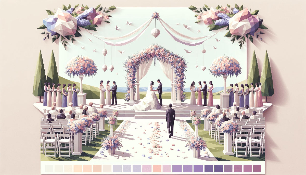
Winter transforms your design palette the same way frost transforms a window. Sharp, deliberate, unmistakable.
Winter color palettes deliver what other seasonal schemes can’t: the tension between icy blues and fireplace warmth, between stark minimalism and rich jewel tones.
Designers who master these cold-weather combinations gain access to everything from corporate elegance to cozy branding, from holiday campaigns to year-round sophistication. The right winter palette communicates trust through cool grays, energy through unexpected oranges, or luxury through deep burgundies.
This guide breaks down 15 proven winter color schemes with exact RGB codes, usage contexts, and combination strategies. You’ll see which palettes work for tech startups versus bakeries, how to balance saturation levels, and when to break the rules entirely.
Winter Color Palettes
Frosty Morning
| #E0ECF2 | #A5C0DF | #7A9EC7 | #3E6589 | #052542 |
Color Breakdown
Pale blue (#E0ECF2) mimics fresh snow under early morning light. Steel blue tones (#A5C0DF, #7A9EC7) anchor the icy palette with cool depth. Deep navy (#052542) adds winter night contrast.
Where to Use It
Works for spa branding, health apps, winter wedding invitations. Strong in web design for clean, minimal interfaces. Avoid for food brands (too cold).
Color Combinations
Pair lightest shade with darkest for maximum contrast in typography. Mid-tones (#A5C0DF + #7A9EC7) create smooth gradient transitions. Add cream (#FFFFF0) as accent for warmth.
Best For
Corporate presentations, medical facilities, winter sports branding. Establishes trust through cool-toned professionalism. —
Winter Sunset
| #FEF8D0 | #FAD9A9 | #DCA99A | #BD808B | #5B3849 |
Color Breakdown
Cream to dusty rose gradient captures golden hour over snow. Peach (#FAD9A9) and mauve (#BD808B) balance warm and cool undertones. Deep plum (#5B3849) grounds the pastel color palette.
Where to Use It
Perfect for vintage aesthetics, romantic branding, artisanal products. Excellent in packaging design for cosmetics, candles, bakeries. Creates cozy, approachable feel.
Color Combinations
Use #FEF8D0 as background with #5B3849 for high contrast text. Blend middle three shades for analogous colors harmony. Add gold (#D4AF37) for holiday themes.
Best For
Wedding stationery, lifestyle blogs, handmade craft brands. Evokes warmth and nostalgia without aggressive seasonal messaging. —
Nordic Cabin
| #DDC6B6 | #B2A394 | #665445 | #583A31 | #262223 |
Color Breakdown
Beige to charcoal progression creates earthy winter warmth. Taupe (#B2A394) and mocha (#665445) reference wood textures. Darkest shades (#583A31, #262223) add depth for neutral color palettes.
Where to Use It
Ideal for rustic brands, coffee shops, outdoor apparel, home decor. Strong for print design requiring warm neutrals. Works in men’s grooming, leather goods.
Color Combinations
Pair lightest two shades for subtle monochrome colors effect. Use #262223 for text on #DDC6B6 backgrounds. Add forest green (#014421) for natural accent.
Best For
Scandinavian-inspired interiors, artisan food brands, architectural portfolios. Communicates quality through understated minimalist design. —
Evergreen & Spice
| #102E05 | #6F7F34 | #F49E3F | #CC5F2E | #8D201A |
Color Breakdown
Deep forest green (#102E05) paired with warm spice tones creates traditional winter feel. Olive (#6F7F34), amber (#F49E3F), burnt sienna (#CC5F2E) reference cinnamon and dried oranges. Crimson (#8D201A) anchors the warm color palette.
Where to Use It
Perfect for Christmas color palettes, holiday marketing, seasonal packaging. Works in restaurant branding, craft beverage labels, festive event materials. Strong for creating cozy atmosphere.
Color Combinations
Use #102E05 with #F49E3F for complementary color scheme punch. Layer all five for rich variety in illustrations. Add cream (#FFFFF0) for breathing room.
Best For
Holiday campaigns, spice companies, winter farmers markets. Balances traditional seasonal colors with sophisticated saturation levels. —
Ice Palace
| #EAEAEA | #C2CBCA | #A3B5B2 | #555E59 | #171C17 |
Color Breakdown
Cool gray color palette with subtle teal undertones creates frosty elegance. Sage gray (#A3B5B2) adds hint of color to neutral scheme. Slate (#555E59) and graphite (#171C17) provide grounding weight.
Where to Use It
Ideal for luxury brands, architectural firms, tech startups seeking sophistication. Excellent in minimalist design contexts. Works for jewelry, watches, premium automotive.
Color Combinations
Use #EAEAEA backgrounds with #171C17 text for maximum visual hierarchy. Blend middle shades for subtle depth in grid systems. Add silver (#C0C0C0) metallic accents.
Best For
Corporate reports, gallery websites, high-end product photography. Communicates precision and refined taste through cool color palettes. —
Deep Winter Jewels
| #070709 | #421131 | #4D2768 | #745480 | #A8ACCE |
Color Breakdown
Obsidian (#070709) to lavender (#A8ACCE) gradient channels luxurious jewel tones. Burgundy (#421131) and royal purple (#4D2768) reference wine and velvet. Amethyst (#745480) bridges dark and light values.
Where to Use It
Perfect for premium beauty brands, wine labels, evening event materials. Strong in poster design for arts venues, opera, theater. Creates dramatic emphasis.
Color Combinations
Use #070709 with #A8ACCE for striking contrast in design. Layer middle three purple color palettes for depth. Add gold (#D4AF37) for opulence.
Best For
Luxury hospitality, fine jewelry, editorial layouts. Evokes sophistication through rich saturation and cool undertones. —
Holiday Classic
| #932421 | #ED4D45 | #DEDFE4 | #93A08D | #3F4636 |
Color Breakdown
Cranberry (#932421) and bright red (#ED4D45) deliver traditional holiday impact. Silver gray (#DEDFE4) acts as neutral buffer. Moss green (#93A08D) and pine (#3F4636) complete the classic winter combination.
Where to Use It
Retail holiday campaigns, greeting cards, seasonal product packaging. Works for family-oriented brands, charitable organizations, festive events. Immediately recognizable as winter seasonal.
Color Combinations
Never use both reds together (too intense). Pair #932421 with greens for triadic color scheme balance. Use #DEDFE4 as primary background to prevent red color palettes overwhelm. Limit red to 20-30% of composition.
Best For
December marketing, gift wrap design, holiday email campaigns. Leverages familiar color psychology for instant seasonal recognition. —
Fireplace Glow
| #889B70 | #EDE0D1 | #F8F1EC | #FFE299 | #F2934C |
Color Breakdown
Muted olive green (#889B70) anchors palette of candlelight warmth. Cream tones (#EDE0D1, #F8F1EC) reference firelight on walls. Butter yellow (#FFE299) and warm orange (#F2934C) capture flame glow.
Where to Use It
Perfect for hygge-inspired brands, home goods, wellness products, comfort food. Excellent in book cover design for fiction, memoirs. Creates inviting atmosphere without holiday specificity.
Color Combinations
Use #F8F1EC as main background with #889B70 for natural color palette grounding. Layer creams with yellows for gradient color palettes warmth. Add brown (#665445) for depth.
Best For
Lifestyle blogs, organic skincare, cafes, cozy knitwear brands. Communicates comfort through muted color palettes and low contrast.
Frozen Lake
| #113640 | #5098B3 | #DAE3EF | #EDAA88 | #F28F3D |
Color Breakdown
Deep teal (#113640) and ocean blue (#5098B3) create frozen water depth. Ice blue (#DAE3EF) transitions to soft coral (#EDAA88). Tangerine (#F28F3D) provides unexpected warmth in cold color palettes.
Where to Use It
Ideal for spa brands, activewear, wellness apps, coastal businesses. Works in motion graphics for refreshing transitions. Creates energizing yet calming balance.
Color Combinations
Use complementary color scheme (#5098B3 + #F28F3D) for dynamic focal point. Pair #113640 with #DAE3EF for blue color palettes depth. Limit orange to 15% of composition for accent impact.
Best For
Fitness studios, swimming pools, travel agencies, hydration products. Balances energy and serenity through temperature contrast. —
Vintage Winter
| #382F28 | #766353 | #ECDBBA | #863F27 | #47231C |
Color Breakdown
Espresso (#382F28) to almond (#ECDBBA) references aged wood textures. Walnut (#766353) and rust (#863F27) add vintage color palette warmth. Dark brown (#47231C) anchors the earth color palette.
Where to Use It
Perfect for antique shops, heritage brands, traditional craftsmen, whiskey labels. Strong in retro color palettes applications. Works for leather goods, woodworking, masculine grooming.
Color Combinations
Use #ECDBBA backgrounds with darker browns for typography readability. Layer all browns for rich monochrome colors depth. Add cream (#FFFFF0) for white space.
Best For
Barbershops, breweries, rustic furniture, historical societies. Evokes tradition through brown color palettes and nostalgic warmth. —
Snowy Pastels
| #FFE8E3 | #D1B8BA | #BA9EAD | #687275 | #40505A |
Color Breakdown
Blush pink (#FFE8E3) and dusty rose (#D1B8BA) create soft winter romance. Lilac (#BA9EAD) bridges pink and gray. Soft gray (#687275) and slate blue (#40505A) ground the pastel color palettes.
Where to Use It
Ideal for wedding color palettes, baby brands, feminine lifestyle products. Excellent in beauty packaging, stationery design, nursery decor. Creates gentle, approachable aesthetic.
Color Combinations
Use #FFE8E3 as primary with #40505A text for soft pink elegance. Blend first three shades for analogous colors harmony. Add white (#FFFFFF) for breathing room.
Best For
Bridal shops, children’s boutiques, cosmetics, greeting cards. Communicates gentleness through pink color palettes and low saturation. —
Golden Winter
| #FFFFF5 | #FDE28E | #FFC251 | #FAAF5B | #712710 |
Color Breakdown
Snow white (#FFFFF5) to deep mahogany (#712710) creates warm luminosity. Pale gold (#FDE28E), sunflower (#FFC251), and amber (#FAAF5B) capture bright yellow winter light.
Where to Use It
Perfect for luxury brands, jewelry, celebratory events, premium packaging. Works in gold color palettes for awards, certificates, anniversary materials. Creates uplifting mood.
Color Combinations
Use #FFFFF5 backgrounds with golden accents for light color palettes sophistication. Pair mustard yellow tones with #712710 for richness. Add metallic gold finish when printing.
Best For
High-end hospitality, champagne brands, festive invitations, achievement recognition. Communicates celebration through yellow color palettes warmth. —
Arctic Night
| #253559 | #014421 | #F3F6FB | #D4AF37 | #003366 |
Color Breakdown
Winter blue (#253559) and midnight blue (#003366) create deep night sky. Forest green (#014421) adds evergreen contrast. Snow (#F3F6FB) and metallic gold (#D4AF37) provide luxury accents.
Where to Use It
Ideal for corporate holiday cards, financial services, formal event invitations. Strong in navy blue professional contexts. Works for government, law firms, educational institutions.
Color Combinations
Use #F3F6FB as primary with dark blue text for visual hierarchy. Pair blues with gold for tetradic color scheme sophistication. Limit green to subtle accents.
Best For
Annual reports, gala programs, diplomatic events, premium insurance. Establishes authority through dark color palettes and controlled contrast. —
Cozy Neutrals
| #421808 | #895838 | #CDD1C9 | #A78C4A | #1E4F42 |
Color Breakdown
Dark mahogany (#421808) and chestnut (#895838) anchor earthy warmth. Soft gray (#CDD1C9) and mustard (#A78C4A) add balanced contrast. Deep teal (#1E4F42) provides cool counterpoint.
Where to Use It
Perfect for outdoor brands, sustainable products, eco-friendly packaging, natural textiles. Works in autumn color palettes transitions. Creates grounded, organic feel.
Color Combinations
Use #CDD1C9 backgrounds with brown color palettes for natural aesthetic. Pair teal with mustard for split-complementary color scheme. Add beige (#F5F5DC) for softness.
Best For
Farm-to-table restaurants, outdoor gear, environmental organizations, artisan markets. Communicates authenticity through nature color palettes. —
Winter Berry
| #C80C1E | #637E68 | #9CB1A5 | #D5DADE | #E3EBF5 |
Color Breakdown
Fire engine red (#C80C1E) pops against muted sage and ice. Reseda green (#637E68) and ash gray (#9CB1A5) balance intensity. Platinum (#D5DADE) and alice blue (#E3EBF5) soften the palette.
Where to Use It
Ideal for festive marketing, berry farms, winter sports, holiday recipes. Works in food color palettes for cranberries, pomegranates. Creates fresh, natural holiday look.
Color Combinations
Use greens as dominant with red accents for balance. Pair #C80C1E with #E3EBF5 for clean contrast. Add white (#FFFFFF) to prevent crowding.
Best For
Farmers markets, organic juice brands, seasonal recipe blogs, garden centers. Balances festive energy with natural sophistication.
FAQ on Winter Color Palettes
What colors are considered winter colors?
Winter colors include icy blues, deep navy, crisp white, charcoal gray, burgundy, forest green, and metallic silver or gold.
Cool-toned palettes dominate, though warm accents like amber, cranberry, and burnt sienna add cozy contrast. Think frozen landscapes mixed with fireplace glow.
What is the best color palette for winter?
Depends on context. Corporate work favors cool grays and navy blue for professionalism.
Holiday marketing needs traditional red-green combinations. Luxury brands lean into jewel tones like burgundy, emerald, and amethyst. Match palette to purpose, not trends.
How do I choose a winter color palette for my brand?
Identify your brand personality first. Cool neutrals communicate sophistication and trust.
Warm earth tones signal comfort and approachability. Test hue, saturation, and contrast across digital and print. Consider seasonal longevity beyond December.
Can I use warm colors in winter palettes?
Absolutely. Amber, mustard, burnt orange, and cinnamon tones create cozy winter warmth.
Balance warm accents with cool anchors like slate gray or deep teal. The contrast between fireplace oranges and icy blues defines many successful winter schemes.
What’s the difference between winter and autumn color palettes?
Autumn palettes emphasize golden yellows, rust, and warm browns at higher saturation.
Winter shifts cooler with muted tones, deeper values, and more gray undertones. Autumn feels abundant; winter feels refined. Temperature and color theory differentiate them.
How many colors should be in a winter palette?
Five colors provide optimal flexibility: one dominant, two supporting, two accent.
Three color palettes work for minimalist projects. Seven-plus risks visual clutter. Include light, mid-tone, and dark values for proper visual hierarchy.
What are good winter color combinations for websites?
Navy blue backgrounds with ice blue accents and white text create professional clarity.
Charcoal gray paired with sage green and cream works for organic brands. Test contrast ratios for accessibility. Limit saturation for extended screen viewing.
How do I avoid making winter palettes look too Christmas-y?
Skip traditional red-green pairings. Use burgundy instead of bright red, sage instead of kelly green.
Add neutrals like gray, taupe, or navy to dilute holiday associations. Adjust saturation levels lower. Incorporate blues, purples, or metallics.
What tools help create winter color palettes?
Adobe Color generates schemes from uploaded winter images. Coolors offers palette randomization with temperature filters.
Pantone seasonal reports provide professional references. Extract colors from nature photography using browser extensions. Test RGB and CMYK values for accuracy.
Can winter color palettes work year-round?
Yes, when divorced from seasonal context. Cool grays, navy, and neutrals function universally.
Avoid obvious winter imagery like snowflakes or pine trees. Focus on color psychology rather than seasonal association. Many corporate brands use winter-origin palettes permanently.
Conclusion
Choosing the right winter color palettes goes beyond seasonal decoration. It’s about matching temperature, saturation, and hue to your specific design goals.
Corporate projects demand cool grays and navy blues. Cozy brands thrive with warm neutrals and earthy tones.
Test your chosen palette across multiple contexts before committing. What works in print design might fail on screens.
Remember that seasonal color schemes gain power through restraint, not excess. Five well-chosen colors beat twelve random ones.
Whether you’re building a visual identity, planning holiday campaigns, or refreshing your brand style guide, these winter combinations provide proven starting points. Adapt them to your needs, test against your audience, and trust the color psychology behind cool-weather palettes.

Renowned for his expertise in logo design and visual branding, Bogdan has developed a multitude of logos for various clients.
His skills extend to creating posters, vector illustrations, business cards, and brochures. Additionally, Bogdan's UI kits were featured on marketplaces like Visual Hierarchy and UI8.
He also wrote in the past years on sites like Design Your Way, WebDesignerDepot, WPDean, Designmodo, Speckyboy, Slider Revolution, and more.
- The Windsurf Logo History, Colors, Font, And Meaning - 10 October 2026
- How to Remove Background From Product Photos (No Photoshop) - 10 October 2026
- How Designers can Build a Stronger Online Creative Identity - 9 October 2026

Bogdan Sandu is a seasoned designer who has been designing websites since 2008. Renowned for his expertise in logo design and visual branding, Bogdan has developed a multitude of logos for various clients. His skills extend to creating posters, vector illustrations, business cards, and brochures. Additionally, Bogdan's UI kits were featured on marketplaces like Visual Hierarchy and UI8. He also wrote in the past years on sites like Design Your Way, WebDesignerDepot, WPDean, Designmodo, Speckyboy, Slider Revolution, and more.
You Might Also Like