
Seamlessly Blended: Gorgeous Gradient Color Palettes
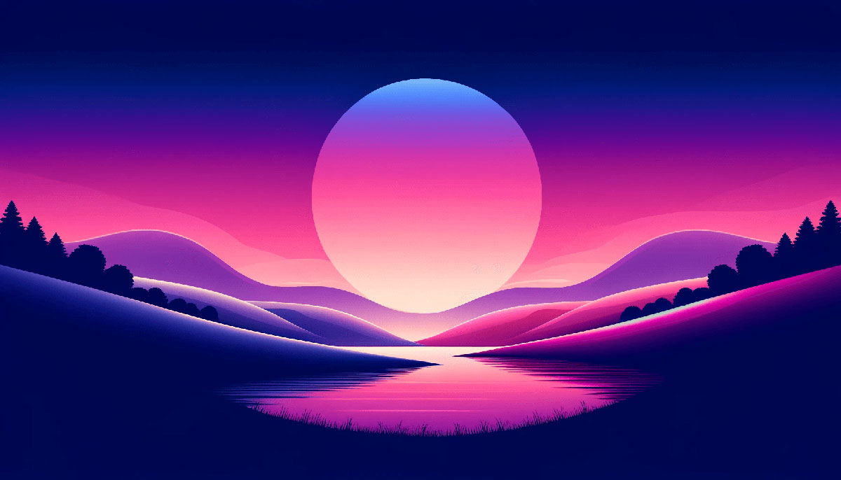
Imagine dipping your brush into a sunset, streaking the sky’s fiery hues across a canvas. That’s the immersive magic of gradient color palettes—a core staple in the visual symphony I orchestrate daily.
In the realm of pixels and vectors, these palettes aren’t mere backdrops; they’re the compelling storytellers of design.
By delving into the gradients’ seamless transitions, you’re unlocking a dimension where color breathes life into digital landscapes.
From subtle whispers of dawn to the bold declarations of the digital art, gradients are your versatile allies in crafting narratives that resonate.
This article is your compass to navigate the vibrant continuum of gradient color palettes.
You’ll emerge with the know-how to wield color theory, apply Web Design trends, and utilize CSS3 techniques with finesse. Journey through the exploration of Material Design norms, Photoshop gradients, and the subtleties of color accessibility.
By the final punctuation mark, you will be the maestro, conducting color with confidence and creativity. Let’s begin this chromatic odyssey.
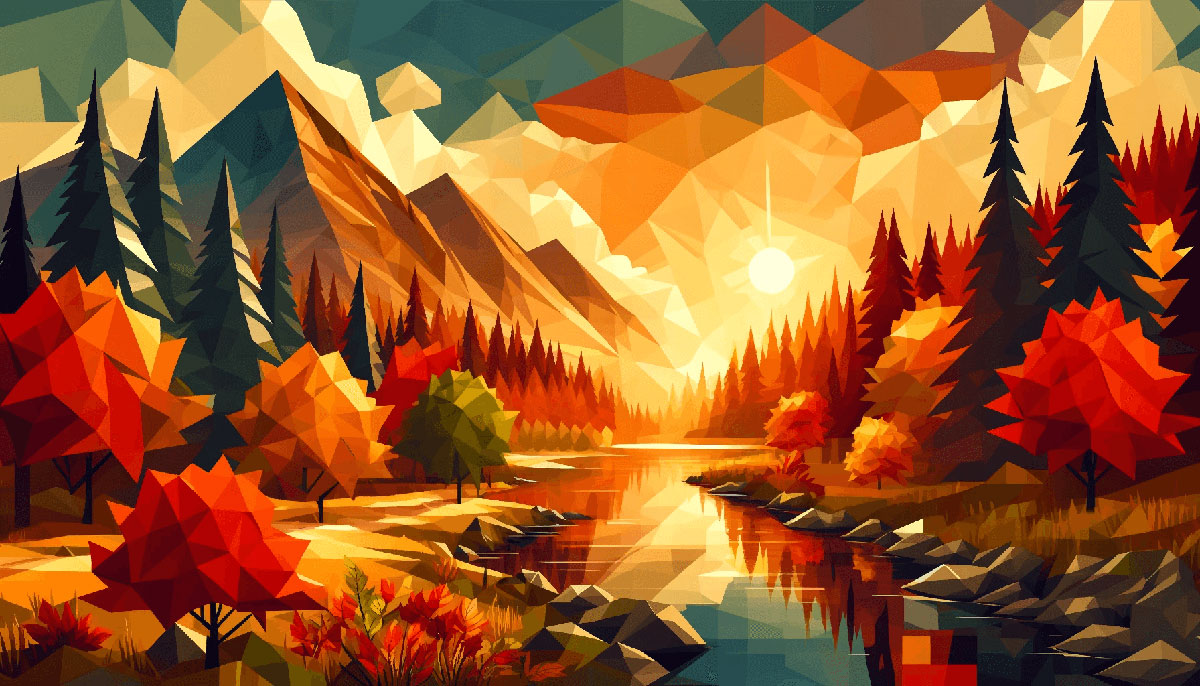
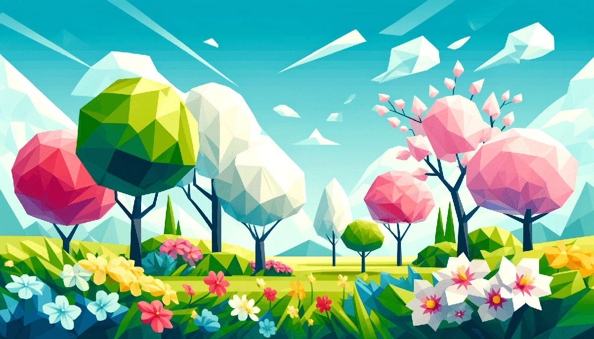
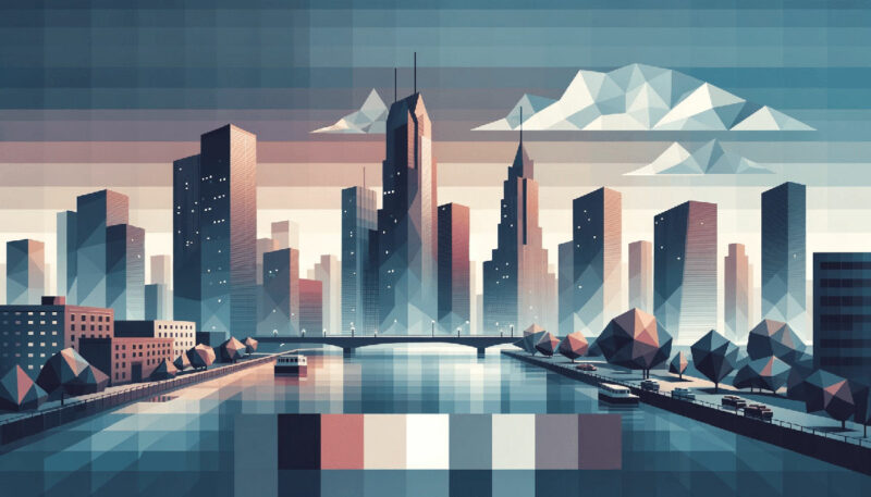
Examples of Gradient Color Palettes
| #FFCDEA | #FB9AD1 | #BC7FCD | #86469C |
| #C5FF95 | #5DEBD7 | #1679AB | #074173 |
| #FDAF7B | #BE7B72 | #824D74 | #401F71 |
| #673F69 | #D74B76 | #FB6D48 | #FFAF45 |
| #FFF2E1 | #EAD8C0 | #D1BB9E | #A79277 |
| #A3FFD6 | #7BC9FF | #8576FF | #1C1678 |
| #C4E4FF | #D895DA | #D6589F | #D20062 |
| #912BBC | #D875C7 | #E9A89B | #FFEBB2 |
| #E2F4C5 | #A8CD9F | #58A399 | #496989 |
| #E3FEF7 | #77B0AA | #135D66 | #003C43 |
| #FF3EA5 | #FF7ED4 | #FFB5DA | #6420AA |
| #5D0E41 | #A0153E | #FF204E | #00224D |
| #F7EEDD | #ACE2E1 | #41C9E2 | #008DDA |
| #DFF5FF | #67C6E3 | #378CE7 | #5356FF |
| #EEE4B1 | #8C6A5D | #5F374B | #430A5D |
| #7469B6 | #AD88C6 | #E1AFD1 | #FFE6E6 |
| #FFFDCB | #FFB38E | #FF8E8F | #E178C5 |
| #F7418F | #FC819E | #FEC7B4 | #FFF3C7 |
| #F4EDCC | #A4CE95 | #6196A6 | #5F5D9C |
| #F1F5A8 | #E5E483 | #D2D180 | #B2B377 |
| #74E291 | #070F2B | #EEA5A6 | #E493B3 |
| #12372A | #FBFADA | #F1FADA | #944E63 |
| #9AD0C2 | #436850 | #F6F5F5 | #ADBC9F |
| #535C91 | #8E7AB5 | #CDFAFB | #D7E4C0 |
| #FFD0EC | #265073 | #474F7A | #B3A398 |
| #9290C3 | #1B1A55 | #59B4C3 | #2D9596 |
| #FFE7E7 | #C6DCBA | #81689D | #EFF396 |
| #0C359E | #FFE3CA | #F6FDC3 | #1F2544 |
| #211C6A | #FFCF96 | #BBC3A4 | #EE99C2 |
| #CAA6A6 | #B784B7 | #FF8080 | #B47B84 |
| #F9F7C9 | #D5F0C1 | #AAD9BB | #80BCBD |
| #E4DEBE | #E6BAA3 | #D24545 | #A94438 |
| #643843 | #85586F | #AC7D88 | #FDF0D1 |
| #DBE7C9 | #789461 | #50623A | #294B29 |
| #96E9C6 | #83C0C1 | #6962AD | #6C22A6 |
| #0F1035 | #365486 | #7FC7D9 | #DCF2F1 |
| #F6B17A | #7077A1 | #424769 | #2D3250 |
| #99BC85 | #BFD8AF | #D4E7C5 | #E1F0DA |
| #176B87 | #86B6F6 | #B4D4FF | #EEF5FF |
| #A87C7C | #7E6363 | #503C3C | #3E3232 |
FAQ on Gradient Color Palettes
What Exactly is a Gradient Color Palette?
A gradient color palette is a range of shifting colors that transition smoothly, creating a dimension of depth. Think of it like a painter’s blending technique but for digital canvases.
It’s a visual hierarchy tool, a favorite in UI/UX Design that can guide a user’s eye effortlessly.
How Do You Create a Gradient Effect in Design Software?
To create a gradient, select the Gradient Tool in software like Adobe Photoshop. You can then choose colors and the style of progression—linear, radial, etc. Adjusting opacity and transparency adds finesse, tailoring the smoothness of your gradient to perfection.
Can Gradients be Used in Print Design?
Absolutely. Gradients add vibrancy in print, just as they do in digital. The key is high-quality printing to ensure these color transitions don’t lose their allure.
Understand that the gradient’s subtleties might differ from screen to paper due to the RGB color model versus CMYK printing processes.
Why are Gradients so Popular in Web and App Design?
Gradients inject life and modernity into Web and App Design. They can set emotional tones and deliver visual hierarchy in the layout.
Their popularity soars because of their dynamism and the unique visual experiences they offer, aligning with evolving Web Design trends.
Do Gradients Affect the User Experience?
When done right, gradients enhance the experience, offering aesthetic color arrangements that are pleasing. They can also focus attention, indicating interactivity, especially in UX design.
But mind the balance; overdoing it can overwhelm or even lead to accessibility issues for visually impaired users.
What’s the Importance of Consistency in Gradients?
Consistency emblazons your work with professionalism. It ensures your gradients align with your brand’s color scheme, crafting a recognizably coherent visual artist‘s narrative across different platforms.
It is almost like creating your own color accessibility standards for every output.
How Do You Choose the Right Colors for a Gradient Palette?
Understanding color theory and aesthetic color arrangements is vital. Begin with your base color and envision the mood you’re aiming for.
Tools like the Adobe Color Wheel can suggest harmonious shades. Remember, the chosen hues should complement each other and align with your design’s purpose.
How Do Gradients Impact Accessibility in Design?
Gradients can be a pitfall if not accessibility-conscious. Consider Color Accessibility: gradients should have sufficient contrast and shouldn’t rely solely on color to convey information.
It’s about inclusivity—ensuring everyone experiences the design’s intended impact, regardless of visual impairments.
What’s the Trend for Gradients in 2023?
The trend for gradients is shifting towards more subtle and complex color blending techniques. Think pastel hues that mimic natural light, offering a sense of serenity and digital wellbeing—perfectly in tune with the current ethos of mindful, intentional design.
How to Optimize Gradients for Faster Website Loading Times?
To ensure your gradients don’t hinder your page load, use CSS3 gradients instead of image files whenever possible.
CSS-based gradients are generated by the browser, which tends to be more efficient than loading images. Plus, they’re scalable and often look sharper across different screen resolutions.
Conclusion
We’ve journeyed through the captivating universe of gradient color palettes, exploring their potency in capturing attention and enriching user engagement. It’s clear—they are more than mere decoration; they are a pillar of modern aesthetics, a driving force in visual storytelling.
What beckons now is application, taking the insights on hues, opacity, and blending colors, and crafting visual experiences that resonate. It’s about striking balance, ensuring functionality and beauty coexist, enhancing without overwhelming. CSS3 gradients, Photoshop wizardry—it’s all at your fingertips.
Expect to see gradients continue their rise, from subtle background gradients in web design trends to bold swatches defining digital marketing. Harness them well, and you’ll see your designs not just seen but felt. Now, with these spectrum shades and color transitions in your arsenal, go forth and paint the digital world with your vision.
Bogdan Sandu, a seasoned designer with 15 years of diverse experience, has been designing websites since 2008.
Renowned for his expertise in logo design and visual branding, Bogdan has developed a multitude of logos for various clients.
His skills extend to creating posters, vector illustrations, business cards, and brochures. Additionally, Bogdan's UI kits were featured on marketplaces like Visual Hierarchy and UI8.
Latest posts by Bogdan Sandu (see all)
- Unique Construction Website Design Examples That Work - 21 May 2024
- The Heineken Logo History, Colors, Font, And Meaning - 20 May 2024
- Graceful Grays: Timeless Gray Color Palettes for Any Project - 20 May 2024