


The Columbia University Logo History, Colors, Font, And Meaning
Imagine unearthing a time capsule, its contents reflecting a storied past yet brimming with modern relevance. The Columbia University logo serves not merely as an emblem but as the silent herald of centuries-old traditions, aspirations, and scholarly pursuits contained within its iconic motif.
Embedded in each line and curve lies a narrative, embodying the institution itself and casting its formidable shadow into the realms of academia and beyond.
A sojourn through this article peels back layers of design, exploring the fusion of educational branding with institutional identity – an identity carved out through the annals of time, safeguarded by trademark registration and enlivened by a palpable sense of pride.
This exploration is not just about a graphic or an academic crest; it’s about the very essence of a historic Ivy League member’s visual identity guidelines, scrutinized and celebrated.
By the final punctuation, one expects to gain an enriched perspective on the intellectual property rights that shape the use and dissemination of Columbia’s heraldry.
The journey navigates through the intricate paths of university branding policies, logo design history, and the trademark licensing agreements that protect and perpetuate its use. Such is the art and strategy behind an icon, and herein lies your map.
The Meaning Behind the Columbia University Logo
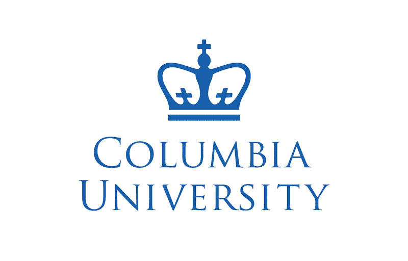
A logo is more than just visual flair; it encapsulates ethos, creed, and history. For Columbia University, the emblem represents a narrative that transcends centuries. Anchored by a crown, reminiscent of the King’s Crown, it pays homage to the university’s inception as King’s College during the reign of George II of Great Britain. This academic crest speaks to the revolutionary path from a regal colony to a bastion of enlightenment.
Symbolism
Each element is meticulously contemplated. The crown reflects not only a historic lineage but also the university’s commitment to intellectual rigor. Beneath the crown, the open book signals the never-ending quest for knowledge—a cornerstone of the educational institution.
Core Values
Interlaced in this imagery are Columbia’s core values: excellence, leadership, and global perspective. In the logo, these values are not explicitly stated but are felt—imbued within the institutional identity itself.
The History of the Columbia University Logo
Delving into the archives, it’s evident how the emblem has maintained its core composition while subtly adapting to the sands of time.
Initially conceived in an era of parchment and quill, the logo has witnessed the digital age dawn without losing its impactful essence that echoes through the walls of this famed Ivy League institution.
Early Beginnings
Tracing back to 1754, the creation of the original seal signaled the institution’s official birth.
Crafted in a period when college seals were the norm, it held symbols of authority and prestige. As time passed, with each subsequent chancellor’s reign, minor tweaks were made to adapt to changing aesthetics and attitudes.
20th Century to Present
Fast forward to the modern era, and digitalization necessitated crisp lines and scalable formats.
The visual identity guidelines became stricter. Despite the evolution, the essence of Columbia’s heraldry remained, fiercely guarded by trademark registration laws to preserve its intellectual property.
The Colors of the Columbia University Logo
Columbia Blue Overview
Columbia Blue, identified as Pantone 290 (PMS 290), is derived from the color of the Philolexian Society, the oldest student group at Columbia, established in 1802.
Note: Color representations on this page may differ across various digital displays and printed outputs may not reflect accurate colors. For official design specifications, refer to the Design System.
For compliance with WCAG AAA Standards:
- Black text or user interface (UI) elements are permissible on Columbia Blue.
- White text or UI elements do not meet WCAG AAA Standards and must not be used.
- The primary Columbia color (PMS 7686) can be used over Columbia Blue for UI components and text in large sizes only.
- For detailed WCAG AAA Compliance guidelines related to Columbia Blue, please consult the compliance chart below.

PMS 290C Specifications
- RGB: 185, 217, 235
- CMYK: 20, 0, 0, 0
- HEX: #B9D9EB
WCAG AAA Compliance for Columbia Blue
- Black Text and UI Components: Compliant
- Primary Blue Text and UI Components: Partial compliance
- White Text and UI Components: Non-compliant
Primary Color Details
Columbia’s trademark can also be presented in an approved deep blue. For any deviations, approval must be obtained from Columbia Creative.
WCAG AAA Standards compliance:
- White text or UI elements are compliant over the primary color.
- Black text or UI elements are non-compliant and should never be used over this color.
- Columbia Blue (PMS 290) can be overlaid on the primary color for large text and UI components only.
- See the detailed WCAG AAA Compliance chart for more information.

PMS 7686C Specifications
- RGB: 29, 79, 145
- CMYK: 100, 73, 0, 10
- HEX: #1D4F91
WCAG AAA Compliance for the Primary Color
- Black Text and UI Components: Non-compliant
- Columbia Blue Text and UI Components: Partial compliance
- White Text and UI Components: Compliant
The Font Used in the Columbia University Logo
The trademark of Columbia University is crafted with the official university typeface, Trajan Pro, featuring meticulous adjustments to size, weight, and the spacing between characters.
Garamond Pro serves as the university’s secondary typeface, mainly utilized for body text. In certain instances, Garamond Pro is also employed for headlines or display text, especially by schools or colleges that prioritize Garamond Pro as their main typeface.
Proxima Nova is designated as the official sans serif typeface for the university, predominantly used on the web. It is suitable for both body text and display elements like headers.
Usage Guidelines and Restrictions
In the realm of higher education and its emblems, the rules are more akin to law than mere suggestion. Logo usage permissions are clear-cut, leaving no space for ambiguity. Guidelines outline the dos and don’ts—disarming potential misuse that could dilute the essence of the university’s branding.
Brand Consistency
With an ironclad grip on consistency, the guidelines are drafted to ensure uniform representation across all platforms. This conformity serves a dual purpose: avoiding potential dilution of brand identity and ensuring that the logo upholds the institution’s caliber.
Legal Boundaries
A clandestine dance with intellectual property law, using the logo necessitates navigating an intricate matrix of rules; unapproved utilization invites not just a tarnished reputation but potential legal consequences.
The Logo’s Impact on Brand Identity
To understand a logo’s impact is to perceive its pulsating influence on identity perception. The Columbia logo, a totem in its own right, exemplifies this—a beacon guiding the collective memory of its stakeholders.
Perception and Recognition
Visual identifiers craft an institution’s public face—an armor of sorts adorned in the throes of societal recognition. It is both shield and standard, representing the university’s philosophy and acting as a portal to its storied halls.
Intrinsic Value
Though seemingly indestructible, a logo’s power is fragile, sustained only by the narrative it projects and the respect it garners. Its value is not just imbued but nurtured through brand management and graphic standards manual adherence.
The Emotional Connection Elicited by the Logo
Plunge into the sea of emotion, and one finds that logos, ostensibly simple hieroglyphs, are actually complex vessels carrying personal and collective sentiment.
Alumni Affiliation
Touching upon the alumni’s affinity for their alma mater, the logo becomes an emblem of their personal journey, a badge worn not just on apparel but etched within their professional and personal narratives.
Prospective Student Aspirations
For the aspirants, the logo is a lighthouse, guiding them to the shores of the future, radiating promise and the potential of becoming part of an elite legacy. It’s a symbol that calls to the future leaders, thinkers, and changemakers.
FAQ On The Columbia University Logo
What is the symbolism behind the Columbia University logo?
The crest is rich in meaning; it’s crowned with a distinct three-crown symbol representing the King’s Crown, harking back to the institution’s roots as King’s College.
It embodies tradition, scholarly achievements, and Ivy League prestige. The logo’s heraldry and design elements speak volumes of its educated lineage and branding.
How has the Columbia University logo evolved over the years?
Initiated with classical motifs, the logo has adapted while maintaining educational branding integrity.
Visual identity guidelines have steered its evolution, ensuring that through each iteration, from intricate to more minimalist forms, the essence of Columbia’s heraldry is retained, always respecting the trademark registration guidelines.
Are there specific color requirements for the Columbia University logo?
Brand equity in higher education hinges on consistency; Columbia blue and white are the prescribed colors.
These serve more than aesthetic purposes—they are an integral part of Columbia University’s identity, governed by strict graphic standards manual to preserve the university branding policies.
Can I use the Columbia University logo for personal projects?
Usage falls under tight stipulations due to intellectual property rights. Logo usage permissions are necessary; without them, personal projects risk infringement on Columbia University’s trademark.
Licensing agreements carefully protect the use and suggest contacting the university’s branding office for clarity.
How can alumni use the Columbia University logo?
Alumni wield the university insignia with pride. Yet, they must observe guidelines laid out by Columbia’s licensing and trademarks policies.
Merchandise for non-commercial, alumni-driven events often gains sanctioning, yet university communication strategy dictates that all such uses must confer with institution watermark standards.
What are the legal restrictions on the Columbia University logo?
The logo is protected rigorously as a registered trademark. Reproduction, modification, or use in any marketing materials without express permission from Columbia violates intellectual property rights.
Misuse may prompt legal action. Always reference branding consistency and university licensing agreements.
What is the importance of the Columbia University logo as a part of its branding?
In the echelons of higher education, an effective logo transcends simple graphic design to become the linchpin of an institution’s identity.
Columbia’s emblem carries weight that signifies excellence and recognition, functioning as a cornerstone in its comprehensive brand communication strategy.
Where can I find the official Columbia University logo for use in a publication?
For official use, Columbia University press kit and communication channels offer access to the authentic logo, adhering to the visual identity guidelines. It’s imperative to source the logo from these official repositories to ensure branding consistency and legal use.
Can I alter the Columbia University logo when using it?
Alterations are a clear breach of Columbia University’s graphic standards manual. Visual identity guidelines prohibit changes as the logo’s higher education graphic design is to be maintained with integrity.
Always use the university logo vector as intended, unmodified to uphold the branded watermark.
What is the process for requesting permission to use the Columbia University logo?
Begin with the University’s Trademark Licensing office. A formal request detailing the use case, scope, and intended distribution for the university insignia will trigger a review process against trademark registration criteria.
Only upon approval can one proceed in alignment with Columbia’s heraldry.
Conclusion
Unraveling the intricate tapestry woven by the Columbia University logo has been an expedition into the very soul of visual storytelling.
The crown’s trio stands not alone but as sentinels guarding a rich narrative steeped in Ivy League heritage. It’s a tale spun from fibers of legacy, fused meticulously into the fabric of academic branding.
As our gaze shifts beyond the emblem’s aesthetic, the profound realization dawns; this is more than a symbol—it is a beacon. A beacon that guides countless individuals through their educational journey, evoking pride and tradition.
In conclusion, the logo stands as testament to an unspoken dialogue between the past and the present, its silent contours yielding a voice both powerful and immutable.
To hold the logo is to hold history itself—a piece of Columbia’s heraldry, a touchstone of intellectual property guarded with reverence, and a companion to the next generation leaving their mark on the world.
Bogdan Sandu, a seasoned designer with 15 years of diverse experience, has been designing websites since 2008.
Renowned for his expertise in logo design and visual branding, Bogdan has developed a multitude of logos for various clients.
His skills extend to creating posters, vector illustrations, business cards, and brochures. Additionally, Bogdan's UI kits were featured on marketplaces like Visual Hierarchy and UI8.
Latest posts by Bogdan Sandu (see all)
- Enhancing User Experience: Top Address Autocomplete APIs - 21 May 2024
- Crisp White Color Palettes for Clean Designs - 21 May 2024
- Unique Construction Website Design Examples That Work - 21 May 2024