Fiocchi and Esfahani tested 44 in-market and de-branded assets from the UK automotive category for a 2024 study in the Journal of Brand Management. The logo came out as the most uniquely ownable asset type.
Fonts and slogans scored low on uniqueness, and so did colors. The authors say creative execution and consistent usage are what turn a shared asset into an owned one, which is a fair summary of what visual identity work comes down to.
The term covers the one logo, color palette, typeface family and image style a company applies everywhere it shows up, so people recognize it at a glance. Designers build the system. Marketers apply it across shelves and screens, and brand guidelines record the rules.
What Is Visual Identity?

A customer runs into it on packaging and in a site header, then again on an invoice and a social avatar. The assets vary from channel to channel, but the same system sits behind all of them.
Put plainly, visual identity is the set of visual brand assets that makes a brand recognizable at a glance, through the same logo, colors, typography and imagery at every touchpoint.
It isn’t a logo on its own, and it isn’t a campaign look that changes every quarter. It also isn’t the whole brand, which takes in voice, values and positioning too.
What visual identity does for a brand
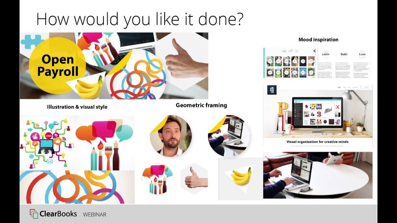
Lucidpress (now Marq) found in its 2019 State of Brand Consistency report that surveyed brand managers expected 33% revenue growth from consistent branding. The 2021 edition frames the gain as 10 to 20%.
Both numbers are self-reported estimates, not measured revenue. They tell you what practitioners believe and prove nothing about cause.
The mechanism is simple enough. Recognition builds through repetition. When the same mark, color and typeface show up across channels, a customer identifies the brand without reading the name.
Separation matters too. A palette and type choice that matches every competitor in the category sends no signal at all.
How Does Visual Identity Differ From Brand Identity and Brand Guidelines?

Brand guidelines are the document that records the rules, and visual identity is the visible layer of brand identity.
Strategy sits at the start. It covers purpose and audience first, then positioning. Brand identity is the full expression of the brand, voice, values and personality included. Visual identity is only how that expression looks, and the guidelines write down how to apply all of it.
Brand identity design work follows that same order, from strategy to visual system to documentation. The visuals exist to express the strategy, so skip it and the result is a polished look with nothing behind it.
A logo is one asset inside the system. Redrawing it while the palette and type stay untouched, imagery included, changes one part and leaves the rest as it was.
Documented brand guidelines also cover non-visual rules such as tone of voice and naming, which is why the visual section is only one chapter of the document.
A quick test helps here. If the complaint is “it does not look like us,” that’s a visual identity problem. “It does not sound like us” points at the wider brand identity.
Which Elements Make Up a Visual Identity?

Logo and color do most of the recognition work, with typography close behind. Imagery and graphic elements extend the system to places where a logo is too small or too formal to appear, and icons do the same job.
On paper the parts are these.
- The primary logo mark and its variations
- A color palette with primary and secondary colors plus neutrals, each with a fixed code
- One or two typefaces with set weights and sizes
- A photography and illustration style, including cropping and treatment
- Patterns, shapes, lines and textures
- One consistent icon set for interfaces and print
Early decisions about typography reach furthest, because type shows up on every page, including the ones with no logo.
Some identities add motion rules on top, or a defined image treatment and illustration style.
Visual identity examples that stay recognizable
The Coca-Cola Company dates its script to 1886, when bookkeeper Frank M. Robinson wrote the name in Spencerian script and his colleagues adopted it by unanimous consent.
Paul Rand’s 8-bar logo for IBM has stayed unchanged since 1972, though IBM’s own history page notes that color, imagery and context have shifted around it over time.
In both cases one distinctive asset stays put while everything around it moves.
Logo System: Variations, Clear Space, Minimum Size and File Formats

A logo turns into a system once the variations, clear space, minimum size and approved file formats are written down.
A full set of variations usually has a primary lockup, horizontal and stacked versions, a stand-alone wordmark or lettermark, a square icon for favicons and avatars, and one-color and reversed versions for dark backgrounds.
Clear space is the empty margin around the mark, and it’s usually defined as a multiple of one of the logo’s own elements so the rule scales with size.
Minimum size gets set separately for print, in millimetres, and for screen, in pixels, at the point where fine detail starts to disappear.
A logo with thin lines or small text often breaks at favicon size. That’s the reason most systems carry a simplified icon version.
Google Search Central’s favicon guidance asks for a square 1:1 image of at least 8 by 8 pixels and recommends going larger than 48 by 48. Earlier wording required multiples of 48 pixels, so older logo packages may still follow that size.
For file formats, SVG works as the vector master for web, PNG gives a transparent raster for screens, and PDF or EPS cover vector files for print.
Build the master in Adobe Illustrator, because vector graphics redraw cleanly at any size while raster files blur when enlarged.
How to Specify and Test Brand Colors
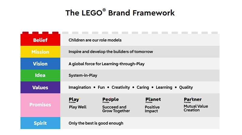
Each brand color needs a code for every medium it appears in. HEX and RGB cover screens, CMYK covers process print, and a Pantone number handles spot color.
| System | Example format | Used for | Main limit |
|---|---|---|---|
| HEX | #RRGGBB | Web and UI code | Screen only |
| RGB | 0-255 per channel | Screens, presentations | Shifts when converted to print |
| CMYK | 0-100% per ink | Process print | Narrower range than RGB |
| Pantone | PMS 2718 C | Spot color, packaging, signage | Needs spot ink on press |
Most palettes assign roles, usually one or two primary colors with a few secondary accents, and neutrals for text and backgrounds. Adobe Color helps build and compare combinations before anything is locked.
Color-meaning tables (blue for trust, red for energy) work as starting hypotheses. Treat them that way, because meaning shifts with industry and culture.
Color codes for screen and print
Document every brand color in all four systems, because no single code travels across media.
IBM’s brand history identifies its core blue as Pantone PMS 2718C, which gives a printer a fixed target instead of a screen value to interpret.
The Pantone Formula Guide covers 2,390 spot colors on coated and uncoated stock, according to Pantone’s product listing, so a chosen number can be checked against a physical chip.
Adobe support replies explain that RGB covers a much wider range of colors than CMYK, which is why saturated screen blues and greens dull when converted for print.
Pick a primary color that survives that conversion. A neon-bright screen green that turns muddy on paper looks inconsistent on every printed touchpoint.
Checking contrast against WCAG 2.2
WCAG 2.2 success criterion 1.4.3 requires a contrast ratio of at least 4.5:1 for normal text and 3:1 for large text (18pt, or 14pt bold), according to the W3C.
Criterion 1.4.11 adds 3:1 for interface components and for graphics needed to understand content.
Text that is part of a logo or brand name is exempt from the text rule. The W3C does flag one problem case, which is a logo that doubles as a link or button.
Test each brand color on white and on black, then white and black text on each brand color, and finally the secondary accents on the neutral background.
Light yellows and pastels rarely pass as text on white, so they work as fills and not as type. Record the passing pairings in the style guide so designers stop guessing.
Choosing and Pairing Brand Typefaces
Two typefaces is the ceiling. A primary face handles headlines and brand moments, and a secondary face takes body text and small sizes. Add a system fallback for email and documents, where custom fonts often fail to load.
When pairing fonts, contrast does the work. Serif with sans-serif works, and so does geometric with humanist. Two faces that are merely similar look like a mistake, not a choice.
Stick to two families and three weights, and keep the same heading order on web, print and slides. Set the scale once, as a base size and a constant ratio, then give each level a name designers can reuse.
Font licensing decides where a typeface can legally appear, whether that’s a logo, a website, an app or print.
According to the Google Fonts FAQ, every family is open source and free for commercial use, logos included. Most ship under the SIL Open Font License, which bars selling the font files on their own.
Adobe Fonts comes with Creative Cloud and is licensed for personal and commercial work. A logo set in an Adobe font can be registered as a trademark, but the typeface design itself cannot, per Adobe’s font licensing FAQ (updated March 2026).
Helvetica is a commercial typeface and needs a purchased license. Max Miedinger and Eduard Hoffmann designed it as a neutral sans-serif, first released in 1957 as Neue Haas Grotesk and renamed Helvetica in 1960. Swissinfo reports that Migros and the Swiss Federal Railways were among the companies that adopted it for corporate identity in the 1970s.
Neutral faces like Helvetica are safe and forgettable. Pair one with a distinctive logo, because the type alone will not carry recognition.
What Does a Brand Style Guide Contain?

Every part of the visual identity gets its own rules, written so a designer or outside vendor can follow them without asking questions.
- Logo rules and misuse examples
- Color codes and approved pairings
- Typography and type scale
- Imagery direction
- Graphic elements and icons
- Application examples (site, social, print)
A brand style guide fails when it sits in a folder nobody opens. Put it where designers already work, and name one person who owns updates.
The NASA Graphics Standards Manual by Richard Danne and Bruce Blackburn is the best-known early example, covering everything from color swatches and uniform patches to vans and spacecraft.
Sources disagree on its date. The reissue campaign calls it the 1975 manual, while Space.com says it was first published in January 1976.
NASA rescinded the logo the manual defined in 1992 and returned to its older insignia.
Where brand assets are stored and shared
- Frontify offers brand portals that replace static PDFs with editable guidelines, according to Frontify
- Brandfolder is a digital asset management platform that keeps guidelines beside the asset files
- Figma libraries hold shared styles and components for design teams
- Canva Brand Kit puts logos, colors and fonts in one place for non-designers
Setting up a brand kit in Canva takes little time, and Brand Controls can then limit team members to approved colors and fonts, per Canva’s Help Center.
Figma’s Help Center lists library publishing as available on all paid plans. A Noble Desktop tutorial written for 2023 updates describes publishing styles on the free Starter plan, so check the current plan page before committing.
How to Build a Visual Identity Step by Step
The order below is fixed, and jumping ahead tends to cost more later.
- Start with strategy, meaning audience, competitors, positioning and personality.
- Set a direction by collecting references, picking keywords and narrowing to two or three style routes.
- Design the logo. Sketch, present concepts, refine one, then build the vector master.
- Build the system around it, covering colors, typefaces, imagery, graphic elements and icons.
- Test everything on real assets, such as a site header, social avatar, invoice and package mockup, including one-color and minimum-size versions.
- Document it and hand over the style guide, asset library and templates.
Brand positioning work belongs in step one because it decides what the look has to say. Without it, every style route is a guess. See how brand positioning is defined before briefing a designer.
A mood board keeps stakeholders choosing between directions, not arguing over finished logos.
If the brand already owns a strong mark, start at step four.
Step five gets skipped most often. It is also the only step that shows whether the system survives a one-color header or a tiny avatar.
DIY, Freelancer or Agency: What Each Route Costs
A freelancer or marketplace package covers most small-business needs. An agency pays off when one identity has to run across many products and markets, or many teams.
| Route | Cost signal | Strength | Main risk |
|---|---|---|---|
| DIY | Tool fees, free fonts | Fast, full control | No outside test of distinctiveness |
| Freelancer or marketplace | Hundreds of dollars | Fixed scope, quick turnaround | Thin strategy work |
| Agency | Tens of thousands | Strategy, system, rollout | Cost and timeline |
The DIY route usually means a design tool subscription such as Canva Pro, plus free typefaces from Google Fonts.
designs’ US pricing lists a logo from $299, a logo with a brand guide from $429 and a logo and brand identity pack from $599.
Clutch’s Branding Pricing Guide 2026 (updated April 1, 2026) puts most reviewed branding projects at $10,000 to $49,999, with agency rates averaging $100 to $149 an hour. Those projects include strategy and messaging, so a visual identity alone can cost less.
Agency work does not always mean a bigger change. Pentagram’s 2016 Mastercard identity, the first update to the mark in about 20 years according to Creative Review, kept the red and yellow circles and simplified everything around them.
Extra revision rounds and commercial font licenses are the usual late costs, plus any file formats missing from the delivery package.
Buy the smallest scope that produces a logo system, color and type specifications and a style guide. Add strategy work only when positioning is still unsettled.
When a Visual Identity Fails
Visual identities fail when they change for no reason customers can see, or when nothing strategic sits behind them. A system frozen so hard that it cannot adapt fails too.
Change for its own sake costs loyal customers the cues they used to find the product. A look with no strategy behind it is polished and says nothing. Trend-led design dates quickly and ends up looking like every competitor. And a pre-launch business with no validated audience needs a logo and two colors, not a full system.
Documented rebranding failures share one trait, and it is that the new look arrived with no reason customers could see.
Advertising Age, citing Information Resources data, reported in 2009 that Tropicana Pure Premium unit sales fell 20% between January 1 and February 22 after a packaging redesign. Tropicana announced on February 23 that it would scrap the new packaging.
Gap put a new logo on its website in October 2010 and was back to its original blue box by October 12, CNNMoney reported. Gap also conceded that crowdsourcing the fix was not the right move.
Sources disagree on whether Airbnb’s 2014 Belo logo failed at all.
Dezeen reported in July 2014 that designers flagged a close resemblance to Automation Anywhere’s logo, and that company said it was moving to a new design. On the other side, Airbnb’s head of art described the public response as a pleasant surprise (Creative Review, 2014), and Creative Review’s 2024 retrospective says the logo now carries a reassuring familiarity.
Either way, a mark that resembles another brand is a reputational risk, and launch reaction is not the same as long-term recognition.
Visual Identity FAQ
Can a visual identity be trademarked?
Partly. A logo can be registered as a trademark, but the typeface design inside it cannot, according to Adobe’s font licensing FAQ.
Protection for colors, packaging or overall look depends on the jurisdiction, so confirm the scope with a trademark attorney.
What is the difference between a brand kit and a brand book?
A brand kit holds the ready-to-use assets, meaning logo files, color codes and fonts.
A brand book, meaning the full brand style guide, adds the usage rules, examples and voice guidance that explain how those assets are applied.
How is a visual identity refresh different from a rebrand?
A refresh updates surface elements such as the mark, palette or typeface and leaves the positioning alone. A rebrand goes deeper, since the strategy changes and the whole system gets rebuilt.
Existing recognition worth keeping points to a refresh. If the business itself has changed, that’s when a rebrand makes sense.
Do I need a mood board before designing a logo?
No. A mood board is optional, but it’s the cheapest way to agree on a direction before anyone draws a mark.
Skip it when the brand already owns a strong logo and only the system around it needs work.
When a Visual Identity Needs a Refresh
A refresh is due when an audit shows that one brand asset no longer works in a channel the company now uses. A design that merely feels dated is not the trigger.
Empathy Lab’s August 2026 write-up of a talk with researcher Jenni Romaniuk names the same test, which is fitness for new media and sales settings, not boredom.
Measure each asset’s recognition with category buyers, then replace only the asset that fails and hold the rest fixed.
Measurement comes first because an asset must earn fame and uniqueness before variation is safe, per the same write-up.
The trade-off is slower visible change, since a fixed system gives up novelty for brand recognition.
This position was verified on September 30, 2026. A measured drop in an asset’s recognition, or a channel the current logo system cannot render, would change it.
When a test fails, the questions to settle before rebranding are the next decision.

Renowned for his expertise in logo design and visual branding, Bogdan has developed a multitude of logos for various clients.
His skills extend to creating posters, vector illustrations, business cards, and brochures. Additionally, Bogdan's UI kits were featured on marketplaces like Visual Hierarchy and UI8.
He also wrote in the past years on sites like Design Your Way, WebDesignerDepot, WPDean, Designmodo, Speckyboy, Slider Revolution, and more.
- The Windsurf Logo History, Colors, Font, And Meaning - 10 October 2026
- How to Remove Background From Product Photos (No Photoshop) - 10 October 2026
- How Designers can Build a Stronger Online Creative Identity - 9 October 2026

Bogdan Sandu is a seasoned designer who has been designing websites since 2008. Renowned for his expertise in logo design and visual branding, Bogdan has developed a multitude of logos for various clients. His skills extend to creating posters, vector illustrations, business cards, and brochures. Additionally, Bogdan's UI kits were featured on marketplaces like Visual Hierarchy and UI8. He also wrote in the past years on sites like Design Your Way, WebDesignerDepot, WPDean, Designmodo, Speckyboy, Slider Revolution, and more.
You Might Also Like