

The Costco Logo History, Colors, Font, And Meaning
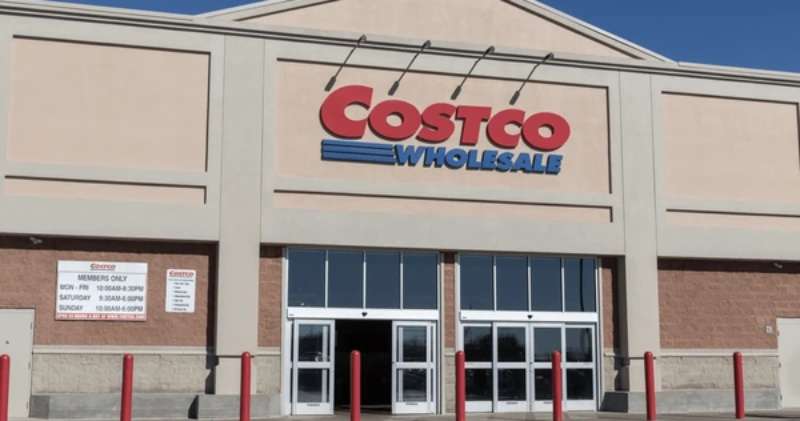
Imagine strolling through the colossal aisles of a Costco warehouse, each corner echoing with the buzz of bargain hunters and bulk buyers.
Your eyes catch a glimpse—almost like a beacon—of the Costco Logo: a name synonymous not just with value, but with an entire philosophy of retail.
Here stands not merely a design, but a symbol that cradles a saga of wholesale branding excellence and membership loyalty.
This emblem—revered as the flag under which millions of shoppers rally—encapsulates a narrative of trust, reliability, and a promise of quality stretching back over decades.
In this piece, delve into the essence of this famous visual identity. From the in-store branding that guides you to your next great find, to the corporate logo that promises consistency and value—and how this retail chain insignia reflects a vast empire standing firm on the pillars of customer satisfaction and market savvy.
By the end of this journey, the brushstrokes of the Costco visual saga shall be vivid on the canvas of your understanding.
The Meaning Behind the Costco Logo
The Symbolism
Have you ever just stared at the Costco logo? Like really look at it? And then wondered, “Hey, what’s this all about?” There’s more to it than meets the eye.
Most logos aren’t just created for the looks, ya know. There’s usually some deep stuff happening. So, let’s dive into that deep end!
The logo, first and foremost, speaks of trustworthiness and reliability. It’s straightforward, not trying to confuse anyone. That’s because Costco wants you to know that when you walk through their doors, there are no hidden tricks.
Brand Recognition
Another biggie. Their logo’s clean design and distinct lettering mean you recognize it immediately, whether it’s on a giant store sign or a tiny receipt.
It’s all about creating that solid memory connection. Every time you spot that logo, your brain goes, “Oh hey, it’s that place with bulk buys and free samples!”
The History of the Costco Logo
Origins
Time travel with me. Way back. When leg warmers were a thing and the first whispers of a warehouse retail store named Costco began.
Their logo has always had a certain vibe to it. It’s matured over the years, kinda like fine wine or that aged cheese they sometimes have on special.
Evolution and Changes
Like everything, there have been tweaks here and there. The logo has seen some shifts in design elements but has always stayed true to its roots. This consistency tells a story of a brand that knows itself and its audience.
The Colors of the Costco Logo
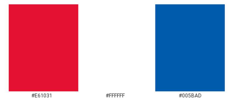
Bold Red
Alright, so here’s a pop quiz. Think of something fast. Got it? Was it… fiery? Passionate?
That’s the thing about red. It’s dynamic. It grabs attention. And that’s why the Costco logo is rooted in this color. It’s bold. It’s inviting. And it screams, “Deals ahead!”
Classic White
The logo’s lettering stands out in pure, crisp white. Why? Simplicity. It ensures clarity and readability.
Plus, white conveys purity and honesty. It’s like Costco saying, “We’re transparent. What you see is what you get.”
Vibrant Blue
Alongside the dominant red, the Costco logo incorporates a touch of vibrant blue. But why blue? It’s simple: trust and reliability. Blue evokes feelings of security and confidence. It’s the color of the sky and the sea, representing depth and stability.
In the context of Costco’s logo, blue balances the passion of red with a calm, reassuring presence. It’s like Costco is saying, “Not only do we have exciting deals, but you can also trust us.” Blue ensures that the message of the brand is not just about excitement and transparency, but also about dependability and trustworthiness.
The Font Used in the Costco Logo
Timeless Typography
Ever noticed the lettering? It’s not too fancy, not too plain. It strikes that perfect balance. There’s a classic feel to it, suggesting longevity and consistency.
Visibility and Legibility
Let’s be real. No one wants to squint at a logo trying to make out the name. Costco nailed it with a font that’s clear, legible, and easily recognizable from a distance. It’s no-nonsense, just like shopping there.
The Logo’s Global Impact
A Worldwide Presence
From North America to Asia, that iconic logo pops up, signaling a universal shopping experience. Even if you don’t speak the language, that logo communicates everything you need to know about Costco.
Cultural Adaptations
In different regions, there might be slight adjustments or cultural nuances. Yet, the core logo remains consistent. This showcases Costco’s ability to adapt while maintaining its foundational identity.
Adaptations Over Different Media
From Storefronts to Screens
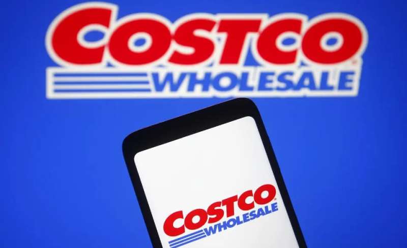
Whether you’re cruising the aisles in person or scrolling through their website, the logo remains consistent. It’s a beacon for shoppers, assuring them of the quality and value they’ve come to expect.
Merchandise and Branding
Ever rocked a Costco tee? Or spotted that logo on their in-house products? It’s more than just branding. It’s a seal of approval, a badge of trust. It whispers, “This is a product we stand behind.”
FAQ On The Costco Logo
Who designed the Costco logo?
Arthurian legends might speak of Excalibur, but in the realm of bulk buying, a designer wove magic into the Costco emblem.
That craftsman’s identity? Shrouded in corporate secrecy. What’s public is the ethos it reflects – an unfaltering visual identity that has stormed the retail industry.
When was the Costco logo created?
The dawn of Costco’s logo dates back to the era of VHS and big hair—the 1980s. It signals the birth of a business model representation; an icon in the retail merchandising narrative unchanged in spirit since its inception, steadfast as the warehouse club savings it promises.
Has the Costco logo ever changed?
Like mountains over millennia, subtle shifts have occurred. A tweak here, a nip there; the Costco logo has experienced slight refinements to keep in step with contemporary design, maintaining its brand recognition without betraying its price club aesthetic.
What do the colors in the Costco logo represent?
Red for passion, energy, and a zeal for deals. Blue signifies trustworthiness, a deep reflection of Costco’s branding strategy that whispers promises of value perception.
Together, they blend on Costco’s shield, heralding an uncompromising march towards customer satisfaction and market dominance.
Why does Costco use its current logo?
The logo, as Spartans their shield, upholds the company’s values—constancy in quality and supremacy in price. It’s the corporate identity—a visual chant that unites the aisles of every Costco warehouse like silent sentries of the brand’s company logo history.
What is the significance of the Costco logo for the brand?
An institution. A vow. The Costco logo is the flag under which a legion of members unite, evoking brand loyalty.
Its significance? As profound as that first exclusive member handshake, it’s the sigil of the membership-only warehouse, a beacon for branding strategy aficionados.
How does Costco’s logo influence customer perception?
It’s the siren song that beckons the seekers of wholesale treasures. The logo stands as a testament to Costco’s pledge—a ripple in the cognitive waters of customer loyalty, influencing perceptions of quality packed within each wholesale branding experience.
Is the Costco logo trademarked?
As fiercely as dragons guard gold, Costco’s logo is trademarked. A legal fortress envelops its symbols and fonts, mitigating the chaos of imposters and ensuring the retail chain insignia remains untarnished in the vast retail merchandising landscape.
Can individuals or businesses use the Costco logo?
Venture not into these waters without permission. Use of the Costco logo by others is akin to sailing a merchant vessel bearing another’s flag—prohibited without explicit consent, taken seriously by the watchful eyes that oversee brand identity and company trademarks.
How important is Costco’s logo in its marketing and advertising?
In Costco’s arsenal, the logo is Excalibur. It slices through the cacophony of marketing noise, standing as an unyielding pillar of visual marketing excellence.
It’s not just important—it’s essential, design of Costco mark underscoring campaigns and in-store branding.
Conclusion
Etched deeply in the marketplace’s collective retina, the Costco Logo stands as a monolith of wholesale magnificence. Much like the final stroke of a master painter’s brush, it crowns an empire built upon endless aisles of opportunity and savings.
- The beacon that is the red and blue insignia guides shoppers to a treasure trove of value.
- It whispers a story of bulk purchase supermarket lore,
- A tale of membership-only warehouse camaraderie.
Embracing what has culminated between bold headings and finer details, this logo encapsulates the spirit of an ethos synonymous with both quality and customer loyalty. It’s not merely ink and hues on a storefront or a flyer; it’s a visual contract of consistency—a designer’s ode to the art of selling a promise through a symbol.
In the serenade of graphic storytelling, Costco’s logo sings the loudest, bearing the standard of a visual identity carved through time—a legacy of wholesale branding, unfaded.
If you liked this article about the Costco logo, you should check out this article about the 7-Eleven logo.
There are also similar articles discussing the Albertsons logo, the Aldi logo, the Carrefour logo, and the Circle K logo.
And let’s not forget about articles on the Giant logo, the QuikTrip logo, the Safeway logo, and the Sainsbury’s logo.
Bogdan Sandu, a seasoned designer with 15 years of diverse experience, has been designing websites since 2008.
Renowned for his expertise in logo design and visual branding, Bogdan has developed a multitude of logos for various clients.
His skills extend to creating posters, vector illustrations, business cards, and brochures. Additionally, Bogdan's UI kits were featured on marketplaces like Visual Hierarchy and UI8.
Latest posts by Bogdan Sandu (see all)
- Examples of Great Gym Websites to Inspire You - 30 April 2024
- The Activision Blizzard Logo History, Colors, Font, And Meaning - 29 April 2024
- Rainbow Color Palettes for Joyful Designs - 29 April 2024