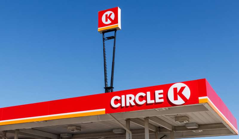
The Circle K logo is one of the most recognized marks in convenience retail, built around a bold red diamond enclosing a white “CK” letterform. It represents a global chain with thousands of locations across North America, Europe, and Asia. The logo has gone through several updates since the brand’s founding, but the core geometric shape has stayed remarkably consistent. Few convenience store brands carry this level of visual recognition at roadside.
In terms of what a logo is meant to do, Circle K’s mark does it well. It identifies instantly, scales cleanly across signage and digital formats, and communicates something specific about the brand’s positioning: direct, bold, accessible.
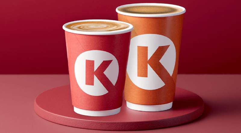
What Is the Circle K Logo?
The Circle K logo is a combination mark featuring a red diamond shape with the letters “CK” in white. Introduced in its modern form in 1951 and refined through subsequent decades, the mark is associated with Alimentation Couche-Tard’s global convenience and fuel retail network. The diamond acts as both a container and a symbol of stability in roadside branding.
- Design Type: Combination mark (geometric symbol + letterform)
- Primary Elements: Red diamond enclosing white “CK” initials
- Official Introduction Date: 1951 (founding); current global version standardized post-2003 Couche-Tard acquisition
- Designer/Agency: Original design attributed to founders; modern brand standardization handled internally by Alimentation Couche-Tard’s brand team
- Trademark Status: Registered trademark, held by Circle K Stores Inc., a subsidiary of Alimentation Couche-Tard
- Color Palette: Circle K Red (#E3262A), White (#FFFFFF)
- Usage Context: Store signage, fuel canopy branding, packaging, mobile app, uniforms, marketing materials, digital platforms
How Has the Circle K Logo Evolved Over Time?
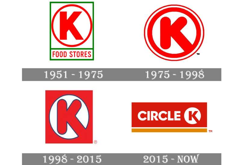
The Circle K logo started as a simple regional mark in 1951 and grew into a globally standardized identity after Alimentation Couche-Tard acquired the brand in 2003. Each version has kept the diamond shape, though colors, proportions, and typography have shifted with each decade.
Original Circle K Logo (1951-1970s)
- Years Active: 1951-1970s
- Design Description: Simple circular or diamond-adjacent mark with “Circle K” text; early versions less refined than today
- Color Scheme: Red and white
- Designer: Fred Hervey and co-founders
- Context: Founded in El Paso, Texas. The brand started as a small grocery store chain and needed a mark that worked on simple roadside signage
- Key Changes from Previous: First iteration; established the CK letterform concept
- Cultural Significance: Represented the rise of the American convenience store format in postwar suburban expansion
Circle K Logo Expansion Era (1970s-1990s)
- Years Active: 1970s-1990s
- Design Description: More structured diamond with cleaner CK letterform; red became more saturated; wordmark “Circle K” appeared alongside the symbol on some applications
- Color Scheme: Brighter red, white
- Designer: In-house brand updates
- Context: Rapid franchise expansion across the American Southwest and beyond; logo needed to work at scale on large canopy signage
- Key Changes from Previous: Tighter proportions, stronger contrast, more consistent application across franchise locations
- Cultural Significance: Became a roadside fixture; the diamond started functioning as a wayfinding device for drivers
Post-Acquisition Global Logo (2003-Present)
- Years Active: 2003-present
- Design Description: Refined diamond with clean white CK letterform; standardized across all global markets as Couche-Tard replaced competing regional brands (including Statoil Fuel & Retail in Europe) with the Circle K identity
- Color Scheme: Circle K Red (#E3262A), White (#FFFFFF)
- Designer: Alimentation Couche-Tard brand team
- Context: Major global rebranding effort; thousands of European stations (previously Statoil) converted to Circle K between 2015-2016
- Key Changes from Previous: Fully standardized proportions, consistent Pantone-matched color, unified digital and physical application guidelines
- Cultural Significance: One of the largest convenience retail rebranding exercises in history; the logo now appears in over 20 countries
What Do the Design Elements of the Circle K Logo Mean?
The red diamond carries the weight of the entire mark. It creates instant visibility at speed, which matters enormously for a brand that depends on drivers noticing it from a distance.
The “CK” letterform inside the diamond is clean and unambiguous. No serifs, no flourishes. It prioritizes legibility over style, which is the right call for signage seen at 60 mph.
The combination of shape and initials creates a mark that works without text. Most people recognize the diamond alone. That’s the goal of a strong logo design approach: reduce to essentials until nothing is left to cut.
Why Did Circle K Choose These Specific Colors?

- Circle K Red (#E3262A)
- Symbolic meaning: Energy, urgency, action
- Psychological impact: Red triggers attention and stimulates fast decision-making, critical for roadside retail where split-second recognition drives foot traffic
- Brand/industry connection: Red is heavily used across fuel and convenience retail. Think of how many red logos dominate this sector. It signals “stop here” without words.
- White (#FFFFFF)
- Symbolic meaning: Clarity, cleanliness, accessibility
- Psychological impact: Creates maximum contrast against red, ensuring the CK letterform reads clearly at any distance or size
- Brand/industry connection: White in retail logos signals approachability and cleanliness, both relevant to a convenience store brand competing on customer experience
The two-color system also keeps production costs manageable across thousands of franchise locations globally. Simple to reproduce. Hard to get wrong.
What Typography Style Is Used in the Circle K Logo?
The “CK” letterform inside the diamond is a custom-drawn mark, not a standard typeface. It reads more as a graphic symbol than a typeset letter pair.
Where the full “Circle K” wordmark appears alongside the diamond, the brand uses a clean, geometric sans-serif font with consistent stroke weight. No dramatic thick-thin contrast.
The typography choice prioritizes readability at distance over personality. That’s intentional. The diamond does the personality work; the type just needs to communicate clearly.
Across digital applications (app icons, website headers), the diamond mark typically appears alone, dropping the wordmark entirely. The symbol has enough recognition to stand on its own.
What Are the Hidden Meanings in the Circle K Logo?
The diamond shape has an underappreciated dual function. Rotated 45 degrees from a square, it creates a dynamic feeling of movement and forward momentum. Not static. Going somewhere.
There’s also a subtle geometry at work: the diamond naturally draws the eye to its center, which is exactly where the CK letterform sits. The focal point of the mark is never in question.
Some brand analysts point out that the diamond shape suggests a “road sign” quality, which is either intentional genius or a very fortunate accident given that Circle K’s primary customers are drivers. Probably a bit of both.
The initials “CK” also compress the full brand name into two characters that feel punchy and abbreviated in a way that “convenience store” never does. It communicates without over-explaining.
How Does the Circle K Logo Compare to Competitor Logos?
Circle K’s red diamond sits in contrast to most competitor marks in convenience retail. Where rivals use text-heavy logos or softer shapes, the Circle K mark is geometric and aggressive. It wins the visibility contest on a busy roadside strip.
Compare it to the 7-Eleven logo, which leans on a striped numeral format with a quirky lowercase “n.” 7-Eleven’s mark is nostalgic and playful; Circle K’s is direct and structural. Different personalities, both immediately recognizable.
The Speedway logo uses a flag-and-speed motif that communicates fuel and motion. Circle K doesn’t gesture toward speed explicitly, but the diamond shape does the same work more subtly.
The QuikTrip logo uses a simpler wordmark approach, relying on clean typography and brand color rather than a strong symbol. Circle K wins on symbol strength; QuikTrip wins on typographic clarity.
Among grocery store and convenience retail logos broadly, Circle K’s mark is one of the few that functions effectively as a standalone icon without any supporting text. That’s a significant advantage in app icons, digital interfaces, and co-branded contexts.
What Are the Technical Specifications of the Circle K Logo?
Official Color Codes
- Primary Color: Circle K Red
- Hex: #E3262A
- RGB: (227, 38, 42)
- CMYK: (0, 83, 81, 11)
- Pantone: Pantone 485 C (approximate)
- Secondary Color: White
- Hex: #FFFFFF
- RGB: (255, 255, 255)
- CMYK: (0, 0, 0, 0)
- Pantone: White
Dimensions and Proportions
- Aspect ratio: The diamond mark is approximately 1:1 (equal width and height), ensuring symmetrical display across all formats
- Minimum size requirements: Per standard brand guidelines for marks of this type, the diamond symbol should not appear smaller than 16px in digital contexts or 0.5 inches in print to maintain legibility of the CK letterform
- Clear space specifications: A minimum clear space equal to the height of the “K” letterform should surround the mark on all sides
- Official usage guidelines: Available through Circle K’s franchise and corporate brand resources; the mark should always appear in the approved red/white or reversed white/red configuration. Black-and-white versions exist for specific print contexts. The diamond should never be distorted, rotated, or recolored outside approved variants.
For digital use, the logo is available as an SVG vector file, which keeps the mark sharp at any resolution. Using a bitmap version at large sizes creates pixelation issues, particularly on high-DPI displays and outdoor signage production. Always use the vector source file for anything above screen-thumbnail size.
What Cultural Impact Has the Circle K Logo Had?
The Circle K logo became a genuine cultural artifact in 1989 when Bill and Ted’s Excellent Adventure used the brand’s parking lot as a time-travel launch point. That kind of unsolicited pop culture placement is worth more than most paid campaigns.
Beyond the film reference, the diamond has become shorthand in American visual culture for roadside America. It appears in photography projects, street art, and even tattoos.
The 2015-2016 European rebranding (converting thousands of Statoil stations to Circle K) introduced the mark to an entirely new audience. In Norway, Denmark, Sweden, and the Baltics, the red diamond went from unknown to ubiquitous within about 18 months. That’s a rare feat for any brand.
The logo also holds up well in the context of broader design history. Its geometric simplicity aligns with mid-century American commercial design sensibilities, and it has aged better than most of its contemporaries from the same era.
How Does the Circle K Logo Fit Into the Overall Brand Identity?
The logo is the anchor of a broader identity system that includes store interior design, uniform colors, packaging, and digital interfaces. Everything references back to the red diamond. It creates visual unity across touchpoints that would otherwise feel disconnected at scale.
The brand guidelines govern how the mark interacts with co-branded fuel partners (like Esso in some markets) and proprietary product lines. The diamond appears on Circle K-branded beverages, food packaging, and loyalty app interfaces, always in the same red/white configuration.
The broader brand style guide extends the logo’s geometry into store signage proportions, shelf layout systems, and digital UI patterns. The diamond isn’t just a logo; it’s a structural reference point for the entire visual system.
In terms of visual hierarchy, the diamond always leads. Supporting typography, promotional graphics, and product imagery are secondary. The mark never gets buried.
How Should the Circle K Logo Be Used?
Official Usage Guidelines
- Do: Use the approved red/white diamond on light backgrounds; use the reversed (white diamond on red) version on dark or red backgrounds; maintain clear space on all sides; use vector source files for all print and large-format applications
- Don’t: Recolor the mark outside approved variants; stretch or distort the diamond proportions; place the logo on busy photographic backgrounds without a clear space buffer; recreate the CK letterform using standard typefaces (it’s a custom mark)
Where to Access Official Logos
- Franchise partners access logo assets through Circle K’s official brand portal, provided upon onboarding
- Media and press can request official assets through Alimentation Couche-Tard’s media relations team
- For general reference, the logo appears in its current form across Circle K’s official website and app store listings
Licensing and Trademark Protection
- The Circle K name and diamond logo are registered trademarks of Circle K Stores Inc., a subsidiary of Alimentation Couche-Tard Inc.
- Unauthorized use of the mark in commercial contexts (including on merchandise, third-party apps, or promotional materials) requires explicit written permission from the trademark holder
- Licensing terms for franchise use are governed by individual franchise agreements and are not publicly available
- Using the logo in editorial, news, or educational contexts (like this article) falls under nominative fair use in most jurisdictions, but commercial applications are a different matter entirely
FAQ on The Circle K Logo
What does the Circle K logo look like?
It’s a red diamond with white “CK” letters inside. Clean, geometric, no extra elements.
The shape works at any size, from a small app icon to a massive fuel canopy. That scalability is the whole point of keeping it simple.
What do the Circle K logo colors mean?
Red drives attention. It’s a deliberate choice for roadside retail where drivers need to spot the brand fast.
White provides contrast. The two-color system also keeps production consistent across thousands of global franchise locations, which matters more than most people realize.
When was the Circle K logo created?
The brand was founded in 1951 in El Paso, Texas. The diamond mark has been part of the Circle K visual identity since the early years.
The current standardized version was refined after Alimentation Couche-Tard acquired the brand in 2003.
Who designed the Circle K logo?
The original mark came from the founding team, including Fred Hervey. There’s no single famous designer attached to it.
Post-acquisition refinements were handled internally by Couche-Tard’s brand team as part of a broader global standardization effort.
Has the Circle K logo changed over time?
Yes, but subtly. The Circle K logo evolution kept the red diamond through every version. Proportions tightened, the red became more saturated, and the CK letterform got cleaner.
The biggest shift came during the 2015-2016 European rebranding, when Statoil stations converted to Circle K across multiple countries.
What font does the Circle K logo use?
The “CK” inside the diamond is a custom-drawn letterform, not a standard typeface. It functions more as a graphic symbol than typed text.
Supporting wordmark applications use a geometric sans-serif with consistent stroke weight, chosen for readability at distance.
What are the Circle K logo color codes?
The primary red is #E3262A (RGB: 227, 38, 42). White is #FFFFFF.
For print production, the red matches approximately Pantone 485 C. Always pull from official brand assets rather than eyeballing the color from a screen.
How does the Circle K logo compare to other convenience store logos?
It’s one of the few convenience retail marks that works as a standalone symbol without any text. Most competitor logos lean on wordmarks.
Compared to the 7-Eleven logo or similar brands, the diamond shape gives Circle K stronger visibility from a distance, which directly supports the brand’s fuel retail positioning.
Is the Circle K logo trademarked?
Yes. The diamond mark and Circle K name are registered trademarks held by Circle K Stores Inc., a subsidiary of Alimentation Couche-Tard.
Commercial use without written permission from the trademark holder is not permitted. Editorial and educational use generally falls under fair use in most jurisdictions.
Where can I download the official Circle K logo?
Franchise partners get access through Circle K’s official brand portal. Press and media can request assets through Alimentation Couche-Tard’s media relations team.
Unofficial downloads floating around the web often have incorrect color values or wrong proportions. Always use official sources for any professional application.
Conclusion
The Circle K logo is a case study in how petroleum brand identity and convenience retail signage can work together without overcomplicating things.
The red diamond has stayed relevant across decades, markets, and ownership changes because the core design logic was sound from the start.
Strong color psychology, a clean geometric container, and a custom CK letterform combine into a mark that franchises consistently and travels globally without losing recognition.
For anyone studying design elements in retail branding, the Circle K diamond is worth paying attention to. Simple decisions, made well, tend to last.
Renowned for his expertise in logo design and visual branding, Bogdan has developed a multitude of logos for various clients.
His skills extend to creating posters, vector illustrations, business cards, and brochures. Additionally, Bogdan's UI kits were featured on marketplaces like Visual Hierarchy and UI8.
He also wrote in the past years on sites like Design Your Way, WebDesignerDepot, WPDean, Designmodo, Speckyboy, Slider Revolution, and more.
- The Best Fonts for Real Estate Branding and Marketing - 15 July 2026
- Hosting in the USA: How to Choose Dedicated Servers for the North American Market - 15 July 2026
- NHL Team Color Codes - 14 July 2026
Bogdan Sandu is a seasoned designer who has been designing websites since 2008. Renowned for his expertise in logo design and visual branding, Bogdan has developed a multitude of logos for various clients. His skills extend to creating posters, vector illustrations, business cards, and brochures. Additionally, Bogdan's UI kits were featured on marketplaces like Visual Hierarchy and UI8. He also wrote in the past years on sites like Design Your Way, WebDesignerDepot, WPDean, Designmodo, Speckyboy, Slider Revolution, and more.
You Might Also Like