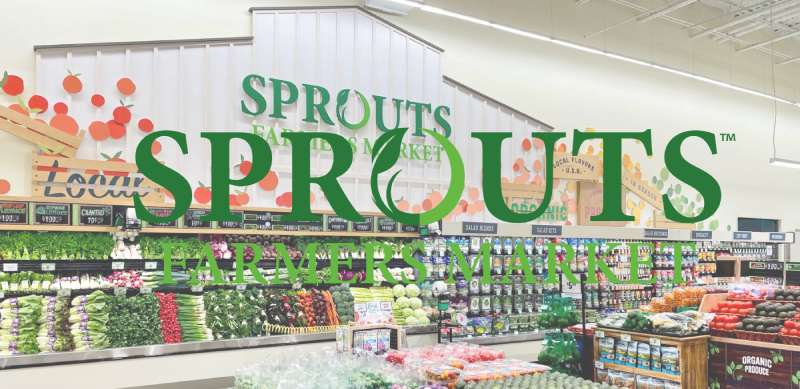
The Sprouts Farmers Market Logo is the official visual identity of Sprouts Farmers Market, a Phoenix-based natural and organic grocery chain operating across the United States. The logo uses a clean wordmark paired with a green leaf graphic, built to communicate freshness, health, and approachability. It has gone through several refinements since the brand launched in 2002, each iteration pushing toward a simpler, more modern look. Today’s version is one of the more recognizable marks in the natural grocery space.
Within the broader history of grocery and natural food retail branding, Sprouts sits in interesting company. The shift toward clean, nature-forward logos in this industry picked up steam in the early 2000s, right alongside rising consumer interest in organic food. Sprouts came up during that wave and its visual identity reflects it.
What is the Sprouts Farmers Market Logo?
The Sprouts Farmers Market logo is a green wordmark featuring the brand name in a custom sans-serif typeface, accompanied by a stylized green leaf icon. Introduced in its current refined form around 2015, the logo was developed to reflect the brand’s focus on fresh, affordable natural food.
- Design Type: Combination mark (wordmark + icon)
- Primary Elements: Stylized green leaf graphic, custom sans-serif wordmark reading “sprouts farmers market”
- Official Introduction Date: Current version circa 2015; brand founded 2002
- Designer/Agency: Not publicly disclosed; developed through internal brand direction
- Trademark Status: Registered trademark, Sprouts Farmers Market, Inc. (USPTO)
- Color Palette: Primary green (#4A7C2F approximate), white, and dark charcoal text variants
- Usage Context: Store signage, packaging, digital platforms, marketing materials, employee uniforms, and merchandise
How Has the Sprouts Farmers Market Logo Evolved Over Time?
![]()
The Sprouts logo has gone through three broad phases since the chain opened its first store in Chandler, Arizona in 2002. Early versions leaned into a more literal farmers market aesthetic. Later updates progressively cleaned things up, landing on the streamlined mark in use today.
Original Sprouts Farmers Market Logo (2002-2008)
- Years Active: 2002-2008
- Design Description: Busier layout with more decorative elements, heavier typeface, and a more literal produce/leaf illustration
- Color Scheme: Multiple greens, earthy browns, yellow accents
- Designer: Not publicly documented
- Context: Introduced at founding to position the brand as a true farmers market alternative to conventional grocery
- Key Changes from Previous: N/A (first version)
- Cultural Significance: Reflected the early 2000s trend of natural food stores borrowing visual language from actual outdoor markets
Transitional Sprouts Farmers Market Logo (2008-2015)
- Years Active: 2008-2015
- Design Description: Simplified compared to original, reduced illustrative elements, cleaner type treatment, leaf motif retained but more geometric
- Color Scheme: Focused more on green and white, reduced earthy tones
- Designer: Not publicly disclosed
- Context: Coincided with the brand’s expansion beyond Arizona and growing retail ambitions
- Key Changes from Previous: Removed decorative flourishes, tightened layout, shifted toward scalable design
- Cultural Significance: Marked the transition from regional curiosity to a serious national grocery contender
Current Sprouts Farmers Market Logo (2015-Present)
- Years Active: 2015 to present
- Design Description: Clean combination mark with a single stylized leaf and a modern lowercase sans-serif wordmark. Strong visual hierarchy between “sprouts” and “farmers market”
- Color Scheme: Solid green on white, white on green for reversed applications
- Designer: Not publicly disclosed
- Context: Introduced as the brand pursued its IPO and national scale, needing a mark that worked across digital and physical contexts
- Key Changes from Previous: Fully simplified, single-color primary version, optimized for digital use, stronger brand consistency
- Cultural Significance: Represents the maturation of the natural grocery category as a mainstream retail force
What Do the Design Elements of the Sprouts Farmers Market Logo Mean?
![]()
Each part of the Sprouts logo carries a specific function. The leaf signals nature and freshness without being heavy-handed about it. The lowercase wordmark keeps the tone approachable rather than corporate.
Together, these choices say: this is a store that takes healthy food seriously, but doesn’t want to feel intimidating or elitist about it.
What Does the Leaf Symbol Represent?
The leaf is the most direct symbol in the mark. It ties directly to fresh produce and plant-based eating.
It also doubles as a visual shorthand for environmental responsibility, which matters to the brand’s core customer base.
The simplified, geometric rendering of the leaf keeps it from looking dated. It’s clean enough to work at small sizes without losing its identity.
Why Did Sprouts Farmers Market Choose These Specific Colors?

- Primary Green
- Hex: Approximately #4A7C2F
- Pantone: Close to Pantone 363 C
- Symbolic Meaning: Nature, freshness, health, growth
- Psychological Impact: Green is consistently linked to wellness and environmental awareness in color psychology research. It’s calming and signals trustworthiness in food retail.
- Brand Connection: Directly reinforces the farmers market and organic positioning
- White
- Hex: #FFFFFF
- Symbolic Meaning: Cleanliness, simplicity, transparency
- Psychological Impact: Adds breathing room and keeps the mark from feeling heavy
- Brand Connection: Supports the clean, honest brand messaging
- Charcoal/Dark Type
- Hex: Approximately #222222 in text applications
- Symbolic Meaning: Stability, legibility, professionalism
- Psychological Impact: Grounds the design and prevents it from reading as too soft or purely lifestyle-focused
What Typography Style Is Used in the Sprouts Farmers Market Logo?
The wordmark uses a custom or heavily modified sans-serif font with rounded terminals and consistent stroke weight.
“Sprouts” appears larger and bolder, while “farmers market” sits below in a lighter weight. That contrast creates a clear reading order without needing size differences alone to do the work.
The rounded letterforms echo the leaf shape, keeping the whole mark visually consistent. It’s not a flashy typography choice, but it’s deliberately approachable.
Earlier logo versions used heavier, more traditional type. The shift to this softer sans-serif happened alongside the broader move in retail branding away from rigid, authoritative fonts toward friendlier, more humanist styles.
What Are the Hidden Meanings in the Sprouts Farmers Market Logo?
There’s no elaborate hidden symbol here. The design is honest about what it is, which is actually part of the point.
The leaf doubling as both a nature symbol and a loose visual rhyme with the rounded letterforms is probably the most intentional subtle detail in the mark.
Some people read the lowercase wordmark as a signal that the brand isn’t trying to act bigger or more corporate than it is. Whether that was a stated design intention or a happy side effect is unclear, but it lands that way.
How Does the Sprouts Farmers Market Logo Compare to Competitor Logos?
Sprouts sits in a crowded visual space. Natural grocery branding almost universally defaults to green, leaf motifs, and clean sans-serif type. The Sprouts mark holds its own by keeping things tighter and more minimal than most.
The Whole Foods Market logo is more badge-like and uses a heavier, more authoritative type treatment. It reads as premium and slightly formal compared to Sprouts.
The Trader Joe’s logo leans into a hand-lettered, almost retro feel. Much warmer and quirkier than Sprouts, which prioritizes clean consistency over personality.
Looking further at the broader grocery store logo landscape, most mainstream chains like Kroger, Publix, and Safeway use wordmarks with stronger color contrast and more traditional type. They signal scale and reliability. Sprouts signals freshness and approachability instead. Different goals, different visual language.
Among natural-leaning competitors, Sprouts’ mark is probably the most straightforwardly modern. It doesn’t try too hard.
What Are the Technical Specifications of the Sprouts Farmers Market Logo?
Official Color Codes
- Primary Color: Sprouts Green
- Hex: #4A7C2F (approximate)
- RGB: (74, 124, 47)
- CMYK: (40, 0, 62, 51)
- Pantone: Approximately 363 C
- Secondary Color: White
- Hex: #FFFFFF
- RGB: (255, 255, 255)
- CMYK: (0, 0, 0, 0)
- Accent/Text Color: Charcoal
- Hex: Approximately #222222
- RGB: (34, 34, 34)
- CMYK: (0, 0, 0, 87)
Note: Sprouts has not officially published exact color codes publicly. The values above are based on careful visual analysis and should be verified against official brand materials before professional use.
Dimensions and Proportions
- Aspect Ratio: Approximately 3:1 (width to height) in standard horizontal lockup
- Minimum Size: Not officially published; standard practice for logos of this type is no smaller than 1 inch wide in print, 120px wide on screen
- Clear Space: Standard brand practice requires clear space equal to the height of the leaf icon on all sides
- File Formats Available: Vector graphics (SVG, EPS, AI) for scalable use; PNG with transparent background for digital; high-resolution JPEG for some marketing contexts
- Usage Guidelines: Do not stretch, recolor, add effects, or use low-resolution bitmap versions for large-format applications
What Cultural Impact Has the Sprouts Farmers Market Logo Had?
The Sprouts logo has become a recognizable shorthand for the “affordable natural grocery” category it helped define. Before Sprouts scaled nationally, the choice was basically Whole Foods (expensive) or conventional chains (not focused on natural/organic). Sprouts carved out a middle space and the logo became part of that identity signal.
It shows up in communities where access to fresh, organic produce is otherwise limited. That’s not nothing. The visual identity travels with that meaning.
Among the wave of green logos in food retail, the Sprouts mark has aged better than most. Partly because the current version was designed with restraint. It doesn’t feel like it’s trying to be a farmers market from 2002 anymore.
It’s also become a familiar sight in suburban strip malls across the Sun Belt, which has its own cultural weight. Recognition built through physical presence is something digital-first brands spend years trying to manufacture.
How Does the Sprouts Farmers Market Logo Fit Into the Overall Brand Identity?
The logo is the anchor for a broader identity system that includes store design, packaging, signage, digital presence, and employee uniforms. All of it runs through the same green and white palette with the same clean, approachable tone.
The leaf icon gets used independently in some contexts, particularly on social media and app icons, which shows the mark was designed with that kind of flexibility in mind.
Store interiors echo the visual language of the logo. Open layouts, natural materials, signage with the same typeface and color. The brand guidelines clearly extend well beyond the logo file itself.
Sprouts’ brand style guide (not publicly available in full) governs how the mark interacts with photography, promotional materials, and digital content. The consistency across touchpoints is strong for a chain of its size.
This kind of coherent system is what separates brands that people recognize from brands people actually trust.
How Should the Sprouts Farmers Market Logo Be Used?
Official Usage Guidelines
- Do use: Approved color versions (full green, reversed white, black-and-white), minimum size requirements, sufficient clear space around the mark
- Do not: Stretch or distort proportions, alter brand colors, add drop shadows or outlines, place on busy backgrounds that reduce legibility, use low-resolution files for print
- Preferred formats: Vector files for print and large-format; PNG (transparent background) for digital use; always maintain the DPI requirements appropriate to the output medium
Where to Access Official Logos
- Media and press assets are available through the Sprouts Farmers Market official newsroom and press kit at sprouts.com/newsroom
- For partnership or co-marketing use, requests go through Sprouts’ corporate communications team
- Third-party use without written permission is not authorized under Sprouts’ trademark protections
Trademark and Licensing
- The Sprouts Farmers Market name and logo are registered trademarks of Sprouts Farmers Market, Inc.
- Unauthorized commercial use, reproduction, or modification is prohibited
- Editorial and journalistic use generally falls under fair use, but commercial applications require explicit written approval from Sprouts
- Trademark registrations are filed with the USPTO; any potential infringement should be reported to Sprouts’ legal team through official channels
FAQ on The Sprouts Farmers Market Logo
What does the Sprouts Farmers Market logo look like?
It’s a combination mark: a stylized green leaf paired with a lowercase sans-serif wordmark.
“Sprouts” appears larger, with “farmers market” set smaller beneath it. The color palette is straightforward: green and white, clean and minimal.
What color is the Sprouts Farmers Market logo?
The primary brand color is a mid-tone green, approximately #4A7C2F, close to Pantone 363 C.
White is used for reversed applications. The green was chosen to signal freshness and health, which is standard in organic grocery store branding.
Has the Sprouts Farmers Market logo changed over time?
Yes. The original 2002 version was busier, with earthy tones and heavier illustration.
The logo evolution moved toward simplicity, landing on the current clean wordmark and leaf icon around 2015. Each update tracked the brand’s national expansion.
What font does the Sprouts Farmers Market logo use?
The wordmark uses a custom or heavily modified sans-serif typeface with rounded terminals and consistent stroke weight.
It’s not a standard off-the-shelf font. The rounded forms echo the leaf icon, keeping the visual identity cohesive across the full mark.
What does the leaf symbol in the Sprouts logo mean?
The leaf is a direct reference to fresh produce and plant-based food. It also signals environmental responsibility.
The geometric, simplified rendering keeps it scalable and modern. It works at small sizes without losing its meaning, which matters for digital and packaging design use.
How does the Sprouts logo compare to other natural grocery store logos?
Most natural grocery logos default to green and leaf imagery. Sprouts holds its own by keeping the mark tighter and less decorative than most competitors.
The Albertsons and Wegmans marks feel more corporate. Sprouts reads as more approachable, which fits its affordable natural food positioning.
Where can I download the official Sprouts Farmers Market logo?
Official press assets are available through the Sprouts newsroom at sprouts.com/newsroom.
For partnership or co-marketing use, you need written approval from Sprouts’ corporate team. Unauthorized commercial use of the trademarked brand mark is not permitted under USPTO registration.
Is the Sprouts Farmers Market logo trademarked?
Yes. The name and logo are registered trademarks of Sprouts Farmers Market, Inc., filed with the USPTO.
Editorial use generally falls under fair use. Commercial reproduction or modification without written permission is prohibited.
What file formats is the Sprouts logo available in?
Official brand assets include vector formats like SVG and EPS for print and large-format applications.
PNG with a transparent background covers most digital needs. Avoid using low-resolution versions in print contexts where high DPI output is required.
What makes the Sprouts Farmers Market logo effective?
Simplicity. The mark communicates fresh, affordable, and natural without overloading the design with symbols or color.
The visual hierarchy between “sprouts” and “farmers market” is clear. It scales well, reads fast, and has stayed consistent enough to build real brand recognition across hundreds of store locations.
Conclusion
The Sprouts Farmers Market Logo is a solid example of grocery store branding that does exactly what it needs to do, without overcomplicating things.
The leaf icon, the clean wordmark, the green and white palette. All of it lines up with the brand’s natural food retailer identity and speaks directly to its audience.
From its busier early versions to the refined brand mark used today, the logo’s history tracks a chain that grew up and got cleaner as it scaled.
For anyone studying organic market visual identity or logo design principles, Sprouts is a useful case. Restraint, consistency, and a clear brand purpose go a long way.
Renowned for his expertise in logo design and visual branding, Bogdan has developed a multitude of logos for various clients.
His skills extend to creating posters, vector illustrations, business cards, and brochures. Additionally, Bogdan's UI kits were featured on marketplaces like Visual Hierarchy and UI8.
He also wrote in the past years on sites like Design Your Way, WebDesignerDepot, WPDean, Designmodo, Speckyboy, Slider Revolution, and more.
- The Airtable Logo History, Colors, Font, And Meaning - 12 July 2026
- How to Blur Background in Canva: A Quick Tutorial - 11 July 2026
- Typography Trends - 10 July 2026
Bogdan Sandu is a seasoned designer who has been designing websites since 2008. Renowned for his expertise in logo design and visual branding, Bogdan has developed a multitude of logos for various clients. His skills extend to creating posters, vector illustrations, business cards, and brochures. Additionally, Bogdan's UI kits were featured on marketplaces like Visual Hierarchy and UI8. He also wrote in the past years on sites like Design Your Way, WebDesignerDepot, WPDean, Designmodo, Speckyboy, Slider Revolution, and more.
You Might Also Like