The Speedway logo is the visual identity of Speedway LLC, one of the largest company-owned and -operated convenience store and gas station chains in the United States. It functions as the brand’s primary mark across thousands of retail locations, fuel stations, and digital platforms. The logo has gone through several updates since the company’s early years, reflecting shifts in ownership, market positioning, and design trends in the convenience retail space.
Within the broader history of fuel and convenience retail branding, Speedway sits alongside major chains that have steadily modernized their identities. The brand became a subsidiary of Marathon Petroleum before being acquired by 7-Eleven in 2021, and each ownership chapter brought subtle or significant changes to how the logo looked and felt.
The current version uses a bold red wordmark with a distinct graphic element, built to read clearly at highway speeds and on fuel canopy signage. Speedway as a company was founded in 1959, and its logo has gone through at least four notable iterations over the decades.
—
What Is the Speedway Logo?
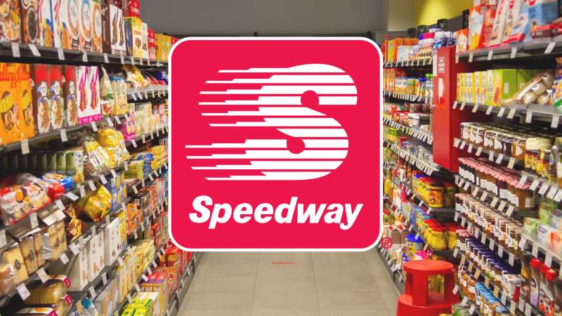
The Speedway logo is a bold red wordmark combined with a stylized checkmark-like graphic element, officially representing the Speedway convenience store and fuel brand. The current version was refined following Marathon Petroleum’s rebranding efforts in the 2010s. It is designed for high visibility across exterior signage, fuel canopies, and digital applications.
- Design Type: Combination mark (wordmark + graphic icon)
- Primary Elements: Bold sans-serif wordmark, red color block, stylized swoosh/checkmark graphic
- Official Introduction Date: Current version refined circa 2012-2014
- Designer/Agency: Developed in-house under Marathon Petroleum brand direction; specific agency not publicly disclosed
- Trademark Status: Registered trademark under Speedway LLC, now held by 7-Eleven Inc. following 2021 acquisition
- Color Palette: Primary red (#CC0000 approximately), white (#FFFFFF), with black used in certain lockup variations
- Usage Context: Exterior store signage, fuel canopy branding, loyalty app (Speedy Rewards), marketing materials, merchandise, and uniforms
—
How Has the Speedway Logo Evolved Over Time?
The Speedway logo has changed meaningfully across four-plus decades, moving from a more ornate, text-heavy design rooted in regional branding to the clean, high-contrast mark used today.
Early versions leaned on traditional fuel station aesthetics.
Later redesigns stripped away complexity and pushed toward something that could scale across hundreds of locations without losing legibility.
Original Speedway Logo (1959-1980s)
- Years Active: 1959 to mid-1980s
- Design Description: Text-focused mark with bolder, more decorative letterforms; often paired with oval or shield-shaped containers common in fuel retail of that era
- Color Scheme: Red and white, sometimes with black outlines
- Designer: Not publicly documented
- Context: Speedway SuperAmerica was operating as a regional Midwest chain; the logo reflected mid-century American gas station design norms
- Key Changes from Previous: N/A (original version)
- Cultural Significance: Represented a growing regional chain competing with national fuel brands during the American highway expansion era
Speedway SuperAmerica Logo (1980s-2000s)
- Years Active: Mid-1980s to early 2000s
- Design Description: The brand operated under the “Speedway SuperAmerica” name in some markets; logo incorporated a star or patriotic visual cue alongside the wordmark
- Color Scheme: Red, white, and blue variations
- Designer: Not publicly documented
- Context: Marathon Oil acquired the SuperAmerica chain and began consolidating the brand under Speedway
- Key Changes from Previous: Added secondary branding element; adjusted color usage to include blue
- Cultural Significance: Reflected the patriotic retail branding common during this period in American convenience and fuel retail
Transitional Speedway Logo (2000s-2012)
- Years Active: Early 2000s to approximately 2012
- Design Description: Simplified wordmark dropping the SuperAmerica name; red identity strengthened; early use of the swoosh/motion graphic element
- Color Scheme: Red and white
- Designer: Internal Marathon Petroleum brand team
- Context: Marathon Petroleum separated from Marathon Oil in 2011, prompting a sharper focus on the Speedway brand as a standalone retail entity
- Key Changes from Previous: Removed blue and patriotic elements; leaner, more corporate-feeling mark
- Cultural Significance: Signaled Speedway’s shift from regional chain to large-scale national convenience brand
Current Speedway Logo (2012-Present)
- Years Active: Approximately 2012 to present
- Design Description: Bold all-caps red wordmark with a dynamic angled graphic element suggesting speed and forward motion; clean white background or reversed white-on-red versions
- Color Scheme: Red (#CC0000) and white (#FFFFFF)
- Designer: Developed under Marathon Petroleum’s brand team; specific agency credit not public
- Context: Designed to support rapid store expansion and consistent signage across thousands of locations
- Key Changes from Previous: More refined graphic element; tighter, more confident typography; better digital adaptability
- Cultural Significance: Now represents one of the most recognized convenience store brands in the US, operating under 7-Eleven ownership since 2021
—
What Do the Design Elements of the Speedway Logo Mean?
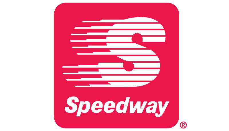
The Speedway logo uses bold red lettering and a directional graphic element to communicate speed, energy, and reliability at a glance.
Every element has a practical function. The design has to work on a fuel canopy 30 feet in the air and on a mobile app icon.
Nothing in it is decorative for decoration’s sake.
What Does the Graphic Element in the Logo Symbolize?
The angled swoosh or checkmark-style mark beside the wordmark is meant to suggest forward movement.
It references the “speedway” concept directly, implying momentum and quick service.
In the convenience retail space, this kind of dynamic shape is a common shorthand for speed and efficiency, which is exactly what customers expect from a fuel and convenience stop.
It also functions as a standalone icon when the full wordmark can’t fit, which matters a lot for app icons and small-format signage.
Why Did Speedway Choose These Specific Colors?

Red
- Hex: Approximately #CC0000
- Pantone: Close to Pantone 485 C
- Symbolic meaning: Energy, urgency, action
- Psychological impact: Red grabs attention quickly, which is critical for roadside signage. Drivers make split-second decisions about where to stop.
- Brand/industry connection: Red is the dominant color in fuel retail. Think Shell, Exxon, Canadian Tire. Speedway fits within that visual language while using its specific shade and weight to stand apart.
White
- Hex: #FFFFFF
- Symbolic meaning: Cleanliness, clarity, simplicity
- Psychological impact: Creates high contrast against red, improving legibility at a distance
- Brand/industry connection: White space in signage design signals a modern, well-maintained brand, which matters in convenience retail where store cleanliness directly affects customer trust
Understanding color psychology helps explain why red dominates so many fuel and convenience brands. It is not a coincidence. Red increases heart rate slightly and triggers faster decision-making, which is exactly what you want when someone is driving past at 60 mph.
What Typography Style Is Used in the Speedway Logo?
The wordmark uses a bold, condensed sans-serif style with strong stroke weights and tight letter spacing.
It is not a standard off-the-shelf font. The letterforms appear customized, with specific cuts and angles that match the brand’s graphic element.
The all-caps treatment adds authority and makes the name easier to read from a distance. Lowercase tends to get lost on large exterior signage, especially at speed.
Tracking is kept tight, which helps the wordmark read as a single solid unit rather than individual letters. This is a deliberate choice for a brand whose name needs to register in under a second.
Over the years, the typography has become progressively bolder and more condensed, moving away from the rounder letterforms in older versions.
What Are the Hidden Meanings in the Speedway Logo?
There are no widely documented hidden or subliminal elements in the Speedway logo the way there are in logos like the FedEx arrow or the Amazon smile.
The design is fairly direct. The name says exactly what the brand is.
That said, the angled graphic element does double duty. It reads as a checkmark (reliability, task completion) and as a motion blur or swoosh (speed, efficiency). Whether that dual reading was intentional is not publicly confirmed.
The focal point of the logo is clearly the wordmark, with the graphic element acting as a visual anchor that draws the eye leftward before moving across the name. It is a clean, deliberate composition.
—
How Does the Speedway Logo Compare to Competitor Logos?
Speedway’s logo sits in a crowded field of red-dominant fuel and convenience brands. Its identity is clean and functional, but it does not stand as far apart from competitors as some might expect.
Within fuel and convenience retail, red is practically the default color.
What separates brands is how they use shape, typography weight, and the relationship between their wordmark and icon.
Here’s how Speedway stacks up against key competitors:
- Circle K: The Circle K logo uses a red circle with a white “K,” making it more icon-forward than Speedway. It is more abstract and globally recognized. Speedway leans on its full name rather than a standalone icon.
- 7-Eleven: Now Speedway’s parent company, 7-Eleven uses a distinctive green and red striped design with a quirky lowercase “n” in its wordmark. It is more playful and has stronger global brand recognition. The two brands currently coexist with separate identities.
- QuikTrip: The QuikTrip logo uses a similar bold red approach with a QT monogram. It is arguably more distinctive because of the monogram-based mark. Speedway’s wordmark is more literal.
- Wawa: Wawa uses a goose mascot and a completely different visual language, making it far more differentiated. It has stronger emotional brand attachment in its core markets.
- Kroger fuel centers: The Kroger logo relies on its grocery retail identity rather than a fuel-specific mark, which is a different branding strategy entirely.
Speedway’s logo is solid and functional. It is not the most memorable mark in convenience retail, but it does its core job well: visible, readable, and instantly categorized as a fuel/convenience brand.
—
What Are the Technical Specifications of the Speedway Logo?
Note: Speedway LLC does not publish full official brand guidelines publicly. The specifications below are based on documented usage and publicly available brand applications. Always request official files from Speedway’s/7-Eleven’s brand team for licensed use.
Official Color Codes
- Primary Color: Red
- Hex: #CC0000
- RGB: (204, 0, 0)
- CMYK: (0, 100, 100, 20)
- Pantone: Approximately Pantone 485 C
- Secondary Color: White
- Hex: #FFFFFF
- RGB: (255, 255, 255)
- CMYK: (0, 0, 0, 0)
- Pantone: N/A (process white)
- Accent Color: Black (select applications)
- Hex: #000000
- RGB: (0, 0, 0)
- CMYK: (0, 0, 0, 100)
- Pantone: Process Black C
For print applications, using proper CMYK values is important to maintain accurate red reproduction. Digital versions use RGB or hex codes depending on the platform.
Dimensions and Proportions
- Aspect ratio: Approximately 4:1 (width to height) for the standard horizontal lockup
- Minimum size requirements: Not officially published; standard practice for this type of logo suggests no smaller than 1 inch wide in print, 120px wide in digital
- Clear space specifications: Standard practice requires clear space equal to the height of the wordmark’s capital letters on all sides
- Official usage guidelines: Managed by 7-Eleven Inc. brand team following the 2021 acquisition; media and partner requests should go through official 7-Eleven brand channels
- File formats available: Vector graphics (SVG, EPS, AI) for scalable applications; PNG with transparent background for digital; JPEG for general use. Avoid bitmap formats for large-format printing as they lose quality at scale.
—
What Cultural Impact Has the Speedway Logo Had?
Speedway’s logo is one of the more recognized marks in Midwest and East Coast American roadside culture. For millions of daily commuters across Ohio, Michigan, Indiana, and surrounding states, the red Speedway sign is a familiar landmark tied to routine stops, fuel, and coffee.
It does not carry the pop culture weight of something like the 7-Eleven logo, which has appeared in film, streetwear, and music videos.
But in its core markets, Speedway has genuine brand loyalty, largely built through its Speedy Rewards program rather than the logo itself.
The 2021 acquisition by 7-Eleven created some cultural tension. Longtime Speedway customers pushed back on the idea of their local stores being converted to 7-Eleven branding. That reaction, honestly, says something meaningful about the logo’s local significance. People cared enough to notice.
The brand also has a loose connection to motorsport culture through its name, even if it has no formal NASCAR or IndyCar sponsorship. The “speedway” name resonates differently in racing-heavy markets like Indianapolis, where the name carries an extra layer of meaning.
—
How Does the Speedway Logo Fit Into the Overall Brand Identity?
The Speedway logo anchors a broader identity system that includes the Speedy Rewards loyalty program, fuel canopy design, store interior signage, staff uniforms, and digital platforms. The logo is the connective thread across all of these touchpoints.
The red color carries consistently from exterior signage to the mobile app.
The wordmark appears on co-branded fuel cards, promotional materials, and in-store point-of-sale displays.
Since the 7-Eleven acquisition, Speedway’s brand identity has been in a holding pattern. Some locations have converted to 7-Eleven branding while others still operate under the Speedway mark. This dual-brand situation is unusual and creates some inconsistency in how the logo functions across the network.
A strong brand identity system connects the color palette, typography, and mark into something that feels cohesive at every customer interaction. Speedway’s system does this reasonably well within its own ecosystem. The challenge now is navigating what comes next under 7-Eleven ownership.
Well-executed brand guidelines are what keep a logo from fragmenting across hundreds of locations. Whatever direction 7-Eleven takes with the Speedway identity, that documentation will matter a lot.
—
How Should the Speedway Logo Be Used?
Official Usage Guidelines
Do’s:
- Use official files provided by Speedway/7-Eleven brand team
- Maintain the correct aspect ratio at all times
- Use approved color variations (full color, reversed white-on-red, black-and-white)
- Maintain required clear space around the logo on all sides
- Use vector files for any large-format or print applications
Don’ts:
- Do not stretch, compress, or distort the logo
- Do not change the colors outside of approved variations
- Do not place the logo on busy or clashing backgrounds
- Do not recreate the logo from memory or using non-official fonts
- Do not use the logo to imply endorsement or partnership without authorization
Where to Access Official Logo Files
Official Speedway logo files are not publicly available for download. Requests for licensed use, media applications, or partner branding should be directed to 7-Eleven Inc.’s communications or brand team, as Speedway LLC is now a wholly owned subsidiary following the 2021 acquisition.
Licensing and Trademark Information
The Speedway name and logo are registered trademarks. Unauthorized commercial use, reproduction, or modification of the logo is a trademark violation. Any co-branding, sponsorship, or licensing arrangement requires written approval from the trademark holder.
For franchise-related or vendor use, requests go through 7-Eleven’s corporate brand management process. Using the logo without permission, even with good intentions, creates legal risk. When in doubt, ask first.
FAQ on The Speedway Logo
What does the Speedway logo look like?
It is a bold, all-caps red wordmark paired with a dynamic angled graphic element suggesting forward motion.
The design is clean, high-contrast, and built for visibility on fuel canopy signage and digital platforms alike.
What colors are used in the Speedway logo?
The primary color is red, approximately #CC0000, paired with white.
Some applications include black as a secondary accent. The red is close to Pantone 485 C, a shade common in fuel and convenience retail branding.
Has the Speedway logo changed over the years?
Yes. The racing logo design evolved from ornate mid-century letterforms through a patriotic red-white-blue phase before settling into today’s stripped-down wordmark.
The biggest shift came in the early 2010s when Marathon Petroleum pushed toward a cleaner, more scalable identity.
Who designed the Speedway logo?
The current version was developed under Marathon Petroleum’s internal brand team. No specific external design agency has been publicly credited.
This is fairly common in large corporate rebrands where in-house teams lead the work.
What font does the Speedway logo use?
The wordmark uses a customized bold condensed sans-serif font with tight kerning and strong stroke weight.
It does not appear to be a standard off-the-shelf typeface. The letterforms have custom cuts that match the brand’s angled graphic element.
What does the graphic element in the Speedway logo represent?
The angled swoosh references speed and forward motion, directly connecting to the brand name.
It also doubles as a checkmark shape, suggesting reliability and quick service. Both readings work well for a convenience and fuel brand competing on speed of service.
How does the Speedway logo compare to other convenience store logos?
Speedway sits within a red-dominant field alongside brands like complementary color scheme-heavy competitors. It is more wordmark-focused than Circle K’s icon-first approach.
Wawa and QuikTrip have stronger visual differentiation. Speedway’s strength is legibility at distance, not memorability as a standalone icon.
Is the Speedway logo trademarked?
Yes. The Speedway name and logo are registered trademarks, currently held by 7-Eleven Inc. following the 2021 acquisition.
Unauthorized use, reproduction, or modification without written approval is a trademark violation.
What happened to the Speedway logo after the 7-Eleven acquisition?
Some locations converted to 7-Eleven branding, while others kept the Speedway identity. The two brands are running in parallel as 7-Eleven works through its conversion timeline.
Customer pushback in core Speedway markets has slowed some conversions.
Where can I download the official Speedway logo?
Official logo files are not publicly available. Media and partner requests go through 7-Eleven Inc.’s corporate brand team.
Using unofficial logo recreations carries legal risk. Always request authorized files directly from the trademark holder for any commercial or editorial use.
Conclusion
The Speedway logo is a straightforward piece of motorsport branding that does its job without overcomplicating things.
Bold red, tight condensed lettering, a directional graphic mark. It works at highway speed, on a mobile screen, and on a fuel canopy thirty feet up.
The racing emblem design has evolved steadily since 1959, getting leaner with each iteration rather than more decorative.
With 7-Eleven now holding the trademark, the future of the visual identity is genuinely uncertain. But in its core markets, the red wordmark still carries real recognition.

Renowned for his expertise in logo design and visual branding, Bogdan has developed a multitude of logos for various clients.
His skills extend to creating posters, vector illustrations, business cards, and brochures. Additionally, Bogdan's UI kits were featured on marketplaces like Visual Hierarchy and UI8.
He also wrote in the past years on sites like Design Your Way, WebDesignerDepot, WPDean, Designmodo, Speckyboy, Slider Revolution, and more.
- The Windsurf Logo History, Colors, Font, And Meaning - 10 October 2026
- How to Remove Background From Product Photos (No Photoshop) - 10 October 2026
- How Designers can Build a Stronger Online Creative Identity - 9 October 2026

Bogdan Sandu is a seasoned designer who has been designing websites since 2008. Renowned for his expertise in logo design and visual branding, Bogdan has developed a multitude of logos for various clients. His skills extend to creating posters, vector illustrations, business cards, and brochures. Additionally, Bogdan's UI kits were featured on marketplaces like Visual Hierarchy and UI8. He also wrote in the past years on sites like Design Your Way, WebDesignerDepot, WPDean, Designmodo, Speckyboy, Slider Revolution, and more.
You Might Also Like