The Publix logo is the official visual mark of Publix Super Markets, one of the largest employee-owned grocery chains in the United States. It functions as the primary brand identifier across all store locations, packaging, and marketing materials. The logo has remained remarkably consistent over the decades, which says a lot about how seriously Publix takes brand recognition.
Within grocery retail branding history, few grocery store logos have held their visual identity as steadily as Publix. Most major chains have gone through aggressive rebrands. Publix took a different path, opting for refinement over reinvention. The current design is a clean, green wordmark that has become deeply familiar to shoppers across the Southeast U.S.
The current logo version has been in use since 1972, featuring the iconic green color and serif-style custom lettering. Publix was founded in 1930 by George W. Jenkins in Winter Haven, Florida. The logo has gone through roughly four notable iterations since then.
What Is the Publix Logo?
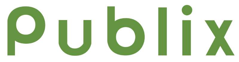
The Publix logo is a green wordmark using a custom serif-style typeface, introduced in its current recognizable form in 1972. It represents the brand’s identity as a trusted, people-first grocery retailer with deep roots in the American Southeast.
- Design Type: Wordmark (text-only logotype)
- Primary Elements: Custom serif-influenced lettering spelling “Publix,” with a distinctive stylized “P” and overall balanced letterforms
- Official Introduction Date: Current version refined and standardized around 1972
- Designer/Agency: Developed internally; no single third-party agency is publicly credited
- Trademark Status: Registered trademark owned by Publix Super Markets, Inc.
- Color Palette: Publix Green (approximately #006B3F), used on white or light backgrounds in primary applications
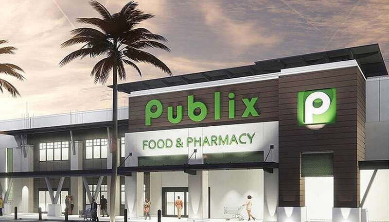
- Usage Context: Store signage, shopping bags, packaging, uniforms, digital platforms, advertising, and branded merchandise
How Has the Publix Logo Evolved Over Time?
![]()
The Publix logo has gone through four main phases since the company launched in 1930, moving from ornate script-influenced lettering toward the clean, confident green wordmark shoppers recognize today.
Original Publix Logo (1930-1950s)
- Years Active: 1930-1950s
- Design Description: Early signage used decorative, hand-lettered style text common to retail storefronts of that era. The treatment was relatively ornate compared to later versions.
- Color Scheme: Varied; early applications lacked strict color standardization
- Designer: Unknown; likely handled in-house or by local sign makers
- Context: George W. Jenkins opened the first Publix Food Store in 1930 in Winter Haven, Florida. Branding was functional rather than strategic at this stage.
- Key Changes from Previous: N/A (original version)
- Cultural Significance: Reflected the small-town, community-oriented grocery store culture of the Depression-era South
Mid-Century Publix Logo (1950s-1960s)
- Years Active: 1950s-1960s
- Design Description: The wordmark became more structured, moving toward a cleaner letterform style. Some versions during this period included the phrase “Super Market” beneath the primary name.
- Color Scheme: Green began appearing more consistently as the brand color during this period
- Designer: Not publicly documented
- Context: Publix expanded rapidly through Florida during the postwar boom. Consistent branding became more important as the chain grew.
- Key Changes from Previous: More standardized letterforms, early adoption of green as a primary color
- Cultural Significance: Signaled Publix’s transition from a local store to a regional chain
Transitional Publix Logo (1960s-1972)
- Years Active: 1960s-1972
- Design Description: The wordmark continued refining toward the familiar form. Green solidified as the dominant brand color. Typography became more uniform across locations.
- Color Scheme: Green and white
- Designer: Internal brand development
- Context: Publix crossed into new states and needed a logo that could scale across diverse store formats and signage systems.
- Key Changes from Previous: Greater typographic consistency, stronger color standardization
- Cultural Significance: Marked the beginning of Publix as a serious Southeast regional supermarket brand
Modern Publix Logo (1972-Present)
- Years Active: 1972-present
- Design Description: The current wordmark uses a custom serif-influenced typeface. The letterforms are confident and well-spaced, with the stylized capital “P” as a subtle focal point. The overall treatment is clean, professional, and immediately recognizable.
- Color Scheme: Publix Green (#006B3F) on white
- Designer: Not publicly credited to a specific individual or agency
- Context: Publix was growing into a dominant regional force. The refined wordmark matched the brand’s positioning as a premium-feeling, customer-first grocery chain.
- Key Changes from Previous: Fully standardized custom lettering, consistent color application, removal of secondary descriptors in the primary mark
- Cultural Significance: This logo became one of the most recognized grocery brand identities in American retail history
What Do the Design Elements of the Publix Logo Mean?
![]()
The Publix logo communicates trust, familiarity, and quality through its restrained wordmark design. Every choice, from the color to the letterforms, points back to the same core message: this is a brand you can rely on.
The green color signals freshness and quality, which makes obvious sense for a grocery retailer.
The serif-influenced typography adds a layer of tradition and dependability that a sans-serif treatment wouldn’t carry the same way.
The clean layout with generous spacing keeps the whole thing readable at any size, from a grocery bag to a building facade.
Why Did Publix Choose These Specific Colors?

Publix Green
- Color Name: Publix Green
- Hex Code: Approximately #006B3F
- Symbolic Meaning: Freshness, natural produce, health, and growth
- Psychological Impact: Green is widely associated with calm, trust, and wellbeing. In color psychology, it’s one of the most positive colors a food brand can use.
- Brand Connection: Reinforces Publix’s positioning around fresh food, quality produce, and a welcoming store environment
White serves as the background in most logo applications, keeping the green mark crisp and easy to read.
The combination is one of the cleaner green logos in the grocery sector. No gradients, no competing tones. Just the mark doing its job.
What Typography Style Is Used in the Publix Logo?
The Publix wordmark uses a custom typeface with serif characteristics, developed specifically for the brand rather than pulled from a standard font library.
The letterforms have moderate stroke contrast and slightly rounded terminals, which gives the type a warm, approachable feel without sacrificing legibility.
The capital “P” has a slightly more prominent treatment than the other letters, which creates a natural focal point within the wordmark without being overly decorative.
Across the logo’s evolution, the typography moved away from more ornate letterforms toward this cleaner, more confident style. The current version reads well at small sizes, which matters a lot for packaging and digital use.
What Are the Hidden Meanings in the Publix Logo?
There are no widely documented hidden or subliminal elements in the Publix logo design. It’s intentionally straightforward.
The design philosophy seems to prioritize clarity and longevity over clever visual tricks.
That said, the consistent use of green over decades has created a strong associative meaning on its own. Shoppers in Florida, Georgia, and across the Southeast connect that specific shade of green with reliability and good customer service almost instinctively at this point.
The real “hidden” element might just be how well the simplicity has aged. Most logos this old would have felt pressure to modernize more aggressively.
How Does the Publix Logo Compare to Competitor Logos?
The Publix logo stands out among major grocery chains for its consistency and restraint. While competitors have gone through multiple rebrands, Publix has refined the same core identity for over five decades.
Compared to the Kroger logo, which uses a blue and red color palette with a more dynamic type treatment, Publix feels more traditional and premium.
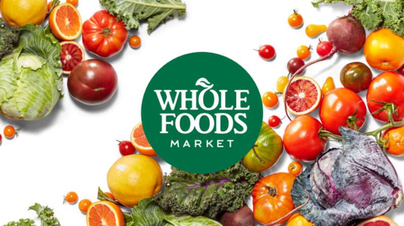
The Whole Foods Market logo also uses green, but with a bolder, sans-serif wordmark that targets a different positioning. Publix’s serif-influenced letterforms lean more toward heritage and trust.
The Albertsons logo and Safeway logo both went through notable modernization efforts in recent years. By comparison, Publix has stayed the course, and arguably benefited from that consistency in terms of brand recognition.
The Trader Joe’s logo takes a completely different approach, leaning into a hand-drawn, casual aesthetic that signals a quirky, independent personality. Publix is the opposite of that. It reads as dependable and mainstream, which suits its market position perfectly.
Among grocery store logos broadly, Publix sits in a group of brands that value stability over trend-chasing.
What Are the Technical Specifications of the Publix Logo?
Official Color Codes
- Primary Color: Publix Green
- Hex: #006B3F
- RGB: (0, 107, 63)
- CMYK: (100, 0, 41, 58) (approximate)
- Pantone: Closest match is Pantone 349 C (exact Pantone designation not officially published)
- Secondary Color: White
- Hex: #FFFFFF
- RGB: (255, 255, 255)
- CMYK: (0, 0, 0, 0)
Dimensions and Proportions
- Aspect Ratio: Horizontal wordmark; approximately 4:1 width-to-height ratio
- Minimum Size Requirements: Not officially published; standard best practice for wordmark logos is no smaller than 1 inch wide in print applications
- Clear Space Specifications: Not officially published externally; standard brand practice applies a minimum clear space equal to the height of the wordmark on all sides
- Official Usage Guidelines: Publix does not publish a public-facing brand style guide. Usage rights are protected under trademark law. The logo should not be altered, recolored, or used in unauthorized commercial contexts.
- File Formats Available: Official assets are provided internally; publicly, the logo can be found in vector graphics format through press resources
- Resolution Requirements: For print, a minimum of 300 DPI applies to any raster-based applications
What Cultural Impact Has the Publix Logo Had?
The Publix logo has become one of the most recognizable retail brand marks in the American Southeast, functioning as a symbol of regional identity as much as a grocery chain identifier.
For many residents of Florida, Georgia, Alabama, South Carolina, Tennessee, Virginia, and North Carolina, the green Publix wordmark is a marker of home.
The brand’s reputation for exceptional customer service and clean stores has transferred directly onto the logo. People genuinely feel positive when they see it, which is not something you can say about many grocery chains.
Publix has also built cultural currency through its holiday commercials, which often go viral and deepen the emotional connection consumers already have with the brand mark. The logo appears throughout those ads, reinforcing the association between the visual identity and warm, family-oriented feelings.
The consistency of the logo across five-plus decades has contributed to that cultural weight. There’s no confusion about what Publix looks like. That kind of recognition takes a long time to build and is genuinely hard to replicate.
How Does the Publix Logo Fit Into the Overall Brand Identity?
The Publix logo anchors a broader brand identity built around the company’s core promise: “Where Shopping Is a Pleasure.” Every element of the visual system, from store design to packaging to uniforms, connects back to what the wordmark communicates.
The green color runs through store signage, employee aprons, shopping bags, and digital platforms.
The clean, traditional typography matches the tone of Publix’s in-store experience, which prioritizes order, cleanliness, and helpfulness.
Publix’s private label products carry a version of the wordmark, extending the logo’s reach into the home. Shoppers see that green mark in their kitchens, not just at the store entrance.
The overall brand system is notably coherent. The brand guidelines aren’t public, but the consistency of execution across every touchpoint suggests a well-managed internal system. The logo doesn’t feel disconnected from the rest of the brand. It feels like the root of it.
Related brand entities include Publix GreenWise Market (Publix’s natural and organic sub-brand), which uses a variation of the parent identity, and Publix Pharmacy, which also carries the primary wordmark into a healthcare context without feeling out of place.
How Should the Publix Logo Be Used?
Official Usage Do’s and Don’ts
Do:
- Use the logo in its approved green and white color combination
- Maintain clear space around the wordmark at all times
- Use official, high-resolution files obtained from Publix directly or through authorized press resources
- Reproduce the logo at sizes where the wordmark remains fully legible
Don’t:
- Alter the logo colors, proportions, or letterforms
- Place the logo on backgrounds that reduce contrast or legibility
- Use the logo in ways that imply endorsement, partnership, or affiliation without authorization
- Recreate the logo using standard fonts (the wordmark uses custom lettering)
- Use the logo for commercial merchandise or promotional materials without written permission
Where to Access Official Logo Files
Publix does not maintain a publicly accessible brand asset portal. Media and press inquiries can be directed to Publix’s corporate communications department for official logo files. Unofficial versions circulating online may be inaccurate in color or proportion.
Licensing and Trademark Protection
The Publix logo and name are registered trademarks of Publix Super Markets, Inc. Unauthorized commercial use is a trademark infringement. This includes use on merchandise, parody products sold commercially, or any application that could create confusion about the source of goods or services.
Journalistic, editorial, and educational use of the logo (such as in news articles or brand analysis) generally falls under fair use, but commercial applications require explicit permission from Publix’s legal team.
FAQ on the Publix Logo
What color is the Publix logo?
The Publix logo uses a deep green, with a hex code of approximately #006B3F.
This specific shade sits close to Pantone 349 C. It appears on white backgrounds across store signage, packaging, and digital platforms.
What font does the Publix logo use?
The Publix wordmark uses a custom serif-influenced typeface, not an off-the-shelf font.
The letterforms were developed specifically for the brand. You won’t find an exact match in any standard font library.
When was the Publix logo redesigned?
The current version of the Publix logo has been in use since around 1972.
Before that, the Publix brand identity went through several earlier iterations dating back to the company’s founding in 1930. The core design has stayed remarkably stable since the 1972 refinement.
Who designed the Publix logo?
No specific designer or external agency has been publicly credited for the Publix logo.
The wordmark appears to have been developed internally as part of the company’s broader brand identity work during its expansion through the Southeast U.S.
What does the Publix logo represent?
The logo communicates trust, freshness, and reliability. The green color ties directly to fresh produce and a healthy shopping experience.
The clean serif-style lettering adds a sense of tradition. Together, these elements reflect Publix’s long-standing reputation for quality and strong customer service.
Is the Publix logo a wordmark or an emblem?
It’s a wordmark. There’s no symbol, icon, or emblem attached to the primary mark.
The Publix logo relies entirely on its custom lettering and green color to carry the brand. That’s it. Simple and consistent.
How does the Publix logo compare to other grocery store logos?
Among major grocery store logos, Publix stands out for how little it has changed over time.
Chains like Wegmans and Lidl have gone through more visible rebrands. Publix has stuck with the same core visual identity for over five decades.
What are the official Publix logo color codes?
The primary color is Publix Green: Hex #006B3F, RGB (0, 107, 63), and CMYK approximately (100, 0, 41, 58).
White (#FFFFFF) is the standard background color used across all primary logo applications.
Can I use the Publix logo for my project?
The Publix logo is a registered trademark of Publix Super Markets, Inc. Unauthorized commercial use is trademark infringement.
Editorial and educational use generally falls under fair use. Anything commercial requires written permission from Publix directly.
Where can I download the official Publix logo?
Publix does not have a public brand asset portal. Official logo files are available through Publix’s corporate communications team for press and media use.
Unofficial versions found online may have incorrect hue values or wrong proportions, so it’s worth going to the source.
Conclusion
The Publix Logo is a case study in what happens when a brand commits to consistency over decades. No dramatic overhauls, no trend-chasing. Just a clean green wordmark that has quietly built some of the strongest grocery brand recognition in the U.S.
The custom serif lettering, the standardized Publix Green color palette, and the straightforward wordmark format all reinforce the same message the company has been sending since 1930.
For a supermarket chain with this kind of regional footprint, that kind of visual identity stability is worth more than any redesign ever could be.
Renowned for his expertise in logo design and visual branding, Bogdan has developed a multitude of logos for various clients.
His skills extend to creating posters, vector illustrations, business cards, and brochures. Additionally, Bogdan's UI kits were featured on marketplaces like Visual Hierarchy and UI8.
He also wrote in the past years on sites like Design Your Way, WebDesignerDepot, WPDean, Designmodo, Speckyboy, Slider Revolution, and more.
- Canva for Teams Review: Is It Worth the Business Plan? - 24 July 2026
- 5 Brand Compliance Checkpoints Every Enterprise Should Automate - 23 July 2026
- Timeless Open Sans Font Pairing for Any Project - 22 July 2026
Bogdan Sandu is a seasoned designer who has been designing websites since 2008. Renowned for his expertise in logo design and visual branding, Bogdan has developed a multitude of logos for various clients. His skills extend to creating posters, vector illustrations, business cards, and brochures. Additionally, Bogdan's UI kits were featured on marketplaces like Visual Hierarchy and UI8. He also wrote in the past years on sites like Design Your Way, WebDesignerDepot, WPDean, Designmodo, Speckyboy, Slider Revolution, and more.
You Might Also Like