The Morrisons logo is the visual identity of Wm Morrison Supermarkets, one of the UK’s largest grocery chains. It combines a bold yellow and black color scheme with a clean wordmark that communicates value and approachability. The logo has gone through several updates since the company’s founding in 1899, each one reflecting shifts in how Morrisons wanted to position itself in a crowded retail market.
Compared to other major British supermarkets, Morrisons has consistently leaned on warmth and directness in its branding rather than sleek minimalism. That yellow has become genuinely recognizable on UK high streets, which is no small thing in a sector where grocery store logos often blur together.
What is the Morrisons Logo?
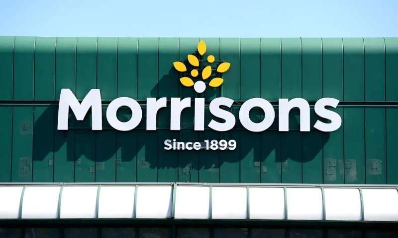
The Morrisons logo is a wordmark-based design featuring the retailer’s name in bold, custom-style lettering set against a bright yellow background. The current version was refined in the early 2000s and uses black typography to maximize contrast and shelf-level visibility across store signage and packaging.
Design Type: Wordmark (text-based logo)
Primary Elements: Bold sans-serif lettering, yellow background block, black typography
Official Introduction Date: Current core identity established circa 2007, with incremental refinements since
Designer/Agency: Developed internally with agency support; no single widely credited external designer
Trademark Status: Registered trademark held by Wm Morrison Supermarkets Limited
Color Palette:
- Primary Yellow: approximately #FFD500
- Primary Black: #000000
- White (used in reversed versions): #FFFFFF
Usage Context: Store fascias, carrier bags, packaging, digital platforms, uniforms, delivery vehicles, and marketing materials
How Has the Morrisons Logo Evolved Over Time?
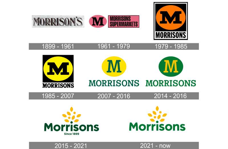
Morrisons has updated its logo several times since the late 1800s, moving from ornate Victorian-era lettering to the stripped-back, high-contrast wordmark used today. Each redesign tracked the company’s growth from a Bradford market stall to a national supermarket chain.
Original Morrisons Logo (1899-1950s)
- Years Active: 1899 to approximately the 1950s
- Design Description: Decorative lettering typical of Victorian and Edwardian commercial signage, reflecting William Morrison’s egg and butter stall origins
- Color Scheme: Mostly monochrome, used in print and hand-painted signage
- Designer: Unknown
- Context: William Morrison founded the business in Bradford’s Rawson Market in 1899. Branding at this stage was functional and locally focused
- Key Changes from Previous: N/A (first iteration)
- Cultural Significance: Represented a working-class northern market trader identity, grounded in fresh food and honest pricing
Mid-Century Morrisons Logo (1950s-1970s)
- Years Active: 1950s to approximately 1970
- Design Description: Simpler block lettering as the business transitioned from market stalls to proper store formats under Ken Morrison’s leadership
- Color Scheme: Early use of yellow and black begins to appear in signage
- Designer: Unknown
- Context: Ken Morrison took over in 1952 and began rapid expansion. The brand needed a more scalable visual identity
- Key Changes from Previous: Shift toward cleaner, more commercial lettering. Less ornate
- Cultural Significance: Marked Morrisons’ move from market trader to recognizable regional retailer
Classic Yellow Era Logo (1970s-2000s)
- Years Active: Early 1970s through early 2000s
- Design Description: Bold uppercase “MORRISONS” wordmark on a yellow background with black text. Chunky, confident letterforms. Some versions included a stylized “M” device
- Color Scheme: Yellow and black, with occasional green accents in sub-branding
- Designer: Developed in-house across multiple iterations
- Context: Morrisons expanded nationally through the 1970s and 1980s. A strong, simple mark was needed for large-format store signage
- Key Changes from Previous: Yellow background fully adopted as the dominant brand color. All-caps treatment introduced
- Cultural Significance: This is the era most older UK shoppers associate with the brand. The yellow became genuinely iconic in northern England
Modern Morrisons Logo (2007-Present)
- Years Active: 2007 to present
- Design Description: Refined wordmark with custom-style lettering, lower case “orrisons” following a capital “M”. Clean, modern weight. Yellow background retained
- Color Scheme: Yellow (#FFD500) and black (#000000)
- Designer: Refined with agency input post-Safeway acquisition period
- Context: Following the 2004 acquisition of Safeway, Morrisons needed a more unified national identity. The updated logo rolled out across converted stores
- Key Changes from Previous: Mixed case treatment, smoother letterforms, tighter spacing, more contemporary feel while retaining the yellow-black foundation
- Cultural Significance: Signaled Morrisons’ intent to compete seriously with Tesco and Sainsbury’s at a national level
What Do the Design Elements of the Morrisons Logo Mean?
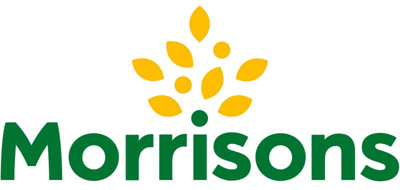
The Morrisons logo uses yellow and black to communicate energy, value, and visibility. The wordmark-only approach keeps things direct. There is no abstract symbol or icon trying to say something clever. The name is the brand, and the color does the emotional work.
What Does the Yellow in the Logo Represent?
Yellow has carried the Morrisons identity for decades. It reads as optimistic and affordable, which fits a supermarket positioning itself around everyday value.
It also just works at scale. On a store fascia or a lorry driving down the motorway, yellow cuts through.
There is nothing accidental about the choice. Retailers understand that color psychology plays a real role in how shoppers feel walking into a store.
Why Did Morrisons Choose These Specific Colors?
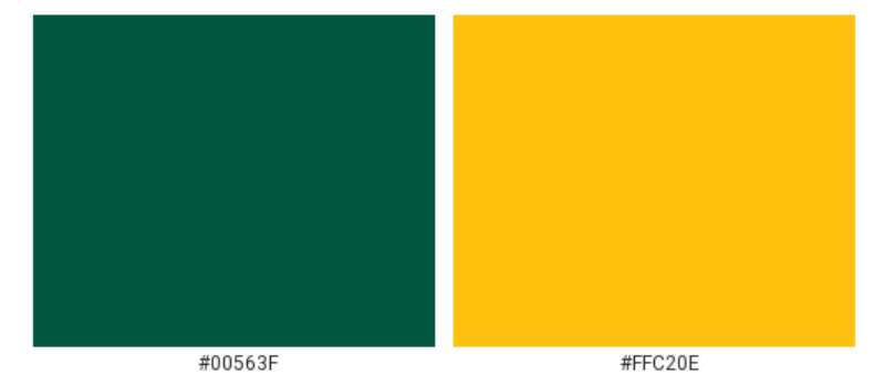
Yellow (approx. #FFD500 / Pantone 109 C)
- Symbolic meaning: Energy, warmth, value, optimism
- Psychological impact: Triggers attention and associates with affordable pricing
- Brand connection: Reinforces Morrisons’ positioning as an accessible, no-nonsense retailer
Black (#000000)
- Symbolic meaning: Confidence, clarity, authority
- Psychological impact: Creates strong contrast against yellow, making the wordmark instantly legible
- Brand connection: Grounds the otherwise energetic yellow and stops it reading as frivolous
The yellow-black pairing also has strong visibility for accessibility purposes. The contrast between the two sits well above standard legibility thresholds.
What Typography Style Is Used in the Morrisons Logo?
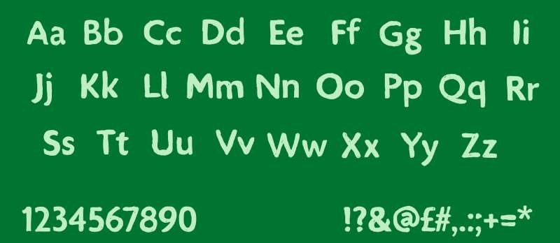
The current logo uses a custom wordmark with characteristics borrowed from humanist sans-serif fonts. The letterforms are rounded and friendly without being cartoonish.
The mixed-case treatment (capital M, lowercase remainder) softens what could otherwise feel like a blunt, corporate shout. It reads conversationally.
Typography choices in retail logos tend to follow function. Wide apertures and generous letter spacing keep things readable from a distance, which matters when your primary canvas is a 10-metre store fascia.
Earlier versions used heavier, more compressed letterforms. The shift to a slightly lighter weight in the modern version makes the logo feel less dated without abandoning the bold character shoppers recognize.
What Are the Hidden Meanings in the Morrisons Logo?
Honestly, there is no elaborate hidden geometry or dual-meaning symbol in the Morrisons logo. That is actually worth noting because a lot of brand storytelling invents depth that was never designed in.
What the logo does communicate intentionally is rootedness. The Yorkshire origins, the market trader heritage, the no-frills directness. A wordmark with no abstract icon says: the name is enough. We do not need a symbol to tell you who we are.
The consistent use of yellow over 50-plus years is the closest thing to a “hidden” message. Stability through color. Shoppers do not need to read the name once they spot that yellow.
How Does the Morrisons Logo Compare to Competitor Logos?
Against the main UK supermarket competitors, Morrisons sits in an interesting middle ground. It is more traditional than the clean blue-and-white of Tesco, warmer than the clinical orange of Sainsbury’s, and more grounded than the red-and-white energy of Asda.
The Sainsbury’s logo leans heavily on orange and a proprietary serif wordmark, which reads as slightly more premium.
The Tesco logo uses a deep blue with a stacked wordmark, which communicates scale and reliability over personality.
The Aldi logo and Lidl logo both use geometric shapes and primary colors to signal no-frills value. Morrisons achieves a similar value perception but with more warmth.
What sets Morrisons apart is the single-color background approach. Most competitors use white as a base. Morrisons fills the whole sign with yellow. It is a bolder, more confident call on the high street.
What Are the Technical Specifications of the Morrisons Logo?
Official Color Codes:
Primary Color: Morrisons Yellow
Primary Color: Black
- Hex: #000000
- RGB: (0, 0, 0)
- CMYK: (0, 0, 0, 100)
- Pantone: Process Black C
Accent Color: White (reversed applications)
- Hex: #FFFFFF
- RGB: (255, 255, 255)
- CMYK: (0, 0, 0, 0)
Dimensions and Proportions:
- Aspect ratio: Approximately 4:1 (width to height) in standard horizontal wordmark applications
- Minimum size requirements: Not publicly specified, but industry standard for wordmarks at this complexity is no smaller than 25mm wide in print
- Clear space: Typically defined as the cap height of the wordmark on all four sides
- File formats used: Vector formats (AI, EPS, SVG) for scalable applications; PNG with transparency for digital use. JPEG versions exist for web use on solid backgrounds
- Resolution: For any print application, a minimum of 300 DPI is standard
What Cultural Impact Has the Morrisons Logo Had?
In northern England especially, the Morrisons yellow is genuinely part of the visual fabric of towns and cities. It has been on high streets long enough that for a certain generation, that yellow-and-black combination just means “supermarket” at a subconscious level.
The brand’s Market Street concept, which Morrisons introduced to emphasize fresh food counters within stores, extended the logo’s meaning beyond just a shop name.
It started to stand for something specific: food made properly, by people you can see.
During difficult economic periods, Morrisons’ positioning around value has made the logo a kind of cultural shorthand for practical, no-nonsense British shopping. Not aspirational, not budget-basement. Just reliable.
That is harder to build than it looks. A lot of yellow logos in retail feel cheap. Morrisons’ version has avoided that partly through sheer consistency.
How Does the Morrisons Logo Fit Into the Overall Brand Identity?
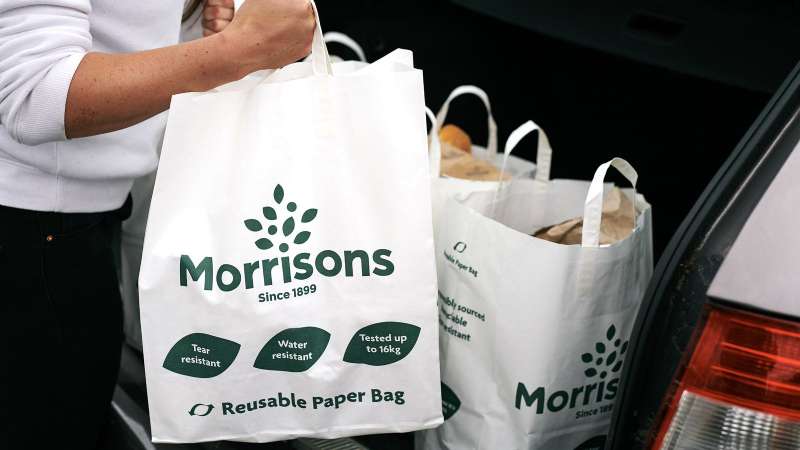
The logo sits at the center of a wider identity system that includes store design, packaging, staff uniforms, and the “More Card” loyalty program. Everything connects back to the yellow-and-black palette.
The brand guidelines extend the logo’s language across packaging, where the yellow appears as a consistent background color on own-brand products.
This creates strong shelf cohesion. You can identify a Morrisons own-brand product without reading the label, which is exactly what good brand style achieves.
The logo also connects to Morrisons’ food production credentials. Unlike most UK supermarkets, Morrisons manufactures much of its own fresh food. The brand identity tries to reflect that hands-on quality, using the Market Street concept and its associated visual language as a secondary identity layer beneath the main logo.
The visual hierarchy across Morrisons’ branded touchpoints consistently places the wordmark as the dominant element, with supporting brand language secondary. Clean, deliberate, and easy to replicate at scale.
How Should the Morrisons Logo Be Used?
Official Usage Guidelines:
- Do: Use the logo on approved yellow or white backgrounds only
- Do: Maintain clear space around the wordmark at all times
- Do: Source logo files from official Morrisons brand or press channels
- Do: Use vector files for any print or large-format application
- Don’t: Alter the color, proportions, or letterforms
- Don’t: Place the logo on busy backgrounds that reduce legibility
- Don’t: Use the logo to imply endorsement or affiliation without written permission
- Don’t: Recreate the logo from memory or from low-resolution screen captures
Where to Access Official Logos:
- Morrisons press office and media center (morrisons.com/media)
- Direct request to Morrisons brand communications team for commercial use
Licensing and Trademark Protection:
- The Morrisons logo is a registered trademark of Wm Morrison Supermarkets Limited
- Unauthorized commercial use, reproduction, or modification is prohibited under UK trademark law
- Editorial and journalistic use (such as news articles or brand analysis) generally falls under fair use principles, but commercial applications require explicit permission
- The trademark covers use across retail, food production, digital platforms, and related commercial categories
FAQ on The Morrisons Logo
What colors does the Morrisons logo use?
The Morrisons logo uses yellow (#FFD500) and black (#000000). Yellow dominates as the background, with black for the wordmark.
This high-contrast pairing has been central to Morrisons’ visual identity for decades.
What font is used in the Morrisons logo?
Morrisons uses a custom wordmark with humanist sans-serif characteristics. It is not a standard off-the-shelf typeface.
The mixed-case treatment, capital M followed by lowercase letters, gives it a approachable, modern feel without being generic.
When was the current Morrisons logo introduced?
The current version of the Morrisons brand identity was largely established around 2007, following the company’s acquisition of Safeway in 2004.
That period triggered a major store conversion programme, which required a unified national logo rollout.
Has the Morrisons logo ever been redesigned?
Yes. The Morrisons logo has gone through several iterations since William Morrison founded the business in Bradford in 1899.
Each update tracked the company’s growth, from market stall signage to a national supermarket corporate identity.
What type of logo is the Morrisons logo?
It is a wordmark logo, meaning the design relies entirely on the brand name as the visual element. There is no standalone icon or symbol.
This keeps the identity direct and consistent across store fascias, packaging, and digital platforms.
What does the yellow in the Morrisons logo mean?
Yellow signals energy, warmth, and value, all associations that align with Morrisons’ food retail positioning.
It also delivers strong visibility on UK high streets. That practical advantage is just as important as any symbolic meaning.
How does the Morrisons logo compare to other UK supermarket logos?
Most UK competitors use white as a base color. Morrisons fills the entire sign with yellow, which makes it stand out from the Tesco blue or the orange used by Sainsbury’s.
It is a bolder, warmer approach to UK supermarket branding.
Can I download the Morrisons logo for free?
Official logo files are available through the Morrisons press and media centre. The logo is a registered trademark of Wm Morrison Supermarkets Limited.
Unauthorized commercial use is not permitted under UK trademark law.
What are the Pantone colors used in the Morrisons logo?
The yellow is approximately Pantone 109 C, with Process Black C for the wordmark.
For screen use, the yellow translates to RGB (255, 213, 0). Print applications should reference the Pantone or CMYK values to maintain color accuracy.
Why has Morrisons kept the same logo colors for so long?
Consistency builds recognition. After 50-plus years, that Morrisons yellow carries instant brand recall across the UK.
Changing it would risk losing one of the most recognizable assets in British grocery retail, so the logic for keeping it is straightforward.
Conclusion
The Morrisons logo is one of the most consistent examples of retail brand identity in British grocery history.
That yellow-and-black wordmark has survived ownership changes, national expansion, and shifting consumer expectations without losing its core character.
The Morrisons visual branding succeeds because it never tried to be clever. A clean wordmark, a bold color palette, and decades of consistent application across store signage, packaging, and digital platforms have done the work.
For any supermarket chain logo, that kind of long-term recognition is genuinely hard to build. Morrisons has it.

Renowned for his expertise in logo design and visual branding, Bogdan has developed a multitude of logos for various clients.
His skills extend to creating posters, vector illustrations, business cards, and brochures. Additionally, Bogdan's UI kits were featured on marketplaces like Visual Hierarchy and UI8.
He also wrote in the past years on sites like Design Your Way, WebDesignerDepot, WPDean, Designmodo, Speckyboy, Slider Revolution, and more.
- Canva vs PowerPoint: Which Is Better for Presentations? - 22 September 2026
- How to Install Fonts on Mac (Step-by-Step Guide) - 20 September 2026
- From Mockup to Code: How AI-Augmented Development Speeds Up the Design Handoff - 19 September 2026

Bogdan Sandu is a seasoned designer who has been designing websites since 2008. Renowned for his expertise in logo design and visual branding, Bogdan has developed a multitude of logos for various clients. His skills extend to creating posters, vector illustrations, business cards, and brochures. Additionally, Bogdan's UI kits were featured on marketplaces like Visual Hierarchy and UI8. He also wrote in the past years on sites like Design Your Way, WebDesignerDepot, WPDean, Designmodo, Speckyboy, Slider Revolution, and more.
You Might Also Like