The Sainsbury’s logo is the primary visual mark of J Sainsbury plc, one of the UK’s largest supermarket chains. It functions as a logo built around a clean wordmark in the brand’s signature orange. The design has gone through several updates since the company was founded in 1869, with the current version reflecting a shift toward modern, minimal retail branding. Across its history, the logo has appeared in roughly six distinct forms.
What Is the Sainsbury’s Logo?
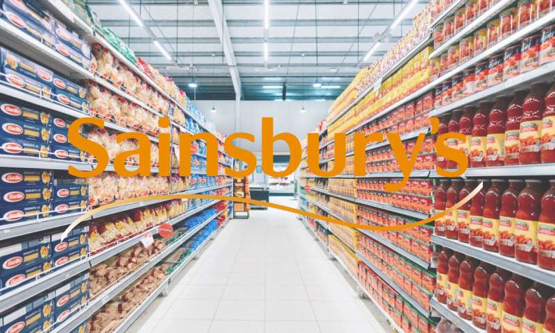
The Sainsbury’s logo is an orange wordmark using a custom sans-serif typeface. The current version was introduced in 2005 following a brand refresh. No external design agency has been officially credited for the most recent iteration. The orange colour is central to its identity, signalling energy and approachability in the competitive UK grocery market.
- Design Type: Wordmark
- Primary Elements: Custom sans-serif lettering, solid orange colour fill, no accompanying icon or symbol in standard usage
- Official Introduction Date: 2005 (current version)
- Designer/Agency: Not publicly credited for current version; earlier iterations involved internal brand teams
- Trademark Status: Registered trademark of J Sainsbury plc
- Color Palette: Sainsbury’s Orange (#F06C00), White (#FFFFFF)
- Usage Context: Store signage, packaging, digital platforms, uniforms, marketing materials, carrier bags, and advertising
How Has the Sainsbury’s Logo Evolved Over Time?
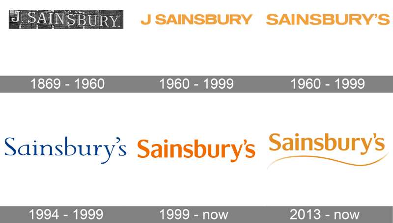
The Sainsbury’s logo has changed considerably since the company opened its first store in 1869. Early versions leaned on ornate Victorian lettering. Later designs moved toward cleaner, bolder type as supermarket culture shifted in the mid-20th century. The orange branding became dominant from the 1980s onward and has remained the core visual anchor ever since.
Original Sainsbury’s Logo (1869-1940s)
- Years Active: 1869 to approximately the 1940s
- Design Description: Ornate serif lettering typical of Victorian retail signage, often accompanied by the full company name “J Sainsbury”
- Color Scheme: Black and white, with occasional use of dark green in physical store contexts
- Designer: Unknown
- Context: Sainsbury’s began as a dairy shop in London. Visual identity reflected Victorian commercial norms
- Key Changes from Previous: N/A, original version
- Cultural Significance: Communicated tradition, quality, and trustworthiness to working-class shoppers
Mid-Century Sainsbury’s Logo (1940s-1970s)
- Years Active: 1940s to approximately 1970
- Design Description: Simplified serif lettering, moving away from ornate Victorian detail toward a cleaner print style
- Color Scheme: Black and white, occasional dark backgrounds in signage
- Designer: Unknown
- Context: Post-war Britain, expansion into self-service supermarket format
- Key Changes from Previous: Removed ornamental flourishes, cleaner letterforms
- Cultural Significance: Reflected modernisation of British retail and shift to mass-market grocery shopping
Orange Era Logo (1970s-1990s)
- Years Active: Early 1970s to mid-1990s
- Design Description: Bold, blocky sans-serif lettering introduced in conjunction with orange as the dominant brand colour. “Sainsbury’s” written in full with a thick, rounded typeface
- Color Scheme: Orange and white
- Designer: Influenced by Sainsbury’s in-house design team, with external consultancy involvement during this period
- Context: Major supermarket expansion, rise of own-brand packaging, increased competition from Tesco and Asda
- Key Changes from Previous: Full adoption of orange, switch to sans-serif, more prominent visual weight
- Cultural Significance: Orange became so associated with the brand that competitors avoided the colour. This version anchored Sainsbury’s as a market leader through the 1980s
Refined Wordmark (1990s-2005)
- Years Active: Mid-1990s to 2005
- Design Description: Slightly refined version of the orange wordmark, with adjusted letter spacing and a cleaner, more contemporary feel
- Color Scheme: Orange and white
- Designer: Not publicly credited
- Context: Increased competition, brand repositioning to address market share losses
- Key Changes from Previous: Subtle typographic adjustments, improved legibility across packaging formats
- Cultural Significance: Maintained brand continuity during a difficult commercial period for the company
Current Sainsbury’s Logo (2005-Present)
- Years Active: 2005 to present
- Design Description: Clean, modern wordmark in a custom sans-serif. No icon. Lower visual weight than previous versions
- Color Scheme: Sainsbury’s Orange (#F06C00) on white, or white on orange for reversed applications
- Designer: Not publicly credited
- Context: Part of a broader brand refresh under new leadership, aimed at repositioning Sainsbury’s as a fresh, quality-focused retailer
- Key Changes from Previous: Lighter typeface weight, refined letterforms, more flexible for digital use
- Cultural Significance: Represents Sainsbury’s push into digital retail, convenience formats, and own-brand food positioning
What Do the Design Elements of the Sainsbury’s Logo Mean?
The Sainsbury’s logo keeps things intentionally simple. The wordmark format puts the name front and centre, no icon needed. Orange does most of the heavy lifting.
The absence of a symbol is a deliberate choice. It signals confidence. A brand that doesn’t need a graphic device to be recognised.
The sans-serif font keeps things accessible and modern. Nothing fussy, nothing that dates easily.
What Does the Orange Colour Represent in the Logo?
Orange sits between red’s urgency and yellow’s warmth. For a supermarket, that’s a useful position to occupy.
It reads as energetic without being aggressive. Friendly without being childish.
Sainsbury’s has used some variation of orange since the 1970s, which means decades of brand recognition are built into that single colour decision. At this point, the orange almost IS the brand for most British shoppers.
Why Did Sainsbury’s Choose These Specific Colors?

- Sainsbury’s Orange
- Hex: #F06C00
- Pantone: Pantone 151 C (approximate)
- Symbolic Meaning: Energy, warmth, approachability
- Psychological Impact: Stimulates appetite, encourages impulse decisions, creates a sense of value. Well-documented in colour psychology research applied to retail environments
- Brand Connection: Differentiates from Tesco blue, Asda green, Morrisons yellow. Orange became Sainsbury’s territory in the UK grocery space
- White
- Hex: #FFFFFF
- Symbolic Meaning: Cleanliness, freshness, simplicity
- Psychological Impact: Creates contrast, improves legibility, reinforces food safety associations
- Brand Connection: Standard in food retail; signals hygiene and product freshness
What Typography Style Is Used in the Sainsbury’s Logo?
The current logo uses a custom sans-serif typeface. It’s not a standard off-the-shelf font available for public use.
The letterforms are rounded but not soft. They sit somewhere between geometric and humanist sans-serif styles.
Kerning is tight and consistent, which helps the wordmark hold together across large-scale signage and small digital formats equally well.
Earlier versions used heavier, blockier type. The current version reduced that visual weight significantly, making it feel less like a 1980s supermarket and more like a contemporary food brand.
What Are the Hidden Meanings in the Sainsbury’s Logo?
There are no widely documented hidden symbols in the Sainsbury’s logo. It’s a straightforward wordmark. No arrow, no subliminal shape, no dual image.
That’s actually worth noting. In a branding era when every logo seems to hide a smile or an arrow, Sainsbury’s keeps things literal.
The main intentional message is recognition through colour consistency. The orange is the symbol. It doesn’t need anything else to communicate “this is Sainsbury’s” to a British shopper.
How Does the Sainsbury’s Logo Compare to Competitor Logos?
UK supermarket logos tend to rely on strong colour coding. Each major chain has essentially claimed a colour. Sainsbury’s orange sits alongside Tesco blue, Asda green, Morrisons yellow, and Lidl’s red/yellow/blue combination. That colour palette differentiation is one of the most important functions the logo serves.
Compared to Tesco, Sainsbury’s keeps it simpler. Tesco uses a red stripe element and has experimented with various supporting graphics. Sainsbury’s sticks to the wordmark.
The Morrisons logo takes a different approach with its stacked layout and yellow/green palette, skewing warmer and more traditionally “grocery”. Sainsbury’s feels more premium in comparison, which tracks with its market positioning.
Compared to discount chains like Aldi or Lidl, Sainsbury’s wordmark is cleaner and less visually busy. Discount retailers tend to use more graphic complexity in their logos, possibly to signal variety and value through visual density. Sainsbury’s does the opposite.
Among grocery store logos globally, the Sainsbury’s mark is notably restrained. Kroger, Walmart, and Costco all incorporate more visual elements. Sainsbury’s confidence in pure typography says something about how established the brand is in its home market.
What Are the Technical Specifications of the Sainsbury’s Logo?
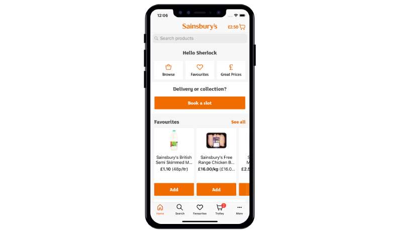
Official Color Codes
- Primary Color: Sainsbury’s Orange
- Hex: #F06C00
- RGB: (240, 108, 0)
- CMYK: (0, 55, 100, 6)
- Pantone: 151 C (approximate match)
- Secondary Color: White
- Hex: #FFFFFF
- RGB: (255, 255, 255)
- CMYK: (0, 0, 0, 0)
Dimensions and Proportions
- Aspect Ratio: Horizontal wordmark; approximate ratio of 5:1 (width to height) in standard usage
- Minimum Size Requirements: Not publicly documented; standard brand practice requires legibility at small sizes, typically no smaller than 20px height in digital use
- Clear Space: Standard practice requires clear space equal to the cap height of the wordmark on all sides
- File Formats: Official assets distributed as vector graphics (SVG, EPS, AI) for scalable use; JPEG and PNG versions for digital applications
- Resolution: For any print application, a minimum of 300 DPI is expected. Avoid using low-resolution bitmap versions at large scale
- Official Usage Guidelines: Governed by J Sainsbury plc brand standards; not publicly released in full
What Cultural Impact Has the Sainsbury’s Logo Had?
Sainsbury’s orange is one of the most recognised brand colours in the UK. Ask most British adults what colour they associate with Sainsbury’s and the answer is immediate. That level of colour ownership is rare and took decades to build.
The logo has appeared on some of the most-watched UK TV adverts, particularly around Christmas, when Sainsbury’s campaigns regularly generate significant public attention.
It’s also embedded in everyday British life in a way that’s easy to underestimate. The bags, the receipts, the store fascia. For a lot of people, the orange wordmark is just part of the visual background of a weekly shop.
Sainsbury’s has also used its brand identity to push into cause-related marketing, most notably with its partnership with Comic Relief and various food waste campaigns. The logo became associated with social responsibility, not just groceries.
In design terms, the logo is a good example of what consistency over time can achieve. It’s not the most complex mark among orange logos in retail, but it doesn’t need to be. Recognition built over 50+ years of colour consistency is hard to replicate.
How Does the Sainsbury’s Logo Fit Into the Overall Brand Identity?
The logo is the anchor point for a broader identity system. Orange carries across store interiors, own-brand packaging, digital platforms, staff uniforms, and marketing materials. The wordmark rarely appears in isolation.
Sainsbury’s own-brand product lines (from “Sainsbury’s Basics” to “Taste the Difference”) each have their own visual sub-identities, but all connect back to the core orange wordmark. It’s a clear example of a brand guidelines system working at scale.
The Nectar loyalty card, Argos (a Sainsbury’s subsidiary), and Tu clothing all operate as separate visual identities but exist within the same corporate brand family. The main Sainsbury’s wordmark sits at the top of that structure.
Subsidiary brands like Argos and Habitat don’t carry the orange wordmark but share parent company values around accessibility and everyday value. The brand style guide keeps those relationships coherent without forcing visual uniformity across every sub-brand.
In terms of visual hierarchy, the orange wordmark always takes priority in co-branded contexts. It’s the dominant signal, with subsidiary marks and campaign graphics playing a supporting role.
How Should the Sainsbury’s Logo Be Used?
Official Usage Guidelines
- Do: Use official files obtained directly from J Sainsbury plc or authorised partners
- Do: Maintain clear space around the wordmark on all sides
- Do: Use the logo at sufficient size for legibility across all applications
- Do: Reproduce in the approved orange (#F06C00) or in white for reversed applications
- Don’t: Alter the colour outside of approved variations
- Don’t: Stretch, distort, or rearrange the wordmark letterforms
- Don’t: Place the logo on backgrounds that reduce contrast or legibility
- Don’t: Add drop shadows, outlines, or graphic effects not included in the official files
- Don’t: Use the logo to imply endorsement or partnership without written authorisation from J Sainsbury plc
Where to Access Official Logo Files
- Official press and media assets are available through the Sainsbury’s newsroom and media centre at www.about.sainsburys.co.uk
- Authorised suppliers and brand partners receive assets through Sainsbury’s internal brand portal
- Third-party logo databases are not authorised sources. Always request files directly from the brand team for commercial or editorial use
Licensing and Trademark Protection
- The Sainsbury’s name and logo are registered trademarks of J Sainsbury plc
- Unauthorised commercial use, including merchandise, advertising, or digital products that imply brand affiliation, is prohibited
- Editorial and journalistic use for identification purposes is generally permitted under fair use principles, but commercial reproduction requires explicit written permission
- Font licensing for the custom typeface used in the wordmark is proprietary and not available to the public
FAQ on the Sainsbury’s Logo
What colour is the Sainsbury’s logo?
The Sainsbury’s logo uses a specific shade of orange, with the hex code #F06C00.
In print, this translates to Pantone 151 C. White is the only secondary colour used, either as the background or as a reversed version of the wordmark.
What font does Sainsbury’s use in its logo?
Sainsbury’s uses a custom sans-serif typeface that isn’t publicly available.
It sits between geometric and humanist styles. The letterforms are rounded but structured, designed for legibility across store signage, packaging, and digital platforms.
When was the current Sainsbury’s logo introduced?
The current version of the Sainsbury’s wordmark was introduced in 2005, as part of a broader brand refresh.
It replaced a heavier, blockier version of the orange logo that had been in use since the 1990s.
Who designed the Sainsbury’s logo?
No external design agency has been officially credited for the current logo design.
Earlier iterations involved both in-house brand teams and external consultants, but J Sainsbury plc has not made specific designer attributions public for the 2005 version.
Has the Sainsbury’s logo always been orange?
No. The earliest versions used Victorian serif lettering in black and white.
Orange became the dominant brand colour during the 1970s supermarket expansion era and has stayed central to the visual identity ever since. That’s over 50 years of colour consistency.
What type of logo is the Sainsbury’s logo?
It is a wordmark, meaning the logo consists entirely of the brand name in a styled typeface with no accompanying icon or symbol.
This format relies on typography and colour alone to carry brand recognition, which works because the orange is so established in the UK market.
How does the Sainsbury’s logo compare to other UK supermarket logos?
UK supermarket branding is heavily colour-coded. Sainsbury’s owns orange, Tesco uses blue, Asda uses green, and Morrisons uses yellow.
Among grocery store logos, Sainsbury’s is one of the cleaner wordmark designs. No icon, no strapline in the main mark. Just the name and the colour.
What do the design elements of the Sainsbury’s logo mean?
The orange signals energy, warmth, and approachability. These are well-documented associations in retail colour theory.
The clean sans-serif typography communicates modernity and accessibility. The decision to use a wordmark without a symbol suggests brand confidence built through decades of recognition.
Can I download and use the Sainsbury’s logo?
The Sainsbury’s logo is a registered trademark of J Sainsbury plc. Unauthorised commercial use is prohibited.
Official press assets are available through the Sainsbury’s media centre. Any commercial or partnership use requires written permission directly from the brand team.
How many times has the Sainsbury’s logo changed?
The logo has gone through approximately six distinct versions since the company was founded in 1869.
Changes moved from ornate Victorian lettering to mid-century serif type, then to the bold orange sans-serif wordmark that defines the brand today. Each shift tracked broader changes in British retail culture.
Conclusion
The Sainsbury’s logo is a good example of what long-term brand consistency actually looks like in practice.
A clean wordmark, a ownable orange, and enough typographic refinement to stay current without losing recognition.
The logo evolution tracks over 150 years of British retail history, from Victorian serif lettering to a modern sans-serif wordmark built for digital and physical use alike.
For anyone studying supermarket brand identity or retail colour psychology, Sainsbury’s is a case worth looking at closely. Simple on the surface. A lot of accumulated meaning underneath.

Renowned for his expertise in logo design and visual branding, Bogdan has developed a multitude of logos for various clients.
His skills extend to creating posters, vector illustrations, business cards, and brochures. Additionally, Bogdan's UI kits were featured on marketplaces like Visual Hierarchy and UI8.
He also wrote in the past years on sites like Design Your Way, WebDesignerDepot, WPDean, Designmodo, Speckyboy, Slider Revolution, and more.
- The Windsurf Logo History, Colors, Font, And Meaning - 10 October 2026
- How to Remove Background From Product Photos (No Photoshop) - 10 October 2026
- How Designers can Build a Stronger Online Creative Identity - 9 October 2026

Bogdan Sandu is a seasoned designer who has been designing websites since 2008. Renowned for his expertise in logo design and visual branding, Bogdan has developed a multitude of logos for various clients. His skills extend to creating posters, vector illustrations, business cards, and brochures. Additionally, Bogdan's UI kits were featured on marketplaces like Visual Hierarchy and UI8. He also wrote in the past years on sites like Design Your Way, WebDesignerDepot, WPDean, Designmodo, Speckyboy, Slider Revolution, and more.
You Might Also Like