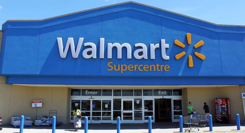
The Walmart logo is one of the most recognized retail brand marks in the world. It pairs a custom blue wordmark with a six-pointed yellow spark symbol, representing the company’s scale, accessibility, and American retail identity. The current version has been in use since 2008 and was developed in partnership with the design firm Lippincott.
Within retail branding history, Walmart’s visual identity sits alongside a small group of corporate rebrands that genuinely shifted how mass-market companies present themselves. The 2008 refresh moved the brand away from aggressive, discount-focused visuals toward something cleaner and more approachable, reflecting a broader industry shift toward logo designs that feel less transactional.
The current logo was introduced on June 30, 2008. Walmart Inc. was founded by Sam Walton in 1962, and the brand has gone through six distinct logo iterations since then.
What is the Walmart Logo?
The Walmart logo is a combination mark featuring the “Walmart” wordmark in a custom sans-serif typeface set in True Blue, paired with a six-pointed yellow spark icon to the right. Introduced in 2008 and developed by Lippincott, it replaced the star-hyphen mark and signals approachability and everyday value.
- Design Type: Combination mark (wordmark + icon)
- Primary Elements: Custom sans-serif wordmark, six-pointed spark symbol
- Official Introduction Date: June 30, 2008
- Designer/Agency: Lippincott (brand strategy and design firm)
- Trademark Status: Registered trademark, U.S. Patent and Trademark Office
- Color Palette:
- True Blue: #0071CE (Pantone 656)
- Everyday Yellow: #FFC220 (Pantone 2154)
- Usage Context: Store signage, product packaging, digital platforms, marketing materials, employee uniforms, merchandise, and the Walmart app
How Has the Walmart Logo Evolved Over Time?
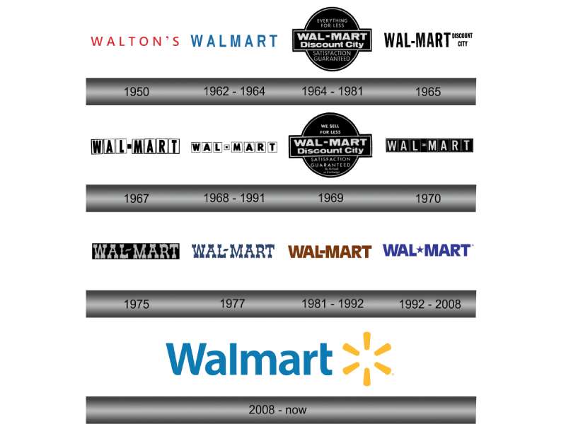
The Walmart logo has gone through six major versions since 1962, moving from simple hand-lettered text to a bold starburst mark, then eventually to the clean combination mark used today.
Early designs reflected the no-frills discount retail environment of mid-century America.
By the late 1980s, the brand started asserting a stronger visual identity. The 2008 redesign was the most significant shift, dropping the aggressive hyphenated star in favor of a warmer, more refined look.
Original Walmart Logo (1962-1964)
- Years Active: 1962-1964
- Design Description: Simple hand-lettered wordmark, no icon
- Color Scheme: Black and white
- Designer: Unknown
- Context: Sam Walton opened the first Walmart store in Rogers, Arkansas; branding was minimal and functional
- Key Changes from Previous: First iteration, no predecessor
- Cultural Significance: Reflected the straightforward, working-class identity of the original discount store concept
Walmart Logo (1964-1981)
- Years Active: 1964-1981
- Design Description: Bold block lettering with a slightly more polished wordmark
- Color Scheme: Brown and white
- Designer: Unknown
- Context: Company was expanding rapidly across the American South and Midwest
- Key Changes from Previous: More structured typography, shift toward a consistent brand identity
- Cultural Significance: Mirrored the earthy, practical aesthetic common in American retail of the era
Walmart Logo (1981-1992)
- Years Active: 1981-1992
- Design Description: Introduced a brown starburst icon alongside the wordmark
- Color Scheme: Brown and white
- Designer: Don Watt
- Context: Walmart was becoming a national force; the starburst hinted at energy and growth
- Key Changes from Previous: First use of an accompanying icon; more dynamic visual presence
- Cultural Significance: Signaled Walmart’s ambition to compete at a national scale
Walmart Logo (1992-2008)
- Years Active: 1992-2008
- Design Description: “Wal-Mart” wordmark with a star used as the hyphen, set in dark blue
- Color Scheme: Dark blue and white
- Designer: Don Watt
- Context: Walmart had become the largest retailer in the world; the logo needed to reflect that authority
- Key Changes from Previous: Color shift to blue; star-hyphen introduced as a signature design element
- Cultural Significance: The blue-and-white palette positioned Walmart as trustworthy and American; the hyphen-star became iconic
Current Walmart Logo (2008-Present)
- Years Active: 2008-present
- Design Description: Clean sans-serif “Walmart” wordmark (no hyphen) paired with a six-pointed spark icon to the right
- Color Scheme: True Blue (#0071CE) and Everyday Yellow (#FFC220)
- Designer: Lippincott
- Context: Part of a larger brand refresh aimed at improving public perception and competing more directly with Target’s cleaner aesthetic
- Key Changes from Previous: Removed the hyphen from “Wal-Mart,” replaced the star-hyphen with a separate spark symbol, introduced yellow as a core brand color
- Cultural Significance: Marked Walmart’s intent to shed its “cheap and aggressive” image and move toward a friendlier, more modern retail identity
What Do the Design Elements of the Walmart Logo Mean?
The Walmart logo uses two core elements, a blue wordmark and a yellow spark, to communicate scale, optimism, and everyday value.
The spark icon is the most discussed element. It has six points, and each point is said to represent one of Sam Walton’s original retail principles.
The decision to drop the hyphen from “Wal-Mart” was also deliberate. It modernized the name and made it feel less like a dated corporate label.
What Does the Spark Symbol Represent?
The six-pointed spark replaced the old star-hyphen in 2008.
Lippincott designed it to feel energetic but not aggressive, a spark of an idea rather than a burst of noise.
The shape draws loosely from sunburst iconography, which connects to warmth, optimism, and light. In the context of retail, it subtly suggests a good deal, a moment of discovery.
Each of the six points is also said to reference Sam Walton’s core business principles, though Walmart has never officially confirmed this detail publicly.
Why Did Walmart Choose These Specific Colors?
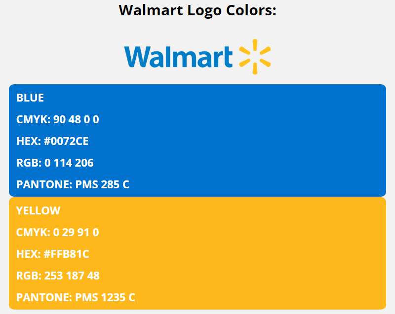
True Blue (Pantone 656 / #0071CE)
- Symbolic meaning: Trust, reliability, stability
- Psychological impact: Blue is one of the most universally trusted colors in branding; it lowers perceived risk for consumers making purchase decisions
- Brand connection: Aligns Walmart with the straightforward, dependable Americana identity the company wants to project
Everyday Yellow (Pantone 2154 / #FFC220)
- Symbolic meaning: Energy, optimism, affordability
- Psychological impact: Yellow draws attention quickly and is associated with value and savings in retail contexts; it also adds warmth that blue alone lacks
- Brand connection: The “Everyday” in the color’s official name directly ties to Walmart’s “Everyday Low Prices” positioning
The blue-yellow pairing avoids feeling aggressive. Together, they read as accessible and confident without being loud. Understanding color theory helps explain why this combination works so well at scale, across signage, digital, and print.
What Typography Style Is Used in the Walmart Logo?
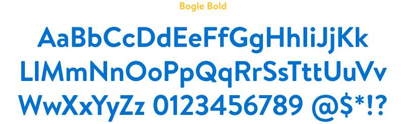
The wordmark uses Walmart Sans, a custom sans-serif font developed specifically for the brand.
It is rounded and approachable, with letter spacing that feels open rather than compressed.
The rounded terminals soften the overall tone, which was a deliberate move away from the more rigid, corporate letterforms used before 2008.
Readability at large scale was a primary consideration, since the wordmark needs to work on everything from store facades to app icons. The typography choices reflect that need for clarity across very different sizes and surfaces.
What Are the Hidden Meanings in the Walmart Logo?
The most talked-about hidden element is the six points of the spark.
Walmart has never officially linked each point to a specific principle, but the “six rules of Sam Walton” theory has circulated widely enough that it’s become part of the brand’s unofficial folklore.
The removal of the hyphen is also intentional symbolism. “Wal-Mart” felt dated and corporate. “Walmart” as one word reads more like a modern brand name, something closer to Amazon or Target in its simplicity.
There are no confirmed subliminal elements in the traditional sense, but the spark’s resemblance to a sun or a flower has been noted by designers. It gives the mark a slightly organic quality that softens what is otherwise a very corporate identity.
How Does the Walmart Logo Compare to Competitor Logos?
Among major retail competitors, Walmart’s logo is one of the more restrained and deliberately approachable designs. Target uses a bold red bullseye, Costco relies on a straightforward wordmark, and Amazon uses its smile-arrow icon.
Walmart sits in an interesting middle ground.
It has more visual warmth than the Costco logo, which is purely typographic. But it is less iconic as a standalone symbol than Target’s bullseye, which works without any text at all.
The spark is recognizable, but only within context. It does not have the standalone recognition of the Target mark.
Compared to the Kroger logo or the Target logo, Walmart’s design feels more considered and less tied to a single graphic device. That’s actually a strength for a company that operates in so many different retail formats, from Walmart Supercenter to Sam’s Club to Flipkart.
Among grocery store logos more broadly, the blue-yellow combination is fairly unique. Most grocery branding skews toward red (Kroger, Safeway, Albertsons) or green (Whole Foods, Sprouts). Walmart’s palette deliberately avoids those associations and sits in its own visual space.
What Are the Technical Specifications of the Walmart Logo?
Official Color Codes
Primary Color: True Blue
Secondary Color: Everyday Yellow
- Hex: #FFC220
- RGB: (255, 194, 32)
- CMYK: (0, 24, 87, 0)
- Pantone: 2154 C
Dimensions and Proportions
- Aspect ratio: Approximately 5:1 (wordmark with spark); the spark alone is roughly square
- Minimum size requirements: Walmart’s brand guidelines specify a minimum width of 1 inch for print applications to maintain legibility
- Clear space specifications: The clear space around the logo should be equal to the height of the lowercase “a” in the wordmark on all sides
- Official usage guidelines: The logo should never be stretched, recolored outside approved palettes, placed on visually competing backgrounds, or used without the spark element unless specifically approved by Walmart’s brand team
- File formats available: Official assets are distributed as vector graphics (SVG, EPS) for scalable use, plus raster formats for digital applications
What Cultural Impact Has the Walmart Logo Had?

The Walmart logo is one of a small number of retail brand marks that has genuinely entered everyday American visual culture. The blue-and-yellow color combination is immediately recognizable even without the wordmark present.
The 2008 rebrand had an outsized cultural moment.
It was widely covered by design press and general media alike, which is unusual for a retail logo change. The decision to drop the hyphen alone generated significant public commentary, something that rarely happens with typographic decisions in corporate branding.
The spark icon has appeared in parody, political commentary, and cultural criticism in ways that confirm its place as a genuinely recognized symbol. It shows up in discussions about American consumerism, labor practices, and the homogenization of retail spaces.
Among blue logos specifically, Walmart’s sits alongside brands like Facebook, Ford, and Samsung as one of the most globally recognized. The shade of blue Walmart uses (#0071CE) has become so closely associated with the brand that it functions almost like a proprietary color in retail contexts.
How Does the Walmart Logo Fit Into the Overall Brand Identity?
The logo anchors a broader identity system that includes Walmart Sans typography, the True Blue and Everyday Yellow color palette, and a set of brand values centered on accessibility, savings, and community. Every brand touchpoint connects back to these elements.
The spark appears across store signage, the Walmart app icon, employee badges, shopping bags, and advertising.
It functions as the connective tissue between very different retail formats. A Walmart Supercenter and a Walmart Neighborhood Market look different physically, but the logo creates continuity.
The brand guidelines that govern logo usage are part of a larger system that also covers tone of voice, photography style, and digital UI patterns. The logo does not exist in isolation; it is the most visible part of a much wider identity framework.
Internationally, the logo has had to adapt. In some markets (like the UK, where Walmart owned Asda), the Walmart identity was secondary to the local brand. That relationship between the global Walmart mark and local subsidiary brands is a good example of how a brand style guide handles identity hierarchy across markets.
How Should the Walmart Logo Be Used?
Official Usage Guidelines
Do’s:
- Use only official, unmodified logo files sourced from Walmart’s brand portal
- Maintain clear space around the logo at all times
- Use approved color versions (full color, all-white, all-blue) depending on background
- Reproduce the wordmark and spark together unless specifically approved otherwise
Don’ts:
- Do not stretch, distort, or rotate the logo
- Do not recolor the logo outside of approved variants
- Do not place the logo on backgrounds that reduce legibility
- Do not separate the spark from the wordmark for general use
- Do not use the logo to imply endorsement or partnership without written permission from Walmart Inc.
Where to Access Official Logo Files
Official Walmart logo assets are available through Walmart’s Media Library at corporate.walmart.com. Vendors, press, and partners can request access through Walmart’s media relations team. Unauthorized downloads from third-party sites are not officially sanctioned and may not reflect current brand specifications.
Licensing and Trademark Protection
The Walmart name and spark symbol are registered trademarks of Walmart Inc. with the U.S. Patent and Trademark Office. Commercial use of the logo without written authorization is a trademark violation. This applies to merchandise, advertising, digital content, and any other use that could imply affiliation with or endorsement by Walmart. The trademark is also registered internationally through WIPO’s Global Brand Database.
FAQ on The Walmart Logo
What does the Walmart logo look like?
The Walmart logo pairs a clean blue wordmark with a six-pointed yellow spark icon placed to its right.
The wordmark uses a custom typeface called Walmart Sans. The color palette consists of True Blue (#0071CE) and Everyday Yellow (#FFC220).
When did Walmart change its logo?
Walmart introduced its current logo on June 30, 2008.
The redesign was developed by Lippincott. It dropped the hyphen from “Wal-Mart” and replaced the old star-hyphen mark with the now-familiar spark symbol.
What is the spark symbol in the Walmart logo?
The spark is a six-pointed yellow icon that sits to the right of the wordmark.
Each point is widely believed to represent one of Sam Walton’s core retail principles. Walmart has never officially confirmed this, but the association has stuck.
What font does the Walmart logo use?
The logo uses Walmart Sans, a custom-designed typeface built specifically for the brand.
It is a rounded sans-serif font with open letter spacing. The rounded terminals make it feel approachable rather than corporate.
What are the official Walmart logo colors?
Walmart uses two official brand colors. True Blue (Pantone 656, #0071CE) and Everyday Yellow (Pantone 2154, #FFC220).
Blue communicates trust and reliability. Yellow signals energy and value, which ties directly to Walmart’s “Everyday Low Prices” positioning.
How many times has the Walmart logo changed?
The Walmart logo has gone through six major versions since Sam Walton opened the first store in Rogers, Arkansas in 1962.
Each iteration reflected a shift in the company’s scale and retail identity, from a simple wordmark to the current combination mark.
Who designed the current Walmart logo?
The current logo was designed by Lippincott, a New York-based brand strategy and design firm.
The 2008 redesign was part of a broader corporate rebrand. It involved renaming the company from “Wal-Mart Stores, Inc.” to “Walmart Inc.” years later in 2018.
What is the Walmart logo color code?
For digital use, the blue is #0071CE in hex, with RGB values of (0, 113, 206). The yellow is #FFC220, with RGB values of (255, 194, 32).
For print, the colors are Pantone 656 C and Pantone 2154 C respectively.
How does the Walmart logo compare to Target’s logo?
Target’s red bullseye works as a standalone icon without any text. The Walmart spark does not have quite that level of standalone recognition yet.
That said, Walmart’s color psychology approach is more nuanced, using blue and yellow to signal both trust and savings simultaneously.
Can I download and use the Walmart logo?
The Walmart name and spark are registered trademarks of Walmart Inc. Unauthorized commercial use is a trademark violation.
Official logo files are available through Walmart’s Media Library at corporate.walmart.com. Always request assets directly from Walmart’s media relations team for any approved use.
Conclusion
The Walmart logo is a case study in how corporate visual identity evolves alongside business strategy. Six iterations over six decades, each one reflecting a different chapter in the company’s growth.
The 2008 redesign by Lippincott was not just a cosmetic update. Dropping the hyphen, introducing the spark symbol, and shifting to the True Blue and Everyday Yellow palette changed how the brand communicates value and trust at scale.
For anyone studying retail branding or logo design principles, Walmart’s wordmark evolution is worth understanding. It shows how typography, color, and iconography work together to carry brand equity forward without losing recognition.

Renowned for his expertise in logo design and visual branding, Bogdan has developed a multitude of logos for various clients.
His skills extend to creating posters, vector illustrations, business cards, and brochures. Additionally, Bogdan's UI kits were featured on marketplaces like Visual Hierarchy and UI8.
He also wrote in the past years on sites like Design Your Way, WebDesignerDepot, WPDean, Designmodo, Speckyboy, Slider Revolution, and more.
- How to Install Fonts on Mac (Step-by-Step Guide) - 20 September 2026
- From Mockup to Code: How AI-Augmented Development Speeds Up the Design Handoff - 19 September 2026
- The Beehiiv Logo History, Colors, Font, And Meaning - 18 September 2026

Bogdan Sandu is a seasoned designer who has been designing websites since 2008. Renowned for his expertise in logo design and visual branding, Bogdan has developed a multitude of logos for various clients. His skills extend to creating posters, vector illustrations, business cards, and brochures. Additionally, Bogdan's UI kits were featured on marketplaces like Visual Hierarchy and UI8. He also wrote in the past years on sites like Design Your Way, WebDesignerDepot, WPDean, Designmodo, Speckyboy, Slider Revolution, and more.
You Might Also Like