The Target Logo History, Colors, Font, And Meaning
Imagine strolling through an immense sea of retail logos, each clamoring for attention. Yet, one emblem stands out: a crimson beacon of simplicity. It’s the Target Logo, an iconic symbol that has navigated decades, encapsulating not just a brand but an American retail legacy.
Embedded within its minimalistic bullseye, stories of ambitious rebranding, an evolution mirroring the shifting retail landscape, and an unwavering dedication to brand identity await.
Standing at the intersection of graphic design and marketing strategy, this symbol transcends mere visual branding to become a corporate emblem recognized across generations.
This exploration unravels the stitchings of the Target logo’s fabric—how it’s more than just design. It’s a language speaking directly to millions, embodying the retailer’s insignia while redefining industry standards.
By its end, readers will unravel the tale behind the simplicity; the precise crafting of a visual identity that resonates an undeniable connection to the consumer psyche—a testament to the lasting power of an emblem in an ever-competitive retail space.
Discovering the secret to its success will leave you contemplating the essence of what makes any logo stick—let’s dive into that red and white world.
The Meaning Behind the Target Logo
![]()
Ever wondered why the Target logo is, well, a target?
This is the deep dive you didn’t know you needed.
Simplicity is Key
The beauty of the Target logo lies in its simplicity. It’s direct, it’s bold, and it does exactly what it says on the tin.
We, as viewers, instantly connect with the image. Why? Because targets signify aims, goals, and hitting the mark.
It’s not just about shopping; it’s about hitting that sweet spot of satisfaction when you find just what you’re looking for.
Emotion and Connection
There’s an emotional connection too. That bullseye is about victory. You know that feeling when you grab the last item on sale? Yeah, that’s the bullseye feeling. It’s the emotional high-five we give ourselves.
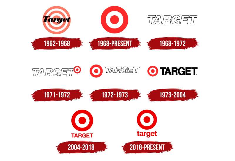
The History of the Target Logo
Gather ’round folks, it’s story time!
Let’s journey through time.
Origins and Evolution
Way back in the day, 1962 to be exact, the first Target store opened its doors. And guess what? The logo was a target, but a bit more detailed.
Over the years, it went through some changes, kinda like a glow up. From a more complex design with multiple rings and the name inscribed, to the modern, sleek, 2-ring design we know today.
An Icon in Retail
The Target logo isn’t just a logo; it’s a symbol. It’s seen the trends come and go, yet stayed iconic throughout the ages. Kinda like your grandma’s timeless style.
The Colors of the Target Logo
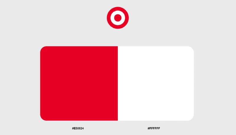
Ah, the colors! Who doesn’t love a good splash of red?
The Power of Red
Red isn’t just a color; it’s an emotion. It shouts passion, excitement, and attention. And for a retail giant like Target, capturing attention is the name of the game.
The cherry-on-top? White. Clean, simple, and the perfect counterpart to the bold red.
The Psychology Bit
Color plays with our emotions. Red incites action, it nudges us, says, “Hey, look here!” Paired with white, it creates a balance of excitement and simplicity.
The Font Used in the Target Logo
Font geeks, this one’s for you.
Bold and Readable
Target’s font is the kind you wanna introduce to your parents. It’s bold, trustworthy, and has no hidden agenda. It’s straightforward and clear, making it super-readable from afar.
Typography Matters
Good typography is like good grammar. Most people won’t notice when it’s right, but they’ll surely notice when it’s wrong. The Target logo nails it by keeping it consistent and fuss-free.
The Impact on Pop Culture
Let’s talk influence, folks.
More Than Just a Store
From movies to TV shows to memes, the Target logo has made its cameo. It’s not just about shopping; it’s a cultural touchstone. You see it, and instantly, a multitude of associations flood in.
The Fashion Statement
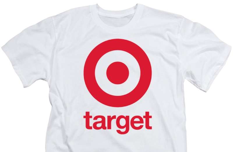
Ever seen those trendy tees sporting the logo? Yup, that’s Target’s influence spilling into the world of fashion, turning customers into walking advertisements. Genius, right?
The Adaptability Factor
In a world that’s always changing, adaptability is key.
Modern Times, Modern Logo
The digital age threw a curveball, and the Target logo caught it with grace. From apps to online banners, its design remains versatile, making it fit seamlessly wherever.
From Billboards to Buttons
Whether it’s a giant billboard or a tiny app button, the logo’s design ensures it stands out. It’s a lesson in branding: always be ready for the next big thing.
FAQ On The Target Logo
Why is the Target logo so simple?
The simplicity of the Target logo is its strength; it embodies the straightforward yet holistic approach that the company takes towards retail.
The minimalistic bullseye reflects an accessible brand that aims straight for what the consumer desires—quality goods without the fuss.
What does the Target logo represent?
It’s more than circles—it represents a mark of confidence and trust. The Target logo epitomizes a legacy of commitment to customer satisfaction and value. It’s a symbol of a shopping destination that consistently hits the mark on consumer expectations.
Who designed the iconic Target logo?
It was Stewart K. Widdess, who was responsible for the branding of Target in the 1960s. Widdess and his team shaped a visual that would evolve into today’s emblem, initially designed to attract consumers with its bold contrast and recognizable shape.
Has the Target logo always been red and white?
Indeed, red and white have been the consistent colors since its inception. These hues are part of the company’s core visual identity, with red suggesting vibrance and excitement while white conveys clarity and purity, echoing the brand’s straightforward promise.
When did Target adopt its current logo?
The current logo, which represents an uncluttered version of the original design, was adopted in 1962. Since then, it has undergone minor tweaks but has substantially maintained its signature look, continually reinforcing its presence in the American retail culture.
What impact has the Target logo had on brand recognition?
The logo’s impact is monumental; it acts as a pillar of the brand imagery. Consumers instantly recognize the association with affordability and style, thus propelling Target to a status beyond a mere sum of its products—into an essential fixture in everyday lives.
How often has the Target logo been redesigned?
Redesigns have been minimal, reflecting a strategy by the company to maintain recognition and legacy. The tweaks were subtle shifts, staying true to the timeless bullseye symbol’s essence, avoiding the perils that drastic rebranding processes often ensue.
Why doesn’t the Target logo include the company name?
Visual identity systems often debate the use of names, but the logo’s distinctiveness eliminates that need. Its design communicates the Target brand so effectively that additional text is superfluous; the emblem stands alone as an internationally recognized iconic logo.
What are the legal trademarks associated with the Target logo?
The Target logo, as a significant commercial symbol, is trademarked. Legal trademarks protect its unique design elements from duplication or misuse, preserving the logo’s integrity, exclusive to Target Corporation, and safeguarding its brand identity.
How do graphic designers view the Target logo in terms of visual branding?
Graphic designers often regard the logo as a paragon of logo evolution. It demonstrates the compelling power of simplicity in visual branding, resonating with the mantra “less is more.” Its endurance and adaptability mark it as a case study in successful design principles.
Conclusion
Within the panorama of commercial emblematry, few have mastered the universal language of design as fluently as the Target Logo. It’s a narrative of bold minimalism that I’ve dissected, laying bare the intricacies beneath its deceptive simplicity. This logo—redolent of graphic finesse, denotes not just a retailer insignia but a heraldic badge of consumer camaraderie; a visual branding mainstay in the American retail saga.
To conclude, this crimson-marked odyssey spins a tale of design prowess that orbits around familiarity, legacy, and adaptability. It coils, steadfast, as an ever-present symbol on the façade of the American ethos, standing as a testament to the emblematic power that transcends generational shifts.
- Bullseyes hit
- Consumer hearts won
- Brand ethos embedded
Reflect on this—when a symbol carves such an indelible imprint in the collective consciousness, its worth transcends mere graphic representation and becomes, indeed, an artifact of culture. The zenith of the logo’s journey is not just seen—it’s felt. It persists; it endures.
If you liked this article about the Target logo, you should check out this article about the ShopRite logo.
There are also similar articles discussing the Speedway logo, the Sprouts Farmers Market logo, the Tesco logo, and the Trader Joe’s logo.
And let’s not forget about articles on the Vons logo, the Walmart logo, the Wegmans logo, and the Whole Foods Market logo.
Bogdan Sandu, a seasoned designer with 15 years of diverse experience, has been designing websites since 2008.
Renowned for his expertise in logo design and visual branding, Bogdan has developed a multitude of logos for various clients.
His skills extend to creating posters, vector illustrations, business cards, and brochures. Additionally, Bogdan's UI kits were featured on marketplaces like Visual Hierarchy and UI8.
Latest posts by Bogdan Sandu (see all)
- After Dark: Night Color Palettes for Mysterious Designs - 27 April 2024
- The Capcom Logo History, Colors, Font, And Meaning - 26 April 2024
- Earth Color Palettes Grounded in Nature: 40 Examples - 26 April 2024