

The Trader Joe’s Logo History, Colors, Font, And Meaning
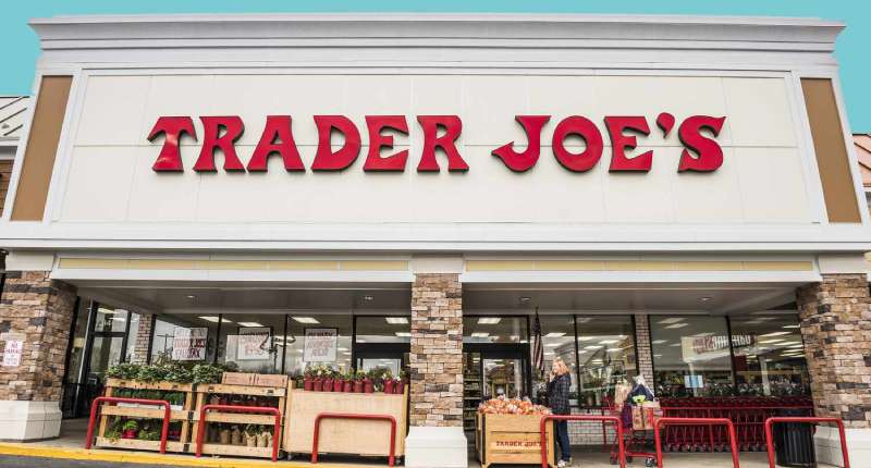
In the bustling aisles where Trader Joe’s reigns supreme, its logo stands as an emblem of simplicity and charm amidst a sea of grocery choices.
Beyond a mere symbol, this vibrant, nautically-themed badge captures a company narrative steeped in uniqueness and customer fidelity. Here, it’s not just about a label but an entire saga whispered through an icon.
Delving into the visual identity of Trader Joe’s, one embarks on an exploration where graphic design intertwines with marketing savvy.
This piece uncovers the strategies engrained within that memorable masthead, decoding the hues and lines that foster such unwavering brand loyalty.
What lies ahead is enlightenment—a map decoding a design that’s more than just an artistic flourish on your favorite private label products.
Navigate through the iconic design’s history, uncover the rationale behind its colorful artwork, and grasp what sets the retailer apart in the competitive retail landscape.
Expect revelations that might just transform your next cart-filling pilgrimage into a quest for meaning down each Trader Joe’s aisle.
The Meaning Behind the Trader Joe’s Logo
![]()
Let’s dive deep into the realm of logos, alright? When you see Trader Joe’s, what pops into your mind? Beaches? Jolly sailors? Maybe even an adventurous explorer vibe?
The Sailor & The Sea
The central figure of Trader Joe’s logo is kinda like this old-school sailor. This isn’t just for aesthetics; it symbolizes exploration.
Trader Joe’s is known for sourcing unique, quality products from all over the world. So, in a way, they’re like modern-day explorers, discovering culinary treasures for us.
Journey & Adventure
The overall design gives you an adventurous feel, right? It’s like inviting you on a gastronomic journey, where every aisle is a new world to discover. It’s more than a grocery store; it’s a story of exploration and discovery.
The History of the Trader Joe’s Logo
Ever wondered how a brand sticks around and keeps its charm? The Trader Joe’s logo has its own tale to tell.
Birth of a Brand
Way back, when our parents or even grandparents were young, Trader Joe’s started as this tiny chain in the 50s. Its logo wasn’t what we see today. Over the years, they tweaked it, giving it a more polished and relevant look.
Evolution & Consistency
It’s fascinating how, even after all these changes, the essence remained. It’s a testimony to the brand’s commitment to staying true to its roots while embracing change.
The Colors of the Trader Joe’s Logo

Colors are like the spices in a dish. They add flavor, emotion, and oomph.
The Red & The Black
Mainly, you’ll spot deep red and black in the logo. Red is bold, lively, and energetic. Black? Timeless and classic. Together? They create a balance of tradition and innovation.
Depth & Personality
Beyond the obvious, the colors exude warmth and familiarity. It’s like they’re saying, “Hey, come on in, discover something new, but also feel at home.”
The Font Used in the Trader Joe’s Logo
Alright, font nerds, gather ’round. Typography is an art, and Trader Joe’s nails it.
Classic Yet Quirky
The font they use has a retro vibe but with a twist. It’s not your average font; it has personality. Kind of like that cool uncle who tells epic stories.
It Speaks Volumes
A font isn’t just letters; it’s a voice. The Trader Joe’s font speaks of nostalgia, stories, and, most importantly, quality.
The Global Appeal of the Trader Joe’s Logo
You’d be amazed how a logo can transcend borders.
Relatability Across Oceans
Even if someone’s never been to a Trader Joe’s store, the logo has this universal appeal. It feels global, yet local. It’s like a universal language of good vibes and quality products.
Brand Recognition
That sailor dude is pretty much iconic now. It’s a symbol of trust, quality, and a good time grocery shopping.
Impact on Pop Culture
Okay, last bit. Logos and brands don’t just live in stores. They seep into our lives.
Memes, Art & More
Have you seen the quirky memes and fan art? The logo inspires creativity. People resonate with it, adapt it, and make it a part of their narrative.
Beyond Groceries
It’s not just a store logo. It’s a cultural phenomenon. It’s on t-shirts, mugs, and even inspired tattoo designs. It’s wild!
FAQ On The Trader Joe’s Logo
Who Designed the Trader Joe’s Logo?
It’s somewhat shrouded in retail mystery, but it’s shaped by the brand’s quirky, maritime spirit. The artwork hints at Trader Joe’s nautical theme, illustrative of their voyage in the grocery sector.
Design credit is often internally attributed, wrapped in the brand’s culture rather than an individual’s creative spark.
What Does the Trader Joe’s Logo Represent?
It’s an anchor in a tumultuous sea of brands. Symbolizing the company’s commitment to quality and value, the logo, with its cheerful aesthetic and approachable font, mirrors their ethos.
It’s not just a logo, it’s a beacon calling to savvy shoppers seeking an adventurous culinary journey.
Why Does the Trader Joe’s Logo Use a Nautical Theme?
Setting sail with a nautical motif speaks to Joe Coulombe’s vision. He imagined stores as trading posts for exotic goods.
The maritime logo aligns perfectly with the brand’s private label products strategy, charting a course through an eclectic mix of international and localized offerings.
Has the Trader Joe’s Logo Changed Over Time?
Yes, but subtly. Over the years, minor tweaks honored evolving graphic design trends while maintaining its recognizable soul.
These changes reflect a dynamic understanding of brand image, ensuring the logo remains fresh and relevant to contemporary visual marketing standards.
What Are the Colors in the Trader Joe’s Logo?
Distinguished by its navy blue and white palette, the logo emanates a timeless, crisp essence. It draws from traditional seafaring hues, reinforcing the store’s image as a staple of American retail, steered by its trademark symbol.
It’s the steadfast lighthouse in the foggy expanse of groceries.
Can the Trader Joe’s Logo Be Used on Personal Merchandise?
Legally speaking, it treads in the realm of intellectual property. Unsanctioned use, particularly for commercial gain, could hoist legal sails.
The company’s trade dress is their ship to captain, and unauthorized merchandise risks running aground on trademark infringement.
How Does the Trader Joe’s Logo Influence Brand Perception?
It sets the stage for brand recognition. The logo’s artistic strokes bridge customers to the store’s personality – inviting, reliable, yet slightly whimsical. It’s not mere painting; it’s visual storytelling enhancing consumer perception and reinforcing the ‘Trader’ in Trader Joe’s.
What’s the Significance of the Bell in the Trader Joe’s Logo?
Ah, the iconic bell! Traditionally, bells signal a ship’s progress. In-store, the bell chimes signal service without an intercom’s distraction.
It’s both a functional tool and a piece of the marketing strategy, aligning seamlessly with the logo’s nautical pastiche.
Is the Trader Joe’s Logo Trademarked?
Indeed, it is a fortified island within the realm of trademarks. This legal recognition safeguards the logo from copycat currents. The company’s visual identity is a coveted jewel in their corporate identity, protected fiercely in the marketplace of retail branding.
How Can Understanding the Trader Joe’s Logo Help with Marketing?
Recognize this; a logo is a silent evangelist. Comprehending its roots and ramifications in visual marketing can unveil tactics that rally brand loyalty and storytelling.
Witnessing the union of trademark symbol and retail identity yields strategies potent for navigating the seas of competitive branding.
Conclusion
In the odyssey through branding and graphic design, the Trader Joe’s Logo stands as a testament to an entity that transcends mere illustration. It anchors deep in the psyche of consumers, its nautical flair a beacon amidst the stormy seas of the retail marketplace.
Hauling the sails, we’ve charted a course through the vibrant history, dissected the color motifs and the shackles of intellectual property. The logo whispers tales of adventure, quality, and trust – an emblem woven into private label brands with the finesse of a cartographer’s quill.
As masts dip over the horizon and our voyage concludes, one reflects on the logo not as static trade dress, but a living, breathing part of the corporate identity. It’s a lesson in visual storytelling, a clarion call to marketers and designers alike. The Trader Joe’s Logo: a legacy etched in shopping lists and hearts, perpetually steering the tides of consumer loyalty.
If you liked this article about the Trader Joe’s logo, you should check out this article about the ShopRite logo.
There are also similar articles discussing the Speedway logo, the Sprouts Farmers Market logo, the Target logo, and the Tesco logo.
And let’s not forget about articles on the Vons logo, the Walmart logo, the Wegmans logo, and the Whole Foods Market logo.
Bogdan Sandu, a seasoned designer with 15 years of diverse experience, has been designing websites since 2008.
Renowned for his expertise in logo design and visual branding, Bogdan has developed a multitude of logos for various clients.
His skills extend to creating posters, vector illustrations, business cards, and brochures. Additionally, Bogdan's UI kits were featured on marketplaces like Visual Hierarchy and UI8.
Latest posts by Bogdan Sandu (see all)
- Brewed to Perfection: Coffee Color Palettes for Warm Designs - 8 May 2024
- The Singha Logo History, Colors, Font, And Meaning - 7 May 2024
- Soft Cream Color Palettes for Subtle Designs - 7 May 2024