A flyer that prints cleanly is mostly decided before any design happens, in the New Document dialog. Use the trim size plus 0.125 inch of bleed on each side, set the resolution to 300 pixels per inch, and pick CMYK if the job is going to a press.
Background, photo, shapes and text each get their own layers. The finished file leaves Photoshop as a PDF saved with a PDF/X preset.
One thing catches people out. Photoshop’s Print presets don’t touch the color mode. An Adobe contributor confirmed in a November 2023 Adobe Community thread that a preset fills in dimensions only, so CMYK has to be set by hand.
How to Set Up a Flyer Document in Photoshop
Set the canvas to the finished flyer size at 300 pixels per inch and add bleed before placing anything. A standard 8.5 x 11 inch flyer comes to 2550 x 3300 px, or 2625 x 3375 px once a 0.125 inch bleed is included.
Moda’s size reference puts a letter flyer at 8.5 x 11 in (215.9 x 279.4 mm), which is 2550 x 3300 px at 300 DPI. A half page at 5.5 x 8.5 in works out to 1650 x 2550 px at 300 DPI (Moda). Adobe’s flyer tutorial uses A5 with bleed, 154 x 216 mm at 300 ppi. Screen copy at the same letter size is only 612 x 792 px at 72 DPI (Moda).
Adobe’s Photoshop API documentation builds its own print example the same way: 2550 x 3300 px, 300 resolution, CMYK, 8-bit.
Half page and A5 are the usual choices when a full sheet is too much paper. A rundown of other common flyer sizes helps if the job needs something other than letter.
- Open File > New (Ctrl/Cmd + N) and switch the units to inches or millimeters before typing anything.
- Enter width and height, including bleed if the file goes straight to a printer.
- Set Resolution to 300 Pixels/Inch.
- Pick the color mode (the next section covers the choice) and leave bit depth at 8 bit.
- Keep Background Contents on white, then click Create.
Back to the preset problem for a second. Because a preset only fills in dimensions, the color mode stays whatever it was before, and the November 2023 thread makes clear you have to change it yourself. Easy to miss, and you won’t notice until the proof looks off.
Printers differ a little on resolution. Printivity calls 300 ppi the standard for digital presses and sees no point in going higher, though it suggests 600 ppi for more detailed graphics. 4OVER4 treats 300 as the target and accepts 150 for large-format pieces.
For a flyer, 300 is plenty. Going to 600 quadruples the pixel count, which slows every filter and bloats the file, and the printer’s own template overrides both opinions anyway.
Screen-only files follow different rules, and the gap between print and screen resolution is why a web-sized JPEG looks soft on paper. Raising the ppi number without adding pixels adds no detail (4OVER4).
Should a Flyer Be Designed in CMYK or RGB?
Design in CMYK when the flyer goes to a print shop or press, and stay in RGB when it stays on screen or comes off a desktop inkjet.
Sources split on this. Printivity asks customers for files in the ink-based CMYK color model because its presses run on that ink set, and most tutorials say to pick CMYK when the document is created.
An Adobe Community expert answering a 2020 thread said the opposite for home printing. Printers without RIP software, which includes most inkjets, handle RGB best, so unless the job is headed to an offset or digital press, RGB is fine. Both statements hold. The output device decides.
CMYK for press printing
Colors on screen sit closer to what the press will produce, and there’s no surprise shift when the printer converts the file. It also matches the color mode most printers ask for.
The price is a smaller gamut. Vivid RGB tones get clipped the moment the mode changes, and bright screen colors look duller while you work.
RGB for screens and inkjet
RGB keeps the full monitor gamut, which suits a flyer posted to social media or emailed as a PNG, and the same file is easy to reuse online.
Send it to a press later and the printed colors won’t match what you saw. That shift shows up after the file has left your hands, which is the annoying part.
What shifts when RGB becomes CMYK
Bright blues and vivid greens lose saturation in conversion, and blues and purples shift the most, according to 4OVER4’s color profile guide.
OVER4 recommends Edit > Convert to Profile over the one-click Image > Mode switch. The profile route lets you choose the profile and rendering intent instead of relying on the default Color Settings. Their example destination is U.S. Web Coated (SWOP) v2 with Relative Colorimetric intent and Black Point Compensation turned on.
Before committing, turn on View > Proof Setup > Working CMYK, toggle the preview with Ctrl/Cmd + Y, and check View > Gamut Warning for clipped areas. The full workflow is covered in a guide on converting RGB to CMYK in Photoshop.
How to Add Bleed and Safe Margins to a Flyer
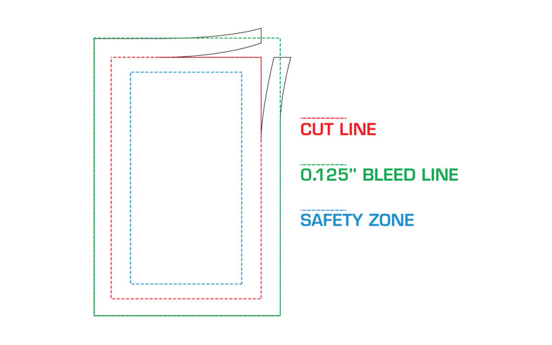
Add 0.125 inches (3 mm) of bleed on every side, then keep text and logos at least 0.125 inches inside the trim line. An 8.5 x 11 in flyer becomes 8.75 x 11.25 in with bleed, per 4OVER4’s flyer FAQ.
Bleed is artwork that runs past the cut, so no white sliver shows if the blade drifts. The concept gets a fuller treatment in this piece on bleed in print design.
| Trim size | File size with bleed | Safe area |
|---|---|---|
| 8.5 x 11 in | 8.75 x 11.25 in | 8.25 x 10.75 in |
| 5.5 x 8.5 in | 5.75 x 8.75 in | 5.25 x 8.25 in |
| 4 x 6 in | 4.25 x 6.25 in | 3.75 x 5.75 in |
| A5 (148 x 210 mm) | 154 x 216 mm | 142 x 204 mm |
Bleed sizes come from 4OVER4 and Adobe. Safe areas apply the 0.125 in (3 mm) inset 4OVER4 recommends, and Moda lists the same 8.25 x 10.75 in for letter.
The standards differ slightly. Adobe, Instantprint and Moda quote 3 mm, while Printivity and 4OVER4 quote 0.125 in, a gap of under 0.2 mm. Go with whatever the printer’s template specifies.
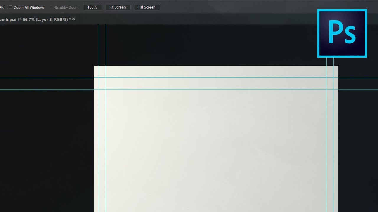
Adding bleed with Canvas Size
- Open the flyer at its trim size, or skip this if it was created with bleed.
- Choose Image > Canvas Size, tick Relative, and add 0.25 in to both width and height with the anchor in the center.
- Stretch the background layer and any edge-to-edge image into the new border.
- Switch on View > Rulers and View > Snap so guides land exactly where you drag them.
Marking the trim and safe lines
View > New Guide Layout draws all four guides in one dialog. Its default is eight columns with 20 px gutters, so untick Columns and tick Margin instead.
Run it twice. The first pass takes 0.125 in for top, left, bottom and right and marks the trim line. For the second, untick Clear Existing Guides and enter 0.25 in, which is 0.125 in of bleed plus 0.125 in of margin, to mark the safe line.
Text-heavy flyers want more room. One 4OVER4 guide suggests 0.25 in inside the trim when the layout is packed with small type, and the reasoning behind that buffer is laid out in this note on the safe zone in print layouts.
Building the Flyer Layout with Layers
Stack the file from the bottom up: background, imagery, shapes, then text. Every element gets its own layer, so a changed phone number never touches the photo.
Background and imagery
Use File > Place Embedded for photos. Photoshop wraps each one as a smart object when Preferences > General > Always Create Smart Object when Placing is checked, which lets you scale down and back up without destroying pixels.
Scaling up is where it goes wrong. A full-bleed letter flyer is 8.75 in wide, so the photo needs 2625 px across (8.75 x 300). A 1200 px web image covers only 4 inches at 300 ppi. 4OVER4’s tip is to divide a photo’s pixel width by 300 to see how large it can print.
Crop so the photo’s focal point stays clear of the area reserved for the headline.
Shapes and clipping masks
Draw panels with the Rectangle tool, one shape layer each, and position them with the Move tool and guides. Backgrounds can take a solid color or a Gradient tool fade.
To fit a photo inside a shape, put the photo directly above the shape and use Layer > Create Clipping Mask, or Alt-click the line between the two layers. Adobe’s help documentation says the base layer defines the visible boundary, and every clipped layer takes on the base layer’s opacity and blend mode.
That last detail causes a common surprise. Drop the shape’s opacity to 60% and the photo fades with it.
Leave a band of empty space around the headline instead of filling every gap. A layout with generous white space reads faster from arm’s length, and it costs nothing in ink.
How to Add and Style Text on a Flyer
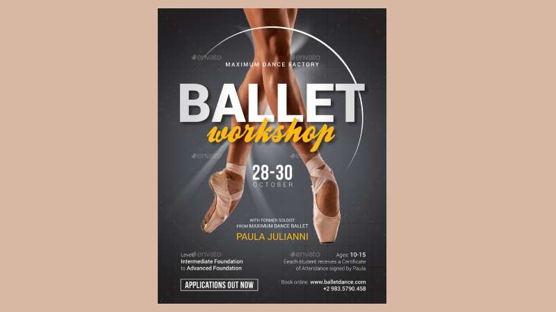
Use clearly different sizes for the headline, the supporting line, and the contact details with the call to action. Two type families are enough to cover all of it.
OVER4’s flyer type guide sets the headline at three to four times the body size. Body text runs 10 or 11 pt for a flyer read in the hand, and 14 pt or more when the flyer is pinned to a board.
Size is only one lever in a typographic hierarchy. Weight adds urgency and color contrast directs the eye, according to Paperlust’s flyer design guide, so the headline should win on at least two of those.
Printers don’t agree on the smallest safe size. MOO and Easil both say to keep text at 8 pt or higher, while 4OVER4 and Paperlust set the floor at 9 pt.
I’d use 9 pt for anything a reader has to act on, like dates, prices and phone numbers, and save 8 pt for the fine print nobody needs.
Choosing and pairing fonts
Pick the body face first. It has to stay clear at 10 pt on paper, which is a harder job than looking good at 60 pt.
OVER4 suggests Anton with Source Sans 3, Oswald with Open Sans, and Playfair Display with Lato as pairings that hold up in print. Each pair differs on one obvious axis (weight, width or classification) and not on several at once.
A broader list of fonts for flyers helps when the brand already dictates a typeface.
Setting the text in Photoshop
Use the Type tool (T) for each level, and set size, leading and tracking in the Character panel. Keep every text layer inside the safe guides built earlier.
If the text sits on a busy photo, put a solid or semi-transparent shape layer between the photo and the type, then check contrast at print size instead of zoomed in.
How to Export a Flyer for Print and for Screen
Print jobs go out as a PDF saved with a PDF/X preset. Screen versions go out through Export As as PNG or JPG in sRGB.
The two routes aren’t interchangeable, and mixing them up is where most bad exports start.
Print-ready PDF
A print-ready file carries bleed, an embedded profile and vector-safe text. One route through Photoshop:
- Choose File > Save a Copy (or Save As) and set Format to Photoshop PDF.
- In the Save Adobe PDF dialog, pick an Adobe PDF Preset such as PDF/X-4.
- Decide on Preserve Photoshop Editing Capabilities (see below).
- Save, then open the result in Acrobat to confirm the page size includes bleed.
Adobe Community experts favor PDF/X-4 over the older PDF/X-1a because it supports transparency, as a 2022 thread explains. A 2025 thread on Photoshop 26 adds that presets such as PDF/X-1a leave the Photoshop data out automatically.
Printers can differ on the Preserve Photoshop Editing Capabilities checkbox, so follow the upload instructions of the printer you are using.
PNG or JPEG for screen
For PNG, Adobe’s Export As documentation (updated December 2025) says the Transparency option writes 32-bit files while Smaller File writes 8-bit.
JPG gives you a quality slider from 1% to 100% that trades detail for file size. A photo-heavy flyer posted online usually suits a JPEG, while flat color and sharp type stay cleaner as PNG.
Tick Convert to sRGB in the Export As dialog so colors match across browsers and phones.
One failure catches people who expect 300 ppi. Export As strips the ppi tag because screens don’t need it, as an Adobe Community expert explained in a 2020 thread, so never send an Export As file to a printer.
Why Do Printed Flyers Look Blurry, Dull or Cropped?
Most bad prints trace back to a photo that was enlarged past its pixels or saved as a PNG, RGB colors that the printer converted without a proof, or artwork and text sitting too close to the trim.
Blur usually means the photo was upscaled or the final file was a PNG. An older 4OVER4 article says PNG files are not intended for professional printing, though its current help pages accept high-resolution PNG.
Dull color means the file went out in RGB and the printer converted it. Cropping means text or a logo sat outside the safe area, or the background stopped at the trim line. Fuzzy small type comes from black text built out of four inks that drifted out of register.
Dull color is partly a screen problem. A monitor that is out of calibration shows colors the press will never reproduce, which is why a guide to calibrating a monitor for print belongs in the workflow before any proofing.
Black ink for text and for backgrounds
Vistaprint’s prepress checklist and Domtar’s press guide give the same split. Small text and thin lines get flat black (C0 M0 Y0 K100), and large background areas get a rich mix such as C60 M40 Y40 K100.
Small text in a four-ink mix risks fuzzy edges because slight ink shifts show up at that size. The trade-offs are explained in more depth in a piece on rich black in CMYK.
Checks on the exported PDF
- Zoom to 100% and scan photos and edges for pixellation (4OVER4’s pixelation guide)
- Confirm the page size includes bleed and matches the printer’s template
- Make sure every edge-to-edge element reaches the bleed line
Safe margins vary more than most tutorials admit. GN Print asks for 5 mm, and MOO’s A6 safe area sits 2 mm inside the trim, so the 0.125 in inset used earlier falls inside that range but is not a universal rule.
When Photoshop Is the Wrong Tool for a Flyer
Photoshop suits photo-heavy flyers built on masks and effects. Text-heavy flyers belong in InDesign, and simple vector flyers do fine in Illustrator.
| Tool | Best for | Main limit |
|---|---|---|
| Photoshop | Photo compositing, masks, effects | Weaker text styles and page layout |
| Illustrator | Logos, simple image-heavy flyers | Not built for photo retouching |
| InDesign | Text-heavy or multi-page print | Photo editing happens elsewhere |
| Canva | Template-first speed | CMYK export needs Canva Pro |
| Adobe Express | Quick templates, PSD/AI import | Print ordering in 4 countries only |
Adobe’s own product guide (published 2017, so a rule of thumb rather than a spec) names InDesign as the first choice for flyers because of text styles and page layouts. It calls Illustrator a good alternative for simpler, image-heavy projects.
Canva’s CMYK profile and print bleed setting depend on the plan, according to print-shop guides such as Paperlust’s. That gap matters when color has to match, and it’s the main reason to weigh how Canva and Photoshop compare before committing to either.
If the flyer is one page, mostly type, and involves no photo work, skip Photoshop. Adobe Express can also import PSD and AI files with layers recognized, so a Photoshop background can move into a template workflow, and a walkthrough on building a flyer in Canva covers the template-first route.
FAQ About Flyer Design in Photoshop
How do I remove the background from a photo for a flyer?
Choose Select > Subject, then click the Add Layer Mask button. The background is hidden, not deleted, so the edge can be refined later.
Zoom to 100% and check hair or fine edges before placing the cutout on the flyer.
Can Generative Fill extend a flyer background?
Yes. Extend the canvas past the trim line, select the empty strip, and run Generative Fill so the background reaches the bleed.
Inspect the filled area at 100% zoom before export.
Where can I find free fonts for a flyer?
Google Fonts is a free library, and Adobe Fonts comes with a Creative Cloud subscription. Free doesn’t always mean free for print, so check the font licensing terms before using a typeface on a business flyer.
Can I edit a flyer template instead of starting from scratch?
Yes. Open the PSD and double-click the smart object thumbnail to swap in your own photo.
An Adobe Community expert notes that replacement content must match the original’s aspect ratio, size and print resolution, or the layer transform will distort it.
How do I design a double-sided flyer?
Build the front and back as two files with the same trim size and bleed, then ask the printer whether it wants one two-page PDF or two separate files.
Paperlust’s flyer guide advises against repeating a full-size logo on the back. Use that space to answer the reader’s next question instead.
Fixing a Finished Flyer That Lacks Bleed or CMYK
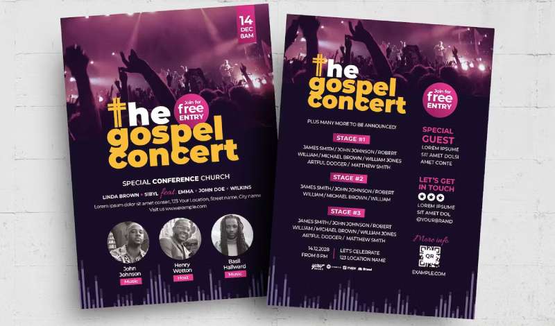
A flyer built in RGB or without bleed can be repaired in Photoshop without a redesign, as long as the order is right. Add bleed with Canvas Size first, convert a copy to the printer’s CMYK profile next, and recheck text against the safe guides last.
Bleed goes first because it changes the canvas. Text goes last so contrast is judged on the converted colors.
Conversion clips saturated tones and can’t be undone in a flattened file, so the RGB layered file stays as the master and only a copy goes to the printer.
This advice rests on sources checked in September 2026. The preset behavior comes from a November 2023 thread on Photoshop 2024, so confirm the current New Document dialog before trusting a Print preset.
With the file corrected, the remaining question is the cost to print a flyer at the chosen size and quantity.

Renowned for his expertise in logo design and visual branding, Bogdan has developed a multitude of logos for various clients.
His skills extend to creating posters, vector illustrations, business cards, and brochures. Additionally, Bogdan's UI kits were featured on marketplaces like Visual Hierarchy and UI8.
He also wrote in the past years on sites like Design Your Way, WebDesignerDepot, WPDean, Designmodo, Speckyboy, Slider Revolution, and more.
- Jujutsu Kaisen Font Generator - 12 October 2026
- The Windsurf Logo History, Colors, Font, And Meaning - 10 October 2026
- How to Remove Background From Product Photos (No Photoshop) - 10 October 2026

Bogdan Sandu is a seasoned designer who has been designing websites since 2008. Renowned for his expertise in logo design and visual branding, Bogdan has developed a multitude of logos for various clients. His skills extend to creating posters, vector illustrations, business cards, and brochures. Additionally, Bogdan's UI kits were featured on marketplaces like Visual Hierarchy and UI8. He also wrote in the past years on sites like Design Your Way, WebDesignerDepot, WPDean, Designmodo, Speckyboy, Slider Revolution, and more.
You Might Also Like