The Lidl logo is one of the most recognized retail brand marks in Europe and North America. It represents a German discount supermarket chain operating in 30+ countries, with a visual identity built around a bold circular emblem and a clean wordmark. The current design has been refined over decades, balancing simplicity with immediate brand recognition. Lidl was founded in 1973, and its logo has gone through several distinct iterations since then.
What Is the Lidl Logo?
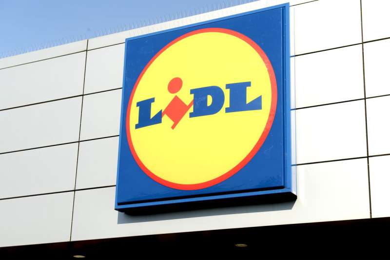
The Lidl logo is a circular emblem combining a bold blue ring, a red inner circle, and the yellow “Lidl” wordmark in a custom sans-serif typeface. First introduced in its modern form in 1973 and significantly updated in 2016, it signals value, reliability, and European retail heritage.
Understanding what a logo actually does for a brand helps frame why Lidl’s design choices matter. Here is a breakdown of the key attributes:
- Design Type: Combination mark (emblem + wordmark)
- Primary Elements: Circular badge, bold red background, blue outer ring, yellow “Lidl” lettering
- Official Introduction Date: 1973 (current simplified version: 2016)
- Designer/Agency: Internal design team (Schwarz Group); no single external agency credited publicly
- Trademark Status: Registered trademark across all operating markets
- Color Palette: Lidl Blue (#0050AA), Lidl Red (#CC0000), Lidl Yellow (#FFD700)
- Usage Context: Store signage, packaging, digital platforms, marketing materials, uniforms, and vehicles
How Has the Lidl Logo Evolved Over Time?
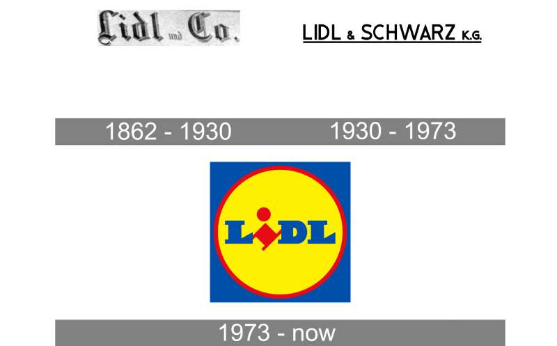
The Lidl logo has gone from a cluttered text-heavy design in the 1970s to the clean, minimal circular badge used today. The biggest shift came in 2016, when the brand stripped back visual complexity and committed to a flat, modern look.
Original Lidl Logo (1973-1978)
- Years Active: 1973-1978
- Design Description: Simple text-based wordmark with minimal graphic support
- Color Scheme: Limited palette, primarily black and white in early applications
- Designer: Unknown
- Context: Lidl opened its first store in Ludwigshafen in 1973; the logo was functional, not strategic
- Key Changes from Previous: N/A (first version)
- Cultural Significance: Reflected the no-frills, discount-first positioning of the brand at launch
Second Lidl Logo (1978-1987)
- Years Active: 1978-1987
- Design Description: Introduction of the circular badge concept with the “Lidl” name enclosed
- Color Scheme: Blue and red begin appearing consistently
- Designer: Internal
- Context: Lidl was expanding rapidly across Germany; the brand needed stronger visual recognition
- Key Changes from Previous: Move from flat wordmark to enclosed emblem format
- Cultural Significance: Started building the badge identity that would define the brand for decades
Refined Lidl Logo (1987-2016)
- Years Active: 1987-2016
- Design Description: Circular badge with blue outer ring, red fill, yellow wordmark, and additional decorative elements including a yellow outer ring and drop shadow effects
- Color Scheme: Blue, red, yellow (with gradients and shadow effects)
- Designer: Internal design team
- Context: Lidl grew into a pan-European chain; the logo needed to work across multiple markets and signage formats
- Key Changes from Previous: Added depth effects, yellow outer ring, more polished execution
- Cultural Significance: This became the version most Europeans associate with the brand through the 1990s and 2000s
Current Lidl Logo (2016-Present)
- Years Active: 2016-present
- Design Description: Flat circular emblem, no gradients, no shadows, no decorative outer ring. Clean blue border, red fill, yellow “Lidl” in bold sans-serif
- Color Scheme: Flat Lidl Blue, Lidl Red, Lidl Yellow
- Designer: Internal rebrand led by Schwarz Group design team
- Context: Digital-first world required logos that work at small sizes on screens and apps
- Key Changes from Previous: Removed all 3D effects, gradients, and decorative elements; embraced flat design
- Cultural Significance: Positions Lidl alongside modern retail brands while keeping the recognizable badge format intact
What Do the Design Elements of the Lidl Logo Mean?
Each element in the Lidl logo carries specific visual weight. The circular badge signals completeness and trust. The color trio of blue, red, and yellow creates high contrast and instant recall, particularly on store facades where visibility from a distance matters.
The choice to use a closed circle rather than a shield or abstract shape was deliberate.
Circles communicate unity and approachability in color theory and brand design. For a discount retailer, that matters.
The wordmark sits centered within the emblem, reinforcing that the name itself is the brand. No icon separate from the name exists. They are one unit.
Why Did Lidl Choose These Specific Colors?
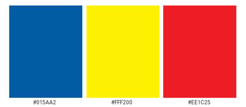
Lidl’s color palette is a calculated decision, not an accident.
- Lidl Blue (#0050AA)
- Color name: Lidl Blue
- Hex: #0050AA
- Symbolic meaning: Reliability, trust, stability
- Psychological impact: Calms shoppers, builds confidence in pricing and quality
- Brand/industry connection: Blue is widely used by retail and financial brands for exactly these reasons
- Lidl Red (#CC0000)
- Color name: Lidl Red
- Hex: #CC0000
- Symbolic meaning: Energy, urgency, value deals
- Psychological impact: Drives attention and action; classic in retail promotions
- Brand/industry connection: Red signals discounts and competitive pricing across grocery retail globally
- Lidl Yellow (#FFD700)
- Color name: Lidl Yellow
- Hex: #FFD700
- Symbolic meaning: Optimism, affordability, warmth
- Psychological impact: High visibility against the red background; draws the eye directly to the wordmark
- Brand/industry connection: Yellow is heavily associated with value-driven brands and yellow logos in the retail sector
Together, these three colors form what is technically a near-triadic color scheme. High contrast, high energy, hard to miss.
What Typography Style Is Used in the Lidl Logo?
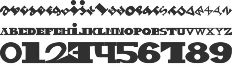
The “Lidl” wordmark uses a custom bold sans-serif font.
It is heavy, compact, and designed to remain legible at very small sizes.
The letterforms are slightly rounded at the terminals, softening what would otherwise be a purely industrial look.
Over the years, the typography has been refined but never dramatically changed. The 2016 update made the letters slightly bolder and removed any remaining decorative weight from earlier versions.
Readability at distance is the top priority here. Store signs, truck liveries, and app icons all need the same mark to work. The current typeface handles all of that well.
What Are the Hidden Meanings in the Lidl Logo?
There are no widely confirmed subliminal elements in the Lidl logo. Lidl has never publicly claimed hidden symbolism.
That said, the circular format does reinforce a sense of completeness and self-sufficiency, which aligns with Lidl’s brand message of having everything a shopper needs at low prices.
Some designers have noted that the yellow lettering on red creates a warm focal zone at the center of the mark, naturally drawing the eye inward to the brand name first.
That is either intentional focal point design or a lucky byproduct of the color choices. Probably both.
How Does the Lidl Logo Compare to Competitor Logos?
Lidl operates in a competitive space where several major grocery chains have strong visual identities. The badge format sets Lidl apart from most direct competitors, who tend to use wordmarks or simpler icon-based designs.
Here is how Lidl stacks up against key competitors:
- Aldi Logo: Aldi uses a rectangular blue mark with white text. Clean and corporate, but less visually distinctive than Lidl’s circular badge. Aldi’s identity feels more like a bank logo than a grocery brand.
- Walmart Logo: Walmart relies on its iconic spark symbol alongside a clean wordmark. It has the budget-friendly signal in blue and yellow but feels more corporate and less warm than Lidl.
- Tesco Logo: Tesco uses a simple blue and red striped wordmark. It is extremely minimal. Easy to reproduce but not particularly memorable at small sizes.
- Carrefour Logo: Carrefour’s logo features a clever negative space “C” in blue and red. More conceptually interesting than Lidl’s emblem, but less recognizable globally.
- Sainsbury’s Logo: Sainsbury’s uses an orange wordmark, positioning it in the mid-market rather than the discount segment. A completely different visual strategy targeting a different buyer.
Among grocery store logos, Lidl’s circular badge is arguably the most badge-like and therefore the most distinct. It functions more like a seal of quality than a standard retail wordmark, which subtly counters the discount-only perception.
What Are the Technical Specifications of the Lidl Logo?
Official Color Codes
- Primary Color: Lidl Blue
- Hex: #0050AA
- RGB: (0, 80, 170)
- CMYK: (100, 53, 0, 33)
- Pantone: 286 C
- Secondary Color: Lidl Red
- Hex: #CC0000
- RGB: (204, 0, 0)
- CMYK: (0, 100, 100, 20)
- Pantone: 485 C
- Accent Color: Lidl Yellow
- Hex: #FFD700
- RGB: (255, 215, 0)
- CMYK: (0, 16, 100, 0)
- Pantone: 116 C
Dimensions and Proportions
- Aspect ratio: 1:1 (the emblem is a perfect circle)
- Minimum size requirements: 20px minimum for digital use; 10mm minimum for print to maintain legibility of the wordmark
- Clear space specifications: A clear space equal to the height of the “L” in the wordmark must surround the logo on all sides
- Official usage guidelines: The logo should never be stretched, recolored, or placed on backgrounds with insufficient contrast. Approved backgrounds are white, light grey, and the official Lidl Blue. The logo files are available in vector graphics formats (SVG, EPS, AI) for scalable use across all applications.
What Cultural Impact Has the Lidl Logo Had?
Lidl’s logo has become a symbol of accessible, everyday value across Europe. In markets like Germany, the UK, and Ireland, the blue-red-yellow badge is as recognizable as any fast food or fuel brand.
The 2016 redesign attracted significant media attention. Design publications debated whether stripping the logo down was a smart modernization or a loss of warmth. Most agreed the flat version aged better digitally.
The logo also became a cultural touchstone in “middle-class guilt” conversations in the UK, where shopping at Lidl went from stigmatized to trendy during the 2010s. The badge essentially became a badge of smart spending. That shift was partly branding, partly economic, but the logo carried it visually.
Among blue logos in the retail sector, Lidl’s circular mark is one of the more studied examples of how a simple color combination can carry significant cultural weight over time.
How Does the Lidl Logo Fit Into the Overall Brand Identity?
The Lidl logo sits at the center of a tightly controlled brand system. Every touchpoint, from store architecture to weekly leaflets to the app icon, uses the same mark consistently. The logo is not decorative. It is structural.
The brand guidelines that govern the logo also extend to typography choices, color application in marketing, and how the emblem scales across packaging. The wordmark uses a consistent type system that pairs the logo font with a secondary sans-serif for body copy in communications.
Lidl’s private label packaging mirrors the logo colors throughout, creating strong shelf presence and visual cohesion.
The result is a brand where the logo does not need to appear large to be recognized. Shoppers identify the color combination alone. That level of recognition takes decades to build, and Lidl has it.
The logo also connects directly to Lidl’s pricing and promotional language. Red is used in sale communications, yellow highlights key prices, and blue frames the overall environment. The logo’s three colors map directly onto the brand’s communication system. That kind of coherence does not happen by accident. It points to solid brand style guide discipline applied consistently across markets.
How Should the Lidl Logo Be Used?
Official usage do’s and don’ts:
- Do: Use the logo on approved backgrounds only (white, light grey, Lidl Blue)
- Do: Maintain the required clear space around the emblem at all times
- Do: Use only official file formats (SVG, EPS, PNG with transparent background)
- Do not: Stretch, rotate, or distort the logo in any way
- Do not: Change the colors or apply effects such as shadows or outlines
- Do not: Place the logo on busy backgrounds or images where contrast is insufficient
- Do not: Use the logo to imply endorsement or partnership without authorization from Lidl
Where to access official logos: Official Lidl logo files are available through Lidl’s corporate press and media portals. Journalists and verified partners can request access directly through regional Lidl communications teams. Unauthorized third-party logo repositories are not reliable sources and may contain outdated versions.
Licensing information: The Lidl logo is proprietary. No commercial use, reproduction, or modification is permitted without explicit written permission from the Schwarz Group or Lidl’s regional legal teams.
Trademark protection: The Lidl logo is a registered trademark in all operating markets. This includes the circular emblem, the color combination as applied to the badge format, and the custom wordmark. Trademark violations are actively enforced across the EU and other jurisdictions where Lidl operates.
FAQ on the Lidl Logo
What colors are used in the Lidl logo?
The Lidl logo uses three colors: Lidl Blue (#0050AA), Lidl Red (#CC0000), and Lidl Yellow (#FFD700).
This near-complementary color scheme creates strong contrast and immediate shelf recognition across store signage and packaging worldwide.
When was the current Lidl logo introduced?
The current flat version launched in 2016. It replaced a more decorative emblem that had gradients, drop shadows, and a yellow outer ring.
The 2016 redesign was driven by digital use cases, where flat logos perform better at small sizes.
What font does the Lidl logo use?
Lidl uses a custom bold sans-serif font in its wordmark. The letterforms are compact and slightly rounded.
No standard commercial typeface matches it exactly. The typeface was developed to maximize legibility on store facades at distance.
What does the Lidl logo represent?
The circular badge communicates trust and completeness. The color trio signals value, energy, and reliability simultaneously.
The Lidl wordmark sits centered in the emblem, reinforcing that the brand name itself carries the identity without needing a separate icon.
How many times has the Lidl logo changed?
The Lidl logo has gone through roughly four major versions since 1973. Each iteration refined the circular badge format rather than replacing it entirely.
The core structure, a circle with the Lidl name inside, has stayed consistent across all versions of the Lidl brand identity.
Is the Lidl logo trademarked?
Yes. The Lidl logo is a registered trademark in all markets where the chain operates, including across the EU, UK, and the US.
The trademark covers the emblem, the color combination as applied to the badge, and the custom Lidl wordmark.
What file formats is the Lidl logo available in?
Official Lidl logo files are distributed as SVG, EPS, AI, and high-resolution PNG. Vector formats are preferred for print and large-format signage.
A bitmap version in PNG works for digital use. Always source files directly from Lidl’s official press portal.
How does the Lidl logo compare to the Aldi logo?
Aldi uses a rectangular blue and white wordmark. Lidl uses a circular three-color badge. The visual strategies are completely different despite both brands competing in discount grocery retail.
Lidl’s emblem feels warmer and more approachable. Aldi’s mark reads more corporate. Both are effective, just aimed at slightly different emotional registers.
What is the meaning behind the circular shape in the Lidl logo?
Circles signal unity, completeness, and approachability in color psychology and brand design. For a mass-market retailer, that association matters.
The shape also works as a badge, giving the logo a seal-like quality that subtly elevates the brand beyond a purely discount-focused image.
Can I use the Lidl logo for my own project?
No. The Lidl logo is proprietary. Commercial use, modification, or reproduction without written permission from the Schwarz Group is a trademark violation.
Journalists and verified partners can request access through Lidl’s regional communications teams. Everyone else needs explicit written authorization before using the Lidl corporate logo in any context.
Conclusion
The Lidl logo is a disciplined piece of retail branding that has held its core structure across five decades of Lidl logo evolution.
The circular emblem, flat color palette, and custom wordmark work together as a system, not just a mark.
Few discount retailers have managed to build this level of Lidl brand recognition through such a restrained visual identity.
The 2016 redesign proved that stripping back complexity was the right call. The logo scales, travels across markets, and reads clearly at any size.
For anyone studying logo design principles in the grocery sector, Lidl’s corporate design is a solid reference point on how consistency and simplicity compound over time.

Renowned for his expertise in logo design and visual branding, Bogdan has developed a multitude of logos for various clients.
His skills extend to creating posters, vector illustrations, business cards, and brochures. Additionally, Bogdan's UI kits were featured on marketplaces like Visual Hierarchy and UI8.
He also wrote in the past years on sites like Design Your Way, WebDesignerDepot, WPDean, Designmodo, Speckyboy, Slider Revolution, and more.
- Canva vs Photoshop: When Does Each Make Sense? - 12 September 2026
- Briefing 3D Game Animation: Rigs, Clip Lists and Engine Handoffs - 11 September 2026
- The Webflow Logo History, Colors, Font, And Meaning - 10 September 2026

Bogdan Sandu is a seasoned designer who has been designing websites since 2008. Renowned for his expertise in logo design and visual branding, Bogdan has developed a multitude of logos for various clients. His skills extend to creating posters, vector illustrations, business cards, and brochures. Additionally, Bogdan's UI kits were featured on marketplaces like Visual Hierarchy and UI8. He also wrote in the past years on sites like Design Your Way, WebDesignerDepot, WPDean, Designmodo, Speckyboy, Slider Revolution, and more.
You Might Also Like