


The Aldi Logo History, Colors, Font, And Meaning
Imagine strolling down the bustling aisles of commerce and catching a glimpse of a symbol that’s both a beacon of value and a herald of quality.
The Aldi logo, more than just a graphic on a sign, encapsulates a philosophy that marries frugality with excellence.
In the intricate dance of color and design, this emblem shapes consumer perceptions and carves out market positioning for one of the world’s most formidable retail giants.
Within these words lies a journey through Aldi’s visual branding, a testament to strategic supermarket branding and the prowess of a well-crafted corporate identity.
As a connoisseur of logo design, I’ve seen how such an emblem can sway brand loyalty and influence shopping behavior.
This article unfolds the tapestry of Aldi’s branding design, dissecting the visual and psychological nuances that elevate this logo from simple art to commercial titan.
By the final punctuation, you’ll unravel the evolution of a grocery store emblem that’s become as iconic as the discounted treasures lining Aldi’s shelves.
You’ll witness the logo’s impact on retail marketing strategies and glean insights into the making of a consumer-captivating insignia. No stone is left unturned—from the Aldi brand colors to the significance of a logo refresh—all through the lens of a seasoned graphic designer.
The Meaning Behind the Aldi Logo
![]()
Ah, the Aldi logo. It’s more than just a simple design—it speaks volumes.
Deep Dive Into Symbolism
You ever think about how a simple image can tell a whole story? That’s logos for you. The Aldi logo might seem straightforward, but there’s meaning. It’s about accessibility, affordability, and reliability.
That “A” Though
The big “A” stands tall, doesn’t it? It’s not just any letter—it’s Aldi’s letter. The “A” speaks of leadership in the supermarket world, always striving for the best.
The Borders and Their Implication
You see those thick borders encircling the name? It’s like a protective shield. It implies trustworthiness and safety. Like a warm hug from your favorite blanket.
The History of the Aldi Logo
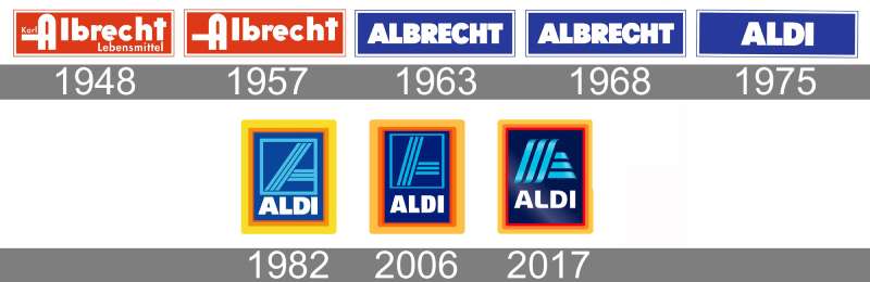
Time for a quick journey down memory lane.
Humble Beginnings
Picture it: Germany, 1940s. Aldi began with just a small store. Its logo? Simple, just like its roots. As time passed, it evolved, keeping pace with the brand’s growth.
Tweaks and Changes
Logos change, it’s just a fact. The Aldi logo wasn’t an exception. It underwent a few tweaks here and there. Each change was a new chapter in Aldi’s tale.
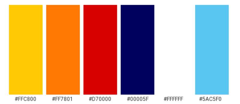
The Colors of the Aldi Logo
Colors aren’t just…colors. They’ve got feels.
Blue: The Trusty Buddy
There’s a lot of blue in the Aldi logo, right? Blue is calm. It’s dependable. Every time you shop at Aldi, you know what you’re getting. No surprises. Just like good ol’ blue.
Red: The Fire Within
Then there’s that fiery red. Passion. The passion Aldi has for quality and value. It’s not just about selling products—it’s about a commitment.
The Font Used in the Aldi Logo
Typography is an art. And Aldi’s font? It’s got style.
Bold and Straightforward
That font isn’t shy. It’s bold. Sturdy. It’s there to say, “Hey, I’m Aldi. Nice to meet ya.” No fuss, just like shopping there.
Why No Cursive or Fancy Twists?
The Aldi experience is simple and direct. The font reflects that. No curls or extravagant designs. It’s genuine.
The Evolution Over Time
Everything changes, including logos.
Adapting to the Times
Aldi’s kept up with the times. The logo’s seen variations. Yet, the essence? Still the same. Adapting, but never losing its soul.
Memorable Moments
Remember when Aldi first introduced organic products? The logo stood as a backdrop to those key moments, marking milestones.
Aldi Logo in Pop Culture
Who would’ve thought? A supermarket logo becoming iconic!
Spotting It in Movies and TV
The Aldi logo has had its moments of fame. A cameo here, a mention there. It’s got this understated charm.
Tattoos, Merch, and More
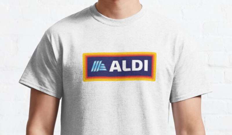
Believe it or not, some folks love Aldi so much they’ve inked it on them. Talk about brand loyalty!
FAQ On The Aldi Logo
What does the Aldi Logo represent?
The Aldi logo is a symbol of affordability meeting quality, a cornerstone of their branding strategy.
Its blue and orange colors project trust and value, while the clean typography assures a modern, customer-focused corporate identity. This emblem is Aldi’s commitment to simplicity and efficiency in every aspect of their retail presence.
Has the Aldi Logo changed over time?
Indeed, the Aldi logo has evolved. From its inception, the emblem has undergone several redesigns, reflecting a dynamic brand that adapts to consumer trends.
Each logo refresh signifies Aldi’s ongoing efforts to stay contemporary and relevant in the competitive grocery retail market, continually bolstering its brand recognition.
What are the colors used in the Aldi Logo?
A look at the logo, and you’ll see a distinctive medley. Bold blue and vibrant orange anchor the design, a duo that speaks to trust and enthusiasm respectively.
This color choice isn’t arbitrary; it’s a calculated element of Aldi’s visual branding, aiding in instant consumer recognition and aligning with their visual communication goals.
Who designed the Aldi Logo?
The creator behind the Aldi logo remains a tale shrouded in corporate history, with details not widely publicized.
What’s known is that the logo is likely the brainchild of a design agency tasked with encapsulating Aldi’s essence—value and simplicity—into a powerful visual statement, a triumph in the realm of graphic design in retail.
What significance does the font of the Aldi Logo have?
Typography in logos is a silent communicator, and Aldi’s choice is no exception. Its sans-serif font conveys modernity and clarity, mirroring Aldi’s store philosophy where efficiency and straightforwardness reign supreme.
Each letter is crafted to epitomize Aldi’s storefront branding, resonating with a diverse customer base.
Is the Aldi Logo trademarked?
Like any corporate juggernaut, the Aldi logo is fiercely protected as a trademark.
This is an assertive declaration of intellectual property rights, a shield against infringement that secures its unique identity in a densely populated supermarket emblem battleground, ensuring Aldi maintains its well-defined place in the grocery sector landscape.
Does the design of the Aldi Logo influence consumer behavior?
Undoubtedly. The Aldi logo isn’t just a visual treat; it’s a psychological lever. It’s designed to evoke a sense of familiarity and trustworthiness, shaping consumer psychology directly.
Customers see the logo and think savings without sacrifice, driving engagement and fostering a brand loyalty that keeps checkouts busy and shoppers returning.
How does the Aldi Logo compare to those of competitive retail logos?
In an arena where visuals vie for attention, the Aldi logo holds its ground with dignity. Its design distills complexity into simplicity, standing out amid the clamor with a clear message of value.
This differentiates it from competitors and fortifies its market positioning within the retail industry.
What does the Aldi Logo tell us about Aldi’s target audience?
The logo speaks directly to a broad audience seeking value without compromising on quality. It resonates with savvy shoppers, reinforcing Aldi’s market positioning as a purveyor of affordable, quality products.
Every element, from color to typeface, is a calculated nod to this diverse demographic, spelling out a welcome mat to the cost-conscious.
How is the Aldi Logo used in the company’s marketing campaigns?
The Aldi logo is more than mere decoration; it’s a linchpin in every marketing campaign, strategically employed across marketing collateral.
Acting as a recognizable beacon, it reinforces campaign messages and strengthens the brand’s visual identity. Its consistent presence ensures each promotional push is unmistakably Aldi, from billboards to digital ads.
Conclusion
In the tapestry of commerce and consumer culture, the Aldi Logo stands as a testament to the power of visual language. We’ve navigated through the sea of blue and orange, unraveling the threads that comprise Aldi’s identity, one intricate stitch at a time. It’s more than an emblem; it’s a beacon of simplicity, a declaration of value, a narrative woven into the very fabric of the marketplace.
This emblematic journey has brought us full circle, from the roots of Aldi’s corporate identity to the leaves of its current market positioning. This is where the timeless meets the modern, the past greets the future, and where a symbol becomes synonymous with an experience. As the doors to our exploration close—a story bookmarked, chapter and verse—it’s clear: a logo is not mere art; it’s the heartbeat of the brand it represents.
In the final analysis, whether considering the grocery store emblem or the visual branding strategy at large, the veritable blueprint of how consumers and brands intertwine has been laid bare. The Aldi logo, both a study and a standard, echoes the retailer’s essence: unmistakable and unambiguous, offering a clear promise in a world of endless choice.
If you liked this article about the Aldi logo, you should check out this article about the 7-Eleven logo.
There are also similar articles discussing the Albertsons logo, the Carrefour logo, the Circle K logo, and the Costco logo.
And let’s not forget about articles on the Giant logo, the QuikTrip logo, the Safeway logo, and the Sainsbury’s logo.
Bogdan Sandu, a seasoned designer with 15 years of diverse experience, has been designing websites since 2008.
Renowned for his expertise in logo design and visual branding, Bogdan has developed a multitude of logos for various clients.
His skills extend to creating posters, vector illustrations, business cards, and brochures. Additionally, Bogdan's UI kits were featured on marketplaces like Visual Hierarchy and UI8.
Latest posts by Bogdan Sandu (see all)
- Deep Dive: Sea Color Palettes for Tranquil Designs - 3 May 2024
- The Stella Artois Logo History, Colors, Font, And Meaning - 2 May 2024
- Sky Color Palettes for Fresh Designs: 40 Examples - 2 May 2024